


Our main challenge lay in the delicate balance between preserving existing brand equity and revitalizing Priority’s visual identity to reflect their evolution and innovation. While their current branding included a wealth of educational information, much of it had become visually outdated, inconsistent, and failed to encapsulate the cutting-edge business they had created.
Additionally, we recognized the importance of ensuring that their messaging resonated with farmers and other industry professionals, striking a delicate balance between expertise and accessibility. Given the highly technical nature of Priority’s microbiology-based nutrition solutions, conveying technical details in a digestible format presented a formidable hurdle. We aimed to create a brand identity that communicated this complex scientific information in a way that was not only digestible for the average farmer but also visually engaging.


First and foremost, we embraced a visual language characterized by geometric icons and thin line illustrations. These elements, while inherently educational and technical, were crafted to be easily understandable, avoiding confusion while conveying the intricacies of microbiology nutrition solutions. Simple data visualizations featuring large numbers and prominent fields of color further enhanced the accessibility of complex information.
To evoke Priority’s holistic approach, we incorporated elements inspired by the earth across all touchpoints. Vibrant yet earthy colors, reminiscent of the natural world, imbued their visual identity with warmth and energy. Secondary colors added another layer of vibrancy and depth to the brand palette, while the thin line illustrations corresponding to each product provided visual clarity and coherence. Stamp elements were strategically employed to reinforce messaging and lend an air of authority to all communication.
Central to Priority’s new branding was their modern and approachable logo, which positioned Priority as stable, contemporary, and invested. Each detail in the logo was meticulously crafted to represent the direct interactions between microbiology and nutrition.


Overall, our solution embodied a harmonious fusion of science, innovation, and visual storytelling, positioning them as trailblazers in the field of microbiology-based nutrition solutions while preserving the integrity of their brand equity.
In translating complex information into digestible content, we leveraged clear, easy-to-read layouts and recognizable elements that exude a high-end feel while retaining a down-to-earth approach. When employed at each touchpoint, every element works together to create a refined and uncluttered design that allows their message and visuals to stand out and declare them the experts in their field.


Our main challenge lay in the delicate balance between preserving existing brand equity and revitalizing Priority’s visual identity to reflect their evolution and innovation. While their current branding included a wealth of educational information, much of it had become visually outdated, inconsistent, and failed to encapsulate the cutting-edge business they had created.
Additionally, we recognized the importance of ensuring that their messaging resonated with farmers and other industry professionals, striking a delicate balance between expertise and accessibility. Given the highly technical nature of Priority’s microbiology-based nutrition solutions, conveying technical details in a digestible format presented a formidable hurdle. We aimed to create a brand identity that communicated this complex scientific information in a way that was not only digestible for the average farmer but also visually engaging.


First and foremost, we embraced a visual language characterized by geometric icons and thin line illustrations. These elements, while inherently educational and technical, were crafted to be easily understandable, avoiding confusion while conveying the intricacies of microbiology nutrition solutions. Simple data visualizations featuring large numbers and prominent fields of color further enhanced the accessibility of complex information.
To evoke Priority’s holistic approach, we incorporated elements inspired by the earth across all touchpoints. Vibrant yet earthy colors, reminiscent of the natural world, imbued their visual identity with warmth and energy. Secondary colors added another layer of vibrancy and depth to the brand palette, while the thin line illustrations corresponding to each product provided visual clarity and coherence. Stamp elements were strategically employed to reinforce messaging and lend an air of authority to all communication.
Central to Priority’s new branding was their modern and approachable logo, which positioned Priority as stable, contemporary, and invested. Each detail in the logo was meticulously crafted to represent the direct interactions between microbiology and nutrition.

Overall, our solution embodied a harmonious fusion of science, innovation, and visual storytelling, positioning them as trailblazers in the field of microbiology-based nutrition solutions while preserving the integrity of their brand equity.
In translating complex information into digestible content, we leveraged clear, easy-to-read layouts and recognizable elements that exude a high-end feel while retaining a down-to-earth approach. When employed at each touchpoint, every element works together to create a refined and uncluttered design that allows their message and visuals to stand out and declare them the experts in their field.


Our main challenge lay in the delicate balance between preserving existing brand equity and revitalizing Priority’s visual identity to reflect their evolution and innovation. While their current branding included a wealth of educational information, much of it had become visually outdated, inconsistent, and failed to encapsulate the cutting-edge business they had created.
Additionally, we recognized the importance of ensuring that their messaging resonated with farmers and other industry professionals, striking a delicate balance between expertise and accessibility. Given the highly technical nature of Priority’s microbiology-based nutrition solutions, conveying technical details in a digestible format presented a formidable hurdle. We aimed to create a brand identity that communicated this complex scientific information in a way that was not only digestible for the average farmer but also visually engaging.

First and foremost, we embraced a visual language characterized by geometric icons and thin line illustrations. These elements, while inherently educational and technical, were crafted to be easily understandable, avoiding confusion while conveying the intricacies of microbiology nutrition solutions. Simple data visualizations featuring large numbers and prominent fields of color further enhanced the accessibility of complex information.
To evoke Priority’s holistic approach, we incorporated elements inspired by the earth across all touchpoints. Vibrant yet earthy colors, reminiscent of the natural world, imbued their visual identity with warmth and energy. Secondary colors added another layer of vibrancy and depth to the brand palette, while the thin line illustrations corresponding to each product provided visual clarity and coherence. Stamp elements were strategically employed to reinforce messaging and lend an air of authority to all communication.
Central to Priority’s new branding was their modern and approachable logo, which positioned Priority as stable, contemporary, and invested. Each detail in the logo was meticulously crafted to represent the direct interactions between microbiology and nutrition.


Overall, our solution embodied a harmonious fusion of science, innovation, and visual storytelling, positioning them as trailblazers in the field of microbiology-based nutrition solutions while preserving the integrity of their brand equity.
In translating complex information into digestible content, we leveraged clear, easy-to-read layouts and recognizable elements that exude a high-end feel while retaining a down-to-earth approach. When employed at each touchpoint, every element works together to create a refined and uncluttered design that allows their message and visuals to stand out and declare them the experts in their field.


Our main challenge lay in the delicate balance between preserving existing brand equity and revitalizing Priority’s visual identity to reflect their evolution and innovation. While their current branding included a wealth of educational information, much of it had become visually outdated, inconsistent, and failed to encapsulate the cutting-edge business they had created.
Additionally, we recognized the importance of ensuring that their messaging resonated with farmers and other industry professionals, striking a delicate balance between expertise and accessibility. Given the highly technical nature of Priority’s microbiology-based nutrition solutions, conveying technical details in a digestible format presented a formidable hurdle. We aimed to create a brand identity that communicated this complex scientific information in a way that was not only digestible for the average farmer but also visually engaging.


First and foremost, we embraced a visual language characterized by geometric icons and thin line illustrations. These elements, while inherently educational and technical, were crafted to be easily understandable, avoiding confusion while conveying the intricacies of microbiology nutrition solutions. Simple data visualizations featuring large numbers and prominent fields of color further enhanced the accessibility of complex information.
To evoke Priority’s holistic approach, we incorporated elements inspired by the earth across all touchpoints. Vibrant yet earthy colors, reminiscent of the natural world, imbued their visual identity with warmth and energy. Secondary colors added another layer of vibrancy and depth to the brand palette, while the thin line illustrations corresponding to each product provided visual clarity and coherence. Stamp elements were strategically employed to reinforce messaging and lend an air of authority to all communication.
Central to Priority’s new branding was their modern and approachable logo, which positioned Priority as stable, contemporary, and invested. Each detail in the logo was meticulously crafted to represent the direct interactions between microbiology and nutrition.


Overall, our solution embodied a harmonious fusion of science, innovation, and visual storytelling, positioning them as trailblazers in the field of microbiology-based nutrition solutions while preserving the integrity of their brand equity.
In translating complex information into digestible content, we leveraged clear, easy-to-read layouts and recognizable elements that exude a high-end feel while retaining a down-to-earth approach. When employed at each touchpoint, every element works together to create a refined and uncluttered design that allows their message and visuals to stand out and declare them the experts in their field.


Our main challenge lay in the delicate balance between preserving existing brand equity and revitalizing Priority’s visual identity to reflect their evolution and innovation. While their current branding included a wealth of educational information, much of it had become visually outdated, inconsistent, and failed to encapsulate the cutting-edge business they had created.
Additionally, we recognized the importance of ensuring that their messaging resonated with farmers and other industry professionals, striking a delicate balance between expertise and accessibility. Given the highly technical nature of Priority’s microbiology-based nutrition solutions, conveying technical details in a digestible format presented a formidable hurdle. We aimed to create a brand identity that communicated this complex scientific information in a way that was not only digestible for the average farmer but also visually engaging.


First and foremost, we embraced a visual language characterized by geometric icons and thin line illustrations. These elements, while inherently educational and technical, were crafted to be easily understandable, avoiding confusion while conveying the intricacies of microbiology nutrition solutions. Simple data visualizations featuring large numbers and prominent fields of color further enhanced the accessibility of complex information.
To evoke Priority’s holistic approach, we incorporated elements inspired by the earth across all touchpoints. Vibrant yet earthy colors, reminiscent of the natural world, imbued their visual identity with warmth and energy. Secondary colors added another layer of vibrancy and depth to the brand palette, while the thin line illustrations corresponding to each product provided visual clarity and coherence. Stamp elements were strategically employed to reinforce messaging and lend an air of authority to all communication.
Central to Priority’s new branding was their modern and approachable logo, which positioned Priority as stable, contemporary, and invested. Each detail in the logo was meticulously crafted to represent the direct interactions between microbiology and nutrition.


Overall, our solution embodied a harmonious fusion of science, innovation, and visual storytelling, positioning them as trailblazers in the field of microbiology-based nutrition solutions while preserving the integrity of their brand equity.
In translating complex information into digestible content, we leveraged clear, easy-to-read layouts and recognizable elements that exude a high-end feel while retaining a down-to-earth approach. When employed at each touchpoint, every element works together to create a refined and uncluttered design that allows their message and visuals to stand out and declare them the experts in their field.


Our main challenge lay in the delicate balance between preserving existing brand equity and revitalizing Priority’s visual identity to reflect their evolution and innovation. While their current branding included a wealth of educational information, much of it had become visually outdated, inconsistent, and failed to encapsulate the cutting-edge business they had created.
Additionally, we recognized the importance of ensuring that their messaging resonated with farmers and other industry professionals, striking a delicate balance between expertise and accessibility. Given the highly technical nature of Priority’s microbiology-based nutrition solutions, conveying technical details in a digestible format presented a formidable hurdle. We aimed to create a brand identity that communicated this complex scientific information in a way that was not only digestible for the average farmer but also visually engaging.


First and foremost, we embraced a visual language characterized by geometric icons and thin line illustrations. These elements, while inherently educational and technical, were crafted to be easily understandable, avoiding confusion while conveying the intricacies of microbiology nutrition solutions. Simple data visualizations featuring large numbers and prominent fields of color further enhanced the accessibility of complex information.
To evoke Priority’s holistic approach, we incorporated elements inspired by the earth across all touchpoints. Vibrant yet earthy colors, reminiscent of the natural world, imbued their visual identity with warmth and energy. Secondary colors added another layer of vibrancy and depth to the brand palette, while the thin line illustrations corresponding to each product provided visual clarity and coherence. Stamp elements were strategically employed to reinforce messaging and lend an air of authority to all communication.
Central to Priority’s new branding was their modern and approachable logo, which positioned Priority as stable, contemporary, and invested. Each detail in the logo was meticulously crafted to represent the direct interactions between microbiology and nutrition.


Overall, our solution embodied a harmonious fusion of science, innovation, and visual storytelling, positioning them as trailblazers in the field of microbiology-based nutrition solutions while preserving the integrity of their brand equity.
In translating complex information into digestible content, we leveraged clear, easy-to-read layouts and recognizable elements that exude a high-end feel while retaining a down-to-earth approach. When employed at each touchpoint, every element works together to create a refined and uncluttered design that allows their message and visuals to stand out and declare them the experts in their field.


Our main challenge lay in the delicate balance between preserving existing brand equity and revitalizing Priority’s visual identity to reflect their evolution and innovation. While their current branding included a wealth of educational information, much of it had become visually outdated, inconsistent, and failed to encapsulate the cutting-edge business they had created.
Additionally, we recognized the importance of ensuring that their messaging resonated with farmers and other industry professionals, striking a delicate balance between expertise and accessibility. Given the highly technical nature of Priority’s microbiology-based nutrition solutions, conveying technical details in a digestible format presented a formidable hurdle. We aimed to create a brand identity that communicated this complex scientific information in a way that was not only digestible for the average farmer but also visually engaging.


First and foremost, we embraced a visual language characterized by geometric icons and thin line illustrations. These elements, while inherently educational and technical, were crafted to be easily understandable, avoiding confusion while conveying the intricacies of microbiology nutrition solutions. Simple data visualizations featuring large numbers and prominent fields of color further enhanced the accessibility of complex information.
To evoke Priority’s holistic approach, we incorporated elements inspired by the earth across all touchpoints. Vibrant yet earthy colors, reminiscent of the natural world, imbued their visual identity with warmth and energy. Secondary colors added another layer of vibrancy and depth to the brand palette, while the thin line illustrations corresponding to each product provided visual clarity and coherence. Stamp elements were strategically employed to reinforce messaging and lend an air of authority to all communication.
Central to Priority’s new branding was their modern and approachable logo, which positioned Priority as stable, contemporary, and invested. Each detail in the logo was meticulously crafted to represent the direct interactions between microbiology and nutrition.


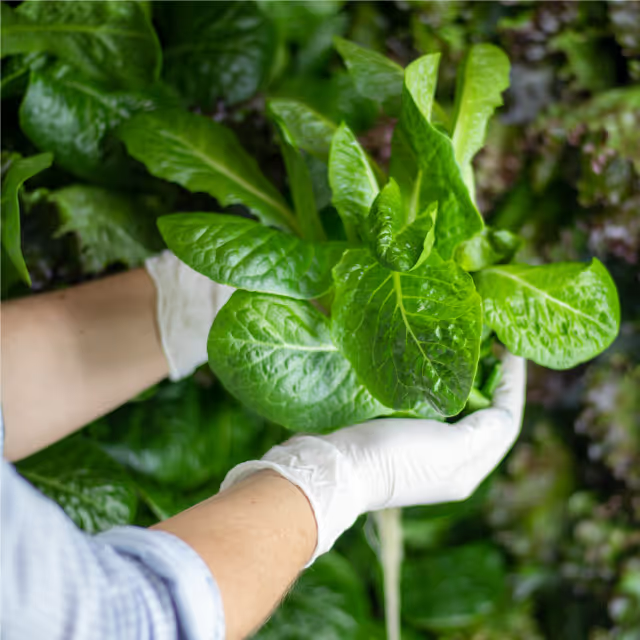


Our main challenge lay in the delicate balance between preserving existing brand equity and revitalizing Priority’s visual identity to reflect their evolution and innovation. While their current branding included a wealth of educational information, much of it had become visually outdated, inconsistent, and failed to encapsulate the cutting-edge business they had created.
Additionally, we recognized the importance of ensuring that their messaging resonated with farmers and other industry professionals, striking a delicate balance between expertise and accessibility. Given the highly technical nature of Priority’s microbiology-based nutrition solutions, conveying technical details in a digestible format presented a formidable hurdle. We aimed to create a brand identity that communicated this complex scientific information in a way that was not only digestible for the average farmer but also visually engaging.
First and foremost, we embraced a visual language characterized by geometric icons and thin line illustrations. These elements, while inherently educational and technical, were crafted to be easily understandable, avoiding confusion while conveying the intricacies of microbiology nutrition solutions. Simple data visualizations featuring large numbers and prominent fields of color further enhanced the accessibility of complex information.
To evoke Priority’s holistic approach, we incorporated elements inspired by the earth across all touchpoints. Vibrant yet earthy colors, reminiscent of the natural world, imbued their visual identity with warmth and energy. Secondary colors added another layer of vibrancy and depth to the brand palette, while the thin line illustrations corresponding to each product provided visual clarity and coherence. Stamp elements were strategically employed to reinforce messaging and lend an air of authority to all communication.
Central to Priority’s new branding was their modern and approachable logo, which positioned Priority as stable, contemporary, and invested. Each detail in the logo was meticulously crafted to represent the direct interactions between microbiology and nutrition.


Overall, our solution embodied a harmonious fusion of science, innovation, and visual storytelling, positioning them as trailblazers in the field of microbiology-based nutrition solutions while preserving the integrity of their brand equity.
In translating complex information into digestible content, we leveraged clear, easy-to-read layouts and recognizable elements that exude a high-end feel while retaining a down-to-earth approach. When employed at each touchpoint, every element works together to create a refined and uncluttered design that allows their message and visuals to stand out and declare them the experts in their field.


Our main challenge lay in the delicate balance between preserving existing brand equity and revitalizing Priority’s visual identity to reflect their evolution and innovation. While their current branding included a wealth of educational information, much of it had become visually outdated, inconsistent, and failed to encapsulate the cutting-edge business they had created.
Additionally, we recognized the importance of ensuring that their messaging resonated with farmers and other industry professionals, striking a delicate balance between expertise and accessibility. Given the highly technical nature of Priority’s microbiology-based nutrition solutions, conveying technical details in a digestible format presented a formidable hurdle. We aimed to create a brand identity that communicated this complex scientific information in a way that was not only digestible for the average farmer but also visually engaging.


First and foremost, we embraced a visual language characterized by geometric icons and thin line illustrations. These elements, while inherently educational and technical, were crafted to be easily understandable, avoiding confusion while conveying the intricacies of microbiology nutrition solutions. Simple data visualizations featuring large numbers and prominent fields of color further enhanced the accessibility of complex information.
To evoke Priority’s holistic approach, we incorporated elements inspired by the earth across all touchpoints. Vibrant yet earthy colors, reminiscent of the natural world, imbued their visual identity with warmth and energy. Secondary colors added another layer of vibrancy and depth to the brand palette, while the thin line illustrations corresponding to each product provided visual clarity and coherence. Stamp elements were strategically employed to reinforce messaging and lend an air of authority to all communication.
Central to Priority’s new branding was their modern and approachable logo, which positioned Priority as stable, contemporary, and invested. Each detail in the logo was meticulously crafted to represent the direct interactions between microbiology and nutrition.
Overall, our solution embodied a harmonious fusion of science, innovation, and visual storytelling, positioning them as trailblazers in the field of microbiology-based nutrition solutions while preserving the integrity of their brand equity.
In translating complex information into digestible content, we leveraged clear, easy-to-read layouts and recognizable elements that exude a high-end feel while retaining a down-to-earth approach. When employed at each touchpoint, every element works together to create a refined and uncluttered design that allows their message and visuals to stand out and declare them the experts in their field.

Our main challenge lay in the delicate balance between preserving existing brand equity and revitalizing Priority’s visual identity to reflect their evolution and innovation. While their current branding included a wealth of educational information, much of it had become visually outdated, inconsistent, and failed to encapsulate the cutting-edge business they had created.
Additionally, we recognized the importance of ensuring that their messaging resonated with farmers and other industry professionals, striking a delicate balance between expertise and accessibility. Given the highly technical nature of Priority’s microbiology-based nutrition solutions, conveying technical details in a digestible format presented a formidable hurdle. We aimed to create a brand identity that communicated this complex scientific information in a way that was not only digestible for the average farmer but also visually engaging.


First and foremost, we embraced a visual language characterized by geometric icons and thin line illustrations. These elements, while inherently educational and technical, were crafted to be easily understandable, avoiding confusion while conveying the intricacies of microbiology nutrition solutions. Simple data visualizations featuring large numbers and prominent fields of color further enhanced the accessibility of complex information.
To evoke Priority’s holistic approach, we incorporated elements inspired by the earth across all touchpoints. Vibrant yet earthy colors, reminiscent of the natural world, imbued their visual identity with warmth and energy. Secondary colors added another layer of vibrancy and depth to the brand palette, while the thin line illustrations corresponding to each product provided visual clarity and coherence. Stamp elements were strategically employed to reinforce messaging and lend an air of authority to all communication.
Central to Priority’s new branding was their modern and approachable logo, which positioned Priority as stable, contemporary, and invested. Each detail in the logo was meticulously crafted to represent the direct interactions between microbiology and nutrition.


Overall, our solution embodied a harmonious fusion of science, innovation, and visual storytelling, positioning them as trailblazers in the field of microbiology-based nutrition solutions while preserving the integrity of their brand equity.
In translating complex information into digestible content, we leveraged clear, easy-to-read layouts and recognizable elements that exude a high-end feel while retaining a down-to-earth approach. When employed at each touchpoint, every element works together to create a refined and uncluttered design that allows their message and visuals to stand out and declare them the experts in their field.


Our main challenge lay in the delicate balance between preserving existing brand equity and revitalizing Priority’s visual identity to reflect their evolution and innovation. While their current branding included a wealth of educational information, much of it had become visually outdated, inconsistent, and failed to encapsulate the cutting-edge business they had created.
Additionally, we recognized the importance of ensuring that their messaging resonated with farmers and other industry professionals, striking a delicate balance between expertise and accessibility. Given the highly technical nature of Priority’s microbiology-based nutrition solutions, conveying technical details in a digestible format presented a formidable hurdle. We aimed to create a brand identity that communicated this complex scientific information in a way that was not only digestible for the average farmer but also visually engaging.

First and foremost, we embraced a visual language characterized by geometric icons and thin line illustrations. These elements, while inherently educational and technical, were crafted to be easily understandable, avoiding confusion while conveying the intricacies of microbiology nutrition solutions. Simple data visualizations featuring large numbers and prominent fields of color further enhanced the accessibility of complex information.
To evoke Priority’s holistic approach, we incorporated elements inspired by the earth across all touchpoints. Vibrant yet earthy colors, reminiscent of the natural world, imbued their visual identity with warmth and energy. Secondary colors added another layer of vibrancy and depth to the brand palette, while the thin line illustrations corresponding to each product provided visual clarity and coherence. Stamp elements were strategically employed to reinforce messaging and lend an air of authority to all communication.
Central to Priority’s new branding was their modern and approachable logo, which positioned Priority as stable, contemporary, and invested. Each detail in the logo was meticulously crafted to represent the direct interactions between microbiology and nutrition.

Overall, our solution embodied a harmonious fusion of science, innovation, and visual storytelling, positioning them as trailblazers in the field of microbiology-based nutrition solutions while preserving the integrity of their brand equity.
In translating complex information into digestible content, we leveraged clear, easy-to-read layouts and recognizable elements that exude a high-end feel while retaining a down-to-earth approach. When employed at each touchpoint, every element works together to create a refined and uncluttered design that allows their message and visuals to stand out and declare them the experts in their field.


Our main challenge lay in the delicate balance between preserving existing brand equity and revitalizing Priority’s visual identity to reflect their evolution and innovation. While their current branding included a wealth of educational information, much of it had become visually outdated, inconsistent, and failed to encapsulate the cutting-edge business they had created.
Additionally, we recognized the importance of ensuring that their messaging resonated with farmers and other industry professionals, striking a delicate balance between expertise and accessibility. Given the highly technical nature of Priority’s microbiology-based nutrition solutions, conveying technical details in a digestible format presented a formidable hurdle. We aimed to create a brand identity that communicated this complex scientific information in a way that was not only digestible for the average farmer but also visually engaging.


First and foremost, we embraced a visual language characterized by geometric icons and thin line illustrations. These elements, while inherently educational and technical, were crafted to be easily understandable, avoiding confusion while conveying the intricacies of microbiology nutrition solutions. Simple data visualizations featuring large numbers and prominent fields of color further enhanced the accessibility of complex information.
To evoke Priority’s holistic approach, we incorporated elements inspired by the earth across all touchpoints. Vibrant yet earthy colors, reminiscent of the natural world, imbued their visual identity with warmth and energy. Secondary colors added another layer of vibrancy and depth to the brand palette, while the thin line illustrations corresponding to each product provided visual clarity and coherence. Stamp elements were strategically employed to reinforce messaging and lend an air of authority to all communication.
Central to Priority’s new branding was their modern and approachable logo, which positioned Priority as stable, contemporary, and invested. Each detail in the logo was meticulously crafted to represent the direct interactions between microbiology and nutrition.


Overall, our solution embodied a harmonious fusion of science, innovation, and visual storytelling, positioning them as trailblazers in the field of microbiology-based nutrition solutions while preserving the integrity of their brand equity.
In translating complex information into digestible content, we leveraged clear, easy-to-read layouts and recognizable elements that exude a high-end feel while retaining a down-to-earth approach. When employed at each touchpoint, every element works together to create a refined and uncluttered design that allows their message and visuals to stand out and declare them the experts in their field.


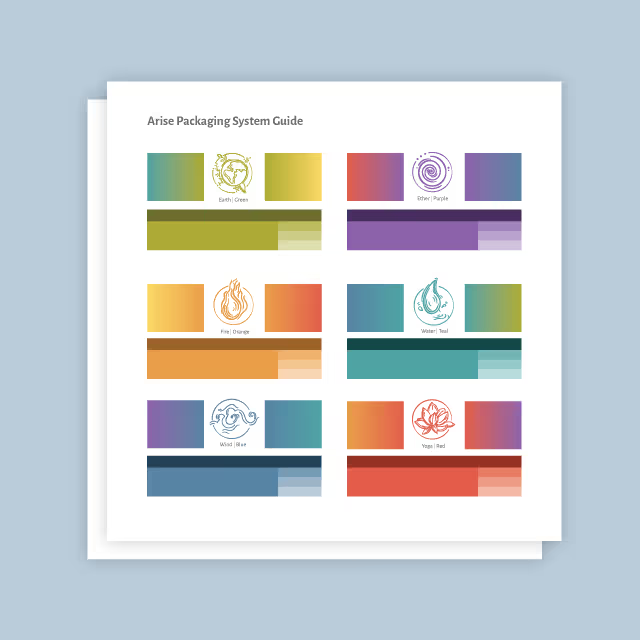
Our main challenge lay in the delicate balance between preserving existing brand equity and revitalizing Priority’s visual identity to reflect their evolution and innovation. While their current branding included a wealth of educational information, much of it had become visually outdated, inconsistent, and failed to encapsulate the cutting-edge business they had created.
Additionally, we recognized the importance of ensuring that their messaging resonated with farmers and other industry professionals, striking a delicate balance between expertise and accessibility. Given the highly technical nature of Priority’s microbiology-based nutrition solutions, conveying technical details in a digestible format presented a formidable hurdle. We aimed to create a brand identity that communicated this complex scientific information in a way that was not only digestible for the average farmer but also visually engaging.
First and foremost, we embraced a visual language characterized by geometric icons and thin line illustrations. These elements, while inherently educational and technical, were crafted to be easily understandable, avoiding confusion while conveying the intricacies of microbiology nutrition solutions. Simple data visualizations featuring large numbers and prominent fields of color further enhanced the accessibility of complex information.
To evoke Priority’s holistic approach, we incorporated elements inspired by the earth across all touchpoints. Vibrant yet earthy colors, reminiscent of the natural world, imbued their visual identity with warmth and energy. Secondary colors added another layer of vibrancy and depth to the brand palette, while the thin line illustrations corresponding to each product provided visual clarity and coherence. Stamp elements were strategically employed to reinforce messaging and lend an air of authority to all communication.
Central to Priority’s new branding was their modern and approachable logo, which positioned Priority as stable, contemporary, and invested. Each detail in the logo was meticulously crafted to represent the direct interactions between microbiology and nutrition.


Overall, our solution embodied a harmonious fusion of science, innovation, and visual storytelling, positioning them as trailblazers in the field of microbiology-based nutrition solutions while preserving the integrity of their brand equity.
In translating complex information into digestible content, we leveraged clear, easy-to-read layouts and recognizable elements that exude a high-end feel while retaining a down-to-earth approach. When employed at each touchpoint, every element works together to create a refined and uncluttered design that allows their message and visuals to stand out and declare them the experts in their field.


Our main challenge lay in the delicate balance between preserving existing brand equity and revitalizing Priority’s visual identity to reflect their evolution and innovation. While their current branding included a wealth of educational information, much of it had become visually outdated, inconsistent, and failed to encapsulate the cutting-edge business they had created.
Additionally, we recognized the importance of ensuring that their messaging resonated with farmers and other industry professionals, striking a delicate balance between expertise and accessibility. Given the highly technical nature of Priority’s microbiology-based nutrition solutions, conveying technical details in a digestible format presented a formidable hurdle. We aimed to create a brand identity that communicated this complex scientific information in a way that was not only digestible for the average farmer but also visually engaging.

First and foremost, we embraced a visual language characterized by geometric icons and thin line illustrations. These elements, while inherently educational and technical, were crafted to be easily understandable, avoiding confusion while conveying the intricacies of microbiology nutrition solutions. Simple data visualizations featuring large numbers and prominent fields of color further enhanced the accessibility of complex information.
To evoke Priority’s holistic approach, we incorporated elements inspired by the earth across all touchpoints. Vibrant yet earthy colors, reminiscent of the natural world, imbued their visual identity with warmth and energy. Secondary colors added another layer of vibrancy and depth to the brand palette, while the thin line illustrations corresponding to each product provided visual clarity and coherence. Stamp elements were strategically employed to reinforce messaging and lend an air of authority to all communication.
Central to Priority’s new branding was their modern and approachable logo, which positioned Priority as stable, contemporary, and invested. Each detail in the logo was meticulously crafted to represent the direct interactions between microbiology and nutrition.
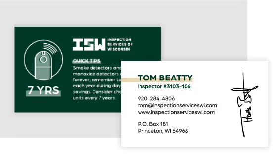

Overall, our solution embodied a harmonious fusion of science, innovation, and visual storytelling, positioning them as trailblazers in the field of microbiology-based nutrition solutions while preserving the integrity of their brand equity.
In translating complex information into digestible content, we leveraged clear, easy-to-read layouts and recognizable elements that exude a high-end feel while retaining a down-to-earth approach. When employed at each touchpoint, every element works together to create a refined and uncluttered design that allows their message and visuals to stand out and declare them the experts in their field.
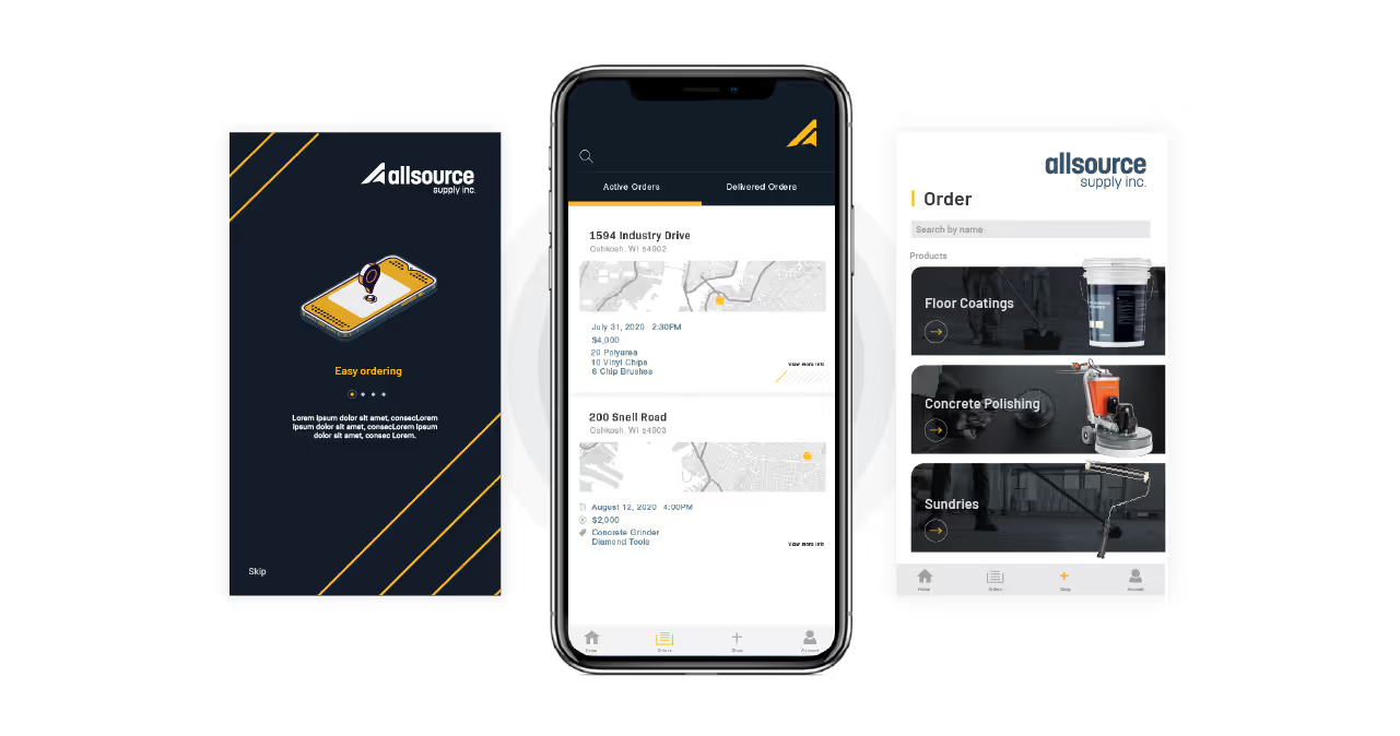


Our main challenge lay in the delicate balance between preserving existing brand equity and revitalizing Priority’s visual identity to reflect their evolution and innovation. While their current branding included a wealth of educational information, much of it had become visually outdated, inconsistent, and failed to encapsulate the cutting-edge business they had created.
Additionally, we recognized the importance of ensuring that their messaging resonated with farmers and other industry professionals, striking a delicate balance between expertise and accessibility. Given the highly technical nature of Priority’s microbiology-based nutrition solutions, conveying technical details in a digestible format presented a formidable hurdle. We aimed to create a brand identity that communicated this complex scientific information in a way that was not only digestible for the average farmer but also visually engaging.


First and foremost, we embraced a visual language characterized by geometric icons and thin line illustrations. These elements, while inherently educational and technical, were crafted to be easily understandable, avoiding confusion while conveying the intricacies of microbiology nutrition solutions. Simple data visualizations featuring large numbers and prominent fields of color further enhanced the accessibility of complex information.
To evoke Priority’s holistic approach, we incorporated elements inspired by the earth across all touchpoints. Vibrant yet earthy colors, reminiscent of the natural world, imbued their visual identity with warmth and energy. Secondary colors added another layer of vibrancy and depth to the brand palette, while the thin line illustrations corresponding to each product provided visual clarity and coherence. Stamp elements were strategically employed to reinforce messaging and lend an air of authority to all communication.
Central to Priority’s new branding was their modern and approachable logo, which positioned Priority as stable, contemporary, and invested. Each detail in the logo was meticulously crafted to represent the direct interactions between microbiology and nutrition.


Overall, our solution embodied a harmonious fusion of science, innovation, and visual storytelling, positioning them as trailblazers in the field of microbiology-based nutrition solutions while preserving the integrity of their brand equity.
In translating complex information into digestible content, we leveraged clear, easy-to-read layouts and recognizable elements that exude a high-end feel while retaining a down-to-earth approach. When employed at each touchpoint, every element works together to create a refined and uncluttered design that allows their message and visuals to stand out and declare them the experts in their field.


Our main challenge lay in the delicate balance between preserving existing brand equity and revitalizing Priority’s visual identity to reflect their evolution and innovation. While their current branding included a wealth of educational information, much of it had become visually outdated, inconsistent, and failed to encapsulate the cutting-edge business they had created.
Additionally, we recognized the importance of ensuring that their messaging resonated with farmers and other industry professionals, striking a delicate balance between expertise and accessibility. Given the highly technical nature of Priority’s microbiology-based nutrition solutions, conveying technical details in a digestible format presented a formidable hurdle. We aimed to create a brand identity that communicated this complex scientific information in a way that was not only digestible for the average farmer but also visually engaging.


First and foremost, we embraced a visual language characterized by geometric icons and thin line illustrations. These elements, while inherently educational and technical, were crafted to be easily understandable, avoiding confusion while conveying the intricacies of microbiology nutrition solutions. Simple data visualizations featuring large numbers and prominent fields of color further enhanced the accessibility of complex information.
To evoke Priority’s holistic approach, we incorporated elements inspired by the earth across all touchpoints. Vibrant yet earthy colors, reminiscent of the natural world, imbued their visual identity with warmth and energy. Secondary colors added another layer of vibrancy and depth to the brand palette, while the thin line illustrations corresponding to each product provided visual clarity and coherence. Stamp elements were strategically employed to reinforce messaging and lend an air of authority to all communication.
Central to Priority’s new branding was their modern and approachable logo, which positioned Priority as stable, contemporary, and invested. Each detail in the logo was meticulously crafted to represent the direct interactions between microbiology and nutrition.

Overall, our solution embodied a harmonious fusion of science, innovation, and visual storytelling, positioning them as trailblazers in the field of microbiology-based nutrition solutions while preserving the integrity of their brand equity.
In translating complex information into digestible content, we leveraged clear, easy-to-read layouts and recognizable elements that exude a high-end feel while retaining a down-to-earth approach. When employed at each touchpoint, every element works together to create a refined and uncluttered design that allows their message and visuals to stand out and declare them the experts in their field.


Our main challenge lay in the delicate balance between preserving existing brand equity and revitalizing Priority’s visual identity to reflect their evolution and innovation. While their current branding included a wealth of educational information, much of it had become visually outdated, inconsistent, and failed to encapsulate the cutting-edge business they had created.
Additionally, we recognized the importance of ensuring that their messaging resonated with farmers and other industry professionals, striking a delicate balance between expertise and accessibility. Given the highly technical nature of Priority’s microbiology-based nutrition solutions, conveying technical details in a digestible format presented a formidable hurdle. We aimed to create a brand identity that communicated this complex scientific information in a way that was not only digestible for the average farmer but also visually engaging.

First and foremost, we embraced a visual language characterized by geometric icons and thin line illustrations. These elements, while inherently educational and technical, were crafted to be easily understandable, avoiding confusion while conveying the intricacies of microbiology nutrition solutions. Simple data visualizations featuring large numbers and prominent fields of color further enhanced the accessibility of complex information.
To evoke Priority’s holistic approach, we incorporated elements inspired by the earth across all touchpoints. Vibrant yet earthy colors, reminiscent of the natural world, imbued their visual identity with warmth and energy. Secondary colors added another layer of vibrancy and depth to the brand palette, while the thin line illustrations corresponding to each product provided visual clarity and coherence. Stamp elements were strategically employed to reinforce messaging and lend an air of authority to all communication.
Central to Priority’s new branding was their modern and approachable logo, which positioned Priority as stable, contemporary, and invested. Each detail in the logo was meticulously crafted to represent the direct interactions between microbiology and nutrition.


Overall, our solution embodied a harmonious fusion of science, innovation, and visual storytelling, positioning them as trailblazers in the field of microbiology-based nutrition solutions while preserving the integrity of their brand equity.
In translating complex information into digestible content, we leveraged clear, easy-to-read layouts and recognizable elements that exude a high-end feel while retaining a down-to-earth approach. When employed at each touchpoint, every element works together to create a refined and uncluttered design that allows their message and visuals to stand out and declare them the experts in their field.
Our main challenge lay in the delicate balance between preserving existing brand equity and revitalizing Priority’s visual identity to reflect their evolution and innovation. While their current branding included a wealth of educational information, much of it had become visually outdated, inconsistent, and failed to encapsulate the cutting-edge business they had created.
Additionally, we recognized the importance of ensuring that their messaging resonated with farmers and other industry professionals, striking a delicate balance between expertise and accessibility. Given the highly technical nature of Priority’s microbiology-based nutrition solutions, conveying technical details in a digestible format presented a formidable hurdle. We aimed to create a brand identity that communicated this complex scientific information in a way that was not only digestible for the average farmer but also visually engaging.

First and foremost, we embraced a visual language characterized by geometric icons and thin line illustrations. These elements, while inherently educational and technical, were crafted to be easily understandable, avoiding confusion while conveying the intricacies of microbiology nutrition solutions. Simple data visualizations featuring large numbers and prominent fields of color further enhanced the accessibility of complex information.
To evoke Priority’s holistic approach, we incorporated elements inspired by the earth across all touchpoints. Vibrant yet earthy colors, reminiscent of the natural world, imbued their visual identity with warmth and energy. Secondary colors added another layer of vibrancy and depth to the brand palette, while the thin line illustrations corresponding to each product provided visual clarity and coherence. Stamp elements were strategically employed to reinforce messaging and lend an air of authority to all communication.
Central to Priority’s new branding was their modern and approachable logo, which positioned Priority as stable, contemporary, and invested. Each detail in the logo was meticulously crafted to represent the direct interactions between microbiology and nutrition.

Overall, our solution embodied a harmonious fusion of science, innovation, and visual storytelling, positioning them as trailblazers in the field of microbiology-based nutrition solutions while preserving the integrity of their brand equity.
In translating complex information into digestible content, we leveraged clear, easy-to-read layouts and recognizable elements that exude a high-end feel while retaining a down-to-earth approach. When employed at each touchpoint, every element works together to create a refined and uncluttered design that allows their message and visuals to stand out and declare them the experts in their field.

First and foremost, we embraced a visual language characterized by geometric icons and thin line illustrations. These elements, while inherently educational and technical, were crafted to be easily understandable, avoiding confusion while conveying the intricacies of microbiology nutrition solutions. Simple data visualizations featuring large numbers and prominent fields of color further enhanced the accessibility of complex information.
To evoke Priority’s holistic approach, we incorporated elements inspired by the earth across all touchpoints. Vibrant yet earthy colors, reminiscent of the natural world, imbued their visual identity with warmth and energy. Secondary colors added another layer of vibrancy and depth to the brand palette, while the thin line illustrations corresponding to each product provided visual clarity and coherence. Stamp elements were strategically employed to reinforce messaging and lend an air of authority to all communication.
Central to Priority’s new branding was their modern and approachable logo, which positioned Priority as stable, contemporary, and invested. Each detail in the logo was meticulously crafted to represent the direct interactions between microbiology and nutrition.

Our main challenge lay in the delicate balance between preserving existing brand equity and revitalizing Priority’s visual identity to reflect their evolution and innovation. While their current branding included a wealth of educational information, much of it had become visually outdated, inconsistent, and failed to encapsulate the cutting-edge business they had created.
Additionally, we recognized the importance of ensuring that their messaging resonated with farmers and other industry professionals, striking a delicate balance between expertise and accessibility. Given the highly technical nature of Priority’s microbiology-based nutrition solutions, conveying technical details in a digestible format presented a formidable hurdle. We aimed to create a brand identity that communicated this complex scientific information in a way that was not only digestible for the average farmer but also visually engaging.

Overall, our solution embodied a harmonious fusion of science, innovation, and visual storytelling, positioning them as trailblazers in the field of microbiology-based nutrition solutions while preserving the integrity of their brand equity.
In translating complex information into digestible content, we leveraged clear, easy-to-read layouts and recognizable elements that exude a high-end feel while retaining a down-to-earth approach. When employed at each touchpoint, every element works together to create a refined and uncluttered design that allows their message and visuals to stand out and declare them the experts in their field.


Our main challenge lay in the delicate balance between preserving existing brand equity and revitalizing Priority’s visual identity to reflect their evolution and innovation. While their current branding included a wealth of educational information, much of it had become visually outdated, inconsistent, and failed to encapsulate the cutting-edge business they had created.
Additionally, we recognized the importance of ensuring that their messaging resonated with farmers and other industry professionals, striking a delicate balance between expertise and accessibility. Given the highly technical nature of Priority’s microbiology-based nutrition solutions, conveying technical details in a digestible format presented a formidable hurdle. We aimed to create a brand identity that communicated this complex scientific information in a way that was not only digestible for the average farmer but also visually engaging.


First and foremost, we embraced a visual language characterized by geometric icons and thin line illustrations. These elements, while inherently educational and technical, were crafted to be easily understandable, avoiding confusion while conveying the intricacies of microbiology nutrition solutions. Simple data visualizations featuring large numbers and prominent fields of color further enhanced the accessibility of complex information.
To evoke Priority’s holistic approach, we incorporated elements inspired by the earth across all touchpoints. Vibrant yet earthy colors, reminiscent of the natural world, imbued their visual identity with warmth and energy. Secondary colors added another layer of vibrancy and depth to the brand palette, while the thin line illustrations corresponding to each product provided visual clarity and coherence. Stamp elements were strategically employed to reinforce messaging and lend an air of authority to all communication.
Central to Priority’s new branding was their modern and approachable logo, which positioned Priority as stable, contemporary, and invested. Each detail in the logo was meticulously crafted to represent the direct interactions between microbiology and nutrition.

Overall, our solution embodied a harmonious fusion of science, innovation, and visual storytelling, positioning them as trailblazers in the field of microbiology-based nutrition solutions while preserving the integrity of their brand equity.
In translating complex information into digestible content, we leveraged clear, easy-to-read layouts and recognizable elements that exude a high-end feel while retaining a down-to-earth approach. When employed at each touchpoint, every element works together to create a refined and uncluttered design that allows their message and visuals to stand out and declare them the experts in their field.


Our main challenge lay in the delicate balance between preserving existing brand equity and revitalizing Priority’s visual identity to reflect their evolution and innovation. While their current branding included a wealth of educational information, much of it had become visually outdated, inconsistent, and failed to encapsulate the cutting-edge business they had created.
Additionally, we recognized the importance of ensuring that their messaging resonated with farmers and other industry professionals, striking a delicate balance between expertise and accessibility. Given the highly technical nature of Priority’s microbiology-based nutrition solutions, conveying technical details in a digestible format presented a formidable hurdle. We aimed to create a brand identity that communicated this complex scientific information in a way that was not only digestible for the average farmer but also visually engaging.
First and foremost, we embraced a visual language characterized by geometric icons and thin line illustrations. These elements, while inherently educational and technical, were crafted to be easily understandable, avoiding confusion while conveying the intricacies of microbiology nutrition solutions. Simple data visualizations featuring large numbers and prominent fields of color further enhanced the accessibility of complex information.
To evoke Priority’s holistic approach, we incorporated elements inspired by the earth across all touchpoints. Vibrant yet earthy colors, reminiscent of the natural world, imbued their visual identity with warmth and energy. Secondary colors added another layer of vibrancy and depth to the brand palette, while the thin line illustrations corresponding to each product provided visual clarity and coherence. Stamp elements were strategically employed to reinforce messaging and lend an air of authority to all communication.
Central to Priority’s new branding was their modern and approachable logo, which positioned Priority as stable, contemporary, and invested. Each detail in the logo was meticulously crafted to represent the direct interactions between microbiology and nutrition.


Overall, our solution embodied a harmonious fusion of science, innovation, and visual storytelling, positioning them as trailblazers in the field of microbiology-based nutrition solutions while preserving the integrity of their brand equity.
In translating complex information into digestible content, we leveraged clear, easy-to-read layouts and recognizable elements that exude a high-end feel while retaining a down-to-earth approach. When employed at each touchpoint, every element works together to create a refined and uncluttered design that allows their message and visuals to stand out and declare them the experts in their field.


Our main challenge lay in the delicate balance between preserving existing brand equity and revitalizing Priority’s visual identity to reflect their evolution and innovation. While their current branding included a wealth of educational information, much of it had become visually outdated, inconsistent, and failed to encapsulate the cutting-edge business they had created.
Additionally, we recognized the importance of ensuring that their messaging resonated with farmers and other industry professionals, striking a delicate balance between expertise and accessibility. Given the highly technical nature of Priority’s microbiology-based nutrition solutions, conveying technical details in a digestible format presented a formidable hurdle. We aimed to create a brand identity that communicated this complex scientific information in a way that was not only digestible for the average farmer but also visually engaging.
Overall, our solution embodied a harmonious fusion of science, innovation, and visual storytelling, positioning them as trailblazers in the field of microbiology-based nutrition solutions while preserving the integrity of their brand equity.
In translating complex information into digestible content, we leveraged clear, easy-to-read layouts and recognizable elements that exude a high-end feel while retaining a down-to-earth approach. When employed at each touchpoint, every element works together to create a refined and uncluttered design that allows their message and visuals to stand out and declare them the experts in their field.

First and foremost, we embraced a visual language characterized by geometric icons and thin line illustrations. These elements, while inherently educational and technical, were crafted to be easily understandable, avoiding confusion while conveying the intricacies of microbiology nutrition solutions. Simple data visualizations featuring large numbers and prominent fields of color further enhanced the accessibility of complex information.
To evoke Priority’s holistic approach, we incorporated elements inspired by the earth across all touchpoints. Vibrant yet earthy colors, reminiscent of the natural world, imbued their visual identity with warmth and energy. Secondary colors added another layer of vibrancy and depth to the brand palette, while the thin line illustrations corresponding to each product provided visual clarity and coherence. Stamp elements were strategically employed to reinforce messaging and lend an air of authority to all communication.
Central to Priority’s new branding was their modern and approachable logo, which positioned Priority as stable, contemporary, and invested. Each detail in the logo was meticulously crafted to represent the direct interactions between microbiology and nutrition.


Overall, our solution embodied a harmonious fusion of science, innovation, and visual storytelling, positioning them as trailblazers in the field of microbiology-based nutrition solutions while preserving the integrity of their brand equity.
In translating complex information into digestible content, we leveraged clear, easy-to-read layouts and recognizable elements that exude a high-end feel while retaining a down-to-earth approach. When employed at each touchpoint, every element works together to create a refined and uncluttered design that allows their message and visuals to stand out and declare them the experts in their field.


Our main challenge lay in the delicate balance between preserving existing brand equity and revitalizing Priority’s visual identity to reflect their evolution and innovation. While their current branding included a wealth of educational information, much of it had become visually outdated, inconsistent, and failed to encapsulate the cutting-edge business they had created.
Additionally, we recognized the importance of ensuring that their messaging resonated with farmers and other industry professionals, striking a delicate balance between expertise and accessibility. Given the highly technical nature of Priority’s microbiology-based nutrition solutions, conveying technical details in a digestible format presented a formidable hurdle. We aimed to create a brand identity that communicated this complex scientific information in a way that was not only digestible for the average farmer but also visually engaging.
First and foremost, we embraced a visual language characterized by geometric icons and thin line illustrations. These elements, while inherently educational and technical, were crafted to be easily understandable, avoiding confusion while conveying the intricacies of microbiology nutrition solutions. Simple data visualizations featuring large numbers and prominent fields of color further enhanced the accessibility of complex information.
To evoke Priority’s holistic approach, we incorporated elements inspired by the earth across all touchpoints. Vibrant yet earthy colors, reminiscent of the natural world, imbued their visual identity with warmth and energy. Secondary colors added another layer of vibrancy and depth to the brand palette, while the thin line illustrations corresponding to each product provided visual clarity and coherence. Stamp elements were strategically employed to reinforce messaging and lend an air of authority to all communication.
Central to Priority’s new branding was their modern and approachable logo, which positioned Priority as stable, contemporary, and invested. Each detail in the logo was meticulously crafted to represent the direct interactions between microbiology and nutrition.


Overall, our solution embodied a harmonious fusion of science, innovation, and visual storytelling, positioning them as trailblazers in the field of microbiology-based nutrition solutions while preserving the integrity of their brand equity.
In translating complex information into digestible content, we leveraged clear, easy-to-read layouts and recognizable elements that exude a high-end feel while retaining a down-to-earth approach. When employed at each touchpoint, every element works together to create a refined and uncluttered design that allows their message and visuals to stand out and declare them the experts in their field.


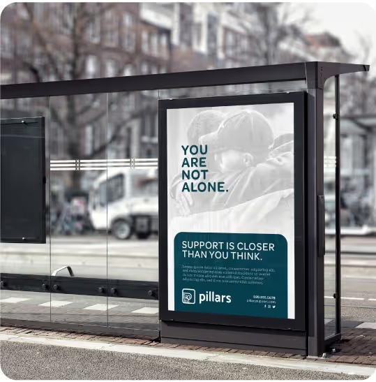
Our main challenge lay in the delicate balance between preserving existing brand equity and revitalizing Priority’s visual identity to reflect their evolution and innovation. While their current branding included a wealth of educational information, much of it had become visually outdated, inconsistent, and failed to encapsulate the cutting-edge business they had created.
Additionally, we recognized the importance of ensuring that their messaging resonated with farmers and other industry professionals, striking a delicate balance between expertise and accessibility. Given the highly technical nature of Priority’s microbiology-based nutrition solutions, conveying technical details in a digestible format presented a formidable hurdle. We aimed to create a brand identity that communicated this complex scientific information in a way that was not only digestible for the average farmer but also visually engaging.

First and foremost, we embraced a visual language characterized by geometric icons and thin line illustrations. These elements, while inherently educational and technical, were crafted to be easily understandable, avoiding confusion while conveying the intricacies of microbiology nutrition solutions. Simple data visualizations featuring large numbers and prominent fields of color further enhanced the accessibility of complex information.
To evoke Priority’s holistic approach, we incorporated elements inspired by the earth across all touchpoints. Vibrant yet earthy colors, reminiscent of the natural world, imbued their visual identity with warmth and energy. Secondary colors added another layer of vibrancy and depth to the brand palette, while the thin line illustrations corresponding to each product provided visual clarity and coherence. Stamp elements were strategically employed to reinforce messaging and lend an air of authority to all communication.
Central to Priority’s new branding was their modern and approachable logo, which positioned Priority as stable, contemporary, and invested. Each detail in the logo was meticulously crafted to represent the direct interactions between microbiology and nutrition.

Overall, our solution embodied a harmonious fusion of science, innovation, and visual storytelling, positioning them as trailblazers in the field of microbiology-based nutrition solutions while preserving the integrity of their brand equity.
In translating complex information into digestible content, we leveraged clear, easy-to-read layouts and recognizable elements that exude a high-end feel while retaining a down-to-earth approach. When employed at each touchpoint, every element works together to create a refined and uncluttered design that allows their message and visuals to stand out and declare them the experts in their field.


Our main challenge lay in the delicate balance between preserving existing brand equity and revitalizing Priority’s visual identity to reflect their evolution and innovation. While their current branding included a wealth of educational information, much of it had become visually outdated, inconsistent, and failed to encapsulate the cutting-edge business they had created.
Additionally, we recognized the importance of ensuring that their messaging resonated with farmers and other industry professionals, striking a delicate balance between expertise and accessibility. Given the highly technical nature of Priority’s microbiology-based nutrition solutions, conveying technical details in a digestible format presented a formidable hurdle. We aimed to create a brand identity that communicated this complex scientific information in a way that was not only digestible for the average farmer but also visually engaging.

First and foremost, we embraced a visual language characterized by geometric icons and thin line illustrations. These elements, while inherently educational and technical, were crafted to be easily understandable, avoiding confusion while conveying the intricacies of microbiology nutrition solutions. Simple data visualizations featuring large numbers and prominent fields of color further enhanced the accessibility of complex information.
To evoke Priority’s holistic approach, we incorporated elements inspired by the earth across all touchpoints. Vibrant yet earthy colors, reminiscent of the natural world, imbued their visual identity with warmth and energy. Secondary colors added another layer of vibrancy and depth to the brand palette, while the thin line illustrations corresponding to each product provided visual clarity and coherence. Stamp elements were strategically employed to reinforce messaging and lend an air of authority to all communication.
Central to Priority’s new branding was their modern and approachable logo, which positioned Priority as stable, contemporary, and invested. Each detail in the logo was meticulously crafted to represent the direct interactions between microbiology and nutrition.


Overall, our solution embodied a harmonious fusion of science, innovation, and visual storytelling, positioning them as trailblazers in the field of microbiology-based nutrition solutions while preserving the integrity of their brand equity.
In translating complex information into digestible content, we leveraged clear, easy-to-read layouts and recognizable elements that exude a high-end feel while retaining a down-to-earth approach. When employed at each touchpoint, every element works together to create a refined and uncluttered design that allows their message and visuals to stand out and declare them the experts in their field.


