


Our creative process was guided by the foundation’s desire to present a polished, visionary, and nurturing brand image. A polished aesthetic would establish trustworthiness and professionalism, while a visionary design approach would project freshness and forward-thinking. The nurturing aspect of their identity was essential to creating an engaging and approachable presence. This collaborative phase allowed us to test ideas and gather feedback, ensuring that the final system was both effective and authentic.

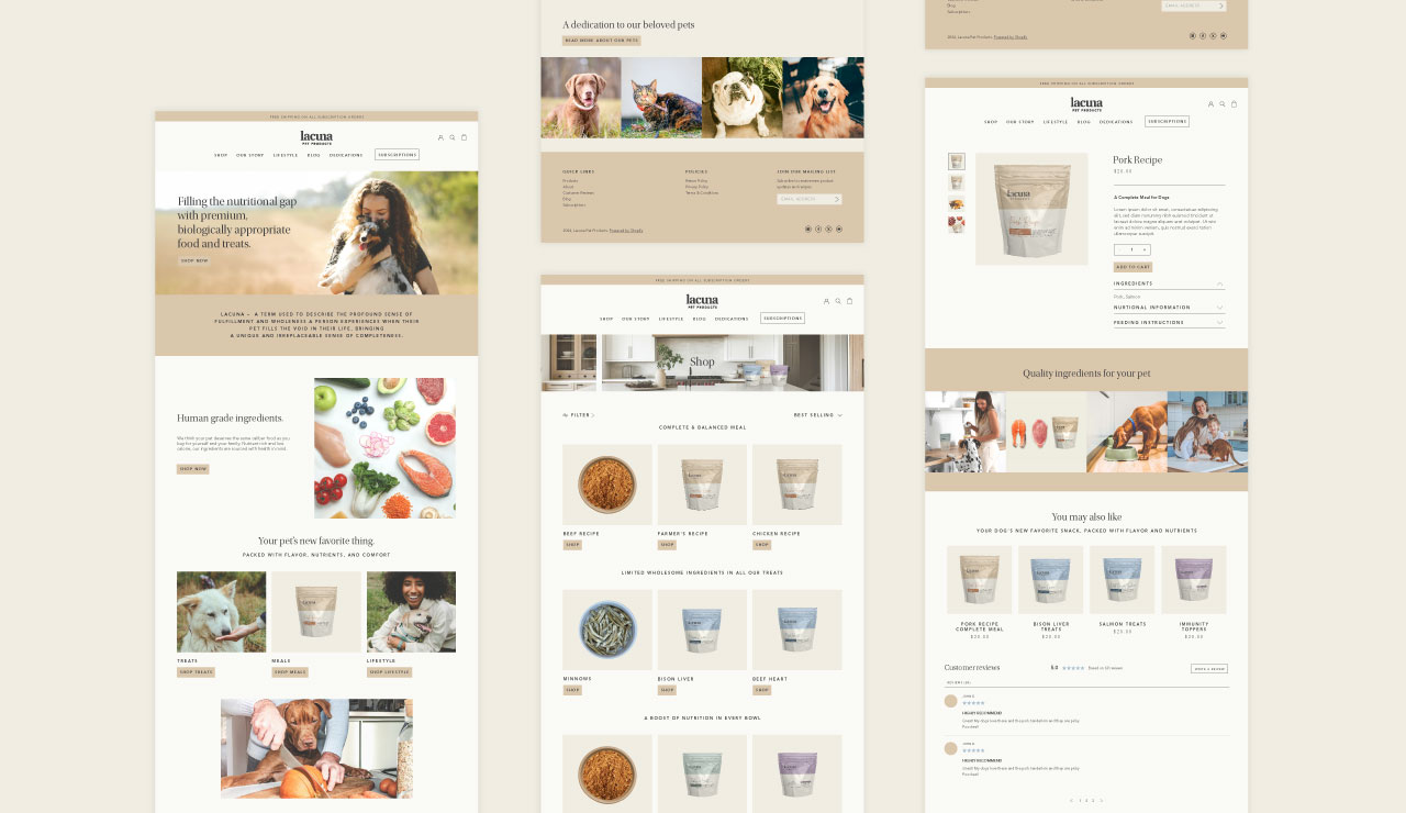

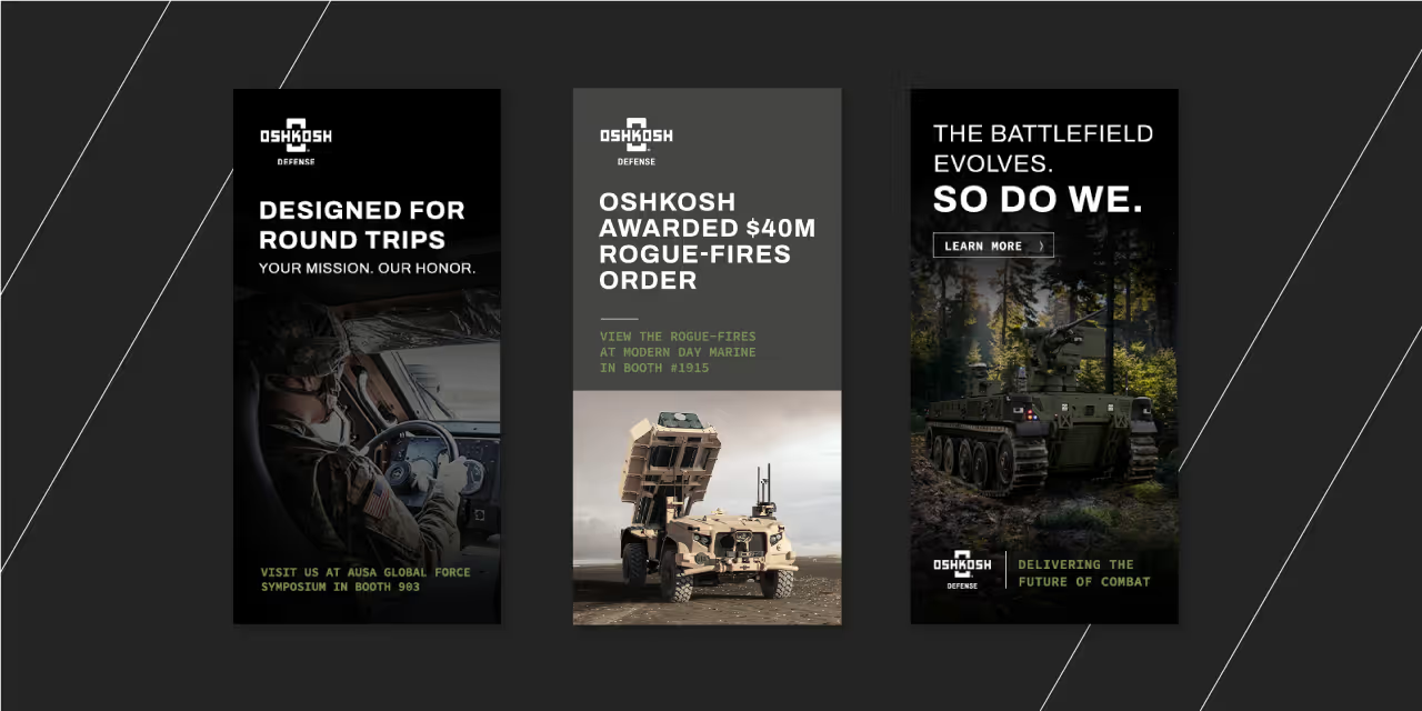
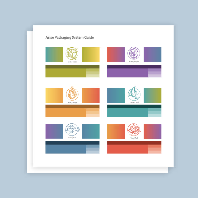
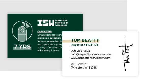
Once all parties agreed on the intended creative direction, we stress-tested the refined visual system across various brand touchpoints, including digital collateral and printed materials. This phase ensured the flexibility and effectiveness of the design, allowing us to establish clear rules for consistent application. We then documented these rules and solutions in a comprehensive visual identity guidelines document. This resource included detailed instructions, pre-designed templates, and exported assets, providing the foundation’s team and external partners with the tools needed to maintain consistency and impact.

The result is a cohesive visual identity system that serves as a guiding framework for the Oshkosh Area Community Foundation’s branding efforts. By leveraging their existing brand equity while introducing strategic refinements, the foundation now embodies a polished, visionary, and nurturing identity that resonates with their community. With this refined system in place, their team and collaborators can confidently represent the foundation, ensuring consistency and meaningful impact across all touchpoints for years to come.


Our creative process was guided by the foundation’s desire to present a polished, visionary, and nurturing brand image. A polished aesthetic would establish trustworthiness and professionalism, while a visionary design approach would project freshness and forward-thinking. The nurturing aspect of their identity was essential to creating an engaging and approachable presence. This collaborative phase allowed us to test ideas and gather feedback, ensuring that the final system was both effective and authentic.


Once all parties agreed on the intended creative direction, we stress-tested the refined visual system across various brand touchpoints, including digital collateral and printed materials. This phase ensured the flexibility and effectiveness of the design, allowing us to establish clear rules for consistent application. We then documented these rules and solutions in a comprehensive visual identity guidelines document. This resource included detailed instructions, pre-designed templates, and exported assets, providing the foundation’s team and external partners with the tools needed to maintain consistency and impact.


The result is a cohesive visual identity system that serves as a guiding framework for the Oshkosh Area Community Foundation’s branding efforts. By leveraging their existing brand equity while introducing strategic refinements, the foundation now embodies a polished, visionary, and nurturing identity that resonates with their community. With this refined system in place, their team and collaborators can confidently represent the foundation, ensuring consistency and meaningful impact across all touchpoints for years to come.


Our creative process was guided by the foundation’s desire to present a polished, visionary, and nurturing brand image. A polished aesthetic would establish trustworthiness and professionalism, while a visionary design approach would project freshness and forward-thinking. The nurturing aspect of their identity was essential to creating an engaging and approachable presence. This collaborative phase allowed us to test ideas and gather feedback, ensuring that the final system was both effective and authentic.


Once all parties agreed on the intended creative direction, we stress-tested the refined visual system across various brand touchpoints, including digital collateral and printed materials. This phase ensured the flexibility and effectiveness of the design, allowing us to establish clear rules for consistent application. We then documented these rules and solutions in a comprehensive visual identity guidelines document. This resource included detailed instructions, pre-designed templates, and exported assets, providing the foundation’s team and external partners with the tools needed to maintain consistency and impact.

The result is a cohesive visual identity system that serves as a guiding framework for the Oshkosh Area Community Foundation’s branding efforts. By leveraging their existing brand equity while introducing strategic refinements, the foundation now embodies a polished, visionary, and nurturing identity that resonates with their community. With this refined system in place, their team and collaborators can confidently represent the foundation, ensuring consistency and meaningful impact across all touchpoints for years to come.


Our creative process was guided by the foundation’s desire to present a polished, visionary, and nurturing brand image. A polished aesthetic would establish trustworthiness and professionalism, while a visionary design approach would project freshness and forward-thinking. The nurturing aspect of their identity was essential to creating an engaging and approachable presence. This collaborative phase allowed us to test ideas and gather feedback, ensuring that the final system was both effective and authentic.

Once all parties agreed on the intended creative direction, we stress-tested the refined visual system across various brand touchpoints, including digital collateral and printed materials. This phase ensured the flexibility and effectiveness of the design, allowing us to establish clear rules for consistent application. We then documented these rules and solutions in a comprehensive visual identity guidelines document. This resource included detailed instructions, pre-designed templates, and exported assets, providing the foundation’s team and external partners with the tools needed to maintain consistency and impact.


The result is a cohesive visual identity system that serves as a guiding framework for the Oshkosh Area Community Foundation’s branding efforts. By leveraging their existing brand equity while introducing strategic refinements, the foundation now embodies a polished, visionary, and nurturing identity that resonates with their community. With this refined system in place, their team and collaborators can confidently represent the foundation, ensuring consistency and meaningful impact across all touchpoints for years to come.


Our creative process was guided by the foundation’s desire to present a polished, visionary, and nurturing brand image. A polished aesthetic would establish trustworthiness and professionalism, while a visionary design approach would project freshness and forward-thinking. The nurturing aspect of their identity was essential to creating an engaging and approachable presence. This collaborative phase allowed us to test ideas and gather feedback, ensuring that the final system was both effective and authentic.


Once all parties agreed on the intended creative direction, we stress-tested the refined visual system across various brand touchpoints, including digital collateral and printed materials. This phase ensured the flexibility and effectiveness of the design, allowing us to establish clear rules for consistent application. We then documented these rules and solutions in a comprehensive visual identity guidelines document. This resource included detailed instructions, pre-designed templates, and exported assets, providing the foundation’s team and external partners with the tools needed to maintain consistency and impact.


The result is a cohesive visual identity system that serves as a guiding framework for the Oshkosh Area Community Foundation’s branding efforts. By leveraging their existing brand equity while introducing strategic refinements, the foundation now embodies a polished, visionary, and nurturing identity that resonates with their community. With this refined system in place, their team and collaborators can confidently represent the foundation, ensuring consistency and meaningful impact across all touchpoints for years to come.


Our creative process was guided by the foundation’s desire to present a polished, visionary, and nurturing brand image. A polished aesthetic would establish trustworthiness and professionalism, while a visionary design approach would project freshness and forward-thinking. The nurturing aspect of their identity was essential to creating an engaging and approachable presence. This collaborative phase allowed us to test ideas and gather feedback, ensuring that the final system was both effective and authentic.


Once all parties agreed on the intended creative direction, we stress-tested the refined visual system across various brand touchpoints, including digital collateral and printed materials. This phase ensured the flexibility and effectiveness of the design, allowing us to establish clear rules for consistent application. We then documented these rules and solutions in a comprehensive visual identity guidelines document. This resource included detailed instructions, pre-designed templates, and exported assets, providing the foundation’s team and external partners with the tools needed to maintain consistency and impact.


The result is a cohesive visual identity system that serves as a guiding framework for the Oshkosh Area Community Foundation’s branding efforts. By leveraging their existing brand equity while introducing strategic refinements, the foundation now embodies a polished, visionary, and nurturing identity that resonates with their community. With this refined system in place, their team and collaborators can confidently represent the foundation, ensuring consistency and meaningful impact across all touchpoints for years to come.


Our creative process was guided by the foundation’s desire to present a polished, visionary, and nurturing brand image. A polished aesthetic would establish trustworthiness and professionalism, while a visionary design approach would project freshness and forward-thinking. The nurturing aspect of their identity was essential to creating an engaging and approachable presence. This collaborative phase allowed us to test ideas and gather feedback, ensuring that the final system was both effective and authentic.


Once all parties agreed on the intended creative direction, we stress-tested the refined visual system across various brand touchpoints, including digital collateral and printed materials. This phase ensured the flexibility and effectiveness of the design, allowing us to establish clear rules for consistent application. We then documented these rules and solutions in a comprehensive visual identity guidelines document. This resource included detailed instructions, pre-designed templates, and exported assets, providing the foundation’s team and external partners with the tools needed to maintain consistency and impact.


The result is a cohesive visual identity system that serves as a guiding framework for the Oshkosh Area Community Foundation’s branding efforts. By leveraging their existing brand equity while introducing strategic refinements, the foundation now embodies a polished, visionary, and nurturing identity that resonates with their community. With this refined system in place, their team and collaborators can confidently represent the foundation, ensuring consistency and meaningful impact across all touchpoints for years to come.


Our creative process was guided by the foundation’s desire to present a polished, visionary, and nurturing brand image. A polished aesthetic would establish trustworthiness and professionalism, while a visionary design approach would project freshness and forward-thinking. The nurturing aspect of their identity was essential to creating an engaging and approachable presence. This collaborative phase allowed us to test ideas and gather feedback, ensuring that the final system was both effective and authentic.


Once all parties agreed on the intended creative direction, we stress-tested the refined visual system across various brand touchpoints, including digital collateral and printed materials. This phase ensured the flexibility and effectiveness of the design, allowing us to establish clear rules for consistent application. We then documented these rules and solutions in a comprehensive visual identity guidelines document. This resource included detailed instructions, pre-designed templates, and exported assets, providing the foundation’s team and external partners with the tools needed to maintain consistency and impact.


Our creative process was guided by the foundation’s desire to present a polished, visionary, and nurturing brand image. A polished aesthetic would establish trustworthiness and professionalism, while a visionary design approach would project freshness and forward-thinking. The nurturing aspect of their identity was essential to creating an engaging and approachable presence. This collaborative phase allowed us to test ideas and gather feedback, ensuring that the final system was both effective and authentic.
Once all parties agreed on the intended creative direction, we stress-tested the refined visual system across various brand touchpoints, including digital collateral and printed materials. This phase ensured the flexibility and effectiveness of the design, allowing us to establish clear rules for consistent application. We then documented these rules and solutions in a comprehensive visual identity guidelines document. This resource included detailed instructions, pre-designed templates, and exported assets, providing the foundation’s team and external partners with the tools needed to maintain consistency and impact.


The result is a cohesive visual identity system that serves as a guiding framework for the Oshkosh Area Community Foundation’s branding efforts. By leveraging their existing brand equity while introducing strategic refinements, the foundation now embodies a polished, visionary, and nurturing identity that resonates with their community. With this refined system in place, their team and collaborators can confidently represent the foundation, ensuring consistency and meaningful impact across all touchpoints for years to come.


Our creative process was guided by the foundation’s desire to present a polished, visionary, and nurturing brand image. A polished aesthetic would establish trustworthiness and professionalism, while a visionary design approach would project freshness and forward-thinking. The nurturing aspect of their identity was essential to creating an engaging and approachable presence. This collaborative phase allowed us to test ideas and gather feedback, ensuring that the final system was both effective and authentic.


Once all parties agreed on the intended creative direction, we stress-tested the refined visual system across various brand touchpoints, including digital collateral and printed materials. This phase ensured the flexibility and effectiveness of the design, allowing us to establish clear rules for consistent application. We then documented these rules and solutions in a comprehensive visual identity guidelines document. This resource included detailed instructions, pre-designed templates, and exported assets, providing the foundation’s team and external partners with the tools needed to maintain consistency and impact.
The result is a cohesive visual identity system that serves as a guiding framework for the Oshkosh Area Community Foundation’s branding efforts. By leveraging their existing brand equity while introducing strategic refinements, the foundation now embodies a polished, visionary, and nurturing identity that resonates with their community. With this refined system in place, their team and collaborators can confidently represent the foundation, ensuring consistency and meaningful impact across all touchpoints for years to come.

Our creative process was guided by the foundation’s desire to present a polished, visionary, and nurturing brand image. A polished aesthetic would establish trustworthiness and professionalism, while a visionary design approach would project freshness and forward-thinking. The nurturing aspect of their identity was essential to creating an engaging and approachable presence. This collaborative phase allowed us to test ideas and gather feedback, ensuring that the final system was both effective and authentic.


Once all parties agreed on the intended creative direction, we stress-tested the refined visual system across various brand touchpoints, including digital collateral and printed materials. This phase ensured the flexibility and effectiveness of the design, allowing us to establish clear rules for consistent application. We then documented these rules and solutions in a comprehensive visual identity guidelines document. This resource included detailed instructions, pre-designed templates, and exported assets, providing the foundation’s team and external partners with the tools needed to maintain consistency and impact.


The result is a cohesive visual identity system that serves as a guiding framework for the Oshkosh Area Community Foundation’s branding efforts. By leveraging their existing brand equity while introducing strategic refinements, the foundation now embodies a polished, visionary, and nurturing identity that resonates with their community. With this refined system in place, their team and collaborators can confidently represent the foundation, ensuring consistency and meaningful impact across all touchpoints for years to come.


Our creative process was guided by the foundation’s desire to present a polished, visionary, and nurturing brand image. A polished aesthetic would establish trustworthiness and professionalism, while a visionary design approach would project freshness and forward-thinking. The nurturing aspect of their identity was essential to creating an engaging and approachable presence. This collaborative phase allowed us to test ideas and gather feedback, ensuring that the final system was both effective and authentic.

Once all parties agreed on the intended creative direction, we stress-tested the refined visual system across various brand touchpoints, including digital collateral and printed materials. This phase ensured the flexibility and effectiveness of the design, allowing us to establish clear rules for consistent application. We then documented these rules and solutions in a comprehensive visual identity guidelines document. This resource included detailed instructions, pre-designed templates, and exported assets, providing the foundation’s team and external partners with the tools needed to maintain consistency and impact.

The result is a cohesive visual identity system that serves as a guiding framework for the Oshkosh Area Community Foundation’s branding efforts. By leveraging their existing brand equity while introducing strategic refinements, the foundation now embodies a polished, visionary, and nurturing identity that resonates with their community. With this refined system in place, their team and collaborators can confidently represent the foundation, ensuring consistency and meaningful impact across all touchpoints for years to come.


Our creative process was guided by the foundation’s desire to present a polished, visionary, and nurturing brand image. A polished aesthetic would establish trustworthiness and professionalism, while a visionary design approach would project freshness and forward-thinking. The nurturing aspect of their identity was essential to creating an engaging and approachable presence. This collaborative phase allowed us to test ideas and gather feedback, ensuring that the final system was both effective and authentic.


Once all parties agreed on the intended creative direction, we stress-tested the refined visual system across various brand touchpoints, including digital collateral and printed materials. This phase ensured the flexibility and effectiveness of the design, allowing us to establish clear rules for consistent application. We then documented these rules and solutions in a comprehensive visual identity guidelines document. This resource included detailed instructions, pre-designed templates, and exported assets, providing the foundation’s team and external partners with the tools needed to maintain consistency and impact.


The result is a cohesive visual identity system that serves as a guiding framework for the Oshkosh Area Community Foundation’s branding efforts. By leveraging their existing brand equity while introducing strategic refinements, the foundation now embodies a polished, visionary, and nurturing identity that resonates with their community. With this refined system in place, their team and collaborators can confidently represent the foundation, ensuring consistency and meaningful impact across all touchpoints for years to come.


Our creative process was guided by the foundation’s desire to present a polished, visionary, and nurturing brand image. A polished aesthetic would establish trustworthiness and professionalism, while a visionary design approach would project freshness and forward-thinking. The nurturing aspect of their identity was essential to creating an engaging and approachable presence. This collaborative phase allowed us to test ideas and gather feedback, ensuring that the final system was both effective and authentic.

Once all parties agreed on the intended creative direction, we stress-tested the refined visual system across various brand touchpoints, including digital collateral and printed materials. This phase ensured the flexibility and effectiveness of the design, allowing us to establish clear rules for consistent application. We then documented these rules and solutions in a comprehensive visual identity guidelines document. This resource included detailed instructions, pre-designed templates, and exported assets, providing the foundation’s team and external partners with the tools needed to maintain consistency and impact.

The result is a cohesive visual identity system that serves as a guiding framework for the Oshkosh Area Community Foundation’s branding efforts. By leveraging their existing brand equity while introducing strategic refinements, the foundation now embodies a polished, visionary, and nurturing identity that resonates with their community. With this refined system in place, their team and collaborators can confidently represent the foundation, ensuring consistency and meaningful impact across all touchpoints for years to come.

Our creative process was guided by the foundation’s desire to present a polished, visionary, and nurturing brand image. A polished aesthetic would establish trustworthiness and professionalism, while a visionary design approach would project freshness and forward-thinking. The nurturing aspect of their identity was essential to creating an engaging and approachable presence. This collaborative phase allowed us to test ideas and gather feedback, ensuring that the final system was both effective and authentic.

Once all parties agreed on the intended creative direction, we stress-tested the refined visual system across various brand touchpoints, including digital collateral and printed materials. This phase ensured the flexibility and effectiveness of the design, allowing us to establish clear rules for consistent application. We then documented these rules and solutions in a comprehensive visual identity guidelines document. This resource included detailed instructions, pre-designed templates, and exported assets, providing the foundation’s team and external partners with the tools needed to maintain consistency and impact.


The result is a cohesive visual identity system that serves as a guiding framework for the Oshkosh Area Community Foundation’s branding efforts. By leveraging their existing brand equity while introducing strategic refinements, the foundation now embodies a polished, visionary, and nurturing identity that resonates with their community. With this refined system in place, their team and collaborators can confidently represent the foundation, ensuring consistency and meaningful impact across all touchpoints for years to come.


Our creative process was guided by the foundation’s desire to present a polished, visionary, and nurturing brand image. A polished aesthetic would establish trustworthiness and professionalism, while a visionary design approach would project freshness and forward-thinking. The nurturing aspect of their identity was essential to creating an engaging and approachable presence. This collaborative phase allowed us to test ideas and gather feedback, ensuring that the final system was both effective and authentic.


Once all parties agreed on the intended creative direction, we stress-tested the refined visual system across various brand touchpoints, including digital collateral and printed materials. This phase ensured the flexibility and effectiveness of the design, allowing us to establish clear rules for consistent application. We then documented these rules and solutions in a comprehensive visual identity guidelines document. This resource included detailed instructions, pre-designed templates, and exported assets, providing the foundation’s team and external partners with the tools needed to maintain consistency and impact.

The result is a cohesive visual identity system that serves as a guiding framework for the Oshkosh Area Community Foundation’s branding efforts. By leveraging their existing brand equity while introducing strategic refinements, the foundation now embodies a polished, visionary, and nurturing identity that resonates with their community. With this refined system in place, their team and collaborators can confidently represent the foundation, ensuring consistency and meaningful impact across all touchpoints for years to come.


Our creative process was guided by the foundation’s desire to present a polished, visionary, and nurturing brand image. A polished aesthetic would establish trustworthiness and professionalism, while a visionary design approach would project freshness and forward-thinking. The nurturing aspect of their identity was essential to creating an engaging and approachable presence. This collaborative phase allowed us to test ideas and gather feedback, ensuring that the final system was both effective and authentic.

Once all parties agreed on the intended creative direction, we stress-tested the refined visual system across various brand touchpoints, including digital collateral and printed materials. This phase ensured the flexibility and effectiveness of the design, allowing us to establish clear rules for consistent application. We then documented these rules and solutions in a comprehensive visual identity guidelines document. This resource included detailed instructions, pre-designed templates, and exported assets, providing the foundation’s team and external partners with the tools needed to maintain consistency and impact.


The result is a cohesive visual identity system that serves as a guiding framework for the Oshkosh Area Community Foundation’s branding efforts. By leveraging their existing brand equity while introducing strategic refinements, the foundation now embodies a polished, visionary, and nurturing identity that resonates with their community. With this refined system in place, their team and collaborators can confidently represent the foundation, ensuring consistency and meaningful impact across all touchpoints for years to come.


The result is a cohesive visual identity system that serves as a guiding framework for the Oshkosh Area Community Foundation’s branding efforts. By leveraging their existing brand equity while introducing strategic refinements, the foundation now embodies a polished, visionary, and nurturing identity that resonates with their community. With this refined system in place, their team and collaborators can confidently represent the foundation, ensuring consistency and meaningful impact across all touchpoints for years to come.
Our creative process was guided by the foundation’s desire to present a polished, visionary, and nurturing brand image. A polished aesthetic would establish trustworthiness and professionalism, while a visionary design approach would project freshness and forward-thinking. The nurturing aspect of their identity was essential to creating an engaging and approachable presence. This collaborative phase allowed us to test ideas and gather feedback, ensuring that the final system was both effective and authentic.

Once all parties agreed on the intended creative direction, we stress-tested the refined visual system across various brand touchpoints, including digital collateral and printed materials. This phase ensured the flexibility and effectiveness of the design, allowing us to establish clear rules for consistent application. We then documented these rules and solutions in a comprehensive visual identity guidelines document. This resource included detailed instructions, pre-designed templates, and exported assets, providing the foundation’s team and external partners with the tools needed to maintain consistency and impact.

The result is a cohesive visual identity system that serves as a guiding framework for the Oshkosh Area Community Foundation’s branding efforts. By leveraging their existing brand equity while introducing strategic refinements, the foundation now embodies a polished, visionary, and nurturing identity that resonates with their community. With this refined system in place, their team and collaborators can confidently represent the foundation, ensuring consistency and meaningful impact across all touchpoints for years to come.

The result is a cohesive visual identity system that serves as a guiding framework for the Oshkosh Area Community Foundation’s branding efforts. By leveraging their existing brand equity while introducing strategic refinements, the foundation now embodies a polished, visionary, and nurturing identity that resonates with their community. With this refined system in place, their team and collaborators can confidently represent the foundation, ensuring consistency and meaningful impact across all touchpoints for years to come.

Once all parties agreed on the intended creative direction, we stress-tested the refined visual system across various brand touchpoints, including digital collateral and printed materials. This phase ensured the flexibility and effectiveness of the design, allowing us to establish clear rules for consistent application. We then documented these rules and solutions in a comprehensive visual identity guidelines document. This resource included detailed instructions, pre-designed templates, and exported assets, providing the foundation’s team and external partners with the tools needed to maintain consistency and impact.

Our creative process was guided by the foundation’s desire to present a polished, visionary, and nurturing brand image. A polished aesthetic would establish trustworthiness and professionalism, while a visionary design approach would project freshness and forward-thinking. The nurturing aspect of their identity was essential to creating an engaging and approachable presence. This collaborative phase allowed us to test ideas and gather feedback, ensuring that the final system was both effective and authentic.

The result is a cohesive visual identity system that serves as a guiding framework for the Oshkosh Area Community Foundation’s branding efforts. By leveraging their existing brand equity while introducing strategic refinements, the foundation now embodies a polished, visionary, and nurturing identity that resonates with their community. With this refined system in place, their team and collaborators can confidently represent the foundation, ensuring consistency and meaningful impact across all touchpoints for years to come.


The result is a cohesive visual identity system that serves as a guiding framework for the Oshkosh Area Community Foundation’s branding efforts. By leveraging their existing brand equity while introducing strategic refinements, the foundation now embodies a polished, visionary, and nurturing identity that resonates with their community. With this refined system in place, their team and collaborators can confidently represent the foundation, ensuring consistency and meaningful impact across all touchpoints for years to come.


Our creative process was guided by the foundation’s desire to present a polished, visionary, and nurturing brand image. A polished aesthetic would establish trustworthiness and professionalism, while a visionary design approach would project freshness and forward-thinking. The nurturing aspect of their identity was essential to creating an engaging and approachable presence. This collaborative phase allowed us to test ideas and gather feedback, ensuring that the final system was both effective and authentic.


Once all parties agreed on the intended creative direction, we stress-tested the refined visual system across various brand touchpoints, including digital collateral and printed materials. This phase ensured the flexibility and effectiveness of the design, allowing us to establish clear rules for consistent application. We then documented these rules and solutions in a comprehensive visual identity guidelines document. This resource included detailed instructions, pre-designed templates, and exported assets, providing the foundation’s team and external partners with the tools needed to maintain consistency and impact.

The result is a cohesive visual identity system that serves as a guiding framework for the Oshkosh Area Community Foundation’s branding efforts. By leveraging their existing brand equity while introducing strategic refinements, the foundation now embodies a polished, visionary, and nurturing identity that resonates with their community. With this refined system in place, their team and collaborators can confidently represent the foundation, ensuring consistency and meaningful impact across all touchpoints for years to come.


Our creative process was guided by the foundation’s desire to present a polished, visionary, and nurturing brand image. A polished aesthetic would establish trustworthiness and professionalism, while a visionary design approach would project freshness and forward-thinking. The nurturing aspect of their identity was essential to creating an engaging and approachable presence. This collaborative phase allowed us to test ideas and gather feedback, ensuring that the final system was both effective and authentic.
Once all parties agreed on the intended creative direction, we stress-tested the refined visual system across various brand touchpoints, including digital collateral and printed materials. This phase ensured the flexibility and effectiveness of the design, allowing us to establish clear rules for consistent application. We then documented these rules and solutions in a comprehensive visual identity guidelines document. This resource included detailed instructions, pre-designed templates, and exported assets, providing the foundation’s team and external partners with the tools needed to maintain consistency and impact.


The result is a cohesive visual identity system that serves as a guiding framework for the Oshkosh Area Community Foundation’s branding efforts. By leveraging their existing brand equity while introducing strategic refinements, the foundation now embodies a polished, visionary, and nurturing identity that resonates with their community. With this refined system in place, their team and collaborators can confidently represent the foundation, ensuring consistency and meaningful impact across all touchpoints for years to come.


Our creative process was guided by the foundation’s desire to present a polished, visionary, and nurturing brand image. A polished aesthetic would establish trustworthiness and professionalism, while a visionary design approach would project freshness and forward-thinking. The nurturing aspect of their identity was essential to creating an engaging and approachable presence. This collaborative phase allowed us to test ideas and gather feedback, ensuring that the final system was both effective and authentic.
The result is a cohesive visual identity system that serves as a guiding framework for the Oshkosh Area Community Foundation’s branding efforts. By leveraging their existing brand equity while introducing strategic refinements, the foundation now embodies a polished, visionary, and nurturing identity that resonates with their community. With this refined system in place, their team and collaborators can confidently represent the foundation, ensuring consistency and meaningful impact across all touchpoints for years to come.

Once all parties agreed on the intended creative direction, we stress-tested the refined visual system across various brand touchpoints, including digital collateral and printed materials. This phase ensured the flexibility and effectiveness of the design, allowing us to establish clear rules for consistent application. We then documented these rules and solutions in a comprehensive visual identity guidelines document. This resource included detailed instructions, pre-designed templates, and exported assets, providing the foundation’s team and external partners with the tools needed to maintain consistency and impact.


The result is a cohesive visual identity system that serves as a guiding framework for the Oshkosh Area Community Foundation’s branding efforts. By leveraging their existing brand equity while introducing strategic refinements, the foundation now embodies a polished, visionary, and nurturing identity that resonates with their community. With this refined system in place, their team and collaborators can confidently represent the foundation, ensuring consistency and meaningful impact across all touchpoints for years to come.


Our creative process was guided by the foundation’s desire to present a polished, visionary, and nurturing brand image. A polished aesthetic would establish trustworthiness and professionalism, while a visionary design approach would project freshness and forward-thinking. The nurturing aspect of their identity was essential to creating an engaging and approachable presence. This collaborative phase allowed us to test ideas and gather feedback, ensuring that the final system was both effective and authentic.
Once all parties agreed on the intended creative direction, we stress-tested the refined visual system across various brand touchpoints, including digital collateral and printed materials. This phase ensured the flexibility and effectiveness of the design, allowing us to establish clear rules for consistent application. We then documented these rules and solutions in a comprehensive visual identity guidelines document. This resource included detailed instructions, pre-designed templates, and exported assets, providing the foundation’s team and external partners with the tools needed to maintain consistency and impact.


The result is a cohesive visual identity system that serves as a guiding framework for the Oshkosh Area Community Foundation’s branding efforts. By leveraging their existing brand equity while introducing strategic refinements, the foundation now embodies a polished, visionary, and nurturing identity that resonates with their community. With this refined system in place, their team and collaborators can confidently represent the foundation, ensuring consistency and meaningful impact across all touchpoints for years to come.


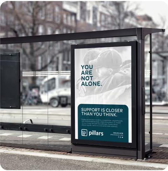
Our creative process was guided by the foundation’s desire to present a polished, visionary, and nurturing brand image. A polished aesthetic would establish trustworthiness and professionalism, while a visionary design approach would project freshness and forward-thinking. The nurturing aspect of their identity was essential to creating an engaging and approachable presence. This collaborative phase allowed us to test ideas and gather feedback, ensuring that the final system was both effective and authentic.

Once all parties agreed on the intended creative direction, we stress-tested the refined visual system across various brand touchpoints, including digital collateral and printed materials. This phase ensured the flexibility and effectiveness of the design, allowing us to establish clear rules for consistent application. We then documented these rules and solutions in a comprehensive visual identity guidelines document. This resource included detailed instructions, pre-designed templates, and exported assets, providing the foundation’s team and external partners with the tools needed to maintain consistency and impact.

The result is a cohesive visual identity system that serves as a guiding framework for the Oshkosh Area Community Foundation’s branding efforts. By leveraging their existing brand equity while introducing strategic refinements, the foundation now embodies a polished, visionary, and nurturing identity that resonates with their community. With this refined system in place, their team and collaborators can confidently represent the foundation, ensuring consistency and meaningful impact across all touchpoints for years to come.


Our creative process was guided by the foundation’s desire to present a polished, visionary, and nurturing brand image. A polished aesthetic would establish trustworthiness and professionalism, while a visionary design approach would project freshness and forward-thinking. The nurturing aspect of their identity was essential to creating an engaging and approachable presence. This collaborative phase allowed us to test ideas and gather feedback, ensuring that the final system was both effective and authentic.

Once all parties agreed on the intended creative direction, we stress-tested the refined visual system across various brand touchpoints, including digital collateral and printed materials. This phase ensured the flexibility and effectiveness of the design, allowing us to establish clear rules for consistent application. We then documented these rules and solutions in a comprehensive visual identity guidelines document. This resource included detailed instructions, pre-designed templates, and exported assets, providing the foundation’s team and external partners with the tools needed to maintain consistency and impact.


The result is a cohesive visual identity system that serves as a guiding framework for the Oshkosh Area Community Foundation’s branding efforts. By leveraging their existing brand equity while introducing strategic refinements, the foundation now embodies a polished, visionary, and nurturing identity that resonates with their community. With this refined system in place, their team and collaborators can confidently represent the foundation, ensuring consistency and meaningful impact across all touchpoints for years to come.


The updated visual identity has brought a fresh, modern look to our brand that will enable us to maintain a sense of consistency and professionalism across all our materials. Quill guided us through the process seamlessly, providing expert recommendations while valuing our input at every step.
Siri Pollnow, Marketing and Communications Manager, Oshkosh Area Community Foundation
