

The challenge was to create a user-friendly website that effectively communicates Oshkosh Defense's value proposition to a diverse audience, including potential clients, investors, and existing partners with varying levels of technical knowledge. Additionally, the website needed to integrate seamlessly with Oshkosh Defense's existing brand identity and present a massive amount of product information in a clear and concise manner.
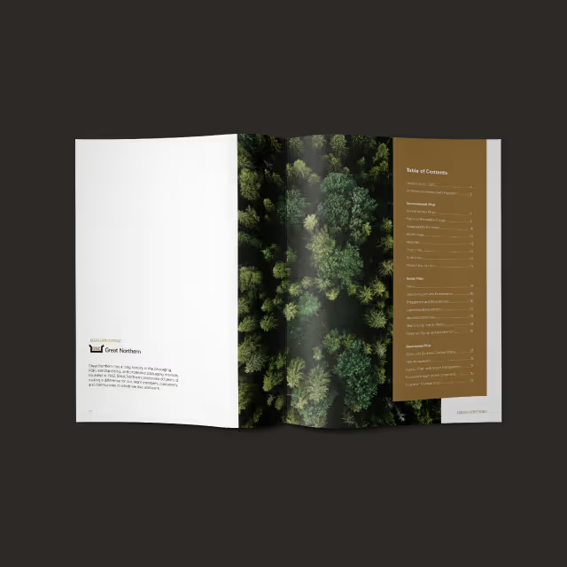

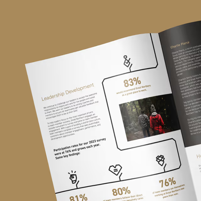
Quill Creative employed a user-centered design approach, prioritizing a clean and intuitive website navigation with a focus on a rigid structure grid and ample white space. This approach emphasized innovation and a forward-thinking brand identity. To cater to the diverse audience, the website utilizes clear and concise messaging paired with high-quality visuals that showcase Oshkosh Defense's industry-leading technology and vehicles in action. Interactive elements and data visualizations were strategically implemented to enhance user engagement and provide a deeper understanding of Oshkosh Defense's capabilities.
The website design reflects Oshkosh Defense's brand identity through a sophisticated and structured visual language. The color palette complements the brand's existing identity while also evoking the environments where Oshkosh Defense vehicles operate.


The new Oshkosh Defense website successfully communicates the brand's commitment to innovation and technological advancement. The user-friendly design ensures a smooth browsing experience for all visitors, with a significant improvement in user engagement compared to the previous website. The clear messaging effectively conveys Oshkosh Defense's value proposition to a diverse audience, and the website's structure allows for easy navigation and discovery of content.


The challenge was to create a user-friendly website that effectively communicates Oshkosh Defense's value proposition to a diverse audience, including potential clients, investors, and existing partners with varying levels of technical knowledge. Additionally, the website needed to integrate seamlessly with Oshkosh Defense's existing brand identity and present a massive amount of product information in a clear and concise manner.



Quill Creative employed a user-centered design approach, prioritizing a clean and intuitive website navigation with a focus on a rigid structure grid and ample white space. This approach emphasized innovation and a forward-thinking brand identity. To cater to the diverse audience, the website utilizes clear and concise messaging paired with high-quality visuals that showcase Oshkosh Defense's industry-leading technology and vehicles in action. Interactive elements and data visualizations were strategically implemented to enhance user engagement and provide a deeper understanding of Oshkosh Defense's capabilities.
The website design reflects Oshkosh Defense's brand identity through a sophisticated and structured visual language. The color palette complements the brand's existing identity while also evoking the environments where Oshkosh Defense vehicles operate.


The new Oshkosh Defense website successfully communicates the brand's commitment to innovation and technological advancement. The user-friendly design ensures a smooth browsing experience for all visitors, with a significant improvement in user engagement compared to the previous website. The clear messaging effectively conveys Oshkosh Defense's value proposition to a diverse audience, and the website's structure allows for easy navigation and discovery of content.





The challenge was to create a user-friendly website that effectively communicates Oshkosh Defense's value proposition to a diverse audience, including potential clients, investors, and existing partners with varying levels of technical knowledge. Additionally, the website needed to integrate seamlessly with Oshkosh Defense's existing brand identity and present a massive amount of product information in a clear and concise manner.

Quill Creative employed a user-centered design approach, prioritizing a clean and intuitive website navigation with a focus on a rigid structure grid and ample white space. This approach emphasized innovation and a forward-thinking brand identity. To cater to the diverse audience, the website utilizes clear and concise messaging paired with high-quality visuals that showcase Oshkosh Defense's industry-leading technology and vehicles in action. Interactive elements and data visualizations were strategically implemented to enhance user engagement and provide a deeper understanding of Oshkosh Defense's capabilities.
The website design reflects Oshkosh Defense's brand identity through a sophisticated and structured visual language. The color palette complements the brand's existing identity while also evoking the environments where Oshkosh Defense vehicles operate.


The new Oshkosh Defense website successfully communicates the brand's commitment to innovation and technological advancement. The user-friendly design ensures a smooth browsing experience for all visitors, with a significant improvement in user engagement compared to the previous website. The clear messaging effectively conveys Oshkosh Defense's value proposition to a diverse audience, and the website's structure allows for easy navigation and discovery of content.


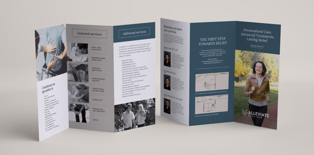

The challenge was to create a user-friendly website that effectively communicates Oshkosh Defense's value proposition to a diverse audience, including potential clients, investors, and existing partners with varying levels of technical knowledge. Additionally, the website needed to integrate seamlessly with Oshkosh Defense's existing brand identity and present a massive amount of product information in a clear and concise manner.
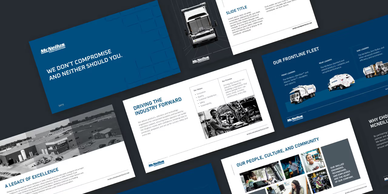
Quill Creative employed a user-centered design approach, prioritizing a clean and intuitive website navigation with a focus on a rigid structure grid and ample white space. This approach emphasized innovation and a forward-thinking brand identity. To cater to the diverse audience, the website utilizes clear and concise messaging paired with high-quality visuals that showcase Oshkosh Defense's industry-leading technology and vehicles in action. Interactive elements and data visualizations were strategically implemented to enhance user engagement and provide a deeper understanding of Oshkosh Defense's capabilities.
The website design reflects Oshkosh Defense's brand identity through a sophisticated and structured visual language. The color palette complements the brand's existing identity while also evoking the environments where Oshkosh Defense vehicles operate.
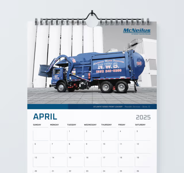



The new Oshkosh Defense website successfully communicates the brand's commitment to innovation and technological advancement. The user-friendly design ensures a smooth browsing experience for all visitors, with a significant improvement in user engagement compared to the previous website. The clear messaging effectively conveys Oshkosh Defense's value proposition to a diverse audience, and the website's structure allows for easy navigation and discovery of content.





The challenge was to create a user-friendly website that effectively communicates Oshkosh Defense's value proposition to a diverse audience, including potential clients, investors, and existing partners with varying levels of technical knowledge. Additionally, the website needed to integrate seamlessly with Oshkosh Defense's existing brand identity and present a massive amount of product information in a clear and concise manner.

Quill Creative employed a user-centered design approach, prioritizing a clean and intuitive website navigation with a focus on a rigid structure grid and ample white space. This approach emphasized innovation and a forward-thinking brand identity. To cater to the diverse audience, the website utilizes clear and concise messaging paired with high-quality visuals that showcase Oshkosh Defense's industry-leading technology and vehicles in action. Interactive elements and data visualizations were strategically implemented to enhance user engagement and provide a deeper understanding of Oshkosh Defense's capabilities.
The website design reflects Oshkosh Defense's brand identity through a sophisticated and structured visual language. The color palette complements the brand's existing identity while also evoking the environments where Oshkosh Defense vehicles operate.



The new Oshkosh Defense website successfully communicates the brand's commitment to innovation and technological advancement. The user-friendly design ensures a smooth browsing experience for all visitors, with a significant improvement in user engagement compared to the previous website. The clear messaging effectively conveys Oshkosh Defense's value proposition to a diverse audience, and the website's structure allows for easy navigation and discovery of content.
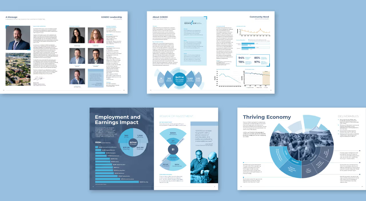

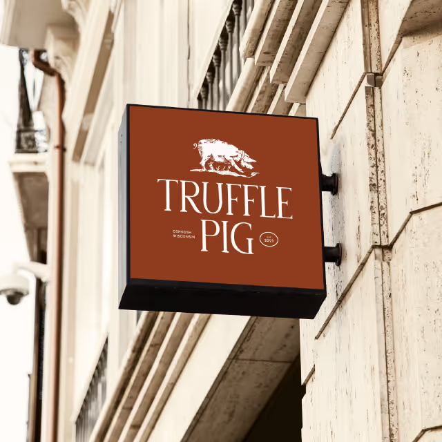
The challenge was to create a user-friendly website that effectively communicates Oshkosh Defense's value proposition to a diverse audience, including potential clients, investors, and existing partners with varying levels of technical knowledge. Additionally, the website needed to integrate seamlessly with Oshkosh Defense's existing brand identity and present a massive amount of product information in a clear and concise manner.
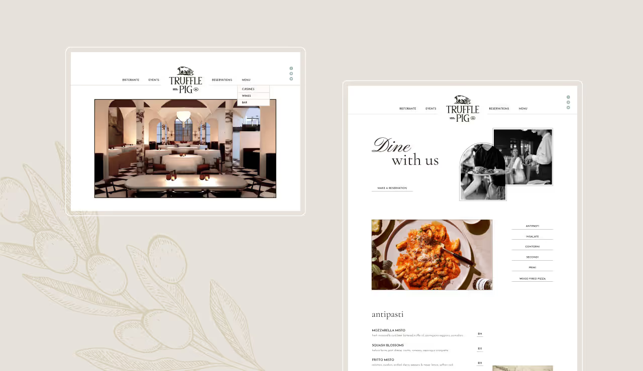
Quill Creative employed a user-centered design approach, prioritizing a clean and intuitive website navigation with a focus on a rigid structure grid and ample white space. This approach emphasized innovation and a forward-thinking brand identity. To cater to the diverse audience, the website utilizes clear and concise messaging paired with high-quality visuals that showcase Oshkosh Defense's industry-leading technology and vehicles in action. Interactive elements and data visualizations were strategically implemented to enhance user engagement and provide a deeper understanding of Oshkosh Defense's capabilities.
The website design reflects Oshkosh Defense's brand identity through a sophisticated and structured visual language. The color palette complements the brand's existing identity while also evoking the environments where Oshkosh Defense vehicles operate.


The new Oshkosh Defense website successfully communicates the brand's commitment to innovation and technological advancement. The user-friendly design ensures a smooth browsing experience for all visitors, with a significant improvement in user engagement compared to the previous website. The clear messaging effectively conveys Oshkosh Defense's value proposition to a diverse audience, and the website's structure allows for easy navigation and discovery of content.


The challenge was to create a user-friendly website that effectively communicates Oshkosh Defense's value proposition to a diverse audience, including potential clients, investors, and existing partners with varying levels of technical knowledge. Additionally, the website needed to integrate seamlessly with Oshkosh Defense's existing brand identity and present a massive amount of product information in a clear and concise manner.


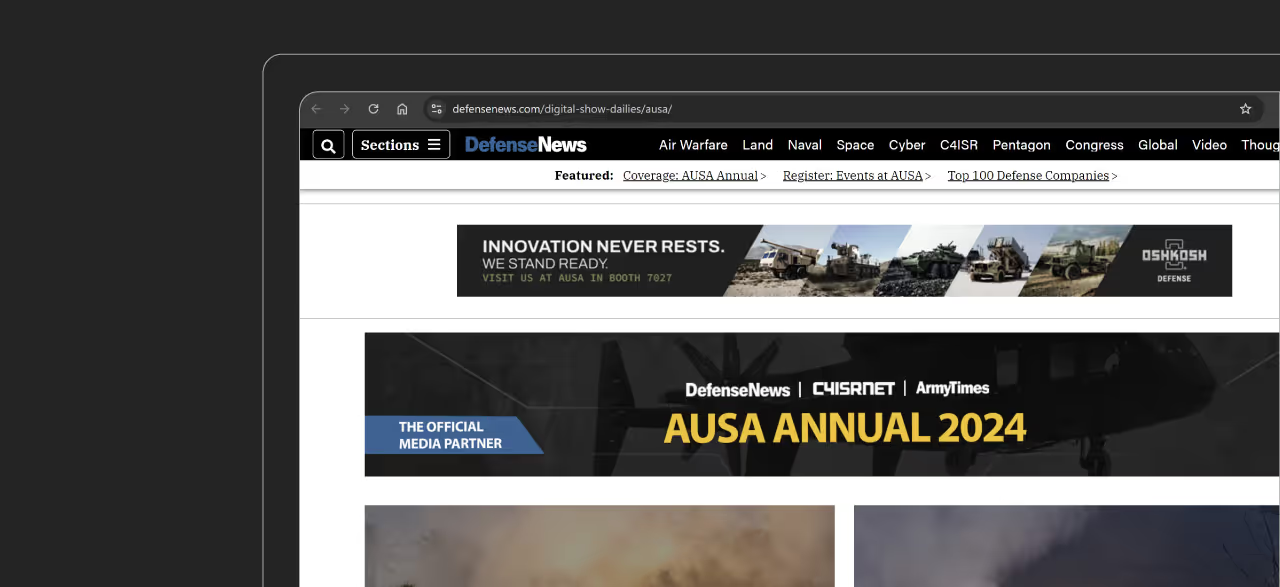
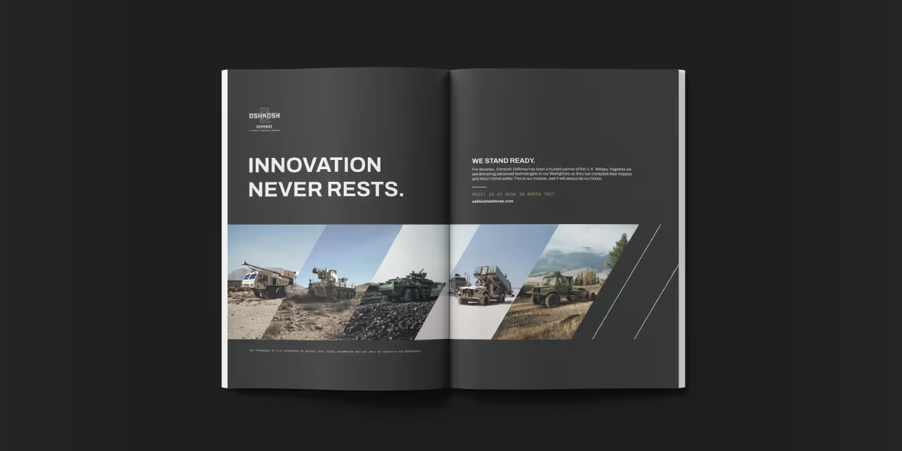
Quill Creative employed a user-centered design approach, prioritizing a clean and intuitive website navigation with a focus on a rigid structure grid and ample white space. This approach emphasized innovation and a forward-thinking brand identity. To cater to the diverse audience, the website utilizes clear and concise messaging paired with high-quality visuals that showcase Oshkosh Defense's industry-leading technology and vehicles in action. Interactive elements and data visualizations were strategically implemented to enhance user engagement and provide a deeper understanding of Oshkosh Defense's capabilities.
The website design reflects Oshkosh Defense's brand identity through a sophisticated and structured visual language. The color palette complements the brand's existing identity while also evoking the environments where Oshkosh Defense vehicles operate.

The new Oshkosh Defense website successfully communicates the brand's commitment to innovation and technological advancement. The user-friendly design ensures a smooth browsing experience for all visitors, with a significant improvement in user engagement compared to the previous website. The clear messaging effectively conveys Oshkosh Defense's value proposition to a diverse audience, and the website's structure allows for easy navigation and discovery of content.


The challenge was to create a user-friendly website that effectively communicates Oshkosh Defense's value proposition to a diverse audience, including potential clients, investors, and existing partners with varying levels of technical knowledge. Additionally, the website needed to integrate seamlessly with Oshkosh Defense's existing brand identity and present a massive amount of product information in a clear and concise manner.

Quill Creative employed a user-centered design approach, prioritizing a clean and intuitive website navigation with a focus on a rigid structure grid and ample white space. This approach emphasized innovation and a forward-thinking brand identity. To cater to the diverse audience, the website utilizes clear and concise messaging paired with high-quality visuals that showcase Oshkosh Defense's industry-leading technology and vehicles in action. Interactive elements and data visualizations were strategically implemented to enhance user engagement and provide a deeper understanding of Oshkosh Defense's capabilities.
The website design reflects Oshkosh Defense's brand identity through a sophisticated and structured visual language. The color palette complements the brand's existing identity while also evoking the environments where Oshkosh Defense vehicles operate.



The new Oshkosh Defense website successfully communicates the brand's commitment to innovation and technological advancement. The user-friendly design ensures a smooth browsing experience for all visitors, with a significant improvement in user engagement compared to the previous website. The clear messaging effectively conveys Oshkosh Defense's value proposition to a diverse audience, and the website's structure allows for easy navigation and discovery of content.




The challenge was to create a user-friendly website that effectively communicates Oshkosh Defense's value proposition to a diverse audience, including potential clients, investors, and existing partners with varying levels of technical knowledge. Additionally, the website needed to integrate seamlessly with Oshkosh Defense's existing brand identity and present a massive amount of product information in a clear and concise manner.



Quill Creative employed a user-centered design approach, prioritizing a clean and intuitive website navigation with a focus on a rigid structure grid and ample white space. This approach emphasized innovation and a forward-thinking brand identity. To cater to the diverse audience, the website utilizes clear and concise messaging paired with high-quality visuals that showcase Oshkosh Defense's industry-leading technology and vehicles in action. Interactive elements and data visualizations were strategically implemented to enhance user engagement and provide a deeper understanding of Oshkosh Defense's capabilities.
The website design reflects Oshkosh Defense's brand identity through a sophisticated and structured visual language. The color palette complements the brand's existing identity while also evoking the environments where Oshkosh Defense vehicles operate.

The new Oshkosh Defense website successfully communicates the brand's commitment to innovation and technological advancement. The user-friendly design ensures a smooth browsing experience for all visitors, with a significant improvement in user engagement compared to the previous website. The clear messaging effectively conveys Oshkosh Defense's value proposition to a diverse audience, and the website's structure allows for easy navigation and discovery of content.



The challenge was to create a user-friendly website that effectively communicates Oshkosh Defense's value proposition to a diverse audience, including potential clients, investors, and existing partners with varying levels of technical knowledge. Additionally, the website needed to integrate seamlessly with Oshkosh Defense's existing brand identity and present a massive amount of product information in a clear and concise manner.


Quill Creative employed a user-centered design approach, prioritizing a clean and intuitive website navigation with a focus on a rigid structure grid and ample white space. This approach emphasized innovation and a forward-thinking brand identity. To cater to the diverse audience, the website utilizes clear and concise messaging paired with high-quality visuals that showcase Oshkosh Defense's industry-leading technology and vehicles in action. Interactive elements and data visualizations were strategically implemented to enhance user engagement and provide a deeper understanding of Oshkosh Defense's capabilities.
The website design reflects Oshkosh Defense's brand identity through a sophisticated and structured visual language. The color palette complements the brand's existing identity while also evoking the environments where Oshkosh Defense vehicles operate.

The new Oshkosh Defense website successfully communicates the brand's commitment to innovation and technological advancement. The user-friendly design ensures a smooth browsing experience for all visitors, with a significant improvement in user engagement compared to the previous website. The clear messaging effectively conveys Oshkosh Defense's value proposition to a diverse audience, and the website's structure allows for easy navigation and discovery of content.


The challenge was to create a user-friendly website that effectively communicates Oshkosh Defense's value proposition to a diverse audience, including potential clients, investors, and existing partners with varying levels of technical knowledge. Additionally, the website needed to integrate seamlessly with Oshkosh Defense's existing brand identity and present a massive amount of product information in a clear and concise manner.

Quill Creative employed a user-centered design approach, prioritizing a clean and intuitive website navigation with a focus on a rigid structure grid and ample white space. This approach emphasized innovation and a forward-thinking brand identity. To cater to the diverse audience, the website utilizes clear and concise messaging paired with high-quality visuals that showcase Oshkosh Defense's industry-leading technology and vehicles in action. Interactive elements and data visualizations were strategically implemented to enhance user engagement and provide a deeper understanding of Oshkosh Defense's capabilities.
The website design reflects Oshkosh Defense's brand identity through a sophisticated and structured visual language. The color palette complements the brand's existing identity while also evoking the environments where Oshkosh Defense vehicles operate.


The new Oshkosh Defense website successfully communicates the brand's commitment to innovation and technological advancement. The user-friendly design ensures a smooth browsing experience for all visitors, with a significant improvement in user engagement compared to the previous website. The clear messaging effectively conveys Oshkosh Defense's value proposition to a diverse audience, and the website's structure allows for easy navigation and discovery of content.


The challenge was to create a user-friendly website that effectively communicates Oshkosh Defense's value proposition to a diverse audience, including potential clients, investors, and existing partners with varying levels of technical knowledge. Additionally, the website needed to integrate seamlessly with Oshkosh Defense's existing brand identity and present a massive amount of product information in a clear and concise manner.


Quill Creative employed a user-centered design approach, prioritizing a clean and intuitive website navigation with a focus on a rigid structure grid and ample white space. This approach emphasized innovation and a forward-thinking brand identity. To cater to the diverse audience, the website utilizes clear and concise messaging paired with high-quality visuals that showcase Oshkosh Defense's industry-leading technology and vehicles in action. Interactive elements and data visualizations were strategically implemented to enhance user engagement and provide a deeper understanding of Oshkosh Defense's capabilities.
The website design reflects Oshkosh Defense's brand identity through a sophisticated and structured visual language. The color palette complements the brand's existing identity while also evoking the environments where Oshkosh Defense vehicles operate.


The new Oshkosh Defense website successfully communicates the brand's commitment to innovation and technological advancement. The user-friendly design ensures a smooth browsing experience for all visitors, with a significant improvement in user engagement compared to the previous website. The clear messaging effectively conveys Oshkosh Defense's value proposition to a diverse audience, and the website's structure allows for easy navigation and discovery of content.


The challenge was to create a user-friendly website that effectively communicates Oshkosh Defense's value proposition to a diverse audience, including potential clients, investors, and existing partners with varying levels of technical knowledge. Additionally, the website needed to integrate seamlessly with Oshkosh Defense's existing brand identity and present a massive amount of product information in a clear and concise manner.


Quill Creative employed a user-centered design approach, prioritizing a clean and intuitive website navigation with a focus on a rigid structure grid and ample white space. This approach emphasized innovation and a forward-thinking brand identity. To cater to the diverse audience, the website utilizes clear and concise messaging paired with high-quality visuals that showcase Oshkosh Defense's industry-leading technology and vehicles in action. Interactive elements and data visualizations were strategically implemented to enhance user engagement and provide a deeper understanding of Oshkosh Defense's capabilities.
The website design reflects Oshkosh Defense's brand identity through a sophisticated and structured visual language. The color palette complements the brand's existing identity while also evoking the environments where Oshkosh Defense vehicles operate.

The new Oshkosh Defense website successfully communicates the brand's commitment to innovation and technological advancement. The user-friendly design ensures a smooth browsing experience for all visitors, with a significant improvement in user engagement compared to the previous website. The clear messaging effectively conveys Oshkosh Defense's value proposition to a diverse audience, and the website's structure allows for easy navigation and discovery of content.


The challenge was to create a user-friendly website that effectively communicates Oshkosh Defense's value proposition to a diverse audience, including potential clients, investors, and existing partners with varying levels of technical knowledge. Additionally, the website needed to integrate seamlessly with Oshkosh Defense's existing brand identity and present a massive amount of product information in a clear and concise manner.


Quill Creative employed a user-centered design approach, prioritizing a clean and intuitive website navigation with a focus on a rigid structure grid and ample white space. This approach emphasized innovation and a forward-thinking brand identity. To cater to the diverse audience, the website utilizes clear and concise messaging paired with high-quality visuals that showcase Oshkosh Defense's industry-leading technology and vehicles in action. Interactive elements and data visualizations were strategically implemented to enhance user engagement and provide a deeper understanding of Oshkosh Defense's capabilities.
The website design reflects Oshkosh Defense's brand identity through a sophisticated and structured visual language. The color palette complements the brand's existing identity while also evoking the environments where Oshkosh Defense vehicles operate.


The new Oshkosh Defense website successfully communicates the brand's commitment to innovation and technological advancement. The user-friendly design ensures a smooth browsing experience for all visitors, with a significant improvement in user engagement compared to the previous website. The clear messaging effectively conveys Oshkosh Defense's value proposition to a diverse audience, and the website's structure allows for easy navigation and discovery of content.


The challenge was to create a user-friendly website that effectively communicates Oshkosh Defense's value proposition to a diverse audience, including potential clients, investors, and existing partners with varying levels of technical knowledge. Additionally, the website needed to integrate seamlessly with Oshkosh Defense's existing brand identity and present a massive amount of product information in a clear and concise manner.

Quill Creative employed a user-centered design approach, prioritizing a clean and intuitive website navigation with a focus on a rigid structure grid and ample white space. This approach emphasized innovation and a forward-thinking brand identity. To cater to the diverse audience, the website utilizes clear and concise messaging paired with high-quality visuals that showcase Oshkosh Defense's industry-leading technology and vehicles in action. Interactive elements and data visualizations were strategically implemented to enhance user engagement and provide a deeper understanding of Oshkosh Defense's capabilities.
The website design reflects Oshkosh Defense's brand identity through a sophisticated and structured visual language. The color palette complements the brand's existing identity while also evoking the environments where Oshkosh Defense vehicles operate.


The new Oshkosh Defense website successfully communicates the brand's commitment to innovation and technological advancement. The user-friendly design ensures a smooth browsing experience for all visitors, with a significant improvement in user engagement compared to the previous website. The clear messaging effectively conveys Oshkosh Defense's value proposition to a diverse audience, and the website's structure allows for easy navigation and discovery of content.


The challenge was to create a user-friendly website that effectively communicates Oshkosh Defense's value proposition to a diverse audience, including potential clients, investors, and existing partners with varying levels of technical knowledge. Additionally, the website needed to integrate seamlessly with Oshkosh Defense's existing brand identity and present a massive amount of product information in a clear and concise manner.


Quill Creative employed a user-centered design approach, prioritizing a clean and intuitive website navigation with a focus on a rigid structure grid and ample white space. This approach emphasized innovation and a forward-thinking brand identity. To cater to the diverse audience, the website utilizes clear and concise messaging paired with high-quality visuals that showcase Oshkosh Defense's industry-leading technology and vehicles in action. Interactive elements and data visualizations were strategically implemented to enhance user engagement and provide a deeper understanding of Oshkosh Defense's capabilities.
The website design reflects Oshkosh Defense's brand identity through a sophisticated and structured visual language. The color palette complements the brand's existing identity while also evoking the environments where Oshkosh Defense vehicles operate.


The new Oshkosh Defense website successfully communicates the brand's commitment to innovation and technological advancement. The user-friendly design ensures a smooth browsing experience for all visitors, with a significant improvement in user engagement compared to the previous website. The clear messaging effectively conveys Oshkosh Defense's value proposition to a diverse audience, and the website's structure allows for easy navigation and discovery of content.


The challenge was to create a user-friendly website that effectively communicates Oshkosh Defense's value proposition to a diverse audience, including potential clients, investors, and existing partners with varying levels of technical knowledge. Additionally, the website needed to integrate seamlessly with Oshkosh Defense's existing brand identity and present a massive amount of product information in a clear and concise manner.

Quill Creative employed a user-centered design approach, prioritizing a clean and intuitive website navigation with a focus on a rigid structure grid and ample white space. This approach emphasized innovation and a forward-thinking brand identity. To cater to the diverse audience, the website utilizes clear and concise messaging paired with high-quality visuals that showcase Oshkosh Defense's industry-leading technology and vehicles in action. Interactive elements and data visualizations were strategically implemented to enhance user engagement and provide a deeper understanding of Oshkosh Defense's capabilities.
The website design reflects Oshkosh Defense's brand identity through a sophisticated and structured visual language. The color palette complements the brand's existing identity while also evoking the environments where Oshkosh Defense vehicles operate.


The new Oshkosh Defense website successfully communicates the brand's commitment to innovation and technological advancement. The user-friendly design ensures a smooth browsing experience for all visitors, with a significant improvement in user engagement compared to the previous website. The clear messaging effectively conveys Oshkosh Defense's value proposition to a diverse audience, and the website's structure allows for easy navigation and discovery of content.


The challenge was to create a user-friendly website that effectively communicates Oshkosh Defense's value proposition to a diverse audience, including potential clients, investors, and existing partners with varying levels of technical knowledge. Additionally, the website needed to integrate seamlessly with Oshkosh Defense's existing brand identity and present a massive amount of product information in a clear and concise manner.

Quill Creative employed a user-centered design approach, prioritizing a clean and intuitive website navigation with a focus on a rigid structure grid and ample white space. This approach emphasized innovation and a forward-thinking brand identity. To cater to the diverse audience, the website utilizes clear and concise messaging paired with high-quality visuals that showcase Oshkosh Defense's industry-leading technology and vehicles in action. Interactive elements and data visualizations were strategically implemented to enhance user engagement and provide a deeper understanding of Oshkosh Defense's capabilities.
The website design reflects Oshkosh Defense's brand identity through a sophisticated and structured visual language. The color palette complements the brand's existing identity while also evoking the environments where Oshkosh Defense vehicles operate.


The new Oshkosh Defense website successfully communicates the brand's commitment to innovation and technological advancement. The user-friendly design ensures a smooth browsing experience for all visitors, with a significant improvement in user engagement compared to the previous website. The clear messaging effectively conveys Oshkosh Defense's value proposition to a diverse audience, and the website's structure allows for easy navigation and discovery of content.


The challenge was to create a user-friendly website that effectively communicates Oshkosh Defense's value proposition to a diverse audience, including potential clients, investors, and existing partners with varying levels of technical knowledge. Additionally, the website needed to integrate seamlessly with Oshkosh Defense's existing brand identity and present a massive amount of product information in a clear and concise manner.


Quill Creative employed a user-centered design approach, prioritizing a clean and intuitive website navigation with a focus on a rigid structure grid and ample white space. This approach emphasized innovation and a forward-thinking brand identity. To cater to the diverse audience, the website utilizes clear and concise messaging paired with high-quality visuals that showcase Oshkosh Defense's industry-leading technology and vehicles in action. Interactive elements and data visualizations were strategically implemented to enhance user engagement and provide a deeper understanding of Oshkosh Defense's capabilities.
The website design reflects Oshkosh Defense's brand identity through a sophisticated and structured visual language. The color palette complements the brand's existing identity while also evoking the environments where Oshkosh Defense vehicles operate.

The new Oshkosh Defense website successfully communicates the brand's commitment to innovation and technological advancement. The user-friendly design ensures a smooth browsing experience for all visitors, with a significant improvement in user engagement compared to the previous website. The clear messaging effectively conveys Oshkosh Defense's value proposition to a diverse audience, and the website's structure allows for easy navigation and discovery of content.


The challenge was to create a user-friendly website that effectively communicates Oshkosh Defense's value proposition to a diverse audience, including potential clients, investors, and existing partners with varying levels of technical knowledge. Additionally, the website needed to integrate seamlessly with Oshkosh Defense's existing brand identity and present a massive amount of product information in a clear and concise manner.

Quill Creative employed a user-centered design approach, prioritizing a clean and intuitive website navigation with a focus on a rigid structure grid and ample white space. This approach emphasized innovation and a forward-thinking brand identity. To cater to the diverse audience, the website utilizes clear and concise messaging paired with high-quality visuals that showcase Oshkosh Defense's industry-leading technology and vehicles in action. Interactive elements and data visualizations were strategically implemented to enhance user engagement and provide a deeper understanding of Oshkosh Defense's capabilities.
The website design reflects Oshkosh Defense's brand identity through a sophisticated and structured visual language. The color palette complements the brand's existing identity while also evoking the environments where Oshkosh Defense vehicles operate.


The new Oshkosh Defense website successfully communicates the brand's commitment to innovation and technological advancement. The user-friendly design ensures a smooth browsing experience for all visitors, with a significant improvement in user engagement compared to the previous website. The clear messaging effectively conveys Oshkosh Defense's value proposition to a diverse audience, and the website's structure allows for easy navigation and discovery of content.


The challenge was to create a user-friendly website that effectively communicates Oshkosh Defense's value proposition to a diverse audience, including potential clients, investors, and existing partners with varying levels of technical knowledge. Additionally, the website needed to integrate seamlessly with Oshkosh Defense's existing brand identity and present a massive amount of product information in a clear and concise manner.

Quill Creative employed a user-centered design approach, prioritizing a clean and intuitive website navigation with a focus on a rigid structure grid and ample white space. This approach emphasized innovation and a forward-thinking brand identity. To cater to the diverse audience, the website utilizes clear and concise messaging paired with high-quality visuals that showcase Oshkosh Defense's industry-leading technology and vehicles in action. Interactive elements and data visualizations were strategically implemented to enhance user engagement and provide a deeper understanding of Oshkosh Defense's capabilities.
The website design reflects Oshkosh Defense's brand identity through a sophisticated and structured visual language. The color palette complements the brand's existing identity while also evoking the environments where Oshkosh Defense vehicles operate.


The new Oshkosh Defense website successfully communicates the brand's commitment to innovation and technological advancement. The user-friendly design ensures a smooth browsing experience for all visitors, with a significant improvement in user engagement compared to the previous website. The clear messaging effectively conveys Oshkosh Defense's value proposition to a diverse audience, and the website's structure allows for easy navigation and discovery of content.


The challenge was to create a user-friendly website that effectively communicates Oshkosh Defense's value proposition to a diverse audience, including potential clients, investors, and existing partners with varying levels of technical knowledge. Additionally, the website needed to integrate seamlessly with Oshkosh Defense's existing brand identity and present a massive amount of product information in a clear and concise manner.


Quill Creative employed a user-centered design approach, prioritizing a clean and intuitive website navigation with a focus on a rigid structure grid and ample white space. This approach emphasized innovation and a forward-thinking brand identity. To cater to the diverse audience, the website utilizes clear and concise messaging paired with high-quality visuals that showcase Oshkosh Defense's industry-leading technology and vehicles in action. Interactive elements and data visualizations were strategically implemented to enhance user engagement and provide a deeper understanding of Oshkosh Defense's capabilities.
The website design reflects Oshkosh Defense's brand identity through a sophisticated and structured visual language. The color palette complements the brand's existing identity while also evoking the environments where Oshkosh Defense vehicles operate.

The new Oshkosh Defense website successfully communicates the brand's commitment to innovation and technological advancement. The user-friendly design ensures a smooth browsing experience for all visitors, with a significant improvement in user engagement compared to the previous website. The clear messaging effectively conveys Oshkosh Defense's value proposition to a diverse audience, and the website's structure allows for easy navigation and discovery of content.


The challenge was to create a user-friendly website that effectively communicates Oshkosh Defense's value proposition to a diverse audience, including potential clients, investors, and existing partners with varying levels of technical knowledge. Additionally, the website needed to integrate seamlessly with Oshkosh Defense's existing brand identity and present a massive amount of product information in a clear and concise manner.


Quill Creative employed a user-centered design approach, prioritizing a clean and intuitive website navigation with a focus on a rigid structure grid and ample white space. This approach emphasized innovation and a forward-thinking brand identity. To cater to the diverse audience, the website utilizes clear and concise messaging paired with high-quality visuals that showcase Oshkosh Defense's industry-leading technology and vehicles in action. Interactive elements and data visualizations were strategically implemented to enhance user engagement and provide a deeper understanding of Oshkosh Defense's capabilities.
The website design reflects Oshkosh Defense's brand identity through a sophisticated and structured visual language. The color palette complements the brand's existing identity while also evoking the environments where Oshkosh Defense vehicles operate.

The new Oshkosh Defense website successfully communicates the brand's commitment to innovation and technological advancement. The user-friendly design ensures a smooth browsing experience for all visitors, with a significant improvement in user engagement compared to the previous website. The clear messaging effectively conveys Oshkosh Defense's value proposition to a diverse audience, and the website's structure allows for easy navigation and discovery of content.


The challenge was to create a user-friendly website that effectively communicates Oshkosh Defense's value proposition to a diverse audience, including potential clients, investors, and existing partners with varying levels of technical knowledge. Additionally, the website needed to integrate seamlessly with Oshkosh Defense's existing brand identity and present a massive amount of product information in a clear and concise manner.


Quill Creative employed a user-centered design approach, prioritizing a clean and intuitive website navigation with a focus on a rigid structure grid and ample white space. This approach emphasized innovation and a forward-thinking brand identity. To cater to the diverse audience, the website utilizes clear and concise messaging paired with high-quality visuals that showcase Oshkosh Defense's industry-leading technology and vehicles in action. Interactive elements and data visualizations were strategically implemented to enhance user engagement and provide a deeper understanding of Oshkosh Defense's capabilities.
The website design reflects Oshkosh Defense's brand identity through a sophisticated and structured visual language. The color palette complements the brand's existing identity while also evoking the environments where Oshkosh Defense vehicles operate.


The new Oshkosh Defense website successfully communicates the brand's commitment to innovation and technological advancement. The user-friendly design ensures a smooth browsing experience for all visitors, with a significant improvement in user engagement compared to the previous website. The clear messaging effectively conveys Oshkosh Defense's value proposition to a diverse audience, and the website's structure allows for easy navigation and discovery of content.


The challenge was to create a user-friendly website that effectively communicates Oshkosh Defense's value proposition to a diverse audience, including potential clients, investors, and existing partners with varying levels of technical knowledge. Additionally, the website needed to integrate seamlessly with Oshkosh Defense's existing brand identity and present a massive amount of product information in a clear and concise manner.


Quill Creative employed a user-centered design approach, prioritizing a clean and intuitive website navigation with a focus on a rigid structure grid and ample white space. This approach emphasized innovation and a forward-thinking brand identity. To cater to the diverse audience, the website utilizes clear and concise messaging paired with high-quality visuals that showcase Oshkosh Defense's industry-leading technology and vehicles in action. Interactive elements and data visualizations were strategically implemented to enhance user engagement and provide a deeper understanding of Oshkosh Defense's capabilities.
The website design reflects Oshkosh Defense's brand identity through a sophisticated and structured visual language. The color palette complements the brand's existing identity while also evoking the environments where Oshkosh Defense vehicles operate.


The new Oshkosh Defense website successfully communicates the brand's commitment to innovation and technological advancement. The user-friendly design ensures a smooth browsing experience for all visitors, with a significant improvement in user engagement compared to the previous website. The clear messaging effectively conveys Oshkosh Defense's value proposition to a diverse audience, and the website's structure allows for easy navigation and discovery of content.



The challenge was to create a user-friendly website that effectively communicates Oshkosh Defense's value proposition to a diverse audience, including potential clients, investors, and existing partners with varying levels of technical knowledge. Additionally, the website needed to integrate seamlessly with Oshkosh Defense's existing brand identity and present a massive amount of product information in a clear and concise manner.

Quill Creative employed a user-centered design approach, prioritizing a clean and intuitive website navigation with a focus on a rigid structure grid and ample white space. This approach emphasized innovation and a forward-thinking brand identity. To cater to the diverse audience, the website utilizes clear and concise messaging paired with high-quality visuals that showcase Oshkosh Defense's industry-leading technology and vehicles in action. Interactive elements and data visualizations were strategically implemented to enhance user engagement and provide a deeper understanding of Oshkosh Defense's capabilities.
The website design reflects Oshkosh Defense's brand identity through a sophisticated and structured visual language. The color palette complements the brand's existing identity while also evoking the environments where Oshkosh Defense vehicles operate.

The new Oshkosh Defense website successfully communicates the brand's commitment to innovation and technological advancement. The user-friendly design ensures a smooth browsing experience for all visitors, with a significant improvement in user engagement compared to the previous website. The clear messaging effectively conveys Oshkosh Defense's value proposition to a diverse audience, and the website's structure allows for easy navigation and discovery of content.


The challenge was to create a user-friendly website that effectively communicates Oshkosh Defense's value proposition to a diverse audience, including potential clients, investors, and existing partners with varying levels of technical knowledge. Additionally, the website needed to integrate seamlessly with Oshkosh Defense's existing brand identity and present a massive amount of product information in a clear and concise manner.


Quill Creative employed a user-centered design approach, prioritizing a clean and intuitive website navigation with a focus on a rigid structure grid and ample white space. This approach emphasized innovation and a forward-thinking brand identity. To cater to the diverse audience, the website utilizes clear and concise messaging paired with high-quality visuals that showcase Oshkosh Defense's industry-leading technology and vehicles in action. Interactive elements and data visualizations were strategically implemented to enhance user engagement and provide a deeper understanding of Oshkosh Defense's capabilities.
The website design reflects Oshkosh Defense's brand identity through a sophisticated and structured visual language. The color palette complements the brand's existing identity while also evoking the environments where Oshkosh Defense vehicles operate.


The new Oshkosh Defense website successfully communicates the brand's commitment to innovation and technological advancement. The user-friendly design ensures a smooth browsing experience for all visitors, with a significant improvement in user engagement compared to the previous website. The clear messaging effectively conveys Oshkosh Defense's value proposition to a diverse audience, and the website's structure allows for easy navigation and discovery of content.


The challenge was to create a user-friendly website that effectively communicates Oshkosh Defense's value proposition to a diverse audience, including potential clients, investors, and existing partners with varying levels of technical knowledge. Additionally, the website needed to integrate seamlessly with Oshkosh Defense's existing brand identity and present a massive amount of product information in a clear and concise manner.


Quill Creative employed a user-centered design approach, prioritizing a clean and intuitive website navigation with a focus on a rigid structure grid and ample white space. This approach emphasized innovation and a forward-thinking brand identity. To cater to the diverse audience, the website utilizes clear and concise messaging paired with high-quality visuals that showcase Oshkosh Defense's industry-leading technology and vehicles in action. Interactive elements and data visualizations were strategically implemented to enhance user engagement and provide a deeper understanding of Oshkosh Defense's capabilities.
The website design reflects Oshkosh Defense's brand identity through a sophisticated and structured visual language. The color palette complements the brand's existing identity while also evoking the environments where Oshkosh Defense vehicles operate.


The new Oshkosh Defense website successfully communicates the brand's commitment to innovation and technological advancement. The user-friendly design ensures a smooth browsing experience for all visitors, with a significant improvement in user engagement compared to the previous website. The clear messaging effectively conveys Oshkosh Defense's value proposition to a diverse audience, and the website's structure allows for easy navigation and discovery of content.


The challenge was to create a user-friendly website that effectively communicates Oshkosh Defense's value proposition to a diverse audience, including potential clients, investors, and existing partners with varying levels of technical knowledge. Additionally, the website needed to integrate seamlessly with Oshkosh Defense's existing brand identity and present a massive amount of product information in a clear and concise manner.


Quill Creative employed a user-centered design approach, prioritizing a clean and intuitive website navigation with a focus on a rigid structure grid and ample white space. This approach emphasized innovation and a forward-thinking brand identity. To cater to the diverse audience, the website utilizes clear and concise messaging paired with high-quality visuals that showcase Oshkosh Defense's industry-leading technology and vehicles in action. Interactive elements and data visualizations were strategically implemented to enhance user engagement and provide a deeper understanding of Oshkosh Defense's capabilities.
The website design reflects Oshkosh Defense's brand identity through a sophisticated and structured visual language. The color palette complements the brand's existing identity while also evoking the environments where Oshkosh Defense vehicles operate.


The new Oshkosh Defense website successfully communicates the brand's commitment to innovation and technological advancement. The user-friendly design ensures a smooth browsing experience for all visitors, with a significant improvement in user engagement compared to the previous website. The clear messaging effectively conveys Oshkosh Defense's value proposition to a diverse audience, and the website's structure allows for easy navigation and discovery of content.


The challenge was to create a user-friendly website that effectively communicates Oshkosh Defense's value proposition to a diverse audience, including potential clients, investors, and existing partners with varying levels of technical knowledge. Additionally, the website needed to integrate seamlessly with Oshkosh Defense's existing brand identity and present a massive amount of product information in a clear and concise manner.

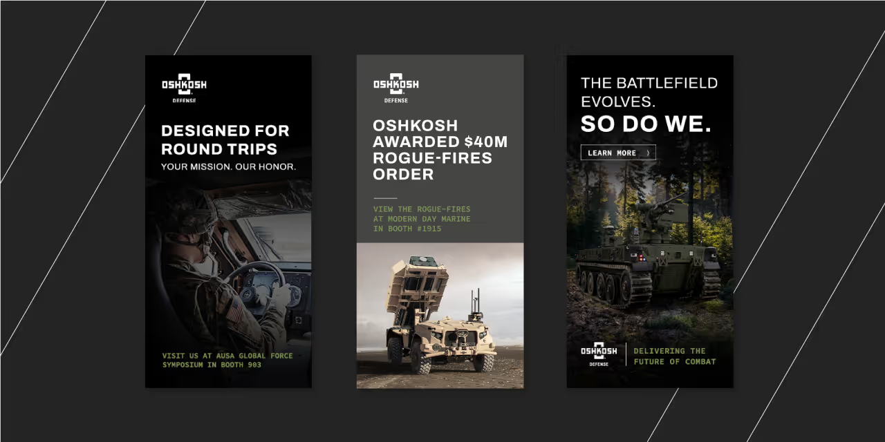
Quill Creative employed a user-centered design approach, prioritizing a clean and intuitive website navigation with a focus on a rigid structure grid and ample white space. This approach emphasized innovation and a forward-thinking brand identity. To cater to the diverse audience, the website utilizes clear and concise messaging paired with high-quality visuals that showcase Oshkosh Defense's industry-leading technology and vehicles in action. Interactive elements and data visualizations were strategically implemented to enhance user engagement and provide a deeper understanding of Oshkosh Defense's capabilities.
The website design reflects Oshkosh Defense's brand identity through a sophisticated and structured visual language. The color palette complements the brand's existing identity while also evoking the environments where Oshkosh Defense vehicles operate.


The new Oshkosh Defense website successfully communicates the brand's commitment to innovation and technological advancement. The user-friendly design ensures a smooth browsing experience for all visitors, with a significant improvement in user engagement compared to the previous website. The clear messaging effectively conveys Oshkosh Defense's value proposition to a diverse audience, and the website's structure allows for easy navigation and discovery of content.


The challenge was to create a user-friendly website that effectively communicates Oshkosh Defense's value proposition to a diverse audience, including potential clients, investors, and existing partners with varying levels of technical knowledge. Additionally, the website needed to integrate seamlessly with Oshkosh Defense's existing brand identity and present a massive amount of product information in a clear and concise manner.


Quill Creative employed a user-centered design approach, prioritizing a clean and intuitive website navigation with a focus on a rigid structure grid and ample white space. This approach emphasized innovation and a forward-thinking brand identity. To cater to the diverse audience, the website utilizes clear and concise messaging paired with high-quality visuals that showcase Oshkosh Defense's industry-leading technology and vehicles in action. Interactive elements and data visualizations were strategically implemented to enhance user engagement and provide a deeper understanding of Oshkosh Defense's capabilities.
The website design reflects Oshkosh Defense's brand identity through a sophisticated and structured visual language. The color palette complements the brand's existing identity while also evoking the environments where Oshkosh Defense vehicles operate.


The new Oshkosh Defense website successfully communicates the brand's commitment to innovation and technological advancement. The user-friendly design ensures a smooth browsing experience for all visitors, with a significant improvement in user engagement compared to the previous website. The clear messaging effectively conveys Oshkosh Defense's value proposition to a diverse audience, and the website's structure allows for easy navigation and discovery of content.


The challenge was to create a user-friendly website that effectively communicates Oshkosh Defense's value proposition to a diverse audience, including potential clients, investors, and existing partners with varying levels of technical knowledge. Additionally, the website needed to integrate seamlessly with Oshkosh Defense's existing brand identity and present a massive amount of product information in a clear and concise manner.


Quill Creative employed a user-centered design approach, prioritizing a clean and intuitive website navigation with a focus on a rigid structure grid and ample white space. This approach emphasized innovation and a forward-thinking brand identity. To cater to the diverse audience, the website utilizes clear and concise messaging paired with high-quality visuals that showcase Oshkosh Defense's industry-leading technology and vehicles in action. Interactive elements and data visualizations were strategically implemented to enhance user engagement and provide a deeper understanding of Oshkosh Defense's capabilities.
The website design reflects Oshkosh Defense's brand identity through a sophisticated and structured visual language. The color palette complements the brand's existing identity while also evoking the environments where Oshkosh Defense vehicles operate.


The new Oshkosh Defense website successfully communicates the brand's commitment to innovation and technological advancement. The user-friendly design ensures a smooth browsing experience for all visitors, with a significant improvement in user engagement compared to the previous website. The clear messaging effectively conveys Oshkosh Defense's value proposition to a diverse audience, and the website's structure allows for easy navigation and discovery of content.




The challenge was to create a user-friendly website that effectively communicates Oshkosh Defense's value proposition to a diverse audience, including potential clients, investors, and existing partners with varying levels of technical knowledge. Additionally, the website needed to integrate seamlessly with Oshkosh Defense's existing brand identity and present a massive amount of product information in a clear and concise manner.


Quill Creative employed a user-centered design approach, prioritizing a clean and intuitive website navigation with a focus on a rigid structure grid and ample white space. This approach emphasized innovation and a forward-thinking brand identity. To cater to the diverse audience, the website utilizes clear and concise messaging paired with high-quality visuals that showcase Oshkosh Defense's industry-leading technology and vehicles in action. Interactive elements and data visualizations were strategically implemented to enhance user engagement and provide a deeper understanding of Oshkosh Defense's capabilities.
The website design reflects Oshkosh Defense's brand identity through a sophisticated and structured visual language. The color palette complements the brand's existing identity while also evoking the environments where Oshkosh Defense vehicles operate.


The new Oshkosh Defense website successfully communicates the brand's commitment to innovation and technological advancement. The user-friendly design ensures a smooth browsing experience for all visitors, with a significant improvement in user engagement compared to the previous website. The clear messaging effectively conveys Oshkosh Defense's value proposition to a diverse audience, and the website's structure allows for easy navigation and discovery of content.


The challenge was to create a user-friendly website that effectively communicates Oshkosh Defense's value proposition to a diverse audience, including potential clients, investors, and existing partners with varying levels of technical knowledge. Additionally, the website needed to integrate seamlessly with Oshkosh Defense's existing brand identity and present a massive amount of product information in a clear and concise manner.

Quill Creative employed a user-centered design approach, prioritizing a clean and intuitive website navigation with a focus on a rigid structure grid and ample white space. This approach emphasized innovation and a forward-thinking brand identity. To cater to the diverse audience, the website utilizes clear and concise messaging paired with high-quality visuals that showcase Oshkosh Defense's industry-leading technology and vehicles in action. Interactive elements and data visualizations were strategically implemented to enhance user engagement and provide a deeper understanding of Oshkosh Defense's capabilities.
The website design reflects Oshkosh Defense's brand identity through a sophisticated and structured visual language. The color palette complements the brand's existing identity while also evoking the environments where Oshkosh Defense vehicles operate.


The new Oshkosh Defense website successfully communicates the brand's commitment to innovation and technological advancement. The user-friendly design ensures a smooth browsing experience for all visitors, with a significant improvement in user engagement compared to the previous website. The clear messaging effectively conveys Oshkosh Defense's value proposition to a diverse audience, and the website's structure allows for easy navigation and discovery of content.


The challenge was to create a user-friendly website that effectively communicates Oshkosh Defense's value proposition to a diverse audience, including potential clients, investors, and existing partners with varying levels of technical knowledge. Additionally, the website needed to integrate seamlessly with Oshkosh Defense's existing brand identity and present a massive amount of product information in a clear and concise manner.


Quill Creative employed a user-centered design approach, prioritizing a clean and intuitive website navigation with a focus on a rigid structure grid and ample white space. This approach emphasized innovation and a forward-thinking brand identity. To cater to the diverse audience, the website utilizes clear and concise messaging paired with high-quality visuals that showcase Oshkosh Defense's industry-leading technology and vehicles in action. Interactive elements and data visualizations were strategically implemented to enhance user engagement and provide a deeper understanding of Oshkosh Defense's capabilities.
The website design reflects Oshkosh Defense's brand identity through a sophisticated and structured visual language. The color palette complements the brand's existing identity while also evoking the environments where Oshkosh Defense vehicles operate.


The new Oshkosh Defense website successfully communicates the brand's commitment to innovation and technological advancement. The user-friendly design ensures a smooth browsing experience for all visitors, with a significant improvement in user engagement compared to the previous website. The clear messaging effectively conveys Oshkosh Defense's value proposition to a diverse audience, and the website's structure allows for easy navigation and discovery of content.

The challenge was to create a user-friendly website that effectively communicates Oshkosh Defense's value proposition to a diverse audience, including potential clients, investors, and existing partners with varying levels of technical knowledge. Additionally, the website needed to integrate seamlessly with Oshkosh Defense's existing brand identity and present a massive amount of product information in a clear and concise manner.


Quill Creative employed a user-centered design approach, prioritizing a clean and intuitive website navigation with a focus on a rigid structure grid and ample white space. This approach emphasized innovation and a forward-thinking brand identity. To cater to the diverse audience, the website utilizes clear and concise messaging paired with high-quality visuals that showcase Oshkosh Defense's industry-leading technology and vehicles in action. Interactive elements and data visualizations were strategically implemented to enhance user engagement and provide a deeper understanding of Oshkosh Defense's capabilities.
The website design reflects Oshkosh Defense's brand identity through a sophisticated and structured visual language. The color palette complements the brand's existing identity while also evoking the environments where Oshkosh Defense vehicles operate.


The new Oshkosh Defense website successfully communicates the brand's commitment to innovation and technological advancement. The user-friendly design ensures a smooth browsing experience for all visitors, with a significant improvement in user engagement compared to the previous website. The clear messaging effectively conveys Oshkosh Defense's value proposition to a diverse audience, and the website's structure allows for easy navigation and discovery of content.


The challenge was to create a user-friendly website that effectively communicates Oshkosh Defense's value proposition to a diverse audience, including potential clients, investors, and existing partners with varying levels of technical knowledge. Additionally, the website needed to integrate seamlessly with Oshkosh Defense's existing brand identity and present a massive amount of product information in a clear and concise manner.

Quill Creative employed a user-centered design approach, prioritizing a clean and intuitive website navigation with a focus on a rigid structure grid and ample white space. This approach emphasized innovation and a forward-thinking brand identity. To cater to the diverse audience, the website utilizes clear and concise messaging paired with high-quality visuals that showcase Oshkosh Defense's industry-leading technology and vehicles in action. Interactive elements and data visualizations were strategically implemented to enhance user engagement and provide a deeper understanding of Oshkosh Defense's capabilities.
The website design reflects Oshkosh Defense's brand identity through a sophisticated and structured visual language. The color palette complements the brand's existing identity while also evoking the environments where Oshkosh Defense vehicles operate.


The new Oshkosh Defense website successfully communicates the brand's commitment to innovation and technological advancement. The user-friendly design ensures a smooth browsing experience for all visitors, with a significant improvement in user engagement compared to the previous website. The clear messaging effectively conveys Oshkosh Defense's value proposition to a diverse audience, and the website's structure allows for easy navigation and discovery of content.


The challenge was to create a user-friendly website that effectively communicates Oshkosh Defense's value proposition to a diverse audience, including potential clients, investors, and existing partners with varying levels of technical knowledge. Additionally, the website needed to integrate seamlessly with Oshkosh Defense's existing brand identity and present a massive amount of product information in a clear and concise manner.


Quill Creative employed a user-centered design approach, prioritizing a clean and intuitive website navigation with a focus on a rigid structure grid and ample white space. This approach emphasized innovation and a forward-thinking brand identity. To cater to the diverse audience, the website utilizes clear and concise messaging paired with high-quality visuals that showcase Oshkosh Defense's industry-leading technology and vehicles in action. Interactive elements and data visualizations were strategically implemented to enhance user engagement and provide a deeper understanding of Oshkosh Defense's capabilities.
The website design reflects Oshkosh Defense's brand identity through a sophisticated and structured visual language. The color palette complements the brand's existing identity while also evoking the environments where Oshkosh Defense vehicles operate.


The new Oshkosh Defense website successfully communicates the brand's commitment to innovation and technological advancement. The user-friendly design ensures a smooth browsing experience for all visitors, with a significant improvement in user engagement compared to the previous website. The clear messaging effectively conveys Oshkosh Defense's value proposition to a diverse audience, and the website's structure allows for easy navigation and discovery of content.


The challenge was to create a user-friendly website that effectively communicates Oshkosh Defense's value proposition to a diverse audience, including potential clients, investors, and existing partners with varying levels of technical knowledge. Additionally, the website needed to integrate seamlessly with Oshkosh Defense's existing brand identity and present a massive amount of product information in a clear and concise manner.


Quill Creative employed a user-centered design approach, prioritizing a clean and intuitive website navigation with a focus on a rigid structure grid and ample white space. This approach emphasized innovation and a forward-thinking brand identity. To cater to the diverse audience, the website utilizes clear and concise messaging paired with high-quality visuals that showcase Oshkosh Defense's industry-leading technology and vehicles in action. Interactive elements and data visualizations were strategically implemented to enhance user engagement and provide a deeper understanding of Oshkosh Defense's capabilities.
The website design reflects Oshkosh Defense's brand identity through a sophisticated and structured visual language. The color palette complements the brand's existing identity while also evoking the environments where Oshkosh Defense vehicles operate.


The new Oshkosh Defense website successfully communicates the brand's commitment to innovation and technological advancement. The user-friendly design ensures a smooth browsing experience for all visitors, with a significant improvement in user engagement compared to the previous website. The clear messaging effectively conveys Oshkosh Defense's value proposition to a diverse audience, and the website's structure allows for easy navigation and discovery of content.


The challenge was to create a user-friendly website that effectively communicates Oshkosh Defense's value proposition to a diverse audience, including potential clients, investors, and existing partners with varying levels of technical knowledge. Additionally, the website needed to integrate seamlessly with Oshkosh Defense's existing brand identity and present a massive amount of product information in a clear and concise manner.


Quill Creative employed a user-centered design approach, prioritizing a clean and intuitive website navigation with a focus on a rigid structure grid and ample white space. This approach emphasized innovation and a forward-thinking brand identity. To cater to the diverse audience, the website utilizes clear and concise messaging paired with high-quality visuals that showcase Oshkosh Defense's industry-leading technology and vehicles in action. Interactive elements and data visualizations were strategically implemented to enhance user engagement and provide a deeper understanding of Oshkosh Defense's capabilities.
The website design reflects Oshkosh Defense's brand identity through a sophisticated and structured visual language. The color palette complements the brand's existing identity while also evoking the environments where Oshkosh Defense vehicles operate.


The new Oshkosh Defense website successfully communicates the brand's commitment to innovation and technological advancement. The user-friendly design ensures a smooth browsing experience for all visitors, with a significant improvement in user engagement compared to the previous website. The clear messaging effectively conveys Oshkosh Defense's value proposition to a diverse audience, and the website's structure allows for easy navigation and discovery of content.


The challenge was to create a user-friendly website that effectively communicates Oshkosh Defense's value proposition to a diverse audience, including potential clients, investors, and existing partners with varying levels of technical knowledge. Additionally, the website needed to integrate seamlessly with Oshkosh Defense's existing brand identity and present a massive amount of product information in a clear and concise manner.


Quill Creative employed a user-centered design approach, prioritizing a clean and intuitive website navigation with a focus on a rigid structure grid and ample white space. This approach emphasized innovation and a forward-thinking brand identity. To cater to the diverse audience, the website utilizes clear and concise messaging paired with high-quality visuals that showcase Oshkosh Defense's industry-leading technology and vehicles in action. Interactive elements and data visualizations were strategically implemented to enhance user engagement and provide a deeper understanding of Oshkosh Defense's capabilities.
The website design reflects Oshkosh Defense's brand identity through a sophisticated and structured visual language. The color palette complements the brand's existing identity while also evoking the environments where Oshkosh Defense vehicles operate.


The new Oshkosh Defense website successfully communicates the brand's commitment to innovation and technological advancement. The user-friendly design ensures a smooth browsing experience for all visitors, with a significant improvement in user engagement compared to the previous website. The clear messaging effectively conveys Oshkosh Defense's value proposition to a diverse audience, and the website's structure allows for easy navigation and discovery of content.


The challenge was to create a user-friendly website that effectively communicates Oshkosh Defense's value proposition to a diverse audience, including potential clients, investors, and existing partners with varying levels of technical knowledge. Additionally, the website needed to integrate seamlessly with Oshkosh Defense's existing brand identity and present a massive amount of product information in a clear and concise manner.

Quill Creative employed a user-centered design approach, prioritizing a clean and intuitive website navigation with a focus on a rigid structure grid and ample white space. This approach emphasized innovation and a forward-thinking brand identity. To cater to the diverse audience, the website utilizes clear and concise messaging paired with high-quality visuals that showcase Oshkosh Defense's industry-leading technology and vehicles in action. Interactive elements and data visualizations were strategically implemented to enhance user engagement and provide a deeper understanding of Oshkosh Defense's capabilities.
The website design reflects Oshkosh Defense's brand identity through a sophisticated and structured visual language. The color palette complements the brand's existing identity while also evoking the environments where Oshkosh Defense vehicles operate.


The new Oshkosh Defense website successfully communicates the brand's commitment to innovation and technological advancement. The user-friendly design ensures a smooth browsing experience for all visitors, with a significant improvement in user engagement compared to the previous website. The clear messaging effectively conveys Oshkosh Defense's value proposition to a diverse audience, and the website's structure allows for easy navigation and discovery of content.


The challenge was to create a user-friendly website that effectively communicates Oshkosh Defense's value proposition to a diverse audience, including potential clients, investors, and existing partners with varying levels of technical knowledge. Additionally, the website needed to integrate seamlessly with Oshkosh Defense's existing brand identity and present a massive amount of product information in a clear and concise manner.


Quill Creative employed a user-centered design approach, prioritizing a clean and intuitive website navigation with a focus on a rigid structure grid and ample white space. This approach emphasized innovation and a forward-thinking brand identity. To cater to the diverse audience, the website utilizes clear and concise messaging paired with high-quality visuals that showcase Oshkosh Defense's industry-leading technology and vehicles in action. Interactive elements and data visualizations were strategically implemented to enhance user engagement and provide a deeper understanding of Oshkosh Defense's capabilities.
The website design reflects Oshkosh Defense's brand identity through a sophisticated and structured visual language. The color palette complements the brand's existing identity while also evoking the environments where Oshkosh Defense vehicles operate.


The new Oshkosh Defense website successfully communicates the brand's commitment to innovation and technological advancement. The user-friendly design ensures a smooth browsing experience for all visitors, with a significant improvement in user engagement compared to the previous website. The clear messaging effectively conveys Oshkosh Defense's value proposition to a diverse audience, and the website's structure allows for easy navigation and discovery of content.


The challenge was to create a user-friendly website that effectively communicates Oshkosh Defense's value proposition to a diverse audience, including potential clients, investors, and existing partners with varying levels of technical knowledge. Additionally, the website needed to integrate seamlessly with Oshkosh Defense's existing brand identity and present a massive amount of product information in a clear and concise manner.

Quill Creative employed a user-centered design approach, prioritizing a clean and intuitive website navigation with a focus on a rigid structure grid and ample white space. This approach emphasized innovation and a forward-thinking brand identity. To cater to the diverse audience, the website utilizes clear and concise messaging paired with high-quality visuals that showcase Oshkosh Defense's industry-leading technology and vehicles in action. Interactive elements and data visualizations were strategically implemented to enhance user engagement and provide a deeper understanding of Oshkosh Defense's capabilities.
The website design reflects Oshkosh Defense's brand identity through a sophisticated and structured visual language. The color palette complements the brand's existing identity while also evoking the environments where Oshkosh Defense vehicles operate.


The new Oshkosh Defense website successfully communicates the brand's commitment to innovation and technological advancement. The user-friendly design ensures a smooth browsing experience for all visitors, with a significant improvement in user engagement compared to the previous website. The clear messaging effectively conveys Oshkosh Defense's value proposition to a diverse audience, and the website's structure allows for easy navigation and discovery of content.


The challenge was to create a user-friendly website that effectively communicates Oshkosh Defense's value proposition to a diverse audience, including potential clients, investors, and existing partners with varying levels of technical knowledge. Additionally, the website needed to integrate seamlessly with Oshkosh Defense's existing brand identity and present a massive amount of product information in a clear and concise manner.


Quill Creative employed a user-centered design approach, prioritizing a clean and intuitive website navigation with a focus on a rigid structure grid and ample white space. This approach emphasized innovation and a forward-thinking brand identity. To cater to the diverse audience, the website utilizes clear and concise messaging paired with high-quality visuals that showcase Oshkosh Defense's industry-leading technology and vehicles in action. Interactive elements and data visualizations were strategically implemented to enhance user engagement and provide a deeper understanding of Oshkosh Defense's capabilities.
The website design reflects Oshkosh Defense's brand identity through a sophisticated and structured visual language. The color palette complements the brand's existing identity while also evoking the environments where Oshkosh Defense vehicles operate.




The new Oshkosh Defense website successfully communicates the brand's commitment to innovation and technological advancement. The user-friendly design ensures a smooth browsing experience for all visitors, with a significant improvement in user engagement compared to the previous website. The clear messaging effectively conveys Oshkosh Defense's value proposition to a diverse audience, and the website's structure allows for easy navigation and discovery of content.


The challenge was to create a user-friendly website that effectively communicates Oshkosh Defense's value proposition to a diverse audience, including potential clients, investors, and existing partners with varying levels of technical knowledge. Additionally, the website needed to integrate seamlessly with Oshkosh Defense's existing brand identity and present a massive amount of product information in a clear and concise manner.


Quill Creative employed a user-centered design approach, prioritizing a clean and intuitive website navigation with a focus on a rigid structure grid and ample white space. This approach emphasized innovation and a forward-thinking brand identity. To cater to the diverse audience, the website utilizes clear and concise messaging paired with high-quality visuals that showcase Oshkosh Defense's industry-leading technology and vehicles in action. Interactive elements and data visualizations were strategically implemented to enhance user engagement and provide a deeper understanding of Oshkosh Defense's capabilities.
The website design reflects Oshkosh Defense's brand identity through a sophisticated and structured visual language. The color palette complements the brand's existing identity while also evoking the environments where Oshkosh Defense vehicles operate.


The new Oshkosh Defense website successfully communicates the brand's commitment to innovation and technological advancement. The user-friendly design ensures a smooth browsing experience for all visitors, with a significant improvement in user engagement compared to the previous website. The clear messaging effectively conveys Oshkosh Defense's value proposition to a diverse audience, and the website's structure allows for easy navigation and discovery of content.


The challenge was to create a user-friendly website that effectively communicates Oshkosh Defense's value proposition to a diverse audience, including potential clients, investors, and existing partners with varying levels of technical knowledge. Additionally, the website needed to integrate seamlessly with Oshkosh Defense's existing brand identity and present a massive amount of product information in a clear and concise manner.


Quill Creative employed a user-centered design approach, prioritizing a clean and intuitive website navigation with a focus on a rigid structure grid and ample white space. This approach emphasized innovation and a forward-thinking brand identity. To cater to the diverse audience, the website utilizes clear and concise messaging paired with high-quality visuals that showcase Oshkosh Defense's industry-leading technology and vehicles in action. Interactive elements and data visualizations were strategically implemented to enhance user engagement and provide a deeper understanding of Oshkosh Defense's capabilities.
The website design reflects Oshkosh Defense's brand identity through a sophisticated and structured visual language. The color palette complements the brand's existing identity while also evoking the environments where Oshkosh Defense vehicles operate.


The new Oshkosh Defense website successfully communicates the brand's commitment to innovation and technological advancement. The user-friendly design ensures a smooth browsing experience for all visitors, with a significant improvement in user engagement compared to the previous website. The clear messaging effectively conveys Oshkosh Defense's value proposition to a diverse audience, and the website's structure allows for easy navigation and discovery of content.


The challenge was to create a user-friendly website that effectively communicates Oshkosh Defense's value proposition to a diverse audience, including potential clients, investors, and existing partners with varying levels of technical knowledge. Additionally, the website needed to integrate seamlessly with Oshkosh Defense's existing brand identity and present a massive amount of product information in a clear and concise manner.


Quill Creative employed a user-centered design approach, prioritizing a clean and intuitive website navigation with a focus on a rigid structure grid and ample white space. This approach emphasized innovation and a forward-thinking brand identity. To cater to the diverse audience, the website utilizes clear and concise messaging paired with high-quality visuals that showcase Oshkosh Defense's industry-leading technology and vehicles in action. Interactive elements and data visualizations were strategically implemented to enhance user engagement and provide a deeper understanding of Oshkosh Defense's capabilities.
The website design reflects Oshkosh Defense's brand identity through a sophisticated and structured visual language. The color palette complements the brand's existing identity while also evoking the environments where Oshkosh Defense vehicles operate.


The challenge was to create a user-friendly website that effectively communicates Oshkosh Defense's value proposition to a diverse audience, including potential clients, investors, and existing partners with varying levels of technical knowledge. Additionally, the website needed to integrate seamlessly with Oshkosh Defense's existing brand identity and present a massive amount of product information in a clear and concise manner.
Quill Creative employed a user-centered design approach, prioritizing a clean and intuitive website navigation with a focus on a rigid structure grid and ample white space. This approach emphasized innovation and a forward-thinking brand identity. To cater to the diverse audience, the website utilizes clear and concise messaging paired with high-quality visuals that showcase Oshkosh Defense's industry-leading technology and vehicles in action. Interactive elements and data visualizations were strategically implemented to enhance user engagement and provide a deeper understanding of Oshkosh Defense's capabilities.
The website design reflects Oshkosh Defense's brand identity through a sophisticated and structured visual language. The color palette complements the brand's existing identity while also evoking the environments where Oshkosh Defense vehicles operate.


The new Oshkosh Defense website successfully communicates the brand's commitment to innovation and technological advancement. The user-friendly design ensures a smooth browsing experience for all visitors, with a significant improvement in user engagement compared to the previous website. The clear messaging effectively conveys Oshkosh Defense's value proposition to a diverse audience, and the website's structure allows for easy navigation and discovery of content.


The challenge was to create a user-friendly website that effectively communicates Oshkosh Defense's value proposition to a diverse audience, including potential clients, investors, and existing partners with varying levels of technical knowledge. Additionally, the website needed to integrate seamlessly with Oshkosh Defense's existing brand identity and present a massive amount of product information in a clear and concise manner.


Quill Creative employed a user-centered design approach, prioritizing a clean and intuitive website navigation with a focus on a rigid structure grid and ample white space. This approach emphasized innovation and a forward-thinking brand identity. To cater to the diverse audience, the website utilizes clear and concise messaging paired with high-quality visuals that showcase Oshkosh Defense's industry-leading technology and vehicles in action. Interactive elements and data visualizations were strategically implemented to enhance user engagement and provide a deeper understanding of Oshkosh Defense's capabilities.
The website design reflects Oshkosh Defense's brand identity through a sophisticated and structured visual language. The color palette complements the brand's existing identity while also evoking the environments where Oshkosh Defense vehicles operate.
The new Oshkosh Defense website successfully communicates the brand's commitment to innovation and technological advancement. The user-friendly design ensures a smooth browsing experience for all visitors, with a significant improvement in user engagement compared to the previous website. The clear messaging effectively conveys Oshkosh Defense's value proposition to a diverse audience, and the website's structure allows for easy navigation and discovery of content.

The challenge was to create a user-friendly website that effectively communicates Oshkosh Defense's value proposition to a diverse audience, including potential clients, investors, and existing partners with varying levels of technical knowledge. Additionally, the website needed to integrate seamlessly with Oshkosh Defense's existing brand identity and present a massive amount of product information in a clear and concise manner.


Quill Creative employed a user-centered design approach, prioritizing a clean and intuitive website navigation with a focus on a rigid structure grid and ample white space. This approach emphasized innovation and a forward-thinking brand identity. To cater to the diverse audience, the website utilizes clear and concise messaging paired with high-quality visuals that showcase Oshkosh Defense's industry-leading technology and vehicles in action. Interactive elements and data visualizations were strategically implemented to enhance user engagement and provide a deeper understanding of Oshkosh Defense's capabilities.
The website design reflects Oshkosh Defense's brand identity through a sophisticated and structured visual language. The color palette complements the brand's existing identity while also evoking the environments where Oshkosh Defense vehicles operate.


The new Oshkosh Defense website successfully communicates the brand's commitment to innovation and technological advancement. The user-friendly design ensures a smooth browsing experience for all visitors, with a significant improvement in user engagement compared to the previous website. The clear messaging effectively conveys Oshkosh Defense's value proposition to a diverse audience, and the website's structure allows for easy navigation and discovery of content.


The challenge was to create a user-friendly website that effectively communicates Oshkosh Defense's value proposition to a diverse audience, including potential clients, investors, and existing partners with varying levels of technical knowledge. Additionally, the website needed to integrate seamlessly with Oshkosh Defense's existing brand identity and present a massive amount of product information in a clear and concise manner.

Quill Creative employed a user-centered design approach, prioritizing a clean and intuitive website navigation with a focus on a rigid structure grid and ample white space. This approach emphasized innovation and a forward-thinking brand identity. To cater to the diverse audience, the website utilizes clear and concise messaging paired with high-quality visuals that showcase Oshkosh Defense's industry-leading technology and vehicles in action. Interactive elements and data visualizations were strategically implemented to enhance user engagement and provide a deeper understanding of Oshkosh Defense's capabilities.
The website design reflects Oshkosh Defense's brand identity through a sophisticated and structured visual language. The color palette complements the brand's existing identity while also evoking the environments where Oshkosh Defense vehicles operate.


The new Oshkosh Defense website successfully communicates the brand's commitment to innovation and technological advancement. The user-friendly design ensures a smooth browsing experience for all visitors, with a significant improvement in user engagement compared to the previous website. The clear messaging effectively conveys Oshkosh Defense's value proposition to a diverse audience, and the website's structure allows for easy navigation and discovery of content.


The challenge was to create a user-friendly website that effectively communicates Oshkosh Defense's value proposition to a diverse audience, including potential clients, investors, and existing partners with varying levels of technical knowledge. Additionally, the website needed to integrate seamlessly with Oshkosh Defense's existing brand identity and present a massive amount of product information in a clear and concise manner.

Quill Creative employed a user-centered design approach, prioritizing a clean and intuitive website navigation with a focus on a rigid structure grid and ample white space. This approach emphasized innovation and a forward-thinking brand identity. To cater to the diverse audience, the website utilizes clear and concise messaging paired with high-quality visuals that showcase Oshkosh Defense's industry-leading technology and vehicles in action. Interactive elements and data visualizations were strategically implemented to enhance user engagement and provide a deeper understanding of Oshkosh Defense's capabilities.
The website design reflects Oshkosh Defense's brand identity through a sophisticated and structured visual language. The color palette complements the brand's existing identity while also evoking the environments where Oshkosh Defense vehicles operate.

The new Oshkosh Defense website successfully communicates the brand's commitment to innovation and technological advancement. The user-friendly design ensures a smooth browsing experience for all visitors, with a significant improvement in user engagement compared to the previous website. The clear messaging effectively conveys Oshkosh Defense's value proposition to a diverse audience, and the website's structure allows for easy navigation and discovery of content.


The challenge was to create a user-friendly website that effectively communicates Oshkosh Defense's value proposition to a diverse audience, including potential clients, investors, and existing partners with varying levels of technical knowledge. Additionally, the website needed to integrate seamlessly with Oshkosh Defense's existing brand identity and present a massive amount of product information in a clear and concise manner.


Quill Creative employed a user-centered design approach, prioritizing a clean and intuitive website navigation with a focus on a rigid structure grid and ample white space. This approach emphasized innovation and a forward-thinking brand identity. To cater to the diverse audience, the website utilizes clear and concise messaging paired with high-quality visuals that showcase Oshkosh Defense's industry-leading technology and vehicles in action. Interactive elements and data visualizations were strategically implemented to enhance user engagement and provide a deeper understanding of Oshkosh Defense's capabilities.
The website design reflects Oshkosh Defense's brand identity through a sophisticated and structured visual language. The color palette complements the brand's existing identity while also evoking the environments where Oshkosh Defense vehicles operate.


The new Oshkosh Defense website successfully communicates the brand's commitment to innovation and technological advancement. The user-friendly design ensures a smooth browsing experience for all visitors, with a significant improvement in user engagement compared to the previous website. The clear messaging effectively conveys Oshkosh Defense's value proposition to a diverse audience, and the website's structure allows for easy navigation and discovery of content.



The challenge was to create a user-friendly website that effectively communicates Oshkosh Defense's value proposition to a diverse audience, including potential clients, investors, and existing partners with varying levels of technical knowledge. Additionally, the website needed to integrate seamlessly with Oshkosh Defense's existing brand identity and present a massive amount of product information in a clear and concise manner.
Quill Creative employed a user-centered design approach, prioritizing a clean and intuitive website navigation with a focus on a rigid structure grid and ample white space. This approach emphasized innovation and a forward-thinking brand identity. To cater to the diverse audience, the website utilizes clear and concise messaging paired with high-quality visuals that showcase Oshkosh Defense's industry-leading technology and vehicles in action. Interactive elements and data visualizations were strategically implemented to enhance user engagement and provide a deeper understanding of Oshkosh Defense's capabilities.
The website design reflects Oshkosh Defense's brand identity through a sophisticated and structured visual language. The color palette complements the brand's existing identity while also evoking the environments where Oshkosh Defense vehicles operate.


The new Oshkosh Defense website successfully communicates the brand's commitment to innovation and technological advancement. The user-friendly design ensures a smooth browsing experience for all visitors, with a significant improvement in user engagement compared to the previous website. The clear messaging effectively conveys Oshkosh Defense's value proposition to a diverse audience, and the website's structure allows for easy navigation and discovery of content.


The challenge was to create a user-friendly website that effectively communicates Oshkosh Defense's value proposition to a diverse audience, including potential clients, investors, and existing partners with varying levels of technical knowledge. Additionally, the website needed to integrate seamlessly with Oshkosh Defense's existing brand identity and present a massive amount of product information in a clear and concise manner.


Quill Creative employed a user-centered design approach, prioritizing a clean and intuitive website navigation with a focus on a rigid structure grid and ample white space. This approach emphasized innovation and a forward-thinking brand identity. To cater to the diverse audience, the website utilizes clear and concise messaging paired with high-quality visuals that showcase Oshkosh Defense's industry-leading technology and vehicles in action. Interactive elements and data visualizations were strategically implemented to enhance user engagement and provide a deeper understanding of Oshkosh Defense's capabilities.
The website design reflects Oshkosh Defense's brand identity through a sophisticated and structured visual language. The color palette complements the brand's existing identity while also evoking the environments where Oshkosh Defense vehicles operate.


The new Oshkosh Defense website successfully communicates the brand's commitment to innovation and technological advancement. The user-friendly design ensures a smooth browsing experience for all visitors, with a significant improvement in user engagement compared to the previous website. The clear messaging effectively conveys Oshkosh Defense's value proposition to a diverse audience, and the website's structure allows for easy navigation and discovery of content.


The challenge was to create a user-friendly website that effectively communicates Oshkosh Defense's value proposition to a diverse audience, including potential clients, investors, and existing partners with varying levels of technical knowledge. Additionally, the website needed to integrate seamlessly with Oshkosh Defense's existing brand identity and present a massive amount of product information in a clear and concise manner.


Quill Creative employed a user-centered design approach, prioritizing a clean and intuitive website navigation with a focus on a rigid structure grid and ample white space. This approach emphasized innovation and a forward-thinking brand identity. To cater to the diverse audience, the website utilizes clear and concise messaging paired with high-quality visuals that showcase Oshkosh Defense's industry-leading technology and vehicles in action. Interactive elements and data visualizations were strategically implemented to enhance user engagement and provide a deeper understanding of Oshkosh Defense's capabilities.
The website design reflects Oshkosh Defense's brand identity through a sophisticated and structured visual language. The color palette complements the brand's existing identity while also evoking the environments where Oshkosh Defense vehicles operate.


The new Oshkosh Defense website successfully communicates the brand's commitment to innovation and technological advancement. The user-friendly design ensures a smooth browsing experience for all visitors, with a significant improvement in user engagement compared to the previous website. The clear messaging effectively conveys Oshkosh Defense's value proposition to a diverse audience, and the website's structure allows for easy navigation and discovery of content.


The challenge was to create a user-friendly website that effectively communicates Oshkosh Defense's value proposition to a diverse audience, including potential clients, investors, and existing partners with varying levels of technical knowledge. Additionally, the website needed to integrate seamlessly with Oshkosh Defense's existing brand identity and present a massive amount of product information in a clear and concise manner.


Quill Creative employed a user-centered design approach, prioritizing a clean and intuitive website navigation with a focus on a rigid structure grid and ample white space. This approach emphasized innovation and a forward-thinking brand identity. To cater to the diverse audience, the website utilizes clear and concise messaging paired with high-quality visuals that showcase Oshkosh Defense's industry-leading technology and vehicles in action. Interactive elements and data visualizations were strategically implemented to enhance user engagement and provide a deeper understanding of Oshkosh Defense's capabilities.
The website design reflects Oshkosh Defense's brand identity through a sophisticated and structured visual language. The color palette complements the brand's existing identity while also evoking the environments where Oshkosh Defense vehicles operate.


The new Oshkosh Defense website successfully communicates the brand's commitment to innovation and technological advancement. The user-friendly design ensures a smooth browsing experience for all visitors, with a significant improvement in user engagement compared to the previous website. The clear messaging effectively conveys Oshkosh Defense's value proposition to a diverse audience, and the website's structure allows for easy navigation and discovery of content.


The challenge was to create a user-friendly website that effectively communicates Oshkosh Defense's value proposition to a diverse audience, including potential clients, investors, and existing partners with varying levels of technical knowledge. Additionally, the website needed to integrate seamlessly with Oshkosh Defense's existing brand identity and present a massive amount of product information in a clear and concise manner.

Quill Creative employed a user-centered design approach, prioritizing a clean and intuitive website navigation with a focus on a rigid structure grid and ample white space. This approach emphasized innovation and a forward-thinking brand identity. To cater to the diverse audience, the website utilizes clear and concise messaging paired with high-quality visuals that showcase Oshkosh Defense's industry-leading technology and vehicles in action. Interactive elements and data visualizations were strategically implemented to enhance user engagement and provide a deeper understanding of Oshkosh Defense's capabilities.
The website design reflects Oshkosh Defense's brand identity through a sophisticated and structured visual language. The color palette complements the brand's existing identity while also evoking the environments where Oshkosh Defense vehicles operate.


The new Oshkosh Defense website successfully communicates the brand's commitment to innovation and technological advancement. The user-friendly design ensures a smooth browsing experience for all visitors, with a significant improvement in user engagement compared to the previous website. The clear messaging effectively conveys Oshkosh Defense's value proposition to a diverse audience, and the website's structure allows for easy navigation and discovery of content.

The challenge was to create a user-friendly website that effectively communicates Oshkosh Defense's value proposition to a diverse audience, including potential clients, investors, and existing partners with varying levels of technical knowledge. Additionally, the website needed to integrate seamlessly with Oshkosh Defense's existing brand identity and present a massive amount of product information in a clear and concise manner.

Quill Creative employed a user-centered design approach, prioritizing a clean and intuitive website navigation with a focus on a rigid structure grid and ample white space. This approach emphasized innovation and a forward-thinking brand identity. To cater to the diverse audience, the website utilizes clear and concise messaging paired with high-quality visuals that showcase Oshkosh Defense's industry-leading technology and vehicles in action. Interactive elements and data visualizations were strategically implemented to enhance user engagement and provide a deeper understanding of Oshkosh Defense's capabilities.
The website design reflects Oshkosh Defense's brand identity through a sophisticated and structured visual language. The color palette complements the brand's existing identity while also evoking the environments where Oshkosh Defense vehicles operate.


The new Oshkosh Defense website successfully communicates the brand's commitment to innovation and technological advancement. The user-friendly design ensures a smooth browsing experience for all visitors, with a significant improvement in user engagement compared to the previous website. The clear messaging effectively conveys Oshkosh Defense's value proposition to a diverse audience, and the website's structure allows for easy navigation and discovery of content.



The challenge was to create a user-friendly website that effectively communicates Oshkosh Defense's value proposition to a diverse audience, including potential clients, investors, and existing partners with varying levels of technical knowledge. Additionally, the website needed to integrate seamlessly with Oshkosh Defense's existing brand identity and present a massive amount of product information in a clear and concise manner.


Quill Creative employed a user-centered design approach, prioritizing a clean and intuitive website navigation with a focus on a rigid structure grid and ample white space. This approach emphasized innovation and a forward-thinking brand identity. To cater to the diverse audience, the website utilizes clear and concise messaging paired with high-quality visuals that showcase Oshkosh Defense's industry-leading technology and vehicles in action. Interactive elements and data visualizations were strategically implemented to enhance user engagement and provide a deeper understanding of Oshkosh Defense's capabilities.
The website design reflects Oshkosh Defense's brand identity through a sophisticated and structured visual language. The color palette complements the brand's existing identity while also evoking the environments where Oshkosh Defense vehicles operate.


The new Oshkosh Defense website successfully communicates the brand's commitment to innovation and technological advancement. The user-friendly design ensures a smooth browsing experience for all visitors, with a significant improvement in user engagement compared to the previous website. The clear messaging effectively conveys Oshkosh Defense's value proposition to a diverse audience, and the website's structure allows for easy navigation and discovery of content.


The challenge was to create a user-friendly website that effectively communicates Oshkosh Defense's value proposition to a diverse audience, including potential clients, investors, and existing partners with varying levels of technical knowledge. Additionally, the website needed to integrate seamlessly with Oshkosh Defense's existing brand identity and present a massive amount of product information in a clear and concise manner.


Quill Creative employed a user-centered design approach, prioritizing a clean and intuitive website navigation with a focus on a rigid structure grid and ample white space. This approach emphasized innovation and a forward-thinking brand identity. To cater to the diverse audience, the website utilizes clear and concise messaging paired with high-quality visuals that showcase Oshkosh Defense's industry-leading technology and vehicles in action. Interactive elements and data visualizations were strategically implemented to enhance user engagement and provide a deeper understanding of Oshkosh Defense's capabilities.
The website design reflects Oshkosh Defense's brand identity through a sophisticated and structured visual language. The color palette complements the brand's existing identity while also evoking the environments where Oshkosh Defense vehicles operate.


The new Oshkosh Defense website successfully communicates the brand's commitment to innovation and technological advancement. The user-friendly design ensures a smooth browsing experience for all visitors, with a significant improvement in user engagement compared to the previous website. The clear messaging effectively conveys Oshkosh Defense's value proposition to a diverse audience, and the website's structure allows for easy navigation and discovery of content.


The challenge was to create a user-friendly website that effectively communicates Oshkosh Defense's value proposition to a diverse audience, including potential clients, investors, and existing partners with varying levels of technical knowledge. Additionally, the website needed to integrate seamlessly with Oshkosh Defense's existing brand identity and present a massive amount of product information in a clear and concise manner.

Quill Creative employed a user-centered design approach, prioritizing a clean and intuitive website navigation with a focus on a rigid structure grid and ample white space. This approach emphasized innovation and a forward-thinking brand identity. To cater to the diverse audience, the website utilizes clear and concise messaging paired with high-quality visuals that showcase Oshkosh Defense's industry-leading technology and vehicles in action. Interactive elements and data visualizations were strategically implemented to enhance user engagement and provide a deeper understanding of Oshkosh Defense's capabilities.
The website design reflects Oshkosh Defense's brand identity through a sophisticated and structured visual language. The color palette complements the brand's existing identity while also evoking the environments where Oshkosh Defense vehicles operate.


The new Oshkosh Defense website successfully communicates the brand's commitment to innovation and technological advancement. The user-friendly design ensures a smooth browsing experience for all visitors, with a significant improvement in user engagement compared to the previous website. The clear messaging effectively conveys Oshkosh Defense's value proposition to a diverse audience, and the website's structure allows for easy navigation and discovery of content.


The challenge was to create a user-friendly website that effectively communicates Oshkosh Defense's value proposition to a diverse audience, including potential clients, investors, and existing partners with varying levels of technical knowledge. Additionally, the website needed to integrate seamlessly with Oshkosh Defense's existing brand identity and present a massive amount of product information in a clear and concise manner.


Quill Creative employed a user-centered design approach, prioritizing a clean and intuitive website navigation with a focus on a rigid structure grid and ample white space. This approach emphasized innovation and a forward-thinking brand identity. To cater to the diverse audience, the website utilizes clear and concise messaging paired with high-quality visuals that showcase Oshkosh Defense's industry-leading technology and vehicles in action. Interactive elements and data visualizations were strategically implemented to enhance user engagement and provide a deeper understanding of Oshkosh Defense's capabilities.
The website design reflects Oshkosh Defense's brand identity through a sophisticated and structured visual language. The color palette complements the brand's existing identity while also evoking the environments where Oshkosh Defense vehicles operate.

The new Oshkosh Defense website successfully communicates the brand's commitment to innovation and technological advancement. The user-friendly design ensures a smooth browsing experience for all visitors, with a significant improvement in user engagement compared to the previous website. The clear messaging effectively conveys Oshkosh Defense's value proposition to a diverse audience, and the website's structure allows for easy navigation and discovery of content.


The challenge was to create a user-friendly website that effectively communicates Oshkosh Defense's value proposition to a diverse audience, including potential clients, investors, and existing partners with varying levels of technical knowledge. Additionally, the website needed to integrate seamlessly with Oshkosh Defense's existing brand identity and present a massive amount of product information in a clear and concise manner.

Quill Creative employed a user-centered design approach, prioritizing a clean and intuitive website navigation with a focus on a rigid structure grid and ample white space. This approach emphasized innovation and a forward-thinking brand identity. To cater to the diverse audience, the website utilizes clear and concise messaging paired with high-quality visuals that showcase Oshkosh Defense's industry-leading technology and vehicles in action. Interactive elements and data visualizations were strategically implemented to enhance user engagement and provide a deeper understanding of Oshkosh Defense's capabilities.
The website design reflects Oshkosh Defense's brand identity through a sophisticated and structured visual language. The color palette complements the brand's existing identity while also evoking the environments where Oshkosh Defense vehicles operate.


The new Oshkosh Defense website successfully communicates the brand's commitment to innovation and technological advancement. The user-friendly design ensures a smooth browsing experience for all visitors, with a significant improvement in user engagement compared to the previous website. The clear messaging effectively conveys Oshkosh Defense's value proposition to a diverse audience, and the website's structure allows for easy navigation and discovery of content.


The new Oshkosh Defense website successfully communicates the brand's commitment to innovation and technological advancement. The user-friendly design ensures a smooth browsing experience for all visitors, with a significant improvement in user engagement compared to the previous website. The clear messaging effectively conveys Oshkosh Defense's value proposition to a diverse audience, and the website's structure allows for easy navigation and discovery of content.
The challenge was to create a user-friendly website that effectively communicates Oshkosh Defense's value proposition to a diverse audience, including potential clients, investors, and existing partners with varying levels of technical knowledge. Additionally, the website needed to integrate seamlessly with Oshkosh Defense's existing brand identity and present a massive amount of product information in a clear and concise manner.

Quill Creative employed a user-centered design approach, prioritizing a clean and intuitive website navigation with a focus on a rigid structure grid and ample white space. This approach emphasized innovation and a forward-thinking brand identity. To cater to the diverse audience, the website utilizes clear and concise messaging paired with high-quality visuals that showcase Oshkosh Defense's industry-leading technology and vehicles in action. Interactive elements and data visualizations were strategically implemented to enhance user engagement and provide a deeper understanding of Oshkosh Defense's capabilities.
The website design reflects Oshkosh Defense's brand identity through a sophisticated and structured visual language. The color palette complements the brand's existing identity while also evoking the environments where Oshkosh Defense vehicles operate.

The new Oshkosh Defense website successfully communicates the brand's commitment to innovation and technological advancement. The user-friendly design ensures a smooth browsing experience for all visitors, with a significant improvement in user engagement compared to the previous website. The clear messaging effectively conveys Oshkosh Defense's value proposition to a diverse audience, and the website's structure allows for easy navigation and discovery of content.

The new Oshkosh Defense website successfully communicates the brand's commitment to innovation and technological advancement. The user-friendly design ensures a smooth browsing experience for all visitors, with a significant improvement in user engagement compared to the previous website. The clear messaging effectively conveys Oshkosh Defense's value proposition to a diverse audience, and the website's structure allows for easy navigation and discovery of content.

Quill Creative employed a user-centered design approach, prioritizing a clean and intuitive website navigation with a focus on a rigid structure grid and ample white space. This approach emphasized innovation and a forward-thinking brand identity. To cater to the diverse audience, the website utilizes clear and concise messaging paired with high-quality visuals that showcase Oshkosh Defense's industry-leading technology and vehicles in action. Interactive elements and data visualizations were strategically implemented to enhance user engagement and provide a deeper understanding of Oshkosh Defense's capabilities.
The website design reflects Oshkosh Defense's brand identity through a sophisticated and structured visual language. The color palette complements the brand's existing identity while also evoking the environments where Oshkosh Defense vehicles operate.

The challenge was to create a user-friendly website that effectively communicates Oshkosh Defense's value proposition to a diverse audience, including potential clients, investors, and existing partners with varying levels of technical knowledge. Additionally, the website needed to integrate seamlessly with Oshkosh Defense's existing brand identity and present a massive amount of product information in a clear and concise manner.

The new Oshkosh Defense website successfully communicates the brand's commitment to innovation and technological advancement. The user-friendly design ensures a smooth browsing experience for all visitors, with a significant improvement in user engagement compared to the previous website. The clear messaging effectively conveys Oshkosh Defense's value proposition to a diverse audience, and the website's structure allows for easy navigation and discovery of content.


The new Oshkosh Defense website successfully communicates the brand's commitment to innovation and technological advancement. The user-friendly design ensures a smooth browsing experience for all visitors, with a significant improvement in user engagement compared to the previous website. The clear messaging effectively conveys Oshkosh Defense's value proposition to a diverse audience, and the website's structure allows for easy navigation and discovery of content.


The challenge was to create a user-friendly website that effectively communicates Oshkosh Defense's value proposition to a diverse audience, including potential clients, investors, and existing partners with varying levels of technical knowledge. Additionally, the website needed to integrate seamlessly with Oshkosh Defense's existing brand identity and present a massive amount of product information in a clear and concise manner.


Quill Creative employed a user-centered design approach, prioritizing a clean and intuitive website navigation with a focus on a rigid structure grid and ample white space. This approach emphasized innovation and a forward-thinking brand identity. To cater to the diverse audience, the website utilizes clear and concise messaging paired with high-quality visuals that showcase Oshkosh Defense's industry-leading technology and vehicles in action. Interactive elements and data visualizations were strategically implemented to enhance user engagement and provide a deeper understanding of Oshkosh Defense's capabilities.
The website design reflects Oshkosh Defense's brand identity through a sophisticated and structured visual language. The color palette complements the brand's existing identity while also evoking the environments where Oshkosh Defense vehicles operate.

The new Oshkosh Defense website successfully communicates the brand's commitment to innovation and technological advancement. The user-friendly design ensures a smooth browsing experience for all visitors, with a significant improvement in user engagement compared to the previous website. The clear messaging effectively conveys Oshkosh Defense's value proposition to a diverse audience, and the website's structure allows for easy navigation and discovery of content.


The challenge was to create a user-friendly website that effectively communicates Oshkosh Defense's value proposition to a diverse audience, including potential clients, investors, and existing partners with varying levels of technical knowledge. Additionally, the website needed to integrate seamlessly with Oshkosh Defense's existing brand identity and present a massive amount of product information in a clear and concise manner.
Quill Creative employed a user-centered design approach, prioritizing a clean and intuitive website navigation with a focus on a rigid structure grid and ample white space. This approach emphasized innovation and a forward-thinking brand identity. To cater to the diverse audience, the website utilizes clear and concise messaging paired with high-quality visuals that showcase Oshkosh Defense's industry-leading technology and vehicles in action. Interactive elements and data visualizations were strategically implemented to enhance user engagement and provide a deeper understanding of Oshkosh Defense's capabilities.
The website design reflects Oshkosh Defense's brand identity through a sophisticated and structured visual language. The color palette complements the brand's existing identity while also evoking the environments where Oshkosh Defense vehicles operate.


The new Oshkosh Defense website successfully communicates the brand's commitment to innovation and technological advancement. The user-friendly design ensures a smooth browsing experience for all visitors, with a significant improvement in user engagement compared to the previous website. The clear messaging effectively conveys Oshkosh Defense's value proposition to a diverse audience, and the website's structure allows for easy navigation and discovery of content.


The challenge was to create a user-friendly website that effectively communicates Oshkosh Defense's value proposition to a diverse audience, including potential clients, investors, and existing partners with varying levels of technical knowledge. Additionally, the website needed to integrate seamlessly with Oshkosh Defense's existing brand identity and present a massive amount of product information in a clear and concise manner.
The new Oshkosh Defense website successfully communicates the brand's commitment to innovation and technological advancement. The user-friendly design ensures a smooth browsing experience for all visitors, with a significant improvement in user engagement compared to the previous website. The clear messaging effectively conveys Oshkosh Defense's value proposition to a diverse audience, and the website's structure allows for easy navigation and discovery of content.

Quill Creative employed a user-centered design approach, prioritizing a clean and intuitive website navigation with a focus on a rigid structure grid and ample white space. This approach emphasized innovation and a forward-thinking brand identity. To cater to the diverse audience, the website utilizes clear and concise messaging paired with high-quality visuals that showcase Oshkosh Defense's industry-leading technology and vehicles in action. Interactive elements and data visualizations were strategically implemented to enhance user engagement and provide a deeper understanding of Oshkosh Defense's capabilities.
The website design reflects Oshkosh Defense's brand identity through a sophisticated and structured visual language. The color palette complements the brand's existing identity while also evoking the environments where Oshkosh Defense vehicles operate.


The new Oshkosh Defense website successfully communicates the brand's commitment to innovation and technological advancement. The user-friendly design ensures a smooth browsing experience for all visitors, with a significant improvement in user engagement compared to the previous website. The clear messaging effectively conveys Oshkosh Defense's value proposition to a diverse audience, and the website's structure allows for easy navigation and discovery of content.


The challenge was to create a user-friendly website that effectively communicates Oshkosh Defense's value proposition to a diverse audience, including potential clients, investors, and existing partners with varying levels of technical knowledge. Additionally, the website needed to integrate seamlessly with Oshkosh Defense's existing brand identity and present a massive amount of product information in a clear and concise manner.
Quill Creative employed a user-centered design approach, prioritizing a clean and intuitive website navigation with a focus on a rigid structure grid and ample white space. This approach emphasized innovation and a forward-thinking brand identity. To cater to the diverse audience, the website utilizes clear and concise messaging paired with high-quality visuals that showcase Oshkosh Defense's industry-leading technology and vehicles in action. Interactive elements and data visualizations were strategically implemented to enhance user engagement and provide a deeper understanding of Oshkosh Defense's capabilities.
The website design reflects Oshkosh Defense's brand identity through a sophisticated and structured visual language. The color palette complements the brand's existing identity while also evoking the environments where Oshkosh Defense vehicles operate.


The new Oshkosh Defense website successfully communicates the brand's commitment to innovation and technological advancement. The user-friendly design ensures a smooth browsing experience for all visitors, with a significant improvement in user engagement compared to the previous website. The clear messaging effectively conveys Oshkosh Defense's value proposition to a diverse audience, and the website's structure allows for easy navigation and discovery of content.


The challenge was to create a user-friendly website that effectively communicates Oshkosh Defense's value proposition to a diverse audience, including potential clients, investors, and existing partners with varying levels of technical knowledge. Additionally, the website needed to integrate seamlessly with Oshkosh Defense's existing brand identity and present a massive amount of product information in a clear and concise manner.

Quill Creative employed a user-centered design approach, prioritizing a clean and intuitive website navigation with a focus on a rigid structure grid and ample white space. This approach emphasized innovation and a forward-thinking brand identity. To cater to the diverse audience, the website utilizes clear and concise messaging paired with high-quality visuals that showcase Oshkosh Defense's industry-leading technology and vehicles in action. Interactive elements and data visualizations were strategically implemented to enhance user engagement and provide a deeper understanding of Oshkosh Defense's capabilities.
The website design reflects Oshkosh Defense's brand identity through a sophisticated and structured visual language. The color palette complements the brand's existing identity while also evoking the environments where Oshkosh Defense vehicles operate.

The new Oshkosh Defense website successfully communicates the brand's commitment to innovation and technological advancement. The user-friendly design ensures a smooth browsing experience for all visitors, with a significant improvement in user engagement compared to the previous website. The clear messaging effectively conveys Oshkosh Defense's value proposition to a diverse audience, and the website's structure allows for easy navigation and discovery of content.


The challenge was to create a user-friendly website that effectively communicates Oshkosh Defense's value proposition to a diverse audience, including potential clients, investors, and existing partners with varying levels of technical knowledge. Additionally, the website needed to integrate seamlessly with Oshkosh Defense's existing brand identity and present a massive amount of product information in a clear and concise manner.

Quill Creative employed a user-centered design approach, prioritizing a clean and intuitive website navigation with a focus on a rigid structure grid and ample white space. This approach emphasized innovation and a forward-thinking brand identity. To cater to the diverse audience, the website utilizes clear and concise messaging paired with high-quality visuals that showcase Oshkosh Defense's industry-leading technology and vehicles in action. Interactive elements and data visualizations were strategically implemented to enhance user engagement and provide a deeper understanding of Oshkosh Defense's capabilities.
The website design reflects Oshkosh Defense's brand identity through a sophisticated and structured visual language. The color palette complements the brand's existing identity while also evoking the environments where Oshkosh Defense vehicles operate.


The new Oshkosh Defense website successfully communicates the brand's commitment to innovation and technological advancement. The user-friendly design ensures a smooth browsing experience for all visitors, with a significant improvement in user engagement compared to the previous website. The clear messaging effectively conveys Oshkosh Defense's value proposition to a diverse audience, and the website's structure allows for easy navigation and discovery of content.


From the very beginning, Quill Creative Studio demonstrated an exceptional understanding of Oshkosh Defense’s history and the vision for where our company is headed. Their team provided an incredible number of high-quality assets, ensuring every aspect of our refreshed brand and website was cohesive and compelling. Their creativity and attention to detail exceeded our expectations, delivering a final product that supports our company’s mission and future. We are extremely grateful for the support and collaboration we received throughout the project and look forward to our continued partnership.
Melonie Wiesner, Manager, Global Marketing and Communications, Oshkosh Defense
