


As Martens Heating & Cooling expanded their digital marketing efforts, it became clear that their existing brand identity lacked the cohesion and impact needed to differentiate them in a competitive HVAC market. Their logo and color palette carried decades of brand equity but needed refinement to reflect their forward-thinking approach. Additionally, their messaging required clarity and consistency to effectively communicate their unique blend of craftsmanship, innovation, and customer commitment. The challenge was to modernize the brand while preserving its trusted reputation and creating a seamless, memorable experience across all customer touchpoints.


Quill Creative Studio developed a strategic brand refresh that balanced tradition with innovation. We retained the core elements of the existing logo while refining its structure and introducing a modern design framework. A bold yet approachable typography system, a tailored color palette of refined reds and blues, and technical design elements created a polished and professional aesthetic.
To enhance brand storytelling, we crafted a messaging platform centered around the slogan “Comfort to the highest degree,” reinforcing Martens' dedication to quality and customer satisfaction. Our work extended across critical brand touchpoints, including business cards, vehicle wraps, service stickers, brochures, and a website design, ensuring a seamless and engaging brand experience. Armed with this refined identity, Martens Heating & Cooling’s digital marketing partner now has a solid foundation to drive brand awareness, engagement, and conversions.

The updated brand identity has positioned Martens Heating & Cooling as a polished, innovative, and customer-focused leader in the HVAC industry. With a clear brand message and cohesive visual identity, they now stand apart from competitors while maintaining the trust and legacy they’ve built over decades. Their new brand system enables seamless implementation across marketing channels, reinforcing consistency and impact. As a result, Martens continues to strengthen relationships with customers, increase brand recognition, and is on a confident path to achieve new levels of business success.


As Martens Heating & Cooling expanded their digital marketing efforts, it became clear that their existing brand identity lacked the cohesion and impact needed to differentiate them in a competitive HVAC market. Their logo and color palette carried decades of brand equity but needed refinement to reflect their forward-thinking approach. Additionally, their messaging required clarity and consistency to effectively communicate their unique blend of craftsmanship, innovation, and customer commitment. The challenge was to modernize the brand while preserving its trusted reputation and creating a seamless, memorable experience across all customer touchpoints.


Quill Creative Studio developed a strategic brand refresh that balanced tradition with innovation. We retained the core elements of the existing logo while refining its structure and introducing a modern design framework. A bold yet approachable typography system, a tailored color palette of refined reds and blues, and technical design elements created a polished and professional aesthetic.
To enhance brand storytelling, we crafted a messaging platform centered around the slogan “Comfort to the highest degree,” reinforcing Martens' dedication to quality and customer satisfaction. Our work extended across critical brand touchpoints, including business cards, vehicle wraps, service stickers, brochures, and a website design, ensuring a seamless and engaging brand experience. Armed with this refined identity, Martens Heating & Cooling’s digital marketing partner now has a solid foundation to drive brand awareness, engagement, and conversions.


The updated brand identity has positioned Martens Heating & Cooling as a polished, innovative, and customer-focused leader in the HVAC industry. With a clear brand message and cohesive visual identity, they now stand apart from competitors while maintaining the trust and legacy they’ve built over decades. Their new brand system enables seamless implementation across marketing channels, reinforcing consistency and impact. As a result, Martens continues to strengthen relationships with customers, increase brand recognition, and is on a confident path to achieve new levels of business success.


As Martens Heating & Cooling expanded their digital marketing efforts, it became clear that their existing brand identity lacked the cohesion and impact needed to differentiate them in a competitive HVAC market. Their logo and color palette carried decades of brand equity but needed refinement to reflect their forward-thinking approach. Additionally, their messaging required clarity and consistency to effectively communicate their unique blend of craftsmanship, innovation, and customer commitment. The challenge was to modernize the brand while preserving its trusted reputation and creating a seamless, memorable experience across all customer touchpoints.


Quill Creative Studio developed a strategic brand refresh that balanced tradition with innovation. We retained the core elements of the existing logo while refining its structure and introducing a modern design framework. A bold yet approachable typography system, a tailored color palette of refined reds and blues, and technical design elements created a polished and professional aesthetic.
To enhance brand storytelling, we crafted a messaging platform centered around the slogan “Comfort to the highest degree,” reinforcing Martens' dedication to quality and customer satisfaction. Our work extended across critical brand touchpoints, including business cards, vehicle wraps, service stickers, brochures, and a website design, ensuring a seamless and engaging brand experience. Armed with this refined identity, Martens Heating & Cooling’s digital marketing partner now has a solid foundation to drive brand awareness, engagement, and conversions.

The updated brand identity has positioned Martens Heating & Cooling as a polished, innovative, and customer-focused leader in the HVAC industry. With a clear brand message and cohesive visual identity, they now stand apart from competitors while maintaining the trust and legacy they’ve built over decades. Their new brand system enables seamless implementation across marketing channels, reinforcing consistency and impact. As a result, Martens continues to strengthen relationships with customers, increase brand recognition, and is on a confident path to achieve new levels of business success.


As Martens Heating & Cooling expanded their digital marketing efforts, it became clear that their existing brand identity lacked the cohesion and impact needed to differentiate them in a competitive HVAC market. Their logo and color palette carried decades of brand equity but needed refinement to reflect their forward-thinking approach. Additionally, their messaging required clarity and consistency to effectively communicate their unique blend of craftsmanship, innovation, and customer commitment. The challenge was to modernize the brand while preserving its trusted reputation and creating a seamless, memorable experience across all customer touchpoints.

Quill Creative Studio developed a strategic brand refresh that balanced tradition with innovation. We retained the core elements of the existing logo while refining its structure and introducing a modern design framework. A bold yet approachable typography system, a tailored color palette of refined reds and blues, and technical design elements created a polished and professional aesthetic.
To enhance brand storytelling, we crafted a messaging platform centered around the slogan “Comfort to the highest degree,” reinforcing Martens' dedication to quality and customer satisfaction. Our work extended across critical brand touchpoints, including business cards, vehicle wraps, service stickers, brochures, and a website design, ensuring a seamless and engaging brand experience. Armed with this refined identity, Martens Heating & Cooling’s digital marketing partner now has a solid foundation to drive brand awareness, engagement, and conversions.


The updated brand identity has positioned Martens Heating & Cooling as a polished, innovative, and customer-focused leader in the HVAC industry. With a clear brand message and cohesive visual identity, they now stand apart from competitors while maintaining the trust and legacy they’ve built over decades. Their new brand system enables seamless implementation across marketing channels, reinforcing consistency and impact. As a result, Martens continues to strengthen relationships with customers, increase brand recognition, and is on a confident path to achieve new levels of business success.


As Martens Heating & Cooling expanded their digital marketing efforts, it became clear that their existing brand identity lacked the cohesion and impact needed to differentiate them in a competitive HVAC market. Their logo and color palette carried decades of brand equity but needed refinement to reflect their forward-thinking approach. Additionally, their messaging required clarity and consistency to effectively communicate their unique blend of craftsmanship, innovation, and customer commitment. The challenge was to modernize the brand while preserving its trusted reputation and creating a seamless, memorable experience across all customer touchpoints.


Quill Creative Studio developed a strategic brand refresh that balanced tradition with innovation. We retained the core elements of the existing logo while refining its structure and introducing a modern design framework. A bold yet approachable typography system, a tailored color palette of refined reds and blues, and technical design elements created a polished and professional aesthetic.
To enhance brand storytelling, we crafted a messaging platform centered around the slogan “Comfort to the highest degree,” reinforcing Martens' dedication to quality and customer satisfaction. Our work extended across critical brand touchpoints, including business cards, vehicle wraps, service stickers, brochures, and a website design, ensuring a seamless and engaging brand experience. Armed with this refined identity, Martens Heating & Cooling’s digital marketing partner now has a solid foundation to drive brand awareness, engagement, and conversions.


The updated brand identity has positioned Martens Heating & Cooling as a polished, innovative, and customer-focused leader in the HVAC industry. With a clear brand message and cohesive visual identity, they now stand apart from competitors while maintaining the trust and legacy they’ve built over decades. Their new brand system enables seamless implementation across marketing channels, reinforcing consistency and impact. As a result, Martens continues to strengthen relationships with customers, increase brand recognition, and is on a confident path to achieve new levels of business success.


As Martens Heating & Cooling expanded their digital marketing efforts, it became clear that their existing brand identity lacked the cohesion and impact needed to differentiate them in a competitive HVAC market. Their logo and color palette carried decades of brand equity but needed refinement to reflect their forward-thinking approach. Additionally, their messaging required clarity and consistency to effectively communicate their unique blend of craftsmanship, innovation, and customer commitment. The challenge was to modernize the brand while preserving its trusted reputation and creating a seamless, memorable experience across all customer touchpoints.


Quill Creative Studio developed a strategic brand refresh that balanced tradition with innovation. We retained the core elements of the existing logo while refining its structure and introducing a modern design framework. A bold yet approachable typography system, a tailored color palette of refined reds and blues, and technical design elements created a polished and professional aesthetic.
To enhance brand storytelling, we crafted a messaging platform centered around the slogan “Comfort to the highest degree,” reinforcing Martens' dedication to quality and customer satisfaction. Our work extended across critical brand touchpoints, including business cards, vehicle wraps, service stickers, brochures, and a website design, ensuring a seamless and engaging brand experience. Armed with this refined identity, Martens Heating & Cooling’s digital marketing partner now has a solid foundation to drive brand awareness, engagement, and conversions.


The updated brand identity has positioned Martens Heating & Cooling as a polished, innovative, and customer-focused leader in the HVAC industry. With a clear brand message and cohesive visual identity, they now stand apart from competitors while maintaining the trust and legacy they’ve built over decades. Their new brand system enables seamless implementation across marketing channels, reinforcing consistency and impact. As a result, Martens continues to strengthen relationships with customers, increase brand recognition, and is on a confident path to achieve new levels of business success.


As Martens Heating & Cooling expanded their digital marketing efforts, it became clear that their existing brand identity lacked the cohesion and impact needed to differentiate them in a competitive HVAC market. Their logo and color palette carried decades of brand equity but needed refinement to reflect their forward-thinking approach. Additionally, their messaging required clarity and consistency to effectively communicate their unique blend of craftsmanship, innovation, and customer commitment. The challenge was to modernize the brand while preserving its trusted reputation and creating a seamless, memorable experience across all customer touchpoints.


Quill Creative Studio developed a strategic brand refresh that balanced tradition with innovation. We retained the core elements of the existing logo while refining its structure and introducing a modern design framework. A bold yet approachable typography system, a tailored color palette of refined reds and blues, and technical design elements created a polished and professional aesthetic.
To enhance brand storytelling, we crafted a messaging platform centered around the slogan “Comfort to the highest degree,” reinforcing Martens' dedication to quality and customer satisfaction. Our work extended across critical brand touchpoints, including business cards, vehicle wraps, service stickers, brochures, and a website design, ensuring a seamless and engaging brand experience. Armed with this refined identity, Martens Heating & Cooling’s digital marketing partner now has a solid foundation to drive brand awareness, engagement, and conversions.


The updated brand identity has positioned Martens Heating & Cooling as a polished, innovative, and customer-focused leader in the HVAC industry. With a clear brand message and cohesive visual identity, they now stand apart from competitors while maintaining the trust and legacy they’ve built over decades. Their new brand system enables seamless implementation across marketing channels, reinforcing consistency and impact. As a result, Martens continues to strengthen relationships with customers, increase brand recognition, and is on a confident path to achieve new levels of business success.


As Martens Heating & Cooling expanded their digital marketing efforts, it became clear that their existing brand identity lacked the cohesion and impact needed to differentiate them in a competitive HVAC market. Their logo and color palette carried decades of brand equity but needed refinement to reflect their forward-thinking approach. Additionally, their messaging required clarity and consistency to effectively communicate their unique blend of craftsmanship, innovation, and customer commitment. The challenge was to modernize the brand while preserving its trusted reputation and creating a seamless, memorable experience across all customer touchpoints.


Quill Creative Studio developed a strategic brand refresh that balanced tradition with innovation. We retained the core elements of the existing logo while refining its structure and introducing a modern design framework. A bold yet approachable typography system, a tailored color palette of refined reds and blues, and technical design elements created a polished and professional aesthetic.
To enhance brand storytelling, we crafted a messaging platform centered around the slogan “Comfort to the highest degree,” reinforcing Martens' dedication to quality and customer satisfaction. Our work extended across critical brand touchpoints, including business cards, vehicle wraps, service stickers, brochures, and a website design, ensuring a seamless and engaging brand experience. Armed with this refined identity, Martens Heating & Cooling’s digital marketing partner now has a solid foundation to drive brand awareness, engagement, and conversions.


As Martens Heating & Cooling expanded their digital marketing efforts, it became clear that their existing brand identity lacked the cohesion and impact needed to differentiate them in a competitive HVAC market. Their logo and color palette carried decades of brand equity but needed refinement to reflect their forward-thinking approach. Additionally, their messaging required clarity and consistency to effectively communicate their unique blend of craftsmanship, innovation, and customer commitment. The challenge was to modernize the brand while preserving its trusted reputation and creating a seamless, memorable experience across all customer touchpoints.
Quill Creative Studio developed a strategic brand refresh that balanced tradition with innovation. We retained the core elements of the existing logo while refining its structure and introducing a modern design framework. A bold yet approachable typography system, a tailored color palette of refined reds and blues, and technical design elements created a polished and professional aesthetic.
To enhance brand storytelling, we crafted a messaging platform centered around the slogan “Comfort to the highest degree,” reinforcing Martens' dedication to quality and customer satisfaction. Our work extended across critical brand touchpoints, including business cards, vehicle wraps, service stickers, brochures, and a website design, ensuring a seamless and engaging brand experience. Armed with this refined identity, Martens Heating & Cooling’s digital marketing partner now has a solid foundation to drive brand awareness, engagement, and conversions.


The updated brand identity has positioned Martens Heating & Cooling as a polished, innovative, and customer-focused leader in the HVAC industry. With a clear brand message and cohesive visual identity, they now stand apart from competitors while maintaining the trust and legacy they’ve built over decades. Their new brand system enables seamless implementation across marketing channels, reinforcing consistency and impact. As a result, Martens continues to strengthen relationships with customers, increase brand recognition, and is on a confident path to achieve new levels of business success.


As Martens Heating & Cooling expanded their digital marketing efforts, it became clear that their existing brand identity lacked the cohesion and impact needed to differentiate them in a competitive HVAC market. Their logo and color palette carried decades of brand equity but needed refinement to reflect their forward-thinking approach. Additionally, their messaging required clarity and consistency to effectively communicate their unique blend of craftsmanship, innovation, and customer commitment. The challenge was to modernize the brand while preserving its trusted reputation and creating a seamless, memorable experience across all customer touchpoints.


Quill Creative Studio developed a strategic brand refresh that balanced tradition with innovation. We retained the core elements of the existing logo while refining its structure and introducing a modern design framework. A bold yet approachable typography system, a tailored color palette of refined reds and blues, and technical design elements created a polished and professional aesthetic.
To enhance brand storytelling, we crafted a messaging platform centered around the slogan “Comfort to the highest degree,” reinforcing Martens' dedication to quality and customer satisfaction. Our work extended across critical brand touchpoints, including business cards, vehicle wraps, service stickers, brochures, and a website design, ensuring a seamless and engaging brand experience. Armed with this refined identity, Martens Heating & Cooling’s digital marketing partner now has a solid foundation to drive brand awareness, engagement, and conversions.
The updated brand identity has positioned Martens Heating & Cooling as a polished, innovative, and customer-focused leader in the HVAC industry. With a clear brand message and cohesive visual identity, they now stand apart from competitors while maintaining the trust and legacy they’ve built over decades. Their new brand system enables seamless implementation across marketing channels, reinforcing consistency and impact. As a result, Martens continues to strengthen relationships with customers, increase brand recognition, and is on a confident path to achieve new levels of business success.

As Martens Heating & Cooling expanded their digital marketing efforts, it became clear that their existing brand identity lacked the cohesion and impact needed to differentiate them in a competitive HVAC market. Their logo and color palette carried decades of brand equity but needed refinement to reflect their forward-thinking approach. Additionally, their messaging required clarity and consistency to effectively communicate their unique blend of craftsmanship, innovation, and customer commitment. The challenge was to modernize the brand while preserving its trusted reputation and creating a seamless, memorable experience across all customer touchpoints.


Quill Creative Studio developed a strategic brand refresh that balanced tradition with innovation. We retained the core elements of the existing logo while refining its structure and introducing a modern design framework. A bold yet approachable typography system, a tailored color palette of refined reds and blues, and technical design elements created a polished and professional aesthetic.
To enhance brand storytelling, we crafted a messaging platform centered around the slogan “Comfort to the highest degree,” reinforcing Martens' dedication to quality and customer satisfaction. Our work extended across critical brand touchpoints, including business cards, vehicle wraps, service stickers, brochures, and a website design, ensuring a seamless and engaging brand experience. Armed with this refined identity, Martens Heating & Cooling’s digital marketing partner now has a solid foundation to drive brand awareness, engagement, and conversions.


The updated brand identity has positioned Martens Heating & Cooling as a polished, innovative, and customer-focused leader in the HVAC industry. With a clear brand message and cohesive visual identity, they now stand apart from competitors while maintaining the trust and legacy they’ve built over decades. Their new brand system enables seamless implementation across marketing channels, reinforcing consistency and impact. As a result, Martens continues to strengthen relationships with customers, increase brand recognition, and is on a confident path to achieve new levels of business success.


As Martens Heating & Cooling expanded their digital marketing efforts, it became clear that their existing brand identity lacked the cohesion and impact needed to differentiate them in a competitive HVAC market. Their logo and color palette carried decades of brand equity but needed refinement to reflect their forward-thinking approach. Additionally, their messaging required clarity and consistency to effectively communicate their unique blend of craftsmanship, innovation, and customer commitment. The challenge was to modernize the brand while preserving its trusted reputation and creating a seamless, memorable experience across all customer touchpoints.

Quill Creative Studio developed a strategic brand refresh that balanced tradition with innovation. We retained the core elements of the existing logo while refining its structure and introducing a modern design framework. A bold yet approachable typography system, a tailored color palette of refined reds and blues, and technical design elements created a polished and professional aesthetic.
To enhance brand storytelling, we crafted a messaging platform centered around the slogan “Comfort to the highest degree,” reinforcing Martens' dedication to quality and customer satisfaction. Our work extended across critical brand touchpoints, including business cards, vehicle wraps, service stickers, brochures, and a website design, ensuring a seamless and engaging brand experience. Armed with this refined identity, Martens Heating & Cooling’s digital marketing partner now has a solid foundation to drive brand awareness, engagement, and conversions.

The updated brand identity has positioned Martens Heating & Cooling as a polished, innovative, and customer-focused leader in the HVAC industry. With a clear brand message and cohesive visual identity, they now stand apart from competitors while maintaining the trust and legacy they’ve built over decades. Their new brand system enables seamless implementation across marketing channels, reinforcing consistency and impact. As a result, Martens continues to strengthen relationships with customers, increase brand recognition, and is on a confident path to achieve new levels of business success.


As Martens Heating & Cooling expanded their digital marketing efforts, it became clear that their existing brand identity lacked the cohesion and impact needed to differentiate them in a competitive HVAC market. Their logo and color palette carried decades of brand equity but needed refinement to reflect their forward-thinking approach. Additionally, their messaging required clarity and consistency to effectively communicate their unique blend of craftsmanship, innovation, and customer commitment. The challenge was to modernize the brand while preserving its trusted reputation and creating a seamless, memorable experience across all customer touchpoints.


Quill Creative Studio developed a strategic brand refresh that balanced tradition with innovation. We retained the core elements of the existing logo while refining its structure and introducing a modern design framework. A bold yet approachable typography system, a tailored color palette of refined reds and blues, and technical design elements created a polished and professional aesthetic.
To enhance brand storytelling, we crafted a messaging platform centered around the slogan “Comfort to the highest degree,” reinforcing Martens' dedication to quality and customer satisfaction. Our work extended across critical brand touchpoints, including business cards, vehicle wraps, service stickers, brochures, and a website design, ensuring a seamless and engaging brand experience. Armed with this refined identity, Martens Heating & Cooling’s digital marketing partner now has a solid foundation to drive brand awareness, engagement, and conversions.


The updated brand identity has positioned Martens Heating & Cooling as a polished, innovative, and customer-focused leader in the HVAC industry. With a clear brand message and cohesive visual identity, they now stand apart from competitors while maintaining the trust and legacy they’ve built over decades. Their new brand system enables seamless implementation across marketing channels, reinforcing consistency and impact. As a result, Martens continues to strengthen relationships with customers, increase brand recognition, and is on a confident path to achieve new levels of business success.


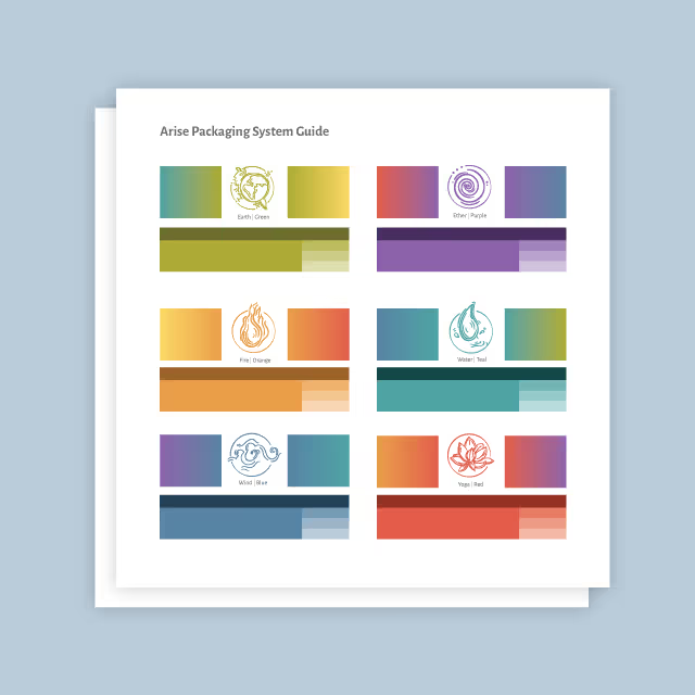
As Martens Heating & Cooling expanded their digital marketing efforts, it became clear that their existing brand identity lacked the cohesion and impact needed to differentiate them in a competitive HVAC market. Their logo and color palette carried decades of brand equity but needed refinement to reflect their forward-thinking approach. Additionally, their messaging required clarity and consistency to effectively communicate their unique blend of craftsmanship, innovation, and customer commitment. The challenge was to modernize the brand while preserving its trusted reputation and creating a seamless, memorable experience across all customer touchpoints.
Quill Creative Studio developed a strategic brand refresh that balanced tradition with innovation. We retained the core elements of the existing logo while refining its structure and introducing a modern design framework. A bold yet approachable typography system, a tailored color palette of refined reds and blues, and technical design elements created a polished and professional aesthetic.
To enhance brand storytelling, we crafted a messaging platform centered around the slogan “Comfort to the highest degree,” reinforcing Martens' dedication to quality and customer satisfaction. Our work extended across critical brand touchpoints, including business cards, vehicle wraps, service stickers, brochures, and a website design, ensuring a seamless and engaging brand experience. Armed with this refined identity, Martens Heating & Cooling’s digital marketing partner now has a solid foundation to drive brand awareness, engagement, and conversions.


The updated brand identity has positioned Martens Heating & Cooling as a polished, innovative, and customer-focused leader in the HVAC industry. With a clear brand message and cohesive visual identity, they now stand apart from competitors while maintaining the trust and legacy they’ve built over decades. Their new brand system enables seamless implementation across marketing channels, reinforcing consistency and impact. As a result, Martens continues to strengthen relationships with customers, increase brand recognition, and is on a confident path to achieve new levels of business success.


As Martens Heating & Cooling expanded their digital marketing efforts, it became clear that their existing brand identity lacked the cohesion and impact needed to differentiate them in a competitive HVAC market. Their logo and color palette carried decades of brand equity but needed refinement to reflect their forward-thinking approach. Additionally, their messaging required clarity and consistency to effectively communicate their unique blend of craftsmanship, innovation, and customer commitment. The challenge was to modernize the brand while preserving its trusted reputation and creating a seamless, memorable experience across all customer touchpoints.

Quill Creative Studio developed a strategic brand refresh that balanced tradition with innovation. We retained the core elements of the existing logo while refining its structure and introducing a modern design framework. A bold yet approachable typography system, a tailored color palette of refined reds and blues, and technical design elements created a polished and professional aesthetic.
To enhance brand storytelling, we crafted a messaging platform centered around the slogan “Comfort to the highest degree,” reinforcing Martens' dedication to quality and customer satisfaction. Our work extended across critical brand touchpoints, including business cards, vehicle wraps, service stickers, brochures, and a website design, ensuring a seamless and engaging brand experience. Armed with this refined identity, Martens Heating & Cooling’s digital marketing partner now has a solid foundation to drive brand awareness, engagement, and conversions.
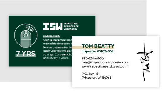

The updated brand identity has positioned Martens Heating & Cooling as a polished, innovative, and customer-focused leader in the HVAC industry. With a clear brand message and cohesive visual identity, they now stand apart from competitors while maintaining the trust and legacy they’ve built over decades. Their new brand system enables seamless implementation across marketing channels, reinforcing consistency and impact. As a result, Martens continues to strengthen relationships with customers, increase brand recognition, and is on a confident path to achieve new levels of business success.
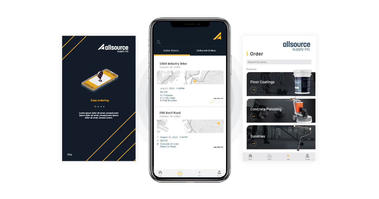


As Martens Heating & Cooling expanded their digital marketing efforts, it became clear that their existing brand identity lacked the cohesion and impact needed to differentiate them in a competitive HVAC market. Their logo and color palette carried decades of brand equity but needed refinement to reflect their forward-thinking approach. Additionally, their messaging required clarity and consistency to effectively communicate their unique blend of craftsmanship, innovation, and customer commitment. The challenge was to modernize the brand while preserving its trusted reputation and creating a seamless, memorable experience across all customer touchpoints.


Quill Creative Studio developed a strategic brand refresh that balanced tradition with innovation. We retained the core elements of the existing logo while refining its structure and introducing a modern design framework. A bold yet approachable typography system, a tailored color palette of refined reds and blues, and technical design elements created a polished and professional aesthetic.
To enhance brand storytelling, we crafted a messaging platform centered around the slogan “Comfort to the highest degree,” reinforcing Martens' dedication to quality and customer satisfaction. Our work extended across critical brand touchpoints, including business cards, vehicle wraps, service stickers, brochures, and a website design, ensuring a seamless and engaging brand experience. Armed with this refined identity, Martens Heating & Cooling’s digital marketing partner now has a solid foundation to drive brand awareness, engagement, and conversions.


The updated brand identity has positioned Martens Heating & Cooling as a polished, innovative, and customer-focused leader in the HVAC industry. With a clear brand message and cohesive visual identity, they now stand apart from competitors while maintaining the trust and legacy they’ve built over decades. Their new brand system enables seamless implementation across marketing channels, reinforcing consistency and impact. As a result, Martens continues to strengthen relationships with customers, increase brand recognition, and is on a confident path to achieve new levels of business success.


As Martens Heating & Cooling expanded their digital marketing efforts, it became clear that their existing brand identity lacked the cohesion and impact needed to differentiate them in a competitive HVAC market. Their logo and color palette carried decades of brand equity but needed refinement to reflect their forward-thinking approach. Additionally, their messaging required clarity and consistency to effectively communicate their unique blend of craftsmanship, innovation, and customer commitment. The challenge was to modernize the brand while preserving its trusted reputation and creating a seamless, memorable experience across all customer touchpoints.


Quill Creative Studio developed a strategic brand refresh that balanced tradition with innovation. We retained the core elements of the existing logo while refining its structure and introducing a modern design framework. A bold yet approachable typography system, a tailored color palette of refined reds and blues, and technical design elements created a polished and professional aesthetic.
To enhance brand storytelling, we crafted a messaging platform centered around the slogan “Comfort to the highest degree,” reinforcing Martens' dedication to quality and customer satisfaction. Our work extended across critical brand touchpoints, including business cards, vehicle wraps, service stickers, brochures, and a website design, ensuring a seamless and engaging brand experience. Armed with this refined identity, Martens Heating & Cooling’s digital marketing partner now has a solid foundation to drive brand awareness, engagement, and conversions.

The updated brand identity has positioned Martens Heating & Cooling as a polished, innovative, and customer-focused leader in the HVAC industry. With a clear brand message and cohesive visual identity, they now stand apart from competitors while maintaining the trust and legacy they’ve built over decades. Their new brand system enables seamless implementation across marketing channels, reinforcing consistency and impact. As a result, Martens continues to strengthen relationships with customers, increase brand recognition, and is on a confident path to achieve new levels of business success.


As Martens Heating & Cooling expanded their digital marketing efforts, it became clear that their existing brand identity lacked the cohesion and impact needed to differentiate them in a competitive HVAC market. Their logo and color palette carried decades of brand equity but needed refinement to reflect their forward-thinking approach. Additionally, their messaging required clarity and consistency to effectively communicate their unique blend of craftsmanship, innovation, and customer commitment. The challenge was to modernize the brand while preserving its trusted reputation and creating a seamless, memorable experience across all customer touchpoints.

Quill Creative Studio developed a strategic brand refresh that balanced tradition with innovation. We retained the core elements of the existing logo while refining its structure and introducing a modern design framework. A bold yet approachable typography system, a tailored color palette of refined reds and blues, and technical design elements created a polished and professional aesthetic.
To enhance brand storytelling, we crafted a messaging platform centered around the slogan “Comfort to the highest degree,” reinforcing Martens' dedication to quality and customer satisfaction. Our work extended across critical brand touchpoints, including business cards, vehicle wraps, service stickers, brochures, and a website design, ensuring a seamless and engaging brand experience. Armed with this refined identity, Martens Heating & Cooling’s digital marketing partner now has a solid foundation to drive brand awareness, engagement, and conversions.


The updated brand identity has positioned Martens Heating & Cooling as a polished, innovative, and customer-focused leader in the HVAC industry. With a clear brand message and cohesive visual identity, they now stand apart from competitors while maintaining the trust and legacy they’ve built over decades. Their new brand system enables seamless implementation across marketing channels, reinforcing consistency and impact. As a result, Martens continues to strengthen relationships with customers, increase brand recognition, and is on a confident path to achieve new levels of business success.


The updated brand identity has positioned Martens Heating & Cooling as a polished, innovative, and customer-focused leader in the HVAC industry. With a clear brand message and cohesive visual identity, they now stand apart from competitors while maintaining the trust and legacy they’ve built over decades. Their new brand system enables seamless implementation across marketing channels, reinforcing consistency and impact. As a result, Martens continues to strengthen relationships with customers, increase brand recognition, and is on a confident path to achieve new levels of business success.
As Martens Heating & Cooling expanded their digital marketing efforts, it became clear that their existing brand identity lacked the cohesion and impact needed to differentiate them in a competitive HVAC market. Their logo and color palette carried decades of brand equity but needed refinement to reflect their forward-thinking approach. Additionally, their messaging required clarity and consistency to effectively communicate their unique blend of craftsmanship, innovation, and customer commitment. The challenge was to modernize the brand while preserving its trusted reputation and creating a seamless, memorable experience across all customer touchpoints.

Quill Creative Studio developed a strategic brand refresh that balanced tradition with innovation. We retained the core elements of the existing logo while refining its structure and introducing a modern design framework. A bold yet approachable typography system, a tailored color palette of refined reds and blues, and technical design elements created a polished and professional aesthetic.
To enhance brand storytelling, we crafted a messaging platform centered around the slogan “Comfort to the highest degree,” reinforcing Martens' dedication to quality and customer satisfaction. Our work extended across critical brand touchpoints, including business cards, vehicle wraps, service stickers, brochures, and a website design, ensuring a seamless and engaging brand experience. Armed with this refined identity, Martens Heating & Cooling’s digital marketing partner now has a solid foundation to drive brand awareness, engagement, and conversions.

The updated brand identity has positioned Martens Heating & Cooling as a polished, innovative, and customer-focused leader in the HVAC industry. With a clear brand message and cohesive visual identity, they now stand apart from competitors while maintaining the trust and legacy they’ve built over decades. Their new brand system enables seamless implementation across marketing channels, reinforcing consistency and impact. As a result, Martens continues to strengthen relationships with customers, increase brand recognition, and is on a confident path to achieve new levels of business success.

The updated brand identity has positioned Martens Heating & Cooling as a polished, innovative, and customer-focused leader in the HVAC industry. With a clear brand message and cohesive visual identity, they now stand apart from competitors while maintaining the trust and legacy they’ve built over decades. Their new brand system enables seamless implementation across marketing channels, reinforcing consistency and impact. As a result, Martens continues to strengthen relationships with customers, increase brand recognition, and is on a confident path to achieve new levels of business success.

Quill Creative Studio developed a strategic brand refresh that balanced tradition with innovation. We retained the core elements of the existing logo while refining its structure and introducing a modern design framework. A bold yet approachable typography system, a tailored color palette of refined reds and blues, and technical design elements created a polished and professional aesthetic.
To enhance brand storytelling, we crafted a messaging platform centered around the slogan “Comfort to the highest degree,” reinforcing Martens' dedication to quality and customer satisfaction. Our work extended across critical brand touchpoints, including business cards, vehicle wraps, service stickers, brochures, and a website design, ensuring a seamless and engaging brand experience. Armed with this refined identity, Martens Heating & Cooling’s digital marketing partner now has a solid foundation to drive brand awareness, engagement, and conversions.

As Martens Heating & Cooling expanded their digital marketing efforts, it became clear that their existing brand identity lacked the cohesion and impact needed to differentiate them in a competitive HVAC market. Their logo and color palette carried decades of brand equity but needed refinement to reflect their forward-thinking approach. Additionally, their messaging required clarity and consistency to effectively communicate their unique blend of craftsmanship, innovation, and customer commitment. The challenge was to modernize the brand while preserving its trusted reputation and creating a seamless, memorable experience across all customer touchpoints.

The updated brand identity has positioned Martens Heating & Cooling as a polished, innovative, and customer-focused leader in the HVAC industry. With a clear brand message and cohesive visual identity, they now stand apart from competitors while maintaining the trust and legacy they’ve built over decades. Their new brand system enables seamless implementation across marketing channels, reinforcing consistency and impact. As a result, Martens continues to strengthen relationships with customers, increase brand recognition, and is on a confident path to achieve new levels of business success.


The updated brand identity has positioned Martens Heating & Cooling as a polished, innovative, and customer-focused leader in the HVAC industry. With a clear brand message and cohesive visual identity, they now stand apart from competitors while maintaining the trust and legacy they’ve built over decades. Their new brand system enables seamless implementation across marketing channels, reinforcing consistency and impact. As a result, Martens continues to strengthen relationships with customers, increase brand recognition, and is on a confident path to achieve new levels of business success.


As Martens Heating & Cooling expanded their digital marketing efforts, it became clear that their existing brand identity lacked the cohesion and impact needed to differentiate them in a competitive HVAC market. Their logo and color palette carried decades of brand equity but needed refinement to reflect their forward-thinking approach. Additionally, their messaging required clarity and consistency to effectively communicate their unique blend of craftsmanship, innovation, and customer commitment. The challenge was to modernize the brand while preserving its trusted reputation and creating a seamless, memorable experience across all customer touchpoints.


Quill Creative Studio developed a strategic brand refresh that balanced tradition with innovation. We retained the core elements of the existing logo while refining its structure and introducing a modern design framework. A bold yet approachable typography system, a tailored color palette of refined reds and blues, and technical design elements created a polished and professional aesthetic.
To enhance brand storytelling, we crafted a messaging platform centered around the slogan “Comfort to the highest degree,” reinforcing Martens' dedication to quality and customer satisfaction. Our work extended across critical brand touchpoints, including business cards, vehicle wraps, service stickers, brochures, and a website design, ensuring a seamless and engaging brand experience. Armed with this refined identity, Martens Heating & Cooling’s digital marketing partner now has a solid foundation to drive brand awareness, engagement, and conversions.

The updated brand identity has positioned Martens Heating & Cooling as a polished, innovative, and customer-focused leader in the HVAC industry. With a clear brand message and cohesive visual identity, they now stand apart from competitors while maintaining the trust and legacy they’ve built over decades. Their new brand system enables seamless implementation across marketing channels, reinforcing consistency and impact. As a result, Martens continues to strengthen relationships with customers, increase brand recognition, and is on a confident path to achieve new levels of business success.


As Martens Heating & Cooling expanded their digital marketing efforts, it became clear that their existing brand identity lacked the cohesion and impact needed to differentiate them in a competitive HVAC market. Their logo and color palette carried decades of brand equity but needed refinement to reflect their forward-thinking approach. Additionally, their messaging required clarity and consistency to effectively communicate their unique blend of craftsmanship, innovation, and customer commitment. The challenge was to modernize the brand while preserving its trusted reputation and creating a seamless, memorable experience across all customer touchpoints.
Quill Creative Studio developed a strategic brand refresh that balanced tradition with innovation. We retained the core elements of the existing logo while refining its structure and introducing a modern design framework. A bold yet approachable typography system, a tailored color palette of refined reds and blues, and technical design elements created a polished and professional aesthetic.
To enhance brand storytelling, we crafted a messaging platform centered around the slogan “Comfort to the highest degree,” reinforcing Martens' dedication to quality and customer satisfaction. Our work extended across critical brand touchpoints, including business cards, vehicle wraps, service stickers, brochures, and a website design, ensuring a seamless and engaging brand experience. Armed with this refined identity, Martens Heating & Cooling’s digital marketing partner now has a solid foundation to drive brand awareness, engagement, and conversions.


The updated brand identity has positioned Martens Heating & Cooling as a polished, innovative, and customer-focused leader in the HVAC industry. With a clear brand message and cohesive visual identity, they now stand apart from competitors while maintaining the trust and legacy they’ve built over decades. Their new brand system enables seamless implementation across marketing channels, reinforcing consistency and impact. As a result, Martens continues to strengthen relationships with customers, increase brand recognition, and is on a confident path to achieve new levels of business success.


As Martens Heating & Cooling expanded their digital marketing efforts, it became clear that their existing brand identity lacked the cohesion and impact needed to differentiate them in a competitive HVAC market. Their logo and color palette carried decades of brand equity but needed refinement to reflect their forward-thinking approach. Additionally, their messaging required clarity and consistency to effectively communicate their unique blend of craftsmanship, innovation, and customer commitment. The challenge was to modernize the brand while preserving its trusted reputation and creating a seamless, memorable experience across all customer touchpoints.
The updated brand identity has positioned Martens Heating & Cooling as a polished, innovative, and customer-focused leader in the HVAC industry. With a clear brand message and cohesive visual identity, they now stand apart from competitors while maintaining the trust and legacy they’ve built over decades. Their new brand system enables seamless implementation across marketing channels, reinforcing consistency and impact. As a result, Martens continues to strengthen relationships with customers, increase brand recognition, and is on a confident path to achieve new levels of business success.

Quill Creative Studio developed a strategic brand refresh that balanced tradition with innovation. We retained the core elements of the existing logo while refining its structure and introducing a modern design framework. A bold yet approachable typography system, a tailored color palette of refined reds and blues, and technical design elements created a polished and professional aesthetic.
To enhance brand storytelling, we crafted a messaging platform centered around the slogan “Comfort to the highest degree,” reinforcing Martens' dedication to quality and customer satisfaction. Our work extended across critical brand touchpoints, including business cards, vehicle wraps, service stickers, brochures, and a website design, ensuring a seamless and engaging brand experience. Armed with this refined identity, Martens Heating & Cooling’s digital marketing partner now has a solid foundation to drive brand awareness, engagement, and conversions.


The updated brand identity has positioned Martens Heating & Cooling as a polished, innovative, and customer-focused leader in the HVAC industry. With a clear brand message and cohesive visual identity, they now stand apart from competitors while maintaining the trust and legacy they’ve built over decades. Their new brand system enables seamless implementation across marketing channels, reinforcing consistency and impact. As a result, Martens continues to strengthen relationships with customers, increase brand recognition, and is on a confident path to achieve new levels of business success.


As Martens Heating & Cooling expanded their digital marketing efforts, it became clear that their existing brand identity lacked the cohesion and impact needed to differentiate them in a competitive HVAC market. Their logo and color palette carried decades of brand equity but needed refinement to reflect their forward-thinking approach. Additionally, their messaging required clarity and consistency to effectively communicate their unique blend of craftsmanship, innovation, and customer commitment. The challenge was to modernize the brand while preserving its trusted reputation and creating a seamless, memorable experience across all customer touchpoints.
Quill Creative Studio developed a strategic brand refresh that balanced tradition with innovation. We retained the core elements of the existing logo while refining its structure and introducing a modern design framework. A bold yet approachable typography system, a tailored color palette of refined reds and blues, and technical design elements created a polished and professional aesthetic.
To enhance brand storytelling, we crafted a messaging platform centered around the slogan “Comfort to the highest degree,” reinforcing Martens' dedication to quality and customer satisfaction. Our work extended across critical brand touchpoints, including business cards, vehicle wraps, service stickers, brochures, and a website design, ensuring a seamless and engaging brand experience. Armed with this refined identity, Martens Heating & Cooling’s digital marketing partner now has a solid foundation to drive brand awareness, engagement, and conversions.


The updated brand identity has positioned Martens Heating & Cooling as a polished, innovative, and customer-focused leader in the HVAC industry. With a clear brand message and cohesive visual identity, they now stand apart from competitors while maintaining the trust and legacy they’ve built over decades. Their new brand system enables seamless implementation across marketing channels, reinforcing consistency and impact. As a result, Martens continues to strengthen relationships with customers, increase brand recognition, and is on a confident path to achieve new levels of business success.


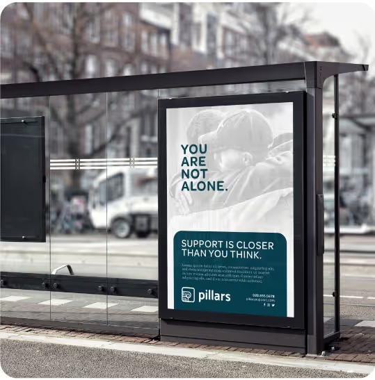
As Martens Heating & Cooling expanded their digital marketing efforts, it became clear that their existing brand identity lacked the cohesion and impact needed to differentiate them in a competitive HVAC market. Their logo and color palette carried decades of brand equity but needed refinement to reflect their forward-thinking approach. Additionally, their messaging required clarity and consistency to effectively communicate their unique blend of craftsmanship, innovation, and customer commitment. The challenge was to modernize the brand while preserving its trusted reputation and creating a seamless, memorable experience across all customer touchpoints.

Quill Creative Studio developed a strategic brand refresh that balanced tradition with innovation. We retained the core elements of the existing logo while refining its structure and introducing a modern design framework. A bold yet approachable typography system, a tailored color palette of refined reds and blues, and technical design elements created a polished and professional aesthetic.
To enhance brand storytelling, we crafted a messaging platform centered around the slogan “Comfort to the highest degree,” reinforcing Martens' dedication to quality and customer satisfaction. Our work extended across critical brand touchpoints, including business cards, vehicle wraps, service stickers, brochures, and a website design, ensuring a seamless and engaging brand experience. Armed with this refined identity, Martens Heating & Cooling’s digital marketing partner now has a solid foundation to drive brand awareness, engagement, and conversions.

The updated brand identity has positioned Martens Heating & Cooling as a polished, innovative, and customer-focused leader in the HVAC industry. With a clear brand message and cohesive visual identity, they now stand apart from competitors while maintaining the trust and legacy they’ve built over decades. Their new brand system enables seamless implementation across marketing channels, reinforcing consistency and impact. As a result, Martens continues to strengthen relationships with customers, increase brand recognition, and is on a confident path to achieve new levels of business success.


As Martens Heating & Cooling expanded their digital marketing efforts, it became clear that their existing brand identity lacked the cohesion and impact needed to differentiate them in a competitive HVAC market. Their logo and color palette carried decades of brand equity but needed refinement to reflect their forward-thinking approach. Additionally, their messaging required clarity and consistency to effectively communicate their unique blend of craftsmanship, innovation, and customer commitment. The challenge was to modernize the brand while preserving its trusted reputation and creating a seamless, memorable experience across all customer touchpoints.

Quill Creative Studio developed a strategic brand refresh that balanced tradition with innovation. We retained the core elements of the existing logo while refining its structure and introducing a modern design framework. A bold yet approachable typography system, a tailored color palette of refined reds and blues, and technical design elements created a polished and professional aesthetic.
To enhance brand storytelling, we crafted a messaging platform centered around the slogan “Comfort to the highest degree,” reinforcing Martens' dedication to quality and customer satisfaction. Our work extended across critical brand touchpoints, including business cards, vehicle wraps, service stickers, brochures, and a website design, ensuring a seamless and engaging brand experience. Armed with this refined identity, Martens Heating & Cooling’s digital marketing partner now has a solid foundation to drive brand awareness, engagement, and conversions.


The updated brand identity has positioned Martens Heating & Cooling as a polished, innovative, and customer-focused leader in the HVAC industry. With a clear brand message and cohesive visual identity, they now stand apart from competitors while maintaining the trust and legacy they’ve built over decades. Their new brand system enables seamless implementation across marketing channels, reinforcing consistency and impact. As a result, Martens continues to strengthen relationships with customers, increase brand recognition, and is on a confident path to achieve new levels of business success.


Quill Creative Studio was highly recommended by our marketing team—and they exceeded all expectations. They were incredibly thorough and engaged, guiding us through brainstorming sessions to understand our vision and then bringing it to life with creativity and expertise.
Jon Kautzer, General Manager, Martens Heating & Cooling
