
The challenge we faced was how to seamlessly integrate new elements that conveyed the company's commitment to cutting-edge defense technologies while honoring the legacy that positioned Oshkosh Defense as a reliable and steadfast partner. Delicately navigating the balance between evolution and preservation, we wanted to tweak the brand for greater alignment with Oshkosh Defense's innovative, technology-forward ethos while safeguarding customer trust built around the pillars of ruggedness and dependability.

We started by zeroing in on brand strategy and identifying key brand pillars that encapsulated the core message and mission of the company. These pillars revolved around Oshkosh Defense's commitment to industry leadership, technology, and engineering innovation, being proven performance partners, and providing functional support. Building upon these foundational elements, our team expanded key messaging and brand strategy.
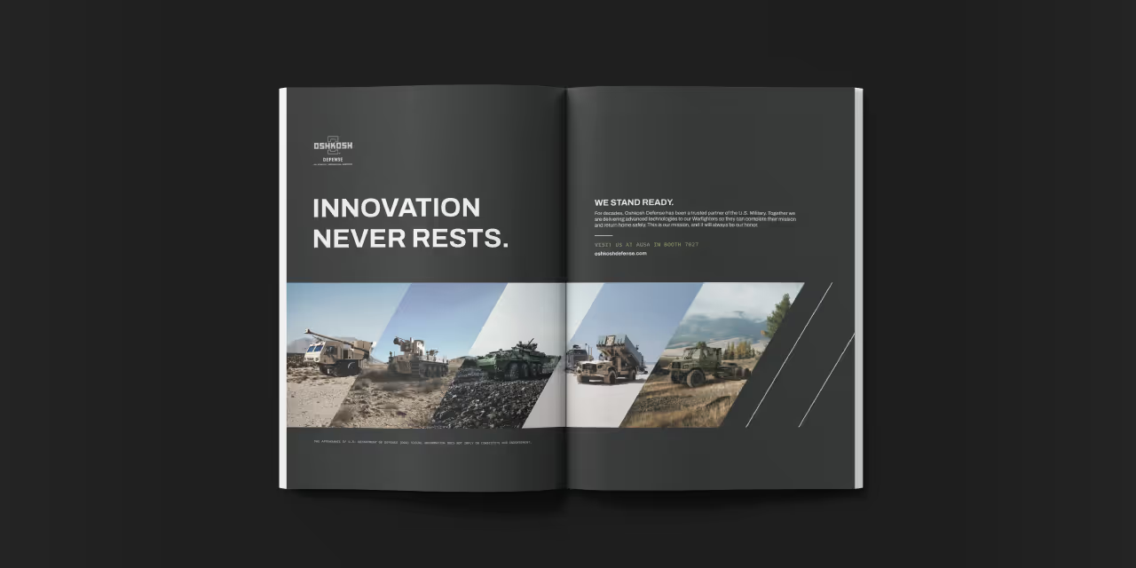
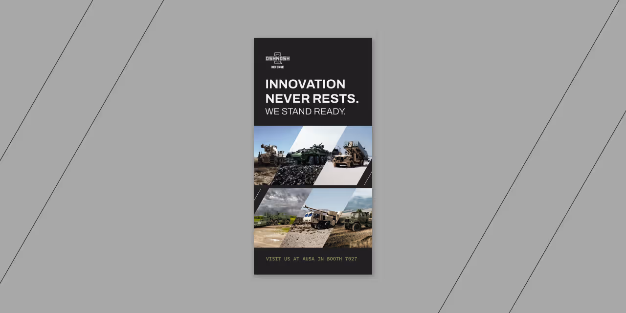
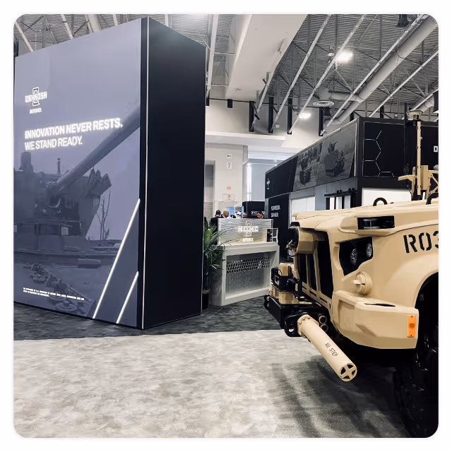
The visual identity reflects the Oshkosh Defense brand with imagery and graphic elements that are sophisticated and structured and that convey a sense of being on the cutting edge of defense technology. The design integrates clean space with powerful imagery, complemented by structured elements such as hexagons, thin-line icons, and clear data visualization, creating a cohesive and visually compelling representation of the brand. The chosen color palette, inspired by the naturally occurring colors found in landscapes where Oshkosh Defense's vehicles operate, adds a subtle yet powerful layer to the overall visual identity.


The reinvigorated brand now places an increased emphasis on Oshkosh Defense's innovative, technology-forward market position. The messaging itself communicates confidence and sophistication, striking a balance that aligns with the bold ruggedness and dependability the brand has built over the years.


The challenge we faced was how to seamlessly integrate new elements that conveyed the company's commitment to cutting-edge defense technologies while honoring the legacy that positioned Oshkosh Defense as a reliable and steadfast partner. Delicately navigating the balance between evolution and preservation, we wanted to tweak the brand for greater alignment with Oshkosh Defense's innovative, technology-forward ethos while safeguarding customer trust built around the pillars of ruggedness and dependability.
We started by zeroing in on brand strategy and identifying key brand pillars that encapsulated the core message and mission of the company. These pillars revolved around Oshkosh Defense's commitment to industry leadership, technology, and engineering innovation, being proven performance partners, and providing functional support. Building upon these foundational elements, our team expanded key messaging and brand strategy.
The visual identity reflects the Oshkosh Defense brand with imagery and graphic elements that are sophisticated and structured and that convey a sense of being on the cutting edge of defense technology. The design integrates clean space with powerful imagery, complemented by structured elements such as hexagons, thin-line icons, and clear data visualization, creating a cohesive and visually compelling representation of the brand. The chosen color palette, inspired by the naturally occurring colors found in landscapes where Oshkosh Defense's vehicles operate, adds a subtle yet powerful layer to the overall visual identity.


The reinvigorated brand now places an increased emphasis on Oshkosh Defense's innovative, technology-forward market position. The messaging itself communicates confidence and sophistication, striking a balance that aligns with the bold ruggedness and dependability the brand has built over the years.


The challenge we faced was how to seamlessly integrate new elements that conveyed the company's commitment to cutting-edge defense technologies while honoring the legacy that positioned Oshkosh Defense as a reliable and steadfast partner. Delicately navigating the balance between evolution and preservation, we wanted to tweak the brand for greater alignment with Oshkosh Defense's innovative, technology-forward ethos while safeguarding customer trust built around the pillars of ruggedness and dependability.

We started by zeroing in on brand strategy and identifying key brand pillars that encapsulated the core message and mission of the company. These pillars revolved around Oshkosh Defense's commitment to industry leadership, technology, and engineering innovation, being proven performance partners, and providing functional support. Building upon these foundational elements, our team expanded key messaging and brand strategy.
The visual identity reflects the Oshkosh Defense brand with imagery and graphic elements that are sophisticated and structured and that convey a sense of being on the cutting edge of defense technology. The design integrates clean space with powerful imagery, complemented by structured elements such as hexagons, thin-line icons, and clear data visualization, creating a cohesive and visually compelling representation of the brand. The chosen color palette, inspired by the naturally occurring colors found in landscapes where Oshkosh Defense's vehicles operate, adds a subtle yet powerful layer to the overall visual identity.

The reinvigorated brand now places an increased emphasis on Oshkosh Defense's innovative, technology-forward market position. The messaging itself communicates confidence and sophistication, striking a balance that aligns with the bold ruggedness and dependability the brand has built over the years.
The challenge we faced was how to seamlessly integrate new elements that conveyed the company's commitment to cutting-edge defense technologies while honoring the legacy that positioned Oshkosh Defense as a reliable and steadfast partner. Delicately navigating the balance between evolution and preservation, we wanted to tweak the brand for greater alignment with Oshkosh Defense's innovative, technology-forward ethos while safeguarding customer trust built around the pillars of ruggedness and dependability.


We started by zeroing in on brand strategy and identifying key brand pillars that encapsulated the core message and mission of the company. These pillars revolved around Oshkosh Defense's commitment to industry leadership, technology, and engineering innovation, being proven performance partners, and providing functional support. Building upon these foundational elements, our team expanded key messaging and brand strategy.
The visual identity reflects the Oshkosh Defense brand with imagery and graphic elements that are sophisticated and structured and that convey a sense of being on the cutting edge of defense technology. The design integrates clean space with powerful imagery, complemented by structured elements such as hexagons, thin-line icons, and clear data visualization, creating a cohesive and visually compelling representation of the brand. The chosen color palette, inspired by the naturally occurring colors found in landscapes where Oshkosh Defense's vehicles operate, adds a subtle yet powerful layer to the overall visual identity.

The reinvigorated brand now places an increased emphasis on Oshkosh Defense's innovative, technology-forward market position. The messaging itself communicates confidence and sophistication, striking a balance that aligns with the bold ruggedness and dependability the brand has built over the years.


The challenge we faced was how to seamlessly integrate new elements that conveyed the company's commitment to cutting-edge defense technologies while honoring the legacy that positioned Oshkosh Defense as a reliable and steadfast partner. Delicately navigating the balance between evolution and preservation, we wanted to tweak the brand for greater alignment with Oshkosh Defense's innovative, technology-forward ethos while safeguarding customer trust built around the pillars of ruggedness and dependability.


We started by zeroing in on brand strategy and identifying key brand pillars that encapsulated the core message and mission of the company. These pillars revolved around Oshkosh Defense's commitment to industry leadership, technology, and engineering innovation, being proven performance partners, and providing functional support. Building upon these foundational elements, our team expanded key messaging and brand strategy.
The visual identity reflects the Oshkosh Defense brand with imagery and graphic elements that are sophisticated and structured and that convey a sense of being on the cutting edge of defense technology. The design integrates clean space with powerful imagery, complemented by structured elements such as hexagons, thin-line icons, and clear data visualization, creating a cohesive and visually compelling representation of the brand. The chosen color palette, inspired by the naturally occurring colors found in landscapes where Oshkosh Defense's vehicles operate, adds a subtle yet powerful layer to the overall visual identity.


The reinvigorated brand now places an increased emphasis on Oshkosh Defense's innovative, technology-forward market position. The messaging itself communicates confidence and sophistication, striking a balance that aligns with the bold ruggedness and dependability the brand has built over the years.


The challenge we faced was how to seamlessly integrate new elements that conveyed the company's commitment to cutting-edge defense technologies while honoring the legacy that positioned Oshkosh Defense as a reliable and steadfast partner. Delicately navigating the balance between evolution and preservation, we wanted to tweak the brand for greater alignment with Oshkosh Defense's innovative, technology-forward ethos while safeguarding customer trust built around the pillars of ruggedness and dependability.

We started by zeroing in on brand strategy and identifying key brand pillars that encapsulated the core message and mission of the company. These pillars revolved around Oshkosh Defense's commitment to industry leadership, technology, and engineering innovation, being proven performance partners, and providing functional support. Building upon these foundational elements, our team expanded key messaging and brand strategy.
The visual identity reflects the Oshkosh Defense brand with imagery and graphic elements that are sophisticated and structured and that convey a sense of being on the cutting edge of defense technology. The design integrates clean space with powerful imagery, complemented by structured elements such as hexagons, thin-line icons, and clear data visualization, creating a cohesive and visually compelling representation of the brand. The chosen color palette, inspired by the naturally occurring colors found in landscapes where Oshkosh Defense's vehicles operate, adds a subtle yet powerful layer to the overall visual identity.


The reinvigorated brand now places an increased emphasis on Oshkosh Defense's innovative, technology-forward market position. The messaging itself communicates confidence and sophistication, striking a balance that aligns with the bold ruggedness and dependability the brand has built over the years.

The challenge we faced was how to seamlessly integrate new elements that conveyed the company's commitment to cutting-edge defense technologies while honoring the legacy that positioned Oshkosh Defense as a reliable and steadfast partner. Delicately navigating the balance between evolution and preservation, we wanted to tweak the brand for greater alignment with Oshkosh Defense's innovative, technology-forward ethos while safeguarding customer trust built around the pillars of ruggedness and dependability.


We started by zeroing in on brand strategy and identifying key brand pillars that encapsulated the core message and mission of the company. These pillars revolved around Oshkosh Defense's commitment to industry leadership, technology, and engineering innovation, being proven performance partners, and providing functional support. Building upon these foundational elements, our team expanded key messaging and brand strategy.
The visual identity reflects the Oshkosh Defense brand with imagery and graphic elements that are sophisticated and structured and that convey a sense of being on the cutting edge of defense technology. The design integrates clean space with powerful imagery, complemented by structured elements such as hexagons, thin-line icons, and clear data visualization, creating a cohesive and visually compelling representation of the brand. The chosen color palette, inspired by the naturally occurring colors found in landscapes where Oshkosh Defense's vehicles operate, adds a subtle yet powerful layer to the overall visual identity.


The reinvigorated brand now places an increased emphasis on Oshkosh Defense's innovative, technology-forward market position. The messaging itself communicates confidence and sophistication, striking a balance that aligns with the bold ruggedness and dependability the brand has built over the years.


The challenge we faced was how to seamlessly integrate new elements that conveyed the company's commitment to cutting-edge defense technologies while honoring the legacy that positioned Oshkosh Defense as a reliable and steadfast partner. Delicately navigating the balance between evolution and preservation, we wanted to tweak the brand for greater alignment with Oshkosh Defense's innovative, technology-forward ethos while safeguarding customer trust built around the pillars of ruggedness and dependability.

We started by zeroing in on brand strategy and identifying key brand pillars that encapsulated the core message and mission of the company. These pillars revolved around Oshkosh Defense's commitment to industry leadership, technology, and engineering innovation, being proven performance partners, and providing functional support. Building upon these foundational elements, our team expanded key messaging and brand strategy.
The visual identity reflects the Oshkosh Defense brand with imagery and graphic elements that are sophisticated and structured and that convey a sense of being on the cutting edge of defense technology. The design integrates clean space with powerful imagery, complemented by structured elements such as hexagons, thin-line icons, and clear data visualization, creating a cohesive and visually compelling representation of the brand. The chosen color palette, inspired by the naturally occurring colors found in landscapes where Oshkosh Defense's vehicles operate, adds a subtle yet powerful layer to the overall visual identity.


The reinvigorated brand now places an increased emphasis on Oshkosh Defense's innovative, technology-forward market position. The messaging itself communicates confidence and sophistication, striking a balance that aligns with the bold ruggedness and dependability the brand has built over the years.


The challenge we faced was how to seamlessly integrate new elements that conveyed the company's commitment to cutting-edge defense technologies while honoring the legacy that positioned Oshkosh Defense as a reliable and steadfast partner. Delicately navigating the balance between evolution and preservation, we wanted to tweak the brand for greater alignment with Oshkosh Defense's innovative, technology-forward ethos while safeguarding customer trust built around the pillars of ruggedness and dependability.

We started by zeroing in on brand strategy and identifying key brand pillars that encapsulated the core message and mission of the company. These pillars revolved around Oshkosh Defense's commitment to industry leadership, technology, and engineering innovation, being proven performance partners, and providing functional support. Building upon these foundational elements, our team expanded key messaging and brand strategy.
The visual identity reflects the Oshkosh Defense brand with imagery and graphic elements that are sophisticated and structured and that convey a sense of being on the cutting edge of defense technology. The design integrates clean space with powerful imagery, complemented by structured elements such as hexagons, thin-line icons, and clear data visualization, creating a cohesive and visually compelling representation of the brand. The chosen color palette, inspired by the naturally occurring colors found in landscapes where Oshkosh Defense's vehicles operate, adds a subtle yet powerful layer to the overall visual identity.

The reinvigorated brand now places an increased emphasis on Oshkosh Defense's innovative, technology-forward market position. The messaging itself communicates confidence and sophistication, striking a balance that aligns with the bold ruggedness and dependability the brand has built over the years.

The challenge we faced was how to seamlessly integrate new elements that conveyed the company's commitment to cutting-edge defense technologies while honoring the legacy that positioned Oshkosh Defense as a reliable and steadfast partner. Delicately navigating the balance between evolution and preservation, we wanted to tweak the brand for greater alignment with Oshkosh Defense's innovative, technology-forward ethos while safeguarding customer trust built around the pillars of ruggedness and dependability.

We started by zeroing in on brand strategy and identifying key brand pillars that encapsulated the core message and mission of the company. These pillars revolved around Oshkosh Defense's commitment to industry leadership, technology, and engineering innovation, being proven performance partners, and providing functional support. Building upon these foundational elements, our team expanded key messaging and brand strategy.
The visual identity reflects the Oshkosh Defense brand with imagery and graphic elements that are sophisticated and structured and that convey a sense of being on the cutting edge of defense technology. The design integrates clean space with powerful imagery, complemented by structured elements such as hexagons, thin-line icons, and clear data visualization, creating a cohesive and visually compelling representation of the brand. The chosen color palette, inspired by the naturally occurring colors found in landscapes where Oshkosh Defense's vehicles operate, adds a subtle yet powerful layer to the overall visual identity.


The reinvigorated brand now places an increased emphasis on Oshkosh Defense's innovative, technology-forward market position. The messaging itself communicates confidence and sophistication, striking a balance that aligns with the bold ruggedness and dependability the brand has built over the years.


The challenge we faced was how to seamlessly integrate new elements that conveyed the company's commitment to cutting-edge defense technologies while honoring the legacy that positioned Oshkosh Defense as a reliable and steadfast partner. Delicately navigating the balance between evolution and preservation, we wanted to tweak the brand for greater alignment with Oshkosh Defense's innovative, technology-forward ethos while safeguarding customer trust built around the pillars of ruggedness and dependability.

We started by zeroing in on brand strategy and identifying key brand pillars that encapsulated the core message and mission of the company. These pillars revolved around Oshkosh Defense's commitment to industry leadership, technology, and engineering innovation, being proven performance partners, and providing functional support. Building upon these foundational elements, our team expanded key messaging and brand strategy.
The visual identity reflects the Oshkosh Defense brand with imagery and graphic elements that are sophisticated and structured and that convey a sense of being on the cutting edge of defense technology. The design integrates clean space with powerful imagery, complemented by structured elements such as hexagons, thin-line icons, and clear data visualization, creating a cohesive and visually compelling representation of the brand. The chosen color palette, inspired by the naturally occurring colors found in landscapes where Oshkosh Defense's vehicles operate, adds a subtle yet powerful layer to the overall visual identity.

The reinvigorated brand now places an increased emphasis on Oshkosh Defense's innovative, technology-forward market position. The messaging itself communicates confidence and sophistication, striking a balance that aligns with the bold ruggedness and dependability the brand has built over the years.


The challenge we faced was how to seamlessly integrate new elements that conveyed the company's commitment to cutting-edge defense technologies while honoring the legacy that positioned Oshkosh Defense as a reliable and steadfast partner. Delicately navigating the balance between evolution and preservation, we wanted to tweak the brand for greater alignment with Oshkosh Defense's innovative, technology-forward ethos while safeguarding customer trust built around the pillars of ruggedness and dependability.

We started by zeroing in on brand strategy and identifying key brand pillars that encapsulated the core message and mission of the company. These pillars revolved around Oshkosh Defense's commitment to industry leadership, technology, and engineering innovation, being proven performance partners, and providing functional support. Building upon these foundational elements, our team expanded key messaging and brand strategy.
The visual identity reflects the Oshkosh Defense brand with imagery and graphic elements that are sophisticated and structured and that convey a sense of being on the cutting edge of defense technology. The design integrates clean space with powerful imagery, complemented by structured elements such as hexagons, thin-line icons, and clear data visualization, creating a cohesive and visually compelling representation of the brand. The chosen color palette, inspired by the naturally occurring colors found in landscapes where Oshkosh Defense's vehicles operate, adds a subtle yet powerful layer to the overall visual identity.


The reinvigorated brand now places an increased emphasis on Oshkosh Defense's innovative, technology-forward market position. The messaging itself communicates confidence and sophistication, striking a balance that aligns with the bold ruggedness and dependability the brand has built over the years.


The challenge we faced was how to seamlessly integrate new elements that conveyed the company's commitment to cutting-edge defense technologies while honoring the legacy that positioned Oshkosh Defense as a reliable and steadfast partner. Delicately navigating the balance between evolution and preservation, we wanted to tweak the brand for greater alignment with Oshkosh Defense's innovative, technology-forward ethos while safeguarding customer trust built around the pillars of ruggedness and dependability.


We started by zeroing in on brand strategy and identifying key brand pillars that encapsulated the core message and mission of the company. These pillars revolved around Oshkosh Defense's commitment to industry leadership, technology, and engineering innovation, being proven performance partners, and providing functional support. Building upon these foundational elements, our team expanded key messaging and brand strategy.
The visual identity reflects the Oshkosh Defense brand with imagery and graphic elements that are sophisticated and structured and that convey a sense of being on the cutting edge of defense technology. The design integrates clean space with powerful imagery, complemented by structured elements such as hexagons, thin-line icons, and clear data visualization, creating a cohesive and visually compelling representation of the brand. The chosen color palette, inspired by the naturally occurring colors found in landscapes where Oshkosh Defense's vehicles operate, adds a subtle yet powerful layer to the overall visual identity.


The reinvigorated brand now places an increased emphasis on Oshkosh Defense's innovative, technology-forward market position. The messaging itself communicates confidence and sophistication, striking a balance that aligns with the bold ruggedness and dependability the brand has built over the years.


The challenge we faced was how to seamlessly integrate new elements that conveyed the company's commitment to cutting-edge defense technologies while honoring the legacy that positioned Oshkosh Defense as a reliable and steadfast partner. Delicately navigating the balance between evolution and preservation, we wanted to tweak the brand for greater alignment with Oshkosh Defense's innovative, technology-forward ethos while safeguarding customer trust built around the pillars of ruggedness and dependability.


We started by zeroing in on brand strategy and identifying key brand pillars that encapsulated the core message and mission of the company. These pillars revolved around Oshkosh Defense's commitment to industry leadership, technology, and engineering innovation, being proven performance partners, and providing functional support. Building upon these foundational elements, our team expanded key messaging and brand strategy.
The visual identity reflects the Oshkosh Defense brand with imagery and graphic elements that are sophisticated and structured and that convey a sense of being on the cutting edge of defense technology. The design integrates clean space with powerful imagery, complemented by structured elements such as hexagons, thin-line icons, and clear data visualization, creating a cohesive and visually compelling representation of the brand. The chosen color palette, inspired by the naturally occurring colors found in landscapes where Oshkosh Defense's vehicles operate, adds a subtle yet powerful layer to the overall visual identity.

The reinvigorated brand now places an increased emphasis on Oshkosh Defense's innovative, technology-forward market position. The messaging itself communicates confidence and sophistication, striking a balance that aligns with the bold ruggedness and dependability the brand has built over the years.


The challenge we faced was how to seamlessly integrate new elements that conveyed the company's commitment to cutting-edge defense technologies while honoring the legacy that positioned Oshkosh Defense as a reliable and steadfast partner. Delicately navigating the balance between evolution and preservation, we wanted to tweak the brand for greater alignment with Oshkosh Defense's innovative, technology-forward ethos while safeguarding customer trust built around the pillars of ruggedness and dependability.

We started by zeroing in on brand strategy and identifying key brand pillars that encapsulated the core message and mission of the company. These pillars revolved around Oshkosh Defense's commitment to industry leadership, technology, and engineering innovation, being proven performance partners, and providing functional support. Building upon these foundational elements, our team expanded key messaging and brand strategy.
The visual identity reflects the Oshkosh Defense brand with imagery and graphic elements that are sophisticated and structured and that convey a sense of being on the cutting edge of defense technology. The design integrates clean space with powerful imagery, complemented by structured elements such as hexagons, thin-line icons, and clear data visualization, creating a cohesive and visually compelling representation of the brand. The chosen color palette, inspired by the naturally occurring colors found in landscapes where Oshkosh Defense's vehicles operate, adds a subtle yet powerful layer to the overall visual identity.


The reinvigorated brand now places an increased emphasis on Oshkosh Defense's innovative, technology-forward market position. The messaging itself communicates confidence and sophistication, striking a balance that aligns with the bold ruggedness and dependability the brand has built over the years.


The challenge we faced was how to seamlessly integrate new elements that conveyed the company's commitment to cutting-edge defense technologies while honoring the legacy that positioned Oshkosh Defense as a reliable and steadfast partner. Delicately navigating the balance between evolution and preservation, we wanted to tweak the brand for greater alignment with Oshkosh Defense's innovative, technology-forward ethos while safeguarding customer trust built around the pillars of ruggedness and dependability.


We started by zeroing in on brand strategy and identifying key brand pillars that encapsulated the core message and mission of the company. These pillars revolved around Oshkosh Defense's commitment to industry leadership, technology, and engineering innovation, being proven performance partners, and providing functional support. Building upon these foundational elements, our team expanded key messaging and brand strategy.
The visual identity reflects the Oshkosh Defense brand with imagery and graphic elements that are sophisticated and structured and that convey a sense of being on the cutting edge of defense technology. The design integrates clean space with powerful imagery, complemented by structured elements such as hexagons, thin-line icons, and clear data visualization, creating a cohesive and visually compelling representation of the brand. The chosen color palette, inspired by the naturally occurring colors found in landscapes where Oshkosh Defense's vehicles operate, adds a subtle yet powerful layer to the overall visual identity.


The reinvigorated brand now places an increased emphasis on Oshkosh Defense's innovative, technology-forward market position. The messaging itself communicates confidence and sophistication, striking a balance that aligns with the bold ruggedness and dependability the brand has built over the years.


The challenge we faced was how to seamlessly integrate new elements that conveyed the company's commitment to cutting-edge defense technologies while honoring the legacy that positioned Oshkosh Defense as a reliable and steadfast partner. Delicately navigating the balance between evolution and preservation, we wanted to tweak the brand for greater alignment with Oshkosh Defense's innovative, technology-forward ethos while safeguarding customer trust built around the pillars of ruggedness and dependability.


We started by zeroing in on brand strategy and identifying key brand pillars that encapsulated the core message and mission of the company. These pillars revolved around Oshkosh Defense's commitment to industry leadership, technology, and engineering innovation, being proven performance partners, and providing functional support. Building upon these foundational elements, our team expanded key messaging and brand strategy.
The visual identity reflects the Oshkosh Defense brand with imagery and graphic elements that are sophisticated and structured and that convey a sense of being on the cutting edge of defense technology. The design integrates clean space with powerful imagery, complemented by structured elements such as hexagons, thin-line icons, and clear data visualization, creating a cohesive and visually compelling representation of the brand. The chosen color palette, inspired by the naturally occurring colors found in landscapes where Oshkosh Defense's vehicles operate, adds a subtle yet powerful layer to the overall visual identity.


The reinvigorated brand now places an increased emphasis on Oshkosh Defense's innovative, technology-forward market position. The messaging itself communicates confidence and sophistication, striking a balance that aligns with the bold ruggedness and dependability the brand has built over the years.


The challenge we faced was how to seamlessly integrate new elements that conveyed the company's commitment to cutting-edge defense technologies while honoring the legacy that positioned Oshkosh Defense as a reliable and steadfast partner. Delicately navigating the balance between evolution and preservation, we wanted to tweak the brand for greater alignment with Oshkosh Defense's innovative, technology-forward ethos while safeguarding customer trust built around the pillars of ruggedness and dependability.


We started by zeroing in on brand strategy and identifying key brand pillars that encapsulated the core message and mission of the company. These pillars revolved around Oshkosh Defense's commitment to industry leadership, technology, and engineering innovation, being proven performance partners, and providing functional support. Building upon these foundational elements, our team expanded key messaging and brand strategy.
The visual identity reflects the Oshkosh Defense brand with imagery and graphic elements that are sophisticated and structured and that convey a sense of being on the cutting edge of defense technology. The design integrates clean space with powerful imagery, complemented by structured elements such as hexagons, thin-line icons, and clear data visualization, creating a cohesive and visually compelling representation of the brand. The chosen color palette, inspired by the naturally occurring colors found in landscapes where Oshkosh Defense's vehicles operate, adds a subtle yet powerful layer to the overall visual identity.
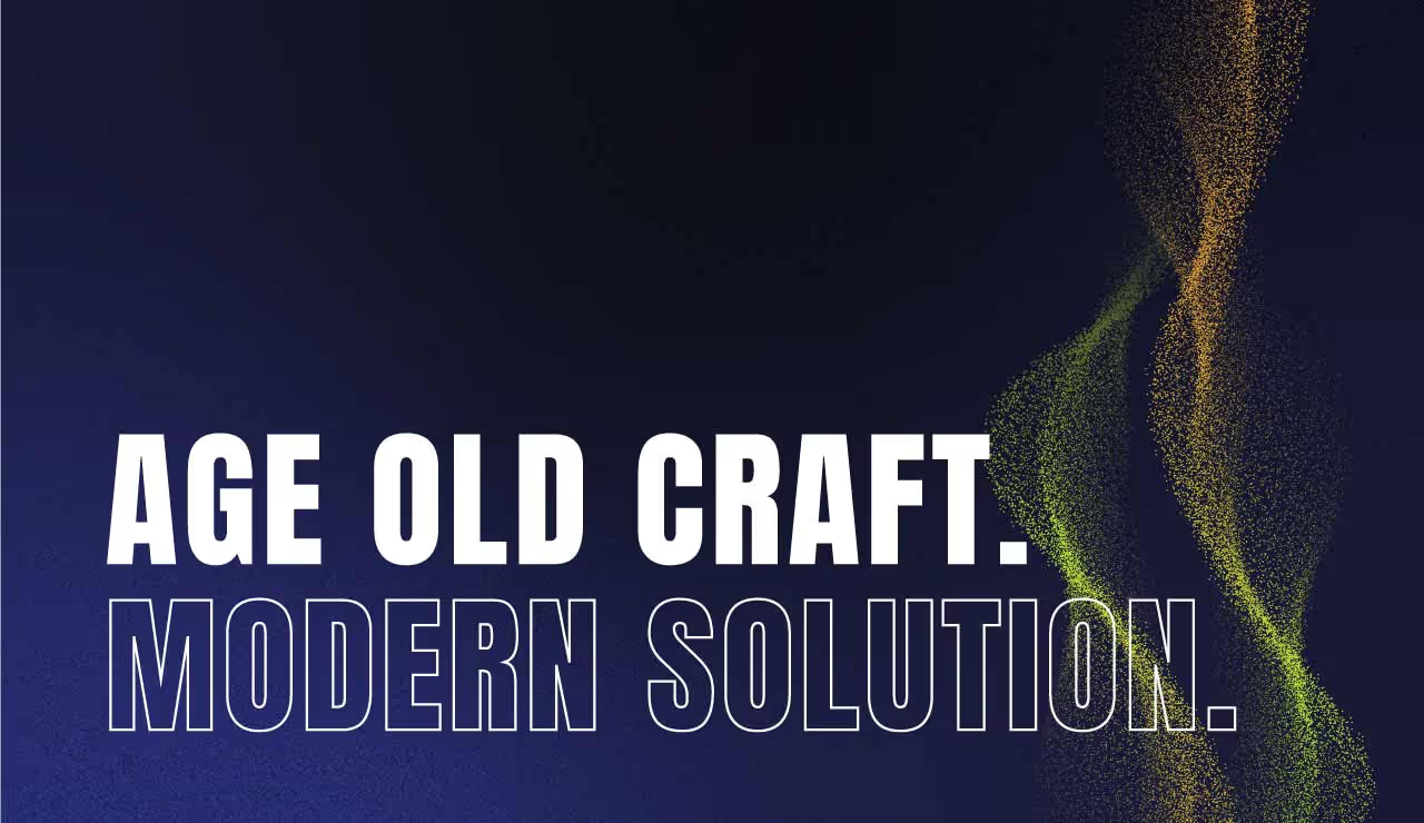


The challenge we faced was how to seamlessly integrate new elements that conveyed the company's commitment to cutting-edge defense technologies while honoring the legacy that positioned Oshkosh Defense as a reliable and steadfast partner. Delicately navigating the balance between evolution and preservation, we wanted to tweak the brand for greater alignment with Oshkosh Defense's innovative, technology-forward ethos while safeguarding customer trust built around the pillars of ruggedness and dependability.
We started by zeroing in on brand strategy and identifying key brand pillars that encapsulated the core message and mission of the company. These pillars revolved around Oshkosh Defense's commitment to industry leadership, technology, and engineering innovation, being proven performance partners, and providing functional support. Building upon these foundational elements, our team expanded key messaging and brand strategy.
The visual identity reflects the Oshkosh Defense brand with imagery and graphic elements that are sophisticated and structured and that convey a sense of being on the cutting edge of defense technology. The design integrates clean space with powerful imagery, complemented by structured elements such as hexagons, thin-line icons, and clear data visualization, creating a cohesive and visually compelling representation of the brand. The chosen color palette, inspired by the naturally occurring colors found in landscapes where Oshkosh Defense's vehicles operate, adds a subtle yet powerful layer to the overall visual identity.


The reinvigorated brand now places an increased emphasis on Oshkosh Defense's innovative, technology-forward market position. The messaging itself communicates confidence and sophistication, striking a balance that aligns with the bold ruggedness and dependability the brand has built over the years.


The challenge we faced was how to seamlessly integrate new elements that conveyed the company's commitment to cutting-edge defense technologies while honoring the legacy that positioned Oshkosh Defense as a reliable and steadfast partner. Delicately navigating the balance between evolution and preservation, we wanted to tweak the brand for greater alignment with Oshkosh Defense's innovative, technology-forward ethos while safeguarding customer trust built around the pillars of ruggedness and dependability.


We started by zeroing in on brand strategy and identifying key brand pillars that encapsulated the core message and mission of the company. These pillars revolved around Oshkosh Defense's commitment to industry leadership, technology, and engineering innovation, being proven performance partners, and providing functional support. Building upon these foundational elements, our team expanded key messaging and brand strategy.
The visual identity reflects the Oshkosh Defense brand with imagery and graphic elements that are sophisticated and structured and that convey a sense of being on the cutting edge of defense technology. The design integrates clean space with powerful imagery, complemented by structured elements such as hexagons, thin-line icons, and clear data visualization, creating a cohesive and visually compelling representation of the brand. The chosen color palette, inspired by the naturally occurring colors found in landscapes where Oshkosh Defense's vehicles operate, adds a subtle yet powerful layer to the overall visual identity.
The reinvigorated brand now places an increased emphasis on Oshkosh Defense's innovative, technology-forward market position. The messaging itself communicates confidence and sophistication, striking a balance that aligns with the bold ruggedness and dependability the brand has built over the years.

The challenge we faced was how to seamlessly integrate new elements that conveyed the company's commitment to cutting-edge defense technologies while honoring the legacy that positioned Oshkosh Defense as a reliable and steadfast partner. Delicately navigating the balance between evolution and preservation, we wanted to tweak the brand for greater alignment with Oshkosh Defense's innovative, technology-forward ethos while safeguarding customer trust built around the pillars of ruggedness and dependability.


We started by zeroing in on brand strategy and identifying key brand pillars that encapsulated the core message and mission of the company. These pillars revolved around Oshkosh Defense's commitment to industry leadership, technology, and engineering innovation, being proven performance partners, and providing functional support. Building upon these foundational elements, our team expanded key messaging and brand strategy.
The visual identity reflects the Oshkosh Defense brand with imagery and graphic elements that are sophisticated and structured and that convey a sense of being on the cutting edge of defense technology. The design integrates clean space with powerful imagery, complemented by structured elements such as hexagons, thin-line icons, and clear data visualization, creating a cohesive and visually compelling representation of the brand. The chosen color palette, inspired by the naturally occurring colors found in landscapes where Oshkosh Defense's vehicles operate, adds a subtle yet powerful layer to the overall visual identity.


The reinvigorated brand now places an increased emphasis on Oshkosh Defense's innovative, technology-forward market position. The messaging itself communicates confidence and sophistication, striking a balance that aligns with the bold ruggedness and dependability the brand has built over the years.


The challenge we faced was how to seamlessly integrate new elements that conveyed the company's commitment to cutting-edge defense technologies while honoring the legacy that positioned Oshkosh Defense as a reliable and steadfast partner. Delicately navigating the balance between evolution and preservation, we wanted to tweak the brand for greater alignment with Oshkosh Defense's innovative, technology-forward ethos while safeguarding customer trust built around the pillars of ruggedness and dependability.

We started by zeroing in on brand strategy and identifying key brand pillars that encapsulated the core message and mission of the company. These pillars revolved around Oshkosh Defense's commitment to industry leadership, technology, and engineering innovation, being proven performance partners, and providing functional support. Building upon these foundational elements, our team expanded key messaging and brand strategy.
The visual identity reflects the Oshkosh Defense brand with imagery and graphic elements that are sophisticated and structured and that convey a sense of being on the cutting edge of defense technology. The design integrates clean space with powerful imagery, complemented by structured elements such as hexagons, thin-line icons, and clear data visualization, creating a cohesive and visually compelling representation of the brand. The chosen color palette, inspired by the naturally occurring colors found in landscapes where Oshkosh Defense's vehicles operate, adds a subtle yet powerful layer to the overall visual identity.

The reinvigorated brand now places an increased emphasis on Oshkosh Defense's innovative, technology-forward market position. The messaging itself communicates confidence and sophistication, striking a balance that aligns with the bold ruggedness and dependability the brand has built over the years.


The challenge we faced was how to seamlessly integrate new elements that conveyed the company's commitment to cutting-edge defense technologies while honoring the legacy that positioned Oshkosh Defense as a reliable and steadfast partner. Delicately navigating the balance between evolution and preservation, we wanted to tweak the brand for greater alignment with Oshkosh Defense's innovative, technology-forward ethos while safeguarding customer trust built around the pillars of ruggedness and dependability.


We started by zeroing in on brand strategy and identifying key brand pillars that encapsulated the core message and mission of the company. These pillars revolved around Oshkosh Defense's commitment to industry leadership, technology, and engineering innovation, being proven performance partners, and providing functional support. Building upon these foundational elements, our team expanded key messaging and brand strategy.
The visual identity reflects the Oshkosh Defense brand with imagery and graphic elements that are sophisticated and structured and that convey a sense of being on the cutting edge of defense technology. The design integrates clean space with powerful imagery, complemented by structured elements such as hexagons, thin-line icons, and clear data visualization, creating a cohesive and visually compelling representation of the brand. The chosen color palette, inspired by the naturally occurring colors found in landscapes where Oshkosh Defense's vehicles operate, adds a subtle yet powerful layer to the overall visual identity.


The reinvigorated brand now places an increased emphasis on Oshkosh Defense's innovative, technology-forward market position. The messaging itself communicates confidence and sophistication, striking a balance that aligns with the bold ruggedness and dependability the brand has built over the years.


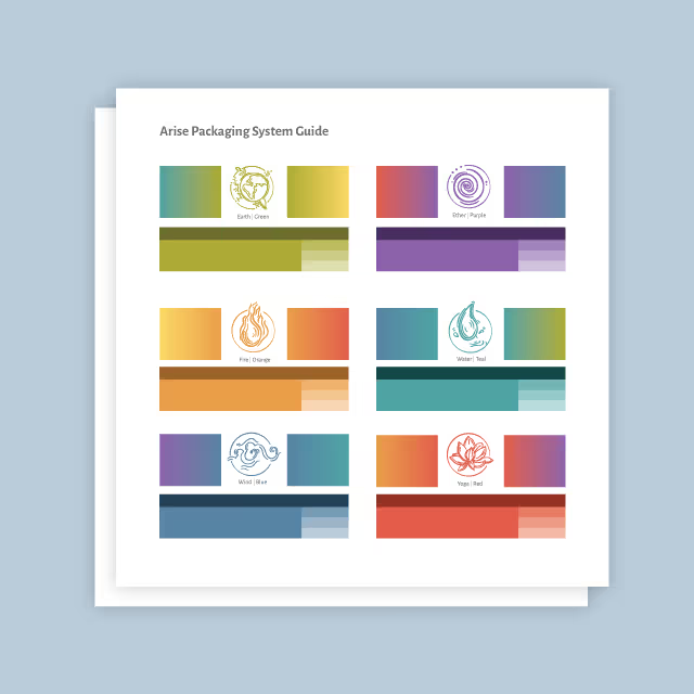
The challenge we faced was how to seamlessly integrate new elements that conveyed the company's commitment to cutting-edge defense technologies while honoring the legacy that positioned Oshkosh Defense as a reliable and steadfast partner. Delicately navigating the balance between evolution and preservation, we wanted to tweak the brand for greater alignment with Oshkosh Defense's innovative, technology-forward ethos while safeguarding customer trust built around the pillars of ruggedness and dependability.
We started by zeroing in on brand strategy and identifying key brand pillars that encapsulated the core message and mission of the company. These pillars revolved around Oshkosh Defense's commitment to industry leadership, technology, and engineering innovation, being proven performance partners, and providing functional support. Building upon these foundational elements, our team expanded key messaging and brand strategy.
The visual identity reflects the Oshkosh Defense brand with imagery and graphic elements that are sophisticated and structured and that convey a sense of being on the cutting edge of defense technology. The design integrates clean space with powerful imagery, complemented by structured elements such as hexagons, thin-line icons, and clear data visualization, creating a cohesive and visually compelling representation of the brand. The chosen color palette, inspired by the naturally occurring colors found in landscapes where Oshkosh Defense's vehicles operate, adds a subtle yet powerful layer to the overall visual identity.


The reinvigorated brand now places an increased emphasis on Oshkosh Defense's innovative, technology-forward market position. The messaging itself communicates confidence and sophistication, striking a balance that aligns with the bold ruggedness and dependability the brand has built over the years.


The challenge we faced was how to seamlessly integrate new elements that conveyed the company's commitment to cutting-edge defense technologies while honoring the legacy that positioned Oshkosh Defense as a reliable and steadfast partner. Delicately navigating the balance between evolution and preservation, we wanted to tweak the brand for greater alignment with Oshkosh Defense's innovative, technology-forward ethos while safeguarding customer trust built around the pillars of ruggedness and dependability.

We started by zeroing in on brand strategy and identifying key brand pillars that encapsulated the core message and mission of the company. These pillars revolved around Oshkosh Defense's commitment to industry leadership, technology, and engineering innovation, being proven performance partners, and providing functional support. Building upon these foundational elements, our team expanded key messaging and brand strategy.
The visual identity reflects the Oshkosh Defense brand with imagery and graphic elements that are sophisticated and structured and that convey a sense of being on the cutting edge of defense technology. The design integrates clean space with powerful imagery, complemented by structured elements such as hexagons, thin-line icons, and clear data visualization, creating a cohesive and visually compelling representation of the brand. The chosen color palette, inspired by the naturally occurring colors found in landscapes where Oshkosh Defense's vehicles operate, adds a subtle yet powerful layer to the overall visual identity.
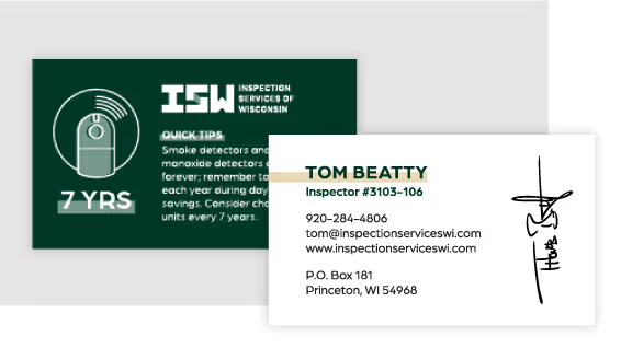

The reinvigorated brand now places an increased emphasis on Oshkosh Defense's innovative, technology-forward market position. The messaging itself communicates confidence and sophistication, striking a balance that aligns with the bold ruggedness and dependability the brand has built over the years.


The challenge we faced was how to seamlessly integrate new elements that conveyed the company's commitment to cutting-edge defense technologies while honoring the legacy that positioned Oshkosh Defense as a reliable and steadfast partner. Delicately navigating the balance between evolution and preservation, we wanted to tweak the brand for greater alignment with Oshkosh Defense's innovative, technology-forward ethos while safeguarding customer trust built around the pillars of ruggedness and dependability.


We started by zeroing in on brand strategy and identifying key brand pillars that encapsulated the core message and mission of the company. These pillars revolved around Oshkosh Defense's commitment to industry leadership, technology, and engineering innovation, being proven performance partners, and providing functional support. Building upon these foundational elements, our team expanded key messaging and brand strategy.
The visual identity reflects the Oshkosh Defense brand with imagery and graphic elements that are sophisticated and structured and that convey a sense of being on the cutting edge of defense technology. The design integrates clean space with powerful imagery, complemented by structured elements such as hexagons, thin-line icons, and clear data visualization, creating a cohesive and visually compelling representation of the brand. The chosen color palette, inspired by the naturally occurring colors found in landscapes where Oshkosh Defense's vehicles operate, adds a subtle yet powerful layer to the overall visual identity.

The reinvigorated brand now places an increased emphasis on Oshkosh Defense's innovative, technology-forward market position. The messaging itself communicates confidence and sophistication, striking a balance that aligns with the bold ruggedness and dependability the brand has built over the years.


The challenge we faced was how to seamlessly integrate new elements that conveyed the company's commitment to cutting-edge defense technologies while honoring the legacy that positioned Oshkosh Defense as a reliable and steadfast partner. Delicately navigating the balance between evolution and preservation, we wanted to tweak the brand for greater alignment with Oshkosh Defense's innovative, technology-forward ethos while safeguarding customer trust built around the pillars of ruggedness and dependability.

We started by zeroing in on brand strategy and identifying key brand pillars that encapsulated the core message and mission of the company. These pillars revolved around Oshkosh Defense's commitment to industry leadership, technology, and engineering innovation, being proven performance partners, and providing functional support. Building upon these foundational elements, our team expanded key messaging and brand strategy.
The visual identity reflects the Oshkosh Defense brand with imagery and graphic elements that are sophisticated and structured and that convey a sense of being on the cutting edge of defense technology. The design integrates clean space with powerful imagery, complemented by structured elements such as hexagons, thin-line icons, and clear data visualization, creating a cohesive and visually compelling representation of the brand. The chosen color palette, inspired by the naturally occurring colors found in landscapes where Oshkosh Defense's vehicles operate, adds a subtle yet powerful layer to the overall visual identity.


The reinvigorated brand now places an increased emphasis on Oshkosh Defense's innovative, technology-forward market position. The messaging itself communicates confidence and sophistication, striking a balance that aligns with the bold ruggedness and dependability the brand has built over the years.


The reinvigorated brand now places an increased emphasis on Oshkosh Defense's innovative, technology-forward market position. The messaging itself communicates confidence and sophistication, striking a balance that aligns with the bold ruggedness and dependability the brand has built over the years.
The challenge we faced was how to seamlessly integrate new elements that conveyed the company's commitment to cutting-edge defense technologies while honoring the legacy that positioned Oshkosh Defense as a reliable and steadfast partner. Delicately navigating the balance between evolution and preservation, we wanted to tweak the brand for greater alignment with Oshkosh Defense's innovative, technology-forward ethos while safeguarding customer trust built around the pillars of ruggedness and dependability.

We started by zeroing in on brand strategy and identifying key brand pillars that encapsulated the core message and mission of the company. These pillars revolved around Oshkosh Defense's commitment to industry leadership, technology, and engineering innovation, being proven performance partners, and providing functional support. Building upon these foundational elements, our team expanded key messaging and brand strategy.
The visual identity reflects the Oshkosh Defense brand with imagery and graphic elements that are sophisticated and structured and that convey a sense of being on the cutting edge of defense technology. The design integrates clean space with powerful imagery, complemented by structured elements such as hexagons, thin-line icons, and clear data visualization, creating a cohesive and visually compelling representation of the brand. The chosen color palette, inspired by the naturally occurring colors found in landscapes where Oshkosh Defense's vehicles operate, adds a subtle yet powerful layer to the overall visual identity.

The reinvigorated brand now places an increased emphasis on Oshkosh Defense's innovative, technology-forward market position. The messaging itself communicates confidence and sophistication, striking a balance that aligns with the bold ruggedness and dependability the brand has built over the years.

The reinvigorated brand now places an increased emphasis on Oshkosh Defense's innovative, technology-forward market position. The messaging itself communicates confidence and sophistication, striking a balance that aligns with the bold ruggedness and dependability the brand has built over the years.

We started by zeroing in on brand strategy and identifying key brand pillars that encapsulated the core message and mission of the company. These pillars revolved around Oshkosh Defense's commitment to industry leadership, technology, and engineering innovation, being proven performance partners, and providing functional support. Building upon these foundational elements, our team expanded key messaging and brand strategy.
The visual identity reflects the Oshkosh Defense brand with imagery and graphic elements that are sophisticated and structured and that convey a sense of being on the cutting edge of defense technology. The design integrates clean space with powerful imagery, complemented by structured elements such as hexagons, thin-line icons, and clear data visualization, creating a cohesive and visually compelling representation of the brand. The chosen color palette, inspired by the naturally occurring colors found in landscapes where Oshkosh Defense's vehicles operate, adds a subtle yet powerful layer to the overall visual identity.

The challenge we faced was how to seamlessly integrate new elements that conveyed the company's commitment to cutting-edge defense technologies while honoring the legacy that positioned Oshkosh Defense as a reliable and steadfast partner. Delicately navigating the balance between evolution and preservation, we wanted to tweak the brand for greater alignment with Oshkosh Defense's innovative, technology-forward ethos while safeguarding customer trust built around the pillars of ruggedness and dependability.

The reinvigorated brand now places an increased emphasis on Oshkosh Defense's innovative, technology-forward market position. The messaging itself communicates confidence and sophistication, striking a balance that aligns with the bold ruggedness and dependability the brand has built over the years.


The reinvigorated brand now places an increased emphasis on Oshkosh Defense's innovative, technology-forward market position. The messaging itself communicates confidence and sophistication, striking a balance that aligns with the bold ruggedness and dependability the brand has built over the years.


The challenge we faced was how to seamlessly integrate new elements that conveyed the company's commitment to cutting-edge defense technologies while honoring the legacy that positioned Oshkosh Defense as a reliable and steadfast partner. Delicately navigating the balance between evolution and preservation, we wanted to tweak the brand for greater alignment with Oshkosh Defense's innovative, technology-forward ethos while safeguarding customer trust built around the pillars of ruggedness and dependability.


We started by zeroing in on brand strategy and identifying key brand pillars that encapsulated the core message and mission of the company. These pillars revolved around Oshkosh Defense's commitment to industry leadership, technology, and engineering innovation, being proven performance partners, and providing functional support. Building upon these foundational elements, our team expanded key messaging and brand strategy.
The visual identity reflects the Oshkosh Defense brand with imagery and graphic elements that are sophisticated and structured and that convey a sense of being on the cutting edge of defense technology. The design integrates clean space with powerful imagery, complemented by structured elements such as hexagons, thin-line icons, and clear data visualization, creating a cohesive and visually compelling representation of the brand. The chosen color palette, inspired by the naturally occurring colors found in landscapes where Oshkosh Defense's vehicles operate, adds a subtle yet powerful layer to the overall visual identity.

The reinvigorated brand now places an increased emphasis on Oshkosh Defense's innovative, technology-forward market position. The messaging itself communicates confidence and sophistication, striking a balance that aligns with the bold ruggedness and dependability the brand has built over the years.


The challenge we faced was how to seamlessly integrate new elements that conveyed the company's commitment to cutting-edge defense technologies while honoring the legacy that positioned Oshkosh Defense as a reliable and steadfast partner. Delicately navigating the balance between evolution and preservation, we wanted to tweak the brand for greater alignment with Oshkosh Defense's innovative, technology-forward ethos while safeguarding customer trust built around the pillars of ruggedness and dependability.
We started by zeroing in on brand strategy and identifying key brand pillars that encapsulated the core message and mission of the company. These pillars revolved around Oshkosh Defense's commitment to industry leadership, technology, and engineering innovation, being proven performance partners, and providing functional support. Building upon these foundational elements, our team expanded key messaging and brand strategy.
The visual identity reflects the Oshkosh Defense brand with imagery and graphic elements that are sophisticated and structured and that convey a sense of being on the cutting edge of defense technology. The design integrates clean space with powerful imagery, complemented by structured elements such as hexagons, thin-line icons, and clear data visualization, creating a cohesive and visually compelling representation of the brand. The chosen color palette, inspired by the naturally occurring colors found in landscapes where Oshkosh Defense's vehicles operate, adds a subtle yet powerful layer to the overall visual identity.


The reinvigorated brand now places an increased emphasis on Oshkosh Defense's innovative, technology-forward market position. The messaging itself communicates confidence and sophistication, striking a balance that aligns with the bold ruggedness and dependability the brand has built over the years.


The challenge we faced was how to seamlessly integrate new elements that conveyed the company's commitment to cutting-edge defense technologies while honoring the legacy that positioned Oshkosh Defense as a reliable and steadfast partner. Delicately navigating the balance between evolution and preservation, we wanted to tweak the brand for greater alignment with Oshkosh Defense's innovative, technology-forward ethos while safeguarding customer trust built around the pillars of ruggedness and dependability.
The reinvigorated brand now places an increased emphasis on Oshkosh Defense's innovative, technology-forward market position. The messaging itself communicates confidence and sophistication, striking a balance that aligns with the bold ruggedness and dependability the brand has built over the years.

We started by zeroing in on brand strategy and identifying key brand pillars that encapsulated the core message and mission of the company. These pillars revolved around Oshkosh Defense's commitment to industry leadership, technology, and engineering innovation, being proven performance partners, and providing functional support. Building upon these foundational elements, our team expanded key messaging and brand strategy.
The visual identity reflects the Oshkosh Defense brand with imagery and graphic elements that are sophisticated and structured and that convey a sense of being on the cutting edge of defense technology. The design integrates clean space with powerful imagery, complemented by structured elements such as hexagons, thin-line icons, and clear data visualization, creating a cohesive and visually compelling representation of the brand. The chosen color palette, inspired by the naturally occurring colors found in landscapes where Oshkosh Defense's vehicles operate, adds a subtle yet powerful layer to the overall visual identity.


The reinvigorated brand now places an increased emphasis on Oshkosh Defense's innovative, technology-forward market position. The messaging itself communicates confidence and sophistication, striking a balance that aligns with the bold ruggedness and dependability the brand has built over the years.


The challenge we faced was how to seamlessly integrate new elements that conveyed the company's commitment to cutting-edge defense technologies while honoring the legacy that positioned Oshkosh Defense as a reliable and steadfast partner. Delicately navigating the balance between evolution and preservation, we wanted to tweak the brand for greater alignment with Oshkosh Defense's innovative, technology-forward ethos while safeguarding customer trust built around the pillars of ruggedness and dependability.
We started by zeroing in on brand strategy and identifying key brand pillars that encapsulated the core message and mission of the company. These pillars revolved around Oshkosh Defense's commitment to industry leadership, technology, and engineering innovation, being proven performance partners, and providing functional support. Building upon these foundational elements, our team expanded key messaging and brand strategy.
The visual identity reflects the Oshkosh Defense brand with imagery and graphic elements that are sophisticated and structured and that convey a sense of being on the cutting edge of defense technology. The design integrates clean space with powerful imagery, complemented by structured elements such as hexagons, thin-line icons, and clear data visualization, creating a cohesive and visually compelling representation of the brand. The chosen color palette, inspired by the naturally occurring colors found in landscapes where Oshkosh Defense's vehicles operate, adds a subtle yet powerful layer to the overall visual identity.


The reinvigorated brand now places an increased emphasis on Oshkosh Defense's innovative, technology-forward market position. The messaging itself communicates confidence and sophistication, striking a balance that aligns with the bold ruggedness and dependability the brand has built over the years.


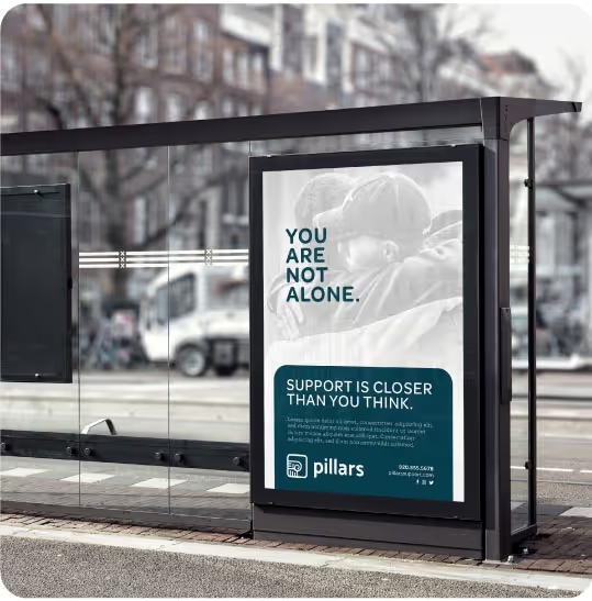
The challenge we faced was how to seamlessly integrate new elements that conveyed the company's commitment to cutting-edge defense technologies while honoring the legacy that positioned Oshkosh Defense as a reliable and steadfast partner. Delicately navigating the balance between evolution and preservation, we wanted to tweak the brand for greater alignment with Oshkosh Defense's innovative, technology-forward ethos while safeguarding customer trust built around the pillars of ruggedness and dependability.

We started by zeroing in on brand strategy and identifying key brand pillars that encapsulated the core message and mission of the company. These pillars revolved around Oshkosh Defense's commitment to industry leadership, technology, and engineering innovation, being proven performance partners, and providing functional support. Building upon these foundational elements, our team expanded key messaging and brand strategy.
The visual identity reflects the Oshkosh Defense brand with imagery and graphic elements that are sophisticated and structured and that convey a sense of being on the cutting edge of defense technology. The design integrates clean space with powerful imagery, complemented by structured elements such as hexagons, thin-line icons, and clear data visualization, creating a cohesive and visually compelling representation of the brand. The chosen color palette, inspired by the naturally occurring colors found in landscapes where Oshkosh Defense's vehicles operate, adds a subtle yet powerful layer to the overall visual identity.

The reinvigorated brand now places an increased emphasis on Oshkosh Defense's innovative, technology-forward market position. The messaging itself communicates confidence and sophistication, striking a balance that aligns with the bold ruggedness and dependability the brand has built over the years.


The challenge we faced was how to seamlessly integrate new elements that conveyed the company's commitment to cutting-edge defense technologies while honoring the legacy that positioned Oshkosh Defense as a reliable and steadfast partner. Delicately navigating the balance between evolution and preservation, we wanted to tweak the brand for greater alignment with Oshkosh Defense's innovative, technology-forward ethos while safeguarding customer trust built around the pillars of ruggedness and dependability.

We started by zeroing in on brand strategy and identifying key brand pillars that encapsulated the core message and mission of the company. These pillars revolved around Oshkosh Defense's commitment to industry leadership, technology, and engineering innovation, being proven performance partners, and providing functional support. Building upon these foundational elements, our team expanded key messaging and brand strategy.
The visual identity reflects the Oshkosh Defense brand with imagery and graphic elements that are sophisticated and structured and that convey a sense of being on the cutting edge of defense technology. The design integrates clean space with powerful imagery, complemented by structured elements such as hexagons, thin-line icons, and clear data visualization, creating a cohesive and visually compelling representation of the brand. The chosen color palette, inspired by the naturally occurring colors found in landscapes where Oshkosh Defense's vehicles operate, adds a subtle yet powerful layer to the overall visual identity.


The reinvigorated brand now places an increased emphasis on Oshkosh Defense's innovative, technology-forward market position. The messaging itself communicates confidence and sophistication, striking a balance that aligns with the bold ruggedness and dependability the brand has built over the years.


From the very beginning, Quill Creative Studio demonstrated an exceptional understanding of Oshkosh Defense’s history and the vision for where our company is headed. Their team provided an incredible number of high-quality assets, ensuring every aspect of our refreshed brand and website was cohesive and compelling. Their creativity and attention to detail exceeded our expectations, delivering a final product that supports our company’s mission and future. We are extremely grateful for the support and collaboration we received throughout the project and look forward to our continued partnership.
Melonie Wiesner, Manager, Global Marketing and Communications, Oshkosh Defense

