


Our goal was not just to update the building’s visual identity but to reimagine its presence in the downtown ecosystem. The building, long seen as monolithic and outdated, needed a perceptual overhaul that would resonate with business owners in the area and attract new tenants, revitalizing its image and energy.
Additionally, 111 N. Main needed a visual guide that would serve as the cornerstone for future branding efforts. We wanted to equip the building’s management team with all the tools necessary to maintain a unified brand presence and lay a foundation for future touchpoints like website development, building signage, and other marketing initiatives.


To reposition 111 N. Main as a contemporary business hub, we knew we needed to embrace its architectural heritage rather than distance the new identity from it. Our team created a visually engaging solution by using the building’s large, recognizable stone columns as a visual framework. We crafted a logo and visual structure for all brand materials that leaned into the building’s distinct form while reimagining it for a modern audience.
The use of columns as a recurring design element reinforces the building’s unique architectural character. The new logo is sleek and geometric, serving as a visual representation of the building’s form. New brand materials were designed to be structured and blocky, mirroring the building’s columns. The color scheme harmonizes with the building’s environment, using construction neutrals and brighter, contrasting natural hues to infuse energy and modernity. Modern, industrial fonts were chosen to evoke a sense of sophistication and strength.

111 N. Main is now set to transcend its legacy with a reimagined visual identity that infuses a contemporary vitality to the space while still honoring its past. With the reinvention of this iconic building, new momentum has been created that will help transform it into a thriving business hub.


Our goal was not just to update the building’s visual identity but to reimagine its presence in the downtown ecosystem. The building, long seen as monolithic and outdated, needed a perceptual overhaul that would resonate with business owners in the area and attract new tenants, revitalizing its image and energy.
Additionally, 111 N. Main needed a visual guide that would serve as the cornerstone for future branding efforts. We wanted to equip the building’s management team with all the tools necessary to maintain a unified brand presence and lay a foundation for future touchpoints like website development, building signage, and other marketing initiatives.


To reposition 111 N. Main as a contemporary business hub, we knew we needed to embrace its architectural heritage rather than distance the new identity from it. Our team created a visually engaging solution by using the building’s large, recognizable stone columns as a visual framework. We crafted a logo and visual structure for all brand materials that leaned into the building’s distinct form while reimagining it for a modern audience.
The use of columns as a recurring design element reinforces the building’s unique architectural character. The new logo is sleek and geometric, serving as a visual representation of the building’s form. New brand materials were designed to be structured and blocky, mirroring the building’s columns. The color scheme harmonizes with the building’s environment, using construction neutrals and brighter, contrasting natural hues to infuse energy and modernity. Modern, industrial fonts were chosen to evoke a sense of sophistication and strength.


111 N. Main is now set to transcend its legacy with a reimagined visual identity that infuses a contemporary vitality to the space while still honoring its past. With the reinvention of this iconic building, new momentum has been created that will help transform it into a thriving business hub.


Our goal was not just to update the building’s visual identity but to reimagine its presence in the downtown ecosystem. The building, long seen as monolithic and outdated, needed a perceptual overhaul that would resonate with business owners in the area and attract new tenants, revitalizing its image and energy.
Additionally, 111 N. Main needed a visual guide that would serve as the cornerstone for future branding efforts. We wanted to equip the building’s management team with all the tools necessary to maintain a unified brand presence and lay a foundation for future touchpoints like website development, building signage, and other marketing initiatives.


To reposition 111 N. Main as a contemporary business hub, we knew we needed to embrace its architectural heritage rather than distance the new identity from it. Our team created a visually engaging solution by using the building’s large, recognizable stone columns as a visual framework. We crafted a logo and visual structure for all brand materials that leaned into the building’s distinct form while reimagining it for a modern audience.
The use of columns as a recurring design element reinforces the building’s unique architectural character. The new logo is sleek and geometric, serving as a visual representation of the building’s form. New brand materials were designed to be structured and blocky, mirroring the building’s columns. The color scheme harmonizes with the building’s environment, using construction neutrals and brighter, contrasting natural hues to infuse energy and modernity. Modern, industrial fonts were chosen to evoke a sense of sophistication and strength.

111 N. Main is now set to transcend its legacy with a reimagined visual identity that infuses a contemporary vitality to the space while still honoring its past. With the reinvention of this iconic building, new momentum has been created that will help transform it into a thriving business hub.


Our goal was not just to update the building’s visual identity but to reimagine its presence in the downtown ecosystem. The building, long seen as monolithic and outdated, needed a perceptual overhaul that would resonate with business owners in the area and attract new tenants, revitalizing its image and energy.
Additionally, 111 N. Main needed a visual guide that would serve as the cornerstone for future branding efforts. We wanted to equip the building’s management team with all the tools necessary to maintain a unified brand presence and lay a foundation for future touchpoints like website development, building signage, and other marketing initiatives.

To reposition 111 N. Main as a contemporary business hub, we knew we needed to embrace its architectural heritage rather than distance the new identity from it. Our team created a visually engaging solution by using the building’s large, recognizable stone columns as a visual framework. We crafted a logo and visual structure for all brand materials that leaned into the building’s distinct form while reimagining it for a modern audience.
The use of columns as a recurring design element reinforces the building’s unique architectural character. The new logo is sleek and geometric, serving as a visual representation of the building’s form. New brand materials were designed to be structured and blocky, mirroring the building’s columns. The color scheme harmonizes with the building’s environment, using construction neutrals and brighter, contrasting natural hues to infuse energy and modernity. Modern, industrial fonts were chosen to evoke a sense of sophistication and strength.


111 N. Main is now set to transcend its legacy with a reimagined visual identity that infuses a contemporary vitality to the space while still honoring its past. With the reinvention of this iconic building, new momentum has been created that will help transform it into a thriving business hub.


Our goal was not just to update the building’s visual identity but to reimagine its presence in the downtown ecosystem. The building, long seen as monolithic and outdated, needed a perceptual overhaul that would resonate with business owners in the area and attract new tenants, revitalizing its image and energy.
Additionally, 111 N. Main needed a visual guide that would serve as the cornerstone for future branding efforts. We wanted to equip the building’s management team with all the tools necessary to maintain a unified brand presence and lay a foundation for future touchpoints like website development, building signage, and other marketing initiatives.


To reposition 111 N. Main as a contemporary business hub, we knew we needed to embrace its architectural heritage rather than distance the new identity from it. Our team created a visually engaging solution by using the building’s large, recognizable stone columns as a visual framework. We crafted a logo and visual structure for all brand materials that leaned into the building’s distinct form while reimagining it for a modern audience.
The use of columns as a recurring design element reinforces the building’s unique architectural character. The new logo is sleek and geometric, serving as a visual representation of the building’s form. New brand materials were designed to be structured and blocky, mirroring the building’s columns. The color scheme harmonizes with the building’s environment, using construction neutrals and brighter, contrasting natural hues to infuse energy and modernity. Modern, industrial fonts were chosen to evoke a sense of sophistication and strength.


111 N. Main is now set to transcend its legacy with a reimagined visual identity that infuses a contemporary vitality to the space while still honoring its past. With the reinvention of this iconic building, new momentum has been created that will help transform it into a thriving business hub.


Our goal was not just to update the building’s visual identity but to reimagine its presence in the downtown ecosystem. The building, long seen as monolithic and outdated, needed a perceptual overhaul that would resonate with business owners in the area and attract new tenants, revitalizing its image and energy.
Additionally, 111 N. Main needed a visual guide that would serve as the cornerstone for future branding efforts. We wanted to equip the building’s management team with all the tools necessary to maintain a unified brand presence and lay a foundation for future touchpoints like website development, building signage, and other marketing initiatives.


To reposition 111 N. Main as a contemporary business hub, we knew we needed to embrace its architectural heritage rather than distance the new identity from it. Our team created a visually engaging solution by using the building’s large, recognizable stone columns as a visual framework. We crafted a logo and visual structure for all brand materials that leaned into the building’s distinct form while reimagining it for a modern audience.
The use of columns as a recurring design element reinforces the building’s unique architectural character. The new logo is sleek and geometric, serving as a visual representation of the building’s form. New brand materials were designed to be structured and blocky, mirroring the building’s columns. The color scheme harmonizes with the building’s environment, using construction neutrals and brighter, contrasting natural hues to infuse energy and modernity. Modern, industrial fonts were chosen to evoke a sense of sophistication and strength.


111 N. Main is now set to transcend its legacy with a reimagined visual identity that infuses a contemporary vitality to the space while still honoring its past. With the reinvention of this iconic building, new momentum has been created that will help transform it into a thriving business hub.


Our goal was not just to update the building’s visual identity but to reimagine its presence in the downtown ecosystem. The building, long seen as monolithic and outdated, needed a perceptual overhaul that would resonate with business owners in the area and attract new tenants, revitalizing its image and energy.
Additionally, 111 N. Main needed a visual guide that would serve as the cornerstone for future branding efforts. We wanted to equip the building’s management team with all the tools necessary to maintain a unified brand presence and lay a foundation for future touchpoints like website development, building signage, and other marketing initiatives.


To reposition 111 N. Main as a contemporary business hub, we knew we needed to embrace its architectural heritage rather than distance the new identity from it. Our team created a visually engaging solution by using the building’s large, recognizable stone columns as a visual framework. We crafted a logo and visual structure for all brand materials that leaned into the building’s distinct form while reimagining it for a modern audience.
The use of columns as a recurring design element reinforces the building’s unique architectural character. The new logo is sleek and geometric, serving as a visual representation of the building’s form. New brand materials were designed to be structured and blocky, mirroring the building’s columns. The color scheme harmonizes with the building’s environment, using construction neutrals and brighter, contrasting natural hues to infuse energy and modernity. Modern, industrial fonts were chosen to evoke a sense of sophistication and strength.


111 N. Main is now set to transcend its legacy with a reimagined visual identity that infuses a contemporary vitality to the space while still honoring its past. With the reinvention of this iconic building, new momentum has been created that will help transform it into a thriving business hub.


Our goal was not just to update the building’s visual identity but to reimagine its presence in the downtown ecosystem. The building, long seen as monolithic and outdated, needed a perceptual overhaul that would resonate with business owners in the area and attract new tenants, revitalizing its image and energy.
Additionally, 111 N. Main needed a visual guide that would serve as the cornerstone for future branding efforts. We wanted to equip the building’s management team with all the tools necessary to maintain a unified brand presence and lay a foundation for future touchpoints like website development, building signage, and other marketing initiatives.


To reposition 111 N. Main as a contemporary business hub, we knew we needed to embrace its architectural heritage rather than distance the new identity from it. Our team created a visually engaging solution by using the building’s large, recognizable stone columns as a visual framework. We crafted a logo and visual structure for all brand materials that leaned into the building’s distinct form while reimagining it for a modern audience.
The use of columns as a recurring design element reinforces the building’s unique architectural character. The new logo is sleek and geometric, serving as a visual representation of the building’s form. New brand materials were designed to be structured and blocky, mirroring the building’s columns. The color scheme harmonizes with the building’s environment, using construction neutrals and brighter, contrasting natural hues to infuse energy and modernity. Modern, industrial fonts were chosen to evoke a sense of sophistication and strength.


Our goal was not just to update the building’s visual identity but to reimagine its presence in the downtown ecosystem. The building, long seen as monolithic and outdated, needed a perceptual overhaul that would resonate with business owners in the area and attract new tenants, revitalizing its image and energy.
Additionally, 111 N. Main needed a visual guide that would serve as the cornerstone for future branding efforts. We wanted to equip the building’s management team with all the tools necessary to maintain a unified brand presence and lay a foundation for future touchpoints like website development, building signage, and other marketing initiatives.
To reposition 111 N. Main as a contemporary business hub, we knew we needed to embrace its architectural heritage rather than distance the new identity from it. Our team created a visually engaging solution by using the building’s large, recognizable stone columns as a visual framework. We crafted a logo and visual structure for all brand materials that leaned into the building’s distinct form while reimagining it for a modern audience.
The use of columns as a recurring design element reinforces the building’s unique architectural character. The new logo is sleek and geometric, serving as a visual representation of the building’s form. New brand materials were designed to be structured and blocky, mirroring the building’s columns. The color scheme harmonizes with the building’s environment, using construction neutrals and brighter, contrasting natural hues to infuse energy and modernity. Modern, industrial fonts were chosen to evoke a sense of sophistication and strength.


111 N. Main is now set to transcend its legacy with a reimagined visual identity that infuses a contemporary vitality to the space while still honoring its past. With the reinvention of this iconic building, new momentum has been created that will help transform it into a thriving business hub.


Our goal was not just to update the building’s visual identity but to reimagine its presence in the downtown ecosystem. The building, long seen as monolithic and outdated, needed a perceptual overhaul that would resonate with business owners in the area and attract new tenants, revitalizing its image and energy.
Additionally, 111 N. Main needed a visual guide that would serve as the cornerstone for future branding efforts. We wanted to equip the building’s management team with all the tools necessary to maintain a unified brand presence and lay a foundation for future touchpoints like website development, building signage, and other marketing initiatives.


To reposition 111 N. Main as a contemporary business hub, we knew we needed to embrace its architectural heritage rather than distance the new identity from it. Our team created a visually engaging solution by using the building’s large, recognizable stone columns as a visual framework. We crafted a logo and visual structure for all brand materials that leaned into the building’s distinct form while reimagining it for a modern audience.
The use of columns as a recurring design element reinforces the building’s unique architectural character. The new logo is sleek and geometric, serving as a visual representation of the building’s form. New brand materials were designed to be structured and blocky, mirroring the building’s columns. The color scheme harmonizes with the building’s environment, using construction neutrals and brighter, contrasting natural hues to infuse energy and modernity. Modern, industrial fonts were chosen to evoke a sense of sophistication and strength.
111 N. Main is now set to transcend its legacy with a reimagined visual identity that infuses a contemporary vitality to the space while still honoring its past. With the reinvention of this iconic building, new momentum has been created that will help transform it into a thriving business hub.

Our goal was not just to update the building’s visual identity but to reimagine its presence in the downtown ecosystem. The building, long seen as monolithic and outdated, needed a perceptual overhaul that would resonate with business owners in the area and attract new tenants, revitalizing its image and energy.
Additionally, 111 N. Main needed a visual guide that would serve as the cornerstone for future branding efforts. We wanted to equip the building’s management team with all the tools necessary to maintain a unified brand presence and lay a foundation for future touchpoints like website development, building signage, and other marketing initiatives.


To reposition 111 N. Main as a contemporary business hub, we knew we needed to embrace its architectural heritage rather than distance the new identity from it. Our team created a visually engaging solution by using the building’s large, recognizable stone columns as a visual framework. We crafted a logo and visual structure for all brand materials that leaned into the building’s distinct form while reimagining it for a modern audience.
The use of columns as a recurring design element reinforces the building’s unique architectural character. The new logo is sleek and geometric, serving as a visual representation of the building’s form. New brand materials were designed to be structured and blocky, mirroring the building’s columns. The color scheme harmonizes with the building’s environment, using construction neutrals and brighter, contrasting natural hues to infuse energy and modernity. Modern, industrial fonts were chosen to evoke a sense of sophistication and strength.


111 N. Main is now set to transcend its legacy with a reimagined visual identity that infuses a contemporary vitality to the space while still honoring its past. With the reinvention of this iconic building, new momentum has been created that will help transform it into a thriving business hub.


Our goal was not just to update the building’s visual identity but to reimagine its presence in the downtown ecosystem. The building, long seen as monolithic and outdated, needed a perceptual overhaul that would resonate with business owners in the area and attract new tenants, revitalizing its image and energy.
Additionally, 111 N. Main needed a visual guide that would serve as the cornerstone for future branding efforts. We wanted to equip the building’s management team with all the tools necessary to maintain a unified brand presence and lay a foundation for future touchpoints like website development, building signage, and other marketing initiatives.

To reposition 111 N. Main as a contemporary business hub, we knew we needed to embrace its architectural heritage rather than distance the new identity from it. Our team created a visually engaging solution by using the building’s large, recognizable stone columns as a visual framework. We crafted a logo and visual structure for all brand materials that leaned into the building’s distinct form while reimagining it for a modern audience.
The use of columns as a recurring design element reinforces the building’s unique architectural character. The new logo is sleek and geometric, serving as a visual representation of the building’s form. New brand materials were designed to be structured and blocky, mirroring the building’s columns. The color scheme harmonizes with the building’s environment, using construction neutrals and brighter, contrasting natural hues to infuse energy and modernity. Modern, industrial fonts were chosen to evoke a sense of sophistication and strength.

111 N. Main is now set to transcend its legacy with a reimagined visual identity that infuses a contemporary vitality to the space while still honoring its past. With the reinvention of this iconic building, new momentum has been created that will help transform it into a thriving business hub.


Our goal was not just to update the building’s visual identity but to reimagine its presence in the downtown ecosystem. The building, long seen as monolithic and outdated, needed a perceptual overhaul that would resonate with business owners in the area and attract new tenants, revitalizing its image and energy.
Additionally, 111 N. Main needed a visual guide that would serve as the cornerstone for future branding efforts. We wanted to equip the building’s management team with all the tools necessary to maintain a unified brand presence and lay a foundation for future touchpoints like website development, building signage, and other marketing initiatives.


To reposition 111 N. Main as a contemporary business hub, we knew we needed to embrace its architectural heritage rather than distance the new identity from it. Our team created a visually engaging solution by using the building’s large, recognizable stone columns as a visual framework. We crafted a logo and visual structure for all brand materials that leaned into the building’s distinct form while reimagining it for a modern audience.
The use of columns as a recurring design element reinforces the building’s unique architectural character. The new logo is sleek and geometric, serving as a visual representation of the building’s form. New brand materials were designed to be structured and blocky, mirroring the building’s columns. The color scheme harmonizes with the building’s environment, using construction neutrals and brighter, contrasting natural hues to infuse energy and modernity. Modern, industrial fonts were chosen to evoke a sense of sophistication and strength.


111 N. Main is now set to transcend its legacy with a reimagined visual identity that infuses a contemporary vitality to the space while still honoring its past. With the reinvention of this iconic building, new momentum has been created that will help transform it into a thriving business hub.


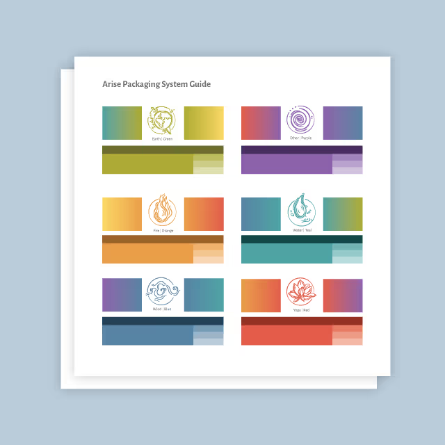
Our goal was not just to update the building’s visual identity but to reimagine its presence in the downtown ecosystem. The building, long seen as monolithic and outdated, needed a perceptual overhaul that would resonate with business owners in the area and attract new tenants, revitalizing its image and energy.
Additionally, 111 N. Main needed a visual guide that would serve as the cornerstone for future branding efforts. We wanted to equip the building’s management team with all the tools necessary to maintain a unified brand presence and lay a foundation for future touchpoints like website development, building signage, and other marketing initiatives.
To reposition 111 N. Main as a contemporary business hub, we knew we needed to embrace its architectural heritage rather than distance the new identity from it. Our team created a visually engaging solution by using the building’s large, recognizable stone columns as a visual framework. We crafted a logo and visual structure for all brand materials that leaned into the building’s distinct form while reimagining it for a modern audience.
The use of columns as a recurring design element reinforces the building’s unique architectural character. The new logo is sleek and geometric, serving as a visual representation of the building’s form. New brand materials were designed to be structured and blocky, mirroring the building’s columns. The color scheme harmonizes with the building’s environment, using construction neutrals and brighter, contrasting natural hues to infuse energy and modernity. Modern, industrial fonts were chosen to evoke a sense of sophistication and strength.


111 N. Main is now set to transcend its legacy with a reimagined visual identity that infuses a contemporary vitality to the space while still honoring its past. With the reinvention of this iconic building, new momentum has been created that will help transform it into a thriving business hub.


Our goal was not just to update the building’s visual identity but to reimagine its presence in the downtown ecosystem. The building, long seen as monolithic and outdated, needed a perceptual overhaul that would resonate with business owners in the area and attract new tenants, revitalizing its image and energy.
Additionally, 111 N. Main needed a visual guide that would serve as the cornerstone for future branding efforts. We wanted to equip the building’s management team with all the tools necessary to maintain a unified brand presence and lay a foundation for future touchpoints like website development, building signage, and other marketing initiatives.

To reposition 111 N. Main as a contemporary business hub, we knew we needed to embrace its architectural heritage rather than distance the new identity from it. Our team created a visually engaging solution by using the building’s large, recognizable stone columns as a visual framework. We crafted a logo and visual structure for all brand materials that leaned into the building’s distinct form while reimagining it for a modern audience.
The use of columns as a recurring design element reinforces the building’s unique architectural character. The new logo is sleek and geometric, serving as a visual representation of the building’s form. New brand materials were designed to be structured and blocky, mirroring the building’s columns. The color scheme harmonizes with the building’s environment, using construction neutrals and brighter, contrasting natural hues to infuse energy and modernity. Modern, industrial fonts were chosen to evoke a sense of sophistication and strength.
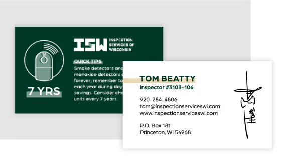

111 N. Main is now set to transcend its legacy with a reimagined visual identity that infuses a contemporary vitality to the space while still honoring its past. With the reinvention of this iconic building, new momentum has been created that will help transform it into a thriving business hub.
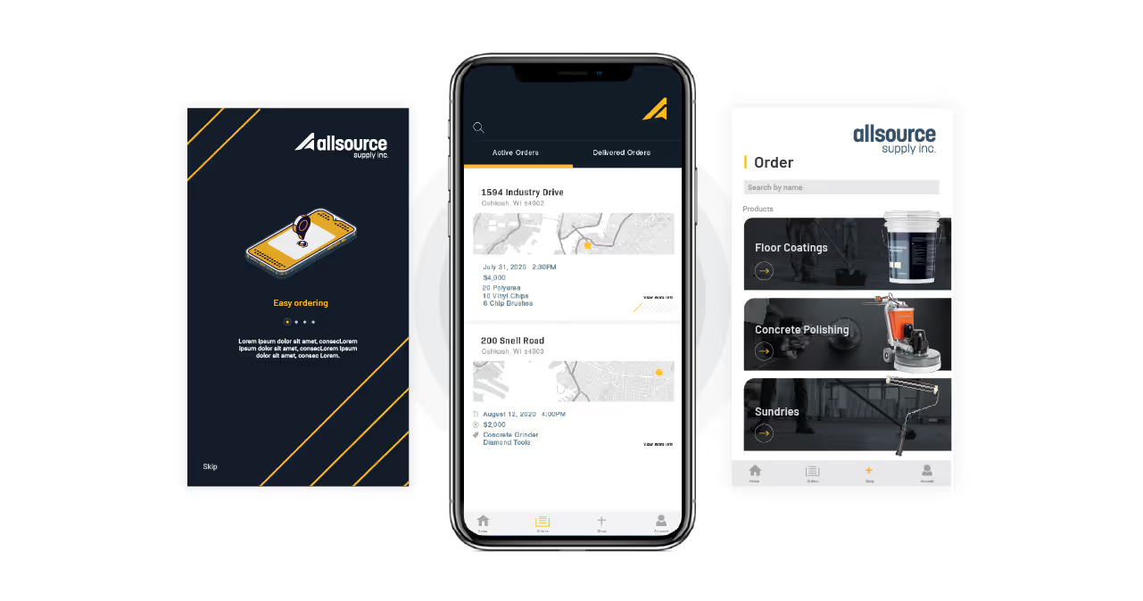


Our goal was not just to update the building’s visual identity but to reimagine its presence in the downtown ecosystem. The building, long seen as monolithic and outdated, needed a perceptual overhaul that would resonate with business owners in the area and attract new tenants, revitalizing its image and energy.
Additionally, 111 N. Main needed a visual guide that would serve as the cornerstone for future branding efforts. We wanted to equip the building’s management team with all the tools necessary to maintain a unified brand presence and lay a foundation for future touchpoints like website development, building signage, and other marketing initiatives.


To reposition 111 N. Main as a contemporary business hub, we knew we needed to embrace its architectural heritage rather than distance the new identity from it. Our team created a visually engaging solution by using the building’s large, recognizable stone columns as a visual framework. We crafted a logo and visual structure for all brand materials that leaned into the building’s distinct form while reimagining it for a modern audience.
The use of columns as a recurring design element reinforces the building’s unique architectural character. The new logo is sleek and geometric, serving as a visual representation of the building’s form. New brand materials were designed to be structured and blocky, mirroring the building’s columns. The color scheme harmonizes with the building’s environment, using construction neutrals and brighter, contrasting natural hues to infuse energy and modernity. Modern, industrial fonts were chosen to evoke a sense of sophistication and strength.


111 N. Main is now set to transcend its legacy with a reimagined visual identity that infuses a contemporary vitality to the space while still honoring its past. With the reinvention of this iconic building, new momentum has been created that will help transform it into a thriving business hub.


Our goal was not just to update the building’s visual identity but to reimagine its presence in the downtown ecosystem. The building, long seen as monolithic and outdated, needed a perceptual overhaul that would resonate with business owners in the area and attract new tenants, revitalizing its image and energy.
Additionally, 111 N. Main needed a visual guide that would serve as the cornerstone for future branding efforts. We wanted to equip the building’s management team with all the tools necessary to maintain a unified brand presence and lay a foundation for future touchpoints like website development, building signage, and other marketing initiatives.


To reposition 111 N. Main as a contemporary business hub, we knew we needed to embrace its architectural heritage rather than distance the new identity from it. Our team created a visually engaging solution by using the building’s large, recognizable stone columns as a visual framework. We crafted a logo and visual structure for all brand materials that leaned into the building’s distinct form while reimagining it for a modern audience.
The use of columns as a recurring design element reinforces the building’s unique architectural character. The new logo is sleek and geometric, serving as a visual representation of the building’s form. New brand materials were designed to be structured and blocky, mirroring the building’s columns. The color scheme harmonizes with the building’s environment, using construction neutrals and brighter, contrasting natural hues to infuse energy and modernity. Modern, industrial fonts were chosen to evoke a sense of sophistication and strength.

111 N. Main is now set to transcend its legacy with a reimagined visual identity that infuses a contemporary vitality to the space while still honoring its past. With the reinvention of this iconic building, new momentum has been created that will help transform it into a thriving business hub.


Our goal was not just to update the building’s visual identity but to reimagine its presence in the downtown ecosystem. The building, long seen as monolithic and outdated, needed a perceptual overhaul that would resonate with business owners in the area and attract new tenants, revitalizing its image and energy.
Additionally, 111 N. Main needed a visual guide that would serve as the cornerstone for future branding efforts. We wanted to equip the building’s management team with all the tools necessary to maintain a unified brand presence and lay a foundation for future touchpoints like website development, building signage, and other marketing initiatives.

To reposition 111 N. Main as a contemporary business hub, we knew we needed to embrace its architectural heritage rather than distance the new identity from it. Our team created a visually engaging solution by using the building’s large, recognizable stone columns as a visual framework. We crafted a logo and visual structure for all brand materials that leaned into the building’s distinct form while reimagining it for a modern audience.
The use of columns as a recurring design element reinforces the building’s unique architectural character. The new logo is sleek and geometric, serving as a visual representation of the building’s form. New brand materials were designed to be structured and blocky, mirroring the building’s columns. The color scheme harmonizes with the building’s environment, using construction neutrals and brighter, contrasting natural hues to infuse energy and modernity. Modern, industrial fonts were chosen to evoke a sense of sophistication and strength.


111 N. Main is now set to transcend its legacy with a reimagined visual identity that infuses a contemporary vitality to the space while still honoring its past. With the reinvention of this iconic building, new momentum has been created that will help transform it into a thriving business hub.


111 N. Main is now set to transcend its legacy with a reimagined visual identity that infuses a contemporary vitality to the space while still honoring its past. With the reinvention of this iconic building, new momentum has been created that will help transform it into a thriving business hub.
Our goal was not just to update the building’s visual identity but to reimagine its presence in the downtown ecosystem. The building, long seen as monolithic and outdated, needed a perceptual overhaul that would resonate with business owners in the area and attract new tenants, revitalizing its image and energy.
Additionally, 111 N. Main needed a visual guide that would serve as the cornerstone for future branding efforts. We wanted to equip the building’s management team with all the tools necessary to maintain a unified brand presence and lay a foundation for future touchpoints like website development, building signage, and other marketing initiatives.

To reposition 111 N. Main as a contemporary business hub, we knew we needed to embrace its architectural heritage rather than distance the new identity from it. Our team created a visually engaging solution by using the building’s large, recognizable stone columns as a visual framework. We crafted a logo and visual structure for all brand materials that leaned into the building’s distinct form while reimagining it for a modern audience.
The use of columns as a recurring design element reinforces the building’s unique architectural character. The new logo is sleek and geometric, serving as a visual representation of the building’s form. New brand materials were designed to be structured and blocky, mirroring the building’s columns. The color scheme harmonizes with the building’s environment, using construction neutrals and brighter, contrasting natural hues to infuse energy and modernity. Modern, industrial fonts were chosen to evoke a sense of sophistication and strength.

111 N. Main is now set to transcend its legacy with a reimagined visual identity that infuses a contemporary vitality to the space while still honoring its past. With the reinvention of this iconic building, new momentum has been created that will help transform it into a thriving business hub.

111 N. Main is now set to transcend its legacy with a reimagined visual identity that infuses a contemporary vitality to the space while still honoring its past. With the reinvention of this iconic building, new momentum has been created that will help transform it into a thriving business hub.

To reposition 111 N. Main as a contemporary business hub, we knew we needed to embrace its architectural heritage rather than distance the new identity from it. Our team created a visually engaging solution by using the building’s large, recognizable stone columns as a visual framework. We crafted a logo and visual structure for all brand materials that leaned into the building’s distinct form while reimagining it for a modern audience.
The use of columns as a recurring design element reinforces the building’s unique architectural character. The new logo is sleek and geometric, serving as a visual representation of the building’s form. New brand materials were designed to be structured and blocky, mirroring the building’s columns. The color scheme harmonizes with the building’s environment, using construction neutrals and brighter, contrasting natural hues to infuse energy and modernity. Modern, industrial fonts were chosen to evoke a sense of sophistication and strength.

Our goal was not just to update the building’s visual identity but to reimagine its presence in the downtown ecosystem. The building, long seen as monolithic and outdated, needed a perceptual overhaul that would resonate with business owners in the area and attract new tenants, revitalizing its image and energy.
Additionally, 111 N. Main needed a visual guide that would serve as the cornerstone for future branding efforts. We wanted to equip the building’s management team with all the tools necessary to maintain a unified brand presence and lay a foundation for future touchpoints like website development, building signage, and other marketing initiatives.

111 N. Main is now set to transcend its legacy with a reimagined visual identity that infuses a contemporary vitality to the space while still honoring its past. With the reinvention of this iconic building, new momentum has been created that will help transform it into a thriving business hub.


111 N. Main is now set to transcend its legacy with a reimagined visual identity that infuses a contemporary vitality to the space while still honoring its past. With the reinvention of this iconic building, new momentum has been created that will help transform it into a thriving business hub.


Our goal was not just to update the building’s visual identity but to reimagine its presence in the downtown ecosystem. The building, long seen as monolithic and outdated, needed a perceptual overhaul that would resonate with business owners in the area and attract new tenants, revitalizing its image and energy.
Additionally, 111 N. Main needed a visual guide that would serve as the cornerstone for future branding efforts. We wanted to equip the building’s management team with all the tools necessary to maintain a unified brand presence and lay a foundation for future touchpoints like website development, building signage, and other marketing initiatives.


To reposition 111 N. Main as a contemporary business hub, we knew we needed to embrace its architectural heritage rather than distance the new identity from it. Our team created a visually engaging solution by using the building’s large, recognizable stone columns as a visual framework. We crafted a logo and visual structure for all brand materials that leaned into the building’s distinct form while reimagining it for a modern audience.
The use of columns as a recurring design element reinforces the building’s unique architectural character. The new logo is sleek and geometric, serving as a visual representation of the building’s form. New brand materials were designed to be structured and blocky, mirroring the building’s columns. The color scheme harmonizes with the building’s environment, using construction neutrals and brighter, contrasting natural hues to infuse energy and modernity. Modern, industrial fonts were chosen to evoke a sense of sophistication and strength.

111 N. Main is now set to transcend its legacy with a reimagined visual identity that infuses a contemporary vitality to the space while still honoring its past. With the reinvention of this iconic building, new momentum has been created that will help transform it into a thriving business hub.


Our goal was not just to update the building’s visual identity but to reimagine its presence in the downtown ecosystem. The building, long seen as monolithic and outdated, needed a perceptual overhaul that would resonate with business owners in the area and attract new tenants, revitalizing its image and energy.
Additionally, 111 N. Main needed a visual guide that would serve as the cornerstone for future branding efforts. We wanted to equip the building’s management team with all the tools necessary to maintain a unified brand presence and lay a foundation for future touchpoints like website development, building signage, and other marketing initiatives.
To reposition 111 N. Main as a contemporary business hub, we knew we needed to embrace its architectural heritage rather than distance the new identity from it. Our team created a visually engaging solution by using the building’s large, recognizable stone columns as a visual framework. We crafted a logo and visual structure for all brand materials that leaned into the building’s distinct form while reimagining it for a modern audience.
The use of columns as a recurring design element reinforces the building’s unique architectural character. The new logo is sleek and geometric, serving as a visual representation of the building’s form. New brand materials were designed to be structured and blocky, mirroring the building’s columns. The color scheme harmonizes with the building’s environment, using construction neutrals and brighter, contrasting natural hues to infuse energy and modernity. Modern, industrial fonts were chosen to evoke a sense of sophistication and strength.


111 N. Main is now set to transcend its legacy with a reimagined visual identity that infuses a contemporary vitality to the space while still honoring its past. With the reinvention of this iconic building, new momentum has been created that will help transform it into a thriving business hub.


Our goal was not just to update the building’s visual identity but to reimagine its presence in the downtown ecosystem. The building, long seen as monolithic and outdated, needed a perceptual overhaul that would resonate with business owners in the area and attract new tenants, revitalizing its image and energy.
Additionally, 111 N. Main needed a visual guide that would serve as the cornerstone for future branding efforts. We wanted to equip the building’s management team with all the tools necessary to maintain a unified brand presence and lay a foundation for future touchpoints like website development, building signage, and other marketing initiatives.
111 N. Main is now set to transcend its legacy with a reimagined visual identity that infuses a contemporary vitality to the space while still honoring its past. With the reinvention of this iconic building, new momentum has been created that will help transform it into a thriving business hub.

To reposition 111 N. Main as a contemporary business hub, we knew we needed to embrace its architectural heritage rather than distance the new identity from it. Our team created a visually engaging solution by using the building’s large, recognizable stone columns as a visual framework. We crafted a logo and visual structure for all brand materials that leaned into the building’s distinct form while reimagining it for a modern audience.
The use of columns as a recurring design element reinforces the building’s unique architectural character. The new logo is sleek and geometric, serving as a visual representation of the building’s form. New brand materials were designed to be structured and blocky, mirroring the building’s columns. The color scheme harmonizes with the building’s environment, using construction neutrals and brighter, contrasting natural hues to infuse energy and modernity. Modern, industrial fonts were chosen to evoke a sense of sophistication and strength.


111 N. Main is now set to transcend its legacy with a reimagined visual identity that infuses a contemporary vitality to the space while still honoring its past. With the reinvention of this iconic building, new momentum has been created that will help transform it into a thriving business hub.


Our goal was not just to update the building’s visual identity but to reimagine its presence in the downtown ecosystem. The building, long seen as monolithic and outdated, needed a perceptual overhaul that would resonate with business owners in the area and attract new tenants, revitalizing its image and energy.
Additionally, 111 N. Main needed a visual guide that would serve as the cornerstone for future branding efforts. We wanted to equip the building’s management team with all the tools necessary to maintain a unified brand presence and lay a foundation for future touchpoints like website development, building signage, and other marketing initiatives.
To reposition 111 N. Main as a contemporary business hub, we knew we needed to embrace its architectural heritage rather than distance the new identity from it. Our team created a visually engaging solution by using the building’s large, recognizable stone columns as a visual framework. We crafted a logo and visual structure for all brand materials that leaned into the building’s distinct form while reimagining it for a modern audience.
The use of columns as a recurring design element reinforces the building’s unique architectural character. The new logo is sleek and geometric, serving as a visual representation of the building’s form. New brand materials were designed to be structured and blocky, mirroring the building’s columns. The color scheme harmonizes with the building’s environment, using construction neutrals and brighter, contrasting natural hues to infuse energy and modernity. Modern, industrial fonts were chosen to evoke a sense of sophistication and strength.


111 N. Main is now set to transcend its legacy with a reimagined visual identity that infuses a contemporary vitality to the space while still honoring its past. With the reinvention of this iconic building, new momentum has been created that will help transform it into a thriving business hub.


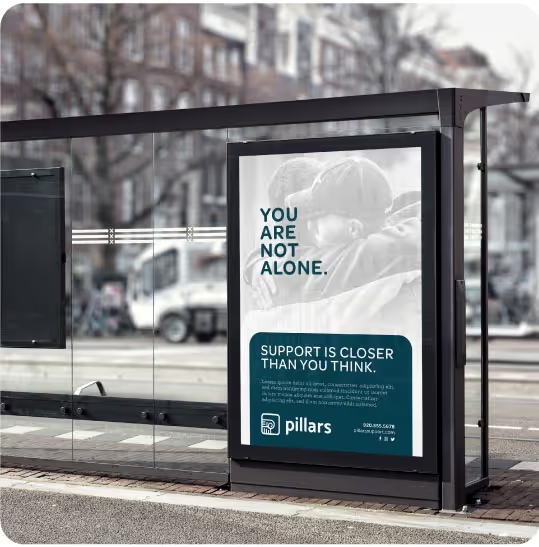
Our goal was not just to update the building’s visual identity but to reimagine its presence in the downtown ecosystem. The building, long seen as monolithic and outdated, needed a perceptual overhaul that would resonate with business owners in the area and attract new tenants, revitalizing its image and energy.
Additionally, 111 N. Main needed a visual guide that would serve as the cornerstone for future branding efforts. We wanted to equip the building’s management team with all the tools necessary to maintain a unified brand presence and lay a foundation for future touchpoints like website development, building signage, and other marketing initiatives.

To reposition 111 N. Main as a contemporary business hub, we knew we needed to embrace its architectural heritage rather than distance the new identity from it. Our team created a visually engaging solution by using the building’s large, recognizable stone columns as a visual framework. We crafted a logo and visual structure for all brand materials that leaned into the building’s distinct form while reimagining it for a modern audience.
The use of columns as a recurring design element reinforces the building’s unique architectural character. The new logo is sleek and geometric, serving as a visual representation of the building’s form. New brand materials were designed to be structured and blocky, mirroring the building’s columns. The color scheme harmonizes with the building’s environment, using construction neutrals and brighter, contrasting natural hues to infuse energy and modernity. Modern, industrial fonts were chosen to evoke a sense of sophistication and strength.

111 N. Main is now set to transcend its legacy with a reimagined visual identity that infuses a contemporary vitality to the space while still honoring its past. With the reinvention of this iconic building, new momentum has been created that will help transform it into a thriving business hub.


Our goal was not just to update the building’s visual identity but to reimagine its presence in the downtown ecosystem. The building, long seen as monolithic and outdated, needed a perceptual overhaul that would resonate with business owners in the area and attract new tenants, revitalizing its image and energy.
Additionally, 111 N. Main needed a visual guide that would serve as the cornerstone for future branding efforts. We wanted to equip the building’s management team with all the tools necessary to maintain a unified brand presence and lay a foundation for future touchpoints like website development, building signage, and other marketing initiatives.

To reposition 111 N. Main as a contemporary business hub, we knew we needed to embrace its architectural heritage rather than distance the new identity from it. Our team created a visually engaging solution by using the building’s large, recognizable stone columns as a visual framework. We crafted a logo and visual structure for all brand materials that leaned into the building’s distinct form while reimagining it for a modern audience.
The use of columns as a recurring design element reinforces the building’s unique architectural character. The new logo is sleek and geometric, serving as a visual representation of the building’s form. New brand materials were designed to be structured and blocky, mirroring the building’s columns. The color scheme harmonizes with the building’s environment, using construction neutrals and brighter, contrasting natural hues to infuse energy and modernity. Modern, industrial fonts were chosen to evoke a sense of sophistication and strength.


111 N. Main is now set to transcend its legacy with a reimagined visual identity that infuses a contemporary vitality to the space while still honoring its past. With the reinvention of this iconic building, new momentum has been created that will help transform it into a thriving business hub.


