


After creating Computer Corner's visual identity a few years earlier, the Quill team was tasked with leveraging the established visual identity and creating design and layout for a new company website. The challenge was to differentiate the business from the often bland and overly corporate aesthetic typical of its competitors and create a web presence that felt modern, youthful, friendly, and accessible to customers.

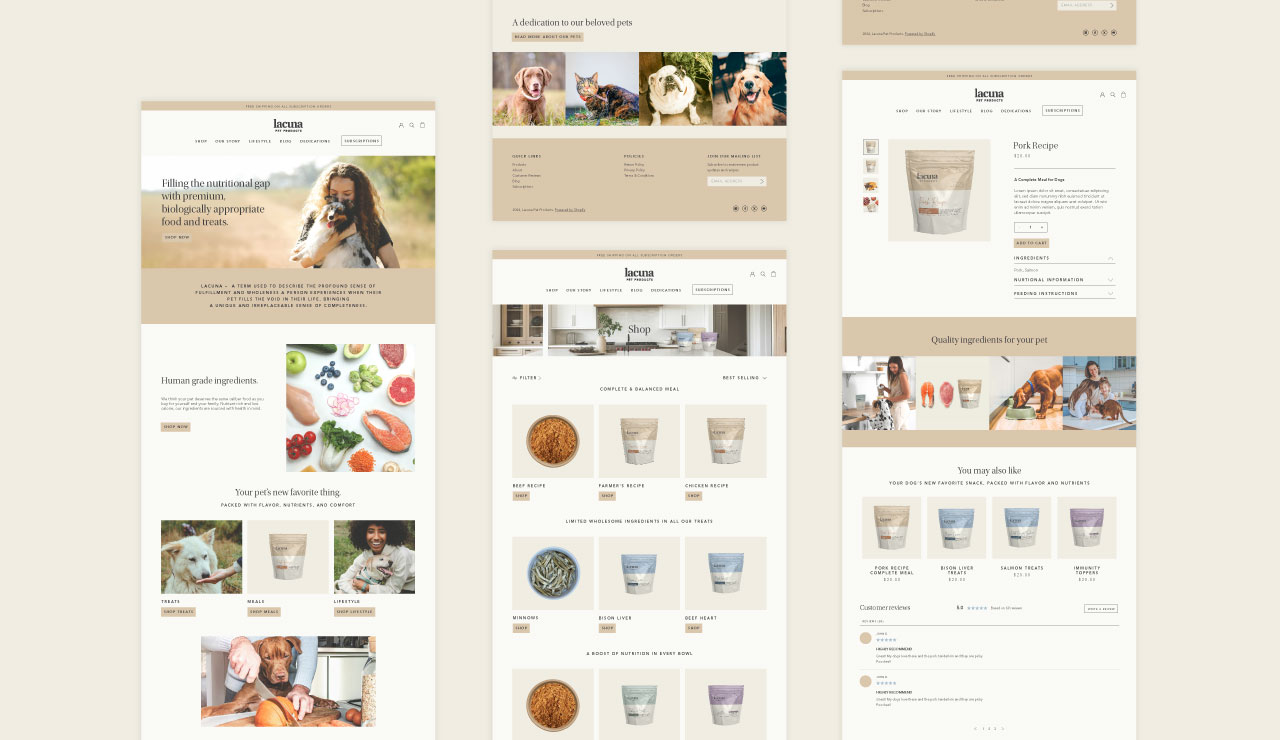

In the initial rebranding for Computer Corner, Quill created the slogan “We’re in your corner,” which conveyed empathy by acknowledging frustrations that many people have when dealing with technology while also highlighting the company’s local presence. This messaging is emphasized in the website copy to inject Computer Corner’s mission at different touchpoints as their audiences navigate the site.
We also created modern, simply illustrated elements with a youthful and confident energy. These illustrations serve as visual representations of Computer Corner’s services, which provide clarity and ease of understanding for website visitors. We also designed centerpiece illustrations of smiling people to emphasize the business’s people-centric approach and dedication to making technology help accessible and user-friendly. Additionally, we prioritized the presentation of information in easily digestible formats using rounded columns and those same illustrated elements to continue a throughline of friendly accessibility.
While photographs were used sparingly, we made sure that when they were employed, they depicted real people actively working with technology, as well as real images of the buildings they work out of. This approach conveys Computer Corner’s expertise and local presence.

Computer Corner’s new website centers on approachability, making it easy for visitors to engage with the brand. The new site also stands out markedly from its competition by avoiding bland corporate visuals in favor of friendly, bright, and charismatic aesthetics. Computer Corner now stands firmly differentiated in the industry, attracting new customers by showcasing their expertise and professionalism without feeling stuffy.


After creating Computer Corner's visual identity a few years earlier, the Quill team was tasked with leveraging the established visual identity and creating design and layout for a new company website. The challenge was to differentiate the business from the often bland and overly corporate aesthetic typical of its competitors and create a web presence that felt modern, youthful, friendly, and accessible to customers.


In the initial rebranding for Computer Corner, Quill created the slogan “We’re in your corner,” which conveyed empathy by acknowledging frustrations that many people have when dealing with technology while also highlighting the company’s local presence. This messaging is emphasized in the website copy to inject Computer Corner’s mission at different touchpoints as their audiences navigate the site.
We also created modern, simply illustrated elements with a youthful and confident energy. These illustrations serve as visual representations of Computer Corner’s services, which provide clarity and ease of understanding for website visitors. We also designed centerpiece illustrations of smiling people to emphasize the business’s people-centric approach and dedication to making technology help accessible and user-friendly. Additionally, we prioritized the presentation of information in easily digestible formats using rounded columns and those same illustrated elements to continue a throughline of friendly accessibility.
While photographs were used sparingly, we made sure that when they were employed, they depicted real people actively working with technology, as well as real images of the buildings they work out of. This approach conveys Computer Corner’s expertise and local presence.


Computer Corner’s new website centers on approachability, making it easy for visitors to engage with the brand. The new site also stands out markedly from its competition by avoiding bland corporate visuals in favor of friendly, bright, and charismatic aesthetics. Computer Corner now stands firmly differentiated in the industry, attracting new customers by showcasing their expertise and professionalism without feeling stuffy.


After creating Computer Corner's visual identity a few years earlier, the Quill team was tasked with leveraging the established visual identity and creating design and layout for a new company website. The challenge was to differentiate the business from the often bland and overly corporate aesthetic typical of its competitors and create a web presence that felt modern, youthful, friendly, and accessible to customers.


In the initial rebranding for Computer Corner, Quill created the slogan “We’re in your corner,” which conveyed empathy by acknowledging frustrations that many people have when dealing with technology while also highlighting the company’s local presence. This messaging is emphasized in the website copy to inject Computer Corner’s mission at different touchpoints as their audiences navigate the site.
We also created modern, simply illustrated elements with a youthful and confident energy. These illustrations serve as visual representations of Computer Corner’s services, which provide clarity and ease of understanding for website visitors. We also designed centerpiece illustrations of smiling people to emphasize the business’s people-centric approach and dedication to making technology help accessible and user-friendly. Additionally, we prioritized the presentation of information in easily digestible formats using rounded columns and those same illustrated elements to continue a throughline of friendly accessibility.
While photographs were used sparingly, we made sure that when they were employed, they depicted real people actively working with technology, as well as real images of the buildings they work out of. This approach conveys Computer Corner’s expertise and local presence.

Computer Corner’s new website centers on approachability, making it easy for visitors to engage with the brand. The new site also stands out markedly from its competition by avoiding bland corporate visuals in favor of friendly, bright, and charismatic aesthetics. Computer Corner now stands firmly differentiated in the industry, attracting new customers by showcasing their expertise and professionalism without feeling stuffy.


After creating Computer Corner's visual identity a few years earlier, the Quill team was tasked with leveraging the established visual identity and creating design and layout for a new company website. The challenge was to differentiate the business from the often bland and overly corporate aesthetic typical of its competitors and create a web presence that felt modern, youthful, friendly, and accessible to customers.

In the initial rebranding for Computer Corner, Quill created the slogan “We’re in your corner,” which conveyed empathy by acknowledging frustrations that many people have when dealing with technology while also highlighting the company’s local presence. This messaging is emphasized in the website copy to inject Computer Corner’s mission at different touchpoints as their audiences navigate the site.
We also created modern, simply illustrated elements with a youthful and confident energy. These illustrations serve as visual representations of Computer Corner’s services, which provide clarity and ease of understanding for website visitors. We also designed centerpiece illustrations of smiling people to emphasize the business’s people-centric approach and dedication to making technology help accessible and user-friendly. Additionally, we prioritized the presentation of information in easily digestible formats using rounded columns and those same illustrated elements to continue a throughline of friendly accessibility.
While photographs were used sparingly, we made sure that when they were employed, they depicted real people actively working with technology, as well as real images of the buildings they work out of. This approach conveys Computer Corner’s expertise and local presence.


Computer Corner’s new website centers on approachability, making it easy for visitors to engage with the brand. The new site also stands out markedly from its competition by avoiding bland corporate visuals in favor of friendly, bright, and charismatic aesthetics. Computer Corner now stands firmly differentiated in the industry, attracting new customers by showcasing their expertise and professionalism without feeling stuffy.


After creating Computer Corner's visual identity a few years earlier, the Quill team was tasked with leveraging the established visual identity and creating design and layout for a new company website. The challenge was to differentiate the business from the often bland and overly corporate aesthetic typical of its competitors and create a web presence that felt modern, youthful, friendly, and accessible to customers.


In the initial rebranding for Computer Corner, Quill created the slogan “We’re in your corner,” which conveyed empathy by acknowledging frustrations that many people have when dealing with technology while also highlighting the company’s local presence. This messaging is emphasized in the website copy to inject Computer Corner’s mission at different touchpoints as their audiences navigate the site.
We also created modern, simply illustrated elements with a youthful and confident energy. These illustrations serve as visual representations of Computer Corner’s services, which provide clarity and ease of understanding for website visitors. We also designed centerpiece illustrations of smiling people to emphasize the business’s people-centric approach and dedication to making technology help accessible and user-friendly. Additionally, we prioritized the presentation of information in easily digestible formats using rounded columns and those same illustrated elements to continue a throughline of friendly accessibility.
While photographs were used sparingly, we made sure that when they were employed, they depicted real people actively working with technology, as well as real images of the buildings they work out of. This approach conveys Computer Corner’s expertise and local presence.


Computer Corner’s new website centers on approachability, making it easy for visitors to engage with the brand. The new site also stands out markedly from its competition by avoiding bland corporate visuals in favor of friendly, bright, and charismatic aesthetics. Computer Corner now stands firmly differentiated in the industry, attracting new customers by showcasing their expertise and professionalism without feeling stuffy.


After creating Computer Corner's visual identity a few years earlier, the Quill team was tasked with leveraging the established visual identity and creating design and layout for a new company website. The challenge was to differentiate the business from the often bland and overly corporate aesthetic typical of its competitors and create a web presence that felt modern, youthful, friendly, and accessible to customers.


In the initial rebranding for Computer Corner, Quill created the slogan “We’re in your corner,” which conveyed empathy by acknowledging frustrations that many people have when dealing with technology while also highlighting the company’s local presence. This messaging is emphasized in the website copy to inject Computer Corner’s mission at different touchpoints as their audiences navigate the site.
We also created modern, simply illustrated elements with a youthful and confident energy. These illustrations serve as visual representations of Computer Corner’s services, which provide clarity and ease of understanding for website visitors. We also designed centerpiece illustrations of smiling people to emphasize the business’s people-centric approach and dedication to making technology help accessible and user-friendly. Additionally, we prioritized the presentation of information in easily digestible formats using rounded columns and those same illustrated elements to continue a throughline of friendly accessibility.
While photographs were used sparingly, we made sure that when they were employed, they depicted real people actively working with technology, as well as real images of the buildings they work out of. This approach conveys Computer Corner’s expertise and local presence.


Computer Corner’s new website centers on approachability, making it easy for visitors to engage with the brand. The new site also stands out markedly from its competition by avoiding bland corporate visuals in favor of friendly, bright, and charismatic aesthetics. Computer Corner now stands firmly differentiated in the industry, attracting new customers by showcasing their expertise and professionalism without feeling stuffy.


After creating Computer Corner's visual identity a few years earlier, the Quill team was tasked with leveraging the established visual identity and creating design and layout for a new company website. The challenge was to differentiate the business from the often bland and overly corporate aesthetic typical of its competitors and create a web presence that felt modern, youthful, friendly, and accessible to customers.


In the initial rebranding for Computer Corner, Quill created the slogan “We’re in your corner,” which conveyed empathy by acknowledging frustrations that many people have when dealing with technology while also highlighting the company’s local presence. This messaging is emphasized in the website copy to inject Computer Corner’s mission at different touchpoints as their audiences navigate the site.
We also created modern, simply illustrated elements with a youthful and confident energy. These illustrations serve as visual representations of Computer Corner’s services, which provide clarity and ease of understanding for website visitors. We also designed centerpiece illustrations of smiling people to emphasize the business’s people-centric approach and dedication to making technology help accessible and user-friendly. Additionally, we prioritized the presentation of information in easily digestible formats using rounded columns and those same illustrated elements to continue a throughline of friendly accessibility.
While photographs were used sparingly, we made sure that when they were employed, they depicted real people actively working with technology, as well as real images of the buildings they work out of. This approach conveys Computer Corner’s expertise and local presence.


Computer Corner’s new website centers on approachability, making it easy for visitors to engage with the brand. The new site also stands out markedly from its competition by avoiding bland corporate visuals in favor of friendly, bright, and charismatic aesthetics. Computer Corner now stands firmly differentiated in the industry, attracting new customers by showcasing their expertise and professionalism without feeling stuffy.


After creating Computer Corner's visual identity a few years earlier, the Quill team was tasked with leveraging the established visual identity and creating design and layout for a new company website. The challenge was to differentiate the business from the often bland and overly corporate aesthetic typical of its competitors and create a web presence that felt modern, youthful, friendly, and accessible to customers.


In the initial rebranding for Computer Corner, Quill created the slogan “We’re in your corner,” which conveyed empathy by acknowledging frustrations that many people have when dealing with technology while also highlighting the company’s local presence. This messaging is emphasized in the website copy to inject Computer Corner’s mission at different touchpoints as their audiences navigate the site.
We also created modern, simply illustrated elements with a youthful and confident energy. These illustrations serve as visual representations of Computer Corner’s services, which provide clarity and ease of understanding for website visitors. We also designed centerpiece illustrations of smiling people to emphasize the business’s people-centric approach and dedication to making technology help accessible and user-friendly. Additionally, we prioritized the presentation of information in easily digestible formats using rounded columns and those same illustrated elements to continue a throughline of friendly accessibility.
While photographs were used sparingly, we made sure that when they were employed, they depicted real people actively working with technology, as well as real images of the buildings they work out of. This approach conveys Computer Corner’s expertise and local presence.


After creating Computer Corner's visual identity a few years earlier, the Quill team was tasked with leveraging the established visual identity and creating design and layout for a new company website. The challenge was to differentiate the business from the often bland and overly corporate aesthetic typical of its competitors and create a web presence that felt modern, youthful, friendly, and accessible to customers.
In the initial rebranding for Computer Corner, Quill created the slogan “We’re in your corner,” which conveyed empathy by acknowledging frustrations that many people have when dealing with technology while also highlighting the company’s local presence. This messaging is emphasized in the website copy to inject Computer Corner’s mission at different touchpoints as their audiences navigate the site.
We also created modern, simply illustrated elements with a youthful and confident energy. These illustrations serve as visual representations of Computer Corner’s services, which provide clarity and ease of understanding for website visitors. We also designed centerpiece illustrations of smiling people to emphasize the business’s people-centric approach and dedication to making technology help accessible and user-friendly. Additionally, we prioritized the presentation of information in easily digestible formats using rounded columns and those same illustrated elements to continue a throughline of friendly accessibility.
While photographs were used sparingly, we made sure that when they were employed, they depicted real people actively working with technology, as well as real images of the buildings they work out of. This approach conveys Computer Corner’s expertise and local presence.


Computer Corner’s new website centers on approachability, making it easy for visitors to engage with the brand. The new site also stands out markedly from its competition by avoiding bland corporate visuals in favor of friendly, bright, and charismatic aesthetics. Computer Corner now stands firmly differentiated in the industry, attracting new customers by showcasing their expertise and professionalism without feeling stuffy.


After creating Computer Corner's visual identity a few years earlier, the Quill team was tasked with leveraging the established visual identity and creating design and layout for a new company website. The challenge was to differentiate the business from the often bland and overly corporate aesthetic typical of its competitors and create a web presence that felt modern, youthful, friendly, and accessible to customers.


In the initial rebranding for Computer Corner, Quill created the slogan “We’re in your corner,” which conveyed empathy by acknowledging frustrations that many people have when dealing with technology while also highlighting the company’s local presence. This messaging is emphasized in the website copy to inject Computer Corner’s mission at different touchpoints as their audiences navigate the site.
We also created modern, simply illustrated elements with a youthful and confident energy. These illustrations serve as visual representations of Computer Corner’s services, which provide clarity and ease of understanding for website visitors. We also designed centerpiece illustrations of smiling people to emphasize the business’s people-centric approach and dedication to making technology help accessible and user-friendly. Additionally, we prioritized the presentation of information in easily digestible formats using rounded columns and those same illustrated elements to continue a throughline of friendly accessibility.
While photographs were used sparingly, we made sure that when they were employed, they depicted real people actively working with technology, as well as real images of the buildings they work out of. This approach conveys Computer Corner’s expertise and local presence.
Computer Corner’s new website centers on approachability, making it easy for visitors to engage with the brand. The new site also stands out markedly from its competition by avoiding bland corporate visuals in favor of friendly, bright, and charismatic aesthetics. Computer Corner now stands firmly differentiated in the industry, attracting new customers by showcasing their expertise and professionalism without feeling stuffy.

After creating Computer Corner's visual identity a few years earlier, the Quill team was tasked with leveraging the established visual identity and creating design and layout for a new company website. The challenge was to differentiate the business from the often bland and overly corporate aesthetic typical of its competitors and create a web presence that felt modern, youthful, friendly, and accessible to customers.


In the initial rebranding for Computer Corner, Quill created the slogan “We’re in your corner,” which conveyed empathy by acknowledging frustrations that many people have when dealing with technology while also highlighting the company’s local presence. This messaging is emphasized in the website copy to inject Computer Corner’s mission at different touchpoints as their audiences navigate the site.
We also created modern, simply illustrated elements with a youthful and confident energy. These illustrations serve as visual representations of Computer Corner’s services, which provide clarity and ease of understanding for website visitors. We also designed centerpiece illustrations of smiling people to emphasize the business’s people-centric approach and dedication to making technology help accessible and user-friendly. Additionally, we prioritized the presentation of information in easily digestible formats using rounded columns and those same illustrated elements to continue a throughline of friendly accessibility.
While photographs were used sparingly, we made sure that when they were employed, they depicted real people actively working with technology, as well as real images of the buildings they work out of. This approach conveys Computer Corner’s expertise and local presence.


Computer Corner’s new website centers on approachability, making it easy for visitors to engage with the brand. The new site also stands out markedly from its competition by avoiding bland corporate visuals in favor of friendly, bright, and charismatic aesthetics. Computer Corner now stands firmly differentiated in the industry, attracting new customers by showcasing their expertise and professionalism without feeling stuffy.


After creating Computer Corner's visual identity a few years earlier, the Quill team was tasked with leveraging the established visual identity and creating design and layout for a new company website. The challenge was to differentiate the business from the often bland and overly corporate aesthetic typical of its competitors and create a web presence that felt modern, youthful, friendly, and accessible to customers.

In the initial rebranding for Computer Corner, Quill created the slogan “We’re in your corner,” which conveyed empathy by acknowledging frustrations that many people have when dealing with technology while also highlighting the company’s local presence. This messaging is emphasized in the website copy to inject Computer Corner’s mission at different touchpoints as their audiences navigate the site.
We also created modern, simply illustrated elements with a youthful and confident energy. These illustrations serve as visual representations of Computer Corner’s services, which provide clarity and ease of understanding for website visitors. We also designed centerpiece illustrations of smiling people to emphasize the business’s people-centric approach and dedication to making technology help accessible and user-friendly. Additionally, we prioritized the presentation of information in easily digestible formats using rounded columns and those same illustrated elements to continue a throughline of friendly accessibility.
While photographs were used sparingly, we made sure that when they were employed, they depicted real people actively working with technology, as well as real images of the buildings they work out of. This approach conveys Computer Corner’s expertise and local presence.

Computer Corner’s new website centers on approachability, making it easy for visitors to engage with the brand. The new site also stands out markedly from its competition by avoiding bland corporate visuals in favor of friendly, bright, and charismatic aesthetics. Computer Corner now stands firmly differentiated in the industry, attracting new customers by showcasing their expertise and professionalism without feeling stuffy.


After creating Computer Corner's visual identity a few years earlier, the Quill team was tasked with leveraging the established visual identity and creating design and layout for a new company website. The challenge was to differentiate the business from the often bland and overly corporate aesthetic typical of its competitors and create a web presence that felt modern, youthful, friendly, and accessible to customers.


In the initial rebranding for Computer Corner, Quill created the slogan “We’re in your corner,” which conveyed empathy by acknowledging frustrations that many people have when dealing with technology while also highlighting the company’s local presence. This messaging is emphasized in the website copy to inject Computer Corner’s mission at different touchpoints as their audiences navigate the site.
We also created modern, simply illustrated elements with a youthful and confident energy. These illustrations serve as visual representations of Computer Corner’s services, which provide clarity and ease of understanding for website visitors. We also designed centerpiece illustrations of smiling people to emphasize the business’s people-centric approach and dedication to making technology help accessible and user-friendly. Additionally, we prioritized the presentation of information in easily digestible formats using rounded columns and those same illustrated elements to continue a throughline of friendly accessibility.
While photographs were used sparingly, we made sure that when they were employed, they depicted real people actively working with technology, as well as real images of the buildings they work out of. This approach conveys Computer Corner’s expertise and local presence.


Computer Corner’s new website centers on approachability, making it easy for visitors to engage with the brand. The new site also stands out markedly from its competition by avoiding bland corporate visuals in favor of friendly, bright, and charismatic aesthetics. Computer Corner now stands firmly differentiated in the industry, attracting new customers by showcasing their expertise and professionalism without feeling stuffy.


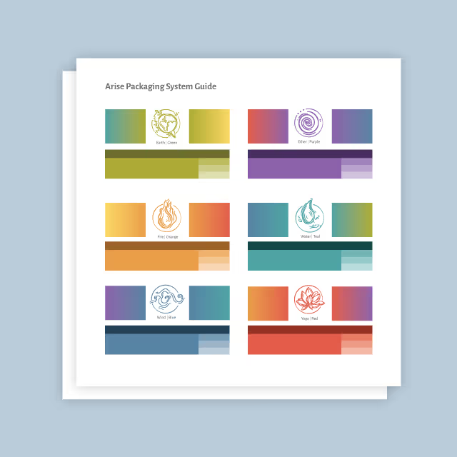
After creating Computer Corner's visual identity a few years earlier, the Quill team was tasked with leveraging the established visual identity and creating design and layout for a new company website. The challenge was to differentiate the business from the often bland and overly corporate aesthetic typical of its competitors and create a web presence that felt modern, youthful, friendly, and accessible to customers.
In the initial rebranding for Computer Corner, Quill created the slogan “We’re in your corner,” which conveyed empathy by acknowledging frustrations that many people have when dealing with technology while also highlighting the company’s local presence. This messaging is emphasized in the website copy to inject Computer Corner’s mission at different touchpoints as their audiences navigate the site.
We also created modern, simply illustrated elements with a youthful and confident energy. These illustrations serve as visual representations of Computer Corner’s services, which provide clarity and ease of understanding for website visitors. We also designed centerpiece illustrations of smiling people to emphasize the business’s people-centric approach and dedication to making technology help accessible and user-friendly. Additionally, we prioritized the presentation of information in easily digestible formats using rounded columns and those same illustrated elements to continue a throughline of friendly accessibility.
While photographs were used sparingly, we made sure that when they were employed, they depicted real people actively working with technology, as well as real images of the buildings they work out of. This approach conveys Computer Corner’s expertise and local presence.


Computer Corner’s new website centers on approachability, making it easy for visitors to engage with the brand. The new site also stands out markedly from its competition by avoiding bland corporate visuals in favor of friendly, bright, and charismatic aesthetics. Computer Corner now stands firmly differentiated in the industry, attracting new customers by showcasing their expertise and professionalism without feeling stuffy.


After creating Computer Corner's visual identity a few years earlier, the Quill team was tasked with leveraging the established visual identity and creating design and layout for a new company website. The challenge was to differentiate the business from the often bland and overly corporate aesthetic typical of its competitors and create a web presence that felt modern, youthful, friendly, and accessible to customers.

In the initial rebranding for Computer Corner, Quill created the slogan “We’re in your corner,” which conveyed empathy by acknowledging frustrations that many people have when dealing with technology while also highlighting the company’s local presence. This messaging is emphasized in the website copy to inject Computer Corner’s mission at different touchpoints as their audiences navigate the site.
We also created modern, simply illustrated elements with a youthful and confident energy. These illustrations serve as visual representations of Computer Corner’s services, which provide clarity and ease of understanding for website visitors. We also designed centerpiece illustrations of smiling people to emphasize the business’s people-centric approach and dedication to making technology help accessible and user-friendly. Additionally, we prioritized the presentation of information in easily digestible formats using rounded columns and those same illustrated elements to continue a throughline of friendly accessibility.
While photographs were used sparingly, we made sure that when they were employed, they depicted real people actively working with technology, as well as real images of the buildings they work out of. This approach conveys Computer Corner’s expertise and local presence.
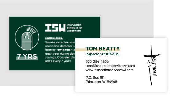

Computer Corner’s new website centers on approachability, making it easy for visitors to engage with the brand. The new site also stands out markedly from its competition by avoiding bland corporate visuals in favor of friendly, bright, and charismatic aesthetics. Computer Corner now stands firmly differentiated in the industry, attracting new customers by showcasing their expertise and professionalism without feeling stuffy.
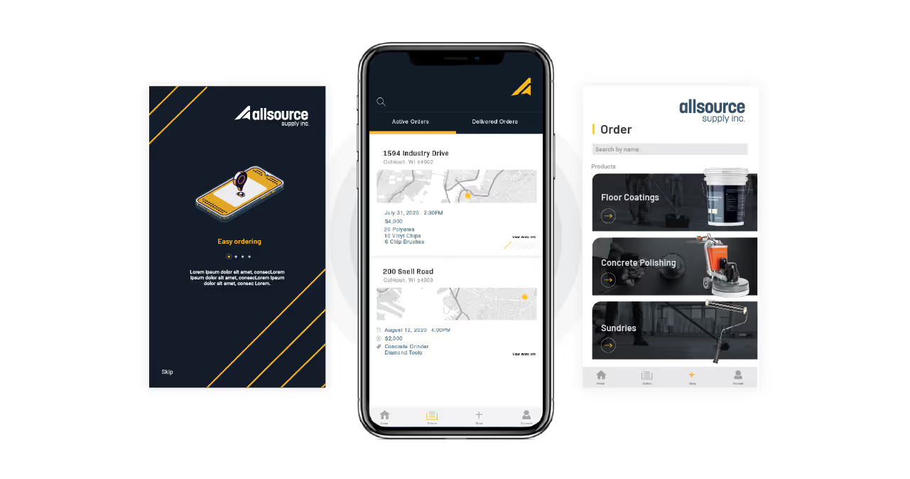


After creating Computer Corner's visual identity a few years earlier, the Quill team was tasked with leveraging the established visual identity and creating design and layout for a new company website. The challenge was to differentiate the business from the often bland and overly corporate aesthetic typical of its competitors and create a web presence that felt modern, youthful, friendly, and accessible to customers.


In the initial rebranding for Computer Corner, Quill created the slogan “We’re in your corner,” which conveyed empathy by acknowledging frustrations that many people have when dealing with technology while also highlighting the company’s local presence. This messaging is emphasized in the website copy to inject Computer Corner’s mission at different touchpoints as their audiences navigate the site.
We also created modern, simply illustrated elements with a youthful and confident energy. These illustrations serve as visual representations of Computer Corner’s services, which provide clarity and ease of understanding for website visitors. We also designed centerpiece illustrations of smiling people to emphasize the business’s people-centric approach and dedication to making technology help accessible and user-friendly. Additionally, we prioritized the presentation of information in easily digestible formats using rounded columns and those same illustrated elements to continue a throughline of friendly accessibility.
While photographs were used sparingly, we made sure that when they were employed, they depicted real people actively working with technology, as well as real images of the buildings they work out of. This approach conveys Computer Corner’s expertise and local presence.


Computer Corner’s new website centers on approachability, making it easy for visitors to engage with the brand. The new site also stands out markedly from its competition by avoiding bland corporate visuals in favor of friendly, bright, and charismatic aesthetics. Computer Corner now stands firmly differentiated in the industry, attracting new customers by showcasing their expertise and professionalism without feeling stuffy.


After creating Computer Corner's visual identity a few years earlier, the Quill team was tasked with leveraging the established visual identity and creating design and layout for a new company website. The challenge was to differentiate the business from the often bland and overly corporate aesthetic typical of its competitors and create a web presence that felt modern, youthful, friendly, and accessible to customers.


In the initial rebranding for Computer Corner, Quill created the slogan “We’re in your corner,” which conveyed empathy by acknowledging frustrations that many people have when dealing with technology while also highlighting the company’s local presence. This messaging is emphasized in the website copy to inject Computer Corner’s mission at different touchpoints as their audiences navigate the site.
We also created modern, simply illustrated elements with a youthful and confident energy. These illustrations serve as visual representations of Computer Corner’s services, which provide clarity and ease of understanding for website visitors. We also designed centerpiece illustrations of smiling people to emphasize the business’s people-centric approach and dedication to making technology help accessible and user-friendly. Additionally, we prioritized the presentation of information in easily digestible formats using rounded columns and those same illustrated elements to continue a throughline of friendly accessibility.
While photographs were used sparingly, we made sure that when they were employed, they depicted real people actively working with technology, as well as real images of the buildings they work out of. This approach conveys Computer Corner’s expertise and local presence.

Computer Corner’s new website centers on approachability, making it easy for visitors to engage with the brand. The new site also stands out markedly from its competition by avoiding bland corporate visuals in favor of friendly, bright, and charismatic aesthetics. Computer Corner now stands firmly differentiated in the industry, attracting new customers by showcasing their expertise and professionalism without feeling stuffy.


After creating Computer Corner's visual identity a few years earlier, the Quill team was tasked with leveraging the established visual identity and creating design and layout for a new company website. The challenge was to differentiate the business from the often bland and overly corporate aesthetic typical of its competitors and create a web presence that felt modern, youthful, friendly, and accessible to customers.

In the initial rebranding for Computer Corner, Quill created the slogan “We’re in your corner,” which conveyed empathy by acknowledging frustrations that many people have when dealing with technology while also highlighting the company’s local presence. This messaging is emphasized in the website copy to inject Computer Corner’s mission at different touchpoints as their audiences navigate the site.
We also created modern, simply illustrated elements with a youthful and confident energy. These illustrations serve as visual representations of Computer Corner’s services, which provide clarity and ease of understanding for website visitors. We also designed centerpiece illustrations of smiling people to emphasize the business’s people-centric approach and dedication to making technology help accessible and user-friendly. Additionally, we prioritized the presentation of information in easily digestible formats using rounded columns and those same illustrated elements to continue a throughline of friendly accessibility.
While photographs were used sparingly, we made sure that when they were employed, they depicted real people actively working with technology, as well as real images of the buildings they work out of. This approach conveys Computer Corner’s expertise and local presence.


Computer Corner’s new website centers on approachability, making it easy for visitors to engage with the brand. The new site also stands out markedly from its competition by avoiding bland corporate visuals in favor of friendly, bright, and charismatic aesthetics. Computer Corner now stands firmly differentiated in the industry, attracting new customers by showcasing their expertise and professionalism without feeling stuffy.


Computer Corner’s new website centers on approachability, making it easy for visitors to engage with the brand. The new site also stands out markedly from its competition by avoiding bland corporate visuals in favor of friendly, bright, and charismatic aesthetics. Computer Corner now stands firmly differentiated in the industry, attracting new customers by showcasing their expertise and professionalism without feeling stuffy.
After creating Computer Corner's visual identity a few years earlier, the Quill team was tasked with leveraging the established visual identity and creating design and layout for a new company website. The challenge was to differentiate the business from the often bland and overly corporate aesthetic typical of its competitors and create a web presence that felt modern, youthful, friendly, and accessible to customers.

In the initial rebranding for Computer Corner, Quill created the slogan “We’re in your corner,” which conveyed empathy by acknowledging frustrations that many people have when dealing with technology while also highlighting the company’s local presence. This messaging is emphasized in the website copy to inject Computer Corner’s mission at different touchpoints as their audiences navigate the site.
We also created modern, simply illustrated elements with a youthful and confident energy. These illustrations serve as visual representations of Computer Corner’s services, which provide clarity and ease of understanding for website visitors. We also designed centerpiece illustrations of smiling people to emphasize the business’s people-centric approach and dedication to making technology help accessible and user-friendly. Additionally, we prioritized the presentation of information in easily digestible formats using rounded columns and those same illustrated elements to continue a throughline of friendly accessibility.
While photographs were used sparingly, we made sure that when they were employed, they depicted real people actively working with technology, as well as real images of the buildings they work out of. This approach conveys Computer Corner’s expertise and local presence.

Computer Corner’s new website centers on approachability, making it easy for visitors to engage with the brand. The new site also stands out markedly from its competition by avoiding bland corporate visuals in favor of friendly, bright, and charismatic aesthetics. Computer Corner now stands firmly differentiated in the industry, attracting new customers by showcasing their expertise and professionalism without feeling stuffy.

Computer Corner’s new website centers on approachability, making it easy for visitors to engage with the brand. The new site also stands out markedly from its competition by avoiding bland corporate visuals in favor of friendly, bright, and charismatic aesthetics. Computer Corner now stands firmly differentiated in the industry, attracting new customers by showcasing their expertise and professionalism without feeling stuffy.

In the initial rebranding for Computer Corner, Quill created the slogan “We’re in your corner,” which conveyed empathy by acknowledging frustrations that many people have when dealing with technology while also highlighting the company’s local presence. This messaging is emphasized in the website copy to inject Computer Corner’s mission at different touchpoints as their audiences navigate the site.
We also created modern, simply illustrated elements with a youthful and confident energy. These illustrations serve as visual representations of Computer Corner’s services, which provide clarity and ease of understanding for website visitors. We also designed centerpiece illustrations of smiling people to emphasize the business’s people-centric approach and dedication to making technology help accessible and user-friendly. Additionally, we prioritized the presentation of information in easily digestible formats using rounded columns and those same illustrated elements to continue a throughline of friendly accessibility.
While photographs were used sparingly, we made sure that when they were employed, they depicted real people actively working with technology, as well as real images of the buildings they work out of. This approach conveys Computer Corner’s expertise and local presence.

After creating Computer Corner's visual identity a few years earlier, the Quill team was tasked with leveraging the established visual identity and creating design and layout for a new company website. The challenge was to differentiate the business from the often bland and overly corporate aesthetic typical of its competitors and create a web presence that felt modern, youthful, friendly, and accessible to customers.

Computer Corner’s new website centers on approachability, making it easy for visitors to engage with the brand. The new site also stands out markedly from its competition by avoiding bland corporate visuals in favor of friendly, bright, and charismatic aesthetics. Computer Corner now stands firmly differentiated in the industry, attracting new customers by showcasing their expertise and professionalism without feeling stuffy.


Computer Corner’s new website centers on approachability, making it easy for visitors to engage with the brand. The new site also stands out markedly from its competition by avoiding bland corporate visuals in favor of friendly, bright, and charismatic aesthetics. Computer Corner now stands firmly differentiated in the industry, attracting new customers by showcasing their expertise and professionalism without feeling stuffy.


After creating Computer Corner's visual identity a few years earlier, the Quill team was tasked with leveraging the established visual identity and creating design and layout for a new company website. The challenge was to differentiate the business from the often bland and overly corporate aesthetic typical of its competitors and create a web presence that felt modern, youthful, friendly, and accessible to customers.


In the initial rebranding for Computer Corner, Quill created the slogan “We’re in your corner,” which conveyed empathy by acknowledging frustrations that many people have when dealing with technology while also highlighting the company’s local presence. This messaging is emphasized in the website copy to inject Computer Corner’s mission at different touchpoints as their audiences navigate the site.
We also created modern, simply illustrated elements with a youthful and confident energy. These illustrations serve as visual representations of Computer Corner’s services, which provide clarity and ease of understanding for website visitors. We also designed centerpiece illustrations of smiling people to emphasize the business’s people-centric approach and dedication to making technology help accessible and user-friendly. Additionally, we prioritized the presentation of information in easily digestible formats using rounded columns and those same illustrated elements to continue a throughline of friendly accessibility.
While photographs were used sparingly, we made sure that when they were employed, they depicted real people actively working with technology, as well as real images of the buildings they work out of. This approach conveys Computer Corner’s expertise and local presence.

Computer Corner’s new website centers on approachability, making it easy for visitors to engage with the brand. The new site also stands out markedly from its competition by avoiding bland corporate visuals in favor of friendly, bright, and charismatic aesthetics. Computer Corner now stands firmly differentiated in the industry, attracting new customers by showcasing their expertise and professionalism without feeling stuffy.


After creating Computer Corner's visual identity a few years earlier, the Quill team was tasked with leveraging the established visual identity and creating design and layout for a new company website. The challenge was to differentiate the business from the often bland and overly corporate aesthetic typical of its competitors and create a web presence that felt modern, youthful, friendly, and accessible to customers.
In the initial rebranding for Computer Corner, Quill created the slogan “We’re in your corner,” which conveyed empathy by acknowledging frustrations that many people have when dealing with technology while also highlighting the company’s local presence. This messaging is emphasized in the website copy to inject Computer Corner’s mission at different touchpoints as their audiences navigate the site.
We also created modern, simply illustrated elements with a youthful and confident energy. These illustrations serve as visual representations of Computer Corner’s services, which provide clarity and ease of understanding for website visitors. We also designed centerpiece illustrations of smiling people to emphasize the business’s people-centric approach and dedication to making technology help accessible and user-friendly. Additionally, we prioritized the presentation of information in easily digestible formats using rounded columns and those same illustrated elements to continue a throughline of friendly accessibility.
While photographs were used sparingly, we made sure that when they were employed, they depicted real people actively working with technology, as well as real images of the buildings they work out of. This approach conveys Computer Corner’s expertise and local presence.


Computer Corner’s new website centers on approachability, making it easy for visitors to engage with the brand. The new site also stands out markedly from its competition by avoiding bland corporate visuals in favor of friendly, bright, and charismatic aesthetics. Computer Corner now stands firmly differentiated in the industry, attracting new customers by showcasing their expertise and professionalism without feeling stuffy.


After creating Computer Corner's visual identity a few years earlier, the Quill team was tasked with leveraging the established visual identity and creating design and layout for a new company website. The challenge was to differentiate the business from the often bland and overly corporate aesthetic typical of its competitors and create a web presence that felt modern, youthful, friendly, and accessible to customers.
Computer Corner’s new website centers on approachability, making it easy for visitors to engage with the brand. The new site also stands out markedly from its competition by avoiding bland corporate visuals in favor of friendly, bright, and charismatic aesthetics. Computer Corner now stands firmly differentiated in the industry, attracting new customers by showcasing their expertise and professionalism without feeling stuffy.

In the initial rebranding for Computer Corner, Quill created the slogan “We’re in your corner,” which conveyed empathy by acknowledging frustrations that many people have when dealing with technology while also highlighting the company’s local presence. This messaging is emphasized in the website copy to inject Computer Corner’s mission at different touchpoints as their audiences navigate the site.
We also created modern, simply illustrated elements with a youthful and confident energy. These illustrations serve as visual representations of Computer Corner’s services, which provide clarity and ease of understanding for website visitors. We also designed centerpiece illustrations of smiling people to emphasize the business’s people-centric approach and dedication to making technology help accessible and user-friendly. Additionally, we prioritized the presentation of information in easily digestible formats using rounded columns and those same illustrated elements to continue a throughline of friendly accessibility.
While photographs were used sparingly, we made sure that when they were employed, they depicted real people actively working with technology, as well as real images of the buildings they work out of. This approach conveys Computer Corner’s expertise and local presence.


Computer Corner’s new website centers on approachability, making it easy for visitors to engage with the brand. The new site also stands out markedly from its competition by avoiding bland corporate visuals in favor of friendly, bright, and charismatic aesthetics. Computer Corner now stands firmly differentiated in the industry, attracting new customers by showcasing their expertise and professionalism without feeling stuffy.


After creating Computer Corner's visual identity a few years earlier, the Quill team was tasked with leveraging the established visual identity and creating design and layout for a new company website. The challenge was to differentiate the business from the often bland and overly corporate aesthetic typical of its competitors and create a web presence that felt modern, youthful, friendly, and accessible to customers.
In the initial rebranding for Computer Corner, Quill created the slogan “We’re in your corner,” which conveyed empathy by acknowledging frustrations that many people have when dealing with technology while also highlighting the company’s local presence. This messaging is emphasized in the website copy to inject Computer Corner’s mission at different touchpoints as their audiences navigate the site.
We also created modern, simply illustrated elements with a youthful and confident energy. These illustrations serve as visual representations of Computer Corner’s services, which provide clarity and ease of understanding for website visitors. We also designed centerpiece illustrations of smiling people to emphasize the business’s people-centric approach and dedication to making technology help accessible and user-friendly. Additionally, we prioritized the presentation of information in easily digestible formats using rounded columns and those same illustrated elements to continue a throughline of friendly accessibility.
While photographs were used sparingly, we made sure that when they were employed, they depicted real people actively working with technology, as well as real images of the buildings they work out of. This approach conveys Computer Corner’s expertise and local presence.


Computer Corner’s new website centers on approachability, making it easy for visitors to engage with the brand. The new site also stands out markedly from its competition by avoiding bland corporate visuals in favor of friendly, bright, and charismatic aesthetics. Computer Corner now stands firmly differentiated in the industry, attracting new customers by showcasing their expertise and professionalism without feeling stuffy.


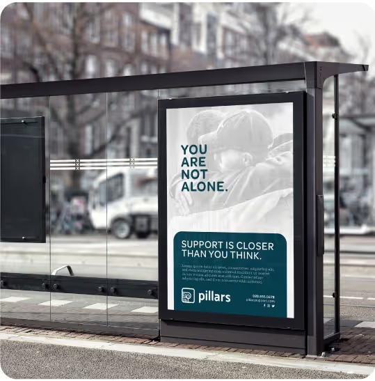
After creating Computer Corner's visual identity a few years earlier, the Quill team was tasked with leveraging the established visual identity and creating design and layout for a new company website. The challenge was to differentiate the business from the often bland and overly corporate aesthetic typical of its competitors and create a web presence that felt modern, youthful, friendly, and accessible to customers.

In the initial rebranding for Computer Corner, Quill created the slogan “We’re in your corner,” which conveyed empathy by acknowledging frustrations that many people have when dealing with technology while also highlighting the company’s local presence. This messaging is emphasized in the website copy to inject Computer Corner’s mission at different touchpoints as their audiences navigate the site.
We also created modern, simply illustrated elements with a youthful and confident energy. These illustrations serve as visual representations of Computer Corner’s services, which provide clarity and ease of understanding for website visitors. We also designed centerpiece illustrations of smiling people to emphasize the business’s people-centric approach and dedication to making technology help accessible and user-friendly. Additionally, we prioritized the presentation of information in easily digestible formats using rounded columns and those same illustrated elements to continue a throughline of friendly accessibility.
While photographs were used sparingly, we made sure that when they were employed, they depicted real people actively working with technology, as well as real images of the buildings they work out of. This approach conveys Computer Corner’s expertise and local presence.

Computer Corner’s new website centers on approachability, making it easy for visitors to engage with the brand. The new site also stands out markedly from its competition by avoiding bland corporate visuals in favor of friendly, bright, and charismatic aesthetics. Computer Corner now stands firmly differentiated in the industry, attracting new customers by showcasing their expertise and professionalism without feeling stuffy.


After creating Computer Corner's visual identity a few years earlier, the Quill team was tasked with leveraging the established visual identity and creating design and layout for a new company website. The challenge was to differentiate the business from the often bland and overly corporate aesthetic typical of its competitors and create a web presence that felt modern, youthful, friendly, and accessible to customers.

In the initial rebranding for Computer Corner, Quill created the slogan “We’re in your corner,” which conveyed empathy by acknowledging frustrations that many people have when dealing with technology while also highlighting the company’s local presence. This messaging is emphasized in the website copy to inject Computer Corner’s mission at different touchpoints as their audiences navigate the site.
We also created modern, simply illustrated elements with a youthful and confident energy. These illustrations serve as visual representations of Computer Corner’s services, which provide clarity and ease of understanding for website visitors. We also designed centerpiece illustrations of smiling people to emphasize the business’s people-centric approach and dedication to making technology help accessible and user-friendly. Additionally, we prioritized the presentation of information in easily digestible formats using rounded columns and those same illustrated elements to continue a throughline of friendly accessibility.
While photographs were used sparingly, we made sure that when they were employed, they depicted real people actively working with technology, as well as real images of the buildings they work out of. This approach conveys Computer Corner’s expertise and local presence.


Computer Corner’s new website centers on approachability, making it easy for visitors to engage with the brand. The new site also stands out markedly from its competition by avoiding bland corporate visuals in favor of friendly, bright, and charismatic aesthetics. Computer Corner now stands firmly differentiated in the industry, attracting new customers by showcasing their expertise and professionalism without feeling stuffy.


