


Motion Works Media had already built a strong reputation for high-quality content and a collaborative, professional approach. The challenge was to retain the equity of the existing brand while elevating the visual identity to better match the energy, precision, and polish of the work being produced. The new identity needed to feel confident, masculine, and energetic, with a system that would scale across web, social, and client-facing materials.


Quill Creative Studio refreshed the Motion Works Media identity by building a structured and cohesive visual system rooted in motion, clarity, and confidence. A more masculine and energetic color palette was introduced to evoke strength and creative drive. Typography was chosen for its modern, approachable qualities, and layouts were designed using geometric grids and content boxes that communicate precision and professionalism.
To reinforce the brand’s core idea of movement, gradients were used as a visual device throughout the system. These subtle color transitions add dimension and flow, mirroring how the team captures and shapes visual stories. The result is a brand identity that feels elevated, intentional, and unmistakably in motion.

The refreshed identity has given Motion Works Media a clear visual presence that aligns with its core mission: to create media that captivates and motivates. With a cohesive system in place, the brand now has the tools to communicate consistently across platforms, attract new clients, and confidently grow its portfolio. The updated visuals and messaging are helping position the company as a trusted creative partner for professionals in industries ranging from community and product marketing to corporate video and event production.


Motion Works Media had already built a strong reputation for high-quality content and a collaborative, professional approach. The challenge was to retain the equity of the existing brand while elevating the visual identity to better match the energy, precision, and polish of the work being produced. The new identity needed to feel confident, masculine, and energetic, with a system that would scale across web, social, and client-facing materials.


Quill Creative Studio refreshed the Motion Works Media identity by building a structured and cohesive visual system rooted in motion, clarity, and confidence. A more masculine and energetic color palette was introduced to evoke strength and creative drive. Typography was chosen for its modern, approachable qualities, and layouts were designed using geometric grids and content boxes that communicate precision and professionalism.
To reinforce the brand’s core idea of movement, gradients were used as a visual device throughout the system. These subtle color transitions add dimension and flow, mirroring how the team captures and shapes visual stories. The result is a brand identity that feels elevated, intentional, and unmistakably in motion.


The refreshed identity has given Motion Works Media a clear visual presence that aligns with its core mission: to create media that captivates and motivates. With a cohesive system in place, the brand now has the tools to communicate consistently across platforms, attract new clients, and confidently grow its portfolio. The updated visuals and messaging are helping position the company as a trusted creative partner for professionals in industries ranging from community and product marketing to corporate video and event production.


Motion Works Media had already built a strong reputation for high-quality content and a collaborative, professional approach. The challenge was to retain the equity of the existing brand while elevating the visual identity to better match the energy, precision, and polish of the work being produced. The new identity needed to feel confident, masculine, and energetic, with a system that would scale across web, social, and client-facing materials.


Quill Creative Studio refreshed the Motion Works Media identity by building a structured and cohesive visual system rooted in motion, clarity, and confidence. A more masculine and energetic color palette was introduced to evoke strength and creative drive. Typography was chosen for its modern, approachable qualities, and layouts were designed using geometric grids and content boxes that communicate precision and professionalism.
To reinforce the brand’s core idea of movement, gradients were used as a visual device throughout the system. These subtle color transitions add dimension and flow, mirroring how the team captures and shapes visual stories. The result is a brand identity that feels elevated, intentional, and unmistakably in motion.

The refreshed identity has given Motion Works Media a clear visual presence that aligns with its core mission: to create media that captivates and motivates. With a cohesive system in place, the brand now has the tools to communicate consistently across platforms, attract new clients, and confidently grow its portfolio. The updated visuals and messaging are helping position the company as a trusted creative partner for professionals in industries ranging from community and product marketing to corporate video and event production.


Motion Works Media had already built a strong reputation for high-quality content and a collaborative, professional approach. The challenge was to retain the equity of the existing brand while elevating the visual identity to better match the energy, precision, and polish of the work being produced. The new identity needed to feel confident, masculine, and energetic, with a system that would scale across web, social, and client-facing materials.

Quill Creative Studio refreshed the Motion Works Media identity by building a structured and cohesive visual system rooted in motion, clarity, and confidence. A more masculine and energetic color palette was introduced to evoke strength and creative drive. Typography was chosen for its modern, approachable qualities, and layouts were designed using geometric grids and content boxes that communicate precision and professionalism.
To reinforce the brand’s core idea of movement, gradients were used as a visual device throughout the system. These subtle color transitions add dimension and flow, mirroring how the team captures and shapes visual stories. The result is a brand identity that feels elevated, intentional, and unmistakably in motion.


The refreshed identity has given Motion Works Media a clear visual presence that aligns with its core mission: to create media that captivates and motivates. With a cohesive system in place, the brand now has the tools to communicate consistently across platforms, attract new clients, and confidently grow its portfolio. The updated visuals and messaging are helping position the company as a trusted creative partner for professionals in industries ranging from community and product marketing to corporate video and event production.


Motion Works Media had already built a strong reputation for high-quality content and a collaborative, professional approach. The challenge was to retain the equity of the existing brand while elevating the visual identity to better match the energy, precision, and polish of the work being produced. The new identity needed to feel confident, masculine, and energetic, with a system that would scale across web, social, and client-facing materials.


Quill Creative Studio refreshed the Motion Works Media identity by building a structured and cohesive visual system rooted in motion, clarity, and confidence. A more masculine and energetic color palette was introduced to evoke strength and creative drive. Typography was chosen for its modern, approachable qualities, and layouts were designed using geometric grids and content boxes that communicate precision and professionalism.
To reinforce the brand’s core idea of movement, gradients were used as a visual device throughout the system. These subtle color transitions add dimension and flow, mirroring how the team captures and shapes visual stories. The result is a brand identity that feels elevated, intentional, and unmistakably in motion.


The refreshed identity has given Motion Works Media a clear visual presence that aligns with its core mission: to create media that captivates and motivates. With a cohesive system in place, the brand now has the tools to communicate consistently across platforms, attract new clients, and confidently grow its portfolio. The updated visuals and messaging are helping position the company as a trusted creative partner for professionals in industries ranging from community and product marketing to corporate video and event production.


Motion Works Media had already built a strong reputation for high-quality content and a collaborative, professional approach. The challenge was to retain the equity of the existing brand while elevating the visual identity to better match the energy, precision, and polish of the work being produced. The new identity needed to feel confident, masculine, and energetic, with a system that would scale across web, social, and client-facing materials.


Quill Creative Studio refreshed the Motion Works Media identity by building a structured and cohesive visual system rooted in motion, clarity, and confidence. A more masculine and energetic color palette was introduced to evoke strength and creative drive. Typography was chosen for its modern, approachable qualities, and layouts were designed using geometric grids and content boxes that communicate precision and professionalism.
To reinforce the brand’s core idea of movement, gradients were used as a visual device throughout the system. These subtle color transitions add dimension and flow, mirroring how the team captures and shapes visual stories. The result is a brand identity that feels elevated, intentional, and unmistakably in motion.


The refreshed identity has given Motion Works Media a clear visual presence that aligns with its core mission: to create media that captivates and motivates. With a cohesive system in place, the brand now has the tools to communicate consistently across platforms, attract new clients, and confidently grow its portfolio. The updated visuals and messaging are helping position the company as a trusted creative partner for professionals in industries ranging from community and product marketing to corporate video and event production.


Motion Works Media had already built a strong reputation for high-quality content and a collaborative, professional approach. The challenge was to retain the equity of the existing brand while elevating the visual identity to better match the energy, precision, and polish of the work being produced. The new identity needed to feel confident, masculine, and energetic, with a system that would scale across web, social, and client-facing materials.


Quill Creative Studio refreshed the Motion Works Media identity by building a structured and cohesive visual system rooted in motion, clarity, and confidence. A more masculine and energetic color palette was introduced to evoke strength and creative drive. Typography was chosen for its modern, approachable qualities, and layouts were designed using geometric grids and content boxes that communicate precision and professionalism.
To reinforce the brand’s core idea of movement, gradients were used as a visual device throughout the system. These subtle color transitions add dimension and flow, mirroring how the team captures and shapes visual stories. The result is a brand identity that feels elevated, intentional, and unmistakably in motion.


The refreshed identity has given Motion Works Media a clear visual presence that aligns with its core mission: to create media that captivates and motivates. With a cohesive system in place, the brand now has the tools to communicate consistently across platforms, attract new clients, and confidently grow its portfolio. The updated visuals and messaging are helping position the company as a trusted creative partner for professionals in industries ranging from community and product marketing to corporate video and event production.


Motion Works Media had already built a strong reputation for high-quality content and a collaborative, professional approach. The challenge was to retain the equity of the existing brand while elevating the visual identity to better match the energy, precision, and polish of the work being produced. The new identity needed to feel confident, masculine, and energetic, with a system that would scale across web, social, and client-facing materials.


Quill Creative Studio refreshed the Motion Works Media identity by building a structured and cohesive visual system rooted in motion, clarity, and confidence. A more masculine and energetic color palette was introduced to evoke strength and creative drive. Typography was chosen for its modern, approachable qualities, and layouts were designed using geometric grids and content boxes that communicate precision and professionalism.
To reinforce the brand’s core idea of movement, gradients were used as a visual device throughout the system. These subtle color transitions add dimension and flow, mirroring how the team captures and shapes visual stories. The result is a brand identity that feels elevated, intentional, and unmistakably in motion.


Motion Works Media had already built a strong reputation for high-quality content and a collaborative, professional approach. The challenge was to retain the equity of the existing brand while elevating the visual identity to better match the energy, precision, and polish of the work being produced. The new identity needed to feel confident, masculine, and energetic, with a system that would scale across web, social, and client-facing materials.
Quill Creative Studio refreshed the Motion Works Media identity by building a structured and cohesive visual system rooted in motion, clarity, and confidence. A more masculine and energetic color palette was introduced to evoke strength and creative drive. Typography was chosen for its modern, approachable qualities, and layouts were designed using geometric grids and content boxes that communicate precision and professionalism.
To reinforce the brand’s core idea of movement, gradients were used as a visual device throughout the system. These subtle color transitions add dimension and flow, mirroring how the team captures and shapes visual stories. The result is a brand identity that feels elevated, intentional, and unmistakably in motion.


The refreshed identity has given Motion Works Media a clear visual presence that aligns with its core mission: to create media that captivates and motivates. With a cohesive system in place, the brand now has the tools to communicate consistently across platforms, attract new clients, and confidently grow its portfolio. The updated visuals and messaging are helping position the company as a trusted creative partner for professionals in industries ranging from community and product marketing to corporate video and event production.


Motion Works Media had already built a strong reputation for high-quality content and a collaborative, professional approach. The challenge was to retain the equity of the existing brand while elevating the visual identity to better match the energy, precision, and polish of the work being produced. The new identity needed to feel confident, masculine, and energetic, with a system that would scale across web, social, and client-facing materials.


Quill Creative Studio refreshed the Motion Works Media identity by building a structured and cohesive visual system rooted in motion, clarity, and confidence. A more masculine and energetic color palette was introduced to evoke strength and creative drive. Typography was chosen for its modern, approachable qualities, and layouts were designed using geometric grids and content boxes that communicate precision and professionalism.
To reinforce the brand’s core idea of movement, gradients were used as a visual device throughout the system. These subtle color transitions add dimension and flow, mirroring how the team captures and shapes visual stories. The result is a brand identity that feels elevated, intentional, and unmistakably in motion.
The refreshed identity has given Motion Works Media a clear visual presence that aligns with its core mission: to create media that captivates and motivates. With a cohesive system in place, the brand now has the tools to communicate consistently across platforms, attract new clients, and confidently grow its portfolio. The updated visuals and messaging are helping position the company as a trusted creative partner for professionals in industries ranging from community and product marketing to corporate video and event production.

Motion Works Media had already built a strong reputation for high-quality content and a collaborative, professional approach. The challenge was to retain the equity of the existing brand while elevating the visual identity to better match the energy, precision, and polish of the work being produced. The new identity needed to feel confident, masculine, and energetic, with a system that would scale across web, social, and client-facing materials.


Quill Creative Studio refreshed the Motion Works Media identity by building a structured and cohesive visual system rooted in motion, clarity, and confidence. A more masculine and energetic color palette was introduced to evoke strength and creative drive. Typography was chosen for its modern, approachable qualities, and layouts were designed using geometric grids and content boxes that communicate precision and professionalism.
To reinforce the brand’s core idea of movement, gradients were used as a visual device throughout the system. These subtle color transitions add dimension and flow, mirroring how the team captures and shapes visual stories. The result is a brand identity that feels elevated, intentional, and unmistakably in motion.


The refreshed identity has given Motion Works Media a clear visual presence that aligns with its core mission: to create media that captivates and motivates. With a cohesive system in place, the brand now has the tools to communicate consistently across platforms, attract new clients, and confidently grow its portfolio. The updated visuals and messaging are helping position the company as a trusted creative partner for professionals in industries ranging from community and product marketing to corporate video and event production.


Motion Works Media had already built a strong reputation for high-quality content and a collaborative, professional approach. The challenge was to retain the equity of the existing brand while elevating the visual identity to better match the energy, precision, and polish of the work being produced. The new identity needed to feel confident, masculine, and energetic, with a system that would scale across web, social, and client-facing materials.

Quill Creative Studio refreshed the Motion Works Media identity by building a structured and cohesive visual system rooted in motion, clarity, and confidence. A more masculine and energetic color palette was introduced to evoke strength and creative drive. Typography was chosen for its modern, approachable qualities, and layouts were designed using geometric grids and content boxes that communicate precision and professionalism.
To reinforce the brand’s core idea of movement, gradients were used as a visual device throughout the system. These subtle color transitions add dimension and flow, mirroring how the team captures and shapes visual stories. The result is a brand identity that feels elevated, intentional, and unmistakably in motion.

The refreshed identity has given Motion Works Media a clear visual presence that aligns with its core mission: to create media that captivates and motivates. With a cohesive system in place, the brand now has the tools to communicate consistently across platforms, attract new clients, and confidently grow its portfolio. The updated visuals and messaging are helping position the company as a trusted creative partner for professionals in industries ranging from community and product marketing to corporate video and event production.


Motion Works Media had already built a strong reputation for high-quality content and a collaborative, professional approach. The challenge was to retain the equity of the existing brand while elevating the visual identity to better match the energy, precision, and polish of the work being produced. The new identity needed to feel confident, masculine, and energetic, with a system that would scale across web, social, and client-facing materials.


Quill Creative Studio refreshed the Motion Works Media identity by building a structured and cohesive visual system rooted in motion, clarity, and confidence. A more masculine and energetic color palette was introduced to evoke strength and creative drive. Typography was chosen for its modern, approachable qualities, and layouts were designed using geometric grids and content boxes that communicate precision and professionalism.
To reinforce the brand’s core idea of movement, gradients were used as a visual device throughout the system. These subtle color transitions add dimension and flow, mirroring how the team captures and shapes visual stories. The result is a brand identity that feels elevated, intentional, and unmistakably in motion.


The refreshed identity has given Motion Works Media a clear visual presence that aligns with its core mission: to create media that captivates and motivates. With a cohesive system in place, the brand now has the tools to communicate consistently across platforms, attract new clients, and confidently grow its portfolio. The updated visuals and messaging are helping position the company as a trusted creative partner for professionals in industries ranging from community and product marketing to corporate video and event production.


Motion Works Media had already built a strong reputation for high-quality content and a collaborative, professional approach. The challenge was to retain the equity of the existing brand while elevating the visual identity to better match the energy, precision, and polish of the work being produced. The new identity needed to feel confident, masculine, and energetic, with a system that would scale across web, social, and client-facing materials.

Quill Creative Studio refreshed the Motion Works Media identity by building a structured and cohesive visual system rooted in motion, clarity, and confidence. A more masculine and energetic color palette was introduced to evoke strength and creative drive. Typography was chosen for its modern, approachable qualities, and layouts were designed using geometric grids and content boxes that communicate precision and professionalism.
To reinforce the brand’s core idea of movement, gradients were used as a visual device throughout the system. These subtle color transitions add dimension and flow, mirroring how the team captures and shapes visual stories. The result is a brand identity that feels elevated, intentional, and unmistakably in motion.
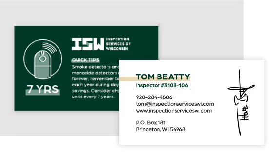

The refreshed identity has given Motion Works Media a clear visual presence that aligns with its core mission: to create media that captivates and motivates. With a cohesive system in place, the brand now has the tools to communicate consistently across platforms, attract new clients, and confidently grow its portfolio. The updated visuals and messaging are helping position the company as a trusted creative partner for professionals in industries ranging from community and product marketing to corporate video and event production.
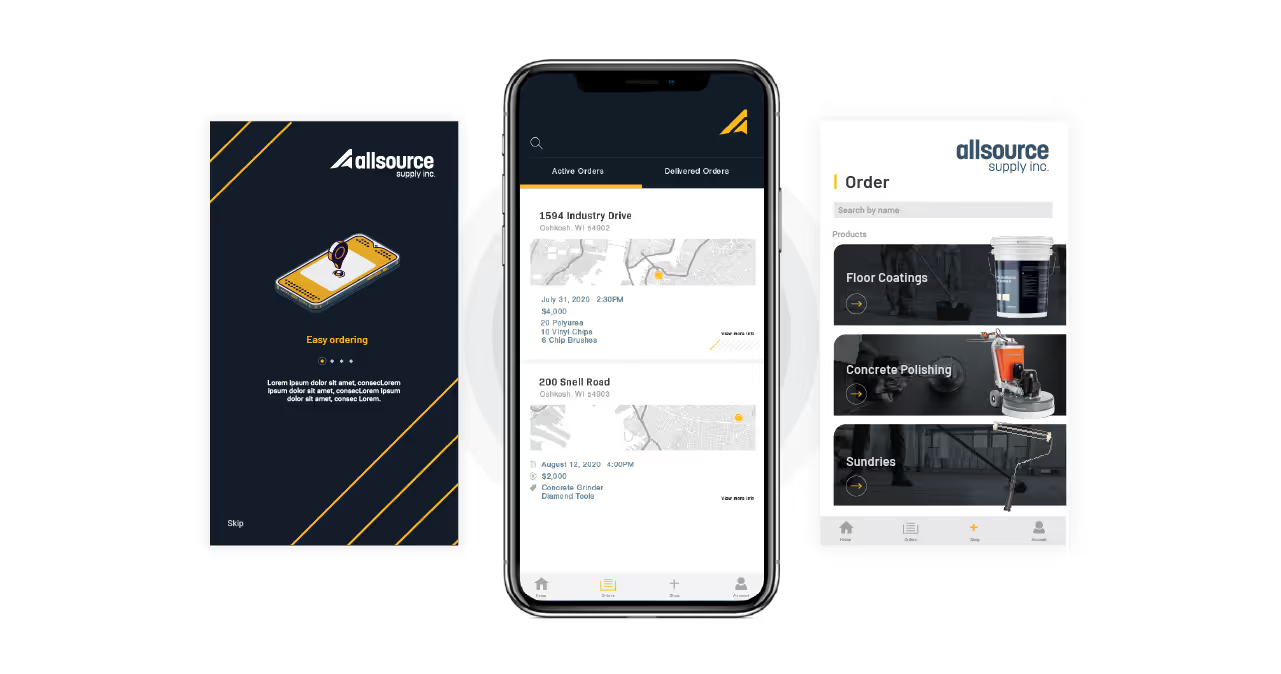


Motion Works Media had already built a strong reputation for high-quality content and a collaborative, professional approach. The challenge was to retain the equity of the existing brand while elevating the visual identity to better match the energy, precision, and polish of the work being produced. The new identity needed to feel confident, masculine, and energetic, with a system that would scale across web, social, and client-facing materials.


Quill Creative Studio refreshed the Motion Works Media identity by building a structured and cohesive visual system rooted in motion, clarity, and confidence. A more masculine and energetic color palette was introduced to evoke strength and creative drive. Typography was chosen for its modern, approachable qualities, and layouts were designed using geometric grids and content boxes that communicate precision and professionalism.
To reinforce the brand’s core idea of movement, gradients were used as a visual device throughout the system. These subtle color transitions add dimension and flow, mirroring how the team captures and shapes visual stories. The result is a brand identity that feels elevated, intentional, and unmistakably in motion.


The refreshed identity has given Motion Works Media a clear visual presence that aligns with its core mission: to create media that captivates and motivates. With a cohesive system in place, the brand now has the tools to communicate consistently across platforms, attract new clients, and confidently grow its portfolio. The updated visuals and messaging are helping position the company as a trusted creative partner for professionals in industries ranging from community and product marketing to corporate video and event production.


Motion Works Media had already built a strong reputation for high-quality content and a collaborative, professional approach. The challenge was to retain the equity of the existing brand while elevating the visual identity to better match the energy, precision, and polish of the work being produced. The new identity needed to feel confident, masculine, and energetic, with a system that would scale across web, social, and client-facing materials.


Quill Creative Studio refreshed the Motion Works Media identity by building a structured and cohesive visual system rooted in motion, clarity, and confidence. A more masculine and energetic color palette was introduced to evoke strength and creative drive. Typography was chosen for its modern, approachable qualities, and layouts were designed using geometric grids and content boxes that communicate precision and professionalism.
To reinforce the brand’s core idea of movement, gradients were used as a visual device throughout the system. These subtle color transitions add dimension and flow, mirroring how the team captures and shapes visual stories. The result is a brand identity that feels elevated, intentional, and unmistakably in motion.

The refreshed identity has given Motion Works Media a clear visual presence that aligns with its core mission: to create media that captivates and motivates. With a cohesive system in place, the brand now has the tools to communicate consistently across platforms, attract new clients, and confidently grow its portfolio. The updated visuals and messaging are helping position the company as a trusted creative partner for professionals in industries ranging from community and product marketing to corporate video and event production.


Motion Works Media had already built a strong reputation for high-quality content and a collaborative, professional approach. The challenge was to retain the equity of the existing brand while elevating the visual identity to better match the energy, precision, and polish of the work being produced. The new identity needed to feel confident, masculine, and energetic, with a system that would scale across web, social, and client-facing materials.

Quill Creative Studio refreshed the Motion Works Media identity by building a structured and cohesive visual system rooted in motion, clarity, and confidence. A more masculine and energetic color palette was introduced to evoke strength and creative drive. Typography was chosen for its modern, approachable qualities, and layouts were designed using geometric grids and content boxes that communicate precision and professionalism.
To reinforce the brand’s core idea of movement, gradients were used as a visual device throughout the system. These subtle color transitions add dimension and flow, mirroring how the team captures and shapes visual stories. The result is a brand identity that feels elevated, intentional, and unmistakably in motion.


The refreshed identity has given Motion Works Media a clear visual presence that aligns with its core mission: to create media that captivates and motivates. With a cohesive system in place, the brand now has the tools to communicate consistently across platforms, attract new clients, and confidently grow its portfolio. The updated visuals and messaging are helping position the company as a trusted creative partner for professionals in industries ranging from community and product marketing to corporate video and event production.


The refreshed identity has given Motion Works Media a clear visual presence that aligns with its core mission: to create media that captivates and motivates. With a cohesive system in place, the brand now has the tools to communicate consistently across platforms, attract new clients, and confidently grow its portfolio. The updated visuals and messaging are helping position the company as a trusted creative partner for professionals in industries ranging from community and product marketing to corporate video and event production.
Motion Works Media had already built a strong reputation for high-quality content and a collaborative, professional approach. The challenge was to retain the equity of the existing brand while elevating the visual identity to better match the energy, precision, and polish of the work being produced. The new identity needed to feel confident, masculine, and energetic, with a system that would scale across web, social, and client-facing materials.

Quill Creative Studio refreshed the Motion Works Media identity by building a structured and cohesive visual system rooted in motion, clarity, and confidence. A more masculine and energetic color palette was introduced to evoke strength and creative drive. Typography was chosen for its modern, approachable qualities, and layouts were designed using geometric grids and content boxes that communicate precision and professionalism.
To reinforce the brand’s core idea of movement, gradients were used as a visual device throughout the system. These subtle color transitions add dimension and flow, mirroring how the team captures and shapes visual stories. The result is a brand identity that feels elevated, intentional, and unmistakably in motion.

The refreshed identity has given Motion Works Media a clear visual presence that aligns with its core mission: to create media that captivates and motivates. With a cohesive system in place, the brand now has the tools to communicate consistently across platforms, attract new clients, and confidently grow its portfolio. The updated visuals and messaging are helping position the company as a trusted creative partner for professionals in industries ranging from community and product marketing to corporate video and event production.

The refreshed identity has given Motion Works Media a clear visual presence that aligns with its core mission: to create media that captivates and motivates. With a cohesive system in place, the brand now has the tools to communicate consistently across platforms, attract new clients, and confidently grow its portfolio. The updated visuals and messaging are helping position the company as a trusted creative partner for professionals in industries ranging from community and product marketing to corporate video and event production.

Quill Creative Studio refreshed the Motion Works Media identity by building a structured and cohesive visual system rooted in motion, clarity, and confidence. A more masculine and energetic color palette was introduced to evoke strength and creative drive. Typography was chosen for its modern, approachable qualities, and layouts were designed using geometric grids and content boxes that communicate precision and professionalism.
To reinforce the brand’s core idea of movement, gradients were used as a visual device throughout the system. These subtle color transitions add dimension and flow, mirroring how the team captures and shapes visual stories. The result is a brand identity that feels elevated, intentional, and unmistakably in motion.

Motion Works Media had already built a strong reputation for high-quality content and a collaborative, professional approach. The challenge was to retain the equity of the existing brand while elevating the visual identity to better match the energy, precision, and polish of the work being produced. The new identity needed to feel confident, masculine, and energetic, with a system that would scale across web, social, and client-facing materials.

The refreshed identity has given Motion Works Media a clear visual presence that aligns with its core mission: to create media that captivates and motivates. With a cohesive system in place, the brand now has the tools to communicate consistently across platforms, attract new clients, and confidently grow its portfolio. The updated visuals and messaging are helping position the company as a trusted creative partner for professionals in industries ranging from community and product marketing to corporate video and event production.


The refreshed identity has given Motion Works Media a clear visual presence that aligns with its core mission: to create media that captivates and motivates. With a cohesive system in place, the brand now has the tools to communicate consistently across platforms, attract new clients, and confidently grow its portfolio. The updated visuals and messaging are helping position the company as a trusted creative partner for professionals in industries ranging from community and product marketing to corporate video and event production.


Motion Works Media had already built a strong reputation for high-quality content and a collaborative, professional approach. The challenge was to retain the equity of the existing brand while elevating the visual identity to better match the energy, precision, and polish of the work being produced. The new identity needed to feel confident, masculine, and energetic, with a system that would scale across web, social, and client-facing materials.


Quill Creative Studio refreshed the Motion Works Media identity by building a structured and cohesive visual system rooted in motion, clarity, and confidence. A more masculine and energetic color palette was introduced to evoke strength and creative drive. Typography was chosen for its modern, approachable qualities, and layouts were designed using geometric grids and content boxes that communicate precision and professionalism.
To reinforce the brand’s core idea of movement, gradients were used as a visual device throughout the system. These subtle color transitions add dimension and flow, mirroring how the team captures and shapes visual stories. The result is a brand identity that feels elevated, intentional, and unmistakably in motion.

The refreshed identity has given Motion Works Media a clear visual presence that aligns with its core mission: to create media that captivates and motivates. With a cohesive system in place, the brand now has the tools to communicate consistently across platforms, attract new clients, and confidently grow its portfolio. The updated visuals and messaging are helping position the company as a trusted creative partner for professionals in industries ranging from community and product marketing to corporate video and event production.


Motion Works Media had already built a strong reputation for high-quality content and a collaborative, professional approach. The challenge was to retain the equity of the existing brand while elevating the visual identity to better match the energy, precision, and polish of the work being produced. The new identity needed to feel confident, masculine, and energetic, with a system that would scale across web, social, and client-facing materials.
Quill Creative Studio refreshed the Motion Works Media identity by building a structured and cohesive visual system rooted in motion, clarity, and confidence. A more masculine and energetic color palette was introduced to evoke strength and creative drive. Typography was chosen for its modern, approachable qualities, and layouts were designed using geometric grids and content boxes that communicate precision and professionalism.
To reinforce the brand’s core idea of movement, gradients were used as a visual device throughout the system. These subtle color transitions add dimension and flow, mirroring how the team captures and shapes visual stories. The result is a brand identity that feels elevated, intentional, and unmistakably in motion.


The refreshed identity has given Motion Works Media a clear visual presence that aligns with its core mission: to create media that captivates and motivates. With a cohesive system in place, the brand now has the tools to communicate consistently across platforms, attract new clients, and confidently grow its portfolio. The updated visuals and messaging are helping position the company as a trusted creative partner for professionals in industries ranging from community and product marketing to corporate video and event production.


Motion Works Media had already built a strong reputation for high-quality content and a collaborative, professional approach. The challenge was to retain the equity of the existing brand while elevating the visual identity to better match the energy, precision, and polish of the work being produced. The new identity needed to feel confident, masculine, and energetic, with a system that would scale across web, social, and client-facing materials.
The refreshed identity has given Motion Works Media a clear visual presence that aligns with its core mission: to create media that captivates and motivates. With a cohesive system in place, the brand now has the tools to communicate consistently across platforms, attract new clients, and confidently grow its portfolio. The updated visuals and messaging are helping position the company as a trusted creative partner for professionals in industries ranging from community and product marketing to corporate video and event production.

Quill Creative Studio refreshed the Motion Works Media identity by building a structured and cohesive visual system rooted in motion, clarity, and confidence. A more masculine and energetic color palette was introduced to evoke strength and creative drive. Typography was chosen for its modern, approachable qualities, and layouts were designed using geometric grids and content boxes that communicate precision and professionalism.
To reinforce the brand’s core idea of movement, gradients were used as a visual device throughout the system. These subtle color transitions add dimension and flow, mirroring how the team captures and shapes visual stories. The result is a brand identity that feels elevated, intentional, and unmistakably in motion.


The refreshed identity has given Motion Works Media a clear visual presence that aligns with its core mission: to create media that captivates and motivates. With a cohesive system in place, the brand now has the tools to communicate consistently across platforms, attract new clients, and confidently grow its portfolio. The updated visuals and messaging are helping position the company as a trusted creative partner for professionals in industries ranging from community and product marketing to corporate video and event production.


Motion Works Media had already built a strong reputation for high-quality content and a collaborative, professional approach. The challenge was to retain the equity of the existing brand while elevating the visual identity to better match the energy, precision, and polish of the work being produced. The new identity needed to feel confident, masculine, and energetic, with a system that would scale across web, social, and client-facing materials.
Quill Creative Studio refreshed the Motion Works Media identity by building a structured and cohesive visual system rooted in motion, clarity, and confidence. A more masculine and energetic color palette was introduced to evoke strength and creative drive. Typography was chosen for its modern, approachable qualities, and layouts were designed using geometric grids and content boxes that communicate precision and professionalism.
To reinforce the brand’s core idea of movement, gradients were used as a visual device throughout the system. These subtle color transitions add dimension and flow, mirroring how the team captures and shapes visual stories. The result is a brand identity that feels elevated, intentional, and unmistakably in motion.


The refreshed identity has given Motion Works Media a clear visual presence that aligns with its core mission: to create media that captivates and motivates. With a cohesive system in place, the brand now has the tools to communicate consistently across platforms, attract new clients, and confidently grow its portfolio. The updated visuals and messaging are helping position the company as a trusted creative partner for professionals in industries ranging from community and product marketing to corporate video and event production.


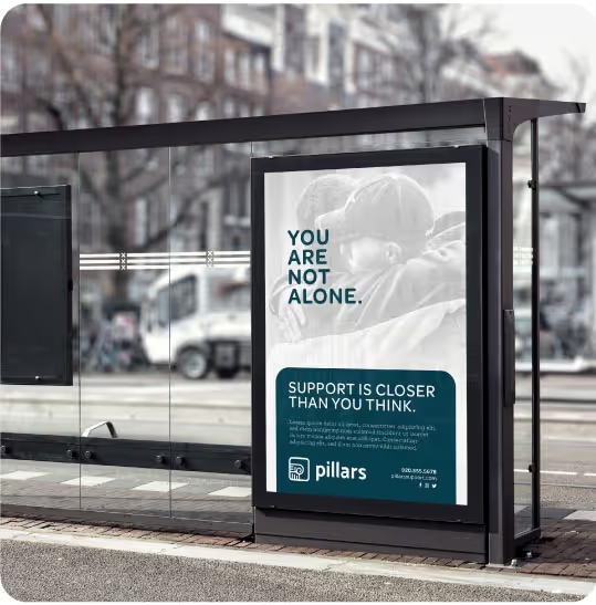
Motion Works Media had already built a strong reputation for high-quality content and a collaborative, professional approach. The challenge was to retain the equity of the existing brand while elevating the visual identity to better match the energy, precision, and polish of the work being produced. The new identity needed to feel confident, masculine, and energetic, with a system that would scale across web, social, and client-facing materials.

Quill Creative Studio refreshed the Motion Works Media identity by building a structured and cohesive visual system rooted in motion, clarity, and confidence. A more masculine and energetic color palette was introduced to evoke strength and creative drive. Typography was chosen for its modern, approachable qualities, and layouts were designed using geometric grids and content boxes that communicate precision and professionalism.
To reinforce the brand’s core idea of movement, gradients were used as a visual device throughout the system. These subtle color transitions add dimension and flow, mirroring how the team captures and shapes visual stories. The result is a brand identity that feels elevated, intentional, and unmistakably in motion.

The refreshed identity has given Motion Works Media a clear visual presence that aligns with its core mission: to create media that captivates and motivates. With a cohesive system in place, the brand now has the tools to communicate consistently across platforms, attract new clients, and confidently grow its portfolio. The updated visuals and messaging are helping position the company as a trusted creative partner for professionals in industries ranging from community and product marketing to corporate video and event production.


Motion Works Media had already built a strong reputation for high-quality content and a collaborative, professional approach. The challenge was to retain the equity of the existing brand while elevating the visual identity to better match the energy, precision, and polish of the work being produced. The new identity needed to feel confident, masculine, and energetic, with a system that would scale across web, social, and client-facing materials.

Quill Creative Studio refreshed the Motion Works Media identity by building a structured and cohesive visual system rooted in motion, clarity, and confidence. A more masculine and energetic color palette was introduced to evoke strength and creative drive. Typography was chosen for its modern, approachable qualities, and layouts were designed using geometric grids and content boxes that communicate precision and professionalism.
To reinforce the brand’s core idea of movement, gradients were used as a visual device throughout the system. These subtle color transitions add dimension and flow, mirroring how the team captures and shapes visual stories. The result is a brand identity that feels elevated, intentional, and unmistakably in motion.


The refreshed identity has given Motion Works Media a clear visual presence that aligns with its core mission: to create media that captivates and motivates. With a cohesive system in place, the brand now has the tools to communicate consistently across platforms, attract new clients, and confidently grow its portfolio. The updated visuals and messaging are helping position the company as a trusted creative partner for professionals in industries ranging from community and product marketing to corporate video and event production.


