


Lacuna Pet Products needed a brand identity that would resonate with modern pet owners—those who research what’s best for their pets, prefer supporting small businesses, and care deeply about ingredients. The brand had to strike the right balance between being purpose-driven and family-friendly, while also standing out in a competitive pet nutrition market. The challenge was to create a visual and verbal identity that felt both elevated and approachable, with clear communication that supports confident buying decisions.

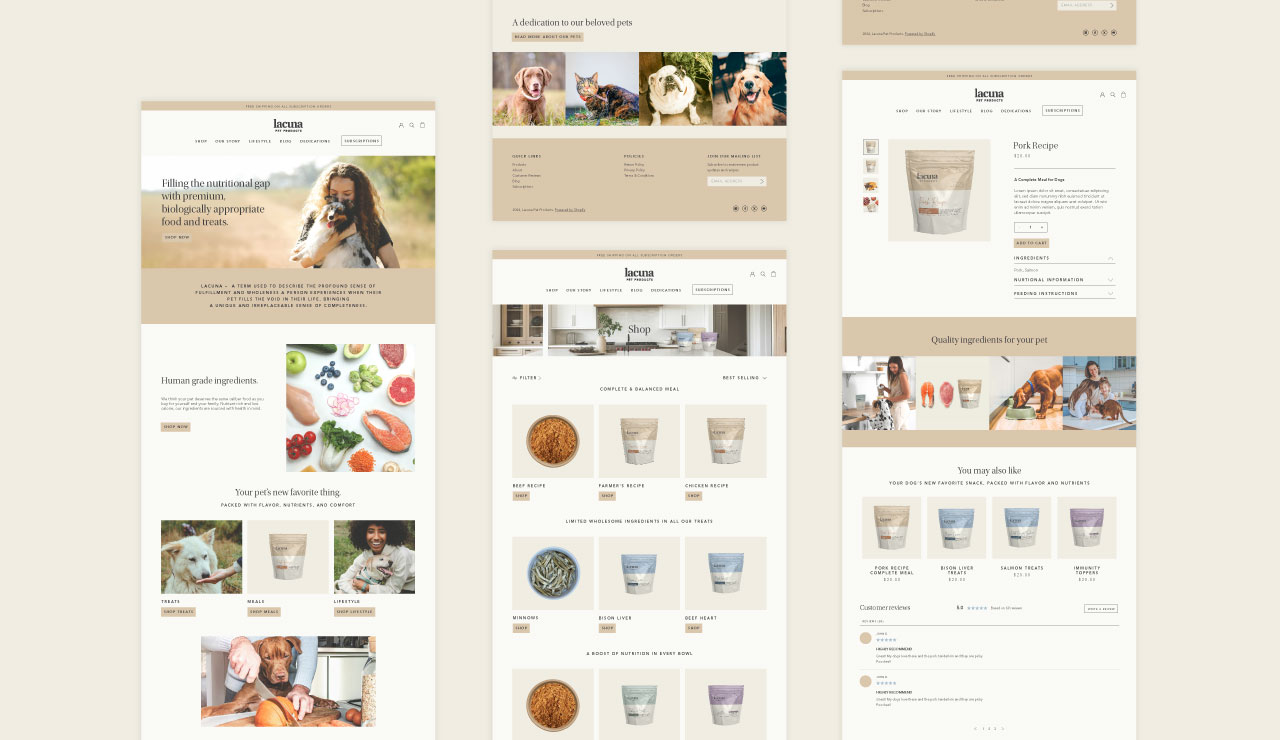

Quill Creative Studio developed a brand identity and packaging system rooted in warmth, clarity, and care. The name “Lacuna” communicates the idea of filling a nutritional gap, just as pets fill an emotional one in our lives. We leaned into this meaning to shape both the tone and the look of the brand.
The visual identity features an approachable color palette, contemporary and legible typography, and softly filtered photography of healthy ingredients and loving moments between people and their pets. We used clean layouts and subtle design textures to support a feeling of natural simplicity and trust. The brand voice is compassionate and supportive, offering customers honest, educational information that empowers them to make confident choices for their furry family members.

With a cohesive brand system in place, Lacuna Pet Products is now confidently positioned to connect with ingredient-conscious pet parents across digital channels. The new identity has helped the brand communicate its purpose and product benefits with clarity, driving interest and early adoption. With packaging that stands out on screen and messaging that builds trust, Lacuna is gaining traction with a growing base of loyal customers who value mindful sourcing, small business values, and purposeful pet nutrition.


Lacuna Pet Products needed a brand identity that would resonate with modern pet owners—those who research what’s best for their pets, prefer supporting small businesses, and care deeply about ingredients. The brand had to strike the right balance between being purpose-driven and family-friendly, while also standing out in a competitive pet nutrition market. The challenge was to create a visual and verbal identity that felt both elevated and approachable, with clear communication that supports confident buying decisions.


Quill Creative Studio developed a brand identity and packaging system rooted in warmth, clarity, and care. The name “Lacuna” communicates the idea of filling a nutritional gap, just as pets fill an emotional one in our lives. We leaned into this meaning to shape both the tone and the look of the brand.
The visual identity features an approachable color palette, contemporary and legible typography, and softly filtered photography of healthy ingredients and loving moments between people and their pets. We used clean layouts and subtle design textures to support a feeling of natural simplicity and trust. The brand voice is compassionate and supportive, offering customers honest, educational information that empowers them to make confident choices for their furry family members.


With a cohesive brand system in place, Lacuna Pet Products is now confidently positioned to connect with ingredient-conscious pet parents across digital channels. The new identity has helped the brand communicate its purpose and product benefits with clarity, driving interest and early adoption. With packaging that stands out on screen and messaging that builds trust, Lacuna is gaining traction with a growing base of loyal customers who value mindful sourcing, small business values, and purposeful pet nutrition.


Lacuna Pet Products needed a brand identity that would resonate with modern pet owners—those who research what’s best for their pets, prefer supporting small businesses, and care deeply about ingredients. The brand had to strike the right balance between being purpose-driven and family-friendly, while also standing out in a competitive pet nutrition market. The challenge was to create a visual and verbal identity that felt both elevated and approachable, with clear communication that supports confident buying decisions.


Quill Creative Studio developed a brand identity and packaging system rooted in warmth, clarity, and care. The name “Lacuna” communicates the idea of filling a nutritional gap, just as pets fill an emotional one in our lives. We leaned into this meaning to shape both the tone and the look of the brand.
The visual identity features an approachable color palette, contemporary and legible typography, and softly filtered photography of healthy ingredients and loving moments between people and their pets. We used clean layouts and subtle design textures to support a feeling of natural simplicity and trust. The brand voice is compassionate and supportive, offering customers honest, educational information that empowers them to make confident choices for their furry family members.

With a cohesive brand system in place, Lacuna Pet Products is now confidently positioned to connect with ingredient-conscious pet parents across digital channels. The new identity has helped the brand communicate its purpose and product benefits with clarity, driving interest and early adoption. With packaging that stands out on screen and messaging that builds trust, Lacuna is gaining traction with a growing base of loyal customers who value mindful sourcing, small business values, and purposeful pet nutrition.


Lacuna Pet Products needed a brand identity that would resonate with modern pet owners—those who research what’s best for their pets, prefer supporting small businesses, and care deeply about ingredients. The brand had to strike the right balance between being purpose-driven and family-friendly, while also standing out in a competitive pet nutrition market. The challenge was to create a visual and verbal identity that felt both elevated and approachable, with clear communication that supports confident buying decisions.

Quill Creative Studio developed a brand identity and packaging system rooted in warmth, clarity, and care. The name “Lacuna” communicates the idea of filling a nutritional gap, just as pets fill an emotional one in our lives. We leaned into this meaning to shape both the tone and the look of the brand.
The visual identity features an approachable color palette, contemporary and legible typography, and softly filtered photography of healthy ingredients and loving moments between people and their pets. We used clean layouts and subtle design textures to support a feeling of natural simplicity and trust. The brand voice is compassionate and supportive, offering customers honest, educational information that empowers them to make confident choices for their furry family members.


With a cohesive brand system in place, Lacuna Pet Products is now confidently positioned to connect with ingredient-conscious pet parents across digital channels. The new identity has helped the brand communicate its purpose and product benefits with clarity, driving interest and early adoption. With packaging that stands out on screen and messaging that builds trust, Lacuna is gaining traction with a growing base of loyal customers who value mindful sourcing, small business values, and purposeful pet nutrition.


Lacuna Pet Products needed a brand identity that would resonate with modern pet owners—those who research what’s best for their pets, prefer supporting small businesses, and care deeply about ingredients. The brand had to strike the right balance between being purpose-driven and family-friendly, while also standing out in a competitive pet nutrition market. The challenge was to create a visual and verbal identity that felt both elevated and approachable, with clear communication that supports confident buying decisions.


Quill Creative Studio developed a brand identity and packaging system rooted in warmth, clarity, and care. The name “Lacuna” communicates the idea of filling a nutritional gap, just as pets fill an emotional one in our lives. We leaned into this meaning to shape both the tone and the look of the brand.
The visual identity features an approachable color palette, contemporary and legible typography, and softly filtered photography of healthy ingredients and loving moments between people and their pets. We used clean layouts and subtle design textures to support a feeling of natural simplicity and trust. The brand voice is compassionate and supportive, offering customers honest, educational information that empowers them to make confident choices for their furry family members.


With a cohesive brand system in place, Lacuna Pet Products is now confidently positioned to connect with ingredient-conscious pet parents across digital channels. The new identity has helped the brand communicate its purpose and product benefits with clarity, driving interest and early adoption. With packaging that stands out on screen and messaging that builds trust, Lacuna is gaining traction with a growing base of loyal customers who value mindful sourcing, small business values, and purposeful pet nutrition.


Lacuna Pet Products needed a brand identity that would resonate with modern pet owners—those who research what’s best for their pets, prefer supporting small businesses, and care deeply about ingredients. The brand had to strike the right balance between being purpose-driven and family-friendly, while also standing out in a competitive pet nutrition market. The challenge was to create a visual and verbal identity that felt both elevated and approachable, with clear communication that supports confident buying decisions.


Quill Creative Studio developed a brand identity and packaging system rooted in warmth, clarity, and care. The name “Lacuna” communicates the idea of filling a nutritional gap, just as pets fill an emotional one in our lives. We leaned into this meaning to shape both the tone and the look of the brand.
The visual identity features an approachable color palette, contemporary and legible typography, and softly filtered photography of healthy ingredients and loving moments between people and their pets. We used clean layouts and subtle design textures to support a feeling of natural simplicity and trust. The brand voice is compassionate and supportive, offering customers honest, educational information that empowers them to make confident choices for their furry family members.


With a cohesive brand system in place, Lacuna Pet Products is now confidently positioned to connect with ingredient-conscious pet parents across digital channels. The new identity has helped the brand communicate its purpose and product benefits with clarity, driving interest and early adoption. With packaging that stands out on screen and messaging that builds trust, Lacuna is gaining traction with a growing base of loyal customers who value mindful sourcing, small business values, and purposeful pet nutrition.


Lacuna Pet Products needed a brand identity that would resonate with modern pet owners—those who research what’s best for their pets, prefer supporting small businesses, and care deeply about ingredients. The brand had to strike the right balance between being purpose-driven and family-friendly, while also standing out in a competitive pet nutrition market. The challenge was to create a visual and verbal identity that felt both elevated and approachable, with clear communication that supports confident buying decisions.


Quill Creative Studio developed a brand identity and packaging system rooted in warmth, clarity, and care. The name “Lacuna” communicates the idea of filling a nutritional gap, just as pets fill an emotional one in our lives. We leaned into this meaning to shape both the tone and the look of the brand.
The visual identity features an approachable color palette, contemporary and legible typography, and softly filtered photography of healthy ingredients and loving moments between people and their pets. We used clean layouts and subtle design textures to support a feeling of natural simplicity and trust. The brand voice is compassionate and supportive, offering customers honest, educational information that empowers them to make confident choices for their furry family members.


With a cohesive brand system in place, Lacuna Pet Products is now confidently positioned to connect with ingredient-conscious pet parents across digital channels. The new identity has helped the brand communicate its purpose and product benefits with clarity, driving interest and early adoption. With packaging that stands out on screen and messaging that builds trust, Lacuna is gaining traction with a growing base of loyal customers who value mindful sourcing, small business values, and purposeful pet nutrition.


Lacuna Pet Products needed a brand identity that would resonate with modern pet owners—those who research what’s best for their pets, prefer supporting small businesses, and care deeply about ingredients. The brand had to strike the right balance between being purpose-driven and family-friendly, while also standing out in a competitive pet nutrition market. The challenge was to create a visual and verbal identity that felt both elevated and approachable, with clear communication that supports confident buying decisions.


Quill Creative Studio developed a brand identity and packaging system rooted in warmth, clarity, and care. The name “Lacuna” communicates the idea of filling a nutritional gap, just as pets fill an emotional one in our lives. We leaned into this meaning to shape both the tone and the look of the brand.
The visual identity features an approachable color palette, contemporary and legible typography, and softly filtered photography of healthy ingredients and loving moments between people and their pets. We used clean layouts and subtle design textures to support a feeling of natural simplicity and trust. The brand voice is compassionate and supportive, offering customers honest, educational information that empowers them to make confident choices for their furry family members.


Lacuna Pet Products needed a brand identity that would resonate with modern pet owners—those who research what’s best for their pets, prefer supporting small businesses, and care deeply about ingredients. The brand had to strike the right balance between being purpose-driven and family-friendly, while also standing out in a competitive pet nutrition market. The challenge was to create a visual and verbal identity that felt both elevated and approachable, with clear communication that supports confident buying decisions.
Quill Creative Studio developed a brand identity and packaging system rooted in warmth, clarity, and care. The name “Lacuna” communicates the idea of filling a nutritional gap, just as pets fill an emotional one in our lives. We leaned into this meaning to shape both the tone and the look of the brand.
The visual identity features an approachable color palette, contemporary and legible typography, and softly filtered photography of healthy ingredients and loving moments between people and their pets. We used clean layouts and subtle design textures to support a feeling of natural simplicity and trust. The brand voice is compassionate and supportive, offering customers honest, educational information that empowers them to make confident choices for their furry family members.


With a cohesive brand system in place, Lacuna Pet Products is now confidently positioned to connect with ingredient-conscious pet parents across digital channels. The new identity has helped the brand communicate its purpose and product benefits with clarity, driving interest and early adoption. With packaging that stands out on screen and messaging that builds trust, Lacuna is gaining traction with a growing base of loyal customers who value mindful sourcing, small business values, and purposeful pet nutrition.


Lacuna Pet Products needed a brand identity that would resonate with modern pet owners—those who research what’s best for their pets, prefer supporting small businesses, and care deeply about ingredients. The brand had to strike the right balance between being purpose-driven and family-friendly, while also standing out in a competitive pet nutrition market. The challenge was to create a visual and verbal identity that felt both elevated and approachable, with clear communication that supports confident buying decisions.


Quill Creative Studio developed a brand identity and packaging system rooted in warmth, clarity, and care. The name “Lacuna” communicates the idea of filling a nutritional gap, just as pets fill an emotional one in our lives. We leaned into this meaning to shape both the tone and the look of the brand.
The visual identity features an approachable color palette, contemporary and legible typography, and softly filtered photography of healthy ingredients and loving moments between people and their pets. We used clean layouts and subtle design textures to support a feeling of natural simplicity and trust. The brand voice is compassionate and supportive, offering customers honest, educational information that empowers them to make confident choices for their furry family members.
With a cohesive brand system in place, Lacuna Pet Products is now confidently positioned to connect with ingredient-conscious pet parents across digital channels. The new identity has helped the brand communicate its purpose and product benefits with clarity, driving interest and early adoption. With packaging that stands out on screen and messaging that builds trust, Lacuna is gaining traction with a growing base of loyal customers who value mindful sourcing, small business values, and purposeful pet nutrition.

Lacuna Pet Products needed a brand identity that would resonate with modern pet owners—those who research what’s best for their pets, prefer supporting small businesses, and care deeply about ingredients. The brand had to strike the right balance between being purpose-driven and family-friendly, while also standing out in a competitive pet nutrition market. The challenge was to create a visual and verbal identity that felt both elevated and approachable, with clear communication that supports confident buying decisions.


Quill Creative Studio developed a brand identity and packaging system rooted in warmth, clarity, and care. The name “Lacuna” communicates the idea of filling a nutritional gap, just as pets fill an emotional one in our lives. We leaned into this meaning to shape both the tone and the look of the brand.
The visual identity features an approachable color palette, contemporary and legible typography, and softly filtered photography of healthy ingredients and loving moments between people and their pets. We used clean layouts and subtle design textures to support a feeling of natural simplicity and trust. The brand voice is compassionate and supportive, offering customers honest, educational information that empowers them to make confident choices for their furry family members.


With a cohesive brand system in place, Lacuna Pet Products is now confidently positioned to connect with ingredient-conscious pet parents across digital channels. The new identity has helped the brand communicate its purpose and product benefits with clarity, driving interest and early adoption. With packaging that stands out on screen and messaging that builds trust, Lacuna is gaining traction with a growing base of loyal customers who value mindful sourcing, small business values, and purposeful pet nutrition.


Lacuna Pet Products needed a brand identity that would resonate with modern pet owners—those who research what’s best for their pets, prefer supporting small businesses, and care deeply about ingredients. The brand had to strike the right balance between being purpose-driven and family-friendly, while also standing out in a competitive pet nutrition market. The challenge was to create a visual and verbal identity that felt both elevated and approachable, with clear communication that supports confident buying decisions.

Quill Creative Studio developed a brand identity and packaging system rooted in warmth, clarity, and care. The name “Lacuna” communicates the idea of filling a nutritional gap, just as pets fill an emotional one in our lives. We leaned into this meaning to shape both the tone and the look of the brand.
The visual identity features an approachable color palette, contemporary and legible typography, and softly filtered photography of healthy ingredients and loving moments between people and their pets. We used clean layouts and subtle design textures to support a feeling of natural simplicity and trust. The brand voice is compassionate and supportive, offering customers honest, educational information that empowers them to make confident choices for their furry family members.

With a cohesive brand system in place, Lacuna Pet Products is now confidently positioned to connect with ingredient-conscious pet parents across digital channels. The new identity has helped the brand communicate its purpose and product benefits with clarity, driving interest and early adoption. With packaging that stands out on screen and messaging that builds trust, Lacuna is gaining traction with a growing base of loyal customers who value mindful sourcing, small business values, and purposeful pet nutrition.


Lacuna Pet Products needed a brand identity that would resonate with modern pet owners—those who research what’s best for their pets, prefer supporting small businesses, and care deeply about ingredients. The brand had to strike the right balance between being purpose-driven and family-friendly, while also standing out in a competitive pet nutrition market. The challenge was to create a visual and verbal identity that felt both elevated and approachable, with clear communication that supports confident buying decisions.


Quill Creative Studio developed a brand identity and packaging system rooted in warmth, clarity, and care. The name “Lacuna” communicates the idea of filling a nutritional gap, just as pets fill an emotional one in our lives. We leaned into this meaning to shape both the tone and the look of the brand.
The visual identity features an approachable color palette, contemporary and legible typography, and softly filtered photography of healthy ingredients and loving moments between people and their pets. We used clean layouts and subtle design textures to support a feeling of natural simplicity and trust. The brand voice is compassionate and supportive, offering customers honest, educational information that empowers them to make confident choices for their furry family members.


With a cohesive brand system in place, Lacuna Pet Products is now confidently positioned to connect with ingredient-conscious pet parents across digital channels. The new identity has helped the brand communicate its purpose and product benefits with clarity, driving interest and early adoption. With packaging that stands out on screen and messaging that builds trust, Lacuna is gaining traction with a growing base of loyal customers who value mindful sourcing, small business values, and purposeful pet nutrition.


Lacuna Pet Products needed a brand identity that would resonate with modern pet owners—those who research what’s best for their pets, prefer supporting small businesses, and care deeply about ingredients. The brand had to strike the right balance between being purpose-driven and family-friendly, while also standing out in a competitive pet nutrition market. The challenge was to create a visual and verbal identity that felt both elevated and approachable, with clear communication that supports confident buying decisions.

Quill Creative Studio developed a brand identity and packaging system rooted in warmth, clarity, and care. The name “Lacuna” communicates the idea of filling a nutritional gap, just as pets fill an emotional one in our lives. We leaned into this meaning to shape both the tone and the look of the brand.
The visual identity features an approachable color palette, contemporary and legible typography, and softly filtered photography of healthy ingredients and loving moments between people and their pets. We used clean layouts and subtle design textures to support a feeling of natural simplicity and trust. The brand voice is compassionate and supportive, offering customers honest, educational information that empowers them to make confident choices for their furry family members.
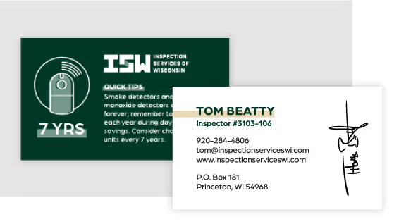

With a cohesive brand system in place, Lacuna Pet Products is now confidently positioned to connect with ingredient-conscious pet parents across digital channels. The new identity has helped the brand communicate its purpose and product benefits with clarity, driving interest and early adoption. With packaging that stands out on screen and messaging that builds trust, Lacuna is gaining traction with a growing base of loyal customers who value mindful sourcing, small business values, and purposeful pet nutrition.
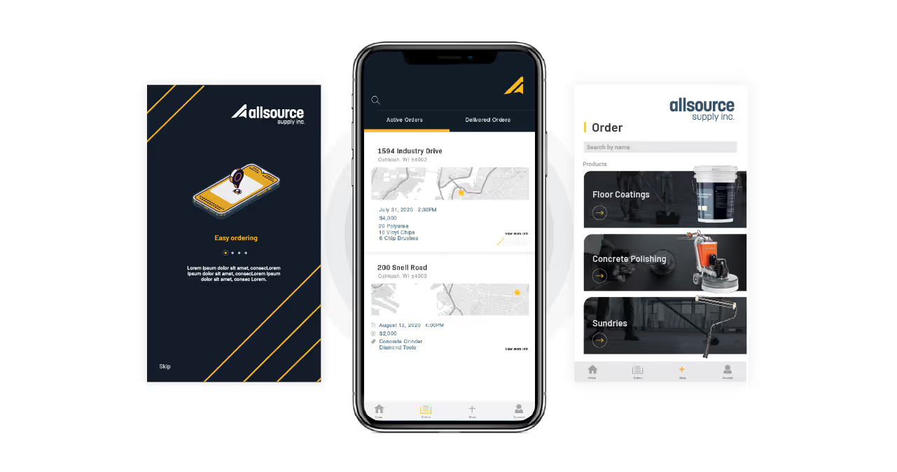


Lacuna Pet Products needed a brand identity that would resonate with modern pet owners—those who research what’s best for their pets, prefer supporting small businesses, and care deeply about ingredients. The brand had to strike the right balance between being purpose-driven and family-friendly, while also standing out in a competitive pet nutrition market. The challenge was to create a visual and verbal identity that felt both elevated and approachable, with clear communication that supports confident buying decisions.


Quill Creative Studio developed a brand identity and packaging system rooted in warmth, clarity, and care. The name “Lacuna” communicates the idea of filling a nutritional gap, just as pets fill an emotional one in our lives. We leaned into this meaning to shape both the tone and the look of the brand.
The visual identity features an approachable color palette, contemporary and legible typography, and softly filtered photography of healthy ingredients and loving moments between people and their pets. We used clean layouts and subtle design textures to support a feeling of natural simplicity and trust. The brand voice is compassionate and supportive, offering customers honest, educational information that empowers them to make confident choices for their furry family members.


With a cohesive brand system in place, Lacuna Pet Products is now confidently positioned to connect with ingredient-conscious pet parents across digital channels. The new identity has helped the brand communicate its purpose and product benefits with clarity, driving interest and early adoption. With packaging that stands out on screen and messaging that builds trust, Lacuna is gaining traction with a growing base of loyal customers who value mindful sourcing, small business values, and purposeful pet nutrition.


Lacuna Pet Products needed a brand identity that would resonate with modern pet owners—those who research what’s best for their pets, prefer supporting small businesses, and care deeply about ingredients. The brand had to strike the right balance between being purpose-driven and family-friendly, while also standing out in a competitive pet nutrition market. The challenge was to create a visual and verbal identity that felt both elevated and approachable, with clear communication that supports confident buying decisions.


Quill Creative Studio developed a brand identity and packaging system rooted in warmth, clarity, and care. The name “Lacuna” communicates the idea of filling a nutritional gap, just as pets fill an emotional one in our lives. We leaned into this meaning to shape both the tone and the look of the brand.
The visual identity features an approachable color palette, contemporary and legible typography, and softly filtered photography of healthy ingredients and loving moments between people and their pets. We used clean layouts and subtle design textures to support a feeling of natural simplicity and trust. The brand voice is compassionate and supportive, offering customers honest, educational information that empowers them to make confident choices for their furry family members.

With a cohesive brand system in place, Lacuna Pet Products is now confidently positioned to connect with ingredient-conscious pet parents across digital channels. The new identity has helped the brand communicate its purpose and product benefits with clarity, driving interest and early adoption. With packaging that stands out on screen and messaging that builds trust, Lacuna is gaining traction with a growing base of loyal customers who value mindful sourcing, small business values, and purposeful pet nutrition.


Lacuna Pet Products needed a brand identity that would resonate with modern pet owners—those who research what’s best for their pets, prefer supporting small businesses, and care deeply about ingredients. The brand had to strike the right balance between being purpose-driven and family-friendly, while also standing out in a competitive pet nutrition market. The challenge was to create a visual and verbal identity that felt both elevated and approachable, with clear communication that supports confident buying decisions.

Quill Creative Studio developed a brand identity and packaging system rooted in warmth, clarity, and care. The name “Lacuna” communicates the idea of filling a nutritional gap, just as pets fill an emotional one in our lives. We leaned into this meaning to shape both the tone and the look of the brand.
The visual identity features an approachable color palette, contemporary and legible typography, and softly filtered photography of healthy ingredients and loving moments between people and their pets. We used clean layouts and subtle design textures to support a feeling of natural simplicity and trust. The brand voice is compassionate and supportive, offering customers honest, educational information that empowers them to make confident choices for their furry family members.


With a cohesive brand system in place, Lacuna Pet Products is now confidently positioned to connect with ingredient-conscious pet parents across digital channels. The new identity has helped the brand communicate its purpose and product benefits with clarity, driving interest and early adoption. With packaging that stands out on screen and messaging that builds trust, Lacuna is gaining traction with a growing base of loyal customers who value mindful sourcing, small business values, and purposeful pet nutrition.


With a cohesive brand system in place, Lacuna Pet Products is now confidently positioned to connect with ingredient-conscious pet parents across digital channels. The new identity has helped the brand communicate its purpose and product benefits with clarity, driving interest and early adoption. With packaging that stands out on screen and messaging that builds trust, Lacuna is gaining traction with a growing base of loyal customers who value mindful sourcing, small business values, and purposeful pet nutrition.
Lacuna Pet Products needed a brand identity that would resonate with modern pet owners—those who research what’s best for their pets, prefer supporting small businesses, and care deeply about ingredients. The brand had to strike the right balance between being purpose-driven and family-friendly, while also standing out in a competitive pet nutrition market. The challenge was to create a visual and verbal identity that felt both elevated and approachable, with clear communication that supports confident buying decisions.

Quill Creative Studio developed a brand identity and packaging system rooted in warmth, clarity, and care. The name “Lacuna” communicates the idea of filling a nutritional gap, just as pets fill an emotional one in our lives. We leaned into this meaning to shape both the tone and the look of the brand.
The visual identity features an approachable color palette, contemporary and legible typography, and softly filtered photography of healthy ingredients and loving moments between people and their pets. We used clean layouts and subtle design textures to support a feeling of natural simplicity and trust. The brand voice is compassionate and supportive, offering customers honest, educational information that empowers them to make confident choices for their furry family members.

With a cohesive brand system in place, Lacuna Pet Products is now confidently positioned to connect with ingredient-conscious pet parents across digital channels. The new identity has helped the brand communicate its purpose and product benefits with clarity, driving interest and early adoption. With packaging that stands out on screen and messaging that builds trust, Lacuna is gaining traction with a growing base of loyal customers who value mindful sourcing, small business values, and purposeful pet nutrition.

With a cohesive brand system in place, Lacuna Pet Products is now confidently positioned to connect with ingredient-conscious pet parents across digital channels. The new identity has helped the brand communicate its purpose and product benefits with clarity, driving interest and early adoption. With packaging that stands out on screen and messaging that builds trust, Lacuna is gaining traction with a growing base of loyal customers who value mindful sourcing, small business values, and purposeful pet nutrition.

Quill Creative Studio developed a brand identity and packaging system rooted in warmth, clarity, and care. The name “Lacuna” communicates the idea of filling a nutritional gap, just as pets fill an emotional one in our lives. We leaned into this meaning to shape both the tone and the look of the brand.
The visual identity features an approachable color palette, contemporary and legible typography, and softly filtered photography of healthy ingredients and loving moments between people and their pets. We used clean layouts and subtle design textures to support a feeling of natural simplicity and trust. The brand voice is compassionate and supportive, offering customers honest, educational information that empowers them to make confident choices for their furry family members.

Lacuna Pet Products needed a brand identity that would resonate with modern pet owners—those who research what’s best for their pets, prefer supporting small businesses, and care deeply about ingredients. The brand had to strike the right balance between being purpose-driven and family-friendly, while also standing out in a competitive pet nutrition market. The challenge was to create a visual and verbal identity that felt both elevated and approachable, with clear communication that supports confident buying decisions.

With a cohesive brand system in place, Lacuna Pet Products is now confidently positioned to connect with ingredient-conscious pet parents across digital channels. The new identity has helped the brand communicate its purpose and product benefits with clarity, driving interest and early adoption. With packaging that stands out on screen and messaging that builds trust, Lacuna is gaining traction with a growing base of loyal customers who value mindful sourcing, small business values, and purposeful pet nutrition.


With a cohesive brand system in place, Lacuna Pet Products is now confidently positioned to connect with ingredient-conscious pet parents across digital channels. The new identity has helped the brand communicate its purpose and product benefits with clarity, driving interest and early adoption. With packaging that stands out on screen and messaging that builds trust, Lacuna is gaining traction with a growing base of loyal customers who value mindful sourcing, small business values, and purposeful pet nutrition.


Lacuna Pet Products needed a brand identity that would resonate with modern pet owners—those who research what’s best for their pets, prefer supporting small businesses, and care deeply about ingredients. The brand had to strike the right balance between being purpose-driven and family-friendly, while also standing out in a competitive pet nutrition market. The challenge was to create a visual and verbal identity that felt both elevated and approachable, with clear communication that supports confident buying decisions.


Quill Creative Studio developed a brand identity and packaging system rooted in warmth, clarity, and care. The name “Lacuna” communicates the idea of filling a nutritional gap, just as pets fill an emotional one in our lives. We leaned into this meaning to shape both the tone and the look of the brand.
The visual identity features an approachable color palette, contemporary and legible typography, and softly filtered photography of healthy ingredients and loving moments between people and their pets. We used clean layouts and subtle design textures to support a feeling of natural simplicity and trust. The brand voice is compassionate and supportive, offering customers honest, educational information that empowers them to make confident choices for their furry family members.

With a cohesive brand system in place, Lacuna Pet Products is now confidently positioned to connect with ingredient-conscious pet parents across digital channels. The new identity has helped the brand communicate its purpose and product benefits with clarity, driving interest and early adoption. With packaging that stands out on screen and messaging that builds trust, Lacuna is gaining traction with a growing base of loyal customers who value mindful sourcing, small business values, and purposeful pet nutrition.


Lacuna Pet Products needed a brand identity that would resonate with modern pet owners—those who research what’s best for their pets, prefer supporting small businesses, and care deeply about ingredients. The brand had to strike the right balance between being purpose-driven and family-friendly, while also standing out in a competitive pet nutrition market. The challenge was to create a visual and verbal identity that felt both elevated and approachable, with clear communication that supports confident buying decisions.
Quill Creative Studio developed a brand identity and packaging system rooted in warmth, clarity, and care. The name “Lacuna” communicates the idea of filling a nutritional gap, just as pets fill an emotional one in our lives. We leaned into this meaning to shape both the tone and the look of the brand.
The visual identity features an approachable color palette, contemporary and legible typography, and softly filtered photography of healthy ingredients and loving moments between people and their pets. We used clean layouts and subtle design textures to support a feeling of natural simplicity and trust. The brand voice is compassionate and supportive, offering customers honest, educational information that empowers them to make confident choices for their furry family members.


With a cohesive brand system in place, Lacuna Pet Products is now confidently positioned to connect with ingredient-conscious pet parents across digital channels. The new identity has helped the brand communicate its purpose and product benefits with clarity, driving interest and early adoption. With packaging that stands out on screen and messaging that builds trust, Lacuna is gaining traction with a growing base of loyal customers who value mindful sourcing, small business values, and purposeful pet nutrition.


Lacuna Pet Products needed a brand identity that would resonate with modern pet owners—those who research what’s best for their pets, prefer supporting small businesses, and care deeply about ingredients. The brand had to strike the right balance between being purpose-driven and family-friendly, while also standing out in a competitive pet nutrition market. The challenge was to create a visual and verbal identity that felt both elevated and approachable, with clear communication that supports confident buying decisions.
With a cohesive brand system in place, Lacuna Pet Products is now confidently positioned to connect with ingredient-conscious pet parents across digital channels. The new identity has helped the brand communicate its purpose and product benefits with clarity, driving interest and early adoption. With packaging that stands out on screen and messaging that builds trust, Lacuna is gaining traction with a growing base of loyal customers who value mindful sourcing, small business values, and purposeful pet nutrition.

Quill Creative Studio developed a brand identity and packaging system rooted in warmth, clarity, and care. The name “Lacuna” communicates the idea of filling a nutritional gap, just as pets fill an emotional one in our lives. We leaned into this meaning to shape both the tone and the look of the brand.
The visual identity features an approachable color palette, contemporary and legible typography, and softly filtered photography of healthy ingredients and loving moments between people and their pets. We used clean layouts and subtle design textures to support a feeling of natural simplicity and trust. The brand voice is compassionate and supportive, offering customers honest, educational information that empowers them to make confident choices for their furry family members.


With a cohesive brand system in place, Lacuna Pet Products is now confidently positioned to connect with ingredient-conscious pet parents across digital channels. The new identity has helped the brand communicate its purpose and product benefits with clarity, driving interest and early adoption. With packaging that stands out on screen and messaging that builds trust, Lacuna is gaining traction with a growing base of loyal customers who value mindful sourcing, small business values, and purposeful pet nutrition.


Lacuna Pet Products needed a brand identity that would resonate with modern pet owners—those who research what’s best for their pets, prefer supporting small businesses, and care deeply about ingredients. The brand had to strike the right balance between being purpose-driven and family-friendly, while also standing out in a competitive pet nutrition market. The challenge was to create a visual and verbal identity that felt both elevated and approachable, with clear communication that supports confident buying decisions.
Quill Creative Studio developed a brand identity and packaging system rooted in warmth, clarity, and care. The name “Lacuna” communicates the idea of filling a nutritional gap, just as pets fill an emotional one in our lives. We leaned into this meaning to shape both the tone and the look of the brand.
The visual identity features an approachable color palette, contemporary and legible typography, and softly filtered photography of healthy ingredients and loving moments between people and their pets. We used clean layouts and subtle design textures to support a feeling of natural simplicity and trust. The brand voice is compassionate and supportive, offering customers honest, educational information that empowers them to make confident choices for their furry family members.


With a cohesive brand system in place, Lacuna Pet Products is now confidently positioned to connect with ingredient-conscious pet parents across digital channels. The new identity has helped the brand communicate its purpose and product benefits with clarity, driving interest and early adoption. With packaging that stands out on screen and messaging that builds trust, Lacuna is gaining traction with a growing base of loyal customers who value mindful sourcing, small business values, and purposeful pet nutrition.


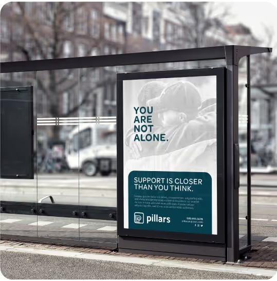
Lacuna Pet Products needed a brand identity that would resonate with modern pet owners—those who research what’s best for their pets, prefer supporting small businesses, and care deeply about ingredients. The brand had to strike the right balance between being purpose-driven and family-friendly, while also standing out in a competitive pet nutrition market. The challenge was to create a visual and verbal identity that felt both elevated and approachable, with clear communication that supports confident buying decisions.

Quill Creative Studio developed a brand identity and packaging system rooted in warmth, clarity, and care. The name “Lacuna” communicates the idea of filling a nutritional gap, just as pets fill an emotional one in our lives. We leaned into this meaning to shape both the tone and the look of the brand.
The visual identity features an approachable color palette, contemporary and legible typography, and softly filtered photography of healthy ingredients and loving moments between people and their pets. We used clean layouts and subtle design textures to support a feeling of natural simplicity and trust. The brand voice is compassionate and supportive, offering customers honest, educational information that empowers them to make confident choices for their furry family members.

With a cohesive brand system in place, Lacuna Pet Products is now confidently positioned to connect with ingredient-conscious pet parents across digital channels. The new identity has helped the brand communicate its purpose and product benefits with clarity, driving interest and early adoption. With packaging that stands out on screen and messaging that builds trust, Lacuna is gaining traction with a growing base of loyal customers who value mindful sourcing, small business values, and purposeful pet nutrition.


Lacuna Pet Products needed a brand identity that would resonate with modern pet owners—those who research what’s best for their pets, prefer supporting small businesses, and care deeply about ingredients. The brand had to strike the right balance between being purpose-driven and family-friendly, while also standing out in a competitive pet nutrition market. The challenge was to create a visual and verbal identity that felt both elevated and approachable, with clear communication that supports confident buying decisions.

Quill Creative Studio developed a brand identity and packaging system rooted in warmth, clarity, and care. The name “Lacuna” communicates the idea of filling a nutritional gap, just as pets fill an emotional one in our lives. We leaned into this meaning to shape both the tone and the look of the brand.
The visual identity features an approachable color palette, contemporary and legible typography, and softly filtered photography of healthy ingredients and loving moments between people and their pets. We used clean layouts and subtle design textures to support a feeling of natural simplicity and trust. The brand voice is compassionate and supportive, offering customers honest, educational information that empowers them to make confident choices for their furry family members.


With a cohesive brand system in place, Lacuna Pet Products is now confidently positioned to connect with ingredient-conscious pet parents across digital channels. The new identity has helped the brand communicate its purpose and product benefits with clarity, driving interest and early adoption. With packaging that stands out on screen and messaging that builds trust, Lacuna is gaining traction with a growing base of loyal customers who value mindful sourcing, small business values, and purposeful pet nutrition.


Finding Quill Creative with a quick Google Search for Wisconsin branding companies was one of the most valuable Google searches I've ever done. The team is very professional, extremely talented in creativity, design and messaging, and exceptional with communication. They know what they are doing, and their work shows. You CANNOT find a better branding company that you'll love to work with.
Toni Maretti, Owner, Lacuna Pet Products
