


After more than two decades of success, it was time for an identity refresh. As digital marketing pros, they knew they were due for a makeover, and their long-time partnership with Quill made finding the right people for the job a snap! E-Power came to Quill with a desire to update their identity to reflect a more modern aesthetic and see it act as a true reflection of an ethos that revolves around long-term partnerships built on trust and results.


We approached E-Power’s identity refresh the same way E-Power approaches business – with a people-first mindset. With a vision to communicate E-Power's approachability and friendliness, we carefully selected a palette of friendly, inviting colors and soft, modern shapes. We then created a set of icons and elements that injected a sense of playfulness paired with professionalism. Lastly, we selected new visuals centered around people – clients, team members, and the wider community. Photographs featured happy faces, successful collaborations, and the genuine connections forged through E-Power's work.

E-Power now has a visual identity that authentically represents their values and approach, setting them on a path to continued success in the ever-evolving digital landscape. While embracing a people-first and friendly image, E-Power's revamped brand identity doesn’t compromise their reputation as experts. In fact, it enhances it. The modern, fresh look now communicates that E-Power is not just experienced but also adaptable in the fast-paced world of digital marketing. The agency's commitment to staying relevant and approachable while maintaining a high-standard of professionalism positions them as leaders who understand both the human and technical aspects of the industry.


After more than two decades of success, it was time for an identity refresh. As digital marketing pros, they knew they were due for a makeover, and their long-time partnership with Quill made finding the right people for the job a snap! E-Power came to Quill with a desire to update their identity to reflect a more modern aesthetic and see it act as a true reflection of an ethos that revolves around long-term partnerships built on trust and results.


We approached E-Power’s identity refresh the same way E-Power approaches business – with a people-first mindset. With a vision to communicate E-Power's approachability and friendliness, we carefully selected a palette of friendly, inviting colors and soft, modern shapes. We then created a set of icons and elements that injected a sense of playfulness paired with professionalism. Lastly, we selected new visuals centered around people – clients, team members, and the wider community. Photographs featured happy faces, successful collaborations, and the genuine connections forged through E-Power's work.


E-Power now has a visual identity that authentically represents their values and approach, setting them on a path to continued success in the ever-evolving digital landscape. While embracing a people-first and friendly image, E-Power's revamped brand identity doesn’t compromise their reputation as experts. In fact, it enhances it. The modern, fresh look now communicates that E-Power is not just experienced but also adaptable in the fast-paced world of digital marketing. The agency's commitment to staying relevant and approachable while maintaining a high-standard of professionalism positions them as leaders who understand both the human and technical aspects of the industry.


After more than two decades of success, it was time for an identity refresh. As digital marketing pros, they knew they were due for a makeover, and their long-time partnership with Quill made finding the right people for the job a snap! E-Power came to Quill with a desire to update their identity to reflect a more modern aesthetic and see it act as a true reflection of an ethos that revolves around long-term partnerships built on trust and results.


We approached E-Power’s identity refresh the same way E-Power approaches business – with a people-first mindset. With a vision to communicate E-Power's approachability and friendliness, we carefully selected a palette of friendly, inviting colors and soft, modern shapes. We then created a set of icons and elements that injected a sense of playfulness paired with professionalism. Lastly, we selected new visuals centered around people – clients, team members, and the wider community. Photographs featured happy faces, successful collaborations, and the genuine connections forged through E-Power's work.

E-Power now has a visual identity that authentically represents their values and approach, setting them on a path to continued success in the ever-evolving digital landscape. While embracing a people-first and friendly image, E-Power's revamped brand identity doesn’t compromise their reputation as experts. In fact, it enhances it. The modern, fresh look now communicates that E-Power is not just experienced but also adaptable in the fast-paced world of digital marketing. The agency's commitment to staying relevant and approachable while maintaining a high-standard of professionalism positions them as leaders who understand both the human and technical aspects of the industry.


After more than two decades of success, it was time for an identity refresh. As digital marketing pros, they knew they were due for a makeover, and their long-time partnership with Quill made finding the right people for the job a snap! E-Power came to Quill with a desire to update their identity to reflect a more modern aesthetic and see it act as a true reflection of an ethos that revolves around long-term partnerships built on trust and results.

We approached E-Power’s identity refresh the same way E-Power approaches business – with a people-first mindset. With a vision to communicate E-Power's approachability and friendliness, we carefully selected a palette of friendly, inviting colors and soft, modern shapes. We then created a set of icons and elements that injected a sense of playfulness paired with professionalism. Lastly, we selected new visuals centered around people – clients, team members, and the wider community. Photographs featured happy faces, successful collaborations, and the genuine connections forged through E-Power's work.


E-Power now has a visual identity that authentically represents their values and approach, setting them on a path to continued success in the ever-evolving digital landscape. While embracing a people-first and friendly image, E-Power's revamped brand identity doesn’t compromise their reputation as experts. In fact, it enhances it. The modern, fresh look now communicates that E-Power is not just experienced but also adaptable in the fast-paced world of digital marketing. The agency's commitment to staying relevant and approachable while maintaining a high-standard of professionalism positions them as leaders who understand both the human and technical aspects of the industry.


After more than two decades of success, it was time for an identity refresh. As digital marketing pros, they knew they were due for a makeover, and their long-time partnership with Quill made finding the right people for the job a snap! E-Power came to Quill with a desire to update their identity to reflect a more modern aesthetic and see it act as a true reflection of an ethos that revolves around long-term partnerships built on trust and results.


We approached E-Power’s identity refresh the same way E-Power approaches business – with a people-first mindset. With a vision to communicate E-Power's approachability and friendliness, we carefully selected a palette of friendly, inviting colors and soft, modern shapes. We then created a set of icons and elements that injected a sense of playfulness paired with professionalism. Lastly, we selected new visuals centered around people – clients, team members, and the wider community. Photographs featured happy faces, successful collaborations, and the genuine connections forged through E-Power's work.


E-Power now has a visual identity that authentically represents their values and approach, setting them on a path to continued success in the ever-evolving digital landscape. While embracing a people-first and friendly image, E-Power's revamped brand identity doesn’t compromise their reputation as experts. In fact, it enhances it. The modern, fresh look now communicates that E-Power is not just experienced but also adaptable in the fast-paced world of digital marketing. The agency's commitment to staying relevant and approachable while maintaining a high-standard of professionalism positions them as leaders who understand both the human and technical aspects of the industry.


After more than two decades of success, it was time for an identity refresh. As digital marketing pros, they knew they were due for a makeover, and their long-time partnership with Quill made finding the right people for the job a snap! E-Power came to Quill with a desire to update their identity to reflect a more modern aesthetic and see it act as a true reflection of an ethos that revolves around long-term partnerships built on trust and results.


We approached E-Power’s identity refresh the same way E-Power approaches business – with a people-first mindset. With a vision to communicate E-Power's approachability and friendliness, we carefully selected a palette of friendly, inviting colors and soft, modern shapes. We then created a set of icons and elements that injected a sense of playfulness paired with professionalism. Lastly, we selected new visuals centered around people – clients, team members, and the wider community. Photographs featured happy faces, successful collaborations, and the genuine connections forged through E-Power's work.


E-Power now has a visual identity that authentically represents their values and approach, setting them on a path to continued success in the ever-evolving digital landscape. While embracing a people-first and friendly image, E-Power's revamped brand identity doesn’t compromise their reputation as experts. In fact, it enhances it. The modern, fresh look now communicates that E-Power is not just experienced but also adaptable in the fast-paced world of digital marketing. The agency's commitment to staying relevant and approachable while maintaining a high-standard of professionalism positions them as leaders who understand both the human and technical aspects of the industry.


After more than two decades of success, it was time for an identity refresh. As digital marketing pros, they knew they were due for a makeover, and their long-time partnership with Quill made finding the right people for the job a snap! E-Power came to Quill with a desire to update their identity to reflect a more modern aesthetic and see it act as a true reflection of an ethos that revolves around long-term partnerships built on trust and results.


We approached E-Power’s identity refresh the same way E-Power approaches business – with a people-first mindset. With a vision to communicate E-Power's approachability and friendliness, we carefully selected a palette of friendly, inviting colors and soft, modern shapes. We then created a set of icons and elements that injected a sense of playfulness paired with professionalism. Lastly, we selected new visuals centered around people – clients, team members, and the wider community. Photographs featured happy faces, successful collaborations, and the genuine connections forged through E-Power's work.


E-Power now has a visual identity that authentically represents their values and approach, setting them on a path to continued success in the ever-evolving digital landscape. While embracing a people-first and friendly image, E-Power's revamped brand identity doesn’t compromise their reputation as experts. In fact, it enhances it. The modern, fresh look now communicates that E-Power is not just experienced but also adaptable in the fast-paced world of digital marketing. The agency's commitment to staying relevant and approachable while maintaining a high-standard of professionalism positions them as leaders who understand both the human and technical aspects of the industry.


After more than two decades of success, it was time for an identity refresh. As digital marketing pros, they knew they were due for a makeover, and their long-time partnership with Quill made finding the right people for the job a snap! E-Power came to Quill with a desire to update their identity to reflect a more modern aesthetic and see it act as a true reflection of an ethos that revolves around long-term partnerships built on trust and results.


We approached E-Power’s identity refresh the same way E-Power approaches business – with a people-first mindset. With a vision to communicate E-Power's approachability and friendliness, we carefully selected a palette of friendly, inviting colors and soft, modern shapes. We then created a set of icons and elements that injected a sense of playfulness paired with professionalism. Lastly, we selected new visuals centered around people – clients, team members, and the wider community. Photographs featured happy faces, successful collaborations, and the genuine connections forged through E-Power's work.


After more than two decades of success, it was time for an identity refresh. As digital marketing pros, they knew they were due for a makeover, and their long-time partnership with Quill made finding the right people for the job a snap! E-Power came to Quill with a desire to update their identity to reflect a more modern aesthetic and see it act as a true reflection of an ethos that revolves around long-term partnerships built on trust and results.
We approached E-Power’s identity refresh the same way E-Power approaches business – with a people-first mindset. With a vision to communicate E-Power's approachability and friendliness, we carefully selected a palette of friendly, inviting colors and soft, modern shapes. We then created a set of icons and elements that injected a sense of playfulness paired with professionalism. Lastly, we selected new visuals centered around people – clients, team members, and the wider community. Photographs featured happy faces, successful collaborations, and the genuine connections forged through E-Power's work.


E-Power now has a visual identity that authentically represents their values and approach, setting them on a path to continued success in the ever-evolving digital landscape. While embracing a people-first and friendly image, E-Power's revamped brand identity doesn’t compromise their reputation as experts. In fact, it enhances it. The modern, fresh look now communicates that E-Power is not just experienced but also adaptable in the fast-paced world of digital marketing. The agency's commitment to staying relevant and approachable while maintaining a high-standard of professionalism positions them as leaders who understand both the human and technical aspects of the industry.


After more than two decades of success, it was time for an identity refresh. As digital marketing pros, they knew they were due for a makeover, and their long-time partnership with Quill made finding the right people for the job a snap! E-Power came to Quill with a desire to update their identity to reflect a more modern aesthetic and see it act as a true reflection of an ethos that revolves around long-term partnerships built on trust and results.


We approached E-Power’s identity refresh the same way E-Power approaches business – with a people-first mindset. With a vision to communicate E-Power's approachability and friendliness, we carefully selected a palette of friendly, inviting colors and soft, modern shapes. We then created a set of icons and elements that injected a sense of playfulness paired with professionalism. Lastly, we selected new visuals centered around people – clients, team members, and the wider community. Photographs featured happy faces, successful collaborations, and the genuine connections forged through E-Power's work.
E-Power now has a visual identity that authentically represents their values and approach, setting them on a path to continued success in the ever-evolving digital landscape. While embracing a people-first and friendly image, E-Power's revamped brand identity doesn’t compromise their reputation as experts. In fact, it enhances it. The modern, fresh look now communicates that E-Power is not just experienced but also adaptable in the fast-paced world of digital marketing. The agency's commitment to staying relevant and approachable while maintaining a high-standard of professionalism positions them as leaders who understand both the human and technical aspects of the industry.

After more than two decades of success, it was time for an identity refresh. As digital marketing pros, they knew they were due for a makeover, and their long-time partnership with Quill made finding the right people for the job a snap! E-Power came to Quill with a desire to update their identity to reflect a more modern aesthetic and see it act as a true reflection of an ethos that revolves around long-term partnerships built on trust and results.


We approached E-Power’s identity refresh the same way E-Power approaches business – with a people-first mindset. With a vision to communicate E-Power's approachability and friendliness, we carefully selected a palette of friendly, inviting colors and soft, modern shapes. We then created a set of icons and elements that injected a sense of playfulness paired with professionalism. Lastly, we selected new visuals centered around people – clients, team members, and the wider community. Photographs featured happy faces, successful collaborations, and the genuine connections forged through E-Power's work.


E-Power now has a visual identity that authentically represents their values and approach, setting them on a path to continued success in the ever-evolving digital landscape. While embracing a people-first and friendly image, E-Power's revamped brand identity doesn’t compromise their reputation as experts. In fact, it enhances it. The modern, fresh look now communicates that E-Power is not just experienced but also adaptable in the fast-paced world of digital marketing. The agency's commitment to staying relevant and approachable while maintaining a high-standard of professionalism positions them as leaders who understand both the human and technical aspects of the industry.


After more than two decades of success, it was time for an identity refresh. As digital marketing pros, they knew they were due for a makeover, and their long-time partnership with Quill made finding the right people for the job a snap! E-Power came to Quill with a desire to update their identity to reflect a more modern aesthetic and see it act as a true reflection of an ethos that revolves around long-term partnerships built on trust and results.

We approached E-Power’s identity refresh the same way E-Power approaches business – with a people-first mindset. With a vision to communicate E-Power's approachability and friendliness, we carefully selected a palette of friendly, inviting colors and soft, modern shapes. We then created a set of icons and elements that injected a sense of playfulness paired with professionalism. Lastly, we selected new visuals centered around people – clients, team members, and the wider community. Photographs featured happy faces, successful collaborations, and the genuine connections forged through E-Power's work.

E-Power now has a visual identity that authentically represents their values and approach, setting them on a path to continued success in the ever-evolving digital landscape. While embracing a people-first and friendly image, E-Power's revamped brand identity doesn’t compromise their reputation as experts. In fact, it enhances it. The modern, fresh look now communicates that E-Power is not just experienced but also adaptable in the fast-paced world of digital marketing. The agency's commitment to staying relevant and approachable while maintaining a high-standard of professionalism positions them as leaders who understand both the human and technical aspects of the industry.


After more than two decades of success, it was time for an identity refresh. As digital marketing pros, they knew they were due for a makeover, and their long-time partnership with Quill made finding the right people for the job a snap! E-Power came to Quill with a desire to update their identity to reflect a more modern aesthetic and see it act as a true reflection of an ethos that revolves around long-term partnerships built on trust and results.


We approached E-Power’s identity refresh the same way E-Power approaches business – with a people-first mindset. With a vision to communicate E-Power's approachability and friendliness, we carefully selected a palette of friendly, inviting colors and soft, modern shapes. We then created a set of icons and elements that injected a sense of playfulness paired with professionalism. Lastly, we selected new visuals centered around people – clients, team members, and the wider community. Photographs featured happy faces, successful collaborations, and the genuine connections forged through E-Power's work.


E-Power now has a visual identity that authentically represents their values and approach, setting them on a path to continued success in the ever-evolving digital landscape. While embracing a people-first and friendly image, E-Power's revamped brand identity doesn’t compromise their reputation as experts. In fact, it enhances it. The modern, fresh look now communicates that E-Power is not just experienced but also adaptable in the fast-paced world of digital marketing. The agency's commitment to staying relevant and approachable while maintaining a high-standard of professionalism positions them as leaders who understand both the human and technical aspects of the industry.


After more than two decades of success, it was time for an identity refresh. As digital marketing pros, they knew they were due for a makeover, and their long-time partnership with Quill made finding the right people for the job a snap! E-Power came to Quill with a desire to update their identity to reflect a more modern aesthetic and see it act as a true reflection of an ethos that revolves around long-term partnerships built on trust and results.

We approached E-Power’s identity refresh the same way E-Power approaches business – with a people-first mindset. With a vision to communicate E-Power's approachability and friendliness, we carefully selected a palette of friendly, inviting colors and soft, modern shapes. We then created a set of icons and elements that injected a sense of playfulness paired with professionalism. Lastly, we selected new visuals centered around people – clients, team members, and the wider community. Photographs featured happy faces, successful collaborations, and the genuine connections forged through E-Power's work.
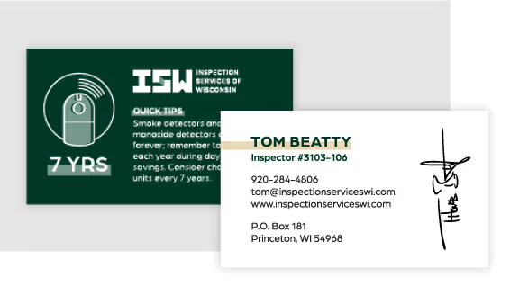

E-Power now has a visual identity that authentically represents their values and approach, setting them on a path to continued success in the ever-evolving digital landscape. While embracing a people-first and friendly image, E-Power's revamped brand identity doesn’t compromise their reputation as experts. In fact, it enhances it. The modern, fresh look now communicates that E-Power is not just experienced but also adaptable in the fast-paced world of digital marketing. The agency's commitment to staying relevant and approachable while maintaining a high-standard of professionalism positions them as leaders who understand both the human and technical aspects of the industry.
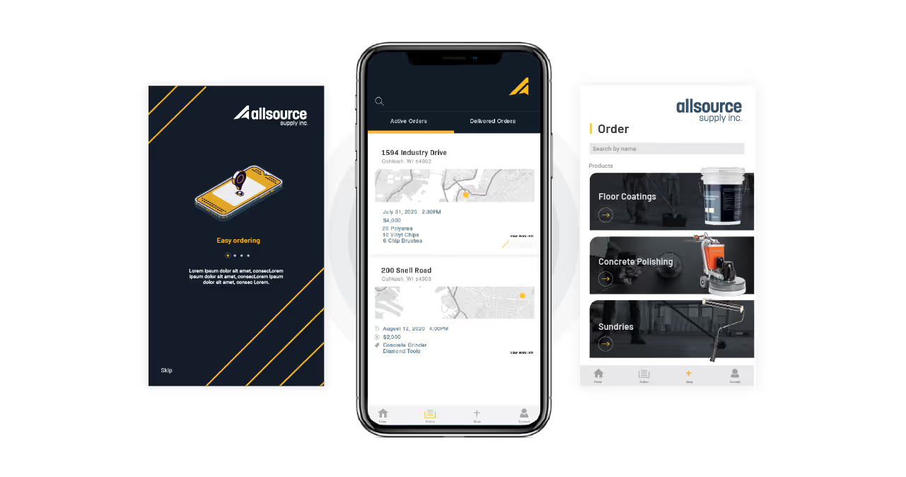


After more than two decades of success, it was time for an identity refresh. As digital marketing pros, they knew they were due for a makeover, and their long-time partnership with Quill made finding the right people for the job a snap! E-Power came to Quill with a desire to update their identity to reflect a more modern aesthetic and see it act as a true reflection of an ethos that revolves around long-term partnerships built on trust and results.


We approached E-Power’s identity refresh the same way E-Power approaches business – with a people-first mindset. With a vision to communicate E-Power's approachability and friendliness, we carefully selected a palette of friendly, inviting colors and soft, modern shapes. We then created a set of icons and elements that injected a sense of playfulness paired with professionalism. Lastly, we selected new visuals centered around people – clients, team members, and the wider community. Photographs featured happy faces, successful collaborations, and the genuine connections forged through E-Power's work.


E-Power now has a visual identity that authentically represents their values and approach, setting them on a path to continued success in the ever-evolving digital landscape. While embracing a people-first and friendly image, E-Power's revamped brand identity doesn’t compromise their reputation as experts. In fact, it enhances it. The modern, fresh look now communicates that E-Power is not just experienced but also adaptable in the fast-paced world of digital marketing. The agency's commitment to staying relevant and approachable while maintaining a high-standard of professionalism positions them as leaders who understand both the human and technical aspects of the industry.


After more than two decades of success, it was time for an identity refresh. As digital marketing pros, they knew they were due for a makeover, and their long-time partnership with Quill made finding the right people for the job a snap! E-Power came to Quill with a desire to update their identity to reflect a more modern aesthetic and see it act as a true reflection of an ethos that revolves around long-term partnerships built on trust and results.


We approached E-Power’s identity refresh the same way E-Power approaches business – with a people-first mindset. With a vision to communicate E-Power's approachability and friendliness, we carefully selected a palette of friendly, inviting colors and soft, modern shapes. We then created a set of icons and elements that injected a sense of playfulness paired with professionalism. Lastly, we selected new visuals centered around people – clients, team members, and the wider community. Photographs featured happy faces, successful collaborations, and the genuine connections forged through E-Power's work.

E-Power now has a visual identity that authentically represents their values and approach, setting them on a path to continued success in the ever-evolving digital landscape. While embracing a people-first and friendly image, E-Power's revamped brand identity doesn’t compromise their reputation as experts. In fact, it enhances it. The modern, fresh look now communicates that E-Power is not just experienced but also adaptable in the fast-paced world of digital marketing. The agency's commitment to staying relevant and approachable while maintaining a high-standard of professionalism positions them as leaders who understand both the human and technical aspects of the industry.


After more than two decades of success, it was time for an identity refresh. As digital marketing pros, they knew they were due for a makeover, and their long-time partnership with Quill made finding the right people for the job a snap! E-Power came to Quill with a desire to update their identity to reflect a more modern aesthetic and see it act as a true reflection of an ethos that revolves around long-term partnerships built on trust and results.

We approached E-Power’s identity refresh the same way E-Power approaches business – with a people-first mindset. With a vision to communicate E-Power's approachability and friendliness, we carefully selected a palette of friendly, inviting colors and soft, modern shapes. We then created a set of icons and elements that injected a sense of playfulness paired with professionalism. Lastly, we selected new visuals centered around people – clients, team members, and the wider community. Photographs featured happy faces, successful collaborations, and the genuine connections forged through E-Power's work.


E-Power now has a visual identity that authentically represents their values and approach, setting them on a path to continued success in the ever-evolving digital landscape. While embracing a people-first and friendly image, E-Power's revamped brand identity doesn’t compromise their reputation as experts. In fact, it enhances it. The modern, fresh look now communicates that E-Power is not just experienced but also adaptable in the fast-paced world of digital marketing. The agency's commitment to staying relevant and approachable while maintaining a high-standard of professionalism positions them as leaders who understand both the human and technical aspects of the industry.


E-Power now has a visual identity that authentically represents their values and approach, setting them on a path to continued success in the ever-evolving digital landscape. While embracing a people-first and friendly image, E-Power's revamped brand identity doesn’t compromise their reputation as experts. In fact, it enhances it. The modern, fresh look now communicates that E-Power is not just experienced but also adaptable in the fast-paced world of digital marketing. The agency's commitment to staying relevant and approachable while maintaining a high-standard of professionalism positions them as leaders who understand both the human and technical aspects of the industry.
After more than two decades of success, it was time for an identity refresh. As digital marketing pros, they knew they were due for a makeover, and their long-time partnership with Quill made finding the right people for the job a snap! E-Power came to Quill with a desire to update their identity to reflect a more modern aesthetic and see it act as a true reflection of an ethos that revolves around long-term partnerships built on trust and results.

We approached E-Power’s identity refresh the same way E-Power approaches business – with a people-first mindset. With a vision to communicate E-Power's approachability and friendliness, we carefully selected a palette of friendly, inviting colors and soft, modern shapes. We then created a set of icons and elements that injected a sense of playfulness paired with professionalism. Lastly, we selected new visuals centered around people – clients, team members, and the wider community. Photographs featured happy faces, successful collaborations, and the genuine connections forged through E-Power's work.

E-Power now has a visual identity that authentically represents their values and approach, setting them on a path to continued success in the ever-evolving digital landscape. While embracing a people-first and friendly image, E-Power's revamped brand identity doesn’t compromise their reputation as experts. In fact, it enhances it. The modern, fresh look now communicates that E-Power is not just experienced but also adaptable in the fast-paced world of digital marketing. The agency's commitment to staying relevant and approachable while maintaining a high-standard of professionalism positions them as leaders who understand both the human and technical aspects of the industry.

E-Power now has a visual identity that authentically represents their values and approach, setting them on a path to continued success in the ever-evolving digital landscape. While embracing a people-first and friendly image, E-Power's revamped brand identity doesn’t compromise their reputation as experts. In fact, it enhances it. The modern, fresh look now communicates that E-Power is not just experienced but also adaptable in the fast-paced world of digital marketing. The agency's commitment to staying relevant and approachable while maintaining a high-standard of professionalism positions them as leaders who understand both the human and technical aspects of the industry.

We approached E-Power’s identity refresh the same way E-Power approaches business – with a people-first mindset. With a vision to communicate E-Power's approachability and friendliness, we carefully selected a palette of friendly, inviting colors and soft, modern shapes. We then created a set of icons and elements that injected a sense of playfulness paired with professionalism. Lastly, we selected new visuals centered around people – clients, team members, and the wider community. Photographs featured happy faces, successful collaborations, and the genuine connections forged through E-Power's work.

After more than two decades of success, it was time for an identity refresh. As digital marketing pros, they knew they were due for a makeover, and their long-time partnership with Quill made finding the right people for the job a snap! E-Power came to Quill with a desire to update their identity to reflect a more modern aesthetic and see it act as a true reflection of an ethos that revolves around long-term partnerships built on trust and results.

E-Power now has a visual identity that authentically represents their values and approach, setting them on a path to continued success in the ever-evolving digital landscape. While embracing a people-first and friendly image, E-Power's revamped brand identity doesn’t compromise their reputation as experts. In fact, it enhances it. The modern, fresh look now communicates that E-Power is not just experienced but also adaptable in the fast-paced world of digital marketing. The agency's commitment to staying relevant and approachable while maintaining a high-standard of professionalism positions them as leaders who understand both the human and technical aspects of the industry.


E-Power now has a visual identity that authentically represents their values and approach, setting them on a path to continued success in the ever-evolving digital landscape. While embracing a people-first and friendly image, E-Power's revamped brand identity doesn’t compromise their reputation as experts. In fact, it enhances it. The modern, fresh look now communicates that E-Power is not just experienced but also adaptable in the fast-paced world of digital marketing. The agency's commitment to staying relevant and approachable while maintaining a high-standard of professionalism positions them as leaders who understand both the human and technical aspects of the industry.


After more than two decades of success, it was time for an identity refresh. As digital marketing pros, they knew they were due for a makeover, and their long-time partnership with Quill made finding the right people for the job a snap! E-Power came to Quill with a desire to update their identity to reflect a more modern aesthetic and see it act as a true reflection of an ethos that revolves around long-term partnerships built on trust and results.


We approached E-Power’s identity refresh the same way E-Power approaches business – with a people-first mindset. With a vision to communicate E-Power's approachability and friendliness, we carefully selected a palette of friendly, inviting colors and soft, modern shapes. We then created a set of icons and elements that injected a sense of playfulness paired with professionalism. Lastly, we selected new visuals centered around people – clients, team members, and the wider community. Photographs featured happy faces, successful collaborations, and the genuine connections forged through E-Power's work.

E-Power now has a visual identity that authentically represents their values and approach, setting them on a path to continued success in the ever-evolving digital landscape. While embracing a people-first and friendly image, E-Power's revamped brand identity doesn’t compromise their reputation as experts. In fact, it enhances it. The modern, fresh look now communicates that E-Power is not just experienced but also adaptable in the fast-paced world of digital marketing. The agency's commitment to staying relevant and approachable while maintaining a high-standard of professionalism positions them as leaders who understand both the human and technical aspects of the industry.


After more than two decades of success, it was time for an identity refresh. As digital marketing pros, they knew they were due for a makeover, and their long-time partnership with Quill made finding the right people for the job a snap! E-Power came to Quill with a desire to update their identity to reflect a more modern aesthetic and see it act as a true reflection of an ethos that revolves around long-term partnerships built on trust and results.
We approached E-Power’s identity refresh the same way E-Power approaches business – with a people-first mindset. With a vision to communicate E-Power's approachability and friendliness, we carefully selected a palette of friendly, inviting colors and soft, modern shapes. We then created a set of icons and elements that injected a sense of playfulness paired with professionalism. Lastly, we selected new visuals centered around people – clients, team members, and the wider community. Photographs featured happy faces, successful collaborations, and the genuine connections forged through E-Power's work.


E-Power now has a visual identity that authentically represents their values and approach, setting them on a path to continued success in the ever-evolving digital landscape. While embracing a people-first and friendly image, E-Power's revamped brand identity doesn’t compromise their reputation as experts. In fact, it enhances it. The modern, fresh look now communicates that E-Power is not just experienced but also adaptable in the fast-paced world of digital marketing. The agency's commitment to staying relevant and approachable while maintaining a high-standard of professionalism positions them as leaders who understand both the human and technical aspects of the industry.


After more than two decades of success, it was time for an identity refresh. As digital marketing pros, they knew they were due for a makeover, and their long-time partnership with Quill made finding the right people for the job a snap! E-Power came to Quill with a desire to update their identity to reflect a more modern aesthetic and see it act as a true reflection of an ethos that revolves around long-term partnerships built on trust and results.
E-Power now has a visual identity that authentically represents their values and approach, setting them on a path to continued success in the ever-evolving digital landscape. While embracing a people-first and friendly image, E-Power's revamped brand identity doesn’t compromise their reputation as experts. In fact, it enhances it. The modern, fresh look now communicates that E-Power is not just experienced but also adaptable in the fast-paced world of digital marketing. The agency's commitment to staying relevant and approachable while maintaining a high-standard of professionalism positions them as leaders who understand both the human and technical aspects of the industry.

We approached E-Power’s identity refresh the same way E-Power approaches business – with a people-first mindset. With a vision to communicate E-Power's approachability and friendliness, we carefully selected a palette of friendly, inviting colors and soft, modern shapes. We then created a set of icons and elements that injected a sense of playfulness paired with professionalism. Lastly, we selected new visuals centered around people – clients, team members, and the wider community. Photographs featured happy faces, successful collaborations, and the genuine connections forged through E-Power's work.


E-Power now has a visual identity that authentically represents their values and approach, setting them on a path to continued success in the ever-evolving digital landscape. While embracing a people-first and friendly image, E-Power's revamped brand identity doesn’t compromise their reputation as experts. In fact, it enhances it. The modern, fresh look now communicates that E-Power is not just experienced but also adaptable in the fast-paced world of digital marketing. The agency's commitment to staying relevant and approachable while maintaining a high-standard of professionalism positions them as leaders who understand both the human and technical aspects of the industry.


After more than two decades of success, it was time for an identity refresh. As digital marketing pros, they knew they were due for a makeover, and their long-time partnership with Quill made finding the right people for the job a snap! E-Power came to Quill with a desire to update their identity to reflect a more modern aesthetic and see it act as a true reflection of an ethos that revolves around long-term partnerships built on trust and results.
We approached E-Power’s identity refresh the same way E-Power approaches business – with a people-first mindset. With a vision to communicate E-Power's approachability and friendliness, we carefully selected a palette of friendly, inviting colors and soft, modern shapes. We then created a set of icons and elements that injected a sense of playfulness paired with professionalism. Lastly, we selected new visuals centered around people – clients, team members, and the wider community. Photographs featured happy faces, successful collaborations, and the genuine connections forged through E-Power's work.


E-Power now has a visual identity that authentically represents their values and approach, setting them on a path to continued success in the ever-evolving digital landscape. While embracing a people-first and friendly image, E-Power's revamped brand identity doesn’t compromise their reputation as experts. In fact, it enhances it. The modern, fresh look now communicates that E-Power is not just experienced but also adaptable in the fast-paced world of digital marketing. The agency's commitment to staying relevant and approachable while maintaining a high-standard of professionalism positions them as leaders who understand both the human and technical aspects of the industry.


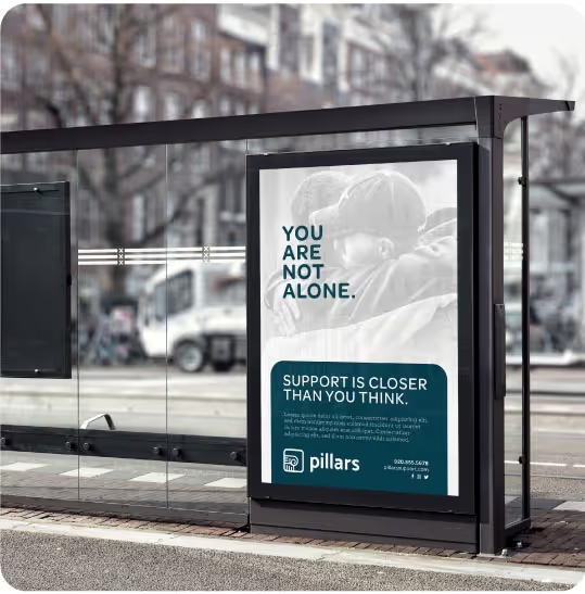
After more than two decades of success, it was time for an identity refresh. As digital marketing pros, they knew they were due for a makeover, and their long-time partnership with Quill made finding the right people for the job a snap! E-Power came to Quill with a desire to update their identity to reflect a more modern aesthetic and see it act as a true reflection of an ethos that revolves around long-term partnerships built on trust and results.

We approached E-Power’s identity refresh the same way E-Power approaches business – with a people-first mindset. With a vision to communicate E-Power's approachability and friendliness, we carefully selected a palette of friendly, inviting colors and soft, modern shapes. We then created a set of icons and elements that injected a sense of playfulness paired with professionalism. Lastly, we selected new visuals centered around people – clients, team members, and the wider community. Photographs featured happy faces, successful collaborations, and the genuine connections forged through E-Power's work.

E-Power now has a visual identity that authentically represents their values and approach, setting them on a path to continued success in the ever-evolving digital landscape. While embracing a people-first and friendly image, E-Power's revamped brand identity doesn’t compromise their reputation as experts. In fact, it enhances it. The modern, fresh look now communicates that E-Power is not just experienced but also adaptable in the fast-paced world of digital marketing. The agency's commitment to staying relevant and approachable while maintaining a high-standard of professionalism positions them as leaders who understand both the human and technical aspects of the industry.


After more than two decades of success, it was time for an identity refresh. As digital marketing pros, they knew they were due for a makeover, and their long-time partnership with Quill made finding the right people for the job a snap! E-Power came to Quill with a desire to update their identity to reflect a more modern aesthetic and see it act as a true reflection of an ethos that revolves around long-term partnerships built on trust and results.

We approached E-Power’s identity refresh the same way E-Power approaches business – with a people-first mindset. With a vision to communicate E-Power's approachability and friendliness, we carefully selected a palette of friendly, inviting colors and soft, modern shapes. We then created a set of icons and elements that injected a sense of playfulness paired with professionalism. Lastly, we selected new visuals centered around people – clients, team members, and the wider community. Photographs featured happy faces, successful collaborations, and the genuine connections forged through E-Power's work.


E-Power now has a visual identity that authentically represents their values and approach, setting them on a path to continued success in the ever-evolving digital landscape. While embracing a people-first and friendly image, E-Power's revamped brand identity doesn’t compromise their reputation as experts. In fact, it enhances it. The modern, fresh look now communicates that E-Power is not just experienced but also adaptable in the fast-paced world of digital marketing. The agency's commitment to staying relevant and approachable while maintaining a high-standard of professionalism positions them as leaders who understand both the human and technical aspects of the industry.


If you are seeking a partner to embark on a journey of brand transformation, I wholeheartedly recommend Quill. Their ability to combine strategic brilliance with creative excellence is a rare find in the industry!
Ellie Gunville, Co-Owner, E-Power Digital Marketing
