


The challenge presented to Quill was a delicate balancing act. AIA had already carved a formidable niche for itself within the promotional product industry, enjoying strong brand equity and industry recognition. The task at hand was to breathe new life into the brand without losing the essence that had made AIA successful in the first place. The challenge was to create a brand identity that felt fresh, dynamic, and contemporary while remaining firmly rooted in AIA's established brand voice. Quill needed to springboard off AIA's existing brand, ensuring that the refresh would enhance the brand's appeal without erasing the legacy that AIA had built over the years.


Recognizing AIA's commitment to community and connection and their empowering and confident voice, Quill crafted a revitalized identity that celebrated these core values. A major aspect of this transformation was creating a robust color palette with a very intentional hierarchy to communicate meaning and provide a calm, approachable harmony throughout every touchpoint. Other key elements included subtle yet impactful callout lines strategically woven throughout the messaging and an updated logo that reflects contemporary industry aesthetics.
Perhaps the most distinguishing element of the new identity was the versatile, rounded, and approachable "speech bubble" design, which served as a visual cornerstone. This element encapsulated AIA's people-first approach, emphasizing the human connection that sets them apart in the industry.

Through the meticulous brand refresh led by Quill, AIA has not only retained its industry standing but also laid a robust foundation for sustained growth and long-term success. The strategic design choices, including a vibrant color palette, resonant messaging, and distinctive elements, have injected new life and energy into AIA's identity while preserving its legacy.
This revitalized brand identity not only reflects AIA's core values of community and connection but also positions them as a dynamic and forward-thinking player in the industry. With this fresh and impactful identity, as well as a comprehensive brand guide to ensure consistency, AIA is poised for continued growth, forging ahead with confidence into a future filled with new opportunities and achievements.


The challenge presented to Quill was a delicate balancing act. AIA had already carved a formidable niche for itself within the promotional product industry, enjoying strong brand equity and industry recognition. The task at hand was to breathe new life into the brand without losing the essence that had made AIA successful in the first place. The challenge was to create a brand identity that felt fresh, dynamic, and contemporary while remaining firmly rooted in AIA's established brand voice. Quill needed to springboard off AIA's existing brand, ensuring that the refresh would enhance the brand's appeal without erasing the legacy that AIA had built over the years.


Recognizing AIA's commitment to community and connection and their empowering and confident voice, Quill crafted a revitalized identity that celebrated these core values. A major aspect of this transformation was creating a robust color palette with a very intentional hierarchy to communicate meaning and provide a calm, approachable harmony throughout every touchpoint. Other key elements included subtle yet impactful callout lines strategically woven throughout the messaging and an updated logo that reflects contemporary industry aesthetics.
Perhaps the most distinguishing element of the new identity was the versatile, rounded, and approachable "speech bubble" design, which served as a visual cornerstone. This element encapsulated AIA's people-first approach, emphasizing the human connection that sets them apart in the industry.


Through the meticulous brand refresh led by Quill, AIA has not only retained its industry standing but also laid a robust foundation for sustained growth and long-term success. The strategic design choices, including a vibrant color palette, resonant messaging, and distinctive elements, have injected new life and energy into AIA's identity while preserving its legacy.
This revitalized brand identity not only reflects AIA's core values of community and connection but also positions them as a dynamic and forward-thinking player in the industry. With this fresh and impactful identity, as well as a comprehensive brand guide to ensure consistency, AIA is poised for continued growth, forging ahead with confidence into a future filled with new opportunities and achievements.


The challenge presented to Quill was a delicate balancing act. AIA had already carved a formidable niche for itself within the promotional product industry, enjoying strong brand equity and industry recognition. The task at hand was to breathe new life into the brand without losing the essence that had made AIA successful in the first place. The challenge was to create a brand identity that felt fresh, dynamic, and contemporary while remaining firmly rooted in AIA's established brand voice. Quill needed to springboard off AIA's existing brand, ensuring that the refresh would enhance the brand's appeal without erasing the legacy that AIA had built over the years.


Recognizing AIA's commitment to community and connection and their empowering and confident voice, Quill crafted a revitalized identity that celebrated these core values. A major aspect of this transformation was creating a robust color palette with a very intentional hierarchy to communicate meaning and provide a calm, approachable harmony throughout every touchpoint. Other key elements included subtle yet impactful callout lines strategically woven throughout the messaging and an updated logo that reflects contemporary industry aesthetics.
Perhaps the most distinguishing element of the new identity was the versatile, rounded, and approachable "speech bubble" design, which served as a visual cornerstone. This element encapsulated AIA's people-first approach, emphasizing the human connection that sets them apart in the industry.

Through the meticulous brand refresh led by Quill, AIA has not only retained its industry standing but also laid a robust foundation for sustained growth and long-term success. The strategic design choices, including a vibrant color palette, resonant messaging, and distinctive elements, have injected new life and energy into AIA's identity while preserving its legacy.
This revitalized brand identity not only reflects AIA's core values of community and connection but also positions them as a dynamic and forward-thinking player in the industry. With this fresh and impactful identity, as well as a comprehensive brand guide to ensure consistency, AIA is poised for continued growth, forging ahead with confidence into a future filled with new opportunities and achievements.


The challenge presented to Quill was a delicate balancing act. AIA had already carved a formidable niche for itself within the promotional product industry, enjoying strong brand equity and industry recognition. The task at hand was to breathe new life into the brand without losing the essence that had made AIA successful in the first place. The challenge was to create a brand identity that felt fresh, dynamic, and contemporary while remaining firmly rooted in AIA's established brand voice. Quill needed to springboard off AIA's existing brand, ensuring that the refresh would enhance the brand's appeal without erasing the legacy that AIA had built over the years.

Recognizing AIA's commitment to community and connection and their empowering and confident voice, Quill crafted a revitalized identity that celebrated these core values. A major aspect of this transformation was creating a robust color palette with a very intentional hierarchy to communicate meaning and provide a calm, approachable harmony throughout every touchpoint. Other key elements included subtle yet impactful callout lines strategically woven throughout the messaging and an updated logo that reflects contemporary industry aesthetics.
Perhaps the most distinguishing element of the new identity was the versatile, rounded, and approachable "speech bubble" design, which served as a visual cornerstone. This element encapsulated AIA's people-first approach, emphasizing the human connection that sets them apart in the industry.


Through the meticulous brand refresh led by Quill, AIA has not only retained its industry standing but also laid a robust foundation for sustained growth and long-term success. The strategic design choices, including a vibrant color palette, resonant messaging, and distinctive elements, have injected new life and energy into AIA's identity while preserving its legacy.
This revitalized brand identity not only reflects AIA's core values of community and connection but also positions them as a dynamic and forward-thinking player in the industry. With this fresh and impactful identity, as well as a comprehensive brand guide to ensure consistency, AIA is poised for continued growth, forging ahead with confidence into a future filled with new opportunities and achievements.


The challenge presented to Quill was a delicate balancing act. AIA had already carved a formidable niche for itself within the promotional product industry, enjoying strong brand equity and industry recognition. The task at hand was to breathe new life into the brand without losing the essence that had made AIA successful in the first place. The challenge was to create a brand identity that felt fresh, dynamic, and contemporary while remaining firmly rooted in AIA's established brand voice. Quill needed to springboard off AIA's existing brand, ensuring that the refresh would enhance the brand's appeal without erasing the legacy that AIA had built over the years.


Recognizing AIA's commitment to community and connection and their empowering and confident voice, Quill crafted a revitalized identity that celebrated these core values. A major aspect of this transformation was creating a robust color palette with a very intentional hierarchy to communicate meaning and provide a calm, approachable harmony throughout every touchpoint. Other key elements included subtle yet impactful callout lines strategically woven throughout the messaging and an updated logo that reflects contemporary industry aesthetics.
Perhaps the most distinguishing element of the new identity was the versatile, rounded, and approachable "speech bubble" design, which served as a visual cornerstone. This element encapsulated AIA's people-first approach, emphasizing the human connection that sets them apart in the industry.


Through the meticulous brand refresh led by Quill, AIA has not only retained its industry standing but also laid a robust foundation for sustained growth and long-term success. The strategic design choices, including a vibrant color palette, resonant messaging, and distinctive elements, have injected new life and energy into AIA's identity while preserving its legacy.
This revitalized brand identity not only reflects AIA's core values of community and connection but also positions them as a dynamic and forward-thinking player in the industry. With this fresh and impactful identity, as well as a comprehensive brand guide to ensure consistency, AIA is poised for continued growth, forging ahead with confidence into a future filled with new opportunities and achievements.


The challenge presented to Quill was a delicate balancing act. AIA had already carved a formidable niche for itself within the promotional product industry, enjoying strong brand equity and industry recognition. The task at hand was to breathe new life into the brand without losing the essence that had made AIA successful in the first place. The challenge was to create a brand identity that felt fresh, dynamic, and contemporary while remaining firmly rooted in AIA's established brand voice. Quill needed to springboard off AIA's existing brand, ensuring that the refresh would enhance the brand's appeal without erasing the legacy that AIA had built over the years.


Recognizing AIA's commitment to community and connection and their empowering and confident voice, Quill crafted a revitalized identity that celebrated these core values. A major aspect of this transformation was creating a robust color palette with a very intentional hierarchy to communicate meaning and provide a calm, approachable harmony throughout every touchpoint. Other key elements included subtle yet impactful callout lines strategically woven throughout the messaging and an updated logo that reflects contemporary industry aesthetics.
Perhaps the most distinguishing element of the new identity was the versatile, rounded, and approachable "speech bubble" design, which served as a visual cornerstone. This element encapsulated AIA's people-first approach, emphasizing the human connection that sets them apart in the industry.


Through the meticulous brand refresh led by Quill, AIA has not only retained its industry standing but also laid a robust foundation for sustained growth and long-term success. The strategic design choices, including a vibrant color palette, resonant messaging, and distinctive elements, have injected new life and energy into AIA's identity while preserving its legacy.
This revitalized brand identity not only reflects AIA's core values of community and connection but also positions them as a dynamic and forward-thinking player in the industry. With this fresh and impactful identity, as well as a comprehensive brand guide to ensure consistency, AIA is poised for continued growth, forging ahead with confidence into a future filled with new opportunities and achievements.


The challenge presented to Quill was a delicate balancing act. AIA had already carved a formidable niche for itself within the promotional product industry, enjoying strong brand equity and industry recognition. The task at hand was to breathe new life into the brand without losing the essence that had made AIA successful in the first place. The challenge was to create a brand identity that felt fresh, dynamic, and contemporary while remaining firmly rooted in AIA's established brand voice. Quill needed to springboard off AIA's existing brand, ensuring that the refresh would enhance the brand's appeal without erasing the legacy that AIA had built over the years.


Recognizing AIA's commitment to community and connection and their empowering and confident voice, Quill crafted a revitalized identity that celebrated these core values. A major aspect of this transformation was creating a robust color palette with a very intentional hierarchy to communicate meaning and provide a calm, approachable harmony throughout every touchpoint. Other key elements included subtle yet impactful callout lines strategically woven throughout the messaging and an updated logo that reflects contemporary industry aesthetics.
Perhaps the most distinguishing element of the new identity was the versatile, rounded, and approachable "speech bubble" design, which served as a visual cornerstone. This element encapsulated AIA's people-first approach, emphasizing the human connection that sets them apart in the industry.


Through the meticulous brand refresh led by Quill, AIA has not only retained its industry standing but also laid a robust foundation for sustained growth and long-term success. The strategic design choices, including a vibrant color palette, resonant messaging, and distinctive elements, have injected new life and energy into AIA's identity while preserving its legacy.
This revitalized brand identity not only reflects AIA's core values of community and connection but also positions them as a dynamic and forward-thinking player in the industry. With this fresh and impactful identity, as well as a comprehensive brand guide to ensure consistency, AIA is poised for continued growth, forging ahead with confidence into a future filled with new opportunities and achievements.


The challenge presented to Quill was a delicate balancing act. AIA had already carved a formidable niche for itself within the promotional product industry, enjoying strong brand equity and industry recognition. The task at hand was to breathe new life into the brand without losing the essence that had made AIA successful in the first place. The challenge was to create a brand identity that felt fresh, dynamic, and contemporary while remaining firmly rooted in AIA's established brand voice. Quill needed to springboard off AIA's existing brand, ensuring that the refresh would enhance the brand's appeal without erasing the legacy that AIA had built over the years.


Recognizing AIA's commitment to community and connection and their empowering and confident voice, Quill crafted a revitalized identity that celebrated these core values. A major aspect of this transformation was creating a robust color palette with a very intentional hierarchy to communicate meaning and provide a calm, approachable harmony throughout every touchpoint. Other key elements included subtle yet impactful callout lines strategically woven throughout the messaging and an updated logo that reflects contemporary industry aesthetics.
Perhaps the most distinguishing element of the new identity was the versatile, rounded, and approachable "speech bubble" design, which served as a visual cornerstone. This element encapsulated AIA's people-first approach, emphasizing the human connection that sets them apart in the industry.


The challenge presented to Quill was a delicate balancing act. AIA had already carved a formidable niche for itself within the promotional product industry, enjoying strong brand equity and industry recognition. The task at hand was to breathe new life into the brand without losing the essence that had made AIA successful in the first place. The challenge was to create a brand identity that felt fresh, dynamic, and contemporary while remaining firmly rooted in AIA's established brand voice. Quill needed to springboard off AIA's existing brand, ensuring that the refresh would enhance the brand's appeal without erasing the legacy that AIA had built over the years.
Recognizing AIA's commitment to community and connection and their empowering and confident voice, Quill crafted a revitalized identity that celebrated these core values. A major aspect of this transformation was creating a robust color palette with a very intentional hierarchy to communicate meaning and provide a calm, approachable harmony throughout every touchpoint. Other key elements included subtle yet impactful callout lines strategically woven throughout the messaging and an updated logo that reflects contemporary industry aesthetics.
Perhaps the most distinguishing element of the new identity was the versatile, rounded, and approachable "speech bubble" design, which served as a visual cornerstone. This element encapsulated AIA's people-first approach, emphasizing the human connection that sets them apart in the industry.


Through the meticulous brand refresh led by Quill, AIA has not only retained its industry standing but also laid a robust foundation for sustained growth and long-term success. The strategic design choices, including a vibrant color palette, resonant messaging, and distinctive elements, have injected new life and energy into AIA's identity while preserving its legacy.
This revitalized brand identity not only reflects AIA's core values of community and connection but also positions them as a dynamic and forward-thinking player in the industry. With this fresh and impactful identity, as well as a comprehensive brand guide to ensure consistency, AIA is poised for continued growth, forging ahead with confidence into a future filled with new opportunities and achievements.


The challenge presented to Quill was a delicate balancing act. AIA had already carved a formidable niche for itself within the promotional product industry, enjoying strong brand equity and industry recognition. The task at hand was to breathe new life into the brand without losing the essence that had made AIA successful in the first place. The challenge was to create a brand identity that felt fresh, dynamic, and contemporary while remaining firmly rooted in AIA's established brand voice. Quill needed to springboard off AIA's existing brand, ensuring that the refresh would enhance the brand's appeal without erasing the legacy that AIA had built over the years.


Recognizing AIA's commitment to community and connection and their empowering and confident voice, Quill crafted a revitalized identity that celebrated these core values. A major aspect of this transformation was creating a robust color palette with a very intentional hierarchy to communicate meaning and provide a calm, approachable harmony throughout every touchpoint. Other key elements included subtle yet impactful callout lines strategically woven throughout the messaging and an updated logo that reflects contemporary industry aesthetics.
Perhaps the most distinguishing element of the new identity was the versatile, rounded, and approachable "speech bubble" design, which served as a visual cornerstone. This element encapsulated AIA's people-first approach, emphasizing the human connection that sets them apart in the industry.
Through the meticulous brand refresh led by Quill, AIA has not only retained its industry standing but also laid a robust foundation for sustained growth and long-term success. The strategic design choices, including a vibrant color palette, resonant messaging, and distinctive elements, have injected new life and energy into AIA's identity while preserving its legacy.
This revitalized brand identity not only reflects AIA's core values of community and connection but also positions them as a dynamic and forward-thinking player in the industry. With this fresh and impactful identity, as well as a comprehensive brand guide to ensure consistency, AIA is poised for continued growth, forging ahead with confidence into a future filled with new opportunities and achievements.

The challenge presented to Quill was a delicate balancing act. AIA had already carved a formidable niche for itself within the promotional product industry, enjoying strong brand equity and industry recognition. The task at hand was to breathe new life into the brand without losing the essence that had made AIA successful in the first place. The challenge was to create a brand identity that felt fresh, dynamic, and contemporary while remaining firmly rooted in AIA's established brand voice. Quill needed to springboard off AIA's existing brand, ensuring that the refresh would enhance the brand's appeal without erasing the legacy that AIA had built over the years.


Recognizing AIA's commitment to community and connection and their empowering and confident voice, Quill crafted a revitalized identity that celebrated these core values. A major aspect of this transformation was creating a robust color palette with a very intentional hierarchy to communicate meaning and provide a calm, approachable harmony throughout every touchpoint. Other key elements included subtle yet impactful callout lines strategically woven throughout the messaging and an updated logo that reflects contemporary industry aesthetics.
Perhaps the most distinguishing element of the new identity was the versatile, rounded, and approachable "speech bubble" design, which served as a visual cornerstone. This element encapsulated AIA's people-first approach, emphasizing the human connection that sets them apart in the industry.


Through the meticulous brand refresh led by Quill, AIA has not only retained its industry standing but also laid a robust foundation for sustained growth and long-term success. The strategic design choices, including a vibrant color palette, resonant messaging, and distinctive elements, have injected new life and energy into AIA's identity while preserving its legacy.
This revitalized brand identity not only reflects AIA's core values of community and connection but also positions them as a dynamic and forward-thinking player in the industry. With this fresh and impactful identity, as well as a comprehensive brand guide to ensure consistency, AIA is poised for continued growth, forging ahead with confidence into a future filled with new opportunities and achievements.


The challenge presented to Quill was a delicate balancing act. AIA had already carved a formidable niche for itself within the promotional product industry, enjoying strong brand equity and industry recognition. The task at hand was to breathe new life into the brand without losing the essence that had made AIA successful in the first place. The challenge was to create a brand identity that felt fresh, dynamic, and contemporary while remaining firmly rooted in AIA's established brand voice. Quill needed to springboard off AIA's existing brand, ensuring that the refresh would enhance the brand's appeal without erasing the legacy that AIA had built over the years.

Recognizing AIA's commitment to community and connection and their empowering and confident voice, Quill crafted a revitalized identity that celebrated these core values. A major aspect of this transformation was creating a robust color palette with a very intentional hierarchy to communicate meaning and provide a calm, approachable harmony throughout every touchpoint. Other key elements included subtle yet impactful callout lines strategically woven throughout the messaging and an updated logo that reflects contemporary industry aesthetics.
Perhaps the most distinguishing element of the new identity was the versatile, rounded, and approachable "speech bubble" design, which served as a visual cornerstone. This element encapsulated AIA's people-first approach, emphasizing the human connection that sets them apart in the industry.

Through the meticulous brand refresh led by Quill, AIA has not only retained its industry standing but also laid a robust foundation for sustained growth and long-term success. The strategic design choices, including a vibrant color palette, resonant messaging, and distinctive elements, have injected new life and energy into AIA's identity while preserving its legacy.
This revitalized brand identity not only reflects AIA's core values of community and connection but also positions them as a dynamic and forward-thinking player in the industry. With this fresh and impactful identity, as well as a comprehensive brand guide to ensure consistency, AIA is poised for continued growth, forging ahead with confidence into a future filled with new opportunities and achievements.


The challenge presented to Quill was a delicate balancing act. AIA had already carved a formidable niche for itself within the promotional product industry, enjoying strong brand equity and industry recognition. The task at hand was to breathe new life into the brand without losing the essence that had made AIA successful in the first place. The challenge was to create a brand identity that felt fresh, dynamic, and contemporary while remaining firmly rooted in AIA's established brand voice. Quill needed to springboard off AIA's existing brand, ensuring that the refresh would enhance the brand's appeal without erasing the legacy that AIA had built over the years.


Recognizing AIA's commitment to community and connection and their empowering and confident voice, Quill crafted a revitalized identity that celebrated these core values. A major aspect of this transformation was creating a robust color palette with a very intentional hierarchy to communicate meaning and provide a calm, approachable harmony throughout every touchpoint. Other key elements included subtle yet impactful callout lines strategically woven throughout the messaging and an updated logo that reflects contemporary industry aesthetics.
Perhaps the most distinguishing element of the new identity was the versatile, rounded, and approachable "speech bubble" design, which served as a visual cornerstone. This element encapsulated AIA's people-first approach, emphasizing the human connection that sets them apart in the industry.


Through the meticulous brand refresh led by Quill, AIA has not only retained its industry standing but also laid a robust foundation for sustained growth and long-term success. The strategic design choices, including a vibrant color palette, resonant messaging, and distinctive elements, have injected new life and energy into AIA's identity while preserving its legacy.
This revitalized brand identity not only reflects AIA's core values of community and connection but also positions them as a dynamic and forward-thinking player in the industry. With this fresh and impactful identity, as well as a comprehensive brand guide to ensure consistency, AIA is poised for continued growth, forging ahead with confidence into a future filled with new opportunities and achievements.


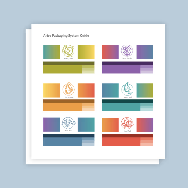
The challenge presented to Quill was a delicate balancing act. AIA had already carved a formidable niche for itself within the promotional product industry, enjoying strong brand equity and industry recognition. The task at hand was to breathe new life into the brand without losing the essence that had made AIA successful in the first place. The challenge was to create a brand identity that felt fresh, dynamic, and contemporary while remaining firmly rooted in AIA's established brand voice. Quill needed to springboard off AIA's existing brand, ensuring that the refresh would enhance the brand's appeal without erasing the legacy that AIA had built over the years.
Recognizing AIA's commitment to community and connection and their empowering and confident voice, Quill crafted a revitalized identity that celebrated these core values. A major aspect of this transformation was creating a robust color palette with a very intentional hierarchy to communicate meaning and provide a calm, approachable harmony throughout every touchpoint. Other key elements included subtle yet impactful callout lines strategically woven throughout the messaging and an updated logo that reflects contemporary industry aesthetics.
Perhaps the most distinguishing element of the new identity was the versatile, rounded, and approachable "speech bubble" design, which served as a visual cornerstone. This element encapsulated AIA's people-first approach, emphasizing the human connection that sets them apart in the industry.


Through the meticulous brand refresh led by Quill, AIA has not only retained its industry standing but also laid a robust foundation for sustained growth and long-term success. The strategic design choices, including a vibrant color palette, resonant messaging, and distinctive elements, have injected new life and energy into AIA's identity while preserving its legacy.
This revitalized brand identity not only reflects AIA's core values of community and connection but also positions them as a dynamic and forward-thinking player in the industry. With this fresh and impactful identity, as well as a comprehensive brand guide to ensure consistency, AIA is poised for continued growth, forging ahead with confidence into a future filled with new opportunities and achievements.


The challenge presented to Quill was a delicate balancing act. AIA had already carved a formidable niche for itself within the promotional product industry, enjoying strong brand equity and industry recognition. The task at hand was to breathe new life into the brand without losing the essence that had made AIA successful in the first place. The challenge was to create a brand identity that felt fresh, dynamic, and contemporary while remaining firmly rooted in AIA's established brand voice. Quill needed to springboard off AIA's existing brand, ensuring that the refresh would enhance the brand's appeal without erasing the legacy that AIA had built over the years.

Recognizing AIA's commitment to community and connection and their empowering and confident voice, Quill crafted a revitalized identity that celebrated these core values. A major aspect of this transformation was creating a robust color palette with a very intentional hierarchy to communicate meaning and provide a calm, approachable harmony throughout every touchpoint. Other key elements included subtle yet impactful callout lines strategically woven throughout the messaging and an updated logo that reflects contemporary industry aesthetics.
Perhaps the most distinguishing element of the new identity was the versatile, rounded, and approachable "speech bubble" design, which served as a visual cornerstone. This element encapsulated AIA's people-first approach, emphasizing the human connection that sets them apart in the industry.

Through the meticulous brand refresh led by Quill, AIA has not only retained its industry standing but also laid a robust foundation for sustained growth and long-term success. The strategic design choices, including a vibrant color palette, resonant messaging, and distinctive elements, have injected new life and energy into AIA's identity while preserving its legacy.
This revitalized brand identity not only reflects AIA's core values of community and connection but also positions them as a dynamic and forward-thinking player in the industry. With this fresh and impactful identity, as well as a comprehensive brand guide to ensure consistency, AIA is poised for continued growth, forging ahead with confidence into a future filled with new opportunities and achievements.

The challenge presented to Quill was a delicate balancing act. AIA had already carved a formidable niche for itself within the promotional product industry, enjoying strong brand equity and industry recognition. The task at hand was to breathe new life into the brand without losing the essence that had made AIA successful in the first place. The challenge was to create a brand identity that felt fresh, dynamic, and contemporary while remaining firmly rooted in AIA's established brand voice. Quill needed to springboard off AIA's existing brand, ensuring that the refresh would enhance the brand's appeal without erasing the legacy that AIA had built over the years.

Recognizing AIA's commitment to community and connection and their empowering and confident voice, Quill crafted a revitalized identity that celebrated these core values. A major aspect of this transformation was creating a robust color palette with a very intentional hierarchy to communicate meaning and provide a calm, approachable harmony throughout every touchpoint. Other key elements included subtle yet impactful callout lines strategically woven throughout the messaging and an updated logo that reflects contemporary industry aesthetics.
Perhaps the most distinguishing element of the new identity was the versatile, rounded, and approachable "speech bubble" design, which served as a visual cornerstone. This element encapsulated AIA's people-first approach, emphasizing the human connection that sets them apart in the industry.


Through the meticulous brand refresh led by Quill, AIA has not only retained its industry standing but also laid a robust foundation for sustained growth and long-term success. The strategic design choices, including a vibrant color palette, resonant messaging, and distinctive elements, have injected new life and energy into AIA's identity while preserving its legacy.
This revitalized brand identity not only reflects AIA's core values of community and connection but also positions them as a dynamic and forward-thinking player in the industry. With this fresh and impactful identity, as well as a comprehensive brand guide to ensure consistency, AIA is poised for continued growth, forging ahead with confidence into a future filled with new opportunities and achievements.
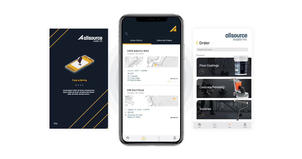


The challenge presented to Quill was a delicate balancing act. AIA had already carved a formidable niche for itself within the promotional product industry, enjoying strong brand equity and industry recognition. The task at hand was to breathe new life into the brand without losing the essence that had made AIA successful in the first place. The challenge was to create a brand identity that felt fresh, dynamic, and contemporary while remaining firmly rooted in AIA's established brand voice. Quill needed to springboard off AIA's existing brand, ensuring that the refresh would enhance the brand's appeal without erasing the legacy that AIA had built over the years.


Recognizing AIA's commitment to community and connection and their empowering and confident voice, Quill crafted a revitalized identity that celebrated these core values. A major aspect of this transformation was creating a robust color palette with a very intentional hierarchy to communicate meaning and provide a calm, approachable harmony throughout every touchpoint. Other key elements included subtle yet impactful callout lines strategically woven throughout the messaging and an updated logo that reflects contemporary industry aesthetics.
Perhaps the most distinguishing element of the new identity was the versatile, rounded, and approachable "speech bubble" design, which served as a visual cornerstone. This element encapsulated AIA's people-first approach, emphasizing the human connection that sets them apart in the industry.


Through the meticulous brand refresh led by Quill, AIA has not only retained its industry standing but also laid a robust foundation for sustained growth and long-term success. The strategic design choices, including a vibrant color palette, resonant messaging, and distinctive elements, have injected new life and energy into AIA's identity while preserving its legacy.
This revitalized brand identity not only reflects AIA's core values of community and connection but also positions them as a dynamic and forward-thinking player in the industry. With this fresh and impactful identity, as well as a comprehensive brand guide to ensure consistency, AIA is poised for continued growth, forging ahead with confidence into a future filled with new opportunities and achievements.


The challenge presented to Quill was a delicate balancing act. AIA had already carved a formidable niche for itself within the promotional product industry, enjoying strong brand equity and industry recognition. The task at hand was to breathe new life into the brand without losing the essence that had made AIA successful in the first place. The challenge was to create a brand identity that felt fresh, dynamic, and contemporary while remaining firmly rooted in AIA's established brand voice. Quill needed to springboard off AIA's existing brand, ensuring that the refresh would enhance the brand's appeal without erasing the legacy that AIA had built over the years.


Recognizing AIA's commitment to community and connection and their empowering and confident voice, Quill crafted a revitalized identity that celebrated these core values. A major aspect of this transformation was creating a robust color palette with a very intentional hierarchy to communicate meaning and provide a calm, approachable harmony throughout every touchpoint. Other key elements included subtle yet impactful callout lines strategically woven throughout the messaging and an updated logo that reflects contemporary industry aesthetics.
Perhaps the most distinguishing element of the new identity was the versatile, rounded, and approachable "speech bubble" design, which served as a visual cornerstone. This element encapsulated AIA's people-first approach, emphasizing the human connection that sets them apart in the industry.

Through the meticulous brand refresh led by Quill, AIA has not only retained its industry standing but also laid a robust foundation for sustained growth and long-term success. The strategic design choices, including a vibrant color palette, resonant messaging, and distinctive elements, have injected new life and energy into AIA's identity while preserving its legacy.
This revitalized brand identity not only reflects AIA's core values of community and connection but also positions them as a dynamic and forward-thinking player in the industry. With this fresh and impactful identity, as well as a comprehensive brand guide to ensure consistency, AIA is poised for continued growth, forging ahead with confidence into a future filled with new opportunities and achievements.


The challenge presented to Quill was a delicate balancing act. AIA had already carved a formidable niche for itself within the promotional product industry, enjoying strong brand equity and industry recognition. The task at hand was to breathe new life into the brand without losing the essence that had made AIA successful in the first place. The challenge was to create a brand identity that felt fresh, dynamic, and contemporary while remaining firmly rooted in AIA's established brand voice. Quill needed to springboard off AIA's existing brand, ensuring that the refresh would enhance the brand's appeal without erasing the legacy that AIA had built over the years.

Recognizing AIA's commitment to community and connection and their empowering and confident voice, Quill crafted a revitalized identity that celebrated these core values. A major aspect of this transformation was creating a robust color palette with a very intentional hierarchy to communicate meaning and provide a calm, approachable harmony throughout every touchpoint. Other key elements included subtle yet impactful callout lines strategically woven throughout the messaging and an updated logo that reflects contemporary industry aesthetics.
Perhaps the most distinguishing element of the new identity was the versatile, rounded, and approachable "speech bubble" design, which served as a visual cornerstone. This element encapsulated AIA's people-first approach, emphasizing the human connection that sets them apart in the industry.


Through the meticulous brand refresh led by Quill, AIA has not only retained its industry standing but also laid a robust foundation for sustained growth and long-term success. The strategic design choices, including a vibrant color palette, resonant messaging, and distinctive elements, have injected new life and energy into AIA's identity while preserving its legacy.
This revitalized brand identity not only reflects AIA's core values of community and connection but also positions them as a dynamic and forward-thinking player in the industry. With this fresh and impactful identity, as well as a comprehensive brand guide to ensure consistency, AIA is poised for continued growth, forging ahead with confidence into a future filled with new opportunities and achievements.
The challenge presented to Quill was a delicate balancing act. AIA had already carved a formidable niche for itself within the promotional product industry, enjoying strong brand equity and industry recognition. The task at hand was to breathe new life into the brand without losing the essence that had made AIA successful in the first place. The challenge was to create a brand identity that felt fresh, dynamic, and contemporary while remaining firmly rooted in AIA's established brand voice. Quill needed to springboard off AIA's existing brand, ensuring that the refresh would enhance the brand's appeal without erasing the legacy that AIA had built over the years.

Recognizing AIA's commitment to community and connection and their empowering and confident voice, Quill crafted a revitalized identity that celebrated these core values. A major aspect of this transformation was creating a robust color palette with a very intentional hierarchy to communicate meaning and provide a calm, approachable harmony throughout every touchpoint. Other key elements included subtle yet impactful callout lines strategically woven throughout the messaging and an updated logo that reflects contemporary industry aesthetics.
Perhaps the most distinguishing element of the new identity was the versatile, rounded, and approachable "speech bubble" design, which served as a visual cornerstone. This element encapsulated AIA's people-first approach, emphasizing the human connection that sets them apart in the industry.

Through the meticulous brand refresh led by Quill, AIA has not only retained its industry standing but also laid a robust foundation for sustained growth and long-term success. The strategic design choices, including a vibrant color palette, resonant messaging, and distinctive elements, have injected new life and energy into AIA's identity while preserving its legacy.
This revitalized brand identity not only reflects AIA's core values of community and connection but also positions them as a dynamic and forward-thinking player in the industry. With this fresh and impactful identity, as well as a comprehensive brand guide to ensure consistency, AIA is poised for continued growth, forging ahead with confidence into a future filled with new opportunities and achievements.

Recognizing AIA's commitment to community and connection and their empowering and confident voice, Quill crafted a revitalized identity that celebrated these core values. A major aspect of this transformation was creating a robust color palette with a very intentional hierarchy to communicate meaning and provide a calm, approachable harmony throughout every touchpoint. Other key elements included subtle yet impactful callout lines strategically woven throughout the messaging and an updated logo that reflects contemporary industry aesthetics.
Perhaps the most distinguishing element of the new identity was the versatile, rounded, and approachable "speech bubble" design, which served as a visual cornerstone. This element encapsulated AIA's people-first approach, emphasizing the human connection that sets them apart in the industry.

The challenge presented to Quill was a delicate balancing act. AIA had already carved a formidable niche for itself within the promotional product industry, enjoying strong brand equity and industry recognition. The task at hand was to breathe new life into the brand without losing the essence that had made AIA successful in the first place. The challenge was to create a brand identity that felt fresh, dynamic, and contemporary while remaining firmly rooted in AIA's established brand voice. Quill needed to springboard off AIA's existing brand, ensuring that the refresh would enhance the brand's appeal without erasing the legacy that AIA had built over the years.

Through the meticulous brand refresh led by Quill, AIA has not only retained its industry standing but also laid a robust foundation for sustained growth and long-term success. The strategic design choices, including a vibrant color palette, resonant messaging, and distinctive elements, have injected new life and energy into AIA's identity while preserving its legacy.
This revitalized brand identity not only reflects AIA's core values of community and connection but also positions them as a dynamic and forward-thinking player in the industry. With this fresh and impactful identity, as well as a comprehensive brand guide to ensure consistency, AIA is poised for continued growth, forging ahead with confidence into a future filled with new opportunities and achievements.


The challenge presented to Quill was a delicate balancing act. AIA had already carved a formidable niche for itself within the promotional product industry, enjoying strong brand equity and industry recognition. The task at hand was to breathe new life into the brand without losing the essence that had made AIA successful in the first place. The challenge was to create a brand identity that felt fresh, dynamic, and contemporary while remaining firmly rooted in AIA's established brand voice. Quill needed to springboard off AIA's existing brand, ensuring that the refresh would enhance the brand's appeal without erasing the legacy that AIA had built over the years.


Recognizing AIA's commitment to community and connection and their empowering and confident voice, Quill crafted a revitalized identity that celebrated these core values. A major aspect of this transformation was creating a robust color palette with a very intentional hierarchy to communicate meaning and provide a calm, approachable harmony throughout every touchpoint. Other key elements included subtle yet impactful callout lines strategically woven throughout the messaging and an updated logo that reflects contemporary industry aesthetics.
Perhaps the most distinguishing element of the new identity was the versatile, rounded, and approachable "speech bubble" design, which served as a visual cornerstone. This element encapsulated AIA's people-first approach, emphasizing the human connection that sets them apart in the industry.

Through the meticulous brand refresh led by Quill, AIA has not only retained its industry standing but also laid a robust foundation for sustained growth and long-term success. The strategic design choices, including a vibrant color palette, resonant messaging, and distinctive elements, have injected new life and energy into AIA's identity while preserving its legacy.
This revitalized brand identity not only reflects AIA's core values of community and connection but also positions them as a dynamic and forward-thinking player in the industry. With this fresh and impactful identity, as well as a comprehensive brand guide to ensure consistency, AIA is poised for continued growth, forging ahead with confidence into a future filled with new opportunities and achievements.


The challenge presented to Quill was a delicate balancing act. AIA had already carved a formidable niche for itself within the promotional product industry, enjoying strong brand equity and industry recognition. The task at hand was to breathe new life into the brand without losing the essence that had made AIA successful in the first place. The challenge was to create a brand identity that felt fresh, dynamic, and contemporary while remaining firmly rooted in AIA's established brand voice. Quill needed to springboard off AIA's existing brand, ensuring that the refresh would enhance the brand's appeal without erasing the legacy that AIA had built over the years.
Recognizing AIA's commitment to community and connection and their empowering and confident voice, Quill crafted a revitalized identity that celebrated these core values. A major aspect of this transformation was creating a robust color palette with a very intentional hierarchy to communicate meaning and provide a calm, approachable harmony throughout every touchpoint. Other key elements included subtle yet impactful callout lines strategically woven throughout the messaging and an updated logo that reflects contemporary industry aesthetics.
Perhaps the most distinguishing element of the new identity was the versatile, rounded, and approachable "speech bubble" design, which served as a visual cornerstone. This element encapsulated AIA's people-first approach, emphasizing the human connection that sets them apart in the industry.


Through the meticulous brand refresh led by Quill, AIA has not only retained its industry standing but also laid a robust foundation for sustained growth and long-term success. The strategic design choices, including a vibrant color palette, resonant messaging, and distinctive elements, have injected new life and energy into AIA's identity while preserving its legacy.
This revitalized brand identity not only reflects AIA's core values of community and connection but also positions them as a dynamic and forward-thinking player in the industry. With this fresh and impactful identity, as well as a comprehensive brand guide to ensure consistency, AIA is poised for continued growth, forging ahead with confidence into a future filled with new opportunities and achievements.


The challenge presented to Quill was a delicate balancing act. AIA had already carved a formidable niche for itself within the promotional product industry, enjoying strong brand equity and industry recognition. The task at hand was to breathe new life into the brand without losing the essence that had made AIA successful in the first place. The challenge was to create a brand identity that felt fresh, dynamic, and contemporary while remaining firmly rooted in AIA's established brand voice. Quill needed to springboard off AIA's existing brand, ensuring that the refresh would enhance the brand's appeal without erasing the legacy that AIA had built over the years.
Through the meticulous brand refresh led by Quill, AIA has not only retained its industry standing but also laid a robust foundation for sustained growth and long-term success. The strategic design choices, including a vibrant color palette, resonant messaging, and distinctive elements, have injected new life and energy into AIA's identity while preserving its legacy.
This revitalized brand identity not only reflects AIA's core values of community and connection but also positions them as a dynamic and forward-thinking player in the industry. With this fresh and impactful identity, as well as a comprehensive brand guide to ensure consistency, AIA is poised for continued growth, forging ahead with confidence into a future filled with new opportunities and achievements.

Recognizing AIA's commitment to community and connection and their empowering and confident voice, Quill crafted a revitalized identity that celebrated these core values. A major aspect of this transformation was creating a robust color palette with a very intentional hierarchy to communicate meaning and provide a calm, approachable harmony throughout every touchpoint. Other key elements included subtle yet impactful callout lines strategically woven throughout the messaging and an updated logo that reflects contemporary industry aesthetics.
Perhaps the most distinguishing element of the new identity was the versatile, rounded, and approachable "speech bubble" design, which served as a visual cornerstone. This element encapsulated AIA's people-first approach, emphasizing the human connection that sets them apart in the industry.


Through the meticulous brand refresh led by Quill, AIA has not only retained its industry standing but also laid a robust foundation for sustained growth and long-term success. The strategic design choices, including a vibrant color palette, resonant messaging, and distinctive elements, have injected new life and energy into AIA's identity while preserving its legacy.
This revitalized brand identity not only reflects AIA's core values of community and connection but also positions them as a dynamic and forward-thinking player in the industry. With this fresh and impactful identity, as well as a comprehensive brand guide to ensure consistency, AIA is poised for continued growth, forging ahead with confidence into a future filled with new opportunities and achievements.


The challenge presented to Quill was a delicate balancing act. AIA had already carved a formidable niche for itself within the promotional product industry, enjoying strong brand equity and industry recognition. The task at hand was to breathe new life into the brand without losing the essence that had made AIA successful in the first place. The challenge was to create a brand identity that felt fresh, dynamic, and contemporary while remaining firmly rooted in AIA's established brand voice. Quill needed to springboard off AIA's existing brand, ensuring that the refresh would enhance the brand's appeal without erasing the legacy that AIA had built over the years.

Recognizing AIA's commitment to community and connection and their empowering and confident voice, Quill crafted a revitalized identity that celebrated these core values. A major aspect of this transformation was creating a robust color palette with a very intentional hierarchy to communicate meaning and provide a calm, approachable harmony throughout every touchpoint. Other key elements included subtle yet impactful callout lines strategically woven throughout the messaging and an updated logo that reflects contemporary industry aesthetics.
Perhaps the most distinguishing element of the new identity was the versatile, rounded, and approachable "speech bubble" design, which served as a visual cornerstone. This element encapsulated AIA's people-first approach, emphasizing the human connection that sets them apart in the industry.


Through the meticulous brand refresh led by Quill, AIA has not only retained its industry standing but also laid a robust foundation for sustained growth and long-term success. The strategic design choices, including a vibrant color palette, resonant messaging, and distinctive elements, have injected new life and energy into AIA's identity while preserving its legacy.
This revitalized brand identity not only reflects AIA's core values of community and connection but also positions them as a dynamic and forward-thinking player in the industry. With this fresh and impactful identity, as well as a comprehensive brand guide to ensure consistency, AIA is poised for continued growth, forging ahead with confidence into a future filled with new opportunities and achievements.


In today’s environment where change is the only constant, the ability to evolve while retaining one's core identity is crucial. Quill Creative has demonstrated this skill brilliantly with AIA's brand refresh. It's a testament to their strategic thinking, creative execution, and deep understanding of brand dynamics in a competitive landscape.
Stacy Price, VP Marketing, AIA Corporation
