Our task was to create a brand identity that communicated both professionalism and elegance while differentiating Advanced Contours in a competitive market. The clinic needed a name and brand messaging that would encapsulate its mission and values while appealing to clients who desire personalized, expert care. Additionally, the visual identity had to reflect a balance between clinical precision and aesthetic refinement, setting the tone for a sophisticated yet approachable experience.

For the logo, we developed a custom wordmark that marries clinical precision with elegance. By incorporating subtle curvature between the letterforms, the logo feels both sophisticated and empowering, a reflection of the confidence Advanced Contours instills in its clients. The color palette is fresh and vibrant, with confident, caring tones that evoke both trust and rejuvenation. A curving, flowing line element was incorporated into the design as a secondary feature to guide the viewer’s eye through layouts, emphasizing the concept of natural contours. We paired serif and sans serif typography to give the brand an authentic, approachable voice, and selected photography that conveys support, confidence, and energy.

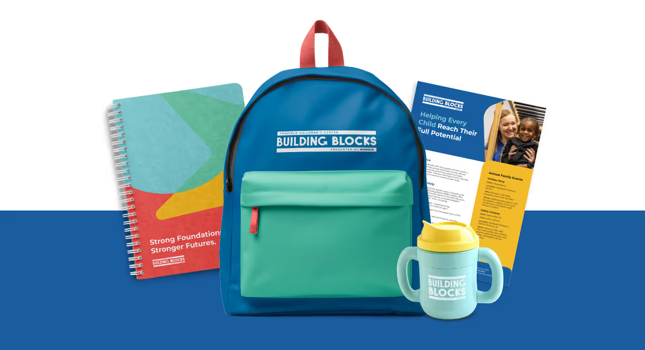
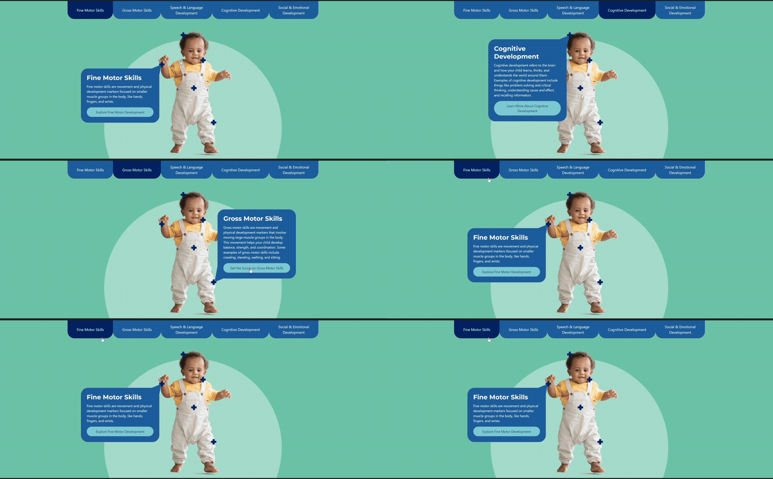
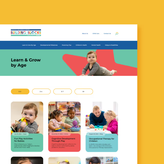
The resulting visual identity for Advanced Contours not only met but exceeded the clinic's goals. The comprehensive brand system has been stress-tested across various collateral, ensuring its consistency and adaptability for future touchpoints. Whether it's print, digital, or environmental branding, the identity remains strong, flexible, and cohesive. Advanced Contours now stands as a visually striking and emotionally resonant brand, equipped with the tools to grow while maintaining its core values of confidence, care, and clinical expertise.
Our task was to create a brand identity that communicated both professionalism and elegance while differentiating Advanced Contours in a competitive market. The clinic needed a name and brand messaging that would encapsulate its mission and values while appealing to clients who desire personalized, expert care. Additionally, the visual identity had to reflect a balance between clinical precision and aesthetic refinement, setting the tone for a sophisticated yet approachable experience.
For the logo, we developed a custom wordmark that marries clinical precision with elegance. By incorporating subtle curvature between the letterforms, the logo feels both sophisticated and empowering, a reflection of the confidence Advanced Contours instills in its clients. The color palette is fresh and vibrant, with confident, caring tones that evoke both trust and rejuvenation. A curving, flowing line element was incorporated into the design as a secondary feature to guide the viewer’s eye through layouts, emphasizing the concept of natural contours. We paired serif and sans serif typography to give the brand an authentic, approachable voice, and selected photography that conveys support, confidence, and energy.

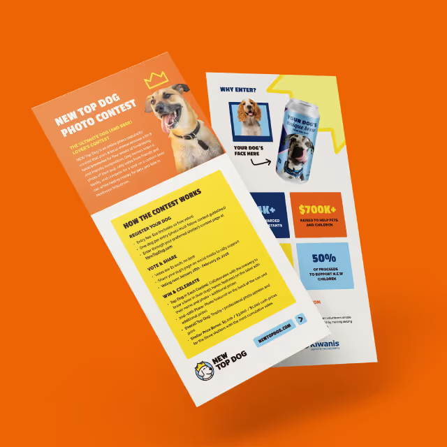
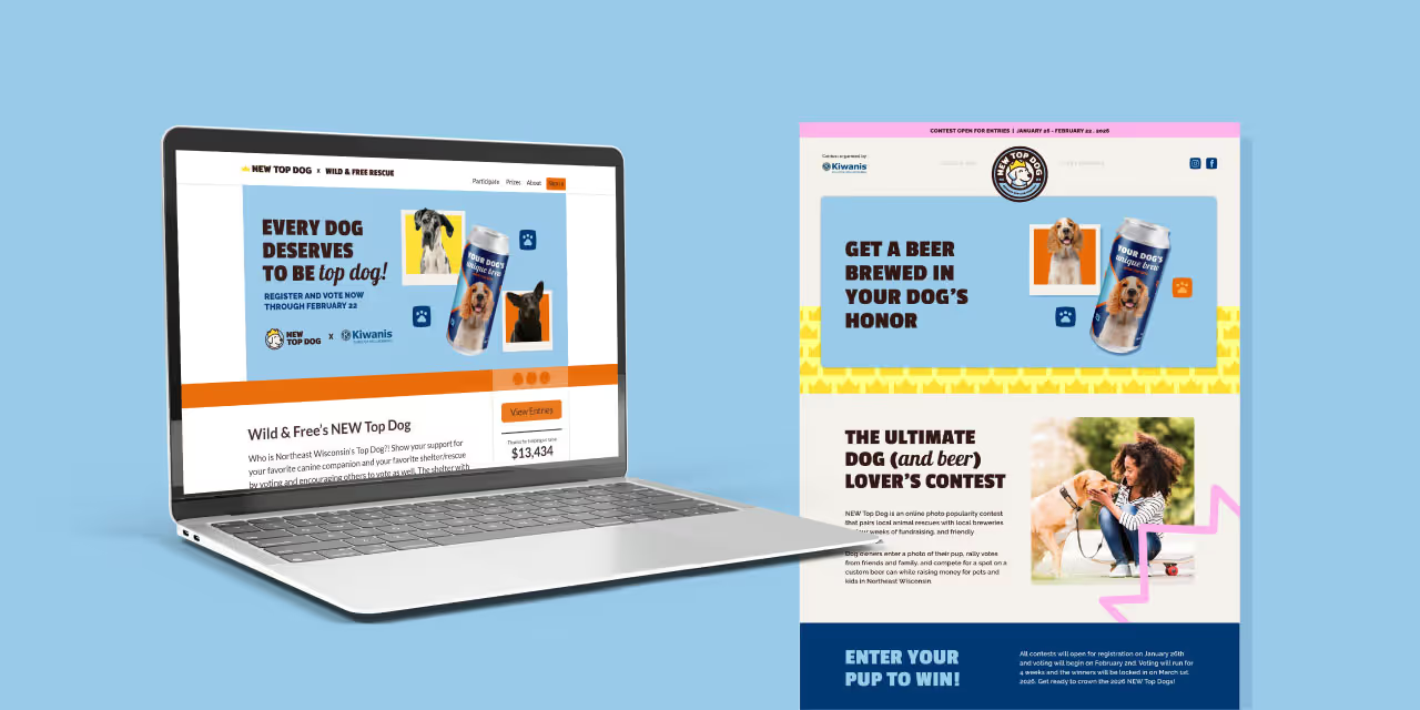
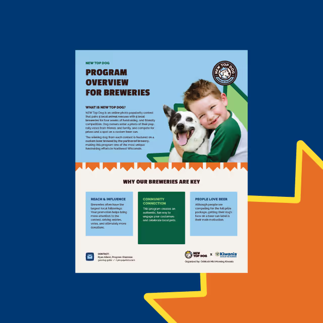
The resulting visual identity for Advanced Contours not only met but exceeded the clinic's goals. The comprehensive brand system has been stress-tested across various collateral, ensuring its consistency and adaptability for future touchpoints. Whether it's print, digital, or environmental branding, the identity remains strong, flexible, and cohesive. Advanced Contours now stands as a visually striking and emotionally resonant brand, equipped with the tools to grow while maintaining its core values of confidence, care, and clinical expertise.
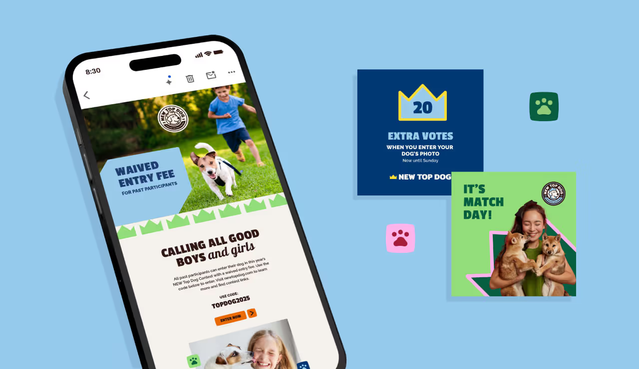



Our task was to create a brand identity that communicated both professionalism and elegance while differentiating Advanced Contours in a competitive market. The clinic needed a name and brand messaging that would encapsulate its mission and values while appealing to clients who desire personalized, expert care. Additionally, the visual identity had to reflect a balance between clinical precision and aesthetic refinement, setting the tone for a sophisticated yet approachable experience.
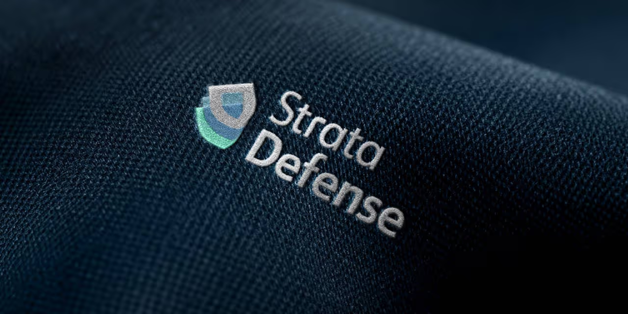
For the logo, we developed a custom wordmark that marries clinical precision with elegance. By incorporating subtle curvature between the letterforms, the logo feels both sophisticated and empowering, a reflection of the confidence Advanced Contours instills in its clients. The color palette is fresh and vibrant, with confident, caring tones that evoke both trust and rejuvenation. A curving, flowing line element was incorporated into the design as a secondary feature to guide the viewer’s eye through layouts, emphasizing the concept of natural contours. We paired serif and sans serif typography to give the brand an authentic, approachable voice, and selected photography that conveys support, confidence, and energy.

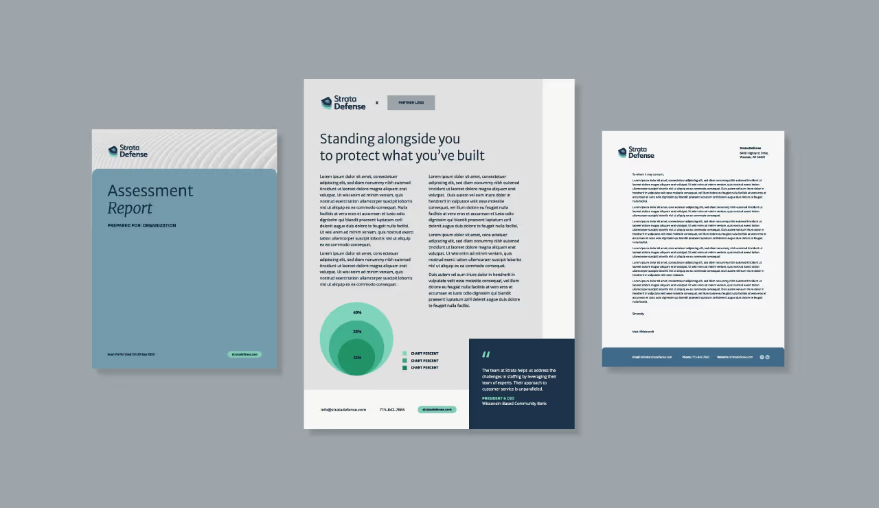



The resulting visual identity for Advanced Contours not only met but exceeded the clinic's goals. The comprehensive brand system has been stress-tested across various collateral, ensuring its consistency and adaptability for future touchpoints. Whether it's print, digital, or environmental branding, the identity remains strong, flexible, and cohesive. Advanced Contours now stands as a visually striking and emotionally resonant brand, equipped with the tools to grow while maintaining its core values of confidence, care, and clinical expertise.
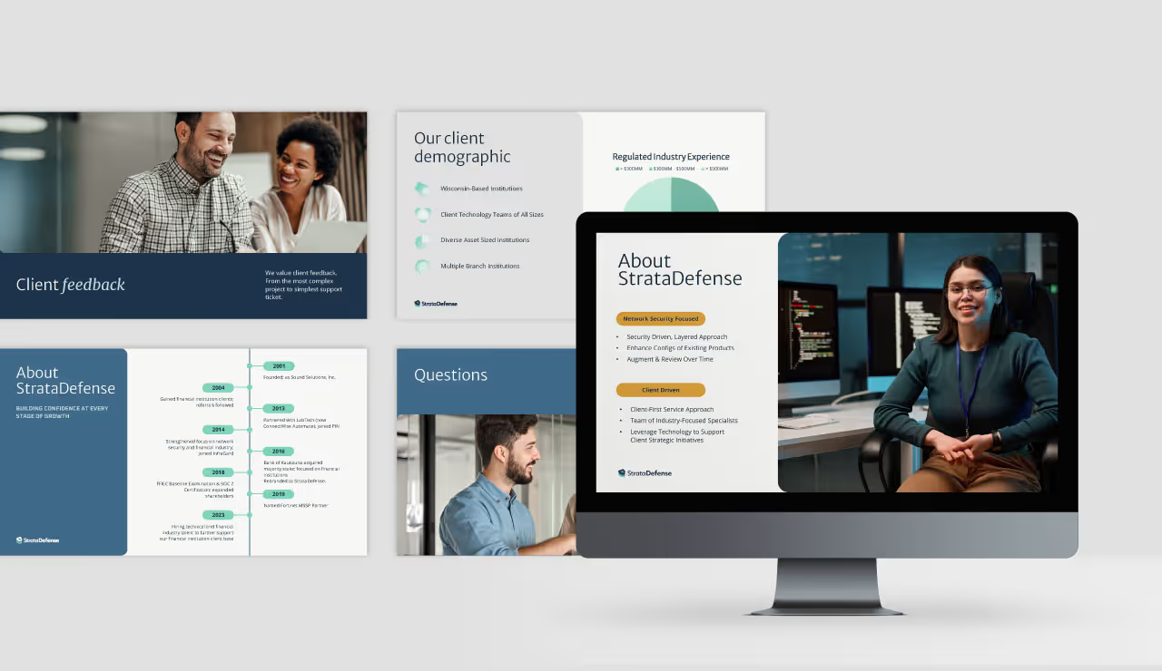

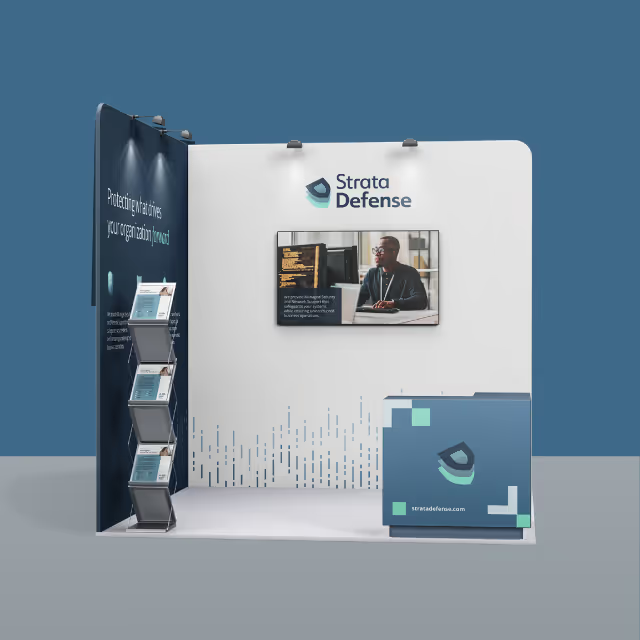


Our task was to create a brand identity that communicated both professionalism and elegance while differentiating Advanced Contours in a competitive market. The clinic needed a name and brand messaging that would encapsulate its mission and values while appealing to clients who desire personalized, expert care. Additionally, the visual identity had to reflect a balance between clinical precision and aesthetic refinement, setting the tone for a sophisticated yet approachable experience.
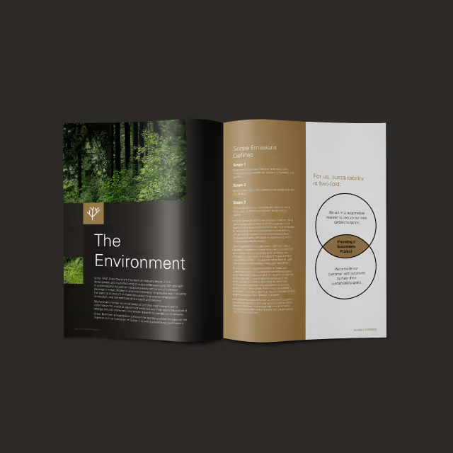
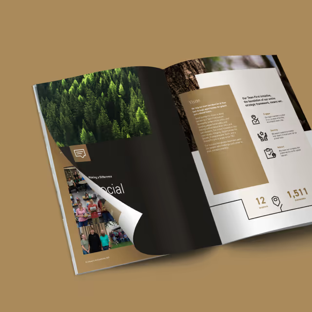
For the logo, we developed a custom wordmark that marries clinical precision with elegance. By incorporating subtle curvature between the letterforms, the logo feels both sophisticated and empowering, a reflection of the confidence Advanced Contours instills in its clients. The color palette is fresh and vibrant, with confident, caring tones that evoke both trust and rejuvenation. A curving, flowing line element was incorporated into the design as a secondary feature to guide the viewer’s eye through layouts, emphasizing the concept of natural contours. We paired serif and sans serif typography to give the brand an authentic, approachable voice, and selected photography that conveys support, confidence, and energy.

The resulting visual identity for Advanced Contours not only met but exceeded the clinic's goals. The comprehensive brand system has been stress-tested across various collateral, ensuring its consistency and adaptability for future touchpoints. Whether it's print, digital, or environmental branding, the identity remains strong, flexible, and cohesive. Advanced Contours now stands as a visually striking and emotionally resonant brand, equipped with the tools to grow while maintaining its core values of confidence, care, and clinical expertise.
Our task was to create a brand identity that communicated both professionalism and elegance while differentiating Advanced Contours in a competitive market. The clinic needed a name and brand messaging that would encapsulate its mission and values while appealing to clients who desire personalized, expert care. Additionally, the visual identity had to reflect a balance between clinical precision and aesthetic refinement, setting the tone for a sophisticated yet approachable experience.


For the logo, we developed a custom wordmark that marries clinical precision with elegance. By incorporating subtle curvature between the letterforms, the logo feels both sophisticated and empowering, a reflection of the confidence Advanced Contours instills in its clients. The color palette is fresh and vibrant, with confident, caring tones that evoke both trust and rejuvenation. A curving, flowing line element was incorporated into the design as a secondary feature to guide the viewer’s eye through layouts, emphasizing the concept of natural contours. We paired serif and sans serif typography to give the brand an authentic, approachable voice, and selected photography that conveys support, confidence, and energy.
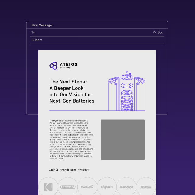
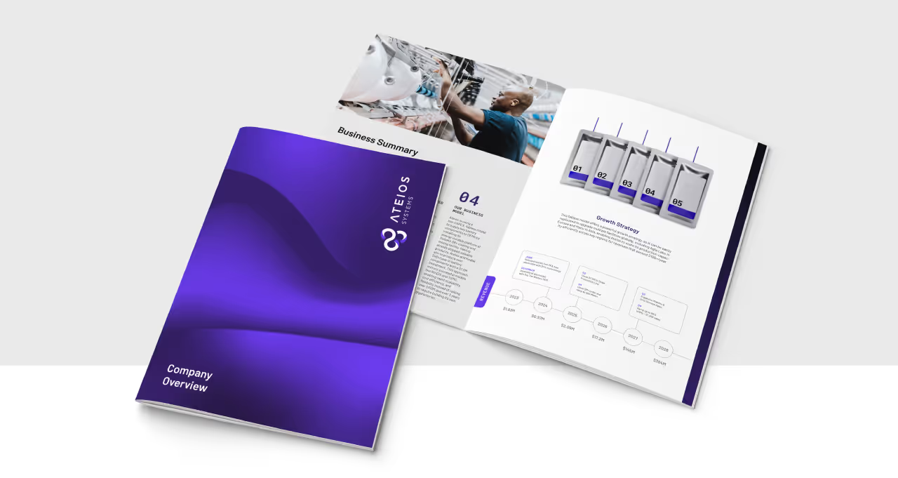
The resulting visual identity for Advanced Contours not only met but exceeded the clinic's goals. The comprehensive brand system has been stress-tested across various collateral, ensuring its consistency and adaptability for future touchpoints. Whether it's print, digital, or environmental branding, the identity remains strong, flexible, and cohesive. Advanced Contours now stands as a visually striking and emotionally resonant brand, equipped with the tools to grow while maintaining its core values of confidence, care, and clinical expertise.

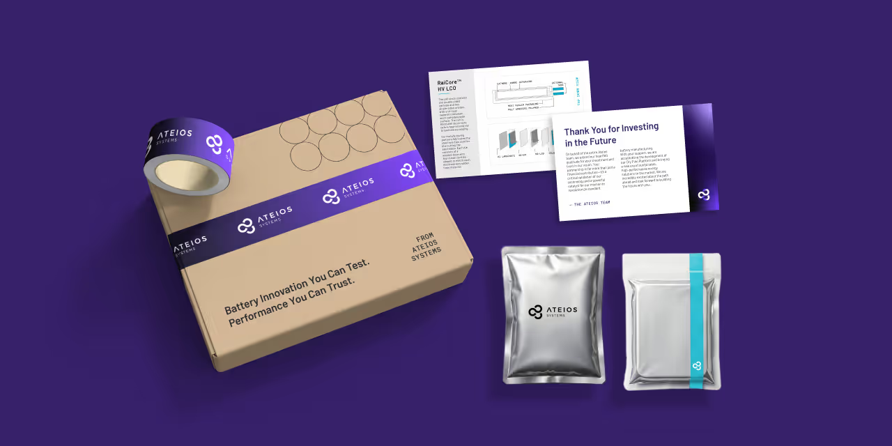
Our task was to create a brand identity that communicated both professionalism and elegance while differentiating Advanced Contours in a competitive market. The clinic needed a name and brand messaging that would encapsulate its mission and values while appealing to clients who desire personalized, expert care. Additionally, the visual identity had to reflect a balance between clinical precision and aesthetic refinement, setting the tone for a sophisticated yet approachable experience.

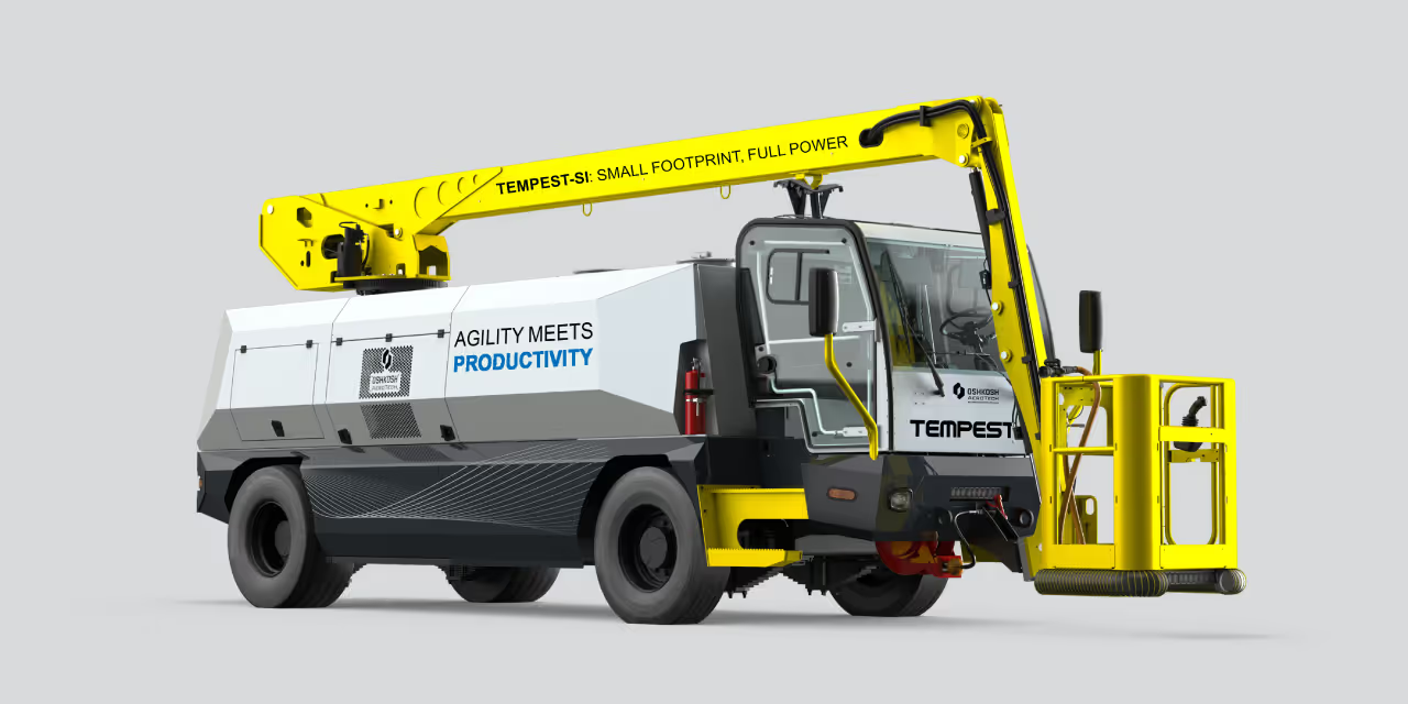

For the logo, we developed a custom wordmark that marries clinical precision with elegance. By incorporating subtle curvature between the letterforms, the logo feels both sophisticated and empowering, a reflection of the confidence Advanced Contours instills in its clients. The color palette is fresh and vibrant, with confident, caring tones that evoke both trust and rejuvenation. A curving, flowing line element was incorporated into the design as a secondary feature to guide the viewer’s eye through layouts, emphasizing the concept of natural contours. We paired serif and sans serif typography to give the brand an authentic, approachable voice, and selected photography that conveys support, confidence, and energy.


The resulting visual identity for Advanced Contours not only met but exceeded the clinic's goals. The comprehensive brand system has been stress-tested across various collateral, ensuring its consistency and adaptability for future touchpoints. Whether it's print, digital, or environmental branding, the identity remains strong, flexible, and cohesive. Advanced Contours now stands as a visually striking and emotionally resonant brand, equipped with the tools to grow while maintaining its core values of confidence, care, and clinical expertise.


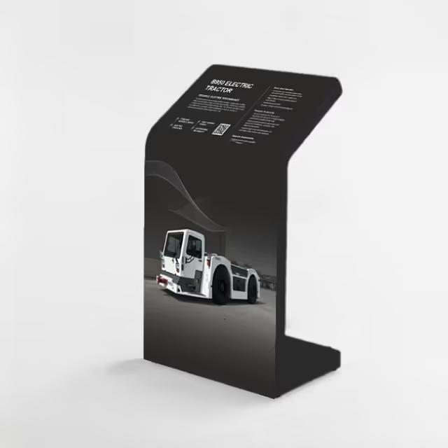
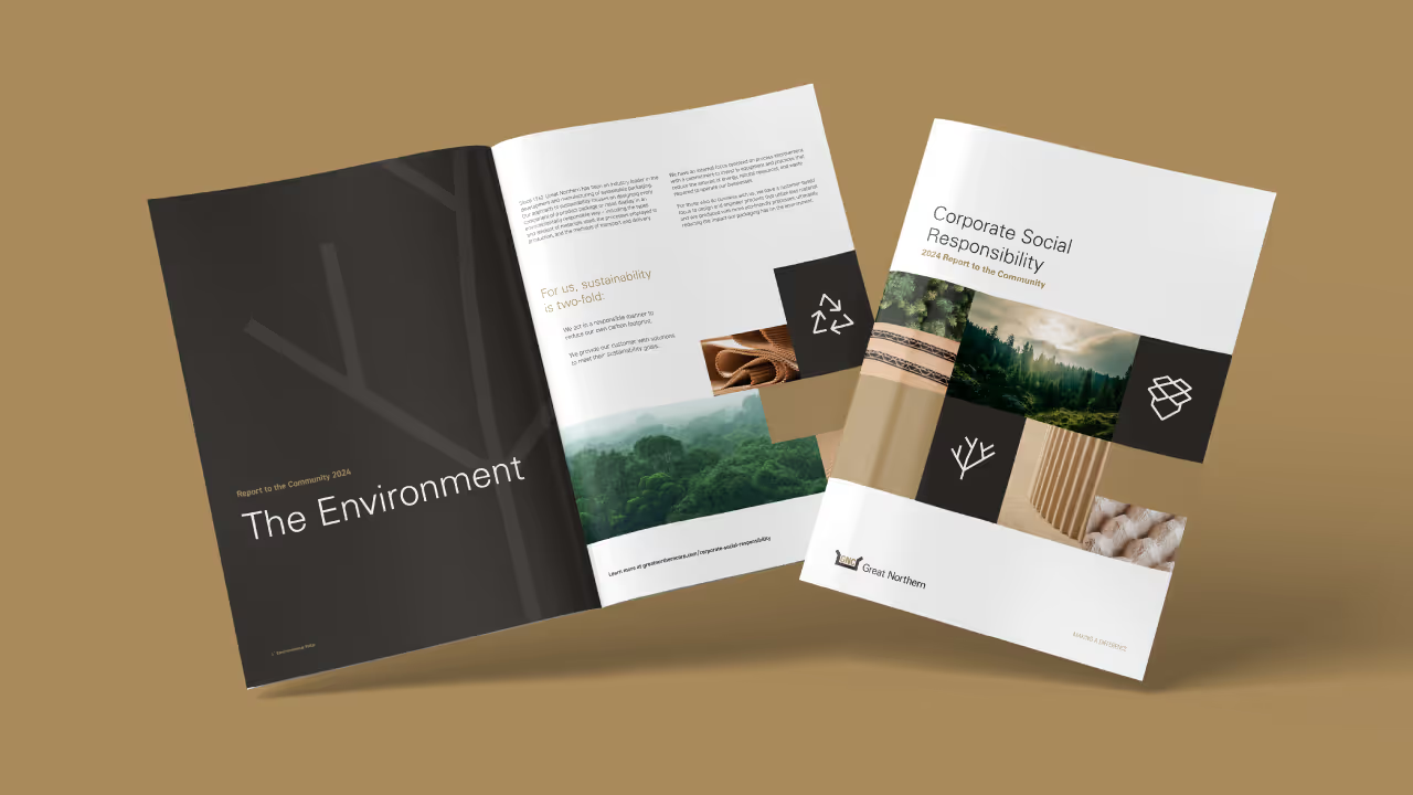
Our task was to create a brand identity that communicated both professionalism and elegance while differentiating Advanced Contours in a competitive market. The clinic needed a name and brand messaging that would encapsulate its mission and values while appealing to clients who desire personalized, expert care. Additionally, the visual identity had to reflect a balance between clinical precision and aesthetic refinement, setting the tone for a sophisticated yet approachable experience.
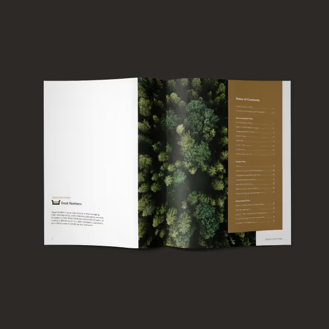

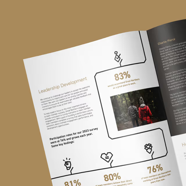
For the logo, we developed a custom wordmark that marries clinical precision with elegance. By incorporating subtle curvature between the letterforms, the logo feels both sophisticated and empowering, a reflection of the confidence Advanced Contours instills in its clients. The color palette is fresh and vibrant, with confident, caring tones that evoke both trust and rejuvenation. A curving, flowing line element was incorporated into the design as a secondary feature to guide the viewer’s eye through layouts, emphasizing the concept of natural contours. We paired serif and sans serif typography to give the brand an authentic, approachable voice, and selected photography that conveys support, confidence, and energy.


The resulting visual identity for Advanced Contours not only met but exceeded the clinic's goals. The comprehensive brand system has been stress-tested across various collateral, ensuring its consistency and adaptability for future touchpoints. Whether it's print, digital, or environmental branding, the identity remains strong, flexible, and cohesive. Advanced Contours now stands as a visually striking and emotionally resonant brand, equipped with the tools to grow while maintaining its core values of confidence, care, and clinical expertise.
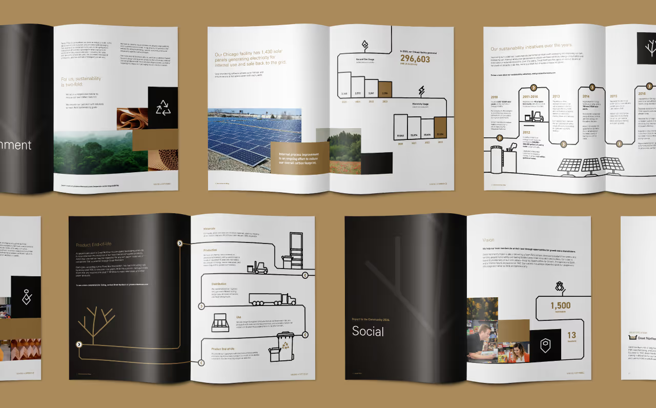

Our task was to create a brand identity that communicated both professionalism and elegance while differentiating Advanced Contours in a competitive market. The clinic needed a name and brand messaging that would encapsulate its mission and values while appealing to clients who desire personalized, expert care. Additionally, the visual identity had to reflect a balance between clinical precision and aesthetic refinement, setting the tone for a sophisticated yet approachable experience.

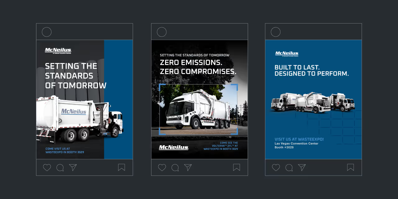

For the logo, we developed a custom wordmark that marries clinical precision with elegance. By incorporating subtle curvature between the letterforms, the logo feels both sophisticated and empowering, a reflection of the confidence Advanced Contours instills in its clients. The color palette is fresh and vibrant, with confident, caring tones that evoke both trust and rejuvenation. A curving, flowing line element was incorporated into the design as a secondary feature to guide the viewer’s eye through layouts, emphasizing the concept of natural contours. We paired serif and sans serif typography to give the brand an authentic, approachable voice, and selected photography that conveys support, confidence, and energy.

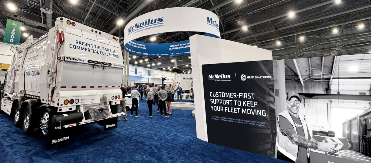
The resulting visual identity for Advanced Contours not only met but exceeded the clinic's goals. The comprehensive brand system has been stress-tested across various collateral, ensuring its consistency and adaptability for future touchpoints. Whether it's print, digital, or environmental branding, the identity remains strong, flexible, and cohesive. Advanced Contours now stands as a visually striking and emotionally resonant brand, equipped with the tools to grow while maintaining its core values of confidence, care, and clinical expertise.




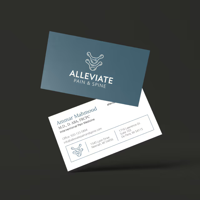
Our task was to create a brand identity that communicated both professionalism and elegance while differentiating Advanced Contours in a competitive market. The clinic needed a name and brand messaging that would encapsulate its mission and values while appealing to clients who desire personalized, expert care. Additionally, the visual identity had to reflect a balance between clinical precision and aesthetic refinement, setting the tone for a sophisticated yet approachable experience.

For the logo, we developed a custom wordmark that marries clinical precision with elegance. By incorporating subtle curvature between the letterforms, the logo feels both sophisticated and empowering, a reflection of the confidence Advanced Contours instills in its clients. The color palette is fresh and vibrant, with confident, caring tones that evoke both trust and rejuvenation. A curving, flowing line element was incorporated into the design as a secondary feature to guide the viewer’s eye through layouts, emphasizing the concept of natural contours. We paired serif and sans serif typography to give the brand an authentic, approachable voice, and selected photography that conveys support, confidence, and energy.
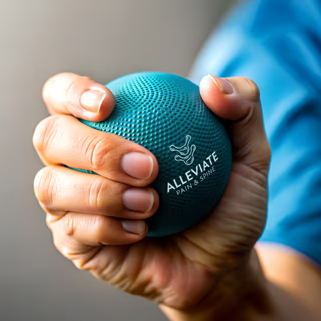

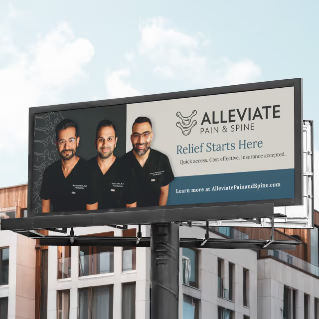
The resulting visual identity for Advanced Contours not only met but exceeded the clinic's goals. The comprehensive brand system has been stress-tested across various collateral, ensuring its consistency and adaptability for future touchpoints. Whether it's print, digital, or environmental branding, the identity remains strong, flexible, and cohesive. Advanced Contours now stands as a visually striking and emotionally resonant brand, equipped with the tools to grow while maintaining its core values of confidence, care, and clinical expertise.


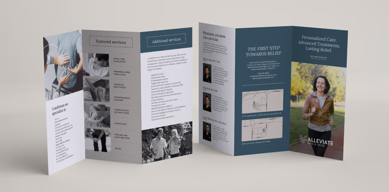

Our task was to create a brand identity that communicated both professionalism and elegance while differentiating Advanced Contours in a competitive market. The clinic needed a name and brand messaging that would encapsulate its mission and values while appealing to clients who desire personalized, expert care. Additionally, the visual identity had to reflect a balance between clinical precision and aesthetic refinement, setting the tone for a sophisticated yet approachable experience.
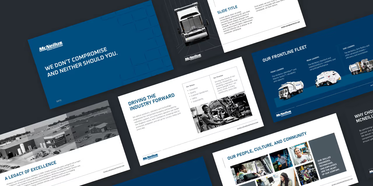
For the logo, we developed a custom wordmark that marries clinical precision with elegance. By incorporating subtle curvature between the letterforms, the logo feels both sophisticated and empowering, a reflection of the confidence Advanced Contours instills in its clients. The color palette is fresh and vibrant, with confident, caring tones that evoke both trust and rejuvenation. A curving, flowing line element was incorporated into the design as a secondary feature to guide the viewer’s eye through layouts, emphasizing the concept of natural contours. We paired serif and sans serif typography to give the brand an authentic, approachable voice, and selected photography that conveys support, confidence, and energy.
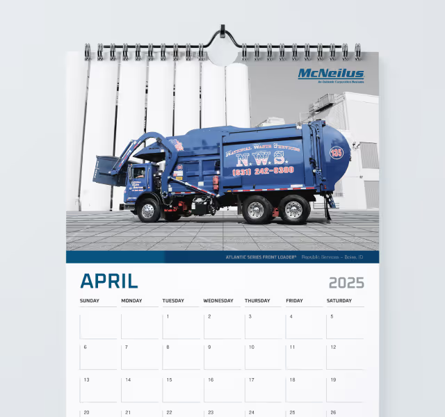


The resulting visual identity for Advanced Contours not only met but exceeded the clinic's goals. The comprehensive brand system has been stress-tested across various collateral, ensuring its consistency and adaptability for future touchpoints. Whether it's print, digital, or environmental branding, the identity remains strong, flexible, and cohesive. Advanced Contours now stands as a visually striking and emotionally resonant brand, equipped with the tools to grow while maintaining its core values of confidence, care, and clinical expertise.



Our task was to create a brand identity that communicated both professionalism and elegance while differentiating Advanced Contours in a competitive market. The clinic needed a name and brand messaging that would encapsulate its mission and values while appealing to clients who desire personalized, expert care. Additionally, the visual identity had to reflect a balance between clinical precision and aesthetic refinement, setting the tone for a sophisticated yet approachable experience.

For the logo, we developed a custom wordmark that marries clinical precision with elegance. By incorporating subtle curvature between the letterforms, the logo feels both sophisticated and empowering, a reflection of the confidence Advanced Contours instills in its clients. The color palette is fresh and vibrant, with confident, caring tones that evoke both trust and rejuvenation. A curving, flowing line element was incorporated into the design as a secondary feature to guide the viewer’s eye through layouts, emphasizing the concept of natural contours. We paired serif and sans serif typography to give the brand an authentic, approachable voice, and selected photography that conveys support, confidence, and energy.


The resulting visual identity for Advanced Contours not only met but exceeded the clinic's goals. The comprehensive brand system has been stress-tested across various collateral, ensuring its consistency and adaptability for future touchpoints. Whether it's print, digital, or environmental branding, the identity remains strong, flexible, and cohesive. Advanced Contours now stands as a visually striking and emotionally resonant brand, equipped with the tools to grow while maintaining its core values of confidence, care, and clinical expertise.

Our task was to create a brand identity that communicated both professionalism and elegance while differentiating Advanced Contours in a competitive market. The clinic needed a name and brand messaging that would encapsulate its mission and values while appealing to clients who desire personalized, expert care. Additionally, the visual identity had to reflect a balance between clinical precision and aesthetic refinement, setting the tone for a sophisticated yet approachable experience.
For the logo, we developed a custom wordmark that marries clinical precision with elegance. By incorporating subtle curvature between the letterforms, the logo feels both sophisticated and empowering, a reflection of the confidence Advanced Contours instills in its clients. The color palette is fresh and vibrant, with confident, caring tones that evoke both trust and rejuvenation. A curving, flowing line element was incorporated into the design as a secondary feature to guide the viewer’s eye through layouts, emphasizing the concept of natural contours. We paired serif and sans serif typography to give the brand an authentic, approachable voice, and selected photography that conveys support, confidence, and energy.
The resulting visual identity for Advanced Contours not only met but exceeded the clinic's goals. The comprehensive brand system has been stress-tested across various collateral, ensuring its consistency and adaptability for future touchpoints. Whether it's print, digital, or environmental branding, the identity remains strong, flexible, and cohesive. Advanced Contours now stands as a visually striking and emotionally resonant brand, equipped with the tools to grow while maintaining its core values of confidence, care, and clinical expertise.
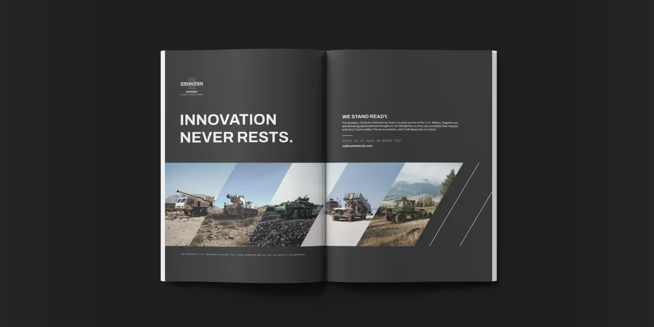
Our task was to create a brand identity that communicated both professionalism and elegance while differentiating Advanced Contours in a competitive market. The clinic needed a name and brand messaging that would encapsulate its mission and values while appealing to clients who desire personalized, expert care. Additionally, the visual identity had to reflect a balance between clinical precision and aesthetic refinement, setting the tone for a sophisticated yet approachable experience.

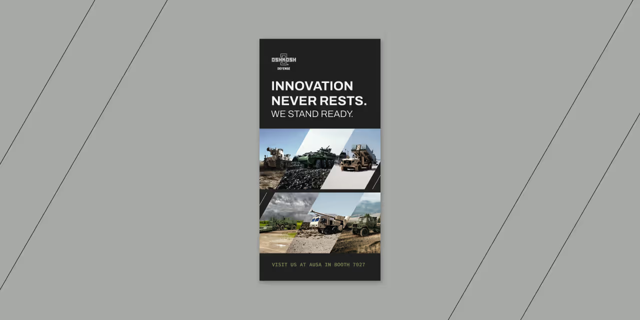
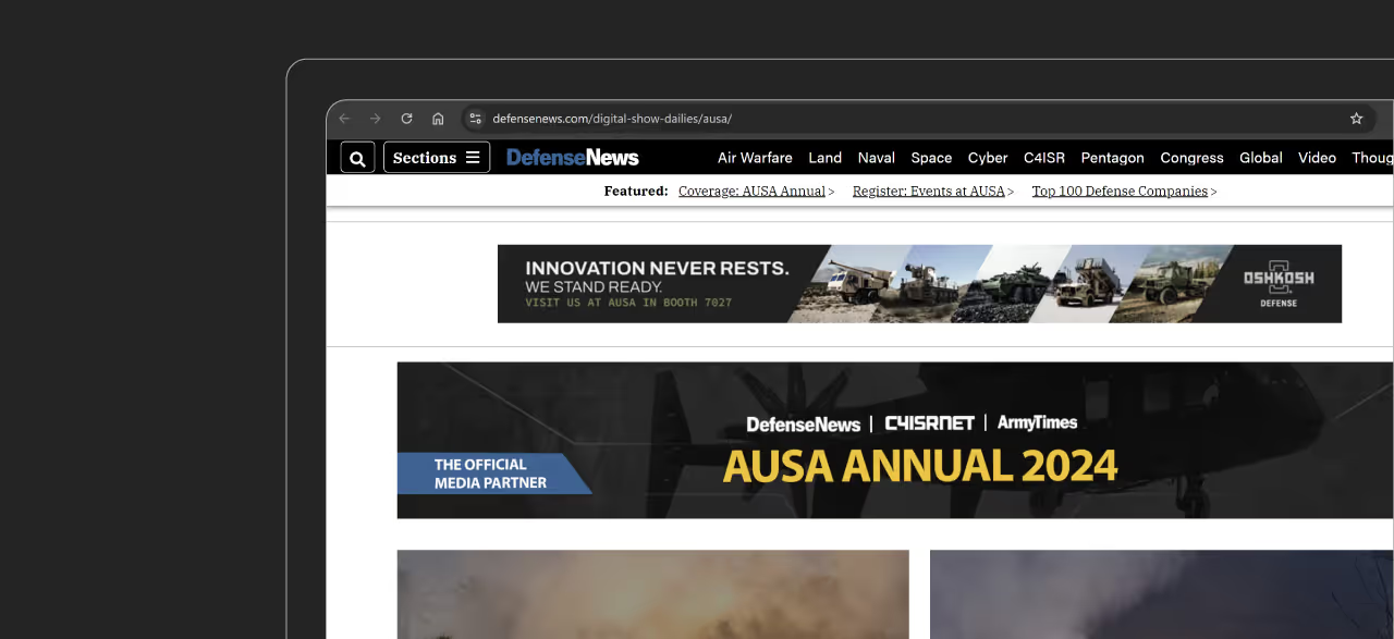
For the logo, we developed a custom wordmark that marries clinical precision with elegance. By incorporating subtle curvature between the letterforms, the logo feels both sophisticated and empowering, a reflection of the confidence Advanced Contours instills in its clients. The color palette is fresh and vibrant, with confident, caring tones that evoke both trust and rejuvenation. A curving, flowing line element was incorporated into the design as a secondary feature to guide the viewer’s eye through layouts, emphasizing the concept of natural contours. We paired serif and sans serif typography to give the brand an authentic, approachable voice, and selected photography that conveys support, confidence, and energy.

The resulting visual identity for Advanced Contours not only met but exceeded the clinic's goals. The comprehensive brand system has been stress-tested across various collateral, ensuring its consistency and adaptability for future touchpoints. Whether it's print, digital, or environmental branding, the identity remains strong, flexible, and cohesive. Advanced Contours now stands as a visually striking and emotionally resonant brand, equipped with the tools to grow while maintaining its core values of confidence, care, and clinical expertise.
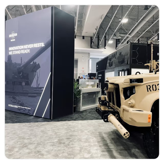

Our task was to create a brand identity that communicated both professionalism and elegance while differentiating Advanced Contours in a competitive market. The clinic needed a name and brand messaging that would encapsulate its mission and values while appealing to clients who desire personalized, expert care. Additionally, the visual identity had to reflect a balance between clinical precision and aesthetic refinement, setting the tone for a sophisticated yet approachable experience.

For the logo, we developed a custom wordmark that marries clinical precision with elegance. By incorporating subtle curvature between the letterforms, the logo feels both sophisticated and empowering, a reflection of the confidence Advanced Contours instills in its clients. The color palette is fresh and vibrant, with confident, caring tones that evoke both trust and rejuvenation. A curving, flowing line element was incorporated into the design as a secondary feature to guide the viewer’s eye through layouts, emphasizing the concept of natural contours. We paired serif and sans serif typography to give the brand an authentic, approachable voice, and selected photography that conveys support, confidence, and energy.

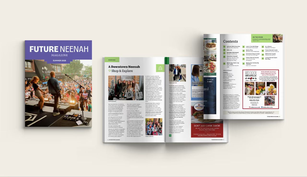
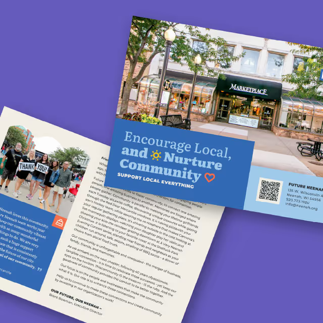
The resulting visual identity for Advanced Contours not only met but exceeded the clinic's goals. The comprehensive brand system has been stress-tested across various collateral, ensuring its consistency and adaptability for future touchpoints. Whether it's print, digital, or environmental branding, the identity remains strong, flexible, and cohesive. Advanced Contours now stands as a visually striking and emotionally resonant brand, equipped with the tools to grow while maintaining its core values of confidence, care, and clinical expertise.

Our task was to create a brand identity that communicated both professionalism and elegance while differentiating Advanced Contours in a competitive market. The clinic needed a name and brand messaging that would encapsulate its mission and values while appealing to clients who desire personalized, expert care. Additionally, the visual identity had to reflect a balance between clinical precision and aesthetic refinement, setting the tone for a sophisticated yet approachable experience.

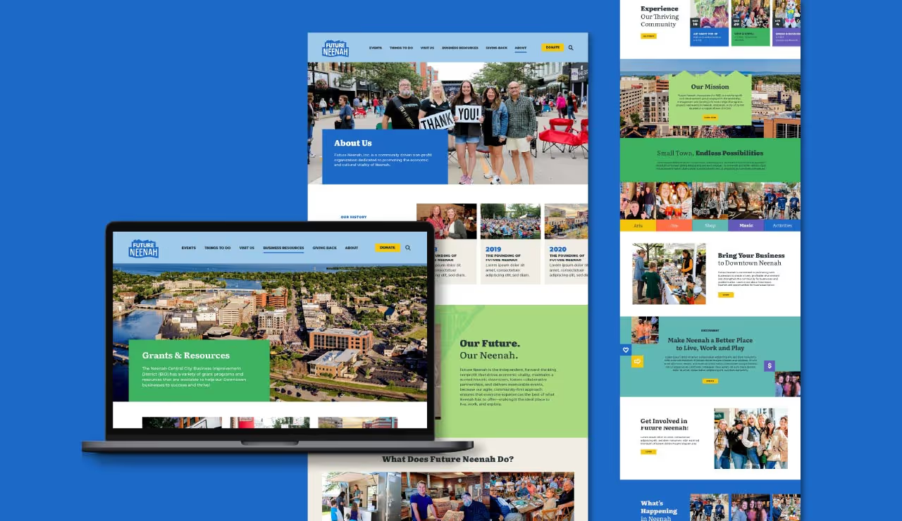
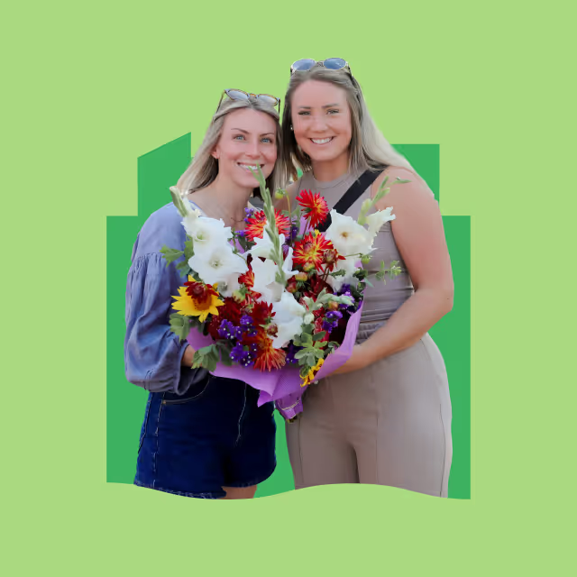
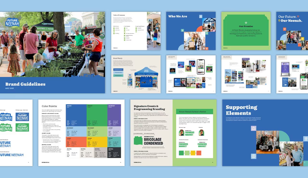
For the logo, we developed a custom wordmark that marries clinical precision with elegance. By incorporating subtle curvature between the letterforms, the logo feels both sophisticated and empowering, a reflection of the confidence Advanced Contours instills in its clients. The color palette is fresh and vibrant, with confident, caring tones that evoke both trust and rejuvenation. A curving, flowing line element was incorporated into the design as a secondary feature to guide the viewer’s eye through layouts, emphasizing the concept of natural contours. We paired serif and sans serif typography to give the brand an authentic, approachable voice, and selected photography that conveys support, confidence, and energy.
The resulting visual identity for Advanced Contours not only met but exceeded the clinic's goals. The comprehensive brand system has been stress-tested across various collateral, ensuring its consistency and adaptability for future touchpoints. Whether it's print, digital, or environmental branding, the identity remains strong, flexible, and cohesive. Advanced Contours now stands as a visually striking and emotionally resonant brand, equipped with the tools to grow while maintaining its core values of confidence, care, and clinical expertise.
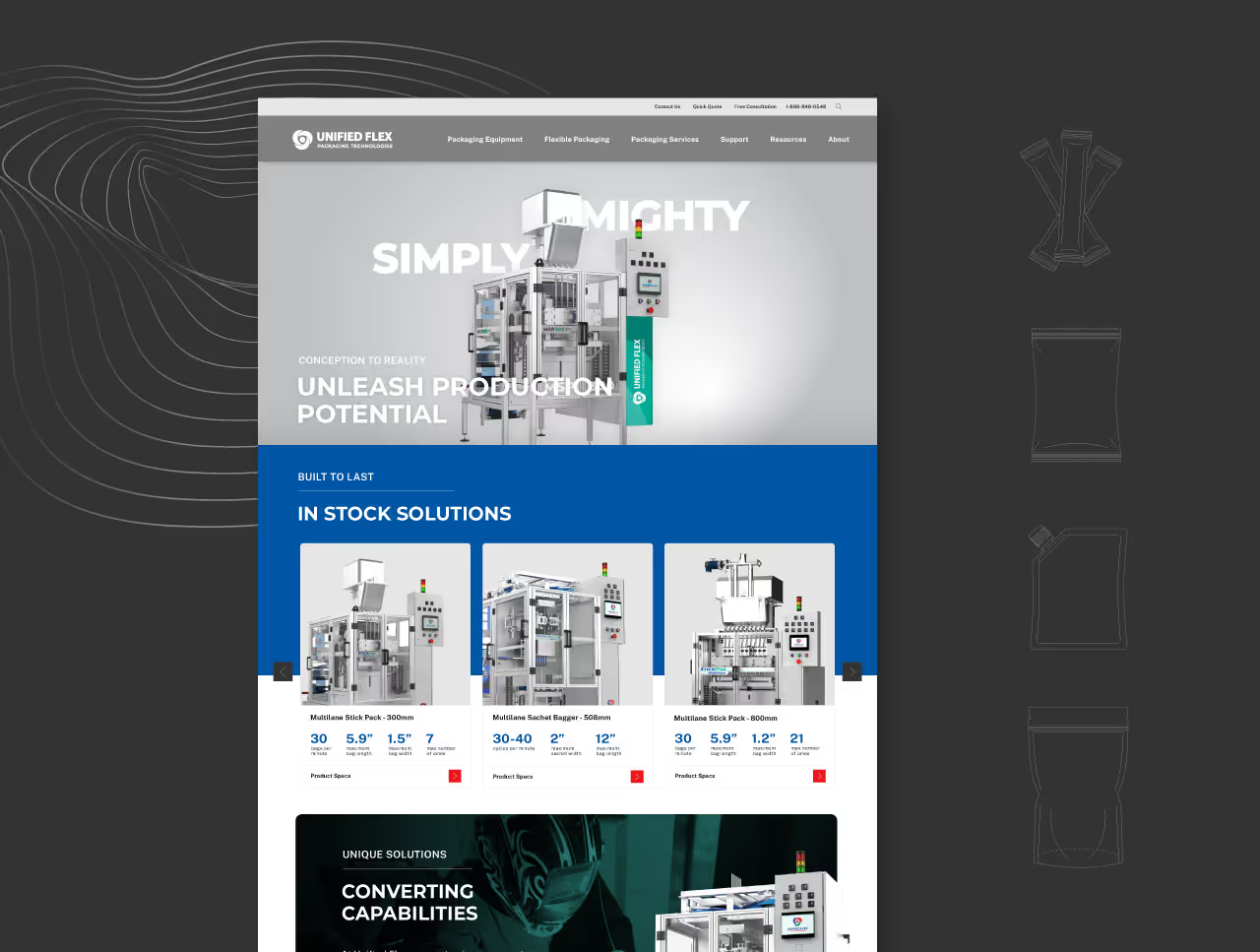


Our task was to create a brand identity that communicated both professionalism and elegance while differentiating Advanced Contours in a competitive market. The clinic needed a name and brand messaging that would encapsulate its mission and values while appealing to clients who desire personalized, expert care. Additionally, the visual identity had to reflect a balance between clinical precision and aesthetic refinement, setting the tone for a sophisticated yet approachable experience.


For the logo, we developed a custom wordmark that marries clinical precision with elegance. By incorporating subtle curvature between the letterforms, the logo feels both sophisticated and empowering, a reflection of the confidence Advanced Contours instills in its clients. The color palette is fresh and vibrant, with confident, caring tones that evoke both trust and rejuvenation. A curving, flowing line element was incorporated into the design as a secondary feature to guide the viewer’s eye through layouts, emphasizing the concept of natural contours. We paired serif and sans serif typography to give the brand an authentic, approachable voice, and selected photography that conveys support, confidence, and energy.

The resulting visual identity for Advanced Contours not only met but exceeded the clinic's goals. The comprehensive brand system has been stress-tested across various collateral, ensuring its consistency and adaptability for future touchpoints. Whether it's print, digital, or environmental branding, the identity remains strong, flexible, and cohesive. Advanced Contours now stands as a visually striking and emotionally resonant brand, equipped with the tools to grow while maintaining its core values of confidence, care, and clinical expertise.


Our task was to create a brand identity that communicated both professionalism and elegance while differentiating Advanced Contours in a competitive market. The clinic needed a name and brand messaging that would encapsulate its mission and values while appealing to clients who desire personalized, expert care. Additionally, the visual identity had to reflect a balance between clinical precision and aesthetic refinement, setting the tone for a sophisticated yet approachable experience.

For the logo, we developed a custom wordmark that marries clinical precision with elegance. By incorporating subtle curvature between the letterforms, the logo feels both sophisticated and empowering, a reflection of the confidence Advanced Contours instills in its clients. The color palette is fresh and vibrant, with confident, caring tones that evoke both trust and rejuvenation. A curving, flowing line element was incorporated into the design as a secondary feature to guide the viewer’s eye through layouts, emphasizing the concept of natural contours. We paired serif and sans serif typography to give the brand an authentic, approachable voice, and selected photography that conveys support, confidence, and energy.


The resulting visual identity for Advanced Contours not only met but exceeded the clinic's goals. The comprehensive brand system has been stress-tested across various collateral, ensuring its consistency and adaptability for future touchpoints. Whether it's print, digital, or environmental branding, the identity remains strong, flexible, and cohesive. Advanced Contours now stands as a visually striking and emotionally resonant brand, equipped with the tools to grow while maintaining its core values of confidence, care, and clinical expertise.


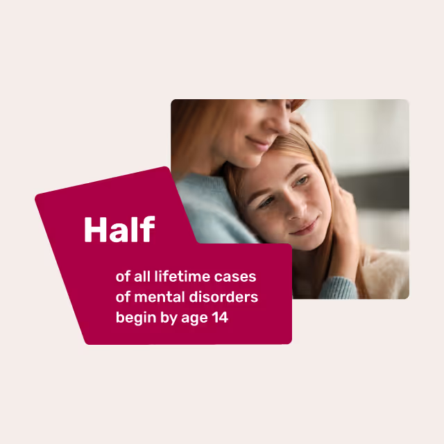
Our task was to create a brand identity that communicated both professionalism and elegance while differentiating Advanced Contours in a competitive market. The clinic needed a name and brand messaging that would encapsulate its mission and values while appealing to clients who desire personalized, expert care. Additionally, the visual identity had to reflect a balance between clinical precision and aesthetic refinement, setting the tone for a sophisticated yet approachable experience.


For the logo, we developed a custom wordmark that marries clinical precision with elegance. By incorporating subtle curvature between the letterforms, the logo feels both sophisticated and empowering, a reflection of the confidence Advanced Contours instills in its clients. The color palette is fresh and vibrant, with confident, caring tones that evoke both trust and rejuvenation. A curving, flowing line element was incorporated into the design as a secondary feature to guide the viewer’s eye through layouts, emphasizing the concept of natural contours. We paired serif and sans serif typography to give the brand an authentic, approachable voice, and selected photography that conveys support, confidence, and energy.



The resulting visual identity for Advanced Contours not only met but exceeded the clinic's goals. The comprehensive brand system has been stress-tested across various collateral, ensuring its consistency and adaptability for future touchpoints. Whether it's print, digital, or environmental branding, the identity remains strong, flexible, and cohesive. Advanced Contours now stands as a visually striking and emotionally resonant brand, equipped with the tools to grow while maintaining its core values of confidence, care, and clinical expertise.





Our task was to create a brand identity that communicated both professionalism and elegance while differentiating Advanced Contours in a competitive market. The clinic needed a name and brand messaging that would encapsulate its mission and values while appealing to clients who desire personalized, expert care. Additionally, the visual identity had to reflect a balance between clinical precision and aesthetic refinement, setting the tone for a sophisticated yet approachable experience.


For the logo, we developed a custom wordmark that marries clinical precision with elegance. By incorporating subtle curvature between the letterforms, the logo feels both sophisticated and empowering, a reflection of the confidence Advanced Contours instills in its clients. The color palette is fresh and vibrant, with confident, caring tones that evoke both trust and rejuvenation. A curving, flowing line element was incorporated into the design as a secondary feature to guide the viewer’s eye through layouts, emphasizing the concept of natural contours. We paired serif and sans serif typography to give the brand an authentic, approachable voice, and selected photography that conveys support, confidence, and energy.

The resulting visual identity for Advanced Contours not only met but exceeded the clinic's goals. The comprehensive brand system has been stress-tested across various collateral, ensuring its consistency and adaptability for future touchpoints. Whether it's print, digital, or environmental branding, the identity remains strong, flexible, and cohesive. Advanced Contours now stands as a visually striking and emotionally resonant brand, equipped with the tools to grow while maintaining its core values of confidence, care, and clinical expertise.


Our task was to create a brand identity that communicated both professionalism and elegance while differentiating Advanced Contours in a competitive market. The clinic needed a name and brand messaging that would encapsulate its mission and values while appealing to clients who desire personalized, expert care. Additionally, the visual identity had to reflect a balance between clinical precision and aesthetic refinement, setting the tone for a sophisticated yet approachable experience.


For the logo, we developed a custom wordmark that marries clinical precision with elegance. By incorporating subtle curvature between the letterforms, the logo feels both sophisticated and empowering, a reflection of the confidence Advanced Contours instills in its clients. The color palette is fresh and vibrant, with confident, caring tones that evoke both trust and rejuvenation. A curving, flowing line element was incorporated into the design as a secondary feature to guide the viewer’s eye through layouts, emphasizing the concept of natural contours. We paired serif and sans serif typography to give the brand an authentic, approachable voice, and selected photography that conveys support, confidence, and energy.


The resulting visual identity for Advanced Contours not only met but exceeded the clinic's goals. The comprehensive brand system has been stress-tested across various collateral, ensuring its consistency and adaptability for future touchpoints. Whether it's print, digital, or environmental branding, the identity remains strong, flexible, and cohesive. Advanced Contours now stands as a visually striking and emotionally resonant brand, equipped with the tools to grow while maintaining its core values of confidence, care, and clinical expertise.
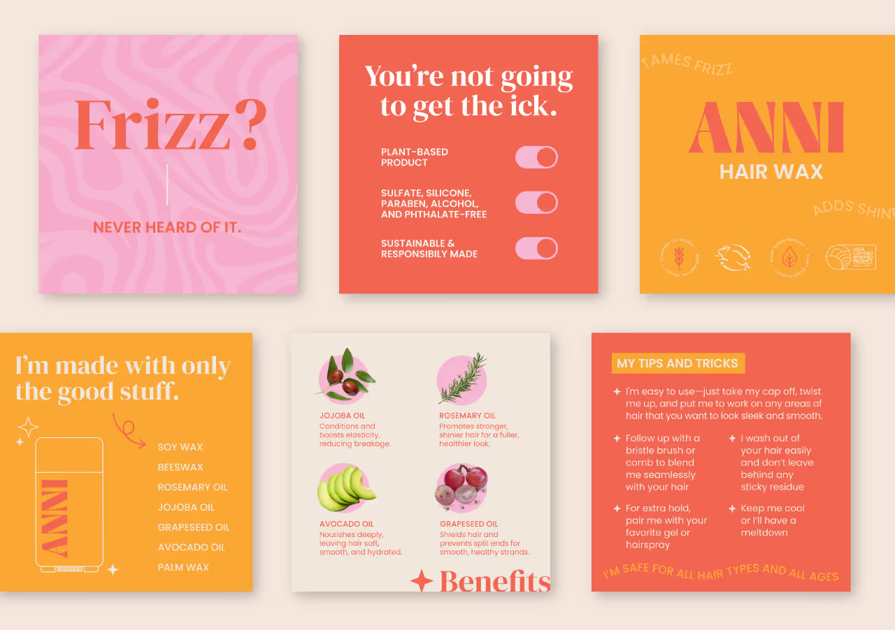


Our task was to create a brand identity that communicated both professionalism and elegance while differentiating Advanced Contours in a competitive market. The clinic needed a name and brand messaging that would encapsulate its mission and values while appealing to clients who desire personalized, expert care. Additionally, the visual identity had to reflect a balance between clinical precision and aesthetic refinement, setting the tone for a sophisticated yet approachable experience.

For the logo, we developed a custom wordmark that marries clinical precision with elegance. By incorporating subtle curvature between the letterforms, the logo feels both sophisticated and empowering, a reflection of the confidence Advanced Contours instills in its clients. The color palette is fresh and vibrant, with confident, caring tones that evoke both trust and rejuvenation. A curving, flowing line element was incorporated into the design as a secondary feature to guide the viewer’s eye through layouts, emphasizing the concept of natural contours. We paired serif and sans serif typography to give the brand an authentic, approachable voice, and selected photography that conveys support, confidence, and energy.


The resulting visual identity for Advanced Contours not only met but exceeded the clinic's goals. The comprehensive brand system has been stress-tested across various collateral, ensuring its consistency and adaptability for future touchpoints. Whether it's print, digital, or environmental branding, the identity remains strong, flexible, and cohesive. Advanced Contours now stands as a visually striking and emotionally resonant brand, equipped with the tools to grow while maintaining its core values of confidence, care, and clinical expertise.


Our task was to create a brand identity that communicated both professionalism and elegance while differentiating Advanced Contours in a competitive market. The clinic needed a name and brand messaging that would encapsulate its mission and values while appealing to clients who desire personalized, expert care. Additionally, the visual identity had to reflect a balance between clinical precision and aesthetic refinement, setting the tone for a sophisticated yet approachable experience.


For the logo, we developed a custom wordmark that marries clinical precision with elegance. By incorporating subtle curvature between the letterforms, the logo feels both sophisticated and empowering, a reflection of the confidence Advanced Contours instills in its clients. The color palette is fresh and vibrant, with confident, caring tones that evoke both trust and rejuvenation. A curving, flowing line element was incorporated into the design as a secondary feature to guide the viewer’s eye through layouts, emphasizing the concept of natural contours. We paired serif and sans serif typography to give the brand an authentic, approachable voice, and selected photography that conveys support, confidence, and energy.


The resulting visual identity for Advanced Contours not only met but exceeded the clinic's goals. The comprehensive brand system has been stress-tested across various collateral, ensuring its consistency and adaptability for future touchpoints. Whether it's print, digital, or environmental branding, the identity remains strong, flexible, and cohesive. Advanced Contours now stands as a visually striking and emotionally resonant brand, equipped with the tools to grow while maintaining its core values of confidence, care, and clinical expertise.


Our task was to create a brand identity that communicated both professionalism and elegance while differentiating Advanced Contours in a competitive market. The clinic needed a name and brand messaging that would encapsulate its mission and values while appealing to clients who desire personalized, expert care. Additionally, the visual identity had to reflect a balance between clinical precision and aesthetic refinement, setting the tone for a sophisticated yet approachable experience.

For the logo, we developed a custom wordmark that marries clinical precision with elegance. By incorporating subtle curvature between the letterforms, the logo feels both sophisticated and empowering, a reflection of the confidence Advanced Contours instills in its clients. The color palette is fresh and vibrant, with confident, caring tones that evoke both trust and rejuvenation. A curving, flowing line element was incorporated into the design as a secondary feature to guide the viewer’s eye through layouts, emphasizing the concept of natural contours. We paired serif and sans serif typography to give the brand an authentic, approachable voice, and selected photography that conveys support, confidence, and energy.


The resulting visual identity for Advanced Contours not only met but exceeded the clinic's goals. The comprehensive brand system has been stress-tested across various collateral, ensuring its consistency and adaptability for future touchpoints. Whether it's print, digital, or environmental branding, the identity remains strong, flexible, and cohesive. Advanced Contours now stands as a visually striking and emotionally resonant brand, equipped with the tools to grow while maintaining its core values of confidence, care, and clinical expertise.


Our task was to create a brand identity that communicated both professionalism and elegance while differentiating Advanced Contours in a competitive market. The clinic needed a name and brand messaging that would encapsulate its mission and values while appealing to clients who desire personalized, expert care. Additionally, the visual identity had to reflect a balance between clinical precision and aesthetic refinement, setting the tone for a sophisticated yet approachable experience.

For the logo, we developed a custom wordmark that marries clinical precision with elegance. By incorporating subtle curvature between the letterforms, the logo feels both sophisticated and empowering, a reflection of the confidence Advanced Contours instills in its clients. The color palette is fresh and vibrant, with confident, caring tones that evoke both trust and rejuvenation. A curving, flowing line element was incorporated into the design as a secondary feature to guide the viewer’s eye through layouts, emphasizing the concept of natural contours. We paired serif and sans serif typography to give the brand an authentic, approachable voice, and selected photography that conveys support, confidence, and energy.


The resulting visual identity for Advanced Contours not only met but exceeded the clinic's goals. The comprehensive brand system has been stress-tested across various collateral, ensuring its consistency and adaptability for future touchpoints. Whether it's print, digital, or environmental branding, the identity remains strong, flexible, and cohesive. Advanced Contours now stands as a visually striking and emotionally resonant brand, equipped with the tools to grow while maintaining its core values of confidence, care, and clinical expertise.


Our task was to create a brand identity that communicated both professionalism and elegance while differentiating Advanced Contours in a competitive market. The clinic needed a name and brand messaging that would encapsulate its mission and values while appealing to clients who desire personalized, expert care. Additionally, the visual identity had to reflect a balance between clinical precision and aesthetic refinement, setting the tone for a sophisticated yet approachable experience.


For the logo, we developed a custom wordmark that marries clinical precision with elegance. By incorporating subtle curvature between the letterforms, the logo feels both sophisticated and empowering, a reflection of the confidence Advanced Contours instills in its clients. The color palette is fresh and vibrant, with confident, caring tones that evoke both trust and rejuvenation. A curving, flowing line element was incorporated into the design as a secondary feature to guide the viewer’s eye through layouts, emphasizing the concept of natural contours. We paired serif and sans serif typography to give the brand an authentic, approachable voice, and selected photography that conveys support, confidence, and energy.

The resulting visual identity for Advanced Contours not only met but exceeded the clinic's goals. The comprehensive brand system has been stress-tested across various collateral, ensuring its consistency and adaptability for future touchpoints. Whether it's print, digital, or environmental branding, the identity remains strong, flexible, and cohesive. Advanced Contours now stands as a visually striking and emotionally resonant brand, equipped with the tools to grow while maintaining its core values of confidence, care, and clinical expertise.


Our task was to create a brand identity that communicated both professionalism and elegance while differentiating Advanced Contours in a competitive market. The clinic needed a name and brand messaging that would encapsulate its mission and values while appealing to clients who desire personalized, expert care. Additionally, the visual identity had to reflect a balance between clinical precision and aesthetic refinement, setting the tone for a sophisticated yet approachable experience.

For the logo, we developed a custom wordmark that marries clinical precision with elegance. By incorporating subtle curvature between the letterforms, the logo feels both sophisticated and empowering, a reflection of the confidence Advanced Contours instills in its clients. The color palette is fresh and vibrant, with confident, caring tones that evoke both trust and rejuvenation. A curving, flowing line element was incorporated into the design as a secondary feature to guide the viewer’s eye through layouts, emphasizing the concept of natural contours. We paired serif and sans serif typography to give the brand an authentic, approachable voice, and selected photography that conveys support, confidence, and energy.


The resulting visual identity for Advanced Contours not only met but exceeded the clinic's goals. The comprehensive brand system has been stress-tested across various collateral, ensuring its consistency and adaptability for future touchpoints. Whether it's print, digital, or environmental branding, the identity remains strong, flexible, and cohesive. Advanced Contours now stands as a visually striking and emotionally resonant brand, equipped with the tools to grow while maintaining its core values of confidence, care, and clinical expertise.


Our task was to create a brand identity that communicated both professionalism and elegance while differentiating Advanced Contours in a competitive market. The clinic needed a name and brand messaging that would encapsulate its mission and values while appealing to clients who desire personalized, expert care. Additionally, the visual identity had to reflect a balance between clinical precision and aesthetic refinement, setting the tone for a sophisticated yet approachable experience.

For the logo, we developed a custom wordmark that marries clinical precision with elegance. By incorporating subtle curvature between the letterforms, the logo feels both sophisticated and empowering, a reflection of the confidence Advanced Contours instills in its clients. The color palette is fresh and vibrant, with confident, caring tones that evoke both trust and rejuvenation. A curving, flowing line element was incorporated into the design as a secondary feature to guide the viewer’s eye through layouts, emphasizing the concept of natural contours. We paired serif and sans serif typography to give the brand an authentic, approachable voice, and selected photography that conveys support, confidence, and energy.


The resulting visual identity for Advanced Contours not only met but exceeded the clinic's goals. The comprehensive brand system has been stress-tested across various collateral, ensuring its consistency and adaptability for future touchpoints. Whether it's print, digital, or environmental branding, the identity remains strong, flexible, and cohesive. Advanced Contours now stands as a visually striking and emotionally resonant brand, equipped with the tools to grow while maintaining its core values of confidence, care, and clinical expertise.


Our task was to create a brand identity that communicated both professionalism and elegance while differentiating Advanced Contours in a competitive market. The clinic needed a name and brand messaging that would encapsulate its mission and values while appealing to clients who desire personalized, expert care. Additionally, the visual identity had to reflect a balance between clinical precision and aesthetic refinement, setting the tone for a sophisticated yet approachable experience.


For the logo, we developed a custom wordmark that marries clinical precision with elegance. By incorporating subtle curvature between the letterforms, the logo feels both sophisticated and empowering, a reflection of the confidence Advanced Contours instills in its clients. The color palette is fresh and vibrant, with confident, caring tones that evoke both trust and rejuvenation. A curving, flowing line element was incorporated into the design as a secondary feature to guide the viewer’s eye through layouts, emphasizing the concept of natural contours. We paired serif and sans serif typography to give the brand an authentic, approachable voice, and selected photography that conveys support, confidence, and energy.

The resulting visual identity for Advanced Contours not only met but exceeded the clinic's goals. The comprehensive brand system has been stress-tested across various collateral, ensuring its consistency and adaptability for future touchpoints. Whether it's print, digital, or environmental branding, the identity remains strong, flexible, and cohesive. Advanced Contours now stands as a visually striking and emotionally resonant brand, equipped with the tools to grow while maintaining its core values of confidence, care, and clinical expertise.


Our task was to create a brand identity that communicated both professionalism and elegance while differentiating Advanced Contours in a competitive market. The clinic needed a name and brand messaging that would encapsulate its mission and values while appealing to clients who desire personalized, expert care. Additionally, the visual identity had to reflect a balance between clinical precision and aesthetic refinement, setting the tone for a sophisticated yet approachable experience.


For the logo, we developed a custom wordmark that marries clinical precision with elegance. By incorporating subtle curvature between the letterforms, the logo feels both sophisticated and empowering, a reflection of the confidence Advanced Contours instills in its clients. The color palette is fresh and vibrant, with confident, caring tones that evoke both trust and rejuvenation. A curving, flowing line element was incorporated into the design as a secondary feature to guide the viewer’s eye through layouts, emphasizing the concept of natural contours. We paired serif and sans serif typography to give the brand an authentic, approachable voice, and selected photography that conveys support, confidence, and energy.

The resulting visual identity for Advanced Contours not only met but exceeded the clinic's goals. The comprehensive brand system has been stress-tested across various collateral, ensuring its consistency and adaptability for future touchpoints. Whether it's print, digital, or environmental branding, the identity remains strong, flexible, and cohesive. Advanced Contours now stands as a visually striking and emotionally resonant brand, equipped with the tools to grow while maintaining its core values of confidence, care, and clinical expertise.


Our task was to create a brand identity that communicated both professionalism and elegance while differentiating Advanced Contours in a competitive market. The clinic needed a name and brand messaging that would encapsulate its mission and values while appealing to clients who desire personalized, expert care. Additionally, the visual identity had to reflect a balance between clinical precision and aesthetic refinement, setting the tone for a sophisticated yet approachable experience.


For the logo, we developed a custom wordmark that marries clinical precision with elegance. By incorporating subtle curvature between the letterforms, the logo feels both sophisticated and empowering, a reflection of the confidence Advanced Contours instills in its clients. The color palette is fresh and vibrant, with confident, caring tones that evoke both trust and rejuvenation. A curving, flowing line element was incorporated into the design as a secondary feature to guide the viewer’s eye through layouts, emphasizing the concept of natural contours. We paired serif and sans serif typography to give the brand an authentic, approachable voice, and selected photography that conveys support, confidence, and energy.


The resulting visual identity for Advanced Contours not only met but exceeded the clinic's goals. The comprehensive brand system has been stress-tested across various collateral, ensuring its consistency and adaptability for future touchpoints. Whether it's print, digital, or environmental branding, the identity remains strong, flexible, and cohesive. Advanced Contours now stands as a visually striking and emotionally resonant brand, equipped with the tools to grow while maintaining its core values of confidence, care, and clinical expertise.


Our task was to create a brand identity that communicated both professionalism and elegance while differentiating Advanced Contours in a competitive market. The clinic needed a name and brand messaging that would encapsulate its mission and values while appealing to clients who desire personalized, expert care. Additionally, the visual identity had to reflect a balance between clinical precision and aesthetic refinement, setting the tone for a sophisticated yet approachable experience.


For the logo, we developed a custom wordmark that marries clinical precision with elegance. By incorporating subtle curvature between the letterforms, the logo feels both sophisticated and empowering, a reflection of the confidence Advanced Contours instills in its clients. The color palette is fresh and vibrant, with confident, caring tones that evoke both trust and rejuvenation. A curving, flowing line element was incorporated into the design as a secondary feature to guide the viewer’s eye through layouts, emphasizing the concept of natural contours. We paired serif and sans serif typography to give the brand an authentic, approachable voice, and selected photography that conveys support, confidence, and energy.


The resulting visual identity for Advanced Contours not only met but exceeded the clinic's goals. The comprehensive brand system has been stress-tested across various collateral, ensuring its consistency and adaptability for future touchpoints. Whether it's print, digital, or environmental branding, the identity remains strong, flexible, and cohesive. Advanced Contours now stands as a visually striking and emotionally resonant brand, equipped with the tools to grow while maintaining its core values of confidence, care, and clinical expertise.

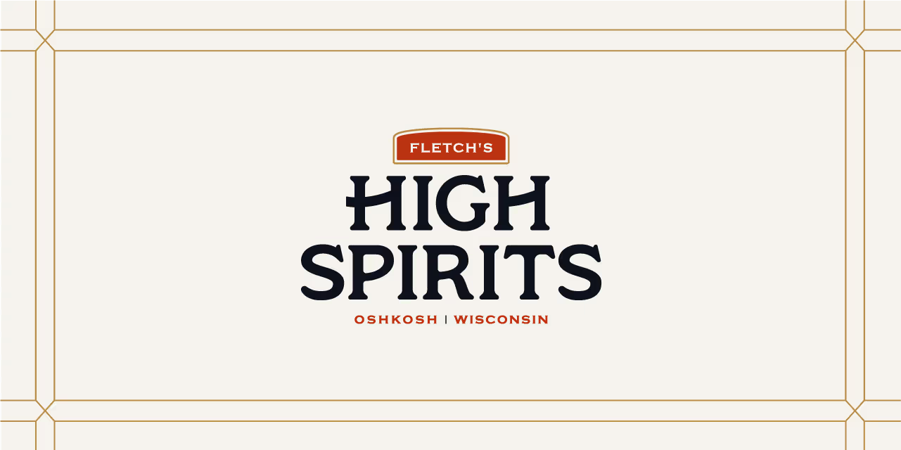

Our task was to create a brand identity that communicated both professionalism and elegance while differentiating Advanced Contours in a competitive market. The clinic needed a name and brand messaging that would encapsulate its mission and values while appealing to clients who desire personalized, expert care. Additionally, the visual identity had to reflect a balance between clinical precision and aesthetic refinement, setting the tone for a sophisticated yet approachable experience.

For the logo, we developed a custom wordmark that marries clinical precision with elegance. By incorporating subtle curvature between the letterforms, the logo feels both sophisticated and empowering, a reflection of the confidence Advanced Contours instills in its clients. The color palette is fresh and vibrant, with confident, caring tones that evoke both trust and rejuvenation. A curving, flowing line element was incorporated into the design as a secondary feature to guide the viewer’s eye through layouts, emphasizing the concept of natural contours. We paired serif and sans serif typography to give the brand an authentic, approachable voice, and selected photography that conveys support, confidence, and energy.

The resulting visual identity for Advanced Contours not only met but exceeded the clinic's goals. The comprehensive brand system has been stress-tested across various collateral, ensuring its consistency and adaptability for future touchpoints. Whether it's print, digital, or environmental branding, the identity remains strong, flexible, and cohesive. Advanced Contours now stands as a visually striking and emotionally resonant brand, equipped with the tools to grow while maintaining its core values of confidence, care, and clinical expertise.


Our task was to create a brand identity that communicated both professionalism and elegance while differentiating Advanced Contours in a competitive market. The clinic needed a name and brand messaging that would encapsulate its mission and values while appealing to clients who desire personalized, expert care. Additionally, the visual identity had to reflect a balance between clinical precision and aesthetic refinement, setting the tone for a sophisticated yet approachable experience.


For the logo, we developed a custom wordmark that marries clinical precision with elegance. By incorporating subtle curvature between the letterforms, the logo feels both sophisticated and empowering, a reflection of the confidence Advanced Contours instills in its clients. The color palette is fresh and vibrant, with confident, caring tones that evoke both trust and rejuvenation. A curving, flowing line element was incorporated into the design as a secondary feature to guide the viewer’s eye through layouts, emphasizing the concept of natural contours. We paired serif and sans serif typography to give the brand an authentic, approachable voice, and selected photography that conveys support, confidence, and energy.


The resulting visual identity for Advanced Contours not only met but exceeded the clinic's goals. The comprehensive brand system has been stress-tested across various collateral, ensuring its consistency and adaptability for future touchpoints. Whether it's print, digital, or environmental branding, the identity remains strong, flexible, and cohesive. Advanced Contours now stands as a visually striking and emotionally resonant brand, equipped with the tools to grow while maintaining its core values of confidence, care, and clinical expertise.


Our task was to create a brand identity that communicated both professionalism and elegance while differentiating Advanced Contours in a competitive market. The clinic needed a name and brand messaging that would encapsulate its mission and values while appealing to clients who desire personalized, expert care. Additionally, the visual identity had to reflect a balance between clinical precision and aesthetic refinement, setting the tone for a sophisticated yet approachable experience.


For the logo, we developed a custom wordmark that marries clinical precision with elegance. By incorporating subtle curvature between the letterforms, the logo feels both sophisticated and empowering, a reflection of the confidence Advanced Contours instills in its clients. The color palette is fresh and vibrant, with confident, caring tones that evoke both trust and rejuvenation. A curving, flowing line element was incorporated into the design as a secondary feature to guide the viewer’s eye through layouts, emphasizing the concept of natural contours. We paired serif and sans serif typography to give the brand an authentic, approachable voice, and selected photography that conveys support, confidence, and energy.


The resulting visual identity for Advanced Contours not only met but exceeded the clinic's goals. The comprehensive brand system has been stress-tested across various collateral, ensuring its consistency and adaptability for future touchpoints. Whether it's print, digital, or environmental branding, the identity remains strong, flexible, and cohesive. Advanced Contours now stands as a visually striking and emotionally resonant brand, equipped with the tools to grow while maintaining its core values of confidence, care, and clinical expertise.


Our task was to create a brand identity that communicated both professionalism and elegance while differentiating Advanced Contours in a competitive market. The clinic needed a name and brand messaging that would encapsulate its mission and values while appealing to clients who desire personalized, expert care. Additionally, the visual identity had to reflect a balance between clinical precision and aesthetic refinement, setting the tone for a sophisticated yet approachable experience.


For the logo, we developed a custom wordmark that marries clinical precision with elegance. By incorporating subtle curvature between the letterforms, the logo feels both sophisticated and empowering, a reflection of the confidence Advanced Contours instills in its clients. The color palette is fresh and vibrant, with confident, caring tones that evoke both trust and rejuvenation. A curving, flowing line element was incorporated into the design as a secondary feature to guide the viewer’s eye through layouts, emphasizing the concept of natural contours. We paired serif and sans serif typography to give the brand an authentic, approachable voice, and selected photography that conveys support, confidence, and energy.


The resulting visual identity for Advanced Contours not only met but exceeded the clinic's goals. The comprehensive brand system has been stress-tested across various collateral, ensuring its consistency and adaptability for future touchpoints. Whether it's print, digital, or environmental branding, the identity remains strong, flexible, and cohesive. Advanced Contours now stands as a visually striking and emotionally resonant brand, equipped with the tools to grow while maintaining its core values of confidence, care, and clinical expertise.



Our task was to create a brand identity that communicated both professionalism and elegance while differentiating Advanced Contours in a competitive market. The clinic needed a name and brand messaging that would encapsulate its mission and values while appealing to clients who desire personalized, expert care. Additionally, the visual identity had to reflect a balance between clinical precision and aesthetic refinement, setting the tone for a sophisticated yet approachable experience.


For the logo, we developed a custom wordmark that marries clinical precision with elegance. By incorporating subtle curvature between the letterforms, the logo feels both sophisticated and empowering, a reflection of the confidence Advanced Contours instills in its clients. The color palette is fresh and vibrant, with confident, caring tones that evoke both trust and rejuvenation. A curving, flowing line element was incorporated into the design as a secondary feature to guide the viewer’s eye through layouts, emphasizing the concept of natural contours. We paired serif and sans serif typography to give the brand an authentic, approachable voice, and selected photography that conveys support, confidence, and energy.


The resulting visual identity for Advanced Contours not only met but exceeded the clinic's goals. The comprehensive brand system has been stress-tested across various collateral, ensuring its consistency and adaptability for future touchpoints. Whether it's print, digital, or environmental branding, the identity remains strong, flexible, and cohesive. Advanced Contours now stands as a visually striking and emotionally resonant brand, equipped with the tools to grow while maintaining its core values of confidence, care, and clinical expertise.


Our task was to create a brand identity that communicated both professionalism and elegance while differentiating Advanced Contours in a competitive market. The clinic needed a name and brand messaging that would encapsulate its mission and values while appealing to clients who desire personalized, expert care. Additionally, the visual identity had to reflect a balance between clinical precision and aesthetic refinement, setting the tone for a sophisticated yet approachable experience.

For the logo, we developed a custom wordmark that marries clinical precision with elegance. By incorporating subtle curvature between the letterforms, the logo feels both sophisticated and empowering, a reflection of the confidence Advanced Contours instills in its clients. The color palette is fresh and vibrant, with confident, caring tones that evoke both trust and rejuvenation. A curving, flowing line element was incorporated into the design as a secondary feature to guide the viewer’s eye through layouts, emphasizing the concept of natural contours. We paired serif and sans serif typography to give the brand an authentic, approachable voice, and selected photography that conveys support, confidence, and energy.


The resulting visual identity for Advanced Contours not only met but exceeded the clinic's goals. The comprehensive brand system has been stress-tested across various collateral, ensuring its consistency and adaptability for future touchpoints. Whether it's print, digital, or environmental branding, the identity remains strong, flexible, and cohesive. Advanced Contours now stands as a visually striking and emotionally resonant brand, equipped with the tools to grow while maintaining its core values of confidence, care, and clinical expertise.


Our task was to create a brand identity that communicated both professionalism and elegance while differentiating Advanced Contours in a competitive market. The clinic needed a name and brand messaging that would encapsulate its mission and values while appealing to clients who desire personalized, expert care. Additionally, the visual identity had to reflect a balance between clinical precision and aesthetic refinement, setting the tone for a sophisticated yet approachable experience.




For the logo, we developed a custom wordmark that marries clinical precision with elegance. By incorporating subtle curvature between the letterforms, the logo feels both sophisticated and empowering, a reflection of the confidence Advanced Contours instills in its clients. The color palette is fresh and vibrant, with confident, caring tones that evoke both trust and rejuvenation. A curving, flowing line element was incorporated into the design as a secondary feature to guide the viewer’s eye through layouts, emphasizing the concept of natural contours. We paired serif and sans serif typography to give the brand an authentic, approachable voice, and selected photography that conveys support, confidence, and energy.


The resulting visual identity for Advanced Contours not only met but exceeded the clinic's goals. The comprehensive brand system has been stress-tested across various collateral, ensuring its consistency and adaptability for future touchpoints. Whether it's print, digital, or environmental branding, the identity remains strong, flexible, and cohesive. Advanced Contours now stands as a visually striking and emotionally resonant brand, equipped with the tools to grow while maintaining its core values of confidence, care, and clinical expertise.

Our task was to create a brand identity that communicated both professionalism and elegance while differentiating Advanced Contours in a competitive market. The clinic needed a name and brand messaging that would encapsulate its mission and values while appealing to clients who desire personalized, expert care. Additionally, the visual identity had to reflect a balance between clinical precision and aesthetic refinement, setting the tone for a sophisticated yet approachable experience.


For the logo, we developed a custom wordmark that marries clinical precision with elegance. By incorporating subtle curvature between the letterforms, the logo feels both sophisticated and empowering, a reflection of the confidence Advanced Contours instills in its clients. The color palette is fresh and vibrant, with confident, caring tones that evoke both trust and rejuvenation. A curving, flowing line element was incorporated into the design as a secondary feature to guide the viewer’s eye through layouts, emphasizing the concept of natural contours. We paired serif and sans serif typography to give the brand an authentic, approachable voice, and selected photography that conveys support, confidence, and energy.


The resulting visual identity for Advanced Contours not only met but exceeded the clinic's goals. The comprehensive brand system has been stress-tested across various collateral, ensuring its consistency and adaptability for future touchpoints. Whether it's print, digital, or environmental branding, the identity remains strong, flexible, and cohesive. Advanced Contours now stands as a visually striking and emotionally resonant brand, equipped with the tools to grow while maintaining its core values of confidence, care, and clinical expertise.


Our task was to create a brand identity that communicated both professionalism and elegance while differentiating Advanced Contours in a competitive market. The clinic needed a name and brand messaging that would encapsulate its mission and values while appealing to clients who desire personalized, expert care. Additionally, the visual identity had to reflect a balance between clinical precision and aesthetic refinement, setting the tone for a sophisticated yet approachable experience.

For the logo, we developed a custom wordmark that marries clinical precision with elegance. By incorporating subtle curvature between the letterforms, the logo feels both sophisticated and empowering, a reflection of the confidence Advanced Contours instills in its clients. The color palette is fresh and vibrant, with confident, caring tones that evoke both trust and rejuvenation. A curving, flowing line element was incorporated into the design as a secondary feature to guide the viewer’s eye through layouts, emphasizing the concept of natural contours. We paired serif and sans serif typography to give the brand an authentic, approachable voice, and selected photography that conveys support, confidence, and energy.


The resulting visual identity for Advanced Contours not only met but exceeded the clinic's goals. The comprehensive brand system has been stress-tested across various collateral, ensuring its consistency and adaptability for future touchpoints. Whether it's print, digital, or environmental branding, the identity remains strong, flexible, and cohesive. Advanced Contours now stands as a visually striking and emotionally resonant brand, equipped with the tools to grow while maintaining its core values of confidence, care, and clinical expertise.


Our task was to create a brand identity that communicated both professionalism and elegance while differentiating Advanced Contours in a competitive market. The clinic needed a name and brand messaging that would encapsulate its mission and values while appealing to clients who desire personalized, expert care. Additionally, the visual identity had to reflect a balance between clinical precision and aesthetic refinement, setting the tone for a sophisticated yet approachable experience.


For the logo, we developed a custom wordmark that marries clinical precision with elegance. By incorporating subtle curvature between the letterforms, the logo feels both sophisticated and empowering, a reflection of the confidence Advanced Contours instills in its clients. The color palette is fresh and vibrant, with confident, caring tones that evoke both trust and rejuvenation. A curving, flowing line element was incorporated into the design as a secondary feature to guide the viewer’s eye through layouts, emphasizing the concept of natural contours. We paired serif and sans serif typography to give the brand an authentic, approachable voice, and selected photography that conveys support, confidence, and energy.


The resulting visual identity for Advanced Contours not only met but exceeded the clinic's goals. The comprehensive brand system has been stress-tested across various collateral, ensuring its consistency and adaptability for future touchpoints. Whether it's print, digital, or environmental branding, the identity remains strong, flexible, and cohesive. Advanced Contours now stands as a visually striking and emotionally resonant brand, equipped with the tools to grow while maintaining its core values of confidence, care, and clinical expertise.


Our task was to create a brand identity that communicated both professionalism and elegance while differentiating Advanced Contours in a competitive market. The clinic needed a name and brand messaging that would encapsulate its mission and values while appealing to clients who desire personalized, expert care. Additionally, the visual identity had to reflect a balance between clinical precision and aesthetic refinement, setting the tone for a sophisticated yet approachable experience.


For the logo, we developed a custom wordmark that marries clinical precision with elegance. By incorporating subtle curvature between the letterforms, the logo feels both sophisticated and empowering, a reflection of the confidence Advanced Contours instills in its clients. The color palette is fresh and vibrant, with confident, caring tones that evoke both trust and rejuvenation. A curving, flowing line element was incorporated into the design as a secondary feature to guide the viewer’s eye through layouts, emphasizing the concept of natural contours. We paired serif and sans serif typography to give the brand an authentic, approachable voice, and selected photography that conveys support, confidence, and energy.


The resulting visual identity for Advanced Contours not only met but exceeded the clinic's goals. The comprehensive brand system has been stress-tested across various collateral, ensuring its consistency and adaptability for future touchpoints. Whether it's print, digital, or environmental branding, the identity remains strong, flexible, and cohesive. Advanced Contours now stands as a visually striking and emotionally resonant brand, equipped with the tools to grow while maintaining its core values of confidence, care, and clinical expertise.


Our task was to create a brand identity that communicated both professionalism and elegance while differentiating Advanced Contours in a competitive market. The clinic needed a name and brand messaging that would encapsulate its mission and values while appealing to clients who desire personalized, expert care. Additionally, the visual identity had to reflect a balance between clinical precision and aesthetic refinement, setting the tone for a sophisticated yet approachable experience.


For the logo, we developed a custom wordmark that marries clinical precision with elegance. By incorporating subtle curvature between the letterforms, the logo feels both sophisticated and empowering, a reflection of the confidence Advanced Contours instills in its clients. The color palette is fresh and vibrant, with confident, caring tones that evoke both trust and rejuvenation. A curving, flowing line element was incorporated into the design as a secondary feature to guide the viewer’s eye through layouts, emphasizing the concept of natural contours. We paired serif and sans serif typography to give the brand an authentic, approachable voice, and selected photography that conveys support, confidence, and energy.


The resulting visual identity for Advanced Contours not only met but exceeded the clinic's goals. The comprehensive brand system has been stress-tested across various collateral, ensuring its consistency and adaptability for future touchpoints. Whether it's print, digital, or environmental branding, the identity remains strong, flexible, and cohesive. Advanced Contours now stands as a visually striking and emotionally resonant brand, equipped with the tools to grow while maintaining its core values of confidence, care, and clinical expertise.




Our task was to create a brand identity that communicated both professionalism and elegance while differentiating Advanced Contours in a competitive market. The clinic needed a name and brand messaging that would encapsulate its mission and values while appealing to clients who desire personalized, expert care. Additionally, the visual identity had to reflect a balance between clinical precision and aesthetic refinement, setting the tone for a sophisticated yet approachable experience.


For the logo, we developed a custom wordmark that marries clinical precision with elegance. By incorporating subtle curvature between the letterforms, the logo feels both sophisticated and empowering, a reflection of the confidence Advanced Contours instills in its clients. The color palette is fresh and vibrant, with confident, caring tones that evoke both trust and rejuvenation. A curving, flowing line element was incorporated into the design as a secondary feature to guide the viewer’s eye through layouts, emphasizing the concept of natural contours. We paired serif and sans serif typography to give the brand an authentic, approachable voice, and selected photography that conveys support, confidence, and energy.


The resulting visual identity for Advanced Contours not only met but exceeded the clinic's goals. The comprehensive brand system has been stress-tested across various collateral, ensuring its consistency and adaptability for future touchpoints. Whether it's print, digital, or environmental branding, the identity remains strong, flexible, and cohesive. Advanced Contours now stands as a visually striking and emotionally resonant brand, equipped with the tools to grow while maintaining its core values of confidence, care, and clinical expertise.


Our task was to create a brand identity that communicated both professionalism and elegance while differentiating Advanced Contours in a competitive market. The clinic needed a name and brand messaging that would encapsulate its mission and values while appealing to clients who desire personalized, expert care. Additionally, the visual identity had to reflect a balance between clinical precision and aesthetic refinement, setting the tone for a sophisticated yet approachable experience.

For the logo, we developed a custom wordmark that marries clinical precision with elegance. By incorporating subtle curvature between the letterforms, the logo feels both sophisticated and empowering, a reflection of the confidence Advanced Contours instills in its clients. The color palette is fresh and vibrant, with confident, caring tones that evoke both trust and rejuvenation. A curving, flowing line element was incorporated into the design as a secondary feature to guide the viewer’s eye through layouts, emphasizing the concept of natural contours. We paired serif and sans serif typography to give the brand an authentic, approachable voice, and selected photography that conveys support, confidence, and energy.


The resulting visual identity for Advanced Contours not only met but exceeded the clinic's goals. The comprehensive brand system has been stress-tested across various collateral, ensuring its consistency and adaptability for future touchpoints. Whether it's print, digital, or environmental branding, the identity remains strong, flexible, and cohesive. Advanced Contours now stands as a visually striking and emotionally resonant brand, equipped with the tools to grow while maintaining its core values of confidence, care, and clinical expertise.


Our task was to create a brand identity that communicated both professionalism and elegance while differentiating Advanced Contours in a competitive market. The clinic needed a name and brand messaging that would encapsulate its mission and values while appealing to clients who desire personalized, expert care. Additionally, the visual identity had to reflect a balance between clinical precision and aesthetic refinement, setting the tone for a sophisticated yet approachable experience.


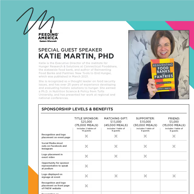
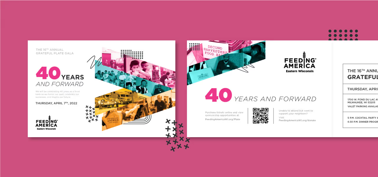


For the logo, we developed a custom wordmark that marries clinical precision with elegance. By incorporating subtle curvature between the letterforms, the logo feels both sophisticated and empowering, a reflection of the confidence Advanced Contours instills in its clients. The color palette is fresh and vibrant, with confident, caring tones that evoke both trust and rejuvenation. A curving, flowing line element was incorporated into the design as a secondary feature to guide the viewer’s eye through layouts, emphasizing the concept of natural contours. We paired serif and sans serif typography to give the brand an authentic, approachable voice, and selected photography that conveys support, confidence, and energy.


The resulting visual identity for Advanced Contours not only met but exceeded the clinic's goals. The comprehensive brand system has been stress-tested across various collateral, ensuring its consistency and adaptability for future touchpoints. Whether it's print, digital, or environmental branding, the identity remains strong, flexible, and cohesive. Advanced Contours now stands as a visually striking and emotionally resonant brand, equipped with the tools to grow while maintaining its core values of confidence, care, and clinical expertise.


Our task was to create a brand identity that communicated both professionalism and elegance while differentiating Advanced Contours in a competitive market. The clinic needed a name and brand messaging that would encapsulate its mission and values while appealing to clients who desire personalized, expert care. Additionally, the visual identity had to reflect a balance between clinical precision and aesthetic refinement, setting the tone for a sophisticated yet approachable experience.

For the logo, we developed a custom wordmark that marries clinical precision with elegance. By incorporating subtle curvature between the letterforms, the logo feels both sophisticated and empowering, a reflection of the confidence Advanced Contours instills in its clients. The color palette is fresh and vibrant, with confident, caring tones that evoke both trust and rejuvenation. A curving, flowing line element was incorporated into the design as a secondary feature to guide the viewer’s eye through layouts, emphasizing the concept of natural contours. We paired serif and sans serif typography to give the brand an authentic, approachable voice, and selected photography that conveys support, confidence, and energy.


The resulting visual identity for Advanced Contours not only met but exceeded the clinic's goals. The comprehensive brand system has been stress-tested across various collateral, ensuring its consistency and adaptability for future touchpoints. Whether it's print, digital, or environmental branding, the identity remains strong, flexible, and cohesive. Advanced Contours now stands as a visually striking and emotionally resonant brand, equipped with the tools to grow while maintaining its core values of confidence, care, and clinical expertise.


Our task was to create a brand identity that communicated both professionalism and elegance while differentiating Advanced Contours in a competitive market. The clinic needed a name and brand messaging that would encapsulate its mission and values while appealing to clients who desire personalized, expert care. Additionally, the visual identity had to reflect a balance between clinical precision and aesthetic refinement, setting the tone for a sophisticated yet approachable experience.


For the logo, we developed a custom wordmark that marries clinical precision with elegance. By incorporating subtle curvature between the letterforms, the logo feels both sophisticated and empowering, a reflection of the confidence Advanced Contours instills in its clients. The color palette is fresh and vibrant, with confident, caring tones that evoke both trust and rejuvenation. A curving, flowing line element was incorporated into the design as a secondary feature to guide the viewer’s eye through layouts, emphasizing the concept of natural contours. We paired serif and sans serif typography to give the brand an authentic, approachable voice, and selected photography that conveys support, confidence, and energy.



The resulting visual identity for Advanced Contours not only met but exceeded the clinic's goals. The comprehensive brand system has been stress-tested across various collateral, ensuring its consistency and adaptability for future touchpoints. Whether it's print, digital, or environmental branding, the identity remains strong, flexible, and cohesive. Advanced Contours now stands as a visually striking and emotionally resonant brand, equipped with the tools to grow while maintaining its core values of confidence, care, and clinical expertise.


Our task was to create a brand identity that communicated both professionalism and elegance while differentiating Advanced Contours in a competitive market. The clinic needed a name and brand messaging that would encapsulate its mission and values while appealing to clients who desire personalized, expert care. Additionally, the visual identity had to reflect a balance between clinical precision and aesthetic refinement, setting the tone for a sophisticated yet approachable experience.


For the logo, we developed a custom wordmark that marries clinical precision with elegance. By incorporating subtle curvature between the letterforms, the logo feels both sophisticated and empowering, a reflection of the confidence Advanced Contours instills in its clients. The color palette is fresh and vibrant, with confident, caring tones that evoke both trust and rejuvenation. A curving, flowing line element was incorporated into the design as a secondary feature to guide the viewer’s eye through layouts, emphasizing the concept of natural contours. We paired serif and sans serif typography to give the brand an authentic, approachable voice, and selected photography that conveys support, confidence, and energy.


The resulting visual identity for Advanced Contours not only met but exceeded the clinic's goals. The comprehensive brand system has been stress-tested across various collateral, ensuring its consistency and adaptability for future touchpoints. Whether it's print, digital, or environmental branding, the identity remains strong, flexible, and cohesive. Advanced Contours now stands as a visually striking and emotionally resonant brand, equipped with the tools to grow while maintaining its core values of confidence, care, and clinical expertise.


Our task was to create a brand identity that communicated both professionalism and elegance while differentiating Advanced Contours in a competitive market. The clinic needed a name and brand messaging that would encapsulate its mission and values while appealing to clients who desire personalized, expert care. Additionally, the visual identity had to reflect a balance between clinical precision and aesthetic refinement, setting the tone for a sophisticated yet approachable experience.


For the logo, we developed a custom wordmark that marries clinical precision with elegance. By incorporating subtle curvature between the letterforms, the logo feels both sophisticated and empowering, a reflection of the confidence Advanced Contours instills in its clients. The color palette is fresh and vibrant, with confident, caring tones that evoke both trust and rejuvenation. A curving, flowing line element was incorporated into the design as a secondary feature to guide the viewer’s eye through layouts, emphasizing the concept of natural contours. We paired serif and sans serif typography to give the brand an authentic, approachable voice, and selected photography that conveys support, confidence, and energy.


The resulting visual identity for Advanced Contours not only met but exceeded the clinic's goals. The comprehensive brand system has been stress-tested across various collateral, ensuring its consistency and adaptability for future touchpoints. Whether it's print, digital, or environmental branding, the identity remains strong, flexible, and cohesive. Advanced Contours now stands as a visually striking and emotionally resonant brand, equipped with the tools to grow while maintaining its core values of confidence, care, and clinical expertise.


Our task was to create a brand identity that communicated both professionalism and elegance while differentiating Advanced Contours in a competitive market. The clinic needed a name and brand messaging that would encapsulate its mission and values while appealing to clients who desire personalized, expert care. Additionally, the visual identity had to reflect a balance between clinical precision and aesthetic refinement, setting the tone for a sophisticated yet approachable experience.


For the logo, we developed a custom wordmark that marries clinical precision with elegance. By incorporating subtle curvature between the letterforms, the logo feels both sophisticated and empowering, a reflection of the confidence Advanced Contours instills in its clients. The color palette is fresh and vibrant, with confident, caring tones that evoke both trust and rejuvenation. A curving, flowing line element was incorporated into the design as a secondary feature to guide the viewer’s eye through layouts, emphasizing the concept of natural contours. We paired serif and sans serif typography to give the brand an authentic, approachable voice, and selected photography that conveys support, confidence, and energy.


Our task was to create a brand identity that communicated both professionalism and elegance while differentiating Advanced Contours in a competitive market. The clinic needed a name and brand messaging that would encapsulate its mission and values while appealing to clients who desire personalized, expert care. Additionally, the visual identity had to reflect a balance between clinical precision and aesthetic refinement, setting the tone for a sophisticated yet approachable experience.
For the logo, we developed a custom wordmark that marries clinical precision with elegance. By incorporating subtle curvature between the letterforms, the logo feels both sophisticated and empowering, a reflection of the confidence Advanced Contours instills in its clients. The color palette is fresh and vibrant, with confident, caring tones that evoke both trust and rejuvenation. A curving, flowing line element was incorporated into the design as a secondary feature to guide the viewer’s eye through layouts, emphasizing the concept of natural contours. We paired serif and sans serif typography to give the brand an authentic, approachable voice, and selected photography that conveys support, confidence, and energy.


The resulting visual identity for Advanced Contours not only met but exceeded the clinic's goals. The comprehensive brand system has been stress-tested across various collateral, ensuring its consistency and adaptability for future touchpoints. Whether it's print, digital, or environmental branding, the identity remains strong, flexible, and cohesive. Advanced Contours now stands as a visually striking and emotionally resonant brand, equipped with the tools to grow while maintaining its core values of confidence, care, and clinical expertise.


Our task was to create a brand identity that communicated both professionalism and elegance while differentiating Advanced Contours in a competitive market. The clinic needed a name and brand messaging that would encapsulate its mission and values while appealing to clients who desire personalized, expert care. Additionally, the visual identity had to reflect a balance between clinical precision and aesthetic refinement, setting the tone for a sophisticated yet approachable experience.


For the logo, we developed a custom wordmark that marries clinical precision with elegance. By incorporating subtle curvature between the letterforms, the logo feels both sophisticated and empowering, a reflection of the confidence Advanced Contours instills in its clients. The color palette is fresh and vibrant, with confident, caring tones that evoke both trust and rejuvenation. A curving, flowing line element was incorporated into the design as a secondary feature to guide the viewer’s eye through layouts, emphasizing the concept of natural contours. We paired serif and sans serif typography to give the brand an authentic, approachable voice, and selected photography that conveys support, confidence, and energy.
The resulting visual identity for Advanced Contours not only met but exceeded the clinic's goals. The comprehensive brand system has been stress-tested across various collateral, ensuring its consistency and adaptability for future touchpoints. Whether it's print, digital, or environmental branding, the identity remains strong, flexible, and cohesive. Advanced Contours now stands as a visually striking and emotionally resonant brand, equipped with the tools to grow while maintaining its core values of confidence, care, and clinical expertise.

Our task was to create a brand identity that communicated both professionalism and elegance while differentiating Advanced Contours in a competitive market. The clinic needed a name and brand messaging that would encapsulate its mission and values while appealing to clients who desire personalized, expert care. Additionally, the visual identity had to reflect a balance between clinical precision and aesthetic refinement, setting the tone for a sophisticated yet approachable experience.


For the logo, we developed a custom wordmark that marries clinical precision with elegance. By incorporating subtle curvature between the letterforms, the logo feels both sophisticated and empowering, a reflection of the confidence Advanced Contours instills in its clients. The color palette is fresh and vibrant, with confident, caring tones that evoke both trust and rejuvenation. A curving, flowing line element was incorporated into the design as a secondary feature to guide the viewer’s eye through layouts, emphasizing the concept of natural contours. We paired serif and sans serif typography to give the brand an authentic, approachable voice, and selected photography that conveys support, confidence, and energy.


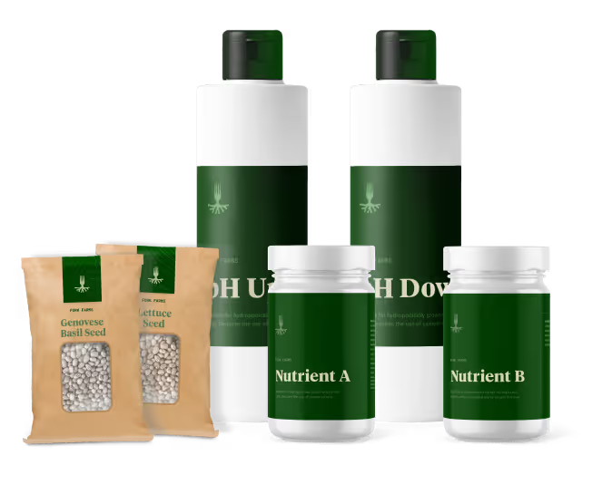
The resulting visual identity for Advanced Contours not only met but exceeded the clinic's goals. The comprehensive brand system has been stress-tested across various collateral, ensuring its consistency and adaptability for future touchpoints. Whether it's print, digital, or environmental branding, the identity remains strong, flexible, and cohesive. Advanced Contours now stands as a visually striking and emotionally resonant brand, equipped with the tools to grow while maintaining its core values of confidence, care, and clinical expertise.


Our task was to create a brand identity that communicated both professionalism and elegance while differentiating Advanced Contours in a competitive market. The clinic needed a name and brand messaging that would encapsulate its mission and values while appealing to clients who desire personalized, expert care. Additionally, the visual identity had to reflect a balance between clinical precision and aesthetic refinement, setting the tone for a sophisticated yet approachable experience.

For the logo, we developed a custom wordmark that marries clinical precision with elegance. By incorporating subtle curvature between the letterforms, the logo feels both sophisticated and empowering, a reflection of the confidence Advanced Contours instills in its clients. The color palette is fresh and vibrant, with confident, caring tones that evoke both trust and rejuvenation. A curving, flowing line element was incorporated into the design as a secondary feature to guide the viewer’s eye through layouts, emphasizing the concept of natural contours. We paired serif and sans serif typography to give the brand an authentic, approachable voice, and selected photography that conveys support, confidence, and energy.


The resulting visual identity for Advanced Contours not only met but exceeded the clinic's goals. The comprehensive brand system has been stress-tested across various collateral, ensuring its consistency and adaptability for future touchpoints. Whether it's print, digital, or environmental branding, the identity remains strong, flexible, and cohesive. Advanced Contours now stands as a visually striking and emotionally resonant brand, equipped with the tools to grow while maintaining its core values of confidence, care, and clinical expertise.


Our task was to create a brand identity that communicated both professionalism and elegance while differentiating Advanced Contours in a competitive market. The clinic needed a name and brand messaging that would encapsulate its mission and values while appealing to clients who desire personalized, expert care. Additionally, the visual identity had to reflect a balance between clinical precision and aesthetic refinement, setting the tone for a sophisticated yet approachable experience.

For the logo, we developed a custom wordmark that marries clinical precision with elegance. By incorporating subtle curvature between the letterforms, the logo feels both sophisticated and empowering, a reflection of the confidence Advanced Contours instills in its clients. The color palette is fresh and vibrant, with confident, caring tones that evoke both trust and rejuvenation. A curving, flowing line element was incorporated into the design as a secondary feature to guide the viewer’s eye through layouts, emphasizing the concept of natural contours. We paired serif and sans serif typography to give the brand an authentic, approachable voice, and selected photography that conveys support, confidence, and energy.

The resulting visual identity for Advanced Contours not only met but exceeded the clinic's goals. The comprehensive brand system has been stress-tested across various collateral, ensuring its consistency and adaptability for future touchpoints. Whether it's print, digital, or environmental branding, the identity remains strong, flexible, and cohesive. Advanced Contours now stands as a visually striking and emotionally resonant brand, equipped with the tools to grow while maintaining its core values of confidence, care, and clinical expertise.


Our task was to create a brand identity that communicated both professionalism and elegance while differentiating Advanced Contours in a competitive market. The clinic needed a name and brand messaging that would encapsulate its mission and values while appealing to clients who desire personalized, expert care. Additionally, the visual identity had to reflect a balance between clinical precision and aesthetic refinement, setting the tone for a sophisticated yet approachable experience.


For the logo, we developed a custom wordmark that marries clinical precision with elegance. By incorporating subtle curvature between the letterforms, the logo feels both sophisticated and empowering, a reflection of the confidence Advanced Contours instills in its clients. The color palette is fresh and vibrant, with confident, caring tones that evoke both trust and rejuvenation. A curving, flowing line element was incorporated into the design as a secondary feature to guide the viewer’s eye through layouts, emphasizing the concept of natural contours. We paired serif and sans serif typography to give the brand an authentic, approachable voice, and selected photography that conveys support, confidence, and energy.


The resulting visual identity for Advanced Contours not only met but exceeded the clinic's goals. The comprehensive brand system has been stress-tested across various collateral, ensuring its consistency and adaptability for future touchpoints. Whether it's print, digital, or environmental branding, the identity remains strong, flexible, and cohesive. Advanced Contours now stands as a visually striking and emotionally resonant brand, equipped with the tools to grow while maintaining its core values of confidence, care, and clinical expertise.


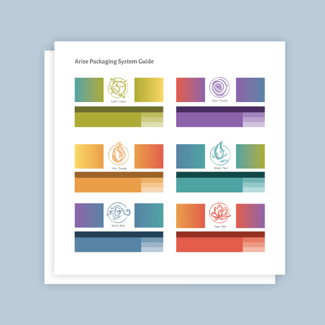
Our task was to create a brand identity that communicated both professionalism and elegance while differentiating Advanced Contours in a competitive market. The clinic needed a name and brand messaging that would encapsulate its mission and values while appealing to clients who desire personalized, expert care. Additionally, the visual identity had to reflect a balance between clinical precision and aesthetic refinement, setting the tone for a sophisticated yet approachable experience.
For the logo, we developed a custom wordmark that marries clinical precision with elegance. By incorporating subtle curvature between the letterforms, the logo feels both sophisticated and empowering, a reflection of the confidence Advanced Contours instills in its clients. The color palette is fresh and vibrant, with confident, caring tones that evoke both trust and rejuvenation. A curving, flowing line element was incorporated into the design as a secondary feature to guide the viewer’s eye through layouts, emphasizing the concept of natural contours. We paired serif and sans serif typography to give the brand an authentic, approachable voice, and selected photography that conveys support, confidence, and energy.


The resulting visual identity for Advanced Contours not only met but exceeded the clinic's goals. The comprehensive brand system has been stress-tested across various collateral, ensuring its consistency and adaptability for future touchpoints. Whether it's print, digital, or environmental branding, the identity remains strong, flexible, and cohesive. Advanced Contours now stands as a visually striking and emotionally resonant brand, equipped with the tools to grow while maintaining its core values of confidence, care, and clinical expertise.


Our task was to create a brand identity that communicated both professionalism and elegance while differentiating Advanced Contours in a competitive market. The clinic needed a name and brand messaging that would encapsulate its mission and values while appealing to clients who desire personalized, expert care. Additionally, the visual identity had to reflect a balance between clinical precision and aesthetic refinement, setting the tone for a sophisticated yet approachable experience.


For the logo, we developed a custom wordmark that marries clinical precision with elegance. By incorporating subtle curvature between the letterforms, the logo feels both sophisticated and empowering, a reflection of the confidence Advanced Contours instills in its clients. The color palette is fresh and vibrant, with confident, caring tones that evoke both trust and rejuvenation. A curving, flowing line element was incorporated into the design as a secondary feature to guide the viewer’s eye through layouts, emphasizing the concept of natural contours. We paired serif and sans serif typography to give the brand an authentic, approachable voice, and selected photography that conveys support, confidence, and energy.


The resulting visual identity for Advanced Contours not only met but exceeded the clinic's goals. The comprehensive brand system has been stress-tested across various collateral, ensuring its consistency and adaptability for future touchpoints. Whether it's print, digital, or environmental branding, the identity remains strong, flexible, and cohesive. Advanced Contours now stands as a visually striking and emotionally resonant brand, equipped with the tools to grow while maintaining its core values of confidence, care, and clinical expertise.


Our task was to create a brand identity that communicated both professionalism and elegance while differentiating Advanced Contours in a competitive market. The clinic needed a name and brand messaging that would encapsulate its mission and values while appealing to clients who desire personalized, expert care. Additionally, the visual identity had to reflect a balance between clinical precision and aesthetic refinement, setting the tone for a sophisticated yet approachable experience.


For the logo, we developed a custom wordmark that marries clinical precision with elegance. By incorporating subtle curvature between the letterforms, the logo feels both sophisticated and empowering, a reflection of the confidence Advanced Contours instills in its clients. The color palette is fresh and vibrant, with confident, caring tones that evoke both trust and rejuvenation. A curving, flowing line element was incorporated into the design as a secondary feature to guide the viewer’s eye through layouts, emphasizing the concept of natural contours. We paired serif and sans serif typography to give the brand an authentic, approachable voice, and selected photography that conveys support, confidence, and energy.


The resulting visual identity for Advanced Contours not only met but exceeded the clinic's goals. The comprehensive brand system has been stress-tested across various collateral, ensuring its consistency and adaptability for future touchpoints. Whether it's print, digital, or environmental branding, the identity remains strong, flexible, and cohesive. Advanced Contours now stands as a visually striking and emotionally resonant brand, equipped with the tools to grow while maintaining its core values of confidence, care, and clinical expertise.


Our task was to create a brand identity that communicated both professionalism and elegance while differentiating Advanced Contours in a competitive market. The clinic needed a name and brand messaging that would encapsulate its mission and values while appealing to clients who desire personalized, expert care. Additionally, the visual identity had to reflect a balance between clinical precision and aesthetic refinement, setting the tone for a sophisticated yet approachable experience.


For the logo, we developed a custom wordmark that marries clinical precision with elegance. By incorporating subtle curvature between the letterforms, the logo feels both sophisticated and empowering, a reflection of the confidence Advanced Contours instills in its clients. The color palette is fresh and vibrant, with confident, caring tones that evoke both trust and rejuvenation. A curving, flowing line element was incorporated into the design as a secondary feature to guide the viewer’s eye through layouts, emphasizing the concept of natural contours. We paired serif and sans serif typography to give the brand an authentic, approachable voice, and selected photography that conveys support, confidence, and energy.


The resulting visual identity for Advanced Contours not only met but exceeded the clinic's goals. The comprehensive brand system has been stress-tested across various collateral, ensuring its consistency and adaptability for future touchpoints. Whether it's print, digital, or environmental branding, the identity remains strong, flexible, and cohesive. Advanced Contours now stands as a visually striking and emotionally resonant brand, equipped with the tools to grow while maintaining its core values of confidence, care, and clinical expertise.


Our task was to create a brand identity that communicated both professionalism and elegance while differentiating Advanced Contours in a competitive market. The clinic needed a name and brand messaging that would encapsulate its mission and values while appealing to clients who desire personalized, expert care. Additionally, the visual identity had to reflect a balance between clinical precision and aesthetic refinement, setting the tone for a sophisticated yet approachable experience.

For the logo, we developed a custom wordmark that marries clinical precision with elegance. By incorporating subtle curvature between the letterforms, the logo feels both sophisticated and empowering, a reflection of the confidence Advanced Contours instills in its clients. The color palette is fresh and vibrant, with confident, caring tones that evoke both trust and rejuvenation. A curving, flowing line element was incorporated into the design as a secondary feature to guide the viewer’s eye through layouts, emphasizing the concept of natural contours. We paired serif and sans serif typography to give the brand an authentic, approachable voice, and selected photography that conveys support, confidence, and energy.
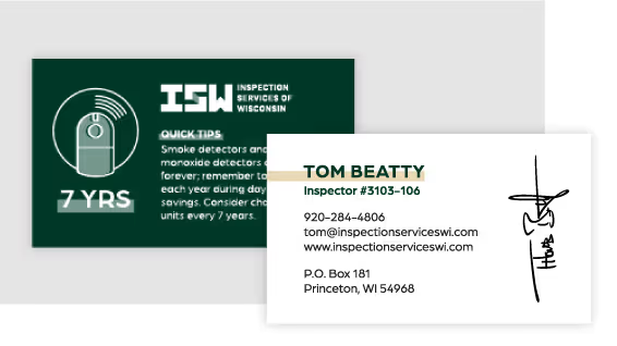

The resulting visual identity for Advanced Contours not only met but exceeded the clinic's goals. The comprehensive brand system has been stress-tested across various collateral, ensuring its consistency and adaptability for future touchpoints. Whether it's print, digital, or environmental branding, the identity remains strong, flexible, and cohesive. Advanced Contours now stands as a visually striking and emotionally resonant brand, equipped with the tools to grow while maintaining its core values of confidence, care, and clinical expertise.

Our task was to create a brand identity that communicated both professionalism and elegance while differentiating Advanced Contours in a competitive market. The clinic needed a name and brand messaging that would encapsulate its mission and values while appealing to clients who desire personalized, expert care. Additionally, the visual identity had to reflect a balance between clinical precision and aesthetic refinement, setting the tone for a sophisticated yet approachable experience.

For the logo, we developed a custom wordmark that marries clinical precision with elegance. By incorporating subtle curvature between the letterforms, the logo feels both sophisticated and empowering, a reflection of the confidence Advanced Contours instills in its clients. The color palette is fresh and vibrant, with confident, caring tones that evoke both trust and rejuvenation. A curving, flowing line element was incorporated into the design as a secondary feature to guide the viewer’s eye through layouts, emphasizing the concept of natural contours. We paired serif and sans serif typography to give the brand an authentic, approachable voice, and selected photography that conveys support, confidence, and energy.


The resulting visual identity for Advanced Contours not only met but exceeded the clinic's goals. The comprehensive brand system has been stress-tested across various collateral, ensuring its consistency and adaptability for future touchpoints. Whether it's print, digital, or environmental branding, the identity remains strong, flexible, and cohesive. Advanced Contours now stands as a visually striking and emotionally resonant brand, equipped with the tools to grow while maintaining its core values of confidence, care, and clinical expertise.
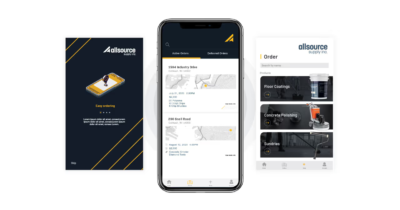


Our task was to create a brand identity that communicated both professionalism and elegance while differentiating Advanced Contours in a competitive market. The clinic needed a name and brand messaging that would encapsulate its mission and values while appealing to clients who desire personalized, expert care. Additionally, the visual identity had to reflect a balance between clinical precision and aesthetic refinement, setting the tone for a sophisticated yet approachable experience.


For the logo, we developed a custom wordmark that marries clinical precision with elegance. By incorporating subtle curvature between the letterforms, the logo feels both sophisticated and empowering, a reflection of the confidence Advanced Contours instills in its clients. The color palette is fresh and vibrant, with confident, caring tones that evoke both trust and rejuvenation. A curving, flowing line element was incorporated into the design as a secondary feature to guide the viewer’s eye through layouts, emphasizing the concept of natural contours. We paired serif and sans serif typography to give the brand an authentic, approachable voice, and selected photography that conveys support, confidence, and energy.


The resulting visual identity for Advanced Contours not only met but exceeded the clinic's goals. The comprehensive brand system has been stress-tested across various collateral, ensuring its consistency and adaptability for future touchpoints. Whether it's print, digital, or environmental branding, the identity remains strong, flexible, and cohesive. Advanced Contours now stands as a visually striking and emotionally resonant brand, equipped with the tools to grow while maintaining its core values of confidence, care, and clinical expertise.


Our task was to create a brand identity that communicated both professionalism and elegance while differentiating Advanced Contours in a competitive market. The clinic needed a name and brand messaging that would encapsulate its mission and values while appealing to clients who desire personalized, expert care. Additionally, the visual identity had to reflect a balance between clinical precision and aesthetic refinement, setting the tone for a sophisticated yet approachable experience.


For the logo, we developed a custom wordmark that marries clinical precision with elegance. By incorporating subtle curvature between the letterforms, the logo feels both sophisticated and empowering, a reflection of the confidence Advanced Contours instills in its clients. The color palette is fresh and vibrant, with confident, caring tones that evoke both trust and rejuvenation. A curving, flowing line element was incorporated into the design as a secondary feature to guide the viewer’s eye through layouts, emphasizing the concept of natural contours. We paired serif and sans serif typography to give the brand an authentic, approachable voice, and selected photography that conveys support, confidence, and energy.


The resulting visual identity for Advanced Contours not only met but exceeded the clinic's goals. The comprehensive brand system has been stress-tested across various collateral, ensuring its consistency and adaptability for future touchpoints. Whether it's print, digital, or environmental branding, the identity remains strong, flexible, and cohesive. Advanced Contours now stands as a visually striking and emotionally resonant brand, equipped with the tools to grow while maintaining its core values of confidence, care, and clinical expertise.


Our task was to create a brand identity that communicated both professionalism and elegance while differentiating Advanced Contours in a competitive market. The clinic needed a name and brand messaging that would encapsulate its mission and values while appealing to clients who desire personalized, expert care. Additionally, the visual identity had to reflect a balance between clinical precision and aesthetic refinement, setting the tone for a sophisticated yet approachable experience.

For the logo, we developed a custom wordmark that marries clinical precision with elegance. By incorporating subtle curvature between the letterforms, the logo feels both sophisticated and empowering, a reflection of the confidence Advanced Contours instills in its clients. The color palette is fresh and vibrant, with confident, caring tones that evoke both trust and rejuvenation. A curving, flowing line element was incorporated into the design as a secondary feature to guide the viewer’s eye through layouts, emphasizing the concept of natural contours. We paired serif and sans serif typography to give the brand an authentic, approachable voice, and selected photography that conveys support, confidence, and energy.


The resulting visual identity for Advanced Contours not only met but exceeded the clinic's goals. The comprehensive brand system has been stress-tested across various collateral, ensuring its consistency and adaptability for future touchpoints. Whether it's print, digital, or environmental branding, the identity remains strong, flexible, and cohesive. Advanced Contours now stands as a visually striking and emotionally resonant brand, equipped with the tools to grow while maintaining its core values of confidence, care, and clinical expertise.


Our task was to create a brand identity that communicated both professionalism and elegance while differentiating Advanced Contours in a competitive market. The clinic needed a name and brand messaging that would encapsulate its mission and values while appealing to clients who desire personalized, expert care. Additionally, the visual identity had to reflect a balance between clinical precision and aesthetic refinement, setting the tone for a sophisticated yet approachable experience.


For the logo, we developed a custom wordmark that marries clinical precision with elegance. By incorporating subtle curvature between the letterforms, the logo feels both sophisticated and empowering, a reflection of the confidence Advanced Contours instills in its clients. The color palette is fresh and vibrant, with confident, caring tones that evoke both trust and rejuvenation. A curving, flowing line element was incorporated into the design as a secondary feature to guide the viewer’s eye through layouts, emphasizing the concept of natural contours. We paired serif and sans serif typography to give the brand an authentic, approachable voice, and selected photography that conveys support, confidence, and energy.

The resulting visual identity for Advanced Contours not only met but exceeded the clinic's goals. The comprehensive brand system has been stress-tested across various collateral, ensuring its consistency and adaptability for future touchpoints. Whether it's print, digital, or environmental branding, the identity remains strong, flexible, and cohesive. Advanced Contours now stands as a visually striking and emotionally resonant brand, equipped with the tools to grow while maintaining its core values of confidence, care, and clinical expertise.


Our task was to create a brand identity that communicated both professionalism and elegance while differentiating Advanced Contours in a competitive market. The clinic needed a name and brand messaging that would encapsulate its mission and values while appealing to clients who desire personalized, expert care. Additionally, the visual identity had to reflect a balance between clinical precision and aesthetic refinement, setting the tone for a sophisticated yet approachable experience.

For the logo, we developed a custom wordmark that marries clinical precision with elegance. By incorporating subtle curvature between the letterforms, the logo feels both sophisticated and empowering, a reflection of the confidence Advanced Contours instills in its clients. The color palette is fresh and vibrant, with confident, caring tones that evoke both trust and rejuvenation. A curving, flowing line element was incorporated into the design as a secondary feature to guide the viewer’s eye through layouts, emphasizing the concept of natural contours. We paired serif and sans serif typography to give the brand an authentic, approachable voice, and selected photography that conveys support, confidence, and energy.


The resulting visual identity for Advanced Contours not only met but exceeded the clinic's goals. The comprehensive brand system has been stress-tested across various collateral, ensuring its consistency and adaptability for future touchpoints. Whether it's print, digital, or environmental branding, the identity remains strong, flexible, and cohesive. Advanced Contours now stands as a visually striking and emotionally resonant brand, equipped with the tools to grow while maintaining its core values of confidence, care, and clinical expertise.


The resulting visual identity for Advanced Contours not only met but exceeded the clinic's goals. The comprehensive brand system has been stress-tested across various collateral, ensuring its consistency and adaptability for future touchpoints. Whether it's print, digital, or environmental branding, the identity remains strong, flexible, and cohesive. Advanced Contours now stands as a visually striking and emotionally resonant brand, equipped with the tools to grow while maintaining its core values of confidence, care, and clinical expertise.
Our task was to create a brand identity that communicated both professionalism and elegance while differentiating Advanced Contours in a competitive market. The clinic needed a name and brand messaging that would encapsulate its mission and values while appealing to clients who desire personalized, expert care. Additionally, the visual identity had to reflect a balance between clinical precision and aesthetic refinement, setting the tone for a sophisticated yet approachable experience.

For the logo, we developed a custom wordmark that marries clinical precision with elegance. By incorporating subtle curvature between the letterforms, the logo feels both sophisticated and empowering, a reflection of the confidence Advanced Contours instills in its clients. The color palette is fresh and vibrant, with confident, caring tones that evoke both trust and rejuvenation. A curving, flowing line element was incorporated into the design as a secondary feature to guide the viewer’s eye through layouts, emphasizing the concept of natural contours. We paired serif and sans serif typography to give the brand an authentic, approachable voice, and selected photography that conveys support, confidence, and energy.

The resulting visual identity for Advanced Contours not only met but exceeded the clinic's goals. The comprehensive brand system has been stress-tested across various collateral, ensuring its consistency and adaptability for future touchpoints. Whether it's print, digital, or environmental branding, the identity remains strong, flexible, and cohesive. Advanced Contours now stands as a visually striking and emotionally resonant brand, equipped with the tools to grow while maintaining its core values of confidence, care, and clinical expertise.

The resulting visual identity for Advanced Contours not only met but exceeded the clinic's goals. The comprehensive brand system has been stress-tested across various collateral, ensuring its consistency and adaptability for future touchpoints. Whether it's print, digital, or environmental branding, the identity remains strong, flexible, and cohesive. Advanced Contours now stands as a visually striking and emotionally resonant brand, equipped with the tools to grow while maintaining its core values of confidence, care, and clinical expertise.

For the logo, we developed a custom wordmark that marries clinical precision with elegance. By incorporating subtle curvature between the letterforms, the logo feels both sophisticated and empowering, a reflection of the confidence Advanced Contours instills in its clients. The color palette is fresh and vibrant, with confident, caring tones that evoke both trust and rejuvenation. A curving, flowing line element was incorporated into the design as a secondary feature to guide the viewer’s eye through layouts, emphasizing the concept of natural contours. We paired serif and sans serif typography to give the brand an authentic, approachable voice, and selected photography that conveys support, confidence, and energy.

Our task was to create a brand identity that communicated both professionalism and elegance while differentiating Advanced Contours in a competitive market. The clinic needed a name and brand messaging that would encapsulate its mission and values while appealing to clients who desire personalized, expert care. Additionally, the visual identity had to reflect a balance between clinical precision and aesthetic refinement, setting the tone for a sophisticated yet approachable experience.

The resulting visual identity for Advanced Contours not only met but exceeded the clinic's goals. The comprehensive brand system has been stress-tested across various collateral, ensuring its consistency and adaptability for future touchpoints. Whether it's print, digital, or environmental branding, the identity remains strong, flexible, and cohesive. Advanced Contours now stands as a visually striking and emotionally resonant brand, equipped with the tools to grow while maintaining its core values of confidence, care, and clinical expertise.


The resulting visual identity for Advanced Contours not only met but exceeded the clinic's goals. The comprehensive brand system has been stress-tested across various collateral, ensuring its consistency and adaptability for future touchpoints. Whether it's print, digital, or environmental branding, the identity remains strong, flexible, and cohesive. Advanced Contours now stands as a visually striking and emotionally resonant brand, equipped with the tools to grow while maintaining its core values of confidence, care, and clinical expertise.


Our task was to create a brand identity that communicated both professionalism and elegance while differentiating Advanced Contours in a competitive market. The clinic needed a name and brand messaging that would encapsulate its mission and values while appealing to clients who desire personalized, expert care. Additionally, the visual identity had to reflect a balance between clinical precision and aesthetic refinement, setting the tone for a sophisticated yet approachable experience.


For the logo, we developed a custom wordmark that marries clinical precision with elegance. By incorporating subtle curvature between the letterforms, the logo feels both sophisticated and empowering, a reflection of the confidence Advanced Contours instills in its clients. The color palette is fresh and vibrant, with confident, caring tones that evoke both trust and rejuvenation. A curving, flowing line element was incorporated into the design as a secondary feature to guide the viewer’s eye through layouts, emphasizing the concept of natural contours. We paired serif and sans serif typography to give the brand an authentic, approachable voice, and selected photography that conveys support, confidence, and energy.

The resulting visual identity for Advanced Contours not only met but exceeded the clinic's goals. The comprehensive brand system has been stress-tested across various collateral, ensuring its consistency and adaptability for future touchpoints. Whether it's print, digital, or environmental branding, the identity remains strong, flexible, and cohesive. Advanced Contours now stands as a visually striking and emotionally resonant brand, equipped with the tools to grow while maintaining its core values of confidence, care, and clinical expertise.


Our task was to create a brand identity that communicated both professionalism and elegance while differentiating Advanced Contours in a competitive market. The clinic needed a name and brand messaging that would encapsulate its mission and values while appealing to clients who desire personalized, expert care. Additionally, the visual identity had to reflect a balance between clinical precision and aesthetic refinement, setting the tone for a sophisticated yet approachable experience.
For the logo, we developed a custom wordmark that marries clinical precision with elegance. By incorporating subtle curvature between the letterforms, the logo feels both sophisticated and empowering, a reflection of the confidence Advanced Contours instills in its clients. The color palette is fresh and vibrant, with confident, caring tones that evoke both trust and rejuvenation. A curving, flowing line element was incorporated into the design as a secondary feature to guide the viewer’s eye through layouts, emphasizing the concept of natural contours. We paired serif and sans serif typography to give the brand an authentic, approachable voice, and selected photography that conveys support, confidence, and energy.


The resulting visual identity for Advanced Contours not only met but exceeded the clinic's goals. The comprehensive brand system has been stress-tested across various collateral, ensuring its consistency and adaptability for future touchpoints. Whether it's print, digital, or environmental branding, the identity remains strong, flexible, and cohesive. Advanced Contours now stands as a visually striking and emotionally resonant brand, equipped with the tools to grow while maintaining its core values of confidence, care, and clinical expertise.


Our task was to create a brand identity that communicated both professionalism and elegance while differentiating Advanced Contours in a competitive market. The clinic needed a name and brand messaging that would encapsulate its mission and values while appealing to clients who desire personalized, expert care. Additionally, the visual identity had to reflect a balance between clinical precision and aesthetic refinement, setting the tone for a sophisticated yet approachable experience.
The resulting visual identity for Advanced Contours not only met but exceeded the clinic's goals. The comprehensive brand system has been stress-tested across various collateral, ensuring its consistency and adaptability for future touchpoints. Whether it's print, digital, or environmental branding, the identity remains strong, flexible, and cohesive. Advanced Contours now stands as a visually striking and emotionally resonant brand, equipped with the tools to grow while maintaining its core values of confidence, care, and clinical expertise.

For the logo, we developed a custom wordmark that marries clinical precision with elegance. By incorporating subtle curvature between the letterforms, the logo feels both sophisticated and empowering, a reflection of the confidence Advanced Contours instills in its clients. The color palette is fresh and vibrant, with confident, caring tones that evoke both trust and rejuvenation. A curving, flowing line element was incorporated into the design as a secondary feature to guide the viewer’s eye through layouts, emphasizing the concept of natural contours. We paired serif and sans serif typography to give the brand an authentic, approachable voice, and selected photography that conveys support, confidence, and energy.


The resulting visual identity for Advanced Contours not only met but exceeded the clinic's goals. The comprehensive brand system has been stress-tested across various collateral, ensuring its consistency and adaptability for future touchpoints. Whether it's print, digital, or environmental branding, the identity remains strong, flexible, and cohesive. Advanced Contours now stands as a visually striking and emotionally resonant brand, equipped with the tools to grow while maintaining its core values of confidence, care, and clinical expertise.


Our task was to create a brand identity that communicated both professionalism and elegance while differentiating Advanced Contours in a competitive market. The clinic needed a name and brand messaging that would encapsulate its mission and values while appealing to clients who desire personalized, expert care. Additionally, the visual identity had to reflect a balance between clinical precision and aesthetic refinement, setting the tone for a sophisticated yet approachable experience.
For the logo, we developed a custom wordmark that marries clinical precision with elegance. By incorporating subtle curvature between the letterforms, the logo feels both sophisticated and empowering, a reflection of the confidence Advanced Contours instills in its clients. The color palette is fresh and vibrant, with confident, caring tones that evoke both trust and rejuvenation. A curving, flowing line element was incorporated into the design as a secondary feature to guide the viewer’s eye through layouts, emphasizing the concept of natural contours. We paired serif and sans serif typography to give the brand an authentic, approachable voice, and selected photography that conveys support, confidence, and energy.


The resulting visual identity for Advanced Contours not only met but exceeded the clinic's goals. The comprehensive brand system has been stress-tested across various collateral, ensuring its consistency and adaptability for future touchpoints. Whether it's print, digital, or environmental branding, the identity remains strong, flexible, and cohesive. Advanced Contours now stands as a visually striking and emotionally resonant brand, equipped with the tools to grow while maintaining its core values of confidence, care, and clinical expertise.


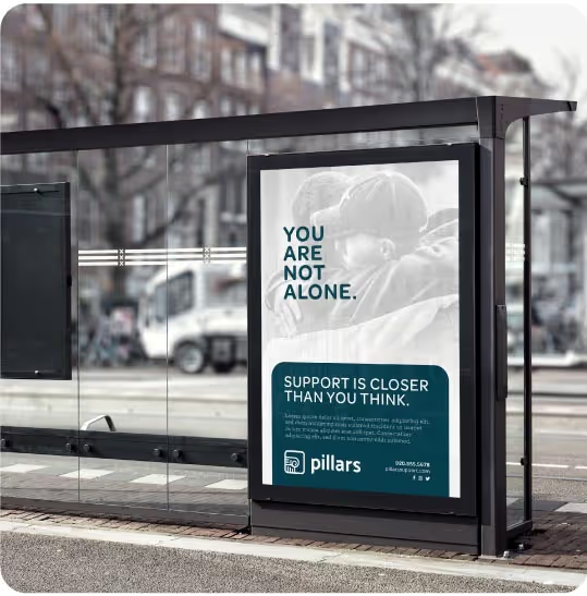
Our task was to create a brand identity that communicated both professionalism and elegance while differentiating Advanced Contours in a competitive market. The clinic needed a name and brand messaging that would encapsulate its mission and values while appealing to clients who desire personalized, expert care. Additionally, the visual identity had to reflect a balance between clinical precision and aesthetic refinement, setting the tone for a sophisticated yet approachable experience.

For the logo, we developed a custom wordmark that marries clinical precision with elegance. By incorporating subtle curvature between the letterforms, the logo feels both sophisticated and empowering, a reflection of the confidence Advanced Contours instills in its clients. The color palette is fresh and vibrant, with confident, caring tones that evoke both trust and rejuvenation. A curving, flowing line element was incorporated into the design as a secondary feature to guide the viewer’s eye through layouts, emphasizing the concept of natural contours. We paired serif and sans serif typography to give the brand an authentic, approachable voice, and selected photography that conveys support, confidence, and energy.

The resulting visual identity for Advanced Contours not only met but exceeded the clinic's goals. The comprehensive brand system has been stress-tested across various collateral, ensuring its consistency and adaptability for future touchpoints. Whether it's print, digital, or environmental branding, the identity remains strong, flexible, and cohesive. Advanced Contours now stands as a visually striking and emotionally resonant brand, equipped with the tools to grow while maintaining its core values of confidence, care, and clinical expertise.


Our task was to create a brand identity that communicated both professionalism and elegance while differentiating Advanced Contours in a competitive market. The clinic needed a name and brand messaging that would encapsulate its mission and values while appealing to clients who desire personalized, expert care. Additionally, the visual identity had to reflect a balance between clinical precision and aesthetic refinement, setting the tone for a sophisticated yet approachable experience.

For the logo, we developed a custom wordmark that marries clinical precision with elegance. By incorporating subtle curvature between the letterforms, the logo feels both sophisticated and empowering, a reflection of the confidence Advanced Contours instills in its clients. The color palette is fresh and vibrant, with confident, caring tones that evoke both trust and rejuvenation. A curving, flowing line element was incorporated into the design as a secondary feature to guide the viewer’s eye through layouts, emphasizing the concept of natural contours. We paired serif and sans serif typography to give the brand an authentic, approachable voice, and selected photography that conveys support, confidence, and energy.


The resulting visual identity for Advanced Contours not only met but exceeded the clinic's goals. The comprehensive brand system has been stress-tested across various collateral, ensuring its consistency and adaptability for future touchpoints. Whether it's print, digital, or environmental branding, the identity remains strong, flexible, and cohesive. Advanced Contours now stands as a visually striking and emotionally resonant brand, equipped with the tools to grow while maintaining its core values of confidence, care, and clinical expertise.


We couldn't be happier with our experience working with Quill Creative Studio! From the start, they were professional, engaging, and communicative, making the entire branding process enjoyable and seamless. What really stood out was the time they spent getting to know us and understanding the message we wanted to convey. Quill Creative Studio captured our brand essence perfectly and went above and beyond. If you're looking for a team that's talented, dedicated, and genuinely cares about your brand, Quill Creative Studio is the way to go!
AMY TRUCKEY, OWNER, ADVANCED CONTOURS
