


Because this was a rebrand for a business that already had a great reputation for exceptional care, we knew we needed to maintain and leverage as much of that brand equity as possible while providing a comprehensive new visual identity that captured the core mission of the business. Paramount to the rebrand was finding a new business name that clearly and simply conveyed the service offered and reinforced the organization’s commitment to enabling seniors to stride confidently through their golden years, supported by compassionate and personalized care.


We approached this rebrand with a mission-first mindset, visually translating the heart of the business’ mission into rich, approachable tones with sophisticated accent colors that differentiated them as a business but didn’t stray too far from their former brand or diminish established brand equity.
For elements and imagery, we used sketched illustrations and icons that showcase the nurturing care that Senior Stride provides. We incorporated lighthearted imagery showcasing both seniors enjoying their independent lives as well as the smiling faces of caregivers that evoked a feeling of genuine care and happiness.
We crafted a typographical hierarchy with a two-fold approach, knowing we wanted modern “high-end” fonts that felt welcoming and premium while also making sure that the selected fonts would be well-contrasted and easy to read for the intended audience.
When crafting the new name, we followed our process and chose Senior Stride to clearly and easily capture the core message of the business–”We help seniors find their stride.” Pairing this message with a new, modern logo with a sense of movement that represented each client’s journey.

Senior Stride’s new brand embodies a sense of vitality and empowerment and conveys a simple, clear message to their clients about their core service and philosophy of care. Each element of the new brand works together to create a comforting, consistent feeling across all touchpoints.


Because this was a rebrand for a business that already had a great reputation for exceptional care, we knew we needed to maintain and leverage as much of that brand equity as possible while providing a comprehensive new visual identity that captured the core mission of the business. Paramount to the rebrand was finding a new business name that clearly and simply conveyed the service offered and reinforced the organization’s commitment to enabling seniors to stride confidently through their golden years, supported by compassionate and personalized care.


We approached this rebrand with a mission-first mindset, visually translating the heart of the business’ mission into rich, approachable tones with sophisticated accent colors that differentiated them as a business but didn’t stray too far from their former brand or diminish established brand equity.
For elements and imagery, we used sketched illustrations and icons that showcase the nurturing care that Senior Stride provides. We incorporated lighthearted imagery showcasing both seniors enjoying their independent lives as well as the smiling faces of caregivers that evoked a feeling of genuine care and happiness.
We crafted a typographical hierarchy with a two-fold approach, knowing we wanted modern “high-end” fonts that felt welcoming and premium while also making sure that the selected fonts would be well-contrasted and easy to read for the intended audience.
When crafting the new name, we followed our process and chose Senior Stride to clearly and easily capture the core message of the business–”We help seniors find their stride.” Pairing this message with a new, modern logo with a sense of movement that represented each client’s journey.


Senior Stride’s new brand embodies a sense of vitality and empowerment and conveys a simple, clear message to their clients about their core service and philosophy of care. Each element of the new brand works together to create a comforting, consistent feeling across all touchpoints.


Because this was a rebrand for a business that already had a great reputation for exceptional care, we knew we needed to maintain and leverage as much of that brand equity as possible while providing a comprehensive new visual identity that captured the core mission of the business. Paramount to the rebrand was finding a new business name that clearly and simply conveyed the service offered and reinforced the organization’s commitment to enabling seniors to stride confidently through their golden years, supported by compassionate and personalized care.


We approached this rebrand with a mission-first mindset, visually translating the heart of the business’ mission into rich, approachable tones with sophisticated accent colors that differentiated them as a business but didn’t stray too far from their former brand or diminish established brand equity.
For elements and imagery, we used sketched illustrations and icons that showcase the nurturing care that Senior Stride provides. We incorporated lighthearted imagery showcasing both seniors enjoying their independent lives as well as the smiling faces of caregivers that evoked a feeling of genuine care and happiness.
We crafted a typographical hierarchy with a two-fold approach, knowing we wanted modern “high-end” fonts that felt welcoming and premium while also making sure that the selected fonts would be well-contrasted and easy to read for the intended audience.
When crafting the new name, we followed our process and chose Senior Stride to clearly and easily capture the core message of the business–”We help seniors find their stride.” Pairing this message with a new, modern logo with a sense of movement that represented each client’s journey.

Senior Stride’s new brand embodies a sense of vitality and empowerment and conveys a simple, clear message to their clients about their core service and philosophy of care. Each element of the new brand works together to create a comforting, consistent feeling across all touchpoints.


Because this was a rebrand for a business that already had a great reputation for exceptional care, we knew we needed to maintain and leverage as much of that brand equity as possible while providing a comprehensive new visual identity that captured the core mission of the business. Paramount to the rebrand was finding a new business name that clearly and simply conveyed the service offered and reinforced the organization’s commitment to enabling seniors to stride confidently through their golden years, supported by compassionate and personalized care.

We approached this rebrand with a mission-first mindset, visually translating the heart of the business’ mission into rich, approachable tones with sophisticated accent colors that differentiated them as a business but didn’t stray too far from their former brand or diminish established brand equity.
For elements and imagery, we used sketched illustrations and icons that showcase the nurturing care that Senior Stride provides. We incorporated lighthearted imagery showcasing both seniors enjoying their independent lives as well as the smiling faces of caregivers that evoked a feeling of genuine care and happiness.
We crafted a typographical hierarchy with a two-fold approach, knowing we wanted modern “high-end” fonts that felt welcoming and premium while also making sure that the selected fonts would be well-contrasted and easy to read for the intended audience.
When crafting the new name, we followed our process and chose Senior Stride to clearly and easily capture the core message of the business–”We help seniors find their stride.” Pairing this message with a new, modern logo with a sense of movement that represented each client’s journey.


Senior Stride’s new brand embodies a sense of vitality and empowerment and conveys a simple, clear message to their clients about their core service and philosophy of care. Each element of the new brand works together to create a comforting, consistent feeling across all touchpoints.


Because this was a rebrand for a business that already had a great reputation for exceptional care, we knew we needed to maintain and leverage as much of that brand equity as possible while providing a comprehensive new visual identity that captured the core mission of the business. Paramount to the rebrand was finding a new business name that clearly and simply conveyed the service offered and reinforced the organization’s commitment to enabling seniors to stride confidently through their golden years, supported by compassionate and personalized care.


We approached this rebrand with a mission-first mindset, visually translating the heart of the business’ mission into rich, approachable tones with sophisticated accent colors that differentiated them as a business but didn’t stray too far from their former brand or diminish established brand equity.
For elements and imagery, we used sketched illustrations and icons that showcase the nurturing care that Senior Stride provides. We incorporated lighthearted imagery showcasing both seniors enjoying their independent lives as well as the smiling faces of caregivers that evoked a feeling of genuine care and happiness.
We crafted a typographical hierarchy with a two-fold approach, knowing we wanted modern “high-end” fonts that felt welcoming and premium while also making sure that the selected fonts would be well-contrasted and easy to read for the intended audience.
When crafting the new name, we followed our process and chose Senior Stride to clearly and easily capture the core message of the business–”We help seniors find their stride.” Pairing this message with a new, modern logo with a sense of movement that represented each client’s journey.


Senior Stride’s new brand embodies a sense of vitality and empowerment and conveys a simple, clear message to their clients about their core service and philosophy of care. Each element of the new brand works together to create a comforting, consistent feeling across all touchpoints.


Because this was a rebrand for a business that already had a great reputation for exceptional care, we knew we needed to maintain and leverage as much of that brand equity as possible while providing a comprehensive new visual identity that captured the core mission of the business. Paramount to the rebrand was finding a new business name that clearly and simply conveyed the service offered and reinforced the organization’s commitment to enabling seniors to stride confidently through their golden years, supported by compassionate and personalized care.


We approached this rebrand with a mission-first mindset, visually translating the heart of the business’ mission into rich, approachable tones with sophisticated accent colors that differentiated them as a business but didn’t stray too far from their former brand or diminish established brand equity.
For elements and imagery, we used sketched illustrations and icons that showcase the nurturing care that Senior Stride provides. We incorporated lighthearted imagery showcasing both seniors enjoying their independent lives as well as the smiling faces of caregivers that evoked a feeling of genuine care and happiness.
We crafted a typographical hierarchy with a two-fold approach, knowing we wanted modern “high-end” fonts that felt welcoming and premium while also making sure that the selected fonts would be well-contrasted and easy to read for the intended audience.
When crafting the new name, we followed our process and chose Senior Stride to clearly and easily capture the core message of the business–”We help seniors find their stride.” Pairing this message with a new, modern logo with a sense of movement that represented each client’s journey.


Senior Stride’s new brand embodies a sense of vitality and empowerment and conveys a simple, clear message to their clients about their core service and philosophy of care. Each element of the new brand works together to create a comforting, consistent feeling across all touchpoints.


Because this was a rebrand for a business that already had a great reputation for exceptional care, we knew we needed to maintain and leverage as much of that brand equity as possible while providing a comprehensive new visual identity that captured the core mission of the business. Paramount to the rebrand was finding a new business name that clearly and simply conveyed the service offered and reinforced the organization’s commitment to enabling seniors to stride confidently through their golden years, supported by compassionate and personalized care.


We approached this rebrand with a mission-first mindset, visually translating the heart of the business’ mission into rich, approachable tones with sophisticated accent colors that differentiated them as a business but didn’t stray too far from their former brand or diminish established brand equity.
For elements and imagery, we used sketched illustrations and icons that showcase the nurturing care that Senior Stride provides. We incorporated lighthearted imagery showcasing both seniors enjoying their independent lives as well as the smiling faces of caregivers that evoked a feeling of genuine care and happiness.
We crafted a typographical hierarchy with a two-fold approach, knowing we wanted modern “high-end” fonts that felt welcoming and premium while also making sure that the selected fonts would be well-contrasted and easy to read for the intended audience.
When crafting the new name, we followed our process and chose Senior Stride to clearly and easily capture the core message of the business–”We help seniors find their stride.” Pairing this message with a new, modern logo with a sense of movement that represented each client’s journey.


Senior Stride’s new brand embodies a sense of vitality and empowerment and conveys a simple, clear message to their clients about their core service and philosophy of care. Each element of the new brand works together to create a comforting, consistent feeling across all touchpoints.


Because this was a rebrand for a business that already had a great reputation for exceptional care, we knew we needed to maintain and leverage as much of that brand equity as possible while providing a comprehensive new visual identity that captured the core mission of the business. Paramount to the rebrand was finding a new business name that clearly and simply conveyed the service offered and reinforced the organization’s commitment to enabling seniors to stride confidently through their golden years, supported by compassionate and personalized care.


We approached this rebrand with a mission-first mindset, visually translating the heart of the business’ mission into rich, approachable tones with sophisticated accent colors that differentiated them as a business but didn’t stray too far from their former brand or diminish established brand equity.
For elements and imagery, we used sketched illustrations and icons that showcase the nurturing care that Senior Stride provides. We incorporated lighthearted imagery showcasing both seniors enjoying their independent lives as well as the smiling faces of caregivers that evoked a feeling of genuine care and happiness.
We crafted a typographical hierarchy with a two-fold approach, knowing we wanted modern “high-end” fonts that felt welcoming and premium while also making sure that the selected fonts would be well-contrasted and easy to read for the intended audience.
When crafting the new name, we followed our process and chose Senior Stride to clearly and easily capture the core message of the business–”We help seniors find their stride.” Pairing this message with a new, modern logo with a sense of movement that represented each client’s journey.


Because this was a rebrand for a business that already had a great reputation for exceptional care, we knew we needed to maintain and leverage as much of that brand equity as possible while providing a comprehensive new visual identity that captured the core mission of the business. Paramount to the rebrand was finding a new business name that clearly and simply conveyed the service offered and reinforced the organization’s commitment to enabling seniors to stride confidently through their golden years, supported by compassionate and personalized care.
We approached this rebrand with a mission-first mindset, visually translating the heart of the business’ mission into rich, approachable tones with sophisticated accent colors that differentiated them as a business but didn’t stray too far from their former brand or diminish established brand equity.
For elements and imagery, we used sketched illustrations and icons that showcase the nurturing care that Senior Stride provides. We incorporated lighthearted imagery showcasing both seniors enjoying their independent lives as well as the smiling faces of caregivers that evoked a feeling of genuine care and happiness.
We crafted a typographical hierarchy with a two-fold approach, knowing we wanted modern “high-end” fonts that felt welcoming and premium while also making sure that the selected fonts would be well-contrasted and easy to read for the intended audience.
When crafting the new name, we followed our process and chose Senior Stride to clearly and easily capture the core message of the business–”We help seniors find their stride.” Pairing this message with a new, modern logo with a sense of movement that represented each client’s journey.


Senior Stride’s new brand embodies a sense of vitality and empowerment and conveys a simple, clear message to their clients about their core service and philosophy of care. Each element of the new brand works together to create a comforting, consistent feeling across all touchpoints.


Because this was a rebrand for a business that already had a great reputation for exceptional care, we knew we needed to maintain and leverage as much of that brand equity as possible while providing a comprehensive new visual identity that captured the core mission of the business. Paramount to the rebrand was finding a new business name that clearly and simply conveyed the service offered and reinforced the organization’s commitment to enabling seniors to stride confidently through their golden years, supported by compassionate and personalized care.


We approached this rebrand with a mission-first mindset, visually translating the heart of the business’ mission into rich, approachable tones with sophisticated accent colors that differentiated them as a business but didn’t stray too far from their former brand or diminish established brand equity.
For elements and imagery, we used sketched illustrations and icons that showcase the nurturing care that Senior Stride provides. We incorporated lighthearted imagery showcasing both seniors enjoying their independent lives as well as the smiling faces of caregivers that evoked a feeling of genuine care and happiness.
We crafted a typographical hierarchy with a two-fold approach, knowing we wanted modern “high-end” fonts that felt welcoming and premium while also making sure that the selected fonts would be well-contrasted and easy to read for the intended audience.
When crafting the new name, we followed our process and chose Senior Stride to clearly and easily capture the core message of the business–”We help seniors find their stride.” Pairing this message with a new, modern logo with a sense of movement that represented each client’s journey.
Senior Stride’s new brand embodies a sense of vitality and empowerment and conveys a simple, clear message to their clients about their core service and philosophy of care. Each element of the new brand works together to create a comforting, consistent feeling across all touchpoints.

Because this was a rebrand for a business that already had a great reputation for exceptional care, we knew we needed to maintain and leverage as much of that brand equity as possible while providing a comprehensive new visual identity that captured the core mission of the business. Paramount to the rebrand was finding a new business name that clearly and simply conveyed the service offered and reinforced the organization’s commitment to enabling seniors to stride confidently through their golden years, supported by compassionate and personalized care.


We approached this rebrand with a mission-first mindset, visually translating the heart of the business’ mission into rich, approachable tones with sophisticated accent colors that differentiated them as a business but didn’t stray too far from their former brand or diminish established brand equity.
For elements and imagery, we used sketched illustrations and icons that showcase the nurturing care that Senior Stride provides. We incorporated lighthearted imagery showcasing both seniors enjoying their independent lives as well as the smiling faces of caregivers that evoked a feeling of genuine care and happiness.
We crafted a typographical hierarchy with a two-fold approach, knowing we wanted modern “high-end” fonts that felt welcoming and premium while also making sure that the selected fonts would be well-contrasted and easy to read for the intended audience.
When crafting the new name, we followed our process and chose Senior Stride to clearly and easily capture the core message of the business–”We help seniors find their stride.” Pairing this message with a new, modern logo with a sense of movement that represented each client’s journey.


Senior Stride’s new brand embodies a sense of vitality and empowerment and conveys a simple, clear message to their clients about their core service and philosophy of care. Each element of the new brand works together to create a comforting, consistent feeling across all touchpoints.


Because this was a rebrand for a business that already had a great reputation for exceptional care, we knew we needed to maintain and leverage as much of that brand equity as possible while providing a comprehensive new visual identity that captured the core mission of the business. Paramount to the rebrand was finding a new business name that clearly and simply conveyed the service offered and reinforced the organization’s commitment to enabling seniors to stride confidently through their golden years, supported by compassionate and personalized care.

We approached this rebrand with a mission-first mindset, visually translating the heart of the business’ mission into rich, approachable tones with sophisticated accent colors that differentiated them as a business but didn’t stray too far from their former brand or diminish established brand equity.
For elements and imagery, we used sketched illustrations and icons that showcase the nurturing care that Senior Stride provides. We incorporated lighthearted imagery showcasing both seniors enjoying their independent lives as well as the smiling faces of caregivers that evoked a feeling of genuine care and happiness.
We crafted a typographical hierarchy with a two-fold approach, knowing we wanted modern “high-end” fonts that felt welcoming and premium while also making sure that the selected fonts would be well-contrasted and easy to read for the intended audience.
When crafting the new name, we followed our process and chose Senior Stride to clearly and easily capture the core message of the business–”We help seniors find their stride.” Pairing this message with a new, modern logo with a sense of movement that represented each client’s journey.

Senior Stride’s new brand embodies a sense of vitality and empowerment and conveys a simple, clear message to their clients about their core service and philosophy of care. Each element of the new brand works together to create a comforting, consistent feeling across all touchpoints.


Because this was a rebrand for a business that already had a great reputation for exceptional care, we knew we needed to maintain and leverage as much of that brand equity as possible while providing a comprehensive new visual identity that captured the core mission of the business. Paramount to the rebrand was finding a new business name that clearly and simply conveyed the service offered and reinforced the organization’s commitment to enabling seniors to stride confidently through their golden years, supported by compassionate and personalized care.


We approached this rebrand with a mission-first mindset, visually translating the heart of the business’ mission into rich, approachable tones with sophisticated accent colors that differentiated them as a business but didn’t stray too far from their former brand or diminish established brand equity.
For elements and imagery, we used sketched illustrations and icons that showcase the nurturing care that Senior Stride provides. We incorporated lighthearted imagery showcasing both seniors enjoying their independent lives as well as the smiling faces of caregivers that evoked a feeling of genuine care and happiness.
We crafted a typographical hierarchy with a two-fold approach, knowing we wanted modern “high-end” fonts that felt welcoming and premium while also making sure that the selected fonts would be well-contrasted and easy to read for the intended audience.
When crafting the new name, we followed our process and chose Senior Stride to clearly and easily capture the core message of the business–”We help seniors find their stride.” Pairing this message with a new, modern logo with a sense of movement that represented each client’s journey.


Senior Stride’s new brand embodies a sense of vitality and empowerment and conveys a simple, clear message to their clients about their core service and philosophy of care. Each element of the new brand works together to create a comforting, consistent feeling across all touchpoints.


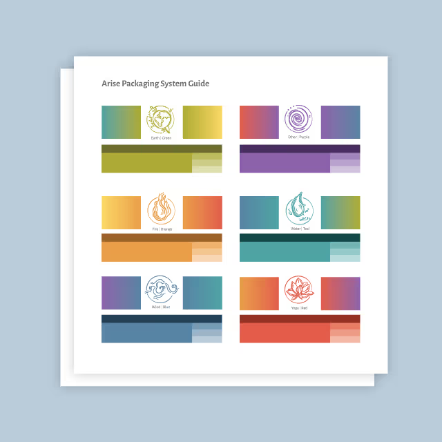
Because this was a rebrand for a business that already had a great reputation for exceptional care, we knew we needed to maintain and leverage as much of that brand equity as possible while providing a comprehensive new visual identity that captured the core mission of the business. Paramount to the rebrand was finding a new business name that clearly and simply conveyed the service offered and reinforced the organization’s commitment to enabling seniors to stride confidently through their golden years, supported by compassionate and personalized care.
We approached this rebrand with a mission-first mindset, visually translating the heart of the business’ mission into rich, approachable tones with sophisticated accent colors that differentiated them as a business but didn’t stray too far from their former brand or diminish established brand equity.
For elements and imagery, we used sketched illustrations and icons that showcase the nurturing care that Senior Stride provides. We incorporated lighthearted imagery showcasing both seniors enjoying their independent lives as well as the smiling faces of caregivers that evoked a feeling of genuine care and happiness.
We crafted a typographical hierarchy with a two-fold approach, knowing we wanted modern “high-end” fonts that felt welcoming and premium while also making sure that the selected fonts would be well-contrasted and easy to read for the intended audience.
When crafting the new name, we followed our process and chose Senior Stride to clearly and easily capture the core message of the business–”We help seniors find their stride.” Pairing this message with a new, modern logo with a sense of movement that represented each client’s journey.


Senior Stride’s new brand embodies a sense of vitality and empowerment and conveys a simple, clear message to their clients about their core service and philosophy of care. Each element of the new brand works together to create a comforting, consistent feeling across all touchpoints.


Because this was a rebrand for a business that already had a great reputation for exceptional care, we knew we needed to maintain and leverage as much of that brand equity as possible while providing a comprehensive new visual identity that captured the core mission of the business. Paramount to the rebrand was finding a new business name that clearly and simply conveyed the service offered and reinforced the organization’s commitment to enabling seniors to stride confidently through their golden years, supported by compassionate and personalized care.

We approached this rebrand with a mission-first mindset, visually translating the heart of the business’ mission into rich, approachable tones with sophisticated accent colors that differentiated them as a business but didn’t stray too far from their former brand or diminish established brand equity.
For elements and imagery, we used sketched illustrations and icons that showcase the nurturing care that Senior Stride provides. We incorporated lighthearted imagery showcasing both seniors enjoying their independent lives as well as the smiling faces of caregivers that evoked a feeling of genuine care and happiness.
We crafted a typographical hierarchy with a two-fold approach, knowing we wanted modern “high-end” fonts that felt welcoming and premium while also making sure that the selected fonts would be well-contrasted and easy to read for the intended audience.
When crafting the new name, we followed our process and chose Senior Stride to clearly and easily capture the core message of the business–”We help seniors find their stride.” Pairing this message with a new, modern logo with a sense of movement that represented each client’s journey.
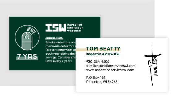

Senior Stride’s new brand embodies a sense of vitality and empowerment and conveys a simple, clear message to their clients about their core service and philosophy of care. Each element of the new brand works together to create a comforting, consistent feeling across all touchpoints.
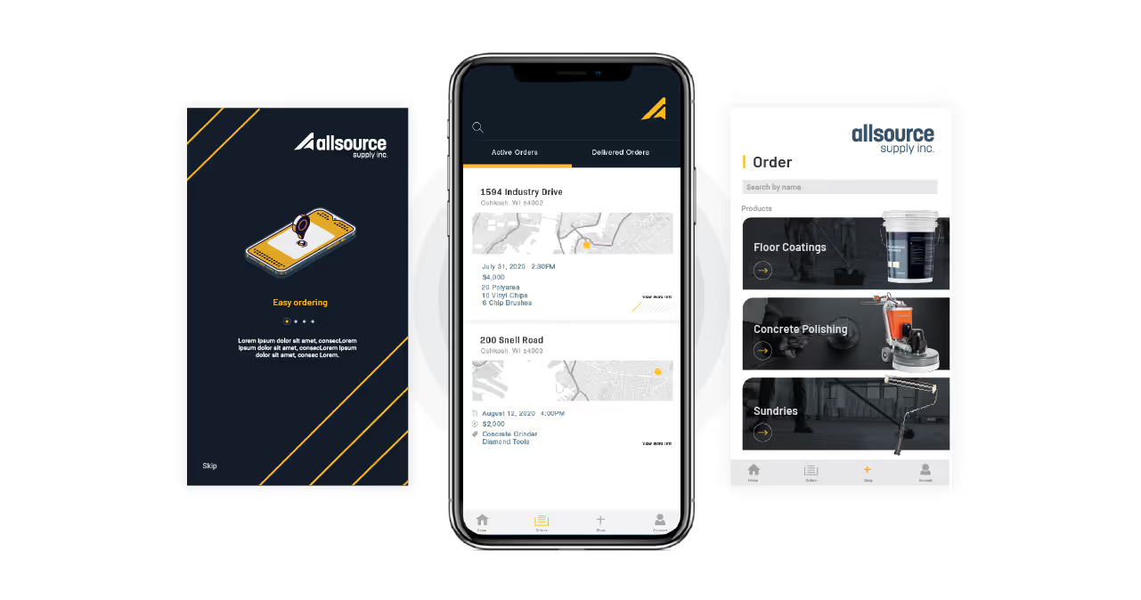


Because this was a rebrand for a business that already had a great reputation for exceptional care, we knew we needed to maintain and leverage as much of that brand equity as possible while providing a comprehensive new visual identity that captured the core mission of the business. Paramount to the rebrand was finding a new business name that clearly and simply conveyed the service offered and reinforced the organization’s commitment to enabling seniors to stride confidently through their golden years, supported by compassionate and personalized care.


We approached this rebrand with a mission-first mindset, visually translating the heart of the business’ mission into rich, approachable tones with sophisticated accent colors that differentiated them as a business but didn’t stray too far from their former brand or diminish established brand equity.
For elements and imagery, we used sketched illustrations and icons that showcase the nurturing care that Senior Stride provides. We incorporated lighthearted imagery showcasing both seniors enjoying their independent lives as well as the smiling faces of caregivers that evoked a feeling of genuine care and happiness.
We crafted a typographical hierarchy with a two-fold approach, knowing we wanted modern “high-end” fonts that felt welcoming and premium while also making sure that the selected fonts would be well-contrasted and easy to read for the intended audience.
When crafting the new name, we followed our process and chose Senior Stride to clearly and easily capture the core message of the business–”We help seniors find their stride.” Pairing this message with a new, modern logo with a sense of movement that represented each client’s journey.


Senior Stride’s new brand embodies a sense of vitality and empowerment and conveys a simple, clear message to their clients about their core service and philosophy of care. Each element of the new brand works together to create a comforting, consistent feeling across all touchpoints.


Because this was a rebrand for a business that already had a great reputation for exceptional care, we knew we needed to maintain and leverage as much of that brand equity as possible while providing a comprehensive new visual identity that captured the core mission of the business. Paramount to the rebrand was finding a new business name that clearly and simply conveyed the service offered and reinforced the organization’s commitment to enabling seniors to stride confidently through their golden years, supported by compassionate and personalized care.


We approached this rebrand with a mission-first mindset, visually translating the heart of the business’ mission into rich, approachable tones with sophisticated accent colors that differentiated them as a business but didn’t stray too far from their former brand or diminish established brand equity.
For elements and imagery, we used sketched illustrations and icons that showcase the nurturing care that Senior Stride provides. We incorporated lighthearted imagery showcasing both seniors enjoying their independent lives as well as the smiling faces of caregivers that evoked a feeling of genuine care and happiness.
We crafted a typographical hierarchy with a two-fold approach, knowing we wanted modern “high-end” fonts that felt welcoming and premium while also making sure that the selected fonts would be well-contrasted and easy to read for the intended audience.
When crafting the new name, we followed our process and chose Senior Stride to clearly and easily capture the core message of the business–”We help seniors find their stride.” Pairing this message with a new, modern logo with a sense of movement that represented each client’s journey.

Senior Stride’s new brand embodies a sense of vitality and empowerment and conveys a simple, clear message to their clients about their core service and philosophy of care. Each element of the new brand works together to create a comforting, consistent feeling across all touchpoints.


Because this was a rebrand for a business that already had a great reputation for exceptional care, we knew we needed to maintain and leverage as much of that brand equity as possible while providing a comprehensive new visual identity that captured the core mission of the business. Paramount to the rebrand was finding a new business name that clearly and simply conveyed the service offered and reinforced the organization’s commitment to enabling seniors to stride confidently through their golden years, supported by compassionate and personalized care.

We approached this rebrand with a mission-first mindset, visually translating the heart of the business’ mission into rich, approachable tones with sophisticated accent colors that differentiated them as a business but didn’t stray too far from their former brand or diminish established brand equity.
For elements and imagery, we used sketched illustrations and icons that showcase the nurturing care that Senior Stride provides. We incorporated lighthearted imagery showcasing both seniors enjoying their independent lives as well as the smiling faces of caregivers that evoked a feeling of genuine care and happiness.
We crafted a typographical hierarchy with a two-fold approach, knowing we wanted modern “high-end” fonts that felt welcoming and premium while also making sure that the selected fonts would be well-contrasted and easy to read for the intended audience.
When crafting the new name, we followed our process and chose Senior Stride to clearly and easily capture the core message of the business–”We help seniors find their stride.” Pairing this message with a new, modern logo with a sense of movement that represented each client’s journey.


Senior Stride’s new brand embodies a sense of vitality and empowerment and conveys a simple, clear message to their clients about their core service and philosophy of care. Each element of the new brand works together to create a comforting, consistent feeling across all touchpoints.


Senior Stride’s new brand embodies a sense of vitality and empowerment and conveys a simple, clear message to their clients about their core service and philosophy of care. Each element of the new brand works together to create a comforting, consistent feeling across all touchpoints.
Because this was a rebrand for a business that already had a great reputation for exceptional care, we knew we needed to maintain and leverage as much of that brand equity as possible while providing a comprehensive new visual identity that captured the core mission of the business. Paramount to the rebrand was finding a new business name that clearly and simply conveyed the service offered and reinforced the organization’s commitment to enabling seniors to stride confidently through their golden years, supported by compassionate and personalized care.

We approached this rebrand with a mission-first mindset, visually translating the heart of the business’ mission into rich, approachable tones with sophisticated accent colors that differentiated them as a business but didn’t stray too far from their former brand or diminish established brand equity.
For elements and imagery, we used sketched illustrations and icons that showcase the nurturing care that Senior Stride provides. We incorporated lighthearted imagery showcasing both seniors enjoying their independent lives as well as the smiling faces of caregivers that evoked a feeling of genuine care and happiness.
We crafted a typographical hierarchy with a two-fold approach, knowing we wanted modern “high-end” fonts that felt welcoming and premium while also making sure that the selected fonts would be well-contrasted and easy to read for the intended audience.
When crafting the new name, we followed our process and chose Senior Stride to clearly and easily capture the core message of the business–”We help seniors find their stride.” Pairing this message with a new, modern logo with a sense of movement that represented each client’s journey.

Senior Stride’s new brand embodies a sense of vitality and empowerment and conveys a simple, clear message to their clients about their core service and philosophy of care. Each element of the new brand works together to create a comforting, consistent feeling across all touchpoints.

Senior Stride’s new brand embodies a sense of vitality and empowerment and conveys a simple, clear message to their clients about their core service and philosophy of care. Each element of the new brand works together to create a comforting, consistent feeling across all touchpoints.

We approached this rebrand with a mission-first mindset, visually translating the heart of the business’ mission into rich, approachable tones with sophisticated accent colors that differentiated them as a business but didn’t stray too far from their former brand or diminish established brand equity.
For elements and imagery, we used sketched illustrations and icons that showcase the nurturing care that Senior Stride provides. We incorporated lighthearted imagery showcasing both seniors enjoying their independent lives as well as the smiling faces of caregivers that evoked a feeling of genuine care and happiness.
We crafted a typographical hierarchy with a two-fold approach, knowing we wanted modern “high-end” fonts that felt welcoming and premium while also making sure that the selected fonts would be well-contrasted and easy to read for the intended audience.
When crafting the new name, we followed our process and chose Senior Stride to clearly and easily capture the core message of the business–”We help seniors find their stride.” Pairing this message with a new, modern logo with a sense of movement that represented each client’s journey.

Because this was a rebrand for a business that already had a great reputation for exceptional care, we knew we needed to maintain and leverage as much of that brand equity as possible while providing a comprehensive new visual identity that captured the core mission of the business. Paramount to the rebrand was finding a new business name that clearly and simply conveyed the service offered and reinforced the organization’s commitment to enabling seniors to stride confidently through their golden years, supported by compassionate and personalized care.

Senior Stride’s new brand embodies a sense of vitality and empowerment and conveys a simple, clear message to their clients about their core service and philosophy of care. Each element of the new brand works together to create a comforting, consistent feeling across all touchpoints.


Senior Stride’s new brand embodies a sense of vitality and empowerment and conveys a simple, clear message to their clients about their core service and philosophy of care. Each element of the new brand works together to create a comforting, consistent feeling across all touchpoints.


Because this was a rebrand for a business that already had a great reputation for exceptional care, we knew we needed to maintain and leverage as much of that brand equity as possible while providing a comprehensive new visual identity that captured the core mission of the business. Paramount to the rebrand was finding a new business name that clearly and simply conveyed the service offered and reinforced the organization’s commitment to enabling seniors to stride confidently through their golden years, supported by compassionate and personalized care.


We approached this rebrand with a mission-first mindset, visually translating the heart of the business’ mission into rich, approachable tones with sophisticated accent colors that differentiated them as a business but didn’t stray too far from their former brand or diminish established brand equity.
For elements and imagery, we used sketched illustrations and icons that showcase the nurturing care that Senior Stride provides. We incorporated lighthearted imagery showcasing both seniors enjoying their independent lives as well as the smiling faces of caregivers that evoked a feeling of genuine care and happiness.
We crafted a typographical hierarchy with a two-fold approach, knowing we wanted modern “high-end” fonts that felt welcoming and premium while also making sure that the selected fonts would be well-contrasted and easy to read for the intended audience.
When crafting the new name, we followed our process and chose Senior Stride to clearly and easily capture the core message of the business–”We help seniors find their stride.” Pairing this message with a new, modern logo with a sense of movement that represented each client’s journey.

Senior Stride’s new brand embodies a sense of vitality and empowerment and conveys a simple, clear message to their clients about their core service and philosophy of care. Each element of the new brand works together to create a comforting, consistent feeling across all touchpoints.


Because this was a rebrand for a business that already had a great reputation for exceptional care, we knew we needed to maintain and leverage as much of that brand equity as possible while providing a comprehensive new visual identity that captured the core mission of the business. Paramount to the rebrand was finding a new business name that clearly and simply conveyed the service offered and reinforced the organization’s commitment to enabling seniors to stride confidently through their golden years, supported by compassionate and personalized care.
We approached this rebrand with a mission-first mindset, visually translating the heart of the business’ mission into rich, approachable tones with sophisticated accent colors that differentiated them as a business but didn’t stray too far from their former brand or diminish established brand equity.
For elements and imagery, we used sketched illustrations and icons that showcase the nurturing care that Senior Stride provides. We incorporated lighthearted imagery showcasing both seniors enjoying their independent lives as well as the smiling faces of caregivers that evoked a feeling of genuine care and happiness.
We crafted a typographical hierarchy with a two-fold approach, knowing we wanted modern “high-end” fonts that felt welcoming and premium while also making sure that the selected fonts would be well-contrasted and easy to read for the intended audience.
When crafting the new name, we followed our process and chose Senior Stride to clearly and easily capture the core message of the business–”We help seniors find their stride.” Pairing this message with a new, modern logo with a sense of movement that represented each client’s journey.


Senior Stride’s new brand embodies a sense of vitality and empowerment and conveys a simple, clear message to their clients about their core service and philosophy of care. Each element of the new brand works together to create a comforting, consistent feeling across all touchpoints.


Because this was a rebrand for a business that already had a great reputation for exceptional care, we knew we needed to maintain and leverage as much of that brand equity as possible while providing a comprehensive new visual identity that captured the core mission of the business. Paramount to the rebrand was finding a new business name that clearly and simply conveyed the service offered and reinforced the organization’s commitment to enabling seniors to stride confidently through their golden years, supported by compassionate and personalized care.
Senior Stride’s new brand embodies a sense of vitality and empowerment and conveys a simple, clear message to their clients about their core service and philosophy of care. Each element of the new brand works together to create a comforting, consistent feeling across all touchpoints.

We approached this rebrand with a mission-first mindset, visually translating the heart of the business’ mission into rich, approachable tones with sophisticated accent colors that differentiated them as a business but didn’t stray too far from their former brand or diminish established brand equity.
For elements and imagery, we used sketched illustrations and icons that showcase the nurturing care that Senior Stride provides. We incorporated lighthearted imagery showcasing both seniors enjoying their independent lives as well as the smiling faces of caregivers that evoked a feeling of genuine care and happiness.
We crafted a typographical hierarchy with a two-fold approach, knowing we wanted modern “high-end” fonts that felt welcoming and premium while also making sure that the selected fonts would be well-contrasted and easy to read for the intended audience.
When crafting the new name, we followed our process and chose Senior Stride to clearly and easily capture the core message of the business–”We help seniors find their stride.” Pairing this message with a new, modern logo with a sense of movement that represented each client’s journey.


Senior Stride’s new brand embodies a sense of vitality and empowerment and conveys a simple, clear message to their clients about their core service and philosophy of care. Each element of the new brand works together to create a comforting, consistent feeling across all touchpoints.


Because this was a rebrand for a business that already had a great reputation for exceptional care, we knew we needed to maintain and leverage as much of that brand equity as possible while providing a comprehensive new visual identity that captured the core mission of the business. Paramount to the rebrand was finding a new business name that clearly and simply conveyed the service offered and reinforced the organization’s commitment to enabling seniors to stride confidently through their golden years, supported by compassionate and personalized care.
We approached this rebrand with a mission-first mindset, visually translating the heart of the business’ mission into rich, approachable tones with sophisticated accent colors that differentiated them as a business but didn’t stray too far from their former brand or diminish established brand equity.
For elements and imagery, we used sketched illustrations and icons that showcase the nurturing care that Senior Stride provides. We incorporated lighthearted imagery showcasing both seniors enjoying their independent lives as well as the smiling faces of caregivers that evoked a feeling of genuine care and happiness.
We crafted a typographical hierarchy with a two-fold approach, knowing we wanted modern “high-end” fonts that felt welcoming and premium while also making sure that the selected fonts would be well-contrasted and easy to read for the intended audience.
When crafting the new name, we followed our process and chose Senior Stride to clearly and easily capture the core message of the business–”We help seniors find their stride.” Pairing this message with a new, modern logo with a sense of movement that represented each client’s journey.


Senior Stride’s new brand embodies a sense of vitality and empowerment and conveys a simple, clear message to their clients about their core service and philosophy of care. Each element of the new brand works together to create a comforting, consistent feeling across all touchpoints.


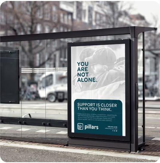
Because this was a rebrand for a business that already had a great reputation for exceptional care, we knew we needed to maintain and leverage as much of that brand equity as possible while providing a comprehensive new visual identity that captured the core mission of the business. Paramount to the rebrand was finding a new business name that clearly and simply conveyed the service offered and reinforced the organization’s commitment to enabling seniors to stride confidently through their golden years, supported by compassionate and personalized care.

We approached this rebrand with a mission-first mindset, visually translating the heart of the business’ mission into rich, approachable tones with sophisticated accent colors that differentiated them as a business but didn’t stray too far from their former brand or diminish established brand equity.
For elements and imagery, we used sketched illustrations and icons that showcase the nurturing care that Senior Stride provides. We incorporated lighthearted imagery showcasing both seniors enjoying their independent lives as well as the smiling faces of caregivers that evoked a feeling of genuine care and happiness.
We crafted a typographical hierarchy with a two-fold approach, knowing we wanted modern “high-end” fonts that felt welcoming and premium while also making sure that the selected fonts would be well-contrasted and easy to read for the intended audience.
When crafting the new name, we followed our process and chose Senior Stride to clearly and easily capture the core message of the business–”We help seniors find their stride.” Pairing this message with a new, modern logo with a sense of movement that represented each client’s journey.

Senior Stride’s new brand embodies a sense of vitality and empowerment and conveys a simple, clear message to their clients about their core service and philosophy of care. Each element of the new brand works together to create a comforting, consistent feeling across all touchpoints.


Because this was a rebrand for a business that already had a great reputation for exceptional care, we knew we needed to maintain and leverage as much of that brand equity as possible while providing a comprehensive new visual identity that captured the core mission of the business. Paramount to the rebrand was finding a new business name that clearly and simply conveyed the service offered and reinforced the organization’s commitment to enabling seniors to stride confidently through their golden years, supported by compassionate and personalized care.

We approached this rebrand with a mission-first mindset, visually translating the heart of the business’ mission into rich, approachable tones with sophisticated accent colors that differentiated them as a business but didn’t stray too far from their former brand or diminish established brand equity.
For elements and imagery, we used sketched illustrations and icons that showcase the nurturing care that Senior Stride provides. We incorporated lighthearted imagery showcasing both seniors enjoying their independent lives as well as the smiling faces of caregivers that evoked a feeling of genuine care and happiness.
We crafted a typographical hierarchy with a two-fold approach, knowing we wanted modern “high-end” fonts that felt welcoming and premium while also making sure that the selected fonts would be well-contrasted and easy to read for the intended audience.
When crafting the new name, we followed our process and chose Senior Stride to clearly and easily capture the core message of the business–”We help seniors find their stride.” Pairing this message with a new, modern logo with a sense of movement that represented each client’s journey.


Senior Stride’s new brand embodies a sense of vitality and empowerment and conveys a simple, clear message to their clients about their core service and philosophy of care. Each element of the new brand works together to create a comforting, consistent feeling across all touchpoints.


