


In 1921, a time when household appliances were just beginning to emerge, Harry Miller opened up a small shop in Chicago where he distributed appliances. He had a great relationship with Speed Queen as they were starting their operations and grew a name for himself specifically for that laundry equipment.
Fast forward to today and they're now looking back at 100 years of company history. Harry Miller appliances is still selling quality appliances at affordable prices and Coin-O-Matic, their commercial laundry division, is supplying and servicing equipment and providing relationships with customers across four states. Recently, one of their suppliers created a shift in the market and the Harry Miller family of companies wanted to ensure their namesake wouldn’t get lost in the shuffle.
Everything that would represent the company moving forward needed to fit this mold. It would need to have a historic essence and feel current as well.


Following conversations with business stakeholders, interviews with clients, and completing a competitive analysis, we came to the conclusion that establishing a stronger brand position and updating the visual identity for the Harry Miller family of brands was the best route forward to meet business objectives. With a keen eye on the past, we worked with the Harry Miller leadership team to paint a vision for the future.
A brand promise was solidified and boiled down to one simple statement. "Current laundry solutions from a company with historic values." Everything that would represent the company moving forward needed to fit this mold. It would need to have a historic essence and feel current as well.

A full visual identity solution was developed for the Harry Miller family of brands. This included Harry Miller appliances as well as Coin-O-Matic that now share a singular visual identity to better resonate across residential and commercial offerings. We leveraged historic brand colors, retro typography with modern styled layouts, and a proper mix of historic and modern photos to make everyone feel like their part of the legacy. Since a brand is much deeper than the visual identity, we're continuing to work with the company's leadership team on future brand-lead marketing and promotional efforts.


In 1921, a time when household appliances were just beginning to emerge, Harry Miller opened up a small shop in Chicago where he distributed appliances. He had a great relationship with Speed Queen as they were starting their operations and grew a name for himself specifically for that laundry equipment.
Fast forward to today and they're now looking back at 100 years of company history. Harry Miller appliances is still selling quality appliances at affordable prices and Coin-O-Matic, their commercial laundry division, is supplying and servicing equipment and providing relationships with customers across four states. Recently, one of their suppliers created a shift in the market and the Harry Miller family of companies wanted to ensure their namesake wouldn’t get lost in the shuffle.
Everything that would represent the company moving forward needed to fit this mold. It would need to have a historic essence and feel current as well.


Following conversations with business stakeholders, interviews with clients, and completing a competitive analysis, we came to the conclusion that establishing a stronger brand position and updating the visual identity for the Harry Miller family of brands was the best route forward to meet business objectives. With a keen eye on the past, we worked with the Harry Miller leadership team to paint a vision for the future.
A brand promise was solidified and boiled down to one simple statement. "Current laundry solutions from a company with historic values." Everything that would represent the company moving forward needed to fit this mold. It would need to have a historic essence and feel current as well.


A full visual identity solution was developed for the Harry Miller family of brands. This included Harry Miller appliances as well as Coin-O-Matic that now share a singular visual identity to better resonate across residential and commercial offerings. We leveraged historic brand colors, retro typography with modern styled layouts, and a proper mix of historic and modern photos to make everyone feel like their part of the legacy. Since a brand is much deeper than the visual identity, we're continuing to work with the company's leadership team on future brand-lead marketing and promotional efforts.


In 1921, a time when household appliances were just beginning to emerge, Harry Miller opened up a small shop in Chicago where he distributed appliances. He had a great relationship with Speed Queen as they were starting their operations and grew a name for himself specifically for that laundry equipment.
Fast forward to today and they're now looking back at 100 years of company history. Harry Miller appliances is still selling quality appliances at affordable prices and Coin-O-Matic, their commercial laundry division, is supplying and servicing equipment and providing relationships with customers across four states. Recently, one of their suppliers created a shift in the market and the Harry Miller family of companies wanted to ensure their namesake wouldn’t get lost in the shuffle.
Everything that would represent the company moving forward needed to fit this mold. It would need to have a historic essence and feel current as well.


Following conversations with business stakeholders, interviews with clients, and completing a competitive analysis, we came to the conclusion that establishing a stronger brand position and updating the visual identity for the Harry Miller family of brands was the best route forward to meet business objectives. With a keen eye on the past, we worked with the Harry Miller leadership team to paint a vision for the future.
A brand promise was solidified and boiled down to one simple statement. "Current laundry solutions from a company with historic values." Everything that would represent the company moving forward needed to fit this mold. It would need to have a historic essence and feel current as well.

A full visual identity solution was developed for the Harry Miller family of brands. This included Harry Miller appliances as well as Coin-O-Matic that now share a singular visual identity to better resonate across residential and commercial offerings. We leveraged historic brand colors, retro typography with modern styled layouts, and a proper mix of historic and modern photos to make everyone feel like their part of the legacy. Since a brand is much deeper than the visual identity, we're continuing to work with the company's leadership team on future brand-lead marketing and promotional efforts.


In 1921, a time when household appliances were just beginning to emerge, Harry Miller opened up a small shop in Chicago where he distributed appliances. He had a great relationship with Speed Queen as they were starting their operations and grew a name for himself specifically for that laundry equipment.
Fast forward to today and they're now looking back at 100 years of company history. Harry Miller appliances is still selling quality appliances at affordable prices and Coin-O-Matic, their commercial laundry division, is supplying and servicing equipment and providing relationships with customers across four states. Recently, one of their suppliers created a shift in the market and the Harry Miller family of companies wanted to ensure their namesake wouldn’t get lost in the shuffle.
Everything that would represent the company moving forward needed to fit this mold. It would need to have a historic essence and feel current as well.

Following conversations with business stakeholders, interviews with clients, and completing a competitive analysis, we came to the conclusion that establishing a stronger brand position and updating the visual identity for the Harry Miller family of brands was the best route forward to meet business objectives. With a keen eye on the past, we worked with the Harry Miller leadership team to paint a vision for the future.
A brand promise was solidified and boiled down to one simple statement. "Current laundry solutions from a company with historic values." Everything that would represent the company moving forward needed to fit this mold. It would need to have a historic essence and feel current as well.


A full visual identity solution was developed for the Harry Miller family of brands. This included Harry Miller appliances as well as Coin-O-Matic that now share a singular visual identity to better resonate across residential and commercial offerings. We leveraged historic brand colors, retro typography with modern styled layouts, and a proper mix of historic and modern photos to make everyone feel like their part of the legacy. Since a brand is much deeper than the visual identity, we're continuing to work with the company's leadership team on future brand-lead marketing and promotional efforts.


In 1921, a time when household appliances were just beginning to emerge, Harry Miller opened up a small shop in Chicago where he distributed appliances. He had a great relationship with Speed Queen as they were starting their operations and grew a name for himself specifically for that laundry equipment.
Fast forward to today and they're now looking back at 100 years of company history. Harry Miller appliances is still selling quality appliances at affordable prices and Coin-O-Matic, their commercial laundry division, is supplying and servicing equipment and providing relationships with customers across four states. Recently, one of their suppliers created a shift in the market and the Harry Miller family of companies wanted to ensure their namesake wouldn’t get lost in the shuffle.
Everything that would represent the company moving forward needed to fit this mold. It would need to have a historic essence and feel current as well.


Following conversations with business stakeholders, interviews with clients, and completing a competitive analysis, we came to the conclusion that establishing a stronger brand position and updating the visual identity for the Harry Miller family of brands was the best route forward to meet business objectives. With a keen eye on the past, we worked with the Harry Miller leadership team to paint a vision for the future.
A brand promise was solidified and boiled down to one simple statement. "Current laundry solutions from a company with historic values." Everything that would represent the company moving forward needed to fit this mold. It would need to have a historic essence and feel current as well.


A full visual identity solution was developed for the Harry Miller family of brands. This included Harry Miller appliances as well as Coin-O-Matic that now share a singular visual identity to better resonate across residential and commercial offerings. We leveraged historic brand colors, retro typography with modern styled layouts, and a proper mix of historic and modern photos to make everyone feel like their part of the legacy. Since a brand is much deeper than the visual identity, we're continuing to work with the company's leadership team on future brand-lead marketing and promotional efforts.


In 1921, a time when household appliances were just beginning to emerge, Harry Miller opened up a small shop in Chicago where he distributed appliances. He had a great relationship with Speed Queen as they were starting their operations and grew a name for himself specifically for that laundry equipment.
Fast forward to today and they're now looking back at 100 years of company history. Harry Miller appliances is still selling quality appliances at affordable prices and Coin-O-Matic, their commercial laundry division, is supplying and servicing equipment and providing relationships with customers across four states. Recently, one of their suppliers created a shift in the market and the Harry Miller family of companies wanted to ensure their namesake wouldn’t get lost in the shuffle.
Everything that would represent the company moving forward needed to fit this mold. It would need to have a historic essence and feel current as well.


Following conversations with business stakeholders, interviews with clients, and completing a competitive analysis, we came to the conclusion that establishing a stronger brand position and updating the visual identity for the Harry Miller family of brands was the best route forward to meet business objectives. With a keen eye on the past, we worked with the Harry Miller leadership team to paint a vision for the future.
A brand promise was solidified and boiled down to one simple statement. "Current laundry solutions from a company with historic values." Everything that would represent the company moving forward needed to fit this mold. It would need to have a historic essence and feel current as well.


A full visual identity solution was developed for the Harry Miller family of brands. This included Harry Miller appliances as well as Coin-O-Matic that now share a singular visual identity to better resonate across residential and commercial offerings. We leveraged historic brand colors, retro typography with modern styled layouts, and a proper mix of historic and modern photos to make everyone feel like their part of the legacy. Since a brand is much deeper than the visual identity, we're continuing to work with the company's leadership team on future brand-lead marketing and promotional efforts.


In 1921, a time when household appliances were just beginning to emerge, Harry Miller opened up a small shop in Chicago where he distributed appliances. He had a great relationship with Speed Queen as they were starting their operations and grew a name for himself specifically for that laundry equipment.
Fast forward to today and they're now looking back at 100 years of company history. Harry Miller appliances is still selling quality appliances at affordable prices and Coin-O-Matic, their commercial laundry division, is supplying and servicing equipment and providing relationships with customers across four states. Recently, one of their suppliers created a shift in the market and the Harry Miller family of companies wanted to ensure their namesake wouldn’t get lost in the shuffle.
Everything that would represent the company moving forward needed to fit this mold. It would need to have a historic essence and feel current as well.


Following conversations with business stakeholders, interviews with clients, and completing a competitive analysis, we came to the conclusion that establishing a stronger brand position and updating the visual identity for the Harry Miller family of brands was the best route forward to meet business objectives. With a keen eye on the past, we worked with the Harry Miller leadership team to paint a vision for the future.
A brand promise was solidified and boiled down to one simple statement. "Current laundry solutions from a company with historic values." Everything that would represent the company moving forward needed to fit this mold. It would need to have a historic essence and feel current as well.


A full visual identity solution was developed for the Harry Miller family of brands. This included Harry Miller appliances as well as Coin-O-Matic that now share a singular visual identity to better resonate across residential and commercial offerings. We leveraged historic brand colors, retro typography with modern styled layouts, and a proper mix of historic and modern photos to make everyone feel like their part of the legacy. Since a brand is much deeper than the visual identity, we're continuing to work with the company's leadership team on future brand-lead marketing and promotional efforts.


In 1921, a time when household appliances were just beginning to emerge, Harry Miller opened up a small shop in Chicago where he distributed appliances. He had a great relationship with Speed Queen as they were starting their operations and grew a name for himself specifically for that laundry equipment.
Fast forward to today and they're now looking back at 100 years of company history. Harry Miller appliances is still selling quality appliances at affordable prices and Coin-O-Matic, their commercial laundry division, is supplying and servicing equipment and providing relationships with customers across four states. Recently, one of their suppliers created a shift in the market and the Harry Miller family of companies wanted to ensure their namesake wouldn’t get lost in the shuffle.
Everything that would represent the company moving forward needed to fit this mold. It would need to have a historic essence and feel current as well.


Following conversations with business stakeholders, interviews with clients, and completing a competitive analysis, we came to the conclusion that establishing a stronger brand position and updating the visual identity for the Harry Miller family of brands was the best route forward to meet business objectives. With a keen eye on the past, we worked with the Harry Miller leadership team to paint a vision for the future.
A brand promise was solidified and boiled down to one simple statement. "Current laundry solutions from a company with historic values." Everything that would represent the company moving forward needed to fit this mold. It would need to have a historic essence and feel current as well.


In 1921, a time when household appliances were just beginning to emerge, Harry Miller opened up a small shop in Chicago where he distributed appliances. He had a great relationship with Speed Queen as they were starting their operations and grew a name for himself specifically for that laundry equipment.
Fast forward to today and they're now looking back at 100 years of company history. Harry Miller appliances is still selling quality appliances at affordable prices and Coin-O-Matic, their commercial laundry division, is supplying and servicing equipment and providing relationships with customers across four states. Recently, one of their suppliers created a shift in the market and the Harry Miller family of companies wanted to ensure their namesake wouldn’t get lost in the shuffle.
Everything that would represent the company moving forward needed to fit this mold. It would need to have a historic essence and feel current as well.
Following conversations with business stakeholders, interviews with clients, and completing a competitive analysis, we came to the conclusion that establishing a stronger brand position and updating the visual identity for the Harry Miller family of brands was the best route forward to meet business objectives. With a keen eye on the past, we worked with the Harry Miller leadership team to paint a vision for the future.
A brand promise was solidified and boiled down to one simple statement. "Current laundry solutions from a company with historic values." Everything that would represent the company moving forward needed to fit this mold. It would need to have a historic essence and feel current as well.


A full visual identity solution was developed for the Harry Miller family of brands. This included Harry Miller appliances as well as Coin-O-Matic that now share a singular visual identity to better resonate across residential and commercial offerings. We leveraged historic brand colors, retro typography with modern styled layouts, and a proper mix of historic and modern photos to make everyone feel like their part of the legacy. Since a brand is much deeper than the visual identity, we're continuing to work with the company's leadership team on future brand-lead marketing and promotional efforts.


In 1921, a time when household appliances were just beginning to emerge, Harry Miller opened up a small shop in Chicago where he distributed appliances. He had a great relationship with Speed Queen as they were starting their operations and grew a name for himself specifically for that laundry equipment.
Fast forward to today and they're now looking back at 100 years of company history. Harry Miller appliances is still selling quality appliances at affordable prices and Coin-O-Matic, their commercial laundry division, is supplying and servicing equipment and providing relationships with customers across four states. Recently, one of their suppliers created a shift in the market and the Harry Miller family of companies wanted to ensure their namesake wouldn’t get lost in the shuffle.
Everything that would represent the company moving forward needed to fit this mold. It would need to have a historic essence and feel current as well.


Following conversations with business stakeholders, interviews with clients, and completing a competitive analysis, we came to the conclusion that establishing a stronger brand position and updating the visual identity for the Harry Miller family of brands was the best route forward to meet business objectives. With a keen eye on the past, we worked with the Harry Miller leadership team to paint a vision for the future.
A brand promise was solidified and boiled down to one simple statement. "Current laundry solutions from a company with historic values." Everything that would represent the company moving forward needed to fit this mold. It would need to have a historic essence and feel current as well.
A full visual identity solution was developed for the Harry Miller family of brands. This included Harry Miller appliances as well as Coin-O-Matic that now share a singular visual identity to better resonate across residential and commercial offerings. We leveraged historic brand colors, retro typography with modern styled layouts, and a proper mix of historic and modern photos to make everyone feel like their part of the legacy. Since a brand is much deeper than the visual identity, we're continuing to work with the company's leadership team on future brand-lead marketing and promotional efforts.

In 1921, a time when household appliances were just beginning to emerge, Harry Miller opened up a small shop in Chicago where he distributed appliances. He had a great relationship with Speed Queen as they were starting their operations and grew a name for himself specifically for that laundry equipment.
Fast forward to today and they're now looking back at 100 years of company history. Harry Miller appliances is still selling quality appliances at affordable prices and Coin-O-Matic, their commercial laundry division, is supplying and servicing equipment and providing relationships with customers across four states. Recently, one of their suppliers created a shift in the market and the Harry Miller family of companies wanted to ensure their namesake wouldn’t get lost in the shuffle.
Everything that would represent the company moving forward needed to fit this mold. It would need to have a historic essence and feel current as well.


Following conversations with business stakeholders, interviews with clients, and completing a competitive analysis, we came to the conclusion that establishing a stronger brand position and updating the visual identity for the Harry Miller family of brands was the best route forward to meet business objectives. With a keen eye on the past, we worked with the Harry Miller leadership team to paint a vision for the future.
A brand promise was solidified and boiled down to one simple statement. "Current laundry solutions from a company with historic values." Everything that would represent the company moving forward needed to fit this mold. It would need to have a historic essence and feel current as well.


A full visual identity solution was developed for the Harry Miller family of brands. This included Harry Miller appliances as well as Coin-O-Matic that now share a singular visual identity to better resonate across residential and commercial offerings. We leveraged historic brand colors, retro typography with modern styled layouts, and a proper mix of historic and modern photos to make everyone feel like their part of the legacy. Since a brand is much deeper than the visual identity, we're continuing to work with the company's leadership team on future brand-lead marketing and promotional efforts.


In 1921, a time when household appliances were just beginning to emerge, Harry Miller opened up a small shop in Chicago where he distributed appliances. He had a great relationship with Speed Queen as they were starting their operations and grew a name for himself specifically for that laundry equipment.
Fast forward to today and they're now looking back at 100 years of company history. Harry Miller appliances is still selling quality appliances at affordable prices and Coin-O-Matic, their commercial laundry division, is supplying and servicing equipment and providing relationships with customers across four states. Recently, one of their suppliers created a shift in the market and the Harry Miller family of companies wanted to ensure their namesake wouldn’t get lost in the shuffle.
Everything that would represent the company moving forward needed to fit this mold. It would need to have a historic essence and feel current as well.

Following conversations with business stakeholders, interviews with clients, and completing a competitive analysis, we came to the conclusion that establishing a stronger brand position and updating the visual identity for the Harry Miller family of brands was the best route forward to meet business objectives. With a keen eye on the past, we worked with the Harry Miller leadership team to paint a vision for the future.
A brand promise was solidified and boiled down to one simple statement. "Current laundry solutions from a company with historic values." Everything that would represent the company moving forward needed to fit this mold. It would need to have a historic essence and feel current as well.

A full visual identity solution was developed for the Harry Miller family of brands. This included Harry Miller appliances as well as Coin-O-Matic that now share a singular visual identity to better resonate across residential and commercial offerings. We leveraged historic brand colors, retro typography with modern styled layouts, and a proper mix of historic and modern photos to make everyone feel like their part of the legacy. Since a brand is much deeper than the visual identity, we're continuing to work with the company's leadership team on future brand-lead marketing and promotional efforts.


In 1921, a time when household appliances were just beginning to emerge, Harry Miller opened up a small shop in Chicago where he distributed appliances. He had a great relationship with Speed Queen as they were starting their operations and grew a name for himself specifically for that laundry equipment.
Fast forward to today and they're now looking back at 100 years of company history. Harry Miller appliances is still selling quality appliances at affordable prices and Coin-O-Matic, their commercial laundry division, is supplying and servicing equipment and providing relationships with customers across four states. Recently, one of their suppliers created a shift in the market and the Harry Miller family of companies wanted to ensure their namesake wouldn’t get lost in the shuffle.
Everything that would represent the company moving forward needed to fit this mold. It would need to have a historic essence and feel current as well.


Following conversations with business stakeholders, interviews with clients, and completing a competitive analysis, we came to the conclusion that establishing a stronger brand position and updating the visual identity for the Harry Miller family of brands was the best route forward to meet business objectives. With a keen eye on the past, we worked with the Harry Miller leadership team to paint a vision for the future.
A brand promise was solidified and boiled down to one simple statement. "Current laundry solutions from a company with historic values." Everything that would represent the company moving forward needed to fit this mold. It would need to have a historic essence and feel current as well.


A full visual identity solution was developed for the Harry Miller family of brands. This included Harry Miller appliances as well as Coin-O-Matic that now share a singular visual identity to better resonate across residential and commercial offerings. We leveraged historic brand colors, retro typography with modern styled layouts, and a proper mix of historic and modern photos to make everyone feel like their part of the legacy. Since a brand is much deeper than the visual identity, we're continuing to work with the company's leadership team on future brand-lead marketing and promotional efforts.


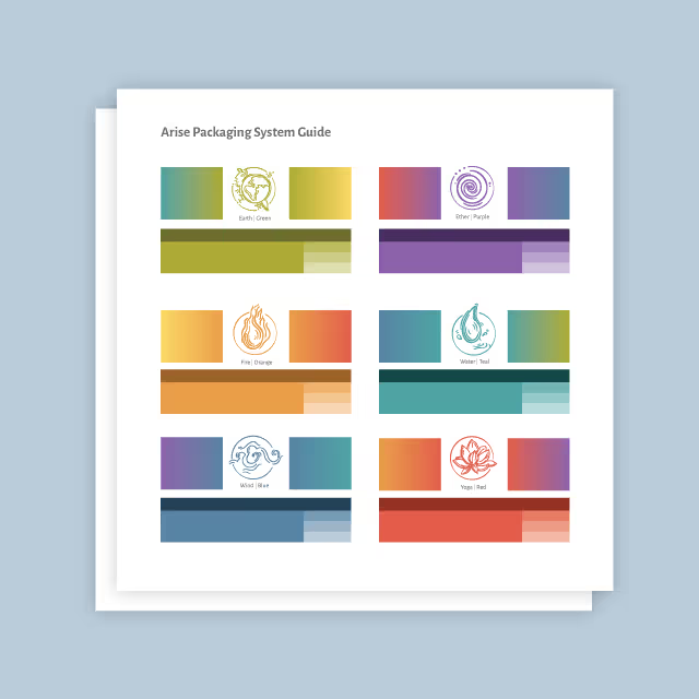
In 1921, a time when household appliances were just beginning to emerge, Harry Miller opened up a small shop in Chicago where he distributed appliances. He had a great relationship with Speed Queen as they were starting their operations and grew a name for himself specifically for that laundry equipment.
Fast forward to today and they're now looking back at 100 years of company history. Harry Miller appliances is still selling quality appliances at affordable prices and Coin-O-Matic, their commercial laundry division, is supplying and servicing equipment and providing relationships with customers across four states. Recently, one of their suppliers created a shift in the market and the Harry Miller family of companies wanted to ensure their namesake wouldn’t get lost in the shuffle.
Everything that would represent the company moving forward needed to fit this mold. It would need to have a historic essence and feel current as well.
Following conversations with business stakeholders, interviews with clients, and completing a competitive analysis, we came to the conclusion that establishing a stronger brand position and updating the visual identity for the Harry Miller family of brands was the best route forward to meet business objectives. With a keen eye on the past, we worked with the Harry Miller leadership team to paint a vision for the future.
A brand promise was solidified and boiled down to one simple statement. "Current laundry solutions from a company with historic values." Everything that would represent the company moving forward needed to fit this mold. It would need to have a historic essence and feel current as well.


A full visual identity solution was developed for the Harry Miller family of brands. This included Harry Miller appliances as well as Coin-O-Matic that now share a singular visual identity to better resonate across residential and commercial offerings. We leveraged historic brand colors, retro typography with modern styled layouts, and a proper mix of historic and modern photos to make everyone feel like their part of the legacy. Since a brand is much deeper than the visual identity, we're continuing to work with the company's leadership team on future brand-lead marketing and promotional efforts.


In 1921, a time when household appliances were just beginning to emerge, Harry Miller opened up a small shop in Chicago where he distributed appliances. He had a great relationship with Speed Queen as they were starting their operations and grew a name for himself specifically for that laundry equipment.
Fast forward to today and they're now looking back at 100 years of company history. Harry Miller appliances is still selling quality appliances at affordable prices and Coin-O-Matic, their commercial laundry division, is supplying and servicing equipment and providing relationships with customers across four states. Recently, one of their suppliers created a shift in the market and the Harry Miller family of companies wanted to ensure their namesake wouldn’t get lost in the shuffle.
Everything that would represent the company moving forward needed to fit this mold. It would need to have a historic essence and feel current as well.

Following conversations with business stakeholders, interviews with clients, and completing a competitive analysis, we came to the conclusion that establishing a stronger brand position and updating the visual identity for the Harry Miller family of brands was the best route forward to meet business objectives. With a keen eye on the past, we worked with the Harry Miller leadership team to paint a vision for the future.
A brand promise was solidified and boiled down to one simple statement. "Current laundry solutions from a company with historic values." Everything that would represent the company moving forward needed to fit this mold. It would need to have a historic essence and feel current as well.
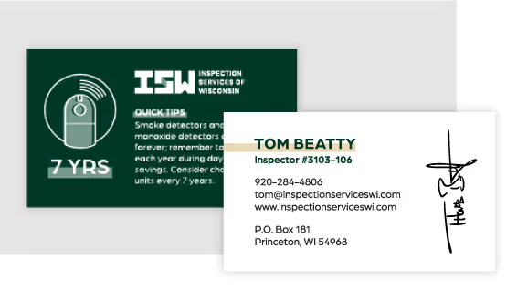

A full visual identity solution was developed for the Harry Miller family of brands. This included Harry Miller appliances as well as Coin-O-Matic that now share a singular visual identity to better resonate across residential and commercial offerings. We leveraged historic brand colors, retro typography with modern styled layouts, and a proper mix of historic and modern photos to make everyone feel like their part of the legacy. Since a brand is much deeper than the visual identity, we're continuing to work with the company's leadership team on future brand-lead marketing and promotional efforts.
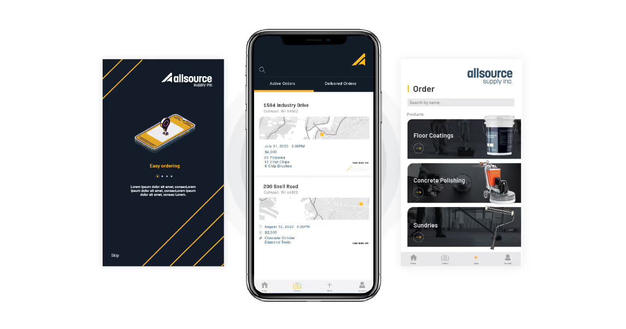


In 1921, a time when household appliances were just beginning to emerge, Harry Miller opened up a small shop in Chicago where he distributed appliances. He had a great relationship with Speed Queen as they were starting their operations and grew a name for himself specifically for that laundry equipment.
Fast forward to today and they're now looking back at 100 years of company history. Harry Miller appliances is still selling quality appliances at affordable prices and Coin-O-Matic, their commercial laundry division, is supplying and servicing equipment and providing relationships with customers across four states. Recently, one of their suppliers created a shift in the market and the Harry Miller family of companies wanted to ensure their namesake wouldn’t get lost in the shuffle.
Everything that would represent the company moving forward needed to fit this mold. It would need to have a historic essence and feel current as well.


Following conversations with business stakeholders, interviews with clients, and completing a competitive analysis, we came to the conclusion that establishing a stronger brand position and updating the visual identity for the Harry Miller family of brands was the best route forward to meet business objectives. With a keen eye on the past, we worked with the Harry Miller leadership team to paint a vision for the future.
A brand promise was solidified and boiled down to one simple statement. "Current laundry solutions from a company with historic values." Everything that would represent the company moving forward needed to fit this mold. It would need to have a historic essence and feel current as well.


A full visual identity solution was developed for the Harry Miller family of brands. This included Harry Miller appliances as well as Coin-O-Matic that now share a singular visual identity to better resonate across residential and commercial offerings. We leveraged historic brand colors, retro typography with modern styled layouts, and a proper mix of historic and modern photos to make everyone feel like their part of the legacy. Since a brand is much deeper than the visual identity, we're continuing to work with the company's leadership team on future brand-lead marketing and promotional efforts.


In 1921, a time when household appliances were just beginning to emerge, Harry Miller opened up a small shop in Chicago where he distributed appliances. He had a great relationship with Speed Queen as they were starting their operations and grew a name for himself specifically for that laundry equipment.
Fast forward to today and they're now looking back at 100 years of company history. Harry Miller appliances is still selling quality appliances at affordable prices and Coin-O-Matic, their commercial laundry division, is supplying and servicing equipment and providing relationships with customers across four states. Recently, one of their suppliers created a shift in the market and the Harry Miller family of companies wanted to ensure their namesake wouldn’t get lost in the shuffle.
Everything that would represent the company moving forward needed to fit this mold. It would need to have a historic essence and feel current as well.


Following conversations with business stakeholders, interviews with clients, and completing a competitive analysis, we came to the conclusion that establishing a stronger brand position and updating the visual identity for the Harry Miller family of brands was the best route forward to meet business objectives. With a keen eye on the past, we worked with the Harry Miller leadership team to paint a vision for the future.
A brand promise was solidified and boiled down to one simple statement. "Current laundry solutions from a company with historic values." Everything that would represent the company moving forward needed to fit this mold. It would need to have a historic essence and feel current as well.

A full visual identity solution was developed for the Harry Miller family of brands. This included Harry Miller appliances as well as Coin-O-Matic that now share a singular visual identity to better resonate across residential and commercial offerings. We leveraged historic brand colors, retro typography with modern styled layouts, and a proper mix of historic and modern photos to make everyone feel like their part of the legacy. Since a brand is much deeper than the visual identity, we're continuing to work with the company's leadership team on future brand-lead marketing and promotional efforts.


In 1921, a time when household appliances were just beginning to emerge, Harry Miller opened up a small shop in Chicago where he distributed appliances. He had a great relationship with Speed Queen as they were starting their operations and grew a name for himself specifically for that laundry equipment.
Fast forward to today and they're now looking back at 100 years of company history. Harry Miller appliances is still selling quality appliances at affordable prices and Coin-O-Matic, their commercial laundry division, is supplying and servicing equipment and providing relationships with customers across four states. Recently, one of their suppliers created a shift in the market and the Harry Miller family of companies wanted to ensure their namesake wouldn’t get lost in the shuffle.
Everything that would represent the company moving forward needed to fit this mold. It would need to have a historic essence and feel current as well.

Following conversations with business stakeholders, interviews with clients, and completing a competitive analysis, we came to the conclusion that establishing a stronger brand position and updating the visual identity for the Harry Miller family of brands was the best route forward to meet business objectives. With a keen eye on the past, we worked with the Harry Miller leadership team to paint a vision for the future.
A brand promise was solidified and boiled down to one simple statement. "Current laundry solutions from a company with historic values." Everything that would represent the company moving forward needed to fit this mold. It would need to have a historic essence and feel current as well.


A full visual identity solution was developed for the Harry Miller family of brands. This included Harry Miller appliances as well as Coin-O-Matic that now share a singular visual identity to better resonate across residential and commercial offerings. We leveraged historic brand colors, retro typography with modern styled layouts, and a proper mix of historic and modern photos to make everyone feel like their part of the legacy. Since a brand is much deeper than the visual identity, we're continuing to work with the company's leadership team on future brand-lead marketing and promotional efforts.


A full visual identity solution was developed for the Harry Miller family of brands. This included Harry Miller appliances as well as Coin-O-Matic that now share a singular visual identity to better resonate across residential and commercial offerings. We leveraged historic brand colors, retro typography with modern styled layouts, and a proper mix of historic and modern photos to make everyone feel like their part of the legacy. Since a brand is much deeper than the visual identity, we're continuing to work with the company's leadership team on future brand-lead marketing and promotional efforts.
In 1921, a time when household appliances were just beginning to emerge, Harry Miller opened up a small shop in Chicago where he distributed appliances. He had a great relationship with Speed Queen as they were starting their operations and grew a name for himself specifically for that laundry equipment.
Fast forward to today and they're now looking back at 100 years of company history. Harry Miller appliances is still selling quality appliances at affordable prices and Coin-O-Matic, their commercial laundry division, is supplying and servicing equipment and providing relationships with customers across four states. Recently, one of their suppliers created a shift in the market and the Harry Miller family of companies wanted to ensure their namesake wouldn’t get lost in the shuffle.
Everything that would represent the company moving forward needed to fit this mold. It would need to have a historic essence and feel current as well.

Following conversations with business stakeholders, interviews with clients, and completing a competitive analysis, we came to the conclusion that establishing a stronger brand position and updating the visual identity for the Harry Miller family of brands was the best route forward to meet business objectives. With a keen eye on the past, we worked with the Harry Miller leadership team to paint a vision for the future.
A brand promise was solidified and boiled down to one simple statement. "Current laundry solutions from a company with historic values." Everything that would represent the company moving forward needed to fit this mold. It would need to have a historic essence and feel current as well.

A full visual identity solution was developed for the Harry Miller family of brands. This included Harry Miller appliances as well as Coin-O-Matic that now share a singular visual identity to better resonate across residential and commercial offerings. We leveraged historic brand colors, retro typography with modern styled layouts, and a proper mix of historic and modern photos to make everyone feel like their part of the legacy. Since a brand is much deeper than the visual identity, we're continuing to work with the company's leadership team on future brand-lead marketing and promotional efforts.

A full visual identity solution was developed for the Harry Miller family of brands. This included Harry Miller appliances as well as Coin-O-Matic that now share a singular visual identity to better resonate across residential and commercial offerings. We leveraged historic brand colors, retro typography with modern styled layouts, and a proper mix of historic and modern photos to make everyone feel like their part of the legacy. Since a brand is much deeper than the visual identity, we're continuing to work with the company's leadership team on future brand-lead marketing and promotional efforts.

Following conversations with business stakeholders, interviews with clients, and completing a competitive analysis, we came to the conclusion that establishing a stronger brand position and updating the visual identity for the Harry Miller family of brands was the best route forward to meet business objectives. With a keen eye on the past, we worked with the Harry Miller leadership team to paint a vision for the future.
A brand promise was solidified and boiled down to one simple statement. "Current laundry solutions from a company with historic values." Everything that would represent the company moving forward needed to fit this mold. It would need to have a historic essence and feel current as well.

In 1921, a time when household appliances were just beginning to emerge, Harry Miller opened up a small shop in Chicago where he distributed appliances. He had a great relationship with Speed Queen as they were starting their operations and grew a name for himself specifically for that laundry equipment.
Fast forward to today and they're now looking back at 100 years of company history. Harry Miller appliances is still selling quality appliances at affordable prices and Coin-O-Matic, their commercial laundry division, is supplying and servicing equipment and providing relationships with customers across four states. Recently, one of their suppliers created a shift in the market and the Harry Miller family of companies wanted to ensure their namesake wouldn’t get lost in the shuffle.
Everything that would represent the company moving forward needed to fit this mold. It would need to have a historic essence and feel current as well.

A full visual identity solution was developed for the Harry Miller family of brands. This included Harry Miller appliances as well as Coin-O-Matic that now share a singular visual identity to better resonate across residential and commercial offerings. We leveraged historic brand colors, retro typography with modern styled layouts, and a proper mix of historic and modern photos to make everyone feel like their part of the legacy. Since a brand is much deeper than the visual identity, we're continuing to work with the company's leadership team on future brand-lead marketing and promotional efforts.


A full visual identity solution was developed for the Harry Miller family of brands. This included Harry Miller appliances as well as Coin-O-Matic that now share a singular visual identity to better resonate across residential and commercial offerings. We leveraged historic brand colors, retro typography with modern styled layouts, and a proper mix of historic and modern photos to make everyone feel like their part of the legacy. Since a brand is much deeper than the visual identity, we're continuing to work with the company's leadership team on future brand-lead marketing and promotional efforts.


In 1921, a time when household appliances were just beginning to emerge, Harry Miller opened up a small shop in Chicago where he distributed appliances. He had a great relationship with Speed Queen as they were starting their operations and grew a name for himself specifically for that laundry equipment.
Fast forward to today and they're now looking back at 100 years of company history. Harry Miller appliances is still selling quality appliances at affordable prices and Coin-O-Matic, their commercial laundry division, is supplying and servicing equipment and providing relationships with customers across four states. Recently, one of their suppliers created a shift in the market and the Harry Miller family of companies wanted to ensure their namesake wouldn’t get lost in the shuffle.
Everything that would represent the company moving forward needed to fit this mold. It would need to have a historic essence and feel current as well.


Following conversations with business stakeholders, interviews with clients, and completing a competitive analysis, we came to the conclusion that establishing a stronger brand position and updating the visual identity for the Harry Miller family of brands was the best route forward to meet business objectives. With a keen eye on the past, we worked with the Harry Miller leadership team to paint a vision for the future.
A brand promise was solidified and boiled down to one simple statement. "Current laundry solutions from a company with historic values." Everything that would represent the company moving forward needed to fit this mold. It would need to have a historic essence and feel current as well.

A full visual identity solution was developed for the Harry Miller family of brands. This included Harry Miller appliances as well as Coin-O-Matic that now share a singular visual identity to better resonate across residential and commercial offerings. We leveraged historic brand colors, retro typography with modern styled layouts, and a proper mix of historic and modern photos to make everyone feel like their part of the legacy. Since a brand is much deeper than the visual identity, we're continuing to work with the company's leadership team on future brand-lead marketing and promotional efforts.


In 1921, a time when household appliances were just beginning to emerge, Harry Miller opened up a small shop in Chicago where he distributed appliances. He had a great relationship with Speed Queen as they were starting their operations and grew a name for himself specifically for that laundry equipment.
Fast forward to today and they're now looking back at 100 years of company history. Harry Miller appliances is still selling quality appliances at affordable prices and Coin-O-Matic, their commercial laundry division, is supplying and servicing equipment and providing relationships with customers across four states. Recently, one of their suppliers created a shift in the market and the Harry Miller family of companies wanted to ensure their namesake wouldn’t get lost in the shuffle.
Everything that would represent the company moving forward needed to fit this mold. It would need to have a historic essence and feel current as well.
Following conversations with business stakeholders, interviews with clients, and completing a competitive analysis, we came to the conclusion that establishing a stronger brand position and updating the visual identity for the Harry Miller family of brands was the best route forward to meet business objectives. With a keen eye on the past, we worked with the Harry Miller leadership team to paint a vision for the future.
A brand promise was solidified and boiled down to one simple statement. "Current laundry solutions from a company with historic values." Everything that would represent the company moving forward needed to fit this mold. It would need to have a historic essence and feel current as well.


A full visual identity solution was developed for the Harry Miller family of brands. This included Harry Miller appliances as well as Coin-O-Matic that now share a singular visual identity to better resonate across residential and commercial offerings. We leveraged historic brand colors, retro typography with modern styled layouts, and a proper mix of historic and modern photos to make everyone feel like their part of the legacy. Since a brand is much deeper than the visual identity, we're continuing to work with the company's leadership team on future brand-lead marketing and promotional efforts.


In 1921, a time when household appliances were just beginning to emerge, Harry Miller opened up a small shop in Chicago where he distributed appliances. He had a great relationship with Speed Queen as they were starting their operations and grew a name for himself specifically for that laundry equipment.
Fast forward to today and they're now looking back at 100 years of company history. Harry Miller appliances is still selling quality appliances at affordable prices and Coin-O-Matic, their commercial laundry division, is supplying and servicing equipment and providing relationships with customers across four states. Recently, one of their suppliers created a shift in the market and the Harry Miller family of companies wanted to ensure their namesake wouldn’t get lost in the shuffle.
Everything that would represent the company moving forward needed to fit this mold. It would need to have a historic essence and feel current as well.
A full visual identity solution was developed for the Harry Miller family of brands. This included Harry Miller appliances as well as Coin-O-Matic that now share a singular visual identity to better resonate across residential and commercial offerings. We leveraged historic brand colors, retro typography with modern styled layouts, and a proper mix of historic and modern photos to make everyone feel like their part of the legacy. Since a brand is much deeper than the visual identity, we're continuing to work with the company's leadership team on future brand-lead marketing and promotional efforts.

Following conversations with business stakeholders, interviews with clients, and completing a competitive analysis, we came to the conclusion that establishing a stronger brand position and updating the visual identity for the Harry Miller family of brands was the best route forward to meet business objectives. With a keen eye on the past, we worked with the Harry Miller leadership team to paint a vision for the future.
A brand promise was solidified and boiled down to one simple statement. "Current laundry solutions from a company with historic values." Everything that would represent the company moving forward needed to fit this mold. It would need to have a historic essence and feel current as well.


A full visual identity solution was developed for the Harry Miller family of brands. This included Harry Miller appliances as well as Coin-O-Matic that now share a singular visual identity to better resonate across residential and commercial offerings. We leveraged historic brand colors, retro typography with modern styled layouts, and a proper mix of historic and modern photos to make everyone feel like their part of the legacy. Since a brand is much deeper than the visual identity, we're continuing to work with the company's leadership team on future brand-lead marketing and promotional efforts.


In 1921, a time when household appliances were just beginning to emerge, Harry Miller opened up a small shop in Chicago where he distributed appliances. He had a great relationship with Speed Queen as they were starting their operations and grew a name for himself specifically for that laundry equipment.
Fast forward to today and they're now looking back at 100 years of company history. Harry Miller appliances is still selling quality appliances at affordable prices and Coin-O-Matic, their commercial laundry division, is supplying and servicing equipment and providing relationships with customers across four states. Recently, one of their suppliers created a shift in the market and the Harry Miller family of companies wanted to ensure their namesake wouldn’t get lost in the shuffle.
Everything that would represent the company moving forward needed to fit this mold. It would need to have a historic essence and feel current as well.
Following conversations with business stakeholders, interviews with clients, and completing a competitive analysis, we came to the conclusion that establishing a stronger brand position and updating the visual identity for the Harry Miller family of brands was the best route forward to meet business objectives. With a keen eye on the past, we worked with the Harry Miller leadership team to paint a vision for the future.
A brand promise was solidified and boiled down to one simple statement. "Current laundry solutions from a company with historic values." Everything that would represent the company moving forward needed to fit this mold. It would need to have a historic essence and feel current as well.


A full visual identity solution was developed for the Harry Miller family of brands. This included Harry Miller appliances as well as Coin-O-Matic that now share a singular visual identity to better resonate across residential and commercial offerings. We leveraged historic brand colors, retro typography with modern styled layouts, and a proper mix of historic and modern photos to make everyone feel like their part of the legacy. Since a brand is much deeper than the visual identity, we're continuing to work with the company's leadership team on future brand-lead marketing and promotional efforts.


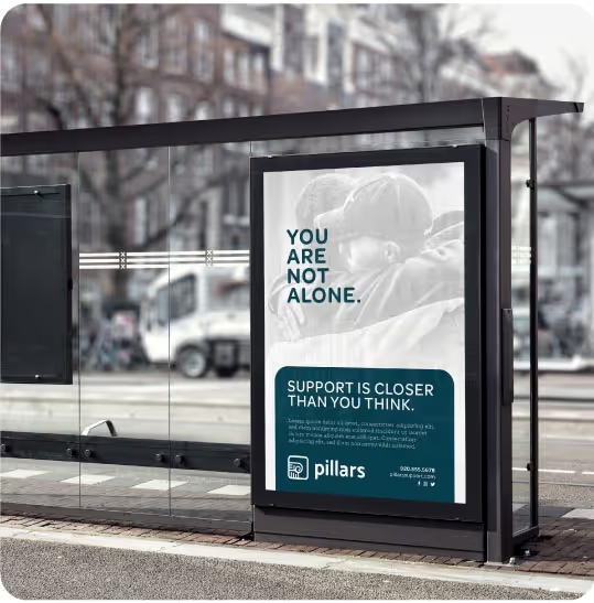
In 1921, a time when household appliances were just beginning to emerge, Harry Miller opened up a small shop in Chicago where he distributed appliances. He had a great relationship with Speed Queen as they were starting their operations and grew a name for himself specifically for that laundry equipment.
Fast forward to today and they're now looking back at 100 years of company history. Harry Miller appliances is still selling quality appliances at affordable prices and Coin-O-Matic, their commercial laundry division, is supplying and servicing equipment and providing relationships with customers across four states. Recently, one of their suppliers created a shift in the market and the Harry Miller family of companies wanted to ensure their namesake wouldn’t get lost in the shuffle.
Everything that would represent the company moving forward needed to fit this mold. It would need to have a historic essence and feel current as well.

Following conversations with business stakeholders, interviews with clients, and completing a competitive analysis, we came to the conclusion that establishing a stronger brand position and updating the visual identity for the Harry Miller family of brands was the best route forward to meet business objectives. With a keen eye on the past, we worked with the Harry Miller leadership team to paint a vision for the future.
A brand promise was solidified and boiled down to one simple statement. "Current laundry solutions from a company with historic values." Everything that would represent the company moving forward needed to fit this mold. It would need to have a historic essence and feel current as well.

A full visual identity solution was developed for the Harry Miller family of brands. This included Harry Miller appliances as well as Coin-O-Matic that now share a singular visual identity to better resonate across residential and commercial offerings. We leveraged historic brand colors, retro typography with modern styled layouts, and a proper mix of historic and modern photos to make everyone feel like their part of the legacy. Since a brand is much deeper than the visual identity, we're continuing to work with the company's leadership team on future brand-lead marketing and promotional efforts.


In 1921, a time when household appliances were just beginning to emerge, Harry Miller opened up a small shop in Chicago where he distributed appliances. He had a great relationship with Speed Queen as they were starting their operations and grew a name for himself specifically for that laundry equipment.
Fast forward to today and they're now looking back at 100 years of company history. Harry Miller appliances is still selling quality appliances at affordable prices and Coin-O-Matic, their commercial laundry division, is supplying and servicing equipment and providing relationships with customers across four states. Recently, one of their suppliers created a shift in the market and the Harry Miller family of companies wanted to ensure their namesake wouldn’t get lost in the shuffle.
Everything that would represent the company moving forward needed to fit this mold. It would need to have a historic essence and feel current as well.

Following conversations with business stakeholders, interviews with clients, and completing a competitive analysis, we came to the conclusion that establishing a stronger brand position and updating the visual identity for the Harry Miller family of brands was the best route forward to meet business objectives. With a keen eye on the past, we worked with the Harry Miller leadership team to paint a vision for the future.
A brand promise was solidified and boiled down to one simple statement. "Current laundry solutions from a company with historic values." Everything that would represent the company moving forward needed to fit this mold. It would need to have a historic essence and feel current as well.


A full visual identity solution was developed for the Harry Miller family of brands. This included Harry Miller appliances as well as Coin-O-Matic that now share a singular visual identity to better resonate across residential and commercial offerings. We leveraged historic brand colors, retro typography with modern styled layouts, and a proper mix of historic and modern photos to make everyone feel like their part of the legacy. Since a brand is much deeper than the visual identity, we're continuing to work with the company's leadership team on future brand-lead marketing and promotional efforts.


Over the last year I've had the pleasure of working with Quill Creative Services to refresh the brand of my family's business which is celebrating its 100th anniversary in 2021. On a scale of 100 for expectations I’d humbly give Quill a score of 200… The discovery, creative and implementation stages could not have gone smoother from my perspective as your typical/busy business owner. Quill invested the time to truly understand my company's history, personality, character, products, services and most importantly our customer base. The end product has taken our brand to a level that I frankly believe to be genius.
MATT MILLER, PRESIDENT, HARRY MILLER COMPANIES
