


A Wisconsin native by the name Steve Gabelbauer spent the majority of his career as a bar and restaurant manager. When an opportunity arose for him to open an establishment of his very own, he gathered together some family recipes and got to work. He knew that in order to differentiate his business from others in the area, he needed to focus on his brand. He led the charge by naming it Gabe’s, a Wisconsin Kitchen & Tavern. Our task was to create a brand that felt like home.

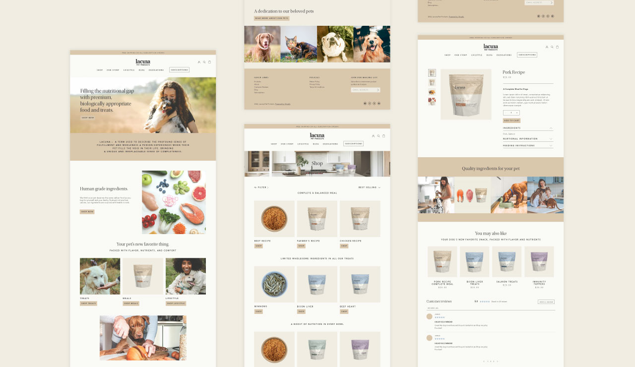

While taking Steve’s vision into consideration and pairing it with found inspiration, we aimed to position the brand as an authentic Wisconsin experience. Just like the personality of the typical Wisconsinite, the identity for Gabe’s needed to be straightforward and bold while giving a tip-of-the-hat to the state’s heritage.

The kitchen & tavern opened to the public and immediately was welcomed into the community with open arms. Today, Gabe’s Wisconsin Kitchen & Tavern has become a staple for those looking for a hearty meal and welcoming midwestern experience.


A Wisconsin native by the name Steve Gabelbauer spent the majority of his career as a bar and restaurant manager. When an opportunity arose for him to open an establishment of his very own, he gathered together some family recipes and got to work. He knew that in order to differentiate his business from others in the area, he needed to focus on his brand. He led the charge by naming it Gabe’s, a Wisconsin Kitchen & Tavern. Our task was to create a brand that felt like home.


While taking Steve’s vision into consideration and pairing it with found inspiration, we aimed to position the brand as an authentic Wisconsin experience. Just like the personality of the typical Wisconsinite, the identity for Gabe’s needed to be straightforward and bold while giving a tip-of-the-hat to the state’s heritage.


The kitchen & tavern opened to the public and immediately was welcomed into the community with open arms. Today, Gabe’s Wisconsin Kitchen & Tavern has become a staple for those looking for a hearty meal and welcoming midwestern experience.



A Wisconsin native by the name Steve Gabelbauer spent the majority of his career as a bar and restaurant manager. When an opportunity arose for him to open an establishment of his very own, he gathered together some family recipes and got to work. He knew that in order to differentiate his business from others in the area, he needed to focus on his brand. He led the charge by naming it Gabe’s, a Wisconsin Kitchen & Tavern. Our task was to create a brand that felt like home.

While taking Steve’s vision into consideration and pairing it with found inspiration, we aimed to position the brand as an authentic Wisconsin experience. Just like the personality of the typical Wisconsinite, the identity for Gabe’s needed to be straightforward and bold while giving a tip-of-the-hat to the state’s heritage.


The kitchen & tavern opened to the public and immediately was welcomed into the community with open arms. Today, Gabe’s Wisconsin Kitchen & Tavern has become a staple for those looking for a hearty meal and welcoming midwestern experience.


A Wisconsin native by the name Steve Gabelbauer spent the majority of his career as a bar and restaurant manager. When an opportunity arose for him to open an establishment of his very own, he gathered together some family recipes and got to work. He knew that in order to differentiate his business from others in the area, he needed to focus on his brand. He led the charge by naming it Gabe’s, a Wisconsin Kitchen & Tavern. Our task was to create a brand that felt like home.


While taking Steve’s vision into consideration and pairing it with found inspiration, we aimed to position the brand as an authentic Wisconsin experience. Just like the personality of the typical Wisconsinite, the identity for Gabe’s needed to be straightforward and bold while giving a tip-of-the-hat to the state’s heritage.


The kitchen & tavern opened to the public and immediately was welcomed into the community with open arms. Today, Gabe’s Wisconsin Kitchen & Tavern has become a staple for those looking for a hearty meal and welcoming midwestern experience.


A Wisconsin native by the name Steve Gabelbauer spent the majority of his career as a bar and restaurant manager. When an opportunity arose for him to open an establishment of his very own, he gathered together some family recipes and got to work. He knew that in order to differentiate his business from others in the area, he needed to focus on his brand. He led the charge by naming it Gabe’s, a Wisconsin Kitchen & Tavern. Our task was to create a brand that felt like home.

While taking Steve’s vision into consideration and pairing it with found inspiration, we aimed to position the brand as an authentic Wisconsin experience. Just like the personality of the typical Wisconsinite, the identity for Gabe’s needed to be straightforward and bold while giving a tip-of-the-hat to the state’s heritage.


The kitchen & tavern opened to the public and immediately was welcomed into the community with open arms. Today, Gabe’s Wisconsin Kitchen & Tavern has become a staple for those looking for a hearty meal and welcoming midwestern experience.


A Wisconsin native by the name Steve Gabelbauer spent the majority of his career as a bar and restaurant manager. When an opportunity arose for him to open an establishment of his very own, he gathered together some family recipes and got to work. He knew that in order to differentiate his business from others in the area, he needed to focus on his brand. He led the charge by naming it Gabe’s, a Wisconsin Kitchen & Tavern. Our task was to create a brand that felt like home.

While taking Steve’s vision into consideration and pairing it with found inspiration, we aimed to position the brand as an authentic Wisconsin experience. Just like the personality of the typical Wisconsinite, the identity for Gabe’s needed to be straightforward and bold while giving a tip-of-the-hat to the state’s heritage.


The kitchen & tavern opened to the public and immediately was welcomed into the community with open arms. Today, Gabe’s Wisconsin Kitchen & Tavern has become a staple for those looking for a hearty meal and welcoming midwestern experience.


A Wisconsin native by the name Steve Gabelbauer spent the majority of his career as a bar and restaurant manager. When an opportunity arose for him to open an establishment of his very own, he gathered together some family recipes and got to work. He knew that in order to differentiate his business from others in the area, he needed to focus on his brand. He led the charge by naming it Gabe’s, a Wisconsin Kitchen & Tavern. Our task was to create a brand that felt like home.


While taking Steve’s vision into consideration and pairing it with found inspiration, we aimed to position the brand as an authentic Wisconsin experience. Just like the personality of the typical Wisconsinite, the identity for Gabe’s needed to be straightforward and bold while giving a tip-of-the-hat to the state’s heritage.

The kitchen & tavern opened to the public and immediately was welcomed into the community with open arms. Today, Gabe’s Wisconsin Kitchen & Tavern has become a staple for those looking for a hearty meal and welcoming midwestern experience.


A Wisconsin native by the name Steve Gabelbauer spent the majority of his career as a bar and restaurant manager. When an opportunity arose for him to open an establishment of his very own, he gathered together some family recipes and got to work. He knew that in order to differentiate his business from others in the area, he needed to focus on his brand. He led the charge by naming it Gabe’s, a Wisconsin Kitchen & Tavern. Our task was to create a brand that felt like home.

While taking Steve’s vision into consideration and pairing it with found inspiration, we aimed to position the brand as an authentic Wisconsin experience. Just like the personality of the typical Wisconsinite, the identity for Gabe’s needed to be straightforward and bold while giving a tip-of-the-hat to the state’s heritage.


The kitchen & tavern opened to the public and immediately was welcomed into the community with open arms. Today, Gabe’s Wisconsin Kitchen & Tavern has become a staple for those looking for a hearty meal and welcoming midwestern experience.


A Wisconsin native by the name Steve Gabelbauer spent the majority of his career as a bar and restaurant manager. When an opportunity arose for him to open an establishment of his very own, he gathered together some family recipes and got to work. He knew that in order to differentiate his business from others in the area, he needed to focus on his brand. He led the charge by naming it Gabe’s, a Wisconsin Kitchen & Tavern. Our task was to create a brand that felt like home.

While taking Steve’s vision into consideration and pairing it with found inspiration, we aimed to position the brand as an authentic Wisconsin experience. Just like the personality of the typical Wisconsinite, the identity for Gabe’s needed to be straightforward and bold while giving a tip-of-the-hat to the state’s heritage.


The kitchen & tavern opened to the public and immediately was welcomed into the community with open arms. Today, Gabe’s Wisconsin Kitchen & Tavern has become a staple for those looking for a hearty meal and welcoming midwestern experience.


A Wisconsin native by the name Steve Gabelbauer spent the majority of his career as a bar and restaurant manager. When an opportunity arose for him to open an establishment of his very own, he gathered together some family recipes and got to work. He knew that in order to differentiate his business from others in the area, he needed to focus on his brand. He led the charge by naming it Gabe’s, a Wisconsin Kitchen & Tavern. Our task was to create a brand that felt like home.


While taking Steve’s vision into consideration and pairing it with found inspiration, we aimed to position the brand as an authentic Wisconsin experience. Just like the personality of the typical Wisconsinite, the identity for Gabe’s needed to be straightforward and bold while giving a tip-of-the-hat to the state’s heritage.

The kitchen & tavern opened to the public and immediately was welcomed into the community with open arms. Today, Gabe’s Wisconsin Kitchen & Tavern has become a staple for those looking for a hearty meal and welcoming midwestern experience.


A Wisconsin native by the name Steve Gabelbauer spent the majority of his career as a bar and restaurant manager. When an opportunity arose for him to open an establishment of his very own, he gathered together some family recipes and got to work. He knew that in order to differentiate his business from others in the area, he needed to focus on his brand. He led the charge by naming it Gabe’s, a Wisconsin Kitchen & Tavern. Our task was to create a brand that felt like home.


While taking Steve’s vision into consideration and pairing it with found inspiration, we aimed to position the brand as an authentic Wisconsin experience. Just like the personality of the typical Wisconsinite, the identity for Gabe’s needed to be straightforward and bold while giving a tip-of-the-hat to the state’s heritage.

The kitchen & tavern opened to the public and immediately was welcomed into the community with open arms. Today, Gabe’s Wisconsin Kitchen & Tavern has become a staple for those looking for a hearty meal and welcoming midwestern experience.


A Wisconsin native by the name Steve Gabelbauer spent the majority of his career as a bar and restaurant manager. When an opportunity arose for him to open an establishment of his very own, he gathered together some family recipes and got to work. He knew that in order to differentiate his business from others in the area, he needed to focus on his brand. He led the charge by naming it Gabe’s, a Wisconsin Kitchen & Tavern. Our task was to create a brand that felt like home.


While taking Steve’s vision into consideration and pairing it with found inspiration, we aimed to position the brand as an authentic Wisconsin experience. Just like the personality of the typical Wisconsinite, the identity for Gabe’s needed to be straightforward and bold while giving a tip-of-the-hat to the state’s heritage.


The kitchen & tavern opened to the public and immediately was welcomed into the community with open arms. Today, Gabe’s Wisconsin Kitchen & Tavern has become a staple for those looking for a hearty meal and welcoming midwestern experience.


A Wisconsin native by the name Steve Gabelbauer spent the majority of his career as a bar and restaurant manager. When an opportunity arose for him to open an establishment of his very own, he gathered together some family recipes and got to work. He knew that in order to differentiate his business from others in the area, he needed to focus on his brand. He led the charge by naming it Gabe’s, a Wisconsin Kitchen & Tavern. Our task was to create a brand that felt like home.


While taking Steve’s vision into consideration and pairing it with found inspiration, we aimed to position the brand as an authentic Wisconsin experience. Just like the personality of the typical Wisconsinite, the identity for Gabe’s needed to be straightforward and bold while giving a tip-of-the-hat to the state’s heritage.


The kitchen & tavern opened to the public and immediately was welcomed into the community with open arms. Today, Gabe’s Wisconsin Kitchen & Tavern has become a staple for those looking for a hearty meal and welcoming midwestern experience.


A Wisconsin native by the name Steve Gabelbauer spent the majority of his career as a bar and restaurant manager. When an opportunity arose for him to open an establishment of his very own, he gathered together some family recipes and got to work. He knew that in order to differentiate his business from others in the area, he needed to focus on his brand. He led the charge by naming it Gabe’s, a Wisconsin Kitchen & Tavern. Our task was to create a brand that felt like home.

While taking Steve’s vision into consideration and pairing it with found inspiration, we aimed to position the brand as an authentic Wisconsin experience. Just like the personality of the typical Wisconsinite, the identity for Gabe’s needed to be straightforward and bold while giving a tip-of-the-hat to the state’s heritage.
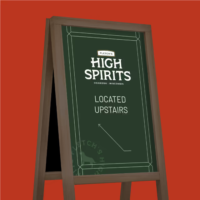

The kitchen & tavern opened to the public and immediately was welcomed into the community with open arms. Today, Gabe’s Wisconsin Kitchen & Tavern has become a staple for those looking for a hearty meal and welcoming midwestern experience.


A Wisconsin native by the name Steve Gabelbauer spent the majority of his career as a bar and restaurant manager. When an opportunity arose for him to open an establishment of his very own, he gathered together some family recipes and got to work. He knew that in order to differentiate his business from others in the area, he needed to focus on his brand. He led the charge by naming it Gabe’s, a Wisconsin Kitchen & Tavern. Our task was to create a brand that felt like home.


While taking Steve’s vision into consideration and pairing it with found inspiration, we aimed to position the brand as an authentic Wisconsin experience. Just like the personality of the typical Wisconsinite, the identity for Gabe’s needed to be straightforward and bold while giving a tip-of-the-hat to the state’s heritage.


The kitchen & tavern opened to the public and immediately was welcomed into the community with open arms. Today, Gabe’s Wisconsin Kitchen & Tavern has become a staple for those looking for a hearty meal and welcoming midwestern experience.


A Wisconsin native by the name Steve Gabelbauer spent the majority of his career as a bar and restaurant manager. When an opportunity arose for him to open an establishment of his very own, he gathered together some family recipes and got to work. He knew that in order to differentiate his business from others in the area, he needed to focus on his brand. He led the charge by naming it Gabe’s, a Wisconsin Kitchen & Tavern. Our task was to create a brand that felt like home.


While taking Steve’s vision into consideration and pairing it with found inspiration, we aimed to position the brand as an authentic Wisconsin experience. Just like the personality of the typical Wisconsinite, the identity for Gabe’s needed to be straightforward and bold while giving a tip-of-the-hat to the state’s heritage.


The kitchen & tavern opened to the public and immediately was welcomed into the community with open arms. Today, Gabe’s Wisconsin Kitchen & Tavern has become a staple for those looking for a hearty meal and welcoming midwestern experience.


A Wisconsin native by the name Steve Gabelbauer spent the majority of his career as a bar and restaurant manager. When an opportunity arose for him to open an establishment of his very own, he gathered together some family recipes and got to work. He knew that in order to differentiate his business from others in the area, he needed to focus on his brand. He led the charge by naming it Gabe’s, a Wisconsin Kitchen & Tavern. Our task was to create a brand that felt like home.


While taking Steve’s vision into consideration and pairing it with found inspiration, we aimed to position the brand as an authentic Wisconsin experience. Just like the personality of the typical Wisconsinite, the identity for Gabe’s needed to be straightforward and bold while giving a tip-of-the-hat to the state’s heritage.


The kitchen & tavern opened to the public and immediately was welcomed into the community with open arms. Today, Gabe’s Wisconsin Kitchen & Tavern has become a staple for those looking for a hearty meal and welcoming midwestern experience.
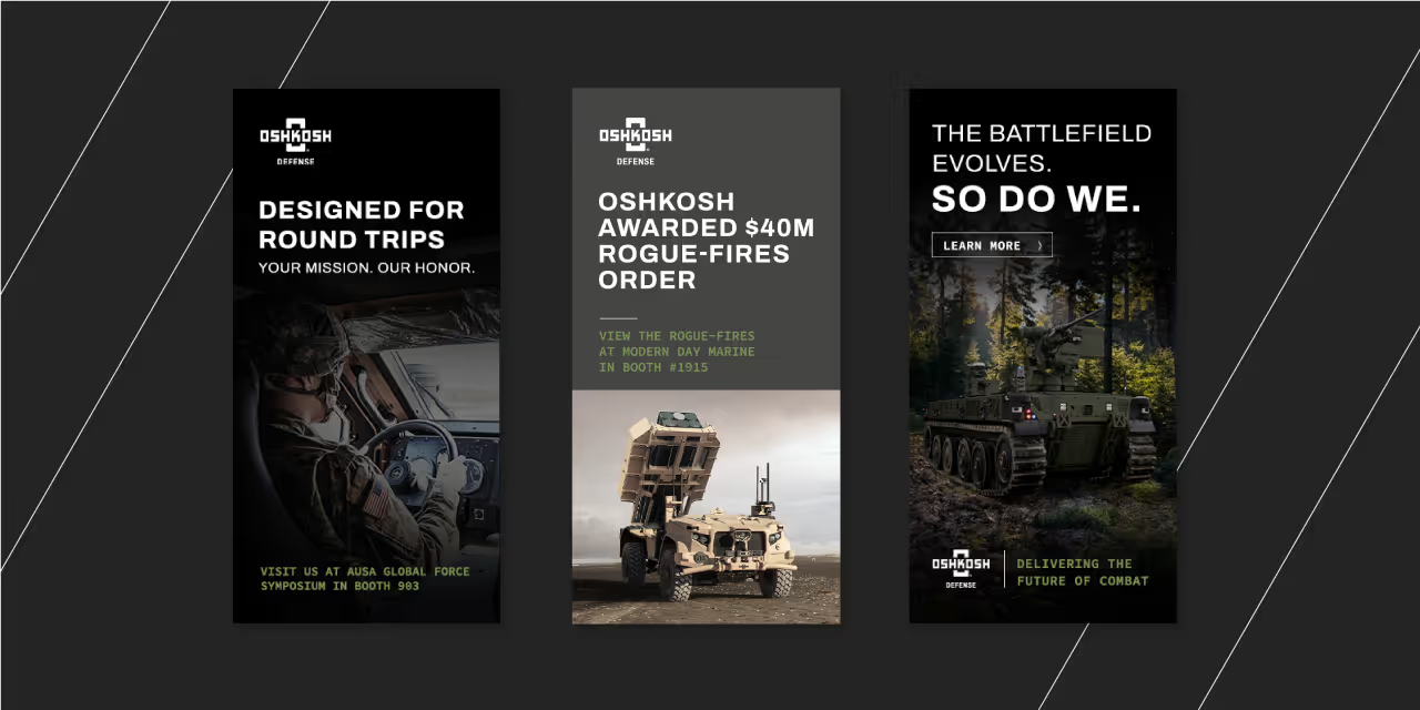


A Wisconsin native by the name Steve Gabelbauer spent the majority of his career as a bar and restaurant manager. When an opportunity arose for him to open an establishment of his very own, he gathered together some family recipes and got to work. He knew that in order to differentiate his business from others in the area, he needed to focus on his brand. He led the charge by naming it Gabe’s, a Wisconsin Kitchen & Tavern. Our task was to create a brand that felt like home.

While taking Steve’s vision into consideration and pairing it with found inspiration, we aimed to position the brand as an authentic Wisconsin experience. Just like the personality of the typical Wisconsinite, the identity for Gabe’s needed to be straightforward and bold while giving a tip-of-the-hat to the state’s heritage.


The kitchen & tavern opened to the public and immediately was welcomed into the community with open arms. Today, Gabe’s Wisconsin Kitchen & Tavern has become a staple for those looking for a hearty meal and welcoming midwestern experience.


A Wisconsin native by the name Steve Gabelbauer spent the majority of his career as a bar and restaurant manager. When an opportunity arose for him to open an establishment of his very own, he gathered together some family recipes and got to work. He knew that in order to differentiate his business from others in the area, he needed to focus on his brand. He led the charge by naming it Gabe’s, a Wisconsin Kitchen & Tavern. Our task was to create a brand that felt like home.


While taking Steve’s vision into consideration and pairing it with found inspiration, we aimed to position the brand as an authentic Wisconsin experience. Just like the personality of the typical Wisconsinite, the identity for Gabe’s needed to be straightforward and bold while giving a tip-of-the-hat to the state’s heritage.


The kitchen & tavern opened to the public and immediately was welcomed into the community with open arms. Today, Gabe’s Wisconsin Kitchen & Tavern has become a staple for those looking for a hearty meal and welcoming midwestern experience.


A Wisconsin native by the name Steve Gabelbauer spent the majority of his career as a bar and restaurant manager. When an opportunity arose for him to open an establishment of his very own, he gathered together some family recipes and got to work. He knew that in order to differentiate his business from others in the area, he needed to focus on his brand. He led the charge by naming it Gabe’s, a Wisconsin Kitchen & Tavern. Our task was to create a brand that felt like home.


While taking Steve’s vision into consideration and pairing it with found inspiration, we aimed to position the brand as an authentic Wisconsin experience. Just like the personality of the typical Wisconsinite, the identity for Gabe’s needed to be straightforward and bold while giving a tip-of-the-hat to the state’s heritage.


The kitchen & tavern opened to the public and immediately was welcomed into the community with open arms. Today, Gabe’s Wisconsin Kitchen & Tavern has become a staple for those looking for a hearty meal and welcoming midwestern experience.



A Wisconsin native by the name Steve Gabelbauer spent the majority of his career as a bar and restaurant manager. When an opportunity arose for him to open an establishment of his very own, he gathered together some family recipes and got to work. He knew that in order to differentiate his business from others in the area, he needed to focus on his brand. He led the charge by naming it Gabe’s, a Wisconsin Kitchen & Tavern. Our task was to create a brand that felt like home.


While taking Steve’s vision into consideration and pairing it with found inspiration, we aimed to position the brand as an authentic Wisconsin experience. Just like the personality of the typical Wisconsinite, the identity for Gabe’s needed to be straightforward and bold while giving a tip-of-the-hat to the state’s heritage.


The kitchen & tavern opened to the public and immediately was welcomed into the community with open arms. Today, Gabe’s Wisconsin Kitchen & Tavern has become a staple for those looking for a hearty meal and welcoming midwestern experience.


A Wisconsin native by the name Steve Gabelbauer spent the majority of his career as a bar and restaurant manager. When an opportunity arose for him to open an establishment of his very own, he gathered together some family recipes and got to work. He knew that in order to differentiate his business from others in the area, he needed to focus on his brand. He led the charge by naming it Gabe’s, a Wisconsin Kitchen & Tavern. Our task was to create a brand that felt like home.

While taking Steve’s vision into consideration and pairing it with found inspiration, we aimed to position the brand as an authentic Wisconsin experience. Just like the personality of the typical Wisconsinite, the identity for Gabe’s needed to be straightforward and bold while giving a tip-of-the-hat to the state’s heritage.


The kitchen & tavern opened to the public and immediately was welcomed into the community with open arms. Today, Gabe’s Wisconsin Kitchen & Tavern has become a staple for those looking for a hearty meal and welcoming midwestern experience.


A Wisconsin native by the name Steve Gabelbauer spent the majority of his career as a bar and restaurant manager. When an opportunity arose for him to open an establishment of his very own, he gathered together some family recipes and got to work. He knew that in order to differentiate his business from others in the area, he needed to focus on his brand. He led the charge by naming it Gabe’s, a Wisconsin Kitchen & Tavern. Our task was to create a brand that felt like home.


While taking Steve’s vision into consideration and pairing it with found inspiration, we aimed to position the brand as an authentic Wisconsin experience. Just like the personality of the typical Wisconsinite, the identity for Gabe’s needed to be straightforward and bold while giving a tip-of-the-hat to the state’s heritage.


The kitchen & tavern opened to the public and immediately was welcomed into the community with open arms. Today, Gabe’s Wisconsin Kitchen & Tavern has become a staple for those looking for a hearty meal and welcoming midwestern experience.

A Wisconsin native by the name Steve Gabelbauer spent the majority of his career as a bar and restaurant manager. When an opportunity arose for him to open an establishment of his very own, he gathered together some family recipes and got to work. He knew that in order to differentiate his business from others in the area, he needed to focus on his brand. He led the charge by naming it Gabe’s, a Wisconsin Kitchen & Tavern. Our task was to create a brand that felt like home.


While taking Steve’s vision into consideration and pairing it with found inspiration, we aimed to position the brand as an authentic Wisconsin experience. Just like the personality of the typical Wisconsinite, the identity for Gabe’s needed to be straightforward and bold while giving a tip-of-the-hat to the state’s heritage.


The kitchen & tavern opened to the public and immediately was welcomed into the community with open arms. Today, Gabe’s Wisconsin Kitchen & Tavern has become a staple for those looking for a hearty meal and welcoming midwestern experience.


A Wisconsin native by the name Steve Gabelbauer spent the majority of his career as a bar and restaurant manager. When an opportunity arose for him to open an establishment of his very own, he gathered together some family recipes and got to work. He knew that in order to differentiate his business from others in the area, he needed to focus on his brand. He led the charge by naming it Gabe’s, a Wisconsin Kitchen & Tavern. Our task was to create a brand that felt like home.

While taking Steve’s vision into consideration and pairing it with found inspiration, we aimed to position the brand as an authentic Wisconsin experience. Just like the personality of the typical Wisconsinite, the identity for Gabe’s needed to be straightforward and bold while giving a tip-of-the-hat to the state’s heritage.


The kitchen & tavern opened to the public and immediately was welcomed into the community with open arms. Today, Gabe’s Wisconsin Kitchen & Tavern has become a staple for those looking for a hearty meal and welcoming midwestern experience.


A Wisconsin native by the name Steve Gabelbauer spent the majority of his career as a bar and restaurant manager. When an opportunity arose for him to open an establishment of his very own, he gathered together some family recipes and got to work. He knew that in order to differentiate his business from others in the area, he needed to focus on his brand. He led the charge by naming it Gabe’s, a Wisconsin Kitchen & Tavern. Our task was to create a brand that felt like home.


While taking Steve’s vision into consideration and pairing it with found inspiration, we aimed to position the brand as an authentic Wisconsin experience. Just like the personality of the typical Wisconsinite, the identity for Gabe’s needed to be straightforward and bold while giving a tip-of-the-hat to the state’s heritage.


The kitchen & tavern opened to the public and immediately was welcomed into the community with open arms. Today, Gabe’s Wisconsin Kitchen & Tavern has become a staple for those looking for a hearty meal and welcoming midwestern experience.


A Wisconsin native by the name Steve Gabelbauer spent the majority of his career as a bar and restaurant manager. When an opportunity arose for him to open an establishment of his very own, he gathered together some family recipes and got to work. He knew that in order to differentiate his business from others in the area, he needed to focus on his brand. He led the charge by naming it Gabe’s, a Wisconsin Kitchen & Tavern. Our task was to create a brand that felt like home.


While taking Steve’s vision into consideration and pairing it with found inspiration, we aimed to position the brand as an authentic Wisconsin experience. Just like the personality of the typical Wisconsinite, the identity for Gabe’s needed to be straightforward and bold while giving a tip-of-the-hat to the state’s heritage.


The kitchen & tavern opened to the public and immediately was welcomed into the community with open arms. Today, Gabe’s Wisconsin Kitchen & Tavern has become a staple for those looking for a hearty meal and welcoming midwestern experience.


A Wisconsin native by the name Steve Gabelbauer spent the majority of his career as a bar and restaurant manager. When an opportunity arose for him to open an establishment of his very own, he gathered together some family recipes and got to work. He knew that in order to differentiate his business from others in the area, he needed to focus on his brand. He led the charge by naming it Gabe’s, a Wisconsin Kitchen & Tavern. Our task was to create a brand that felt like home.


While taking Steve’s vision into consideration and pairing it with found inspiration, we aimed to position the brand as an authentic Wisconsin experience. Just like the personality of the typical Wisconsinite, the identity for Gabe’s needed to be straightforward and bold while giving a tip-of-the-hat to the state’s heritage.


The kitchen & tavern opened to the public and immediately was welcomed into the community with open arms. Today, Gabe’s Wisconsin Kitchen & Tavern has become a staple for those looking for a hearty meal and welcoming midwestern experience.


A Wisconsin native by the name Steve Gabelbauer spent the majority of his career as a bar and restaurant manager. When an opportunity arose for him to open an establishment of his very own, he gathered together some family recipes and got to work. He knew that in order to differentiate his business from others in the area, he needed to focus on his brand. He led the charge by naming it Gabe’s, a Wisconsin Kitchen & Tavern. Our task was to create a brand that felt like home.


While taking Steve’s vision into consideration and pairing it with found inspiration, we aimed to position the brand as an authentic Wisconsin experience. Just like the personality of the typical Wisconsinite, the identity for Gabe’s needed to be straightforward and bold while giving a tip-of-the-hat to the state’s heritage.


The kitchen & tavern opened to the public and immediately was welcomed into the community with open arms. Today, Gabe’s Wisconsin Kitchen & Tavern has become a staple for those looking for a hearty meal and welcoming midwestern experience.


A Wisconsin native by the name Steve Gabelbauer spent the majority of his career as a bar and restaurant manager. When an opportunity arose for him to open an establishment of his very own, he gathered together some family recipes and got to work. He knew that in order to differentiate his business from others in the area, he needed to focus on his brand. He led the charge by naming it Gabe’s, a Wisconsin Kitchen & Tavern. Our task was to create a brand that felt like home.

While taking Steve’s vision into consideration and pairing it with found inspiration, we aimed to position the brand as an authentic Wisconsin experience. Just like the personality of the typical Wisconsinite, the identity for Gabe’s needed to be straightforward and bold while giving a tip-of-the-hat to the state’s heritage.


The kitchen & tavern opened to the public and immediately was welcomed into the community with open arms. Today, Gabe’s Wisconsin Kitchen & Tavern has become a staple for those looking for a hearty meal and welcoming midwestern experience.


A Wisconsin native by the name Steve Gabelbauer spent the majority of his career as a bar and restaurant manager. When an opportunity arose for him to open an establishment of his very own, he gathered together some family recipes and got to work. He knew that in order to differentiate his business from others in the area, he needed to focus on his brand. He led the charge by naming it Gabe’s, a Wisconsin Kitchen & Tavern. Our task was to create a brand that felt like home.




While taking Steve’s vision into consideration and pairing it with found inspiration, we aimed to position the brand as an authentic Wisconsin experience. Just like the personality of the typical Wisconsinite, the identity for Gabe’s needed to be straightforward and bold while giving a tip-of-the-hat to the state’s heritage.


The kitchen & tavern opened to the public and immediately was welcomed into the community with open arms. Today, Gabe’s Wisconsin Kitchen & Tavern has become a staple for those looking for a hearty meal and welcoming midwestern experience.


A Wisconsin native by the name Steve Gabelbauer spent the majority of his career as a bar and restaurant manager. When an opportunity arose for him to open an establishment of his very own, he gathered together some family recipes and got to work. He knew that in order to differentiate his business from others in the area, he needed to focus on his brand. He led the charge by naming it Gabe’s, a Wisconsin Kitchen & Tavern. Our task was to create a brand that felt like home.

While taking Steve’s vision into consideration and pairing it with found inspiration, we aimed to position the brand as an authentic Wisconsin experience. Just like the personality of the typical Wisconsinite, the identity for Gabe’s needed to be straightforward and bold while giving a tip-of-the-hat to the state’s heritage.


The kitchen & tavern opened to the public and immediately was welcomed into the community with open arms. Today, Gabe’s Wisconsin Kitchen & Tavern has become a staple for those looking for a hearty meal and welcoming midwestern experience.


A Wisconsin native by the name Steve Gabelbauer spent the majority of his career as a bar and restaurant manager. When an opportunity arose for him to open an establishment of his very own, he gathered together some family recipes and got to work. He knew that in order to differentiate his business from others in the area, he needed to focus on his brand. He led the charge by naming it Gabe’s, a Wisconsin Kitchen & Tavern. Our task was to create a brand that felt like home.


While taking Steve’s vision into consideration and pairing it with found inspiration, we aimed to position the brand as an authentic Wisconsin experience. Just like the personality of the typical Wisconsinite, the identity for Gabe’s needed to be straightforward and bold while giving a tip-of-the-hat to the state’s heritage.



The kitchen & tavern opened to the public and immediately was welcomed into the community with open arms. Today, Gabe’s Wisconsin Kitchen & Tavern has become a staple for those looking for a hearty meal and welcoming midwestern experience.


A Wisconsin native by the name Steve Gabelbauer spent the majority of his career as a bar and restaurant manager. When an opportunity arose for him to open an establishment of his very own, he gathered together some family recipes and got to work. He knew that in order to differentiate his business from others in the area, he needed to focus on his brand. He led the charge by naming it Gabe’s, a Wisconsin Kitchen & Tavern. Our task was to create a brand that felt like home.


While taking Steve’s vision into consideration and pairing it with found inspiration, we aimed to position the brand as an authentic Wisconsin experience. Just like the personality of the typical Wisconsinite, the identity for Gabe’s needed to be straightforward and bold while giving a tip-of-the-hat to the state’s heritage.


The kitchen & tavern opened to the public and immediately was welcomed into the community with open arms. Today, Gabe’s Wisconsin Kitchen & Tavern has become a staple for those looking for a hearty meal and welcoming midwestern experience.


A Wisconsin native by the name Steve Gabelbauer spent the majority of his career as a bar and restaurant manager. When an opportunity arose for him to open an establishment of his very own, he gathered together some family recipes and got to work. He knew that in order to differentiate his business from others in the area, he needed to focus on his brand. He led the charge by naming it Gabe’s, a Wisconsin Kitchen & Tavern. Our task was to create a brand that felt like home.


While taking Steve’s vision into consideration and pairing it with found inspiration, we aimed to position the brand as an authentic Wisconsin experience. Just like the personality of the typical Wisconsinite, the identity for Gabe’s needed to be straightforward and bold while giving a tip-of-the-hat to the state’s heritage.


The kitchen & tavern opened to the public and immediately was welcomed into the community with open arms. Today, Gabe’s Wisconsin Kitchen & Tavern has become a staple for those looking for a hearty meal and welcoming midwestern experience.


A Wisconsin native by the name Steve Gabelbauer spent the majority of his career as a bar and restaurant manager. When an opportunity arose for him to open an establishment of his very own, he gathered together some family recipes and got to work. He knew that in order to differentiate his business from others in the area, he needed to focus on his brand. He led the charge by naming it Gabe’s, a Wisconsin Kitchen & Tavern. Our task was to create a brand that felt like home.


While taking Steve’s vision into consideration and pairing it with found inspiration, we aimed to position the brand as an authentic Wisconsin experience. Just like the personality of the typical Wisconsinite, the identity for Gabe’s needed to be straightforward and bold while giving a tip-of-the-hat to the state’s heritage.





A Wisconsin native by the name Steve Gabelbauer spent the majority of his career as a bar and restaurant manager. When an opportunity arose for him to open an establishment of his very own, he gathered together some family recipes and got to work. He knew that in order to differentiate his business from others in the area, he needed to focus on his brand. He led the charge by naming it Gabe’s, a Wisconsin Kitchen & Tavern. Our task was to create a brand that felt like home.
While taking Steve’s vision into consideration and pairing it with found inspiration, we aimed to position the brand as an authentic Wisconsin experience. Just like the personality of the typical Wisconsinite, the identity for Gabe’s needed to be straightforward and bold while giving a tip-of-the-hat to the state’s heritage.


The kitchen & tavern opened to the public and immediately was welcomed into the community with open arms. Today, Gabe’s Wisconsin Kitchen & Tavern has become a staple for those looking for a hearty meal and welcoming midwestern experience.


A Wisconsin native by the name Steve Gabelbauer spent the majority of his career as a bar and restaurant manager. When an opportunity arose for him to open an establishment of his very own, he gathered together some family recipes and got to work. He knew that in order to differentiate his business from others in the area, he needed to focus on his brand. He led the charge by naming it Gabe’s, a Wisconsin Kitchen & Tavern. Our task was to create a brand that felt like home.


While taking Steve’s vision into consideration and pairing it with found inspiration, we aimed to position the brand as an authentic Wisconsin experience. Just like the personality of the typical Wisconsinite, the identity for Gabe’s needed to be straightforward and bold while giving a tip-of-the-hat to the state’s heritage.
The kitchen & tavern opened to the public and immediately was welcomed into the community with open arms. Today, Gabe’s Wisconsin Kitchen & Tavern has become a staple for those looking for a hearty meal and welcoming midwestern experience.

A Wisconsin native by the name Steve Gabelbauer spent the majority of his career as a bar and restaurant manager. When an opportunity arose for him to open an establishment of his very own, he gathered together some family recipes and got to work. He knew that in order to differentiate his business from others in the area, he needed to focus on his brand. He led the charge by naming it Gabe’s, a Wisconsin Kitchen & Tavern. Our task was to create a brand that felt like home.


While taking Steve’s vision into consideration and pairing it with found inspiration, we aimed to position the brand as an authentic Wisconsin experience. Just like the personality of the typical Wisconsinite, the identity for Gabe’s needed to be straightforward and bold while giving a tip-of-the-hat to the state’s heritage.


The kitchen & tavern opened to the public and immediately was welcomed into the community with open arms. Today, Gabe’s Wisconsin Kitchen & Tavern has become a staple for those looking for a hearty meal and welcoming midwestern experience.


A Wisconsin native by the name Steve Gabelbauer spent the majority of his career as a bar and restaurant manager. When an opportunity arose for him to open an establishment of his very own, he gathered together some family recipes and got to work. He knew that in order to differentiate his business from others in the area, he needed to focus on his brand. He led the charge by naming it Gabe’s, a Wisconsin Kitchen & Tavern. Our task was to create a brand that felt like home.

While taking Steve’s vision into consideration and pairing it with found inspiration, we aimed to position the brand as an authentic Wisconsin experience. Just like the personality of the typical Wisconsinite, the identity for Gabe’s needed to be straightforward and bold while giving a tip-of-the-hat to the state’s heritage.


The kitchen & tavern opened to the public and immediately was welcomed into the community with open arms. Today, Gabe’s Wisconsin Kitchen & Tavern has become a staple for those looking for a hearty meal and welcoming midwestern experience.


A Wisconsin native by the name Steve Gabelbauer spent the majority of his career as a bar and restaurant manager. When an opportunity arose for him to open an establishment of his very own, he gathered together some family recipes and got to work. He knew that in order to differentiate his business from others in the area, he needed to focus on his brand. He led the charge by naming it Gabe’s, a Wisconsin Kitchen & Tavern. Our task was to create a brand that felt like home.

While taking Steve’s vision into consideration and pairing it with found inspiration, we aimed to position the brand as an authentic Wisconsin experience. Just like the personality of the typical Wisconsinite, the identity for Gabe’s needed to be straightforward and bold while giving a tip-of-the-hat to the state’s heritage.

The kitchen & tavern opened to the public and immediately was welcomed into the community with open arms. Today, Gabe’s Wisconsin Kitchen & Tavern has become a staple for those looking for a hearty meal and welcoming midwestern experience.


A Wisconsin native by the name Steve Gabelbauer spent the majority of his career as a bar and restaurant manager. When an opportunity arose for him to open an establishment of his very own, he gathered together some family recipes and got to work. He knew that in order to differentiate his business from others in the area, he needed to focus on his brand. He led the charge by naming it Gabe’s, a Wisconsin Kitchen & Tavern. Our task was to create a brand that felt like home.


While taking Steve’s vision into consideration and pairing it with found inspiration, we aimed to position the brand as an authentic Wisconsin experience. Just like the personality of the typical Wisconsinite, the identity for Gabe’s needed to be straightforward and bold while giving a tip-of-the-hat to the state’s heritage.


The kitchen & tavern opened to the public and immediately was welcomed into the community with open arms. Today, Gabe’s Wisconsin Kitchen & Tavern has become a staple for those looking for a hearty meal and welcoming midwestern experience.



A Wisconsin native by the name Steve Gabelbauer spent the majority of his career as a bar and restaurant manager. When an opportunity arose for him to open an establishment of his very own, he gathered together some family recipes and got to work. He knew that in order to differentiate his business from others in the area, he needed to focus on his brand. He led the charge by naming it Gabe’s, a Wisconsin Kitchen & Tavern. Our task was to create a brand that felt like home.
While taking Steve’s vision into consideration and pairing it with found inspiration, we aimed to position the brand as an authentic Wisconsin experience. Just like the personality of the typical Wisconsinite, the identity for Gabe’s needed to be straightforward and bold while giving a tip-of-the-hat to the state’s heritage.


The kitchen & tavern opened to the public and immediately was welcomed into the community with open arms. Today, Gabe’s Wisconsin Kitchen & Tavern has become a staple for those looking for a hearty meal and welcoming midwestern experience.


A Wisconsin native by the name Steve Gabelbauer spent the majority of his career as a bar and restaurant manager. When an opportunity arose for him to open an establishment of his very own, he gathered together some family recipes and got to work. He knew that in order to differentiate his business from others in the area, he needed to focus on his brand. He led the charge by naming it Gabe’s, a Wisconsin Kitchen & Tavern. Our task was to create a brand that felt like home.


While taking Steve’s vision into consideration and pairing it with found inspiration, we aimed to position the brand as an authentic Wisconsin experience. Just like the personality of the typical Wisconsinite, the identity for Gabe’s needed to be straightforward and bold while giving a tip-of-the-hat to the state’s heritage.


The kitchen & tavern opened to the public and immediately was welcomed into the community with open arms. Today, Gabe’s Wisconsin Kitchen & Tavern has become a staple for those looking for a hearty meal and welcoming midwestern experience.


A Wisconsin native by the name Steve Gabelbauer spent the majority of his career as a bar and restaurant manager. When an opportunity arose for him to open an establishment of his very own, he gathered together some family recipes and got to work. He knew that in order to differentiate his business from others in the area, he needed to focus on his brand. He led the charge by naming it Gabe’s, a Wisconsin Kitchen & Tavern. Our task was to create a brand that felt like home.


While taking Steve’s vision into consideration and pairing it with found inspiration, we aimed to position the brand as an authentic Wisconsin experience. Just like the personality of the typical Wisconsinite, the identity for Gabe’s needed to be straightforward and bold while giving a tip-of-the-hat to the state’s heritage.


The kitchen & tavern opened to the public and immediately was welcomed into the community with open arms. Today, Gabe’s Wisconsin Kitchen & Tavern has become a staple for those looking for a hearty meal and welcoming midwestern experience.


A Wisconsin native by the name Steve Gabelbauer spent the majority of his career as a bar and restaurant manager. When an opportunity arose for him to open an establishment of his very own, he gathered together some family recipes and got to work. He knew that in order to differentiate his business from others in the area, he needed to focus on his brand. He led the charge by naming it Gabe’s, a Wisconsin Kitchen & Tavern. Our task was to create a brand that felt like home.


While taking Steve’s vision into consideration and pairing it with found inspiration, we aimed to position the brand as an authentic Wisconsin experience. Just like the personality of the typical Wisconsinite, the identity for Gabe’s needed to be straightforward and bold while giving a tip-of-the-hat to the state’s heritage.


The kitchen & tavern opened to the public and immediately was welcomed into the community with open arms. Today, Gabe’s Wisconsin Kitchen & Tavern has become a staple for those looking for a hearty meal and welcoming midwestern experience.


A Wisconsin native by the name Steve Gabelbauer spent the majority of his career as a bar and restaurant manager. When an opportunity arose for him to open an establishment of his very own, he gathered together some family recipes and got to work. He knew that in order to differentiate his business from others in the area, he needed to focus on his brand. He led the charge by naming it Gabe’s, a Wisconsin Kitchen & Tavern. Our task was to create a brand that felt like home.

While taking Steve’s vision into consideration and pairing it with found inspiration, we aimed to position the brand as an authentic Wisconsin experience. Just like the personality of the typical Wisconsinite, the identity for Gabe’s needed to be straightforward and bold while giving a tip-of-the-hat to the state’s heritage.


The kitchen & tavern opened to the public and immediately was welcomed into the community with open arms. Today, Gabe’s Wisconsin Kitchen & Tavern has become a staple for those looking for a hearty meal and welcoming midwestern experience.

A Wisconsin native by the name Steve Gabelbauer spent the majority of his career as a bar and restaurant manager. When an opportunity arose for him to open an establishment of his very own, he gathered together some family recipes and got to work. He knew that in order to differentiate his business from others in the area, he needed to focus on his brand. He led the charge by naming it Gabe’s, a Wisconsin Kitchen & Tavern. Our task was to create a brand that felt like home.

While taking Steve’s vision into consideration and pairing it with found inspiration, we aimed to position the brand as an authentic Wisconsin experience. Just like the personality of the typical Wisconsinite, the identity for Gabe’s needed to be straightforward and bold while giving a tip-of-the-hat to the state’s heritage.


The kitchen & tavern opened to the public and immediately was welcomed into the community with open arms. Today, Gabe’s Wisconsin Kitchen & Tavern has become a staple for those looking for a hearty meal and welcoming midwestern experience.



A Wisconsin native by the name Steve Gabelbauer spent the majority of his career as a bar and restaurant manager. When an opportunity arose for him to open an establishment of his very own, he gathered together some family recipes and got to work. He knew that in order to differentiate his business from others in the area, he needed to focus on his brand. He led the charge by naming it Gabe’s, a Wisconsin Kitchen & Tavern. Our task was to create a brand that felt like home.


While taking Steve’s vision into consideration and pairing it with found inspiration, we aimed to position the brand as an authentic Wisconsin experience. Just like the personality of the typical Wisconsinite, the identity for Gabe’s needed to be straightforward and bold while giving a tip-of-the-hat to the state’s heritage.


The kitchen & tavern opened to the public and immediately was welcomed into the community with open arms. Today, Gabe’s Wisconsin Kitchen & Tavern has become a staple for those looking for a hearty meal and welcoming midwestern experience.


A Wisconsin native by the name Steve Gabelbauer spent the majority of his career as a bar and restaurant manager. When an opportunity arose for him to open an establishment of his very own, he gathered together some family recipes and got to work. He knew that in order to differentiate his business from others in the area, he needed to focus on his brand. He led the charge by naming it Gabe’s, a Wisconsin Kitchen & Tavern. Our task was to create a brand that felt like home.


While taking Steve’s vision into consideration and pairing it with found inspiration, we aimed to position the brand as an authentic Wisconsin experience. Just like the personality of the typical Wisconsinite, the identity for Gabe’s needed to be straightforward and bold while giving a tip-of-the-hat to the state’s heritage.


The kitchen & tavern opened to the public and immediately was welcomed into the community with open arms. Today, Gabe’s Wisconsin Kitchen & Tavern has become a staple for those looking for a hearty meal and welcoming midwestern experience.


A Wisconsin native by the name Steve Gabelbauer spent the majority of his career as a bar and restaurant manager. When an opportunity arose for him to open an establishment of his very own, he gathered together some family recipes and got to work. He knew that in order to differentiate his business from others in the area, he needed to focus on his brand. He led the charge by naming it Gabe’s, a Wisconsin Kitchen & Tavern. Our task was to create a brand that felt like home.

While taking Steve’s vision into consideration and pairing it with found inspiration, we aimed to position the brand as an authentic Wisconsin experience. Just like the personality of the typical Wisconsinite, the identity for Gabe’s needed to be straightforward and bold while giving a tip-of-the-hat to the state’s heritage.


The kitchen & tavern opened to the public and immediately was welcomed into the community with open arms. Today, Gabe’s Wisconsin Kitchen & Tavern has become a staple for those looking for a hearty meal and welcoming midwestern experience.


A Wisconsin native by the name Steve Gabelbauer spent the majority of his career as a bar and restaurant manager. When an opportunity arose for him to open an establishment of his very own, he gathered together some family recipes and got to work. He knew that in order to differentiate his business from others in the area, he needed to focus on his brand. He led the charge by naming it Gabe’s, a Wisconsin Kitchen & Tavern. Our task was to create a brand that felt like home.


While taking Steve’s vision into consideration and pairing it with found inspiration, we aimed to position the brand as an authentic Wisconsin experience. Just like the personality of the typical Wisconsinite, the identity for Gabe’s needed to be straightforward and bold while giving a tip-of-the-hat to the state’s heritage.

The kitchen & tavern opened to the public and immediately was welcomed into the community with open arms. Today, Gabe’s Wisconsin Kitchen & Tavern has become a staple for those looking for a hearty meal and welcoming midwestern experience.


A Wisconsin native by the name Steve Gabelbauer spent the majority of his career as a bar and restaurant manager. When an opportunity arose for him to open an establishment of his very own, he gathered together some family recipes and got to work. He knew that in order to differentiate his business from others in the area, he needed to focus on his brand. He led the charge by naming it Gabe’s, a Wisconsin Kitchen & Tavern. Our task was to create a brand that felt like home.

While taking Steve’s vision into consideration and pairing it with found inspiration, we aimed to position the brand as an authentic Wisconsin experience. Just like the personality of the typical Wisconsinite, the identity for Gabe’s needed to be straightforward and bold while giving a tip-of-the-hat to the state’s heritage.


The kitchen & tavern opened to the public and immediately was welcomed into the community with open arms. Today, Gabe’s Wisconsin Kitchen & Tavern has become a staple for those looking for a hearty meal and welcoming midwestern experience.


The kitchen & tavern opened to the public and immediately was welcomed into the community with open arms. Today, Gabe’s Wisconsin Kitchen & Tavern has become a staple for those looking for a hearty meal and welcoming midwestern experience.
A Wisconsin native by the name Steve Gabelbauer spent the majority of his career as a bar and restaurant manager. When an opportunity arose for him to open an establishment of his very own, he gathered together some family recipes and got to work. He knew that in order to differentiate his business from others in the area, he needed to focus on his brand. He led the charge by naming it Gabe’s, a Wisconsin Kitchen & Tavern. Our task was to create a brand that felt like home.

While taking Steve’s vision into consideration and pairing it with found inspiration, we aimed to position the brand as an authentic Wisconsin experience. Just like the personality of the typical Wisconsinite, the identity for Gabe’s needed to be straightforward and bold while giving a tip-of-the-hat to the state’s heritage.

The kitchen & tavern opened to the public and immediately was welcomed into the community with open arms. Today, Gabe’s Wisconsin Kitchen & Tavern has become a staple for those looking for a hearty meal and welcoming midwestern experience.

The kitchen & tavern opened to the public and immediately was welcomed into the community with open arms. Today, Gabe’s Wisconsin Kitchen & Tavern has become a staple for those looking for a hearty meal and welcoming midwestern experience.

While taking Steve’s vision into consideration and pairing it with found inspiration, we aimed to position the brand as an authentic Wisconsin experience. Just like the personality of the typical Wisconsinite, the identity for Gabe’s needed to be straightforward and bold while giving a tip-of-the-hat to the state’s heritage.

A Wisconsin native by the name Steve Gabelbauer spent the majority of his career as a bar and restaurant manager. When an opportunity arose for him to open an establishment of his very own, he gathered together some family recipes and got to work. He knew that in order to differentiate his business from others in the area, he needed to focus on his brand. He led the charge by naming it Gabe’s, a Wisconsin Kitchen & Tavern. Our task was to create a brand that felt like home.

The kitchen & tavern opened to the public and immediately was welcomed into the community with open arms. Today, Gabe’s Wisconsin Kitchen & Tavern has become a staple for those looking for a hearty meal and welcoming midwestern experience.


The kitchen & tavern opened to the public and immediately was welcomed into the community with open arms. Today, Gabe’s Wisconsin Kitchen & Tavern has become a staple for those looking for a hearty meal and welcoming midwestern experience.


A Wisconsin native by the name Steve Gabelbauer spent the majority of his career as a bar and restaurant manager. When an opportunity arose for him to open an establishment of his very own, he gathered together some family recipes and got to work. He knew that in order to differentiate his business from others in the area, he needed to focus on his brand. He led the charge by naming it Gabe’s, a Wisconsin Kitchen & Tavern. Our task was to create a brand that felt like home.


While taking Steve’s vision into consideration and pairing it with found inspiration, we aimed to position the brand as an authentic Wisconsin experience. Just like the personality of the typical Wisconsinite, the identity for Gabe’s needed to be straightforward and bold while giving a tip-of-the-hat to the state’s heritage.

The kitchen & tavern opened to the public and immediately was welcomed into the community with open arms. Today, Gabe’s Wisconsin Kitchen & Tavern has become a staple for those looking for a hearty meal and welcoming midwestern experience.


A Wisconsin native by the name Steve Gabelbauer spent the majority of his career as a bar and restaurant manager. When an opportunity arose for him to open an establishment of his very own, he gathered together some family recipes and got to work. He knew that in order to differentiate his business from others in the area, he needed to focus on his brand. He led the charge by naming it Gabe’s, a Wisconsin Kitchen & Tavern. Our task was to create a brand that felt like home.
While taking Steve’s vision into consideration and pairing it with found inspiration, we aimed to position the brand as an authentic Wisconsin experience. Just like the personality of the typical Wisconsinite, the identity for Gabe’s needed to be straightforward and bold while giving a tip-of-the-hat to the state’s heritage.


The kitchen & tavern opened to the public and immediately was welcomed into the community with open arms. Today, Gabe’s Wisconsin Kitchen & Tavern has become a staple for those looking for a hearty meal and welcoming midwestern experience.


A Wisconsin native by the name Steve Gabelbauer spent the majority of his career as a bar and restaurant manager. When an opportunity arose for him to open an establishment of his very own, he gathered together some family recipes and got to work. He knew that in order to differentiate his business from others in the area, he needed to focus on his brand. He led the charge by naming it Gabe’s, a Wisconsin Kitchen & Tavern. Our task was to create a brand that felt like home.
The kitchen & tavern opened to the public and immediately was welcomed into the community with open arms. Today, Gabe’s Wisconsin Kitchen & Tavern has become a staple for those looking for a hearty meal and welcoming midwestern experience.

While taking Steve’s vision into consideration and pairing it with found inspiration, we aimed to position the brand as an authentic Wisconsin experience. Just like the personality of the typical Wisconsinite, the identity for Gabe’s needed to be straightforward and bold while giving a tip-of-the-hat to the state’s heritage.


The kitchen & tavern opened to the public and immediately was welcomed into the community with open arms. Today, Gabe’s Wisconsin Kitchen & Tavern has become a staple for those looking for a hearty meal and welcoming midwestern experience.


A Wisconsin native by the name Steve Gabelbauer spent the majority of his career as a bar and restaurant manager. When an opportunity arose for him to open an establishment of his very own, he gathered together some family recipes and got to work. He knew that in order to differentiate his business from others in the area, he needed to focus on his brand. He led the charge by naming it Gabe’s, a Wisconsin Kitchen & Tavern. Our task was to create a brand that felt like home.
While taking Steve’s vision into consideration and pairing it with found inspiration, we aimed to position the brand as an authentic Wisconsin experience. Just like the personality of the typical Wisconsinite, the identity for Gabe’s needed to be straightforward and bold while giving a tip-of-the-hat to the state’s heritage.


The kitchen & tavern opened to the public and immediately was welcomed into the community with open arms. Today, Gabe’s Wisconsin Kitchen & Tavern has become a staple for those looking for a hearty meal and welcoming midwestern experience.


A Wisconsin native by the name Steve Gabelbauer spent the majority of his career as a bar and restaurant manager. When an opportunity arose for him to open an establishment of his very own, he gathered together some family recipes and got to work. He knew that in order to differentiate his business from others in the area, he needed to focus on his brand. He led the charge by naming it Gabe’s, a Wisconsin Kitchen & Tavern. Our task was to create a brand that felt like home.

While taking Steve’s vision into consideration and pairing it with found inspiration, we aimed to position the brand as an authentic Wisconsin experience. Just like the personality of the typical Wisconsinite, the identity for Gabe’s needed to be straightforward and bold while giving a tip-of-the-hat to the state’s heritage.

The kitchen & tavern opened to the public and immediately was welcomed into the community with open arms. Today, Gabe’s Wisconsin Kitchen & Tavern has become a staple for those looking for a hearty meal and welcoming midwestern experience.


A Wisconsin native by the name Steve Gabelbauer spent the majority of his career as a bar and restaurant manager. When an opportunity arose for him to open an establishment of his very own, he gathered together some family recipes and got to work. He knew that in order to differentiate his business from others in the area, he needed to focus on his brand. He led the charge by naming it Gabe’s, a Wisconsin Kitchen & Tavern. Our task was to create a brand that felt like home.

While taking Steve’s vision into consideration and pairing it with found inspiration, we aimed to position the brand as an authentic Wisconsin experience. Just like the personality of the typical Wisconsinite, the identity for Gabe’s needed to be straightforward and bold while giving a tip-of-the-hat to the state’s heritage.


The kitchen & tavern opened to the public and immediately was welcomed into the community with open arms. Today, Gabe’s Wisconsin Kitchen & Tavern has become a staple for those looking for a hearty meal and welcoming midwestern experience.


