


Rebranding an organization that has established brand equity is always a delicate task. Lead by the brand promise and established brand positioning, Fork Farms chose Quill Creative Studio to lead the way on their mission to inspire and connect their messaging and demonstrate their support and sincerity with their brand’s updated visual identity. Our challenge was to evolve their brand and establish a new creative foundation for current and future touchpoints and initiatives.

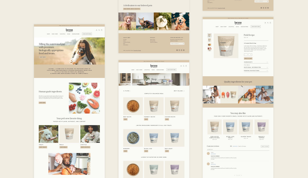

Informed by their newly developed brand strategy, the fresh, new visual identity brings defining brand characteristics to life. With various customer segments to consider, the visual identity was built to be flexible across various collateral types such as educational programs, sales materials, brand extensions, packaging and marketing materials to create continuity throughout the entire customer experience. Inspired by a design that's intimate, empowering, simple and sustainable, our team used clean layout, organic shapes and approachable typography to bring the updated personality of Fork Farms to life.

The Fork Farms team and partners are strengthening their brand position on a daily basis with more energy than ever before. Due to the strategy work, messaging platforms, and updated visual identity, their brand can move forward faster and with greater intention towards a mission to change the global food system.


Rebranding an organization that has established brand equity is always a delicate task. Lead by the brand promise and established brand positioning, Fork Farms chose Quill Creative Studio to lead the way on their mission to inspire and connect their messaging and demonstrate their support and sincerity with their brand’s updated visual identity. Our challenge was to evolve their brand and establish a new creative foundation for current and future touchpoints and initiatives.


Informed by their newly developed brand strategy, the fresh, new visual identity brings defining brand characteristics to life. With various customer segments to consider, the visual identity was built to be flexible across various collateral types such as educational programs, sales materials, brand extensions, packaging and marketing materials to create continuity throughout the entire customer experience. Inspired by a design that's intimate, empowering, simple and sustainable, our team used clean layout, organic shapes and approachable typography to bring the updated personality of Fork Farms to life.


The Fork Farms team and partners are strengthening their brand position on a daily basis with more energy than ever before. Due to the strategy work, messaging platforms, and updated visual identity, their brand can move forward faster and with greater intention towards a mission to change the global food system.


Rebranding an organization that has established brand equity is always a delicate task. Lead by the brand promise and established brand positioning, Fork Farms chose Quill Creative Studio to lead the way on their mission to inspire and connect their messaging and demonstrate their support and sincerity with their brand’s updated visual identity. Our challenge was to evolve their brand and establish a new creative foundation for current and future touchpoints and initiatives.


Informed by their newly developed brand strategy, the fresh, new visual identity brings defining brand characteristics to life. With various customer segments to consider, the visual identity was built to be flexible across various collateral types such as educational programs, sales materials, brand extensions, packaging and marketing materials to create continuity throughout the entire customer experience. Inspired by a design that's intimate, empowering, simple and sustainable, our team used clean layout, organic shapes and approachable typography to bring the updated personality of Fork Farms to life.

The Fork Farms team and partners are strengthening their brand position on a daily basis with more energy than ever before. Due to the strategy work, messaging platforms, and updated visual identity, their brand can move forward faster and with greater intention towards a mission to change the global food system.


Rebranding an organization that has established brand equity is always a delicate task. Lead by the brand promise and established brand positioning, Fork Farms chose Quill Creative Studio to lead the way on their mission to inspire and connect their messaging and demonstrate their support and sincerity with their brand’s updated visual identity. Our challenge was to evolve their brand and establish a new creative foundation for current and future touchpoints and initiatives.

Informed by their newly developed brand strategy, the fresh, new visual identity brings defining brand characteristics to life. With various customer segments to consider, the visual identity was built to be flexible across various collateral types such as educational programs, sales materials, brand extensions, packaging and marketing materials to create continuity throughout the entire customer experience. Inspired by a design that's intimate, empowering, simple and sustainable, our team used clean layout, organic shapes and approachable typography to bring the updated personality of Fork Farms to life.


The Fork Farms team and partners are strengthening their brand position on a daily basis with more energy than ever before. Due to the strategy work, messaging platforms, and updated visual identity, their brand can move forward faster and with greater intention towards a mission to change the global food system.


Rebranding an organization that has established brand equity is always a delicate task. Lead by the brand promise and established brand positioning, Fork Farms chose Quill Creative Studio to lead the way on their mission to inspire and connect their messaging and demonstrate their support and sincerity with their brand’s updated visual identity. Our challenge was to evolve their brand and establish a new creative foundation for current and future touchpoints and initiatives.


Informed by their newly developed brand strategy, the fresh, new visual identity brings defining brand characteristics to life. With various customer segments to consider, the visual identity was built to be flexible across various collateral types such as educational programs, sales materials, brand extensions, packaging and marketing materials to create continuity throughout the entire customer experience. Inspired by a design that's intimate, empowering, simple and sustainable, our team used clean layout, organic shapes and approachable typography to bring the updated personality of Fork Farms to life.


The Fork Farms team and partners are strengthening their brand position on a daily basis with more energy than ever before. Due to the strategy work, messaging platforms, and updated visual identity, their brand can move forward faster and with greater intention towards a mission to change the global food system.


Rebranding an organization that has established brand equity is always a delicate task. Lead by the brand promise and established brand positioning, Fork Farms chose Quill Creative Studio to lead the way on their mission to inspire and connect their messaging and demonstrate their support and sincerity with their brand’s updated visual identity. Our challenge was to evolve their brand and establish a new creative foundation for current and future touchpoints and initiatives.


Informed by their newly developed brand strategy, the fresh, new visual identity brings defining brand characteristics to life. With various customer segments to consider, the visual identity was built to be flexible across various collateral types such as educational programs, sales materials, brand extensions, packaging and marketing materials to create continuity throughout the entire customer experience. Inspired by a design that's intimate, empowering, simple and sustainable, our team used clean layout, organic shapes and approachable typography to bring the updated personality of Fork Farms to life.


The Fork Farms team and partners are strengthening their brand position on a daily basis with more energy than ever before. Due to the strategy work, messaging platforms, and updated visual identity, their brand can move forward faster and with greater intention towards a mission to change the global food system.


Rebranding an organization that has established brand equity is always a delicate task. Lead by the brand promise and established brand positioning, Fork Farms chose Quill Creative Studio to lead the way on their mission to inspire and connect their messaging and demonstrate their support and sincerity with their brand’s updated visual identity. Our challenge was to evolve their brand and establish a new creative foundation for current and future touchpoints and initiatives.


Informed by their newly developed brand strategy, the fresh, new visual identity brings defining brand characteristics to life. With various customer segments to consider, the visual identity was built to be flexible across various collateral types such as educational programs, sales materials, brand extensions, packaging and marketing materials to create continuity throughout the entire customer experience. Inspired by a design that's intimate, empowering, simple and sustainable, our team used clean layout, organic shapes and approachable typography to bring the updated personality of Fork Farms to life.


The Fork Farms team and partners are strengthening their brand position on a daily basis with more energy than ever before. Due to the strategy work, messaging platforms, and updated visual identity, their brand can move forward faster and with greater intention towards a mission to change the global food system.


Rebranding an organization that has established brand equity is always a delicate task. Lead by the brand promise and established brand positioning, Fork Farms chose Quill Creative Studio to lead the way on their mission to inspire and connect their messaging and demonstrate their support and sincerity with their brand’s updated visual identity. Our challenge was to evolve their brand and establish a new creative foundation for current and future touchpoints and initiatives.


Informed by their newly developed brand strategy, the fresh, new visual identity brings defining brand characteristics to life. With various customer segments to consider, the visual identity was built to be flexible across various collateral types such as educational programs, sales materials, brand extensions, packaging and marketing materials to create continuity throughout the entire customer experience. Inspired by a design that's intimate, empowering, simple and sustainable, our team used clean layout, organic shapes and approachable typography to bring the updated personality of Fork Farms to life.


Rebranding an organization that has established brand equity is always a delicate task. Lead by the brand promise and established brand positioning, Fork Farms chose Quill Creative Studio to lead the way on their mission to inspire and connect their messaging and demonstrate their support and sincerity with their brand’s updated visual identity. Our challenge was to evolve their brand and establish a new creative foundation for current and future touchpoints and initiatives.
Informed by their newly developed brand strategy, the fresh, new visual identity brings defining brand characteristics to life. With various customer segments to consider, the visual identity was built to be flexible across various collateral types such as educational programs, sales materials, brand extensions, packaging and marketing materials to create continuity throughout the entire customer experience. Inspired by a design that's intimate, empowering, simple and sustainable, our team used clean layout, organic shapes and approachable typography to bring the updated personality of Fork Farms to life.


The Fork Farms team and partners are strengthening their brand position on a daily basis with more energy than ever before. Due to the strategy work, messaging platforms, and updated visual identity, their brand can move forward faster and with greater intention towards a mission to change the global food system.


Rebranding an organization that has established brand equity is always a delicate task. Lead by the brand promise and established brand positioning, Fork Farms chose Quill Creative Studio to lead the way on their mission to inspire and connect their messaging and demonstrate their support and sincerity with their brand’s updated visual identity. Our challenge was to evolve their brand and establish a new creative foundation for current and future touchpoints and initiatives.


Informed by their newly developed brand strategy, the fresh, new visual identity brings defining brand characteristics to life. With various customer segments to consider, the visual identity was built to be flexible across various collateral types such as educational programs, sales materials, brand extensions, packaging and marketing materials to create continuity throughout the entire customer experience. Inspired by a design that's intimate, empowering, simple and sustainable, our team used clean layout, organic shapes and approachable typography to bring the updated personality of Fork Farms to life.
The Fork Farms team and partners are strengthening their brand position on a daily basis with more energy than ever before. Due to the strategy work, messaging platforms, and updated visual identity, their brand can move forward faster and with greater intention towards a mission to change the global food system.

Rebranding an organization that has established brand equity is always a delicate task. Lead by the brand promise and established brand positioning, Fork Farms chose Quill Creative Studio to lead the way on their mission to inspire and connect their messaging and demonstrate their support and sincerity with their brand’s updated visual identity. Our challenge was to evolve their brand and establish a new creative foundation for current and future touchpoints and initiatives.


Informed by their newly developed brand strategy, the fresh, new visual identity brings defining brand characteristics to life. With various customer segments to consider, the visual identity was built to be flexible across various collateral types such as educational programs, sales materials, brand extensions, packaging and marketing materials to create continuity throughout the entire customer experience. Inspired by a design that's intimate, empowering, simple and sustainable, our team used clean layout, organic shapes and approachable typography to bring the updated personality of Fork Farms to life.


The Fork Farms team and partners are strengthening their brand position on a daily basis with more energy than ever before. Due to the strategy work, messaging platforms, and updated visual identity, their brand can move forward faster and with greater intention towards a mission to change the global food system.


Rebranding an organization that has established brand equity is always a delicate task. Lead by the brand promise and established brand positioning, Fork Farms chose Quill Creative Studio to lead the way on their mission to inspire and connect their messaging and demonstrate their support and sincerity with their brand’s updated visual identity. Our challenge was to evolve their brand and establish a new creative foundation for current and future touchpoints and initiatives.

Informed by their newly developed brand strategy, the fresh, new visual identity brings defining brand characteristics to life. With various customer segments to consider, the visual identity was built to be flexible across various collateral types such as educational programs, sales materials, brand extensions, packaging and marketing materials to create continuity throughout the entire customer experience. Inspired by a design that's intimate, empowering, simple and sustainable, our team used clean layout, organic shapes and approachable typography to bring the updated personality of Fork Farms to life.

The Fork Farms team and partners are strengthening their brand position on a daily basis with more energy than ever before. Due to the strategy work, messaging platforms, and updated visual identity, their brand can move forward faster and with greater intention towards a mission to change the global food system.


Rebranding an organization that has established brand equity is always a delicate task. Lead by the brand promise and established brand positioning, Fork Farms chose Quill Creative Studio to lead the way on their mission to inspire and connect their messaging and demonstrate their support and sincerity with their brand’s updated visual identity. Our challenge was to evolve their brand and establish a new creative foundation for current and future touchpoints and initiatives.


Informed by their newly developed brand strategy, the fresh, new visual identity brings defining brand characteristics to life. With various customer segments to consider, the visual identity was built to be flexible across various collateral types such as educational programs, sales materials, brand extensions, packaging and marketing materials to create continuity throughout the entire customer experience. Inspired by a design that's intimate, empowering, simple and sustainable, our team used clean layout, organic shapes and approachable typography to bring the updated personality of Fork Farms to life.


The Fork Farms team and partners are strengthening their brand position on a daily basis with more energy than ever before. Due to the strategy work, messaging platforms, and updated visual identity, their brand can move forward faster and with greater intention towards a mission to change the global food system.


Rebranding an organization that has established brand equity is always a delicate task. Lead by the brand promise and established brand positioning, Fork Farms chose Quill Creative Studio to lead the way on their mission to inspire and connect their messaging and demonstrate their support and sincerity with their brand’s updated visual identity. Our challenge was to evolve their brand and establish a new creative foundation for current and future touchpoints and initiatives.

Informed by their newly developed brand strategy, the fresh, new visual identity brings defining brand characteristics to life. With various customer segments to consider, the visual identity was built to be flexible across various collateral types such as educational programs, sales materials, brand extensions, packaging and marketing materials to create continuity throughout the entire customer experience. Inspired by a design that's intimate, empowering, simple and sustainable, our team used clean layout, organic shapes and approachable typography to bring the updated personality of Fork Farms to life.

The Fork Farms team and partners are strengthening their brand position on a daily basis with more energy than ever before. Due to the strategy work, messaging platforms, and updated visual identity, their brand can move forward faster and with greater intention towards a mission to change the global food system.

Rebranding an organization that has established brand equity is always a delicate task. Lead by the brand promise and established brand positioning, Fork Farms chose Quill Creative Studio to lead the way on their mission to inspire and connect their messaging and demonstrate their support and sincerity with their brand’s updated visual identity. Our challenge was to evolve their brand and establish a new creative foundation for current and future touchpoints and initiatives.

Informed by their newly developed brand strategy, the fresh, new visual identity brings defining brand characteristics to life. With various customer segments to consider, the visual identity was built to be flexible across various collateral types such as educational programs, sales materials, brand extensions, packaging and marketing materials to create continuity throughout the entire customer experience. Inspired by a design that's intimate, empowering, simple and sustainable, our team used clean layout, organic shapes and approachable typography to bring the updated personality of Fork Farms to life.


The Fork Farms team and partners are strengthening their brand position on a daily basis with more energy than ever before. Due to the strategy work, messaging platforms, and updated visual identity, their brand can move forward faster and with greater intention towards a mission to change the global food system.


Rebranding an organization that has established brand equity is always a delicate task. Lead by the brand promise and established brand positioning, Fork Farms chose Quill Creative Studio to lead the way on their mission to inspire and connect their messaging and demonstrate their support and sincerity with their brand’s updated visual identity. Our challenge was to evolve their brand and establish a new creative foundation for current and future touchpoints and initiatives.


Informed by their newly developed brand strategy, the fresh, new visual identity brings defining brand characteristics to life. With various customer segments to consider, the visual identity was built to be flexible across various collateral types such as educational programs, sales materials, brand extensions, packaging and marketing materials to create continuity throughout the entire customer experience. Inspired by a design that's intimate, empowering, simple and sustainable, our team used clean layout, organic shapes and approachable typography to bring the updated personality of Fork Farms to life.

The Fork Farms team and partners are strengthening their brand position on a daily basis with more energy than ever before. Due to the strategy work, messaging platforms, and updated visual identity, their brand can move forward faster and with greater intention towards a mission to change the global food system.


Rebranding an organization that has established brand equity is always a delicate task. Lead by the brand promise and established brand positioning, Fork Farms chose Quill Creative Studio to lead the way on their mission to inspire and connect their messaging and demonstrate their support and sincerity with their brand’s updated visual identity. Our challenge was to evolve their brand and establish a new creative foundation for current and future touchpoints and initiatives.

Informed by their newly developed brand strategy, the fresh, new visual identity brings defining brand characteristics to life. With various customer segments to consider, the visual identity was built to be flexible across various collateral types such as educational programs, sales materials, brand extensions, packaging and marketing materials to create continuity throughout the entire customer experience. Inspired by a design that's intimate, empowering, simple and sustainable, our team used clean layout, organic shapes and approachable typography to bring the updated personality of Fork Farms to life.


The Fork Farms team and partners are strengthening their brand position on a daily basis with more energy than ever before. Due to the strategy work, messaging platforms, and updated visual identity, their brand can move forward faster and with greater intention towards a mission to change the global food system.


The Fork Farms team and partners are strengthening their brand position on a daily basis with more energy than ever before. Due to the strategy work, messaging platforms, and updated visual identity, their brand can move forward faster and with greater intention towards a mission to change the global food system.
Rebranding an organization that has established brand equity is always a delicate task. Lead by the brand promise and established brand positioning, Fork Farms chose Quill Creative Studio to lead the way on their mission to inspire and connect their messaging and demonstrate their support and sincerity with their brand’s updated visual identity. Our challenge was to evolve their brand and establish a new creative foundation for current and future touchpoints and initiatives.

Informed by their newly developed brand strategy, the fresh, new visual identity brings defining brand characteristics to life. With various customer segments to consider, the visual identity was built to be flexible across various collateral types such as educational programs, sales materials, brand extensions, packaging and marketing materials to create continuity throughout the entire customer experience. Inspired by a design that's intimate, empowering, simple and sustainable, our team used clean layout, organic shapes and approachable typography to bring the updated personality of Fork Farms to life.

The Fork Farms team and partners are strengthening their brand position on a daily basis with more energy than ever before. Due to the strategy work, messaging platforms, and updated visual identity, their brand can move forward faster and with greater intention towards a mission to change the global food system.

The Fork Farms team and partners are strengthening their brand position on a daily basis with more energy than ever before. Due to the strategy work, messaging platforms, and updated visual identity, their brand can move forward faster and with greater intention towards a mission to change the global food system.

Informed by their newly developed brand strategy, the fresh, new visual identity brings defining brand characteristics to life. With various customer segments to consider, the visual identity was built to be flexible across various collateral types such as educational programs, sales materials, brand extensions, packaging and marketing materials to create continuity throughout the entire customer experience. Inspired by a design that's intimate, empowering, simple and sustainable, our team used clean layout, organic shapes and approachable typography to bring the updated personality of Fork Farms to life.

Rebranding an organization that has established brand equity is always a delicate task. Lead by the brand promise and established brand positioning, Fork Farms chose Quill Creative Studio to lead the way on their mission to inspire and connect their messaging and demonstrate their support and sincerity with their brand’s updated visual identity. Our challenge was to evolve their brand and establish a new creative foundation for current and future touchpoints and initiatives.

The Fork Farms team and partners are strengthening their brand position on a daily basis with more energy than ever before. Due to the strategy work, messaging platforms, and updated visual identity, their brand can move forward faster and with greater intention towards a mission to change the global food system.


The Fork Farms team and partners are strengthening their brand position on a daily basis with more energy than ever before. Due to the strategy work, messaging platforms, and updated visual identity, their brand can move forward faster and with greater intention towards a mission to change the global food system.


Rebranding an organization that has established brand equity is always a delicate task. Lead by the brand promise and established brand positioning, Fork Farms chose Quill Creative Studio to lead the way on their mission to inspire and connect their messaging and demonstrate their support and sincerity with their brand’s updated visual identity. Our challenge was to evolve their brand and establish a new creative foundation for current and future touchpoints and initiatives.


Informed by their newly developed brand strategy, the fresh, new visual identity brings defining brand characteristics to life. With various customer segments to consider, the visual identity was built to be flexible across various collateral types such as educational programs, sales materials, brand extensions, packaging and marketing materials to create continuity throughout the entire customer experience. Inspired by a design that's intimate, empowering, simple and sustainable, our team used clean layout, organic shapes and approachable typography to bring the updated personality of Fork Farms to life.

The Fork Farms team and partners are strengthening their brand position on a daily basis with more energy than ever before. Due to the strategy work, messaging platforms, and updated visual identity, their brand can move forward faster and with greater intention towards a mission to change the global food system.


Rebranding an organization that has established brand equity is always a delicate task. Lead by the brand promise and established brand positioning, Fork Farms chose Quill Creative Studio to lead the way on their mission to inspire and connect their messaging and demonstrate their support and sincerity with their brand’s updated visual identity. Our challenge was to evolve their brand and establish a new creative foundation for current and future touchpoints and initiatives.
Informed by their newly developed brand strategy, the fresh, new visual identity brings defining brand characteristics to life. With various customer segments to consider, the visual identity was built to be flexible across various collateral types such as educational programs, sales materials, brand extensions, packaging and marketing materials to create continuity throughout the entire customer experience. Inspired by a design that's intimate, empowering, simple and sustainable, our team used clean layout, organic shapes and approachable typography to bring the updated personality of Fork Farms to life.


The Fork Farms team and partners are strengthening their brand position on a daily basis with more energy than ever before. Due to the strategy work, messaging platforms, and updated visual identity, their brand can move forward faster and with greater intention towards a mission to change the global food system.


Rebranding an organization that has established brand equity is always a delicate task. Lead by the brand promise and established brand positioning, Fork Farms chose Quill Creative Studio to lead the way on their mission to inspire and connect their messaging and demonstrate their support and sincerity with their brand’s updated visual identity. Our challenge was to evolve their brand and establish a new creative foundation for current and future touchpoints and initiatives.
The Fork Farms team and partners are strengthening their brand position on a daily basis with more energy than ever before. Due to the strategy work, messaging platforms, and updated visual identity, their brand can move forward faster and with greater intention towards a mission to change the global food system.

Informed by their newly developed brand strategy, the fresh, new visual identity brings defining brand characteristics to life. With various customer segments to consider, the visual identity was built to be flexible across various collateral types such as educational programs, sales materials, brand extensions, packaging and marketing materials to create continuity throughout the entire customer experience. Inspired by a design that's intimate, empowering, simple and sustainable, our team used clean layout, organic shapes and approachable typography to bring the updated personality of Fork Farms to life.


The Fork Farms team and partners are strengthening their brand position on a daily basis with more energy than ever before. Due to the strategy work, messaging platforms, and updated visual identity, their brand can move forward faster and with greater intention towards a mission to change the global food system.


Rebranding an organization that has established brand equity is always a delicate task. Lead by the brand promise and established brand positioning, Fork Farms chose Quill Creative Studio to lead the way on their mission to inspire and connect their messaging and demonstrate their support and sincerity with their brand’s updated visual identity. Our challenge was to evolve their brand and establish a new creative foundation for current and future touchpoints and initiatives.
Informed by their newly developed brand strategy, the fresh, new visual identity brings defining brand characteristics to life. With various customer segments to consider, the visual identity was built to be flexible across various collateral types such as educational programs, sales materials, brand extensions, packaging and marketing materials to create continuity throughout the entire customer experience. Inspired by a design that's intimate, empowering, simple and sustainable, our team used clean layout, organic shapes and approachable typography to bring the updated personality of Fork Farms to life.


The Fork Farms team and partners are strengthening their brand position on a daily basis with more energy than ever before. Due to the strategy work, messaging platforms, and updated visual identity, their brand can move forward faster and with greater intention towards a mission to change the global food system.


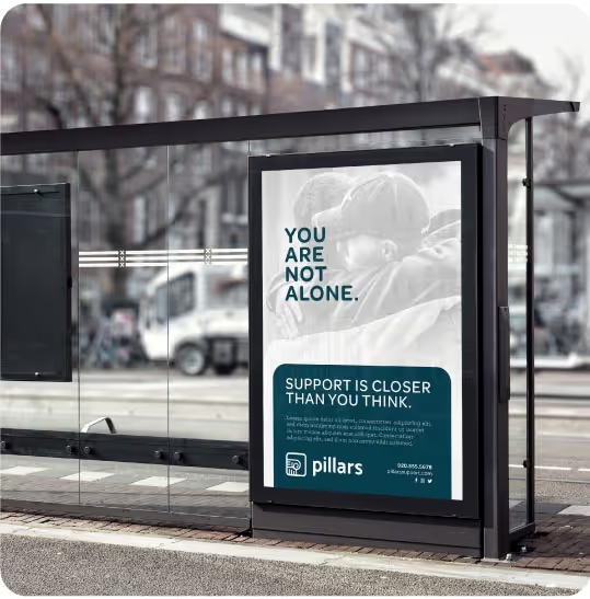
Rebranding an organization that has established brand equity is always a delicate task. Lead by the brand promise and established brand positioning, Fork Farms chose Quill Creative Studio to lead the way on their mission to inspire and connect their messaging and demonstrate their support and sincerity with their brand’s updated visual identity. Our challenge was to evolve their brand and establish a new creative foundation for current and future touchpoints and initiatives.

Informed by their newly developed brand strategy, the fresh, new visual identity brings defining brand characteristics to life. With various customer segments to consider, the visual identity was built to be flexible across various collateral types such as educational programs, sales materials, brand extensions, packaging and marketing materials to create continuity throughout the entire customer experience. Inspired by a design that's intimate, empowering, simple and sustainable, our team used clean layout, organic shapes and approachable typography to bring the updated personality of Fork Farms to life.

The Fork Farms team and partners are strengthening their brand position on a daily basis with more energy than ever before. Due to the strategy work, messaging platforms, and updated visual identity, their brand can move forward faster and with greater intention towards a mission to change the global food system.


Rebranding an organization that has established brand equity is always a delicate task. Lead by the brand promise and established brand positioning, Fork Farms chose Quill Creative Studio to lead the way on their mission to inspire and connect their messaging and demonstrate their support and sincerity with their brand’s updated visual identity. Our challenge was to evolve their brand and establish a new creative foundation for current and future touchpoints and initiatives.

Informed by their newly developed brand strategy, the fresh, new visual identity brings defining brand characteristics to life. With various customer segments to consider, the visual identity was built to be flexible across various collateral types such as educational programs, sales materials, brand extensions, packaging and marketing materials to create continuity throughout the entire customer experience. Inspired by a design that's intimate, empowering, simple and sustainable, our team used clean layout, organic shapes and approachable typography to bring the updated personality of Fork Farms to life.


The Fork Farms team and partners are strengthening their brand position on a daily basis with more energy than ever before. Due to the strategy work, messaging platforms, and updated visual identity, their brand can move forward faster and with greater intention towards a mission to change the global food system.


Quill Creative has been the creative design firm of choice for Fork Farms since its inception. Their ability to grow and evolve brand strategy and design along with our company growth has allowed us to more effectively reach and build relationships with customers.
ALEX TYINK, PRESIDENT & CEO, FORK FARMS
