


Thedacare is one of the leading nonprofit healthcare providers in northeast and central Wisconsin. They work passionately to support programs and initiatives for improving community health. One of those programs has been running consecutively for almost 20 years and started as a program to educate high schoolers on the dangers of drinking and driving. Over the years, the number of distractions available has increased and the program has shifted to stay relevant. Not only is there a focus on drinking and driving, but now incidents stemming from distractions such as cell phone use have continued to rise. Our job was to rename and rebrand this community program to bring it up to speed with today’s issues.


Our goal for creating the identity for this program is to provide a clear message and an impactful design system that they could leverage for the next 20 years. By including colors from the Thedacare brand and giving the design an edgy twist, we aimed to create a solution that would resonate with students as well as compliment the core brand.
In an effort to be as straightforward as possible, we chose to rename the program to FOCUS. As simple as it sounds, it’s what needs to stick. The word is also an acronym with 5 pillars of information. This program and it’s marketing materials are crafted and designed to remind people, with sobering examples of the alternative, that while they’re on the road, they should just focus on driving.

On May 26th, 2020, Thedacare announced the launch of the new FOCUS program to an excited community. Plans were set to hold their first event in late October that year. Due to the worldwide COVID pandemic, the 2020 program was canceled and rescheduled to be virtual. With the newly created brand and visual elements, Thedacare was able to leverage production partners to bring the program to life in a virtual environment. When Thedacare extends its reach into our community with programs such as this one, there’s no doubt that positive impact happens.


Thedacare is one of the leading nonprofit healthcare providers in northeast and central Wisconsin. They work passionately to support programs and initiatives for improving community health. One of those programs has been running consecutively for almost 20 years and started as a program to educate high schoolers on the dangers of drinking and driving. Over the years, the number of distractions available has increased and the program has shifted to stay relevant. Not only is there a focus on drinking and driving, but now incidents stemming from distractions such as cell phone use have continued to rise. Our job was to rename and rebrand this community program to bring it up to speed with today’s issues.


Our goal for creating the identity for this program is to provide a clear message and an impactful design system that they could leverage for the next 20 years. By including colors from the Thedacare brand and giving the design an edgy twist, we aimed to create a solution that would resonate with students as well as compliment the core brand.
In an effort to be as straightforward as possible, we chose to rename the program to FOCUS. As simple as it sounds, it’s what needs to stick. The word is also an acronym with 5 pillars of information. This program and it’s marketing materials are crafted and designed to remind people, with sobering examples of the alternative, that while they’re on the road, they should just focus on driving.


On May 26th, 2020, Thedacare announced the launch of the new FOCUS program to an excited community. Plans were set to hold their first event in late October that year. Due to the worldwide COVID pandemic, the 2020 program was canceled and rescheduled to be virtual. With the newly created brand and visual elements, Thedacare was able to leverage production partners to bring the program to life in a virtual environment. When Thedacare extends its reach into our community with programs such as this one, there’s no doubt that positive impact happens.


Thedacare is one of the leading nonprofit healthcare providers in northeast and central Wisconsin. They work passionately to support programs and initiatives for improving community health. One of those programs has been running consecutively for almost 20 years and started as a program to educate high schoolers on the dangers of drinking and driving. Over the years, the number of distractions available has increased and the program has shifted to stay relevant. Not only is there a focus on drinking and driving, but now incidents stemming from distractions such as cell phone use have continued to rise. Our job was to rename and rebrand this community program to bring it up to speed with today’s issues.


Our goal for creating the identity for this program is to provide a clear message and an impactful design system that they could leverage for the next 20 years. By including colors from the Thedacare brand and giving the design an edgy twist, we aimed to create a solution that would resonate with students as well as compliment the core brand.
In an effort to be as straightforward as possible, we chose to rename the program to FOCUS. As simple as it sounds, it’s what needs to stick. The word is also an acronym with 5 pillars of information. This program and it’s marketing materials are crafted and designed to remind people, with sobering examples of the alternative, that while they’re on the road, they should just focus on driving.

On May 26th, 2020, Thedacare announced the launch of the new FOCUS program to an excited community. Plans were set to hold their first event in late October that year. Due to the worldwide COVID pandemic, the 2020 program was canceled and rescheduled to be virtual. With the newly created brand and visual elements, Thedacare was able to leverage production partners to bring the program to life in a virtual environment. When Thedacare extends its reach into our community with programs such as this one, there’s no doubt that positive impact happens.


Thedacare is one of the leading nonprofit healthcare providers in northeast and central Wisconsin. They work passionately to support programs and initiatives for improving community health. One of those programs has been running consecutively for almost 20 years and started as a program to educate high schoolers on the dangers of drinking and driving. Over the years, the number of distractions available has increased and the program has shifted to stay relevant. Not only is there a focus on drinking and driving, but now incidents stemming from distractions such as cell phone use have continued to rise. Our job was to rename and rebrand this community program to bring it up to speed with today’s issues.

Our goal for creating the identity for this program is to provide a clear message and an impactful design system that they could leverage for the next 20 years. By including colors from the Thedacare brand and giving the design an edgy twist, we aimed to create a solution that would resonate with students as well as compliment the core brand.
In an effort to be as straightforward as possible, we chose to rename the program to FOCUS. As simple as it sounds, it’s what needs to stick. The word is also an acronym with 5 pillars of information. This program and it’s marketing materials are crafted and designed to remind people, with sobering examples of the alternative, that while they’re on the road, they should just focus on driving.


On May 26th, 2020, Thedacare announced the launch of the new FOCUS program to an excited community. Plans were set to hold their first event in late October that year. Due to the worldwide COVID pandemic, the 2020 program was canceled and rescheduled to be virtual. With the newly created brand and visual elements, Thedacare was able to leverage production partners to bring the program to life in a virtual environment. When Thedacare extends its reach into our community with programs such as this one, there’s no doubt that positive impact happens.


Thedacare is one of the leading nonprofit healthcare providers in northeast and central Wisconsin. They work passionately to support programs and initiatives for improving community health. One of those programs has been running consecutively for almost 20 years and started as a program to educate high schoolers on the dangers of drinking and driving. Over the years, the number of distractions available has increased and the program has shifted to stay relevant. Not only is there a focus on drinking and driving, but now incidents stemming from distractions such as cell phone use have continued to rise. Our job was to rename and rebrand this community program to bring it up to speed with today’s issues.


Our goal for creating the identity for this program is to provide a clear message and an impactful design system that they could leverage for the next 20 years. By including colors from the Thedacare brand and giving the design an edgy twist, we aimed to create a solution that would resonate with students as well as compliment the core brand.
In an effort to be as straightforward as possible, we chose to rename the program to FOCUS. As simple as it sounds, it’s what needs to stick. The word is also an acronym with 5 pillars of information. This program and it’s marketing materials are crafted and designed to remind people, with sobering examples of the alternative, that while they’re on the road, they should just focus on driving.


On May 26th, 2020, Thedacare announced the launch of the new FOCUS program to an excited community. Plans were set to hold their first event in late October that year. Due to the worldwide COVID pandemic, the 2020 program was canceled and rescheduled to be virtual. With the newly created brand and visual elements, Thedacare was able to leverage production partners to bring the program to life in a virtual environment. When Thedacare extends its reach into our community with programs such as this one, there’s no doubt that positive impact happens.


Thedacare is one of the leading nonprofit healthcare providers in northeast and central Wisconsin. They work passionately to support programs and initiatives for improving community health. One of those programs has been running consecutively for almost 20 years and started as a program to educate high schoolers on the dangers of drinking and driving. Over the years, the number of distractions available has increased and the program has shifted to stay relevant. Not only is there a focus on drinking and driving, but now incidents stemming from distractions such as cell phone use have continued to rise. Our job was to rename and rebrand this community program to bring it up to speed with today’s issues.


Our goal for creating the identity for this program is to provide a clear message and an impactful design system that they could leverage for the next 20 years. By including colors from the Thedacare brand and giving the design an edgy twist, we aimed to create a solution that would resonate with students as well as compliment the core brand.
In an effort to be as straightforward as possible, we chose to rename the program to FOCUS. As simple as it sounds, it’s what needs to stick. The word is also an acronym with 5 pillars of information. This program and it’s marketing materials are crafted and designed to remind people, with sobering examples of the alternative, that while they’re on the road, they should just focus on driving.


On May 26th, 2020, Thedacare announced the launch of the new FOCUS program to an excited community. Plans were set to hold their first event in late October that year. Due to the worldwide COVID pandemic, the 2020 program was canceled and rescheduled to be virtual. With the newly created brand and visual elements, Thedacare was able to leverage production partners to bring the program to life in a virtual environment. When Thedacare extends its reach into our community with programs such as this one, there’s no doubt that positive impact happens.


Thedacare is one of the leading nonprofit healthcare providers in northeast and central Wisconsin. They work passionately to support programs and initiatives for improving community health. One of those programs has been running consecutively for almost 20 years and started as a program to educate high schoolers on the dangers of drinking and driving. Over the years, the number of distractions available has increased and the program has shifted to stay relevant. Not only is there a focus on drinking and driving, but now incidents stemming from distractions such as cell phone use have continued to rise. Our job was to rename and rebrand this community program to bring it up to speed with today’s issues.


Our goal for creating the identity for this program is to provide a clear message and an impactful design system that they could leverage for the next 20 years. By including colors from the Thedacare brand and giving the design an edgy twist, we aimed to create a solution that would resonate with students as well as compliment the core brand.
In an effort to be as straightforward as possible, we chose to rename the program to FOCUS. As simple as it sounds, it’s what needs to stick. The word is also an acronym with 5 pillars of information. This program and it’s marketing materials are crafted and designed to remind people, with sobering examples of the alternative, that while they’re on the road, they should just focus on driving.


On May 26th, 2020, Thedacare announced the launch of the new FOCUS program to an excited community. Plans were set to hold their first event in late October that year. Due to the worldwide COVID pandemic, the 2020 program was canceled and rescheduled to be virtual. With the newly created brand and visual elements, Thedacare was able to leverage production partners to bring the program to life in a virtual environment. When Thedacare extends its reach into our community with programs such as this one, there’s no doubt that positive impact happens.


Thedacare is one of the leading nonprofit healthcare providers in northeast and central Wisconsin. They work passionately to support programs and initiatives for improving community health. One of those programs has been running consecutively for almost 20 years and started as a program to educate high schoolers on the dangers of drinking and driving. Over the years, the number of distractions available has increased and the program has shifted to stay relevant. Not only is there a focus on drinking and driving, but now incidents stemming from distractions such as cell phone use have continued to rise. Our job was to rename and rebrand this community program to bring it up to speed with today’s issues.


Our goal for creating the identity for this program is to provide a clear message and an impactful design system that they could leverage for the next 20 years. By including colors from the Thedacare brand and giving the design an edgy twist, we aimed to create a solution that would resonate with students as well as compliment the core brand.
In an effort to be as straightforward as possible, we chose to rename the program to FOCUS. As simple as it sounds, it’s what needs to stick. The word is also an acronym with 5 pillars of information. This program and it’s marketing materials are crafted and designed to remind people, with sobering examples of the alternative, that while they’re on the road, they should just focus on driving.


Thedacare is one of the leading nonprofit healthcare providers in northeast and central Wisconsin. They work passionately to support programs and initiatives for improving community health. One of those programs has been running consecutively for almost 20 years and started as a program to educate high schoolers on the dangers of drinking and driving. Over the years, the number of distractions available has increased and the program has shifted to stay relevant. Not only is there a focus on drinking and driving, but now incidents stemming from distractions such as cell phone use have continued to rise. Our job was to rename and rebrand this community program to bring it up to speed with today’s issues.
Our goal for creating the identity for this program is to provide a clear message and an impactful design system that they could leverage for the next 20 years. By including colors from the Thedacare brand and giving the design an edgy twist, we aimed to create a solution that would resonate with students as well as compliment the core brand.
In an effort to be as straightforward as possible, we chose to rename the program to FOCUS. As simple as it sounds, it’s what needs to stick. The word is also an acronym with 5 pillars of information. This program and it’s marketing materials are crafted and designed to remind people, with sobering examples of the alternative, that while they’re on the road, they should just focus on driving.


On May 26th, 2020, Thedacare announced the launch of the new FOCUS program to an excited community. Plans were set to hold their first event in late October that year. Due to the worldwide COVID pandemic, the 2020 program was canceled and rescheduled to be virtual. With the newly created brand and visual elements, Thedacare was able to leverage production partners to bring the program to life in a virtual environment. When Thedacare extends its reach into our community with programs such as this one, there’s no doubt that positive impact happens.


Thedacare is one of the leading nonprofit healthcare providers in northeast and central Wisconsin. They work passionately to support programs and initiatives for improving community health. One of those programs has been running consecutively for almost 20 years and started as a program to educate high schoolers on the dangers of drinking and driving. Over the years, the number of distractions available has increased and the program has shifted to stay relevant. Not only is there a focus on drinking and driving, but now incidents stemming from distractions such as cell phone use have continued to rise. Our job was to rename and rebrand this community program to bring it up to speed with today’s issues.


Our goal for creating the identity for this program is to provide a clear message and an impactful design system that they could leverage for the next 20 years. By including colors from the Thedacare brand and giving the design an edgy twist, we aimed to create a solution that would resonate with students as well as compliment the core brand.
In an effort to be as straightforward as possible, we chose to rename the program to FOCUS. As simple as it sounds, it’s what needs to stick. The word is also an acronym with 5 pillars of information. This program and it’s marketing materials are crafted and designed to remind people, with sobering examples of the alternative, that while they’re on the road, they should just focus on driving.
On May 26th, 2020, Thedacare announced the launch of the new FOCUS program to an excited community. Plans were set to hold their first event in late October that year. Due to the worldwide COVID pandemic, the 2020 program was canceled and rescheduled to be virtual. With the newly created brand and visual elements, Thedacare was able to leverage production partners to bring the program to life in a virtual environment. When Thedacare extends its reach into our community with programs such as this one, there’s no doubt that positive impact happens.

Thedacare is one of the leading nonprofit healthcare providers in northeast and central Wisconsin. They work passionately to support programs and initiatives for improving community health. One of those programs has been running consecutively for almost 20 years and started as a program to educate high schoolers on the dangers of drinking and driving. Over the years, the number of distractions available has increased and the program has shifted to stay relevant. Not only is there a focus on drinking and driving, but now incidents stemming from distractions such as cell phone use have continued to rise. Our job was to rename and rebrand this community program to bring it up to speed with today’s issues.


Our goal for creating the identity for this program is to provide a clear message and an impactful design system that they could leverage for the next 20 years. By including colors from the Thedacare brand and giving the design an edgy twist, we aimed to create a solution that would resonate with students as well as compliment the core brand.
In an effort to be as straightforward as possible, we chose to rename the program to FOCUS. As simple as it sounds, it’s what needs to stick. The word is also an acronym with 5 pillars of information. This program and it’s marketing materials are crafted and designed to remind people, with sobering examples of the alternative, that while they’re on the road, they should just focus on driving.


On May 26th, 2020, Thedacare announced the launch of the new FOCUS program to an excited community. Plans were set to hold their first event in late October that year. Due to the worldwide COVID pandemic, the 2020 program was canceled and rescheduled to be virtual. With the newly created brand and visual elements, Thedacare was able to leverage production partners to bring the program to life in a virtual environment. When Thedacare extends its reach into our community with programs such as this one, there’s no doubt that positive impact happens.


Thedacare is one of the leading nonprofit healthcare providers in northeast and central Wisconsin. They work passionately to support programs and initiatives for improving community health. One of those programs has been running consecutively for almost 20 years and started as a program to educate high schoolers on the dangers of drinking and driving. Over the years, the number of distractions available has increased and the program has shifted to stay relevant. Not only is there a focus on drinking and driving, but now incidents stemming from distractions such as cell phone use have continued to rise. Our job was to rename and rebrand this community program to bring it up to speed with today’s issues.

Our goal for creating the identity for this program is to provide a clear message and an impactful design system that they could leverage for the next 20 years. By including colors from the Thedacare brand and giving the design an edgy twist, we aimed to create a solution that would resonate with students as well as compliment the core brand.
In an effort to be as straightforward as possible, we chose to rename the program to FOCUS. As simple as it sounds, it’s what needs to stick. The word is also an acronym with 5 pillars of information. This program and it’s marketing materials are crafted and designed to remind people, with sobering examples of the alternative, that while they’re on the road, they should just focus on driving.

On May 26th, 2020, Thedacare announced the launch of the new FOCUS program to an excited community. Plans were set to hold their first event in late October that year. Due to the worldwide COVID pandemic, the 2020 program was canceled and rescheduled to be virtual. With the newly created brand and visual elements, Thedacare was able to leverage production partners to bring the program to life in a virtual environment. When Thedacare extends its reach into our community with programs such as this one, there’s no doubt that positive impact happens.


Thedacare is one of the leading nonprofit healthcare providers in northeast and central Wisconsin. They work passionately to support programs and initiatives for improving community health. One of those programs has been running consecutively for almost 20 years and started as a program to educate high schoolers on the dangers of drinking and driving. Over the years, the number of distractions available has increased and the program has shifted to stay relevant. Not only is there a focus on drinking and driving, but now incidents stemming from distractions such as cell phone use have continued to rise. Our job was to rename and rebrand this community program to bring it up to speed with today’s issues.


Our goal for creating the identity for this program is to provide a clear message and an impactful design system that they could leverage for the next 20 years. By including colors from the Thedacare brand and giving the design an edgy twist, we aimed to create a solution that would resonate with students as well as compliment the core brand.
In an effort to be as straightforward as possible, we chose to rename the program to FOCUS. As simple as it sounds, it’s what needs to stick. The word is also an acronym with 5 pillars of information. This program and it’s marketing materials are crafted and designed to remind people, with sobering examples of the alternative, that while they’re on the road, they should just focus on driving.


On May 26th, 2020, Thedacare announced the launch of the new FOCUS program to an excited community. Plans were set to hold their first event in late October that year. Due to the worldwide COVID pandemic, the 2020 program was canceled and rescheduled to be virtual. With the newly created brand and visual elements, Thedacare was able to leverage production partners to bring the program to life in a virtual environment. When Thedacare extends its reach into our community with programs such as this one, there’s no doubt that positive impact happens.


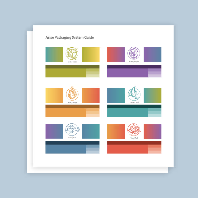
Thedacare is one of the leading nonprofit healthcare providers in northeast and central Wisconsin. They work passionately to support programs and initiatives for improving community health. One of those programs has been running consecutively for almost 20 years and started as a program to educate high schoolers on the dangers of drinking and driving. Over the years, the number of distractions available has increased and the program has shifted to stay relevant. Not only is there a focus on drinking and driving, but now incidents stemming from distractions such as cell phone use have continued to rise. Our job was to rename and rebrand this community program to bring it up to speed with today’s issues.
Our goal for creating the identity for this program is to provide a clear message and an impactful design system that they could leverage for the next 20 years. By including colors from the Thedacare brand and giving the design an edgy twist, we aimed to create a solution that would resonate with students as well as compliment the core brand.
In an effort to be as straightforward as possible, we chose to rename the program to FOCUS. As simple as it sounds, it’s what needs to stick. The word is also an acronym with 5 pillars of information. This program and it’s marketing materials are crafted and designed to remind people, with sobering examples of the alternative, that while they’re on the road, they should just focus on driving.


On May 26th, 2020, Thedacare announced the launch of the new FOCUS program to an excited community. Plans were set to hold their first event in late October that year. Due to the worldwide COVID pandemic, the 2020 program was canceled and rescheduled to be virtual. With the newly created brand and visual elements, Thedacare was able to leverage production partners to bring the program to life in a virtual environment. When Thedacare extends its reach into our community with programs such as this one, there’s no doubt that positive impact happens.


Thedacare is one of the leading nonprofit healthcare providers in northeast and central Wisconsin. They work passionately to support programs and initiatives for improving community health. One of those programs has been running consecutively for almost 20 years and started as a program to educate high schoolers on the dangers of drinking and driving. Over the years, the number of distractions available has increased and the program has shifted to stay relevant. Not only is there a focus on drinking and driving, but now incidents stemming from distractions such as cell phone use have continued to rise. Our job was to rename and rebrand this community program to bring it up to speed with today’s issues.

Our goal for creating the identity for this program is to provide a clear message and an impactful design system that they could leverage for the next 20 years. By including colors from the Thedacare brand and giving the design an edgy twist, we aimed to create a solution that would resonate with students as well as compliment the core brand.
In an effort to be as straightforward as possible, we chose to rename the program to FOCUS. As simple as it sounds, it’s what needs to stick. The word is also an acronym with 5 pillars of information. This program and it’s marketing materials are crafted and designed to remind people, with sobering examples of the alternative, that while they’re on the road, they should just focus on driving.


On May 26th, 2020, Thedacare announced the launch of the new FOCUS program to an excited community. Plans were set to hold their first event in late October that year. Due to the worldwide COVID pandemic, the 2020 program was canceled and rescheduled to be virtual. With the newly created brand and visual elements, Thedacare was able to leverage production partners to bring the program to life in a virtual environment. When Thedacare extends its reach into our community with programs such as this one, there’s no doubt that positive impact happens.
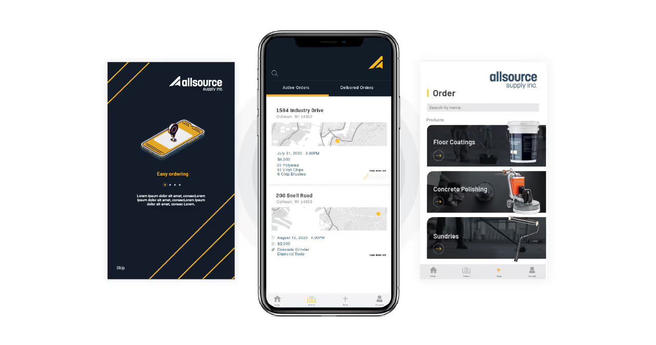


Thedacare is one of the leading nonprofit healthcare providers in northeast and central Wisconsin. They work passionately to support programs and initiatives for improving community health. One of those programs has been running consecutively for almost 20 years and started as a program to educate high schoolers on the dangers of drinking and driving. Over the years, the number of distractions available has increased and the program has shifted to stay relevant. Not only is there a focus on drinking and driving, but now incidents stemming from distractions such as cell phone use have continued to rise. Our job was to rename and rebrand this community program to bring it up to speed with today’s issues.


Our goal for creating the identity for this program is to provide a clear message and an impactful design system that they could leverage for the next 20 years. By including colors from the Thedacare brand and giving the design an edgy twist, we aimed to create a solution that would resonate with students as well as compliment the core brand.
In an effort to be as straightforward as possible, we chose to rename the program to FOCUS. As simple as it sounds, it’s what needs to stick. The word is also an acronym with 5 pillars of information. This program and it’s marketing materials are crafted and designed to remind people, with sobering examples of the alternative, that while they’re on the road, they should just focus on driving.


On May 26th, 2020, Thedacare announced the launch of the new FOCUS program to an excited community. Plans were set to hold their first event in late October that year. Due to the worldwide COVID pandemic, the 2020 program was canceled and rescheduled to be virtual. With the newly created brand and visual elements, Thedacare was able to leverage production partners to bring the program to life in a virtual environment. When Thedacare extends its reach into our community with programs such as this one, there’s no doubt that positive impact happens.


Thedacare is one of the leading nonprofit healthcare providers in northeast and central Wisconsin. They work passionately to support programs and initiatives for improving community health. One of those programs has been running consecutively for almost 20 years and started as a program to educate high schoolers on the dangers of drinking and driving. Over the years, the number of distractions available has increased and the program has shifted to stay relevant. Not only is there a focus on drinking and driving, but now incidents stemming from distractions such as cell phone use have continued to rise. Our job was to rename and rebrand this community program to bring it up to speed with today’s issues.


Our goal for creating the identity for this program is to provide a clear message and an impactful design system that they could leverage for the next 20 years. By including colors from the Thedacare brand and giving the design an edgy twist, we aimed to create a solution that would resonate with students as well as compliment the core brand.
In an effort to be as straightforward as possible, we chose to rename the program to FOCUS. As simple as it sounds, it’s what needs to stick. The word is also an acronym with 5 pillars of information. This program and it’s marketing materials are crafted and designed to remind people, with sobering examples of the alternative, that while they’re on the road, they should just focus on driving.

On May 26th, 2020, Thedacare announced the launch of the new FOCUS program to an excited community. Plans were set to hold their first event in late October that year. Due to the worldwide COVID pandemic, the 2020 program was canceled and rescheduled to be virtual. With the newly created brand and visual elements, Thedacare was able to leverage production partners to bring the program to life in a virtual environment. When Thedacare extends its reach into our community with programs such as this one, there’s no doubt that positive impact happens.


Thedacare is one of the leading nonprofit healthcare providers in northeast and central Wisconsin. They work passionately to support programs and initiatives for improving community health. One of those programs has been running consecutively for almost 20 years and started as a program to educate high schoolers on the dangers of drinking and driving. Over the years, the number of distractions available has increased and the program has shifted to stay relevant. Not only is there a focus on drinking and driving, but now incidents stemming from distractions such as cell phone use have continued to rise. Our job was to rename and rebrand this community program to bring it up to speed with today’s issues.

Our goal for creating the identity for this program is to provide a clear message and an impactful design system that they could leverage for the next 20 years. By including colors from the Thedacare brand and giving the design an edgy twist, we aimed to create a solution that would resonate with students as well as compliment the core brand.
In an effort to be as straightforward as possible, we chose to rename the program to FOCUS. As simple as it sounds, it’s what needs to stick. The word is also an acronym with 5 pillars of information. This program and it’s marketing materials are crafted and designed to remind people, with sobering examples of the alternative, that while they’re on the road, they should just focus on driving.


On May 26th, 2020, Thedacare announced the launch of the new FOCUS program to an excited community. Plans were set to hold their first event in late October that year. Due to the worldwide COVID pandemic, the 2020 program was canceled and rescheduled to be virtual. With the newly created brand and visual elements, Thedacare was able to leverage production partners to bring the program to life in a virtual environment. When Thedacare extends its reach into our community with programs such as this one, there’s no doubt that positive impact happens.


On May 26th, 2020, Thedacare announced the launch of the new FOCUS program to an excited community. Plans were set to hold their first event in late October that year. Due to the worldwide COVID pandemic, the 2020 program was canceled and rescheduled to be virtual. With the newly created brand and visual elements, Thedacare was able to leverage production partners to bring the program to life in a virtual environment. When Thedacare extends its reach into our community with programs such as this one, there’s no doubt that positive impact happens.
Thedacare is one of the leading nonprofit healthcare providers in northeast and central Wisconsin. They work passionately to support programs and initiatives for improving community health. One of those programs has been running consecutively for almost 20 years and started as a program to educate high schoolers on the dangers of drinking and driving. Over the years, the number of distractions available has increased and the program has shifted to stay relevant. Not only is there a focus on drinking and driving, but now incidents stemming from distractions such as cell phone use have continued to rise. Our job was to rename and rebrand this community program to bring it up to speed with today’s issues.

Our goal for creating the identity for this program is to provide a clear message and an impactful design system that they could leverage for the next 20 years. By including colors from the Thedacare brand and giving the design an edgy twist, we aimed to create a solution that would resonate with students as well as compliment the core brand.
In an effort to be as straightforward as possible, we chose to rename the program to FOCUS. As simple as it sounds, it’s what needs to stick. The word is also an acronym with 5 pillars of information. This program and it’s marketing materials are crafted and designed to remind people, with sobering examples of the alternative, that while they’re on the road, they should just focus on driving.

On May 26th, 2020, Thedacare announced the launch of the new FOCUS program to an excited community. Plans were set to hold their first event in late October that year. Due to the worldwide COVID pandemic, the 2020 program was canceled and rescheduled to be virtual. With the newly created brand and visual elements, Thedacare was able to leverage production partners to bring the program to life in a virtual environment. When Thedacare extends its reach into our community with programs such as this one, there’s no doubt that positive impact happens.

On May 26th, 2020, Thedacare announced the launch of the new FOCUS program to an excited community. Plans were set to hold their first event in late October that year. Due to the worldwide COVID pandemic, the 2020 program was canceled and rescheduled to be virtual. With the newly created brand and visual elements, Thedacare was able to leverage production partners to bring the program to life in a virtual environment. When Thedacare extends its reach into our community with programs such as this one, there’s no doubt that positive impact happens.

Our goal for creating the identity for this program is to provide a clear message and an impactful design system that they could leverage for the next 20 years. By including colors from the Thedacare brand and giving the design an edgy twist, we aimed to create a solution that would resonate with students as well as compliment the core brand.
In an effort to be as straightforward as possible, we chose to rename the program to FOCUS. As simple as it sounds, it’s what needs to stick. The word is also an acronym with 5 pillars of information. This program and it’s marketing materials are crafted and designed to remind people, with sobering examples of the alternative, that while they’re on the road, they should just focus on driving.

Thedacare is one of the leading nonprofit healthcare providers in northeast and central Wisconsin. They work passionately to support programs and initiatives for improving community health. One of those programs has been running consecutively for almost 20 years and started as a program to educate high schoolers on the dangers of drinking and driving. Over the years, the number of distractions available has increased and the program has shifted to stay relevant. Not only is there a focus on drinking and driving, but now incidents stemming from distractions such as cell phone use have continued to rise. Our job was to rename and rebrand this community program to bring it up to speed with today’s issues.

On May 26th, 2020, Thedacare announced the launch of the new FOCUS program to an excited community. Plans were set to hold their first event in late October that year. Due to the worldwide COVID pandemic, the 2020 program was canceled and rescheduled to be virtual. With the newly created brand and visual elements, Thedacare was able to leverage production partners to bring the program to life in a virtual environment. When Thedacare extends its reach into our community with programs such as this one, there’s no doubt that positive impact happens.


On May 26th, 2020, Thedacare announced the launch of the new FOCUS program to an excited community. Plans were set to hold their first event in late October that year. Due to the worldwide COVID pandemic, the 2020 program was canceled and rescheduled to be virtual. With the newly created brand and visual elements, Thedacare was able to leverage production partners to bring the program to life in a virtual environment. When Thedacare extends its reach into our community with programs such as this one, there’s no doubt that positive impact happens.


Thedacare is one of the leading nonprofit healthcare providers in northeast and central Wisconsin. They work passionately to support programs and initiatives for improving community health. One of those programs has been running consecutively for almost 20 years and started as a program to educate high schoolers on the dangers of drinking and driving. Over the years, the number of distractions available has increased and the program has shifted to stay relevant. Not only is there a focus on drinking and driving, but now incidents stemming from distractions such as cell phone use have continued to rise. Our job was to rename and rebrand this community program to bring it up to speed with today’s issues.


Our goal for creating the identity for this program is to provide a clear message and an impactful design system that they could leverage for the next 20 years. By including colors from the Thedacare brand and giving the design an edgy twist, we aimed to create a solution that would resonate with students as well as compliment the core brand.
In an effort to be as straightforward as possible, we chose to rename the program to FOCUS. As simple as it sounds, it’s what needs to stick. The word is also an acronym with 5 pillars of information. This program and it’s marketing materials are crafted and designed to remind people, with sobering examples of the alternative, that while they’re on the road, they should just focus on driving.

On May 26th, 2020, Thedacare announced the launch of the new FOCUS program to an excited community. Plans were set to hold their first event in late October that year. Due to the worldwide COVID pandemic, the 2020 program was canceled and rescheduled to be virtual. With the newly created brand and visual elements, Thedacare was able to leverage production partners to bring the program to life in a virtual environment. When Thedacare extends its reach into our community with programs such as this one, there’s no doubt that positive impact happens.


Thedacare is one of the leading nonprofit healthcare providers in northeast and central Wisconsin. They work passionately to support programs and initiatives for improving community health. One of those programs has been running consecutively for almost 20 years and started as a program to educate high schoolers on the dangers of drinking and driving. Over the years, the number of distractions available has increased and the program has shifted to stay relevant. Not only is there a focus on drinking and driving, but now incidents stemming from distractions such as cell phone use have continued to rise. Our job was to rename and rebrand this community program to bring it up to speed with today’s issues.
Our goal for creating the identity for this program is to provide a clear message and an impactful design system that they could leverage for the next 20 years. By including colors from the Thedacare brand and giving the design an edgy twist, we aimed to create a solution that would resonate with students as well as compliment the core brand.
In an effort to be as straightforward as possible, we chose to rename the program to FOCUS. As simple as it sounds, it’s what needs to stick. The word is also an acronym with 5 pillars of information. This program and it’s marketing materials are crafted and designed to remind people, with sobering examples of the alternative, that while they’re on the road, they should just focus on driving.


On May 26th, 2020, Thedacare announced the launch of the new FOCUS program to an excited community. Plans were set to hold their first event in late October that year. Due to the worldwide COVID pandemic, the 2020 program was canceled and rescheduled to be virtual. With the newly created brand and visual elements, Thedacare was able to leverage production partners to bring the program to life in a virtual environment. When Thedacare extends its reach into our community with programs such as this one, there’s no doubt that positive impact happens.


Thedacare is one of the leading nonprofit healthcare providers in northeast and central Wisconsin. They work passionately to support programs and initiatives for improving community health. One of those programs has been running consecutively for almost 20 years and started as a program to educate high schoolers on the dangers of drinking and driving. Over the years, the number of distractions available has increased and the program has shifted to stay relevant. Not only is there a focus on drinking and driving, but now incidents stemming from distractions such as cell phone use have continued to rise. Our job was to rename and rebrand this community program to bring it up to speed with today’s issues.
On May 26th, 2020, Thedacare announced the launch of the new FOCUS program to an excited community. Plans were set to hold their first event in late October that year. Due to the worldwide COVID pandemic, the 2020 program was canceled and rescheduled to be virtual. With the newly created brand and visual elements, Thedacare was able to leverage production partners to bring the program to life in a virtual environment. When Thedacare extends its reach into our community with programs such as this one, there’s no doubt that positive impact happens.

Our goal for creating the identity for this program is to provide a clear message and an impactful design system that they could leverage for the next 20 years. By including colors from the Thedacare brand and giving the design an edgy twist, we aimed to create a solution that would resonate with students as well as compliment the core brand.
In an effort to be as straightforward as possible, we chose to rename the program to FOCUS. As simple as it sounds, it’s what needs to stick. The word is also an acronym with 5 pillars of information. This program and it’s marketing materials are crafted and designed to remind people, with sobering examples of the alternative, that while they’re on the road, they should just focus on driving.


On May 26th, 2020, Thedacare announced the launch of the new FOCUS program to an excited community. Plans were set to hold their first event in late October that year. Due to the worldwide COVID pandemic, the 2020 program was canceled and rescheduled to be virtual. With the newly created brand and visual elements, Thedacare was able to leverage production partners to bring the program to life in a virtual environment. When Thedacare extends its reach into our community with programs such as this one, there’s no doubt that positive impact happens.


Thedacare is one of the leading nonprofit healthcare providers in northeast and central Wisconsin. They work passionately to support programs and initiatives for improving community health. One of those programs has been running consecutively for almost 20 years and started as a program to educate high schoolers on the dangers of drinking and driving. Over the years, the number of distractions available has increased and the program has shifted to stay relevant. Not only is there a focus on drinking and driving, but now incidents stemming from distractions such as cell phone use have continued to rise. Our job was to rename and rebrand this community program to bring it up to speed with today’s issues.
Our goal for creating the identity for this program is to provide a clear message and an impactful design system that they could leverage for the next 20 years. By including colors from the Thedacare brand and giving the design an edgy twist, we aimed to create a solution that would resonate with students as well as compliment the core brand.
In an effort to be as straightforward as possible, we chose to rename the program to FOCUS. As simple as it sounds, it’s what needs to stick. The word is also an acronym with 5 pillars of information. This program and it’s marketing materials are crafted and designed to remind people, with sobering examples of the alternative, that while they’re on the road, they should just focus on driving.


On May 26th, 2020, Thedacare announced the launch of the new FOCUS program to an excited community. Plans were set to hold their first event in late October that year. Due to the worldwide COVID pandemic, the 2020 program was canceled and rescheduled to be virtual. With the newly created brand and visual elements, Thedacare was able to leverage production partners to bring the program to life in a virtual environment. When Thedacare extends its reach into our community with programs such as this one, there’s no doubt that positive impact happens.


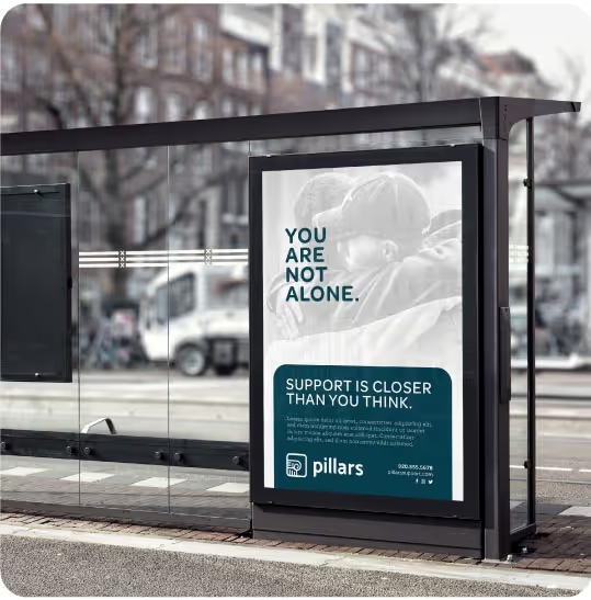
Thedacare is one of the leading nonprofit healthcare providers in northeast and central Wisconsin. They work passionately to support programs and initiatives for improving community health. One of those programs has been running consecutively for almost 20 years and started as a program to educate high schoolers on the dangers of drinking and driving. Over the years, the number of distractions available has increased and the program has shifted to stay relevant. Not only is there a focus on drinking and driving, but now incidents stemming from distractions such as cell phone use have continued to rise. Our job was to rename and rebrand this community program to bring it up to speed with today’s issues.

Our goal for creating the identity for this program is to provide a clear message and an impactful design system that they could leverage for the next 20 years. By including colors from the Thedacare brand and giving the design an edgy twist, we aimed to create a solution that would resonate with students as well as compliment the core brand.
In an effort to be as straightforward as possible, we chose to rename the program to FOCUS. As simple as it sounds, it’s what needs to stick. The word is also an acronym with 5 pillars of information. This program and it’s marketing materials are crafted and designed to remind people, with sobering examples of the alternative, that while they’re on the road, they should just focus on driving.

On May 26th, 2020, Thedacare announced the launch of the new FOCUS program to an excited community. Plans were set to hold their first event in late October that year. Due to the worldwide COVID pandemic, the 2020 program was canceled and rescheduled to be virtual. With the newly created brand and visual elements, Thedacare was able to leverage production partners to bring the program to life in a virtual environment. When Thedacare extends its reach into our community with programs such as this one, there’s no doubt that positive impact happens.


Thedacare is one of the leading nonprofit healthcare providers in northeast and central Wisconsin. They work passionately to support programs and initiatives for improving community health. One of those programs has been running consecutively for almost 20 years and started as a program to educate high schoolers on the dangers of drinking and driving. Over the years, the number of distractions available has increased and the program has shifted to stay relevant. Not only is there a focus on drinking and driving, but now incidents stemming from distractions such as cell phone use have continued to rise. Our job was to rename and rebrand this community program to bring it up to speed with today’s issues.

Our goal for creating the identity for this program is to provide a clear message and an impactful design system that they could leverage for the next 20 years. By including colors from the Thedacare brand and giving the design an edgy twist, we aimed to create a solution that would resonate with students as well as compliment the core brand.
In an effort to be as straightforward as possible, we chose to rename the program to FOCUS. As simple as it sounds, it’s what needs to stick. The word is also an acronym with 5 pillars of information. This program and it’s marketing materials are crafted and designed to remind people, with sobering examples of the alternative, that while they’re on the road, they should just focus on driving.


On May 26th, 2020, Thedacare announced the launch of the new FOCUS program to an excited community. Plans were set to hold their first event in late October that year. Due to the worldwide COVID pandemic, the 2020 program was canceled and rescheduled to be virtual. With the newly created brand and visual elements, Thedacare was able to leverage production partners to bring the program to life in a virtual environment. When Thedacare extends its reach into our community with programs such as this one, there’s no doubt that positive impact happens.


From initial concept discussions through creative brief and end product the team at Quill was responsive, receptive and thorough.
KATHI HEGRANES, INJURY PREVENTION & OUTREACH COORDINATOR, THEDACARE
