


Built from more than 100 years of established brand equity, Castle Pierce found that their visual identity and market position was feeling dated and lacked an intentional direction. In an effort to create a solid foundation for brand-forward marketing, sales, and customer and employee experiences, they chose to invest in a brand strategy and visual identity update as an essential piece of their growth strategy. Our job was to highlight the generations of past performance and set a course for future brand success.

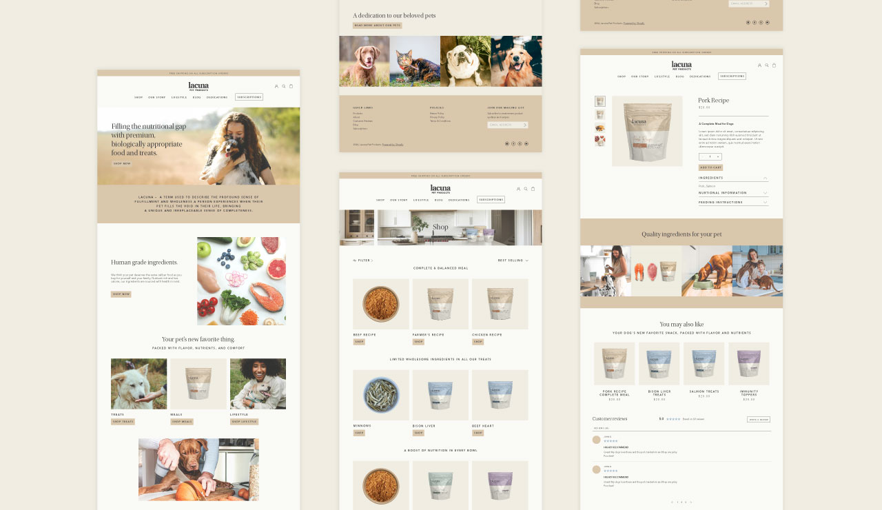

Following extensive research into the competitive landscape as well as historic artifacts from the organization’s archives, the creative team worked to uncover and distill key differentiating features and attributes. This provided the core foundation for brand positioning and set the course for Castle Pierce’s sustainable competitive advantages of unstoppable responsiveness and an unmatched legacy of proven performance.

Highlighting the key differentiators through core messages in a newly established brand-appropriate voice, the creative team at Quill developed a system of design elements, layout stylings and rules of design to use across all touchpoints of the brand identity. The Castle Pierce internal marketing resources and external partners are now aligned for years of consistent and impactful efforts led by a documented brand guide.


Built from more than 100 years of established brand equity, Castle Pierce found that their visual identity and market position was feeling dated and lacked an intentional direction. In an effort to create a solid foundation for brand-forward marketing, sales, and customer and employee experiences, they chose to invest in a brand strategy and visual identity update as an essential piece of their growth strategy. Our job was to highlight the generations of past performance and set a course for future brand success.


Following extensive research into the competitive landscape as well as historic artifacts from the organization’s archives, the creative team worked to uncover and distill key differentiating features and attributes. This provided the core foundation for brand positioning and set the course for Castle Pierce’s sustainable competitive advantages of unstoppable responsiveness and an unmatched legacy of proven performance.


Highlighting the key differentiators through core messages in a newly established brand-appropriate voice, the creative team at Quill developed a system of design elements, layout stylings and rules of design to use across all touchpoints of the brand identity. The Castle Pierce internal marketing resources and external partners are now aligned for years of consistent and impactful efforts led by a documented brand guide.
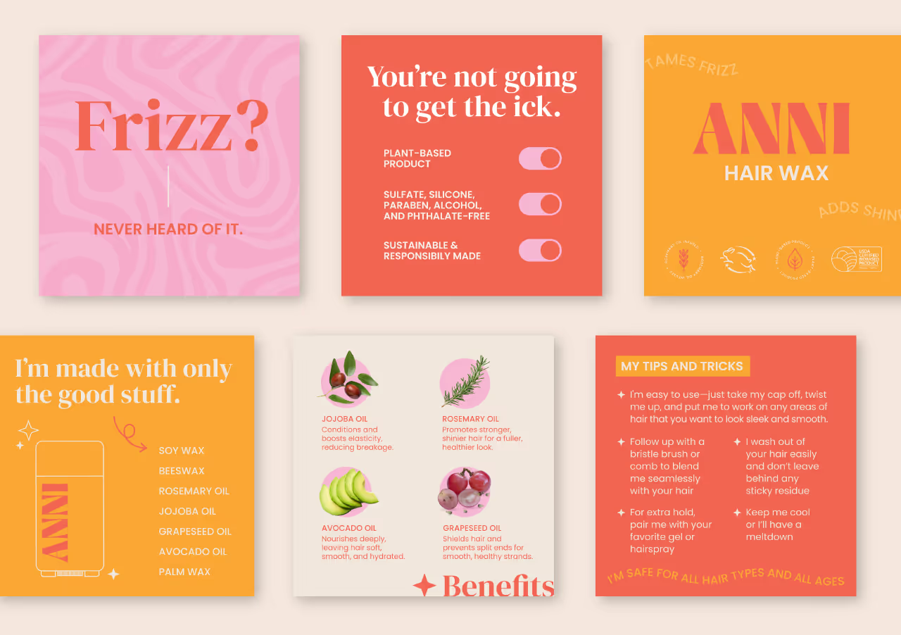


Built from more than 100 years of established brand equity, Castle Pierce found that their visual identity and market position was feeling dated and lacked an intentional direction. In an effort to create a solid foundation for brand-forward marketing, sales, and customer and employee experiences, they chose to invest in a brand strategy and visual identity update as an essential piece of their growth strategy. Our job was to highlight the generations of past performance and set a course for future brand success.

Following extensive research into the competitive landscape as well as historic artifacts from the organization’s archives, the creative team worked to uncover and distill key differentiating features and attributes. This provided the core foundation for brand positioning and set the course for Castle Pierce’s sustainable competitive advantages of unstoppable responsiveness and an unmatched legacy of proven performance.


Highlighting the key differentiators through core messages in a newly established brand-appropriate voice, the creative team at Quill developed a system of design elements, layout stylings and rules of design to use across all touchpoints of the brand identity. The Castle Pierce internal marketing resources and external partners are now aligned for years of consistent and impactful efforts led by a documented brand guide.


Built from more than 100 years of established brand equity, Castle Pierce found that their visual identity and market position was feeling dated and lacked an intentional direction. In an effort to create a solid foundation for brand-forward marketing, sales, and customer and employee experiences, they chose to invest in a brand strategy and visual identity update as an essential piece of their growth strategy. Our job was to highlight the generations of past performance and set a course for future brand success.


Following extensive research into the competitive landscape as well as historic artifacts from the organization’s archives, the creative team worked to uncover and distill key differentiating features and attributes. This provided the core foundation for brand positioning and set the course for Castle Pierce’s sustainable competitive advantages of unstoppable responsiveness and an unmatched legacy of proven performance.


Highlighting the key differentiators through core messages in a newly established brand-appropriate voice, the creative team at Quill developed a system of design elements, layout stylings and rules of design to use across all touchpoints of the brand identity. The Castle Pierce internal marketing resources and external partners are now aligned for years of consistent and impactful efforts led by a documented brand guide.


Built from more than 100 years of established brand equity, Castle Pierce found that their visual identity and market position was feeling dated and lacked an intentional direction. In an effort to create a solid foundation for brand-forward marketing, sales, and customer and employee experiences, they chose to invest in a brand strategy and visual identity update as an essential piece of their growth strategy. Our job was to highlight the generations of past performance and set a course for future brand success.

Following extensive research into the competitive landscape as well as historic artifacts from the organization’s archives, the creative team worked to uncover and distill key differentiating features and attributes. This provided the core foundation for brand positioning and set the course for Castle Pierce’s sustainable competitive advantages of unstoppable responsiveness and an unmatched legacy of proven performance.


Highlighting the key differentiators through core messages in a newly established brand-appropriate voice, the creative team at Quill developed a system of design elements, layout stylings and rules of design to use across all touchpoints of the brand identity. The Castle Pierce internal marketing resources and external partners are now aligned for years of consistent and impactful efforts led by a documented brand guide.


Built from more than 100 years of established brand equity, Castle Pierce found that their visual identity and market position was feeling dated and lacked an intentional direction. In an effort to create a solid foundation for brand-forward marketing, sales, and customer and employee experiences, they chose to invest in a brand strategy and visual identity update as an essential piece of their growth strategy. Our job was to highlight the generations of past performance and set a course for future brand success.

Following extensive research into the competitive landscape as well as historic artifacts from the organization’s archives, the creative team worked to uncover and distill key differentiating features and attributes. This provided the core foundation for brand positioning and set the course for Castle Pierce’s sustainable competitive advantages of unstoppable responsiveness and an unmatched legacy of proven performance.


Highlighting the key differentiators through core messages in a newly established brand-appropriate voice, the creative team at Quill developed a system of design elements, layout stylings and rules of design to use across all touchpoints of the brand identity. The Castle Pierce internal marketing resources and external partners are now aligned for years of consistent and impactful efforts led by a documented brand guide.


Built from more than 100 years of established brand equity, Castle Pierce found that their visual identity and market position was feeling dated and lacked an intentional direction. In an effort to create a solid foundation for brand-forward marketing, sales, and customer and employee experiences, they chose to invest in a brand strategy and visual identity update as an essential piece of their growth strategy. Our job was to highlight the generations of past performance and set a course for future brand success.


Following extensive research into the competitive landscape as well as historic artifacts from the organization’s archives, the creative team worked to uncover and distill key differentiating features and attributes. This provided the core foundation for brand positioning and set the course for Castle Pierce’s sustainable competitive advantages of unstoppable responsiveness and an unmatched legacy of proven performance.

Highlighting the key differentiators through core messages in a newly established brand-appropriate voice, the creative team at Quill developed a system of design elements, layout stylings and rules of design to use across all touchpoints of the brand identity. The Castle Pierce internal marketing resources and external partners are now aligned for years of consistent and impactful efforts led by a documented brand guide.


Built from more than 100 years of established brand equity, Castle Pierce found that their visual identity and market position was feeling dated and lacked an intentional direction. In an effort to create a solid foundation for brand-forward marketing, sales, and customer and employee experiences, they chose to invest in a brand strategy and visual identity update as an essential piece of their growth strategy. Our job was to highlight the generations of past performance and set a course for future brand success.

Following extensive research into the competitive landscape as well as historic artifacts from the organization’s archives, the creative team worked to uncover and distill key differentiating features and attributes. This provided the core foundation for brand positioning and set the course for Castle Pierce’s sustainable competitive advantages of unstoppable responsiveness and an unmatched legacy of proven performance.


Highlighting the key differentiators through core messages in a newly established brand-appropriate voice, the creative team at Quill developed a system of design elements, layout stylings and rules of design to use across all touchpoints of the brand identity. The Castle Pierce internal marketing resources and external partners are now aligned for years of consistent and impactful efforts led by a documented brand guide.


Built from more than 100 years of established brand equity, Castle Pierce found that their visual identity and market position was feeling dated and lacked an intentional direction. In an effort to create a solid foundation for brand-forward marketing, sales, and customer and employee experiences, they chose to invest in a brand strategy and visual identity update as an essential piece of their growth strategy. Our job was to highlight the generations of past performance and set a course for future brand success.

Following extensive research into the competitive landscape as well as historic artifacts from the organization’s archives, the creative team worked to uncover and distill key differentiating features and attributes. This provided the core foundation for brand positioning and set the course for Castle Pierce’s sustainable competitive advantages of unstoppable responsiveness and an unmatched legacy of proven performance.


Highlighting the key differentiators through core messages in a newly established brand-appropriate voice, the creative team at Quill developed a system of design elements, layout stylings and rules of design to use across all touchpoints of the brand identity. The Castle Pierce internal marketing resources and external partners are now aligned for years of consistent and impactful efforts led by a documented brand guide.


Built from more than 100 years of established brand equity, Castle Pierce found that their visual identity and market position was feeling dated and lacked an intentional direction. In an effort to create a solid foundation for brand-forward marketing, sales, and customer and employee experiences, they chose to invest in a brand strategy and visual identity update as an essential piece of their growth strategy. Our job was to highlight the generations of past performance and set a course for future brand success.


Following extensive research into the competitive landscape as well as historic artifacts from the organization’s archives, the creative team worked to uncover and distill key differentiating features and attributes. This provided the core foundation for brand positioning and set the course for Castle Pierce’s sustainable competitive advantages of unstoppable responsiveness and an unmatched legacy of proven performance.

Highlighting the key differentiators through core messages in a newly established brand-appropriate voice, the creative team at Quill developed a system of design elements, layout stylings and rules of design to use across all touchpoints of the brand identity. The Castle Pierce internal marketing resources and external partners are now aligned for years of consistent and impactful efforts led by a documented brand guide.


Built from more than 100 years of established brand equity, Castle Pierce found that their visual identity and market position was feeling dated and lacked an intentional direction. In an effort to create a solid foundation for brand-forward marketing, sales, and customer and employee experiences, they chose to invest in a brand strategy and visual identity update as an essential piece of their growth strategy. Our job was to highlight the generations of past performance and set a course for future brand success.


Following extensive research into the competitive landscape as well as historic artifacts from the organization’s archives, the creative team worked to uncover and distill key differentiating features and attributes. This provided the core foundation for brand positioning and set the course for Castle Pierce’s sustainable competitive advantages of unstoppable responsiveness and an unmatched legacy of proven performance.

Highlighting the key differentiators through core messages in a newly established brand-appropriate voice, the creative team at Quill developed a system of design elements, layout stylings and rules of design to use across all touchpoints of the brand identity. The Castle Pierce internal marketing resources and external partners are now aligned for years of consistent and impactful efforts led by a documented brand guide.


Built from more than 100 years of established brand equity, Castle Pierce found that their visual identity and market position was feeling dated and lacked an intentional direction. In an effort to create a solid foundation for brand-forward marketing, sales, and customer and employee experiences, they chose to invest in a brand strategy and visual identity update as an essential piece of their growth strategy. Our job was to highlight the generations of past performance and set a course for future brand success.


Following extensive research into the competitive landscape as well as historic artifacts from the organization’s archives, the creative team worked to uncover and distill key differentiating features and attributes. This provided the core foundation for brand positioning and set the course for Castle Pierce’s sustainable competitive advantages of unstoppable responsiveness and an unmatched legacy of proven performance.


Highlighting the key differentiators through core messages in a newly established brand-appropriate voice, the creative team at Quill developed a system of design elements, layout stylings and rules of design to use across all touchpoints of the brand identity. The Castle Pierce internal marketing resources and external partners are now aligned for years of consistent and impactful efforts led by a documented brand guide.


Built from more than 100 years of established brand equity, Castle Pierce found that their visual identity and market position was feeling dated and lacked an intentional direction. In an effort to create a solid foundation for brand-forward marketing, sales, and customer and employee experiences, they chose to invest in a brand strategy and visual identity update as an essential piece of their growth strategy. Our job was to highlight the generations of past performance and set a course for future brand success.


Following extensive research into the competitive landscape as well as historic artifacts from the organization’s archives, the creative team worked to uncover and distill key differentiating features and attributes. This provided the core foundation for brand positioning and set the course for Castle Pierce’s sustainable competitive advantages of unstoppable responsiveness and an unmatched legacy of proven performance.


Highlighting the key differentiators through core messages in a newly established brand-appropriate voice, the creative team at Quill developed a system of design elements, layout stylings and rules of design to use across all touchpoints of the brand identity. The Castle Pierce internal marketing resources and external partners are now aligned for years of consistent and impactful efforts led by a documented brand guide.

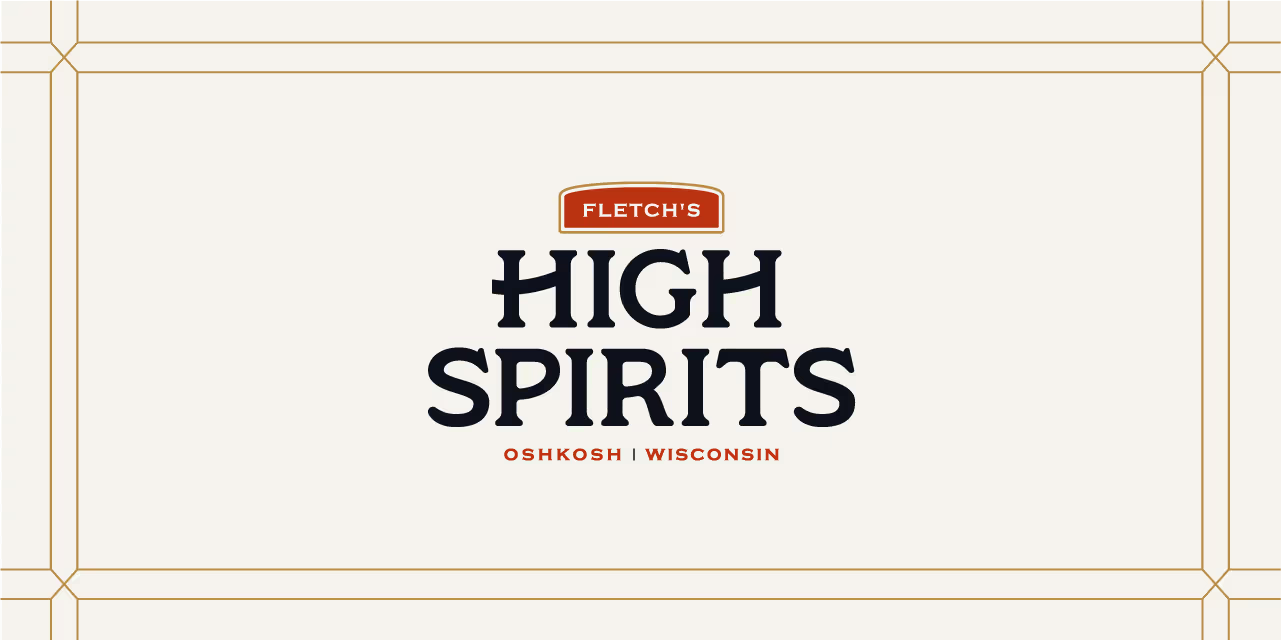

Built from more than 100 years of established brand equity, Castle Pierce found that their visual identity and market position was feeling dated and lacked an intentional direction. In an effort to create a solid foundation for brand-forward marketing, sales, and customer and employee experiences, they chose to invest in a brand strategy and visual identity update as an essential piece of their growth strategy. Our job was to highlight the generations of past performance and set a course for future brand success.

Following extensive research into the competitive landscape as well as historic artifacts from the organization’s archives, the creative team worked to uncover and distill key differentiating features and attributes. This provided the core foundation for brand positioning and set the course for Castle Pierce’s sustainable competitive advantages of unstoppable responsiveness and an unmatched legacy of proven performance.
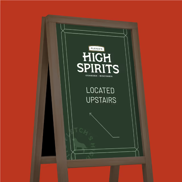

Highlighting the key differentiators through core messages in a newly established brand-appropriate voice, the creative team at Quill developed a system of design elements, layout stylings and rules of design to use across all touchpoints of the brand identity. The Castle Pierce internal marketing resources and external partners are now aligned for years of consistent and impactful efforts led by a documented brand guide.


Built from more than 100 years of established brand equity, Castle Pierce found that their visual identity and market position was feeling dated and lacked an intentional direction. In an effort to create a solid foundation for brand-forward marketing, sales, and customer and employee experiences, they chose to invest in a brand strategy and visual identity update as an essential piece of their growth strategy. Our job was to highlight the generations of past performance and set a course for future brand success.


Following extensive research into the competitive landscape as well as historic artifacts from the organization’s archives, the creative team worked to uncover and distill key differentiating features and attributes. This provided the core foundation for brand positioning and set the course for Castle Pierce’s sustainable competitive advantages of unstoppable responsiveness and an unmatched legacy of proven performance.


Highlighting the key differentiators through core messages in a newly established brand-appropriate voice, the creative team at Quill developed a system of design elements, layout stylings and rules of design to use across all touchpoints of the brand identity. The Castle Pierce internal marketing resources and external partners are now aligned for years of consistent and impactful efforts led by a documented brand guide.


Built from more than 100 years of established brand equity, Castle Pierce found that their visual identity and market position was feeling dated and lacked an intentional direction. In an effort to create a solid foundation for brand-forward marketing, sales, and customer and employee experiences, they chose to invest in a brand strategy and visual identity update as an essential piece of their growth strategy. Our job was to highlight the generations of past performance and set a course for future brand success.


Following extensive research into the competitive landscape as well as historic artifacts from the organization’s archives, the creative team worked to uncover and distill key differentiating features and attributes. This provided the core foundation for brand positioning and set the course for Castle Pierce’s sustainable competitive advantages of unstoppable responsiveness and an unmatched legacy of proven performance.


Highlighting the key differentiators through core messages in a newly established brand-appropriate voice, the creative team at Quill developed a system of design elements, layout stylings and rules of design to use across all touchpoints of the brand identity. The Castle Pierce internal marketing resources and external partners are now aligned for years of consistent and impactful efforts led by a documented brand guide.


Built from more than 100 years of established brand equity, Castle Pierce found that their visual identity and market position was feeling dated and lacked an intentional direction. In an effort to create a solid foundation for brand-forward marketing, sales, and customer and employee experiences, they chose to invest in a brand strategy and visual identity update as an essential piece of their growth strategy. Our job was to highlight the generations of past performance and set a course for future brand success.


Following extensive research into the competitive landscape as well as historic artifacts from the organization’s archives, the creative team worked to uncover and distill key differentiating features and attributes. This provided the core foundation for brand positioning and set the course for Castle Pierce’s sustainable competitive advantages of unstoppable responsiveness and an unmatched legacy of proven performance.


Highlighting the key differentiators through core messages in a newly established brand-appropriate voice, the creative team at Quill developed a system of design elements, layout stylings and rules of design to use across all touchpoints of the brand identity. The Castle Pierce internal marketing resources and external partners are now aligned for years of consistent and impactful efforts led by a documented brand guide.
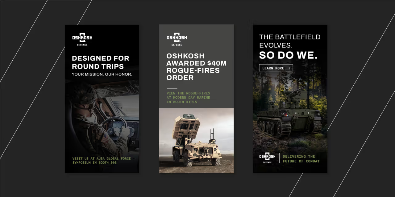


Built from more than 100 years of established brand equity, Castle Pierce found that their visual identity and market position was feeling dated and lacked an intentional direction. In an effort to create a solid foundation for brand-forward marketing, sales, and customer and employee experiences, they chose to invest in a brand strategy and visual identity update as an essential piece of their growth strategy. Our job was to highlight the generations of past performance and set a course for future brand success.

Following extensive research into the competitive landscape as well as historic artifacts from the organization’s archives, the creative team worked to uncover and distill key differentiating features and attributes. This provided the core foundation for brand positioning and set the course for Castle Pierce’s sustainable competitive advantages of unstoppable responsiveness and an unmatched legacy of proven performance.


Highlighting the key differentiators through core messages in a newly established brand-appropriate voice, the creative team at Quill developed a system of design elements, layout stylings and rules of design to use across all touchpoints of the brand identity. The Castle Pierce internal marketing resources and external partners are now aligned for years of consistent and impactful efforts led by a documented brand guide.


Built from more than 100 years of established brand equity, Castle Pierce found that their visual identity and market position was feeling dated and lacked an intentional direction. In an effort to create a solid foundation for brand-forward marketing, sales, and customer and employee experiences, they chose to invest in a brand strategy and visual identity update as an essential piece of their growth strategy. Our job was to highlight the generations of past performance and set a course for future brand success.


Following extensive research into the competitive landscape as well as historic artifacts from the organization’s archives, the creative team worked to uncover and distill key differentiating features and attributes. This provided the core foundation for brand positioning and set the course for Castle Pierce’s sustainable competitive advantages of unstoppable responsiveness and an unmatched legacy of proven performance.


Highlighting the key differentiators through core messages in a newly established brand-appropriate voice, the creative team at Quill developed a system of design elements, layout stylings and rules of design to use across all touchpoints of the brand identity. The Castle Pierce internal marketing resources and external partners are now aligned for years of consistent and impactful efforts led by a documented brand guide.


Built from more than 100 years of established brand equity, Castle Pierce found that their visual identity and market position was feeling dated and lacked an intentional direction. In an effort to create a solid foundation for brand-forward marketing, sales, and customer and employee experiences, they chose to invest in a brand strategy and visual identity update as an essential piece of their growth strategy. Our job was to highlight the generations of past performance and set a course for future brand success.


Following extensive research into the competitive landscape as well as historic artifacts from the organization’s archives, the creative team worked to uncover and distill key differentiating features and attributes. This provided the core foundation for brand positioning and set the course for Castle Pierce’s sustainable competitive advantages of unstoppable responsiveness and an unmatched legacy of proven performance.


Highlighting the key differentiators through core messages in a newly established brand-appropriate voice, the creative team at Quill developed a system of design elements, layout stylings and rules of design to use across all touchpoints of the brand identity. The Castle Pierce internal marketing resources and external partners are now aligned for years of consistent and impactful efforts led by a documented brand guide.

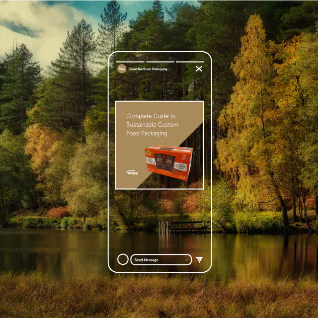


Built from more than 100 years of established brand equity, Castle Pierce found that their visual identity and market position was feeling dated and lacked an intentional direction. In an effort to create a solid foundation for brand-forward marketing, sales, and customer and employee experiences, they chose to invest in a brand strategy and visual identity update as an essential piece of their growth strategy. Our job was to highlight the generations of past performance and set a course for future brand success.


Following extensive research into the competitive landscape as well as historic artifacts from the organization’s archives, the creative team worked to uncover and distill key differentiating features and attributes. This provided the core foundation for brand positioning and set the course for Castle Pierce’s sustainable competitive advantages of unstoppable responsiveness and an unmatched legacy of proven performance.


Highlighting the key differentiators through core messages in a newly established brand-appropriate voice, the creative team at Quill developed a system of design elements, layout stylings and rules of design to use across all touchpoints of the brand identity. The Castle Pierce internal marketing resources and external partners are now aligned for years of consistent and impactful efforts led by a documented brand guide.


Built from more than 100 years of established brand equity, Castle Pierce found that their visual identity and market position was feeling dated and lacked an intentional direction. In an effort to create a solid foundation for brand-forward marketing, sales, and customer and employee experiences, they chose to invest in a brand strategy and visual identity update as an essential piece of their growth strategy. Our job was to highlight the generations of past performance and set a course for future brand success.

Following extensive research into the competitive landscape as well as historic artifacts from the organization’s archives, the creative team worked to uncover and distill key differentiating features and attributes. This provided the core foundation for brand positioning and set the course for Castle Pierce’s sustainable competitive advantages of unstoppable responsiveness and an unmatched legacy of proven performance.


Highlighting the key differentiators through core messages in a newly established brand-appropriate voice, the creative team at Quill developed a system of design elements, layout stylings and rules of design to use across all touchpoints of the brand identity. The Castle Pierce internal marketing resources and external partners are now aligned for years of consistent and impactful efforts led by a documented brand guide.


Built from more than 100 years of established brand equity, Castle Pierce found that their visual identity and market position was feeling dated and lacked an intentional direction. In an effort to create a solid foundation for brand-forward marketing, sales, and customer and employee experiences, they chose to invest in a brand strategy and visual identity update as an essential piece of their growth strategy. Our job was to highlight the generations of past performance and set a course for future brand success.


Following extensive research into the competitive landscape as well as historic artifacts from the organization’s archives, the creative team worked to uncover and distill key differentiating features and attributes. This provided the core foundation for brand positioning and set the course for Castle Pierce’s sustainable competitive advantages of unstoppable responsiveness and an unmatched legacy of proven performance.


Highlighting the key differentiators through core messages in a newly established brand-appropriate voice, the creative team at Quill developed a system of design elements, layout stylings and rules of design to use across all touchpoints of the brand identity. The Castle Pierce internal marketing resources and external partners are now aligned for years of consistent and impactful efforts led by a documented brand guide.

Built from more than 100 years of established brand equity, Castle Pierce found that their visual identity and market position was feeling dated and lacked an intentional direction. In an effort to create a solid foundation for brand-forward marketing, sales, and customer and employee experiences, they chose to invest in a brand strategy and visual identity update as an essential piece of their growth strategy. Our job was to highlight the generations of past performance and set a course for future brand success.


Following extensive research into the competitive landscape as well as historic artifacts from the organization’s archives, the creative team worked to uncover and distill key differentiating features and attributes. This provided the core foundation for brand positioning and set the course for Castle Pierce’s sustainable competitive advantages of unstoppable responsiveness and an unmatched legacy of proven performance.


Highlighting the key differentiators through core messages in a newly established brand-appropriate voice, the creative team at Quill developed a system of design elements, layout stylings and rules of design to use across all touchpoints of the brand identity. The Castle Pierce internal marketing resources and external partners are now aligned for years of consistent and impactful efforts led by a documented brand guide.


Built from more than 100 years of established brand equity, Castle Pierce found that their visual identity and market position was feeling dated and lacked an intentional direction. In an effort to create a solid foundation for brand-forward marketing, sales, and customer and employee experiences, they chose to invest in a brand strategy and visual identity update as an essential piece of their growth strategy. Our job was to highlight the generations of past performance and set a course for future brand success.

Following extensive research into the competitive landscape as well as historic artifacts from the organization’s archives, the creative team worked to uncover and distill key differentiating features and attributes. This provided the core foundation for brand positioning and set the course for Castle Pierce’s sustainable competitive advantages of unstoppable responsiveness and an unmatched legacy of proven performance.


Highlighting the key differentiators through core messages in a newly established brand-appropriate voice, the creative team at Quill developed a system of design elements, layout stylings and rules of design to use across all touchpoints of the brand identity. The Castle Pierce internal marketing resources and external partners are now aligned for years of consistent and impactful efforts led by a documented brand guide.


Built from more than 100 years of established brand equity, Castle Pierce found that their visual identity and market position was feeling dated and lacked an intentional direction. In an effort to create a solid foundation for brand-forward marketing, sales, and customer and employee experiences, they chose to invest in a brand strategy and visual identity update as an essential piece of their growth strategy. Our job was to highlight the generations of past performance and set a course for future brand success.


Following extensive research into the competitive landscape as well as historic artifacts from the organization’s archives, the creative team worked to uncover and distill key differentiating features and attributes. This provided the core foundation for brand positioning and set the course for Castle Pierce’s sustainable competitive advantages of unstoppable responsiveness and an unmatched legacy of proven performance.


Highlighting the key differentiators through core messages in a newly established brand-appropriate voice, the creative team at Quill developed a system of design elements, layout stylings and rules of design to use across all touchpoints of the brand identity. The Castle Pierce internal marketing resources and external partners are now aligned for years of consistent and impactful efforts led by a documented brand guide.


Built from more than 100 years of established brand equity, Castle Pierce found that their visual identity and market position was feeling dated and lacked an intentional direction. In an effort to create a solid foundation for brand-forward marketing, sales, and customer and employee experiences, they chose to invest in a brand strategy and visual identity update as an essential piece of their growth strategy. Our job was to highlight the generations of past performance and set a course for future brand success.


Following extensive research into the competitive landscape as well as historic artifacts from the organization’s archives, the creative team worked to uncover and distill key differentiating features and attributes. This provided the core foundation for brand positioning and set the course for Castle Pierce’s sustainable competitive advantages of unstoppable responsiveness and an unmatched legacy of proven performance.


Highlighting the key differentiators through core messages in a newly established brand-appropriate voice, the creative team at Quill developed a system of design elements, layout stylings and rules of design to use across all touchpoints of the brand identity. The Castle Pierce internal marketing resources and external partners are now aligned for years of consistent and impactful efforts led by a documented brand guide.


Built from more than 100 years of established brand equity, Castle Pierce found that their visual identity and market position was feeling dated and lacked an intentional direction. In an effort to create a solid foundation for brand-forward marketing, sales, and customer and employee experiences, they chose to invest in a brand strategy and visual identity update as an essential piece of their growth strategy. Our job was to highlight the generations of past performance and set a course for future brand success.


Following extensive research into the competitive landscape as well as historic artifacts from the organization’s archives, the creative team worked to uncover and distill key differentiating features and attributes. This provided the core foundation for brand positioning and set the course for Castle Pierce’s sustainable competitive advantages of unstoppable responsiveness and an unmatched legacy of proven performance.


Highlighting the key differentiators through core messages in a newly established brand-appropriate voice, the creative team at Quill developed a system of design elements, layout stylings and rules of design to use across all touchpoints of the brand identity. The Castle Pierce internal marketing resources and external partners are now aligned for years of consistent and impactful efforts led by a documented brand guide.


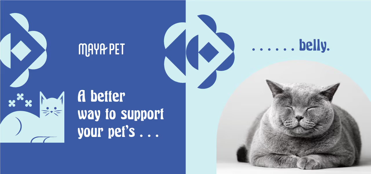


Built from more than 100 years of established brand equity, Castle Pierce found that their visual identity and market position was feeling dated and lacked an intentional direction. In an effort to create a solid foundation for brand-forward marketing, sales, and customer and employee experiences, they chose to invest in a brand strategy and visual identity update as an essential piece of their growth strategy. Our job was to highlight the generations of past performance and set a course for future brand success.


Following extensive research into the competitive landscape as well as historic artifacts from the organization’s archives, the creative team worked to uncover and distill key differentiating features and attributes. This provided the core foundation for brand positioning and set the course for Castle Pierce’s sustainable competitive advantages of unstoppable responsiveness and an unmatched legacy of proven performance.


Highlighting the key differentiators through core messages in a newly established brand-appropriate voice, the creative team at Quill developed a system of design elements, layout stylings and rules of design to use across all touchpoints of the brand identity. The Castle Pierce internal marketing resources and external partners are now aligned for years of consistent and impactful efforts led by a documented brand guide.


Built from more than 100 years of established brand equity, Castle Pierce found that their visual identity and market position was feeling dated and lacked an intentional direction. In an effort to create a solid foundation for brand-forward marketing, sales, and customer and employee experiences, they chose to invest in a brand strategy and visual identity update as an essential piece of their growth strategy. Our job was to highlight the generations of past performance and set a course for future brand success.

Following extensive research into the competitive landscape as well as historic artifacts from the organization’s archives, the creative team worked to uncover and distill key differentiating features and attributes. This provided the core foundation for brand positioning and set the course for Castle Pierce’s sustainable competitive advantages of unstoppable responsiveness and an unmatched legacy of proven performance.


Highlighting the key differentiators through core messages in a newly established brand-appropriate voice, the creative team at Quill developed a system of design elements, layout stylings and rules of design to use across all touchpoints of the brand identity. The Castle Pierce internal marketing resources and external partners are now aligned for years of consistent and impactful efforts led by a documented brand guide.


Built from more than 100 years of established brand equity, Castle Pierce found that their visual identity and market position was feeling dated and lacked an intentional direction. In an effort to create a solid foundation for brand-forward marketing, sales, and customer and employee experiences, they chose to invest in a brand strategy and visual identity update as an essential piece of their growth strategy. Our job was to highlight the generations of past performance and set a course for future brand success.



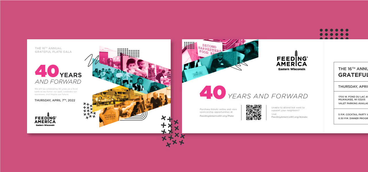


Following extensive research into the competitive landscape as well as historic artifacts from the organization’s archives, the creative team worked to uncover and distill key differentiating features and attributes. This provided the core foundation for brand positioning and set the course for Castle Pierce’s sustainable competitive advantages of unstoppable responsiveness and an unmatched legacy of proven performance.


Highlighting the key differentiators through core messages in a newly established brand-appropriate voice, the creative team at Quill developed a system of design elements, layout stylings and rules of design to use across all touchpoints of the brand identity. The Castle Pierce internal marketing resources and external partners are now aligned for years of consistent and impactful efforts led by a documented brand guide.


Built from more than 100 years of established brand equity, Castle Pierce found that their visual identity and market position was feeling dated and lacked an intentional direction. In an effort to create a solid foundation for brand-forward marketing, sales, and customer and employee experiences, they chose to invest in a brand strategy and visual identity update as an essential piece of their growth strategy. Our job was to highlight the generations of past performance and set a course for future brand success.

Following extensive research into the competitive landscape as well as historic artifacts from the organization’s archives, the creative team worked to uncover and distill key differentiating features and attributes. This provided the core foundation for brand positioning and set the course for Castle Pierce’s sustainable competitive advantages of unstoppable responsiveness and an unmatched legacy of proven performance.


Highlighting the key differentiators through core messages in a newly established brand-appropriate voice, the creative team at Quill developed a system of design elements, layout stylings and rules of design to use across all touchpoints of the brand identity. The Castle Pierce internal marketing resources and external partners are now aligned for years of consistent and impactful efforts led by a documented brand guide.


Built from more than 100 years of established brand equity, Castle Pierce found that their visual identity and market position was feeling dated and lacked an intentional direction. In an effort to create a solid foundation for brand-forward marketing, sales, and customer and employee experiences, they chose to invest in a brand strategy and visual identity update as an essential piece of their growth strategy. Our job was to highlight the generations of past performance and set a course for future brand success.


Following extensive research into the competitive landscape as well as historic artifacts from the organization’s archives, the creative team worked to uncover and distill key differentiating features and attributes. This provided the core foundation for brand positioning and set the course for Castle Pierce’s sustainable competitive advantages of unstoppable responsiveness and an unmatched legacy of proven performance.



Highlighting the key differentiators through core messages in a newly established brand-appropriate voice, the creative team at Quill developed a system of design elements, layout stylings and rules of design to use across all touchpoints of the brand identity. The Castle Pierce internal marketing resources and external partners are now aligned for years of consistent and impactful efforts led by a documented brand guide.


Built from more than 100 years of established brand equity, Castle Pierce found that their visual identity and market position was feeling dated and lacked an intentional direction. In an effort to create a solid foundation for brand-forward marketing, sales, and customer and employee experiences, they chose to invest in a brand strategy and visual identity update as an essential piece of their growth strategy. Our job was to highlight the generations of past performance and set a course for future brand success.


Following extensive research into the competitive landscape as well as historic artifacts from the organization’s archives, the creative team worked to uncover and distill key differentiating features and attributes. This provided the core foundation for brand positioning and set the course for Castle Pierce’s sustainable competitive advantages of unstoppable responsiveness and an unmatched legacy of proven performance.


Highlighting the key differentiators through core messages in a newly established brand-appropriate voice, the creative team at Quill developed a system of design elements, layout stylings and rules of design to use across all touchpoints of the brand identity. The Castle Pierce internal marketing resources and external partners are now aligned for years of consistent and impactful efforts led by a documented brand guide.


Built from more than 100 years of established brand equity, Castle Pierce found that their visual identity and market position was feeling dated and lacked an intentional direction. In an effort to create a solid foundation for brand-forward marketing, sales, and customer and employee experiences, they chose to invest in a brand strategy and visual identity update as an essential piece of their growth strategy. Our job was to highlight the generations of past performance and set a course for future brand success.


Following extensive research into the competitive landscape as well as historic artifacts from the organization’s archives, the creative team worked to uncover and distill key differentiating features and attributes. This provided the core foundation for brand positioning and set the course for Castle Pierce’s sustainable competitive advantages of unstoppable responsiveness and an unmatched legacy of proven performance.


Highlighting the key differentiators through core messages in a newly established brand-appropriate voice, the creative team at Quill developed a system of design elements, layout stylings and rules of design to use across all touchpoints of the brand identity. The Castle Pierce internal marketing resources and external partners are now aligned for years of consistent and impactful efforts led by a documented brand guide.


Built from more than 100 years of established brand equity, Castle Pierce found that their visual identity and market position was feeling dated and lacked an intentional direction. In an effort to create a solid foundation for brand-forward marketing, sales, and customer and employee experiences, they chose to invest in a brand strategy and visual identity update as an essential piece of their growth strategy. Our job was to highlight the generations of past performance and set a course for future brand success.


Following extensive research into the competitive landscape as well as historic artifacts from the organization’s archives, the creative team worked to uncover and distill key differentiating features and attributes. This provided the core foundation for brand positioning and set the course for Castle Pierce’s sustainable competitive advantages of unstoppable responsiveness and an unmatched legacy of proven performance.


Built from more than 100 years of established brand equity, Castle Pierce found that their visual identity and market position was feeling dated and lacked an intentional direction. In an effort to create a solid foundation for brand-forward marketing, sales, and customer and employee experiences, they chose to invest in a brand strategy and visual identity update as an essential piece of their growth strategy. Our job was to highlight the generations of past performance and set a course for future brand success.
Following extensive research into the competitive landscape as well as historic artifacts from the organization’s archives, the creative team worked to uncover and distill key differentiating features and attributes. This provided the core foundation for brand positioning and set the course for Castle Pierce’s sustainable competitive advantages of unstoppable responsiveness and an unmatched legacy of proven performance.


Highlighting the key differentiators through core messages in a newly established brand-appropriate voice, the creative team at Quill developed a system of design elements, layout stylings and rules of design to use across all touchpoints of the brand identity. The Castle Pierce internal marketing resources and external partners are now aligned for years of consistent and impactful efforts led by a documented brand guide.


Built from more than 100 years of established brand equity, Castle Pierce found that their visual identity and market position was feeling dated and lacked an intentional direction. In an effort to create a solid foundation for brand-forward marketing, sales, and customer and employee experiences, they chose to invest in a brand strategy and visual identity update as an essential piece of their growth strategy. Our job was to highlight the generations of past performance and set a course for future brand success.


Following extensive research into the competitive landscape as well as historic artifacts from the organization’s archives, the creative team worked to uncover and distill key differentiating features and attributes. This provided the core foundation for brand positioning and set the course for Castle Pierce’s sustainable competitive advantages of unstoppable responsiveness and an unmatched legacy of proven performance.
Highlighting the key differentiators through core messages in a newly established brand-appropriate voice, the creative team at Quill developed a system of design elements, layout stylings and rules of design to use across all touchpoints of the brand identity. The Castle Pierce internal marketing resources and external partners are now aligned for years of consistent and impactful efforts led by a documented brand guide.

Built from more than 100 years of established brand equity, Castle Pierce found that their visual identity and market position was feeling dated and lacked an intentional direction. In an effort to create a solid foundation for brand-forward marketing, sales, and customer and employee experiences, they chose to invest in a brand strategy and visual identity update as an essential piece of their growth strategy. Our job was to highlight the generations of past performance and set a course for future brand success.


Following extensive research into the competitive landscape as well as historic artifacts from the organization’s archives, the creative team worked to uncover and distill key differentiating features and attributes. This provided the core foundation for brand positioning and set the course for Castle Pierce’s sustainable competitive advantages of unstoppable responsiveness and an unmatched legacy of proven performance.


Highlighting the key differentiators through core messages in a newly established brand-appropriate voice, the creative team at Quill developed a system of design elements, layout stylings and rules of design to use across all touchpoints of the brand identity. The Castle Pierce internal marketing resources and external partners are now aligned for years of consistent and impactful efforts led by a documented brand guide.


Built from more than 100 years of established brand equity, Castle Pierce found that their visual identity and market position was feeling dated and lacked an intentional direction. In an effort to create a solid foundation for brand-forward marketing, sales, and customer and employee experiences, they chose to invest in a brand strategy and visual identity update as an essential piece of their growth strategy. Our job was to highlight the generations of past performance and set a course for future brand success.

Following extensive research into the competitive landscape as well as historic artifacts from the organization’s archives, the creative team worked to uncover and distill key differentiating features and attributes. This provided the core foundation for brand positioning and set the course for Castle Pierce’s sustainable competitive advantages of unstoppable responsiveness and an unmatched legacy of proven performance.


Highlighting the key differentiators through core messages in a newly established brand-appropriate voice, the creative team at Quill developed a system of design elements, layout stylings and rules of design to use across all touchpoints of the brand identity. The Castle Pierce internal marketing resources and external partners are now aligned for years of consistent and impactful efforts led by a documented brand guide.


Built from more than 100 years of established brand equity, Castle Pierce found that their visual identity and market position was feeling dated and lacked an intentional direction. In an effort to create a solid foundation for brand-forward marketing, sales, and customer and employee experiences, they chose to invest in a brand strategy and visual identity update as an essential piece of their growth strategy. Our job was to highlight the generations of past performance and set a course for future brand success.

Following extensive research into the competitive landscape as well as historic artifacts from the organization’s archives, the creative team worked to uncover and distill key differentiating features and attributes. This provided the core foundation for brand positioning and set the course for Castle Pierce’s sustainable competitive advantages of unstoppable responsiveness and an unmatched legacy of proven performance.

Highlighting the key differentiators through core messages in a newly established brand-appropriate voice, the creative team at Quill developed a system of design elements, layout stylings and rules of design to use across all touchpoints of the brand identity. The Castle Pierce internal marketing resources and external partners are now aligned for years of consistent and impactful efforts led by a documented brand guide.


Built from more than 100 years of established brand equity, Castle Pierce found that their visual identity and market position was feeling dated and lacked an intentional direction. In an effort to create a solid foundation for brand-forward marketing, sales, and customer and employee experiences, they chose to invest in a brand strategy and visual identity update as an essential piece of their growth strategy. Our job was to highlight the generations of past performance and set a course for future brand success.


Following extensive research into the competitive landscape as well as historic artifacts from the organization’s archives, the creative team worked to uncover and distill key differentiating features and attributes. This provided the core foundation for brand positioning and set the course for Castle Pierce’s sustainable competitive advantages of unstoppable responsiveness and an unmatched legacy of proven performance.


Highlighting the key differentiators through core messages in a newly established brand-appropriate voice, the creative team at Quill developed a system of design elements, layout stylings and rules of design to use across all touchpoints of the brand identity. The Castle Pierce internal marketing resources and external partners are now aligned for years of consistent and impactful efforts led by a documented brand guide.


Built from more than 100 years of established brand equity, Castle Pierce found that their visual identity and market position was feeling dated and lacked an intentional direction. In an effort to create a solid foundation for brand-forward marketing, sales, and customer and employee experiences, they chose to invest in a brand strategy and visual identity update as an essential piece of their growth strategy. Our job was to highlight the generations of past performance and set a course for future brand success.
Following extensive research into the competitive landscape as well as historic artifacts from the organization’s archives, the creative team worked to uncover and distill key differentiating features and attributes. This provided the core foundation for brand positioning and set the course for Castle Pierce’s sustainable competitive advantages of unstoppable responsiveness and an unmatched legacy of proven performance.


Highlighting the key differentiators through core messages in a newly established brand-appropriate voice, the creative team at Quill developed a system of design elements, layout stylings and rules of design to use across all touchpoints of the brand identity. The Castle Pierce internal marketing resources and external partners are now aligned for years of consistent and impactful efforts led by a documented brand guide.


Built from more than 100 years of established brand equity, Castle Pierce found that their visual identity and market position was feeling dated and lacked an intentional direction. In an effort to create a solid foundation for brand-forward marketing, sales, and customer and employee experiences, they chose to invest in a brand strategy and visual identity update as an essential piece of their growth strategy. Our job was to highlight the generations of past performance and set a course for future brand success.


Following extensive research into the competitive landscape as well as historic artifacts from the organization’s archives, the creative team worked to uncover and distill key differentiating features and attributes. This provided the core foundation for brand positioning and set the course for Castle Pierce’s sustainable competitive advantages of unstoppable responsiveness and an unmatched legacy of proven performance.


Highlighting the key differentiators through core messages in a newly established brand-appropriate voice, the creative team at Quill developed a system of design elements, layout stylings and rules of design to use across all touchpoints of the brand identity. The Castle Pierce internal marketing resources and external partners are now aligned for years of consistent and impactful efforts led by a documented brand guide.


Built from more than 100 years of established brand equity, Castle Pierce found that their visual identity and market position was feeling dated and lacked an intentional direction. In an effort to create a solid foundation for brand-forward marketing, sales, and customer and employee experiences, they chose to invest in a brand strategy and visual identity update as an essential piece of their growth strategy. Our job was to highlight the generations of past performance and set a course for future brand success.


Following extensive research into the competitive landscape as well as historic artifacts from the organization’s archives, the creative team worked to uncover and distill key differentiating features and attributes. This provided the core foundation for brand positioning and set the course for Castle Pierce’s sustainable competitive advantages of unstoppable responsiveness and an unmatched legacy of proven performance.


Highlighting the key differentiators through core messages in a newly established brand-appropriate voice, the creative team at Quill developed a system of design elements, layout stylings and rules of design to use across all touchpoints of the brand identity. The Castle Pierce internal marketing resources and external partners are now aligned for years of consistent and impactful efforts led by a documented brand guide.


Built from more than 100 years of established brand equity, Castle Pierce found that their visual identity and market position was feeling dated and lacked an intentional direction. In an effort to create a solid foundation for brand-forward marketing, sales, and customer and employee experiences, they chose to invest in a brand strategy and visual identity update as an essential piece of their growth strategy. Our job was to highlight the generations of past performance and set a course for future brand success.


Following extensive research into the competitive landscape as well as historic artifacts from the organization’s archives, the creative team worked to uncover and distill key differentiating features and attributes. This provided the core foundation for brand positioning and set the course for Castle Pierce’s sustainable competitive advantages of unstoppable responsiveness and an unmatched legacy of proven performance.


Highlighting the key differentiators through core messages in a newly established brand-appropriate voice, the creative team at Quill developed a system of design elements, layout stylings and rules of design to use across all touchpoints of the brand identity. The Castle Pierce internal marketing resources and external partners are now aligned for years of consistent and impactful efforts led by a documented brand guide.


Built from more than 100 years of established brand equity, Castle Pierce found that their visual identity and market position was feeling dated and lacked an intentional direction. In an effort to create a solid foundation for brand-forward marketing, sales, and customer and employee experiences, they chose to invest in a brand strategy and visual identity update as an essential piece of their growth strategy. Our job was to highlight the generations of past performance and set a course for future brand success.

Following extensive research into the competitive landscape as well as historic artifacts from the organization’s archives, the creative team worked to uncover and distill key differentiating features and attributes. This provided the core foundation for brand positioning and set the course for Castle Pierce’s sustainable competitive advantages of unstoppable responsiveness and an unmatched legacy of proven performance.

Highlighting the key differentiators through core messages in a newly established brand-appropriate voice, the creative team at Quill developed a system of design elements, layout stylings and rules of design to use across all touchpoints of the brand identity. The Castle Pierce internal marketing resources and external partners are now aligned for years of consistent and impactful efforts led by a documented brand guide.

Built from more than 100 years of established brand equity, Castle Pierce found that their visual identity and market position was feeling dated and lacked an intentional direction. In an effort to create a solid foundation for brand-forward marketing, sales, and customer and employee experiences, they chose to invest in a brand strategy and visual identity update as an essential piece of their growth strategy. Our job was to highlight the generations of past performance and set a course for future brand success.

Following extensive research into the competitive landscape as well as historic artifacts from the organization’s archives, the creative team worked to uncover and distill key differentiating features and attributes. This provided the core foundation for brand positioning and set the course for Castle Pierce’s sustainable competitive advantages of unstoppable responsiveness and an unmatched legacy of proven performance.


Highlighting the key differentiators through core messages in a newly established brand-appropriate voice, the creative team at Quill developed a system of design elements, layout stylings and rules of design to use across all touchpoints of the brand identity. The Castle Pierce internal marketing resources and external partners are now aligned for years of consistent and impactful efforts led by a documented brand guide.


Built from more than 100 years of established brand equity, Castle Pierce found that their visual identity and market position was feeling dated and lacked an intentional direction. In an effort to create a solid foundation for brand-forward marketing, sales, and customer and employee experiences, they chose to invest in a brand strategy and visual identity update as an essential piece of their growth strategy. Our job was to highlight the generations of past performance and set a course for future brand success.


Following extensive research into the competitive landscape as well as historic artifacts from the organization’s archives, the creative team worked to uncover and distill key differentiating features and attributes. This provided the core foundation for brand positioning and set the course for Castle Pierce’s sustainable competitive advantages of unstoppable responsiveness and an unmatched legacy of proven performance.


Highlighting the key differentiators through core messages in a newly established brand-appropriate voice, the creative team at Quill developed a system of design elements, layout stylings and rules of design to use across all touchpoints of the brand identity. The Castle Pierce internal marketing resources and external partners are now aligned for years of consistent and impactful efforts led by a documented brand guide.


Built from more than 100 years of established brand equity, Castle Pierce found that their visual identity and market position was feeling dated and lacked an intentional direction. In an effort to create a solid foundation for brand-forward marketing, sales, and customer and employee experiences, they chose to invest in a brand strategy and visual identity update as an essential piece of their growth strategy. Our job was to highlight the generations of past performance and set a course for future brand success.


Following extensive research into the competitive landscape as well as historic artifacts from the organization’s archives, the creative team worked to uncover and distill key differentiating features and attributes. This provided the core foundation for brand positioning and set the course for Castle Pierce’s sustainable competitive advantages of unstoppable responsiveness and an unmatched legacy of proven performance.


Highlighting the key differentiators through core messages in a newly established brand-appropriate voice, the creative team at Quill developed a system of design elements, layout stylings and rules of design to use across all touchpoints of the brand identity. The Castle Pierce internal marketing resources and external partners are now aligned for years of consistent and impactful efforts led by a documented brand guide.


Built from more than 100 years of established brand equity, Castle Pierce found that their visual identity and market position was feeling dated and lacked an intentional direction. In an effort to create a solid foundation for brand-forward marketing, sales, and customer and employee experiences, they chose to invest in a brand strategy and visual identity update as an essential piece of their growth strategy. Our job was to highlight the generations of past performance and set a course for future brand success.

Following extensive research into the competitive landscape as well as historic artifacts from the organization’s archives, the creative team worked to uncover and distill key differentiating features and attributes. This provided the core foundation for brand positioning and set the course for Castle Pierce’s sustainable competitive advantages of unstoppable responsiveness and an unmatched legacy of proven performance.


Highlighting the key differentiators through core messages in a newly established brand-appropriate voice, the creative team at Quill developed a system of design elements, layout stylings and rules of design to use across all touchpoints of the brand identity. The Castle Pierce internal marketing resources and external partners are now aligned for years of consistent and impactful efforts led by a documented brand guide.


Built from more than 100 years of established brand equity, Castle Pierce found that their visual identity and market position was feeling dated and lacked an intentional direction. In an effort to create a solid foundation for brand-forward marketing, sales, and customer and employee experiences, they chose to invest in a brand strategy and visual identity update as an essential piece of their growth strategy. Our job was to highlight the generations of past performance and set a course for future brand success.


Following extensive research into the competitive landscape as well as historic artifacts from the organization’s archives, the creative team worked to uncover and distill key differentiating features and attributes. This provided the core foundation for brand positioning and set the course for Castle Pierce’s sustainable competitive advantages of unstoppable responsiveness and an unmatched legacy of proven performance.

Highlighting the key differentiators through core messages in a newly established brand-appropriate voice, the creative team at Quill developed a system of design elements, layout stylings and rules of design to use across all touchpoints of the brand identity. The Castle Pierce internal marketing resources and external partners are now aligned for years of consistent and impactful efforts led by a documented brand guide.


Built from more than 100 years of established brand equity, Castle Pierce found that their visual identity and market position was feeling dated and lacked an intentional direction. In an effort to create a solid foundation for brand-forward marketing, sales, and customer and employee experiences, they chose to invest in a brand strategy and visual identity update as an essential piece of their growth strategy. Our job was to highlight the generations of past performance and set a course for future brand success.

Following extensive research into the competitive landscape as well as historic artifacts from the organization’s archives, the creative team worked to uncover and distill key differentiating features and attributes. This provided the core foundation for brand positioning and set the course for Castle Pierce’s sustainable competitive advantages of unstoppable responsiveness and an unmatched legacy of proven performance.


Highlighting the key differentiators through core messages in a newly established brand-appropriate voice, the creative team at Quill developed a system of design elements, layout stylings and rules of design to use across all touchpoints of the brand identity. The Castle Pierce internal marketing resources and external partners are now aligned for years of consistent and impactful efforts led by a documented brand guide.


Highlighting the key differentiators through core messages in a newly established brand-appropriate voice, the creative team at Quill developed a system of design elements, layout stylings and rules of design to use across all touchpoints of the brand identity. The Castle Pierce internal marketing resources and external partners are now aligned for years of consistent and impactful efforts led by a documented brand guide.
Built from more than 100 years of established brand equity, Castle Pierce found that their visual identity and market position was feeling dated and lacked an intentional direction. In an effort to create a solid foundation for brand-forward marketing, sales, and customer and employee experiences, they chose to invest in a brand strategy and visual identity update as an essential piece of their growth strategy. Our job was to highlight the generations of past performance and set a course for future brand success.

Following extensive research into the competitive landscape as well as historic artifacts from the organization’s archives, the creative team worked to uncover and distill key differentiating features and attributes. This provided the core foundation for brand positioning and set the course for Castle Pierce’s sustainable competitive advantages of unstoppable responsiveness and an unmatched legacy of proven performance.

Highlighting the key differentiators through core messages in a newly established brand-appropriate voice, the creative team at Quill developed a system of design elements, layout stylings and rules of design to use across all touchpoints of the brand identity. The Castle Pierce internal marketing resources and external partners are now aligned for years of consistent and impactful efforts led by a documented brand guide.

Highlighting the key differentiators through core messages in a newly established brand-appropriate voice, the creative team at Quill developed a system of design elements, layout stylings and rules of design to use across all touchpoints of the brand identity. The Castle Pierce internal marketing resources and external partners are now aligned for years of consistent and impactful efforts led by a documented brand guide.

Following extensive research into the competitive landscape as well as historic artifacts from the organization’s archives, the creative team worked to uncover and distill key differentiating features and attributes. This provided the core foundation for brand positioning and set the course for Castle Pierce’s sustainable competitive advantages of unstoppable responsiveness and an unmatched legacy of proven performance.

Built from more than 100 years of established brand equity, Castle Pierce found that their visual identity and market position was feeling dated and lacked an intentional direction. In an effort to create a solid foundation for brand-forward marketing, sales, and customer and employee experiences, they chose to invest in a brand strategy and visual identity update as an essential piece of their growth strategy. Our job was to highlight the generations of past performance and set a course for future brand success.

Highlighting the key differentiators through core messages in a newly established brand-appropriate voice, the creative team at Quill developed a system of design elements, layout stylings and rules of design to use across all touchpoints of the brand identity. The Castle Pierce internal marketing resources and external partners are now aligned for years of consistent and impactful efforts led by a documented brand guide.


Highlighting the key differentiators through core messages in a newly established brand-appropriate voice, the creative team at Quill developed a system of design elements, layout stylings and rules of design to use across all touchpoints of the brand identity. The Castle Pierce internal marketing resources and external partners are now aligned for years of consistent and impactful efforts led by a documented brand guide.


Built from more than 100 years of established brand equity, Castle Pierce found that their visual identity and market position was feeling dated and lacked an intentional direction. In an effort to create a solid foundation for brand-forward marketing, sales, and customer and employee experiences, they chose to invest in a brand strategy and visual identity update as an essential piece of their growth strategy. Our job was to highlight the generations of past performance and set a course for future brand success.


Following extensive research into the competitive landscape as well as historic artifacts from the organization’s archives, the creative team worked to uncover and distill key differentiating features and attributes. This provided the core foundation for brand positioning and set the course for Castle Pierce’s sustainable competitive advantages of unstoppable responsiveness and an unmatched legacy of proven performance.

Highlighting the key differentiators through core messages in a newly established brand-appropriate voice, the creative team at Quill developed a system of design elements, layout stylings and rules of design to use across all touchpoints of the brand identity. The Castle Pierce internal marketing resources and external partners are now aligned for years of consistent and impactful efforts led by a documented brand guide.


Built from more than 100 years of established brand equity, Castle Pierce found that their visual identity and market position was feeling dated and lacked an intentional direction. In an effort to create a solid foundation for brand-forward marketing, sales, and customer and employee experiences, they chose to invest in a brand strategy and visual identity update as an essential piece of their growth strategy. Our job was to highlight the generations of past performance and set a course for future brand success.
Following extensive research into the competitive landscape as well as historic artifacts from the organization’s archives, the creative team worked to uncover and distill key differentiating features and attributes. This provided the core foundation for brand positioning and set the course for Castle Pierce’s sustainable competitive advantages of unstoppable responsiveness and an unmatched legacy of proven performance.


Highlighting the key differentiators through core messages in a newly established brand-appropriate voice, the creative team at Quill developed a system of design elements, layout stylings and rules of design to use across all touchpoints of the brand identity. The Castle Pierce internal marketing resources and external partners are now aligned for years of consistent and impactful efforts led by a documented brand guide.


Built from more than 100 years of established brand equity, Castle Pierce found that their visual identity and market position was feeling dated and lacked an intentional direction. In an effort to create a solid foundation for brand-forward marketing, sales, and customer and employee experiences, they chose to invest in a brand strategy and visual identity update as an essential piece of their growth strategy. Our job was to highlight the generations of past performance and set a course for future brand success.
Highlighting the key differentiators through core messages in a newly established brand-appropriate voice, the creative team at Quill developed a system of design elements, layout stylings and rules of design to use across all touchpoints of the brand identity. The Castle Pierce internal marketing resources and external partners are now aligned for years of consistent and impactful efforts led by a documented brand guide.

Following extensive research into the competitive landscape as well as historic artifacts from the organization’s archives, the creative team worked to uncover and distill key differentiating features and attributes. This provided the core foundation for brand positioning and set the course for Castle Pierce’s sustainable competitive advantages of unstoppable responsiveness and an unmatched legacy of proven performance.


Highlighting the key differentiators through core messages in a newly established brand-appropriate voice, the creative team at Quill developed a system of design elements, layout stylings and rules of design to use across all touchpoints of the brand identity. The Castle Pierce internal marketing resources and external partners are now aligned for years of consistent and impactful efforts led by a documented brand guide.


Built from more than 100 years of established brand equity, Castle Pierce found that their visual identity and market position was feeling dated and lacked an intentional direction. In an effort to create a solid foundation for brand-forward marketing, sales, and customer and employee experiences, they chose to invest in a brand strategy and visual identity update as an essential piece of their growth strategy. Our job was to highlight the generations of past performance and set a course for future brand success.
Following extensive research into the competitive landscape as well as historic artifacts from the organization’s archives, the creative team worked to uncover and distill key differentiating features and attributes. This provided the core foundation for brand positioning and set the course for Castle Pierce’s sustainable competitive advantages of unstoppable responsiveness and an unmatched legacy of proven performance.


Highlighting the key differentiators through core messages in a newly established brand-appropriate voice, the creative team at Quill developed a system of design elements, layout stylings and rules of design to use across all touchpoints of the brand identity. The Castle Pierce internal marketing resources and external partners are now aligned for years of consistent and impactful efforts led by a documented brand guide.


Built from more than 100 years of established brand equity, Castle Pierce found that their visual identity and market position was feeling dated and lacked an intentional direction. In an effort to create a solid foundation for brand-forward marketing, sales, and customer and employee experiences, they chose to invest in a brand strategy and visual identity update as an essential piece of their growth strategy. Our job was to highlight the generations of past performance and set a course for future brand success.

Following extensive research into the competitive landscape as well as historic artifacts from the organization’s archives, the creative team worked to uncover and distill key differentiating features and attributes. This provided the core foundation for brand positioning and set the course for Castle Pierce’s sustainable competitive advantages of unstoppable responsiveness and an unmatched legacy of proven performance.

Highlighting the key differentiators through core messages in a newly established brand-appropriate voice, the creative team at Quill developed a system of design elements, layout stylings and rules of design to use across all touchpoints of the brand identity. The Castle Pierce internal marketing resources and external partners are now aligned for years of consistent and impactful efforts led by a documented brand guide.


Built from more than 100 years of established brand equity, Castle Pierce found that their visual identity and market position was feeling dated and lacked an intentional direction. In an effort to create a solid foundation for brand-forward marketing, sales, and customer and employee experiences, they chose to invest in a brand strategy and visual identity update as an essential piece of their growth strategy. Our job was to highlight the generations of past performance and set a course for future brand success.

Following extensive research into the competitive landscape as well as historic artifacts from the organization’s archives, the creative team worked to uncover and distill key differentiating features and attributes. This provided the core foundation for brand positioning and set the course for Castle Pierce’s sustainable competitive advantages of unstoppable responsiveness and an unmatched legacy of proven performance.


Highlighting the key differentiators through core messages in a newly established brand-appropriate voice, the creative team at Quill developed a system of design elements, layout stylings and rules of design to use across all touchpoints of the brand identity. The Castle Pierce internal marketing resources and external partners are now aligned for years of consistent and impactful efforts led by a documented brand guide.


Updating the brand of the oldest business in Wisconsin still owned by a legacy family member, was not to be taken lightly. What we liked best about working with Quill was their respect for the past, while still forging a current brand strategy, supported with great creativity, to help us grow for another 100 years. It’s a very open and transparent relationship with great communication along the way.
Mark Elliott, Brand Packaging Sales & Marketing, Castle Pierce
